03/07/2014

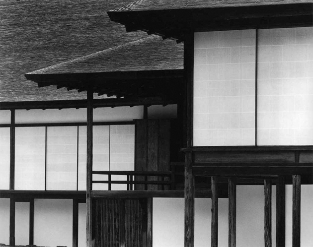
The Architecture of Katsura Palace

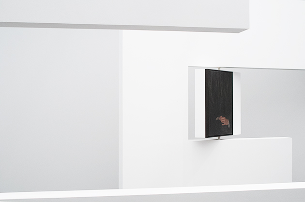
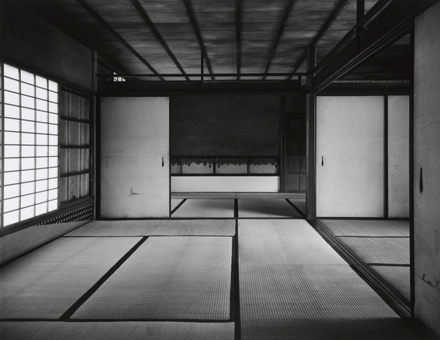
Set in wooded surroundings within the ancient perimeter of the imperial capital, Kyoto, the rikyu, or separated residence, of the Katsura Palace is the finest product of a secular and unofficial tradition. It was built in the 17th century by Kobori Enshu, tea ceremony master and architect, who sought to express his ideals of rustic simplicity and picturesque nature on a larger scale than had been attempted before. Katsura is not attributable to a single architectural style, nor to a unique project or to a single author, with its extremely heterogeneous mixture of compositional elements, but at the time perfectly integrated one with one another.
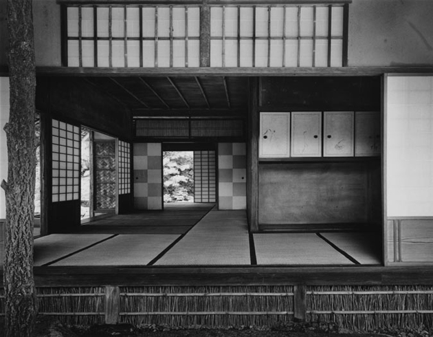
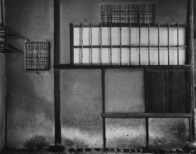
The villa of Katsura has been the focus of many different theories of interpretation on the part of the most powerful representatives of modern architecture. They, as architects, have focused their investigation of Katsura as architectural work; the analysis of Katsura is the analysis of the “space”, since it is the space to establish the extent of the architecture. The modernist architect Bruno Taut made a critical and utopian analysis, which he expresses through the language of architecture, with the search for “unity, simplicity and transparency”. So Taut read Katsura, as a place in which every element is in perfect harmony with the others, but at the same time perfectly independent, “as in a good society” thus giving the villa a symbolic political connotation. Katsura was seen as an “ultimate meaning of world through architectural form”, a “totality” in which they identified significance of higher order and conceived to unify man with nature. The carefully balanced environment considered the fragility of a human and caged its experience within proportions a man could relate to. The next western architect to comment on Japanese architecture, Walter Gropius, reiterates Taut’s earliest interpretations calling the simplicity, modularity, and indoor-outdoor relationship, “many of our modern requirements”.
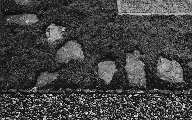
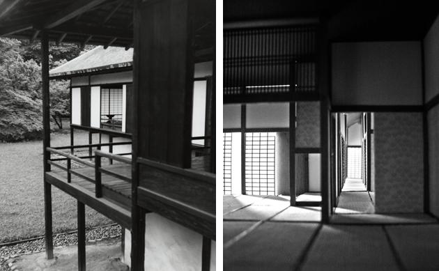
Kenzo Tange was among the first in his “Tradition and creation in Japanese architecture”, in 1960, to speak of “symbiosis” of elements and stylistic tastes in villa of Katsura, analysing the evolution of architectural styles and showing how these in Katsura combine in a harmonious way. But although still admiring the villa to a degree, Tange expressed criticism of the tradition of Katsura. Tange claimed Katsura draws Japanese architecture away from reality and into a passive and contemplative space, rather than a progressive one engaged with progress and technique. But contemplation is not passive. If Katsura has hidden tensions, then is not a purely passive sanctuary, it is very much in a state of progress and a state of living, and one finds an acknowledgment of the vitality of Katsura in its unfinished character and its openness to expansion, not simply a machine for living in but an ever-changing living space as yet unclosed.
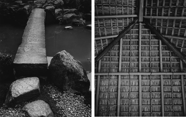
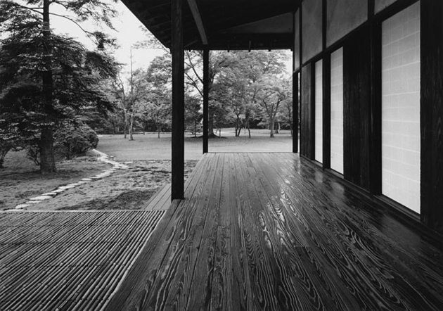
Tange tries to trace the characteristics of Japanese architecture in the villa that he will define Jomon and Yayoi, respectively “energetic, violent and popular” force and a “serene, refined and aristocratic” force. These two forces, popular and aristocratic, in Katsura collide, creating a strong spatial tension. Arata Isozaki did the latest, updated, interpretation of the villa; it contains a summary of the various interpretations so far attempted and thus provides a vision that leaves open the question of interpretation of the architectural space of Katsura talking about “ambiguity of space”. The purity of the materials used, the precious dark Hinoki wood, the rigour of design principles, the simplicity of structural elements – columns, architraves and balustrades – make it the ultimate expression of classical Japanese style.
Giulio Ghirardi 
03/07/2014

Some notes on: Antwerp Royal Academy Fashion Show

It is no secret that the power of design education lies in its lack of restraints. While the ultimate goal of any university degree is to best prepare us for ‘real’ life, it might just be that avoiding the limits of everyday reality, offers the best preparation a design student could get. When we speak about any design practice – graphics, product, or fashion – forgoing the limits of commercial production – marketing rules, costs, distribution, and so on – is at the core of research and innovation.

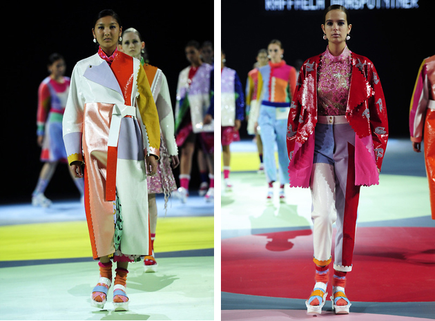
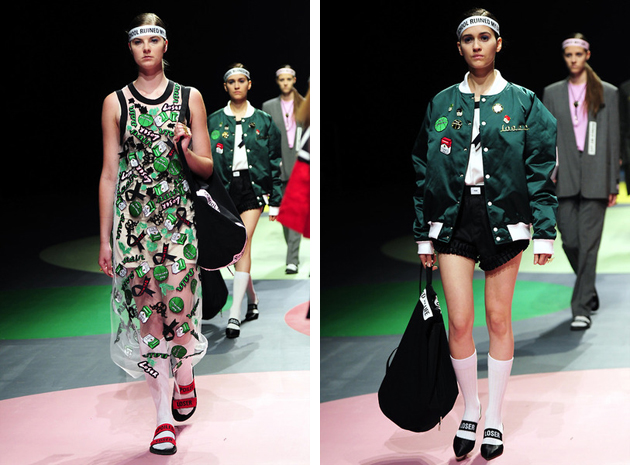
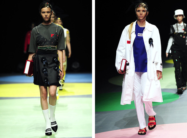
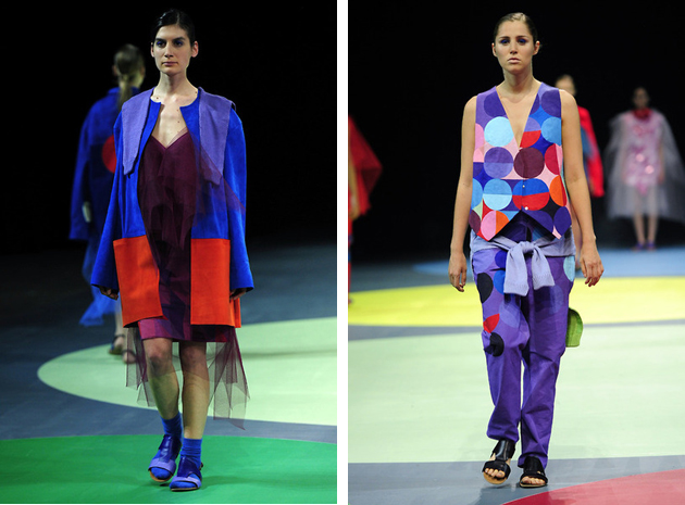
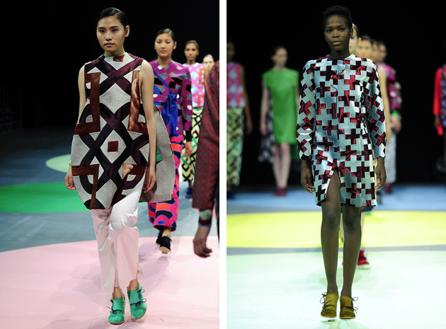
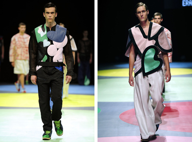
This line of thought appeared to be at the basis of Antwerp Royal Academy of Fine Arts Fashion course, whose 2014 final show presented a series of projects inspired by child-like freedom and mind wandering. Differently from its British counterparts – Royal College of Art and Central Saint Martins – Antwerp school’s runway didn’t strike us for its impeccable sartorial quality or conceptual research. Rather, its students were capable of capturing the unique spirit of the moment, transforming it into a vision for the future.
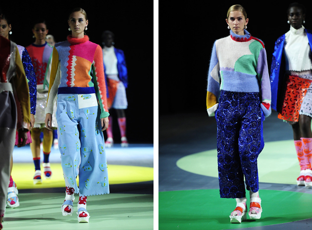
Among its ten 2014 graduates, the one that immediately stood out – bringing home three different awards – was Raffaela Graspointer. Titled “Holi Blush Bubble Crush”, this explicitly meaningless title captured the essence of her collection made of apparently random and unexpected combinations of materials, colours and shapes – fused together in a series of eclectic kaleidoscopic looks. On the other hand, Hyein Seo or Eran Shanny’s collections were perfectly summed up in their respective titles. Seo’s “Bad Education” featured bold graphic garments and punk aesthetics, toned down by simpler cuts and essential lines, while Shanny’s “Wild Hearts” designated a menswear collection full of hart-like cuts, shapes and décors.
On the other side of the ‘let your mind wander’ spectrum, were the collections of Clara Jungman Malmquist and Madeleine Coisne, who concentrated on tactile and textile research rather than playing with conceptual puns. Therefore, their collection featured bold patterns and colourful, yet refined juxtapositions, fused with brainy silhouettes, showing, as usual, that Antwerp is still the hot spot of creative freedom and exceptional fashion education.

Rujana Rebernjak 
02/07/2014

Style Suggestions: Summer Dresses

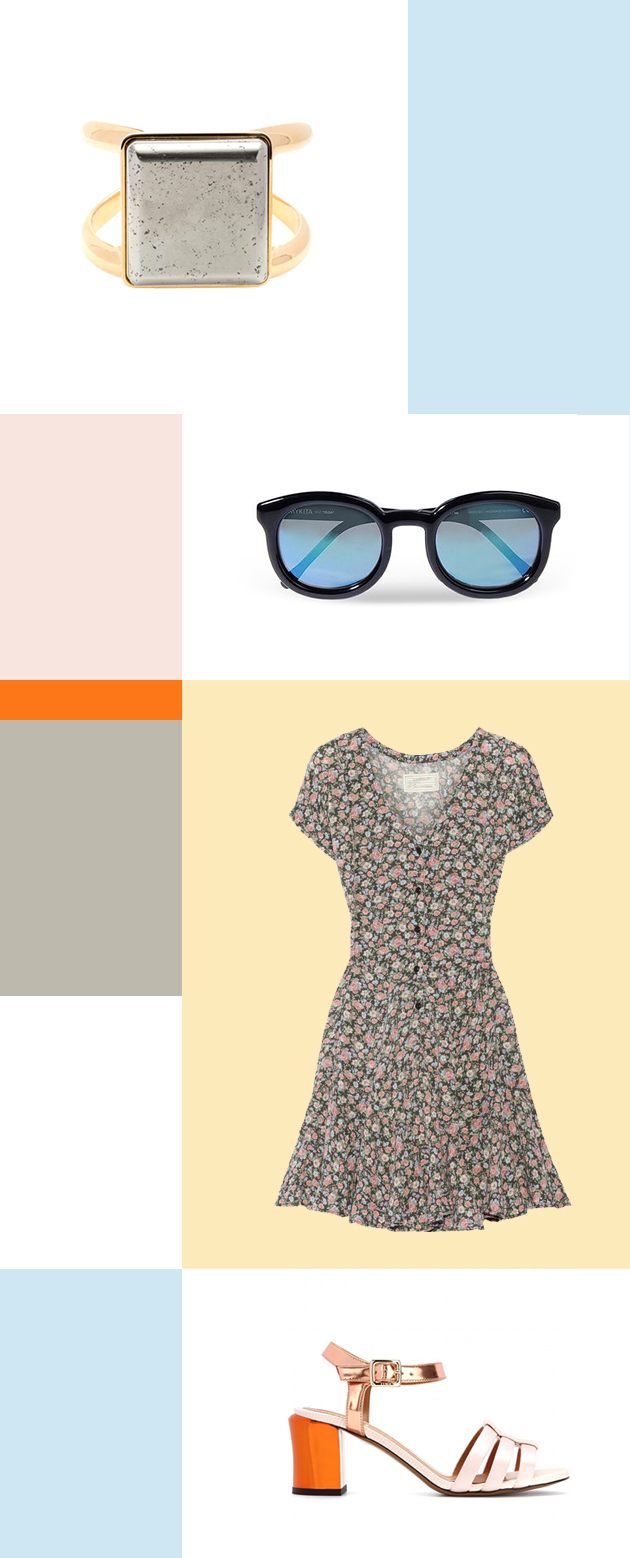
For the best throw-on-and-go piece in your wardrobe, summer dresses are the ultimate must-have. Whether you are in the city or at the beach, the summer dress will always keep you feeling comfortable and looking great.

Ring: Chloé, Sunglasses: Mykita, Dress: Current/Elliott, Shoes: Fendi

Styling by Vanessa Cocchiaro 

02/07/2014

Through the Lens of Jessica Backhaus

Jessica Backhaus was born in Cuxhaven, Germany, in 1970 and grew up in an artistic family. At the age of sixteen, she moved to Paris, where she later studied photography and visual communications, and where she met Gisèle Freund in 1992, who became her mentor. In 1995 her passion for photography drew her to New York, where she assisted photographers, pursued her own projects and lived until 2009.

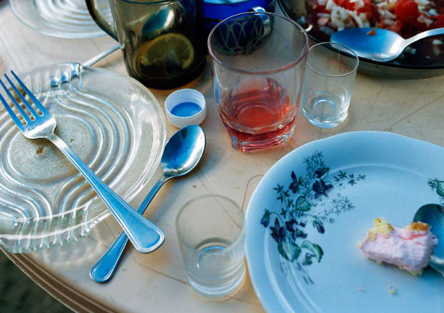
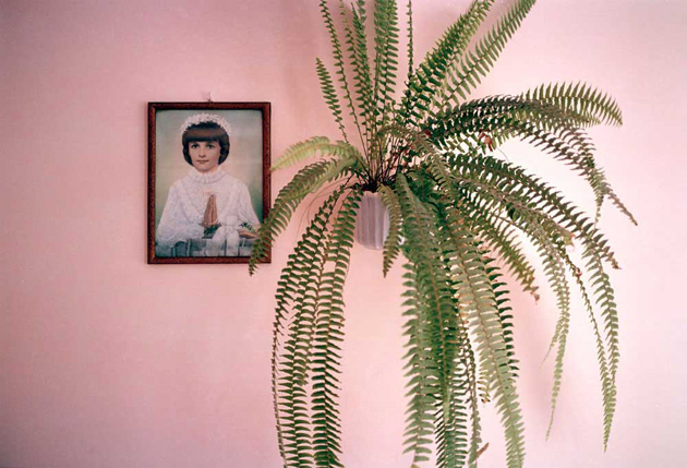
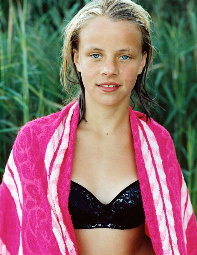
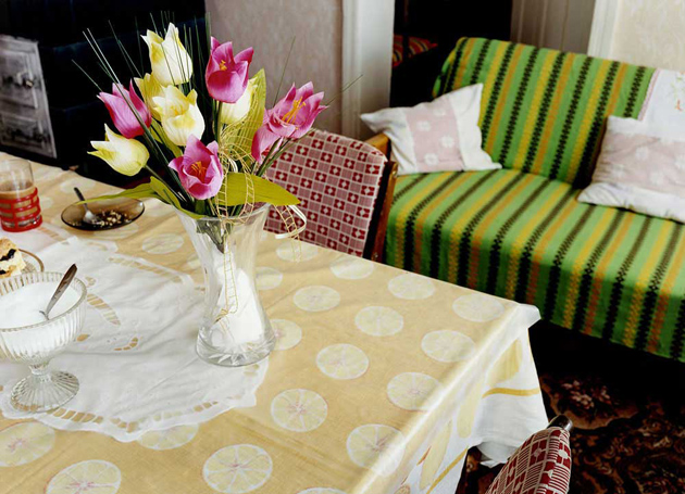
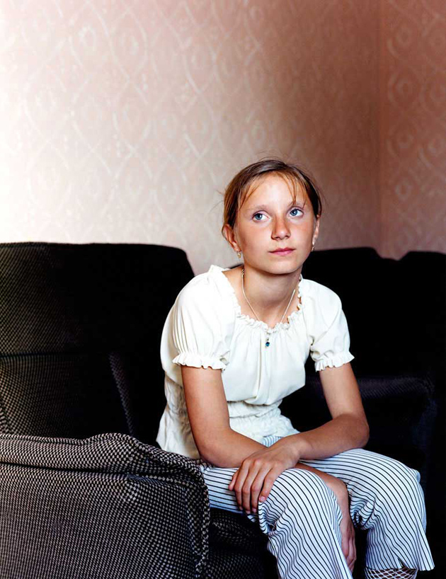
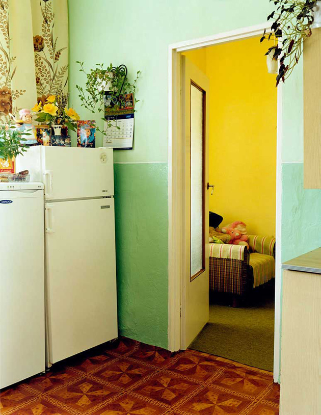
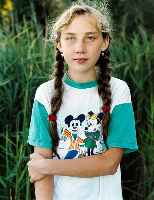
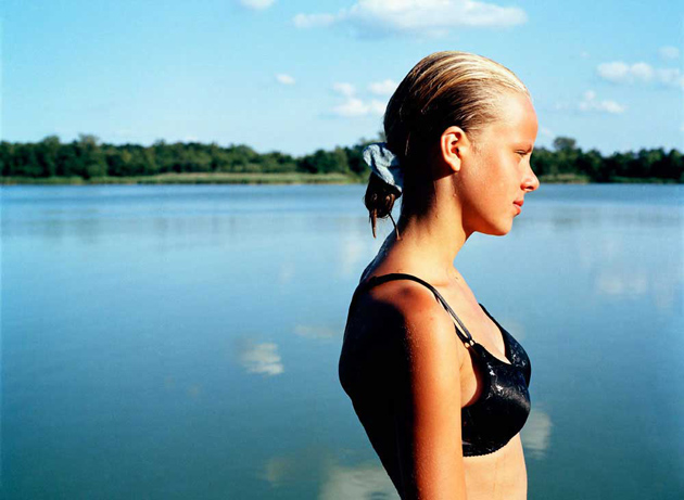
Regarded as one of the most distinguished voices in contemporary photography in Germany today, Jessica Backhaus has shown her work in numerous solo and group exhibitions, published different books and is featured in numerous prominent art collections. Presented here is a series of images from her project “Jesus and the Cherries”, published in 2005, documenting everyday life in the Polish province of Pomosrskie, where the artists has spent a total of three and a half years portraying the residents of Netno town.

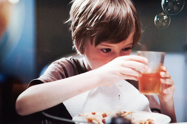
She shows people in their apartments, at work, and in the untouched Polish landscape. With a sure eye and an unusual colour language, she points out important but easily overlooked details: plastic flowers and crocheted pillowcases, images of saints and lace doilies, and cherries preserved in mason jars. The pictures are neither intrusive nor tactless; she encounters people with dignity and full of admiration for the way of life of Poland’s rural population. The intimate character of the photos suggests a special relationship to the subject: we feel the warmth, cordiality, and authenticity with which Backhaus was received in Poland. Jessica Backhaus thus tells a tale of traditional ways of life that may already belong to the past.

Images courtesy of Jessica Backhaus 
01/07/2014

Young Architects Program at PS1: Hy-Fi by The Living

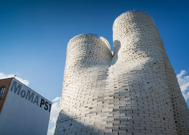
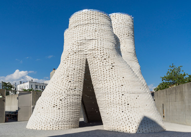
Summer seems to be the season for everything light, temporary and superficial, therefore even design and architecture disciplines need to follow suit, with temporary pavilions popping up everywhere from London to Venice. Following this line of development, albeit leaving the superficial side to other creative practices like fashion and, more often than not, art, MoMA PS1 has recently unveiled the winning project of its Young Architect Program: The Living’s Hy-Fi tower.

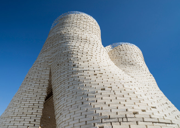
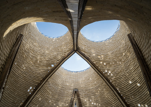
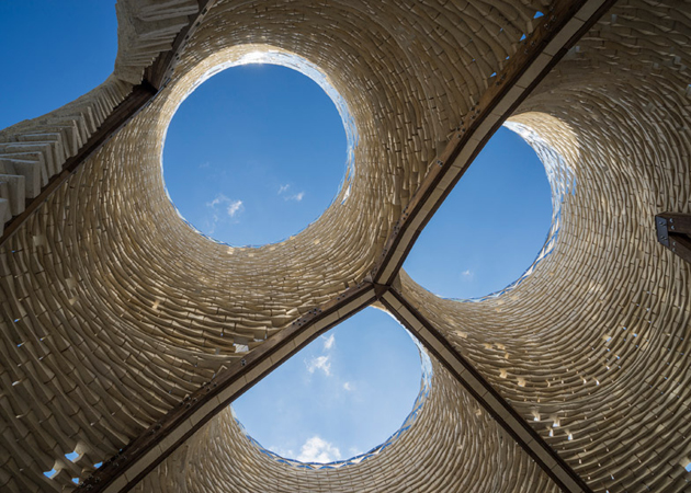
With the aim of promoting emerging architectural talent and giving space to new forms of practice, YAP commissions a temporary, outdoor installation that needs to provide shade, seating and water, while, at the same time, addressing environmental issues. The winning project – Hy-Fi – designed by The Living’s David Benjamin, uses biological technologies combined with cutting-edge computation and engineering to create new building structure made from 100% organic materials. The building is structured as a simple tower made of rectangular bricks, inverting the logic of load-bearing construction and creating a gravity defying effect, with a porous bottom and a more dense upper part.

Yet, what is truly revolutionary about Hy-Fi is not its form or function, but the peculiar material from which it was built. The organic bricks are produced through an innovative combination of corn stalks (that otherwise have no value) and specially-developed living root structures. The reflective bricks are produced through the custom-forming of a new daylighting mirror film, used as growing trays for the organic bricks, and then incorporated into the final construction. The organic bricks are arranged at the bottom of the structure and
the reflective bricks are arranged at the top to bounce light down on the towers and the ground. The structure temporarily diverts the natural carbon cycle to produce a building that grows out of nothing but earth and returns to nothing but earth—with almost no waste, no energy needs, and no carbon emissions. This approach offers a new vision for society’s approach to physical objects and the built environment.

Rujana Rebernjak – Images courtesy of Kris Graves 
01/07/2014

Paris Fashion Week: Military Looks and Tank-Tops

The overtly romantic French capital was the last stop on our Men Fashion Week road trip. The oldest and possibly most established venue, Paris has shown a new, easier, vibe this year, without losing its authentic signature – a dashingly charming attitude.

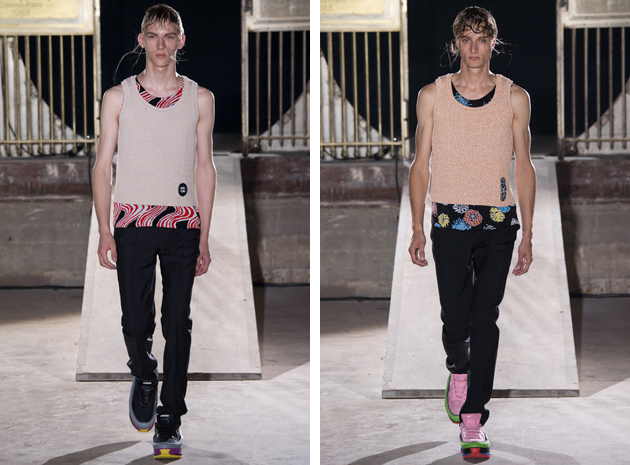
The first sign of change could be seen at Raf Simons’ show, where men in cotton tanks – layered one on top of another – walked the brainy designer’s catwalk. There was no space for sporty, basket-alike sleeveless shirts. Instead, it was all about quality craftsmanship and impeccable garments, usually left for posh female clothing, matched with futuristic shoes and well tailored pants.

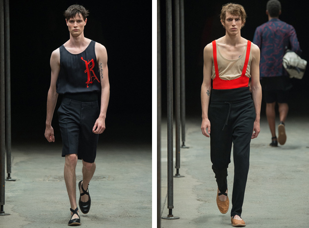
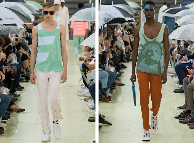
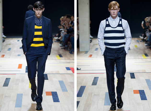
Dries Van Noten used a totally different approach, applying it to the same type of gaments. The Belgian designer took inspiration from elegant dancers and developed a collection full of feminine elements – together with tanks, a notable piece were the ballerina-shaped shoes. Kenzo, on the other hand, featured a series of pastel tones and maxi polka dots that gave the idea of an American tourist lost on the streets of Europe. But, in the end, the most unexpected runway was Dior Homme, with striped tanks styled on top of classic shirts rather than worn under elegant jackets, for a classy yet edgy feel.

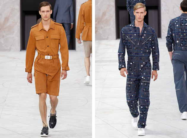
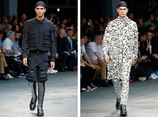
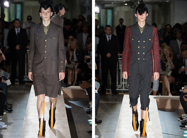
On the other hand, air force and military world won the attention of many fashion designers, forming a second relevant trend. From Louis Vuitton’s man, a hybrid between Sixties-style bourgeoisie – with his turtlenecks and trench coats – and a daredevil aviator – with his decorated jumpsuits and typically rough belts – to Comme des Garçons, where Rei Kawakubo exploited military jackets and typical uniforms and subverted them to speak about peace. And last but not least, Givenchy fashion show sparked from that influence, too, with Riccardo Tisci going along his well established path, revisiting bomber jackets and utility pockets in line with army apparel codes.

Francesca Crippa 
30/06/2014

Bye Bye Art Basel #45

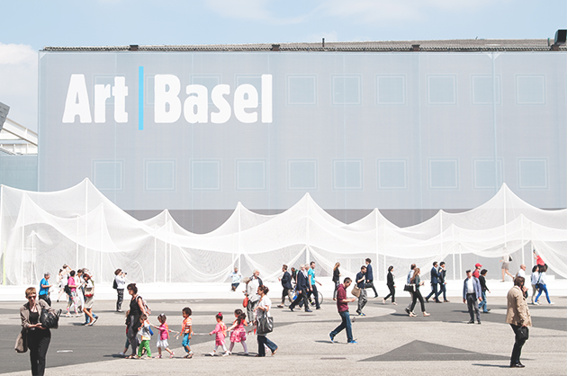
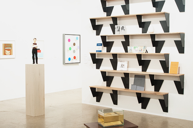
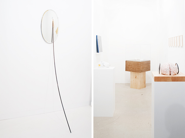
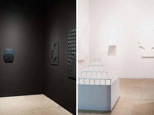
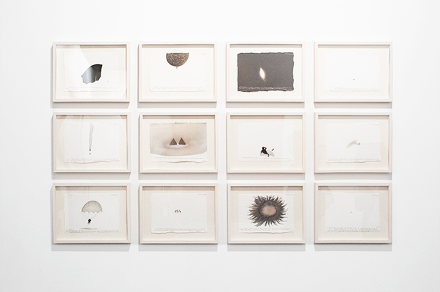
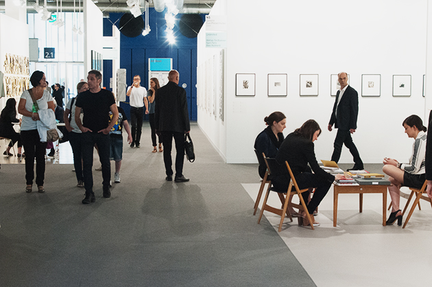
The 45th edition of Art Basel, the most renowned contemporary art fair worldwide, able to attract a sensational number of visitors, ended a few days ago and it’s time to review this latest intense experience, before it’s too late. This year 92.000 collectors, art players and lovers reached the Swiss city to visit 285 galleries coming from 34 countries and presenting 4.000 artists. Professionals reported a great success in terms of buying and selling. Many big galleries such as David Zwirner, Marian Goodman, Michael Werner, Skarstedt seem to have closed very good deals and the presence of international museums – Moca, Whitney, Pompidou, Louvre, even Maxxi from Rome –, made us think it truly was a success.

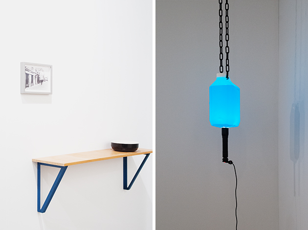
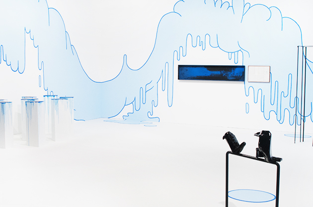
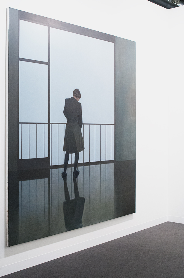
Starting from hall 2.0, proceeding randomly, we saw the essential shapes made of mirror and bronze created by Alicia Kwade both at mennour and Wallner; at Lambert we stopped to check the space devoted to Jenny Holzer, while Marconi showed a fascinating and mysterious middle-large canvas of Markus Schinwald (we will meet him again later, visiting Unlimited). There are sketches by Raymond Pettibon and pictures in pictures by Will Benedict in more than one gallery; Massimo De Carlo offers a sober, b/w symmetrical selection of works by Paola Pivi, Piotr Uklanski, Nate Lowman, Massimo Bartolini, Enrico Castellani and Alighiero Boetti; Eigen+Art displays a large-scale painting by Tim Eitel, while Kaufmann Repetto surprises with a total stand concept that unites different artist under the light blue liquid clouds by Lilly Van Der Stokker. gb agency merits a special attention thanks to contributions of artists of the like of Ryan Gander, Roman Ondák, Pratchaya Phinthong, Jiri Kovanda and Hassan Sharif. The ground floor was occupied by the usual giants, renown names such as White cube, Tucci Russo, Raffaella Cortese, Lisson, the “loud” Gagosian and so on, showing off their muscles.

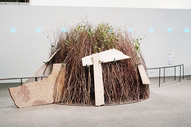
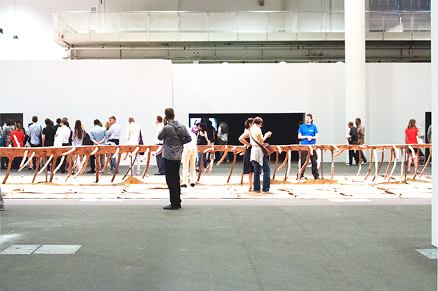
But what really makes the difference is Art Unlimited in hall 1. Allowing the exhibitors to put on display monumental works, exceeding the size of a normal stand, this important section of the fair, presents, among the others: the amazing Matrice di Linfa (Matrix of Sap) (2008) by Giuseppe Penone, a 46m imposing and significant work based on the morphology of a tree, elaborated through resin, terracotta and leather to show the life sap of nature; Arte Povera and its strong sensory effect is featured also through the igloo of brushwood, steel, stones made by Mario Merz. We considered absolutely cool the presence of Christian Marclay with his Shake Rattle and Roll (Fluxmix), an installation of 16 videos playing simultaneously on monitors arranged in circle and displaying the artist’s hands manipulating Fluxus objects. The result is a kind of a visual concert, producing an absurd, hypnotic symphony. Ryan Gander exhibits a film production entitled Imagineering (2013), a short movie recalling in all a perfect governmental positive advertisement, and Bruce Nauman, one of the pioneers of Post-minimal and conceptual art, presents the Raw Material with Continuous Shift – MMMM, 1991, a single video shoot looped in two monitors, one upside-down, depicting a turning head with shifts in color.

There were so many things to enjoy in Basel, but unfortunately times goes by so fast when you’re having fun… see you next year!

Monica Lombardi – Images courtesy of Agota Lukyte 
27/06/2014

Marie Rime: the Obvious and the Unkown

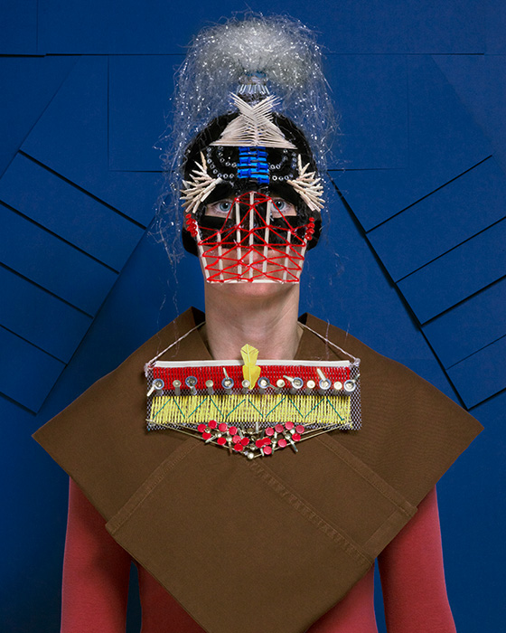
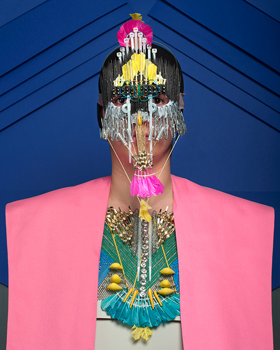
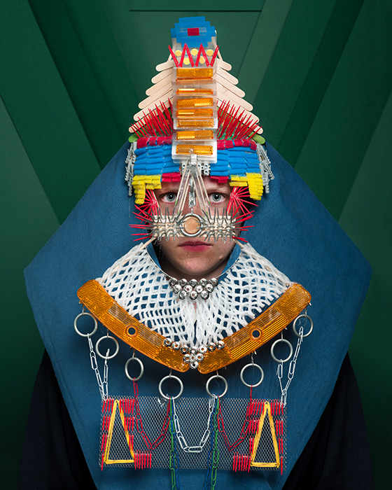
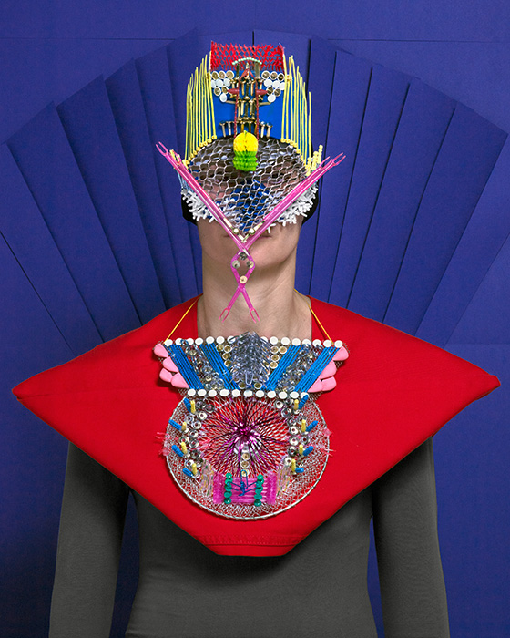
Marie Rime is a young Swiss photographer (class of 1989), studying at the Ecole Cantonale d’Art de Lausanne (ECAL). This year, her work was shown at Hyères Photography Festival, where she won the Public Prize for her two projects: Armures and Pharma, characterized by high-colored geometries and strict compositions.

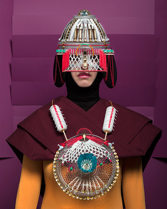
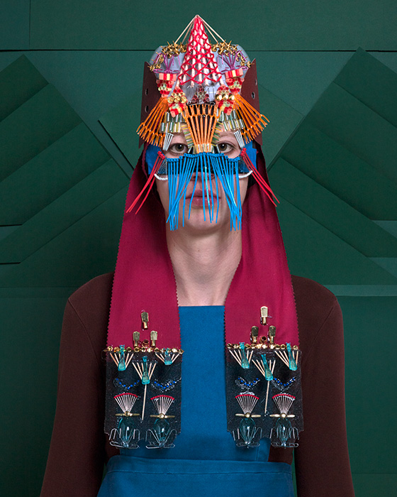
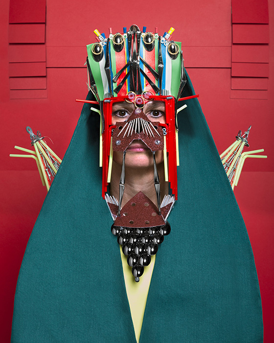
Armures is a series about women dressed in costumes fashioned from everyday objects. These portraits are the starting point of a reflexion about the relationship between power, war and ornament. These women lose their identity and become a support for their clothing. In Pharma, Rime questions an industry which is very much talked about in Switzerland: the pharmaceutical industry. Here, she zoomes in pharmaceutics packagings, that she chooses to photograph against a colored background, for a result which recalls minimalist painting, questioning the notion of a too-obvious beauty.

Her work has been exhibited in 2013 as part of the ECAL photography show at Galerie Azzedine Alaïa, Paris and Galleria Carla Sozzani, Milano as well as in the context of the prize Vfg Nachwuchsfördepreis at Galerie Oslo 8, Basel, Switzerland.

Rujana Rebernjak – Images courtesy of Marie Rime 
26/06/2014

Milano Moda Uomo: Technical Details and Monochrome Looks

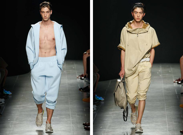
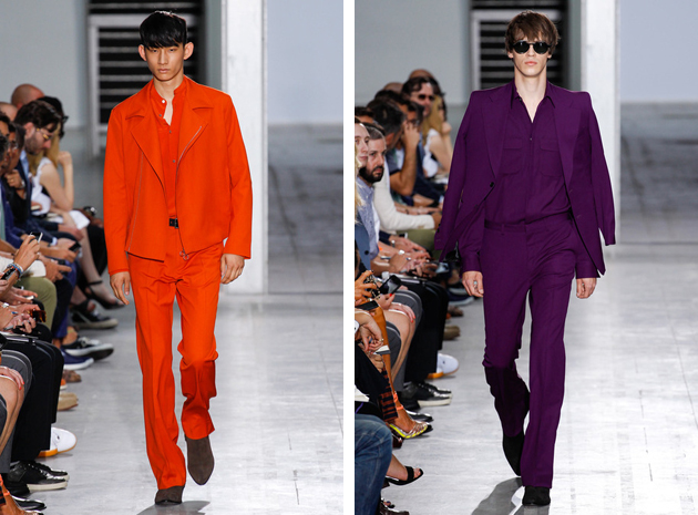
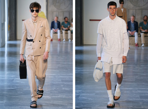
If London is considered the rich soil of fashion originality, Milan is surely the one of tradition and craftsmanship. For the next Spring-Summer 2015 season, the breeze seems to bring a more relaxed and comfy approach, not excluding elegance, although giving it a brand new and extremely contemporary twist. Two trends we saw on the catwalks seem to particularly meaningful: technical detailing – often combined with contrasting preppy looks – and monochromatic suits.

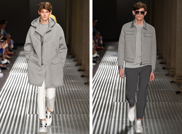
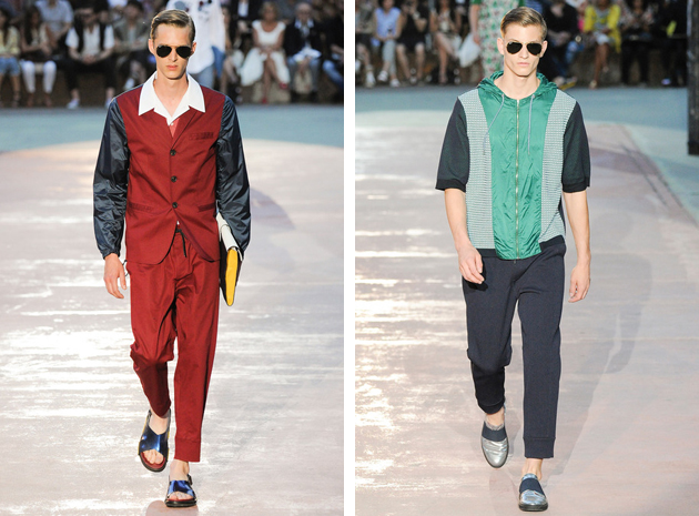
Let’s start from the first trend. The adjective “technical” in fashion usually refers to a certain kind of garment – even the most traditional one – made precious and unique by adding sporty details in very technical fabrics. One of the best examples of this trend is Neil Barrett. Clean and pure silhouettes, restricted color palette and digital prints, distinguish themselves thanks to modern materials used on Seventies-style shapes: like the slim jackets or even the elastic bands on sartorial pants. Antonio Marras followed a similar path when he decided to focus on Gigi Riva – an Italian 60s football player – and presented a burgundy tuxedo with waterproof sleeves or simple shirts embellished by hoods. No less technical were the choices of Ports 1961 and Iceberg, where the first played with the contrast between bourgeois looks and flashy clothing, while the second did the opposite.

We already told you about monochromatic looks. This trend is slightly different, since it does not involve womenswear. From Costume National, where Ennio Capasa took inspiration from legendary rock stars and developed a very Seventies oriented collection characterized by vitaminic shades – the total purple look was a step forward –, to Bottega Veneta, probably the most casual collection of the season, where plenty of male models strode down the catwalk wearing ton sur ton looks. Many brands with completely different philosophies, aesthetic appeal or even generational references – like Versace and Andrea Pompilio – were seen embracing the same choices. It kind of makes you wonder, doesn’t it?

Francesca Crippa 
25/06/2014

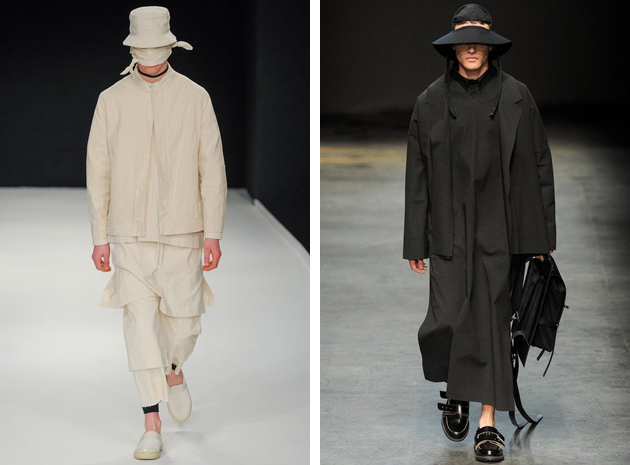
Craig Green: Yin and Yang of Contemporary Fashion

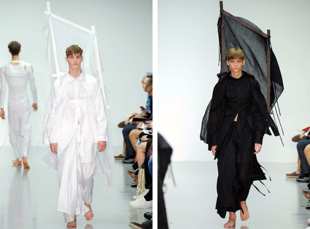
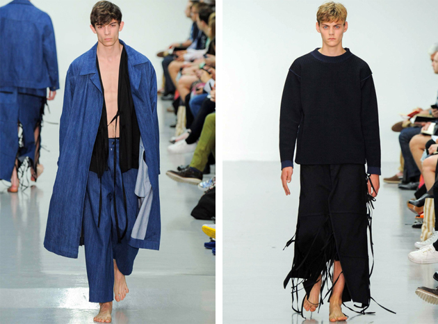
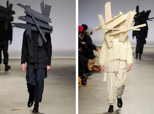
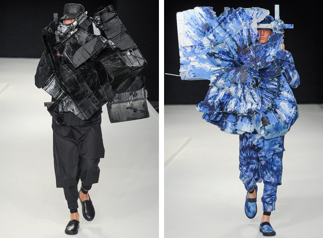
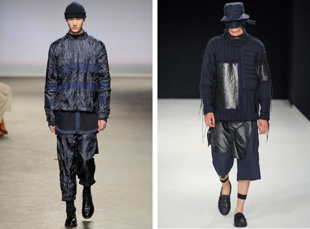
Craig Green’s latest collection for SS15 managed to move most of the fashionable crowd with a silent message of beauty: soft colors and yards of fabric, the ease of several of the runway looks was only partly contrasted with giant wooden sculptures on the back. The London native, who studied for a BA and MA in Fashion at Central Saint Martins, stood out with his own particular aesthetics. Nevertheless, this is not the first time that Green’s name comes up among fashion crowds. After graduating, Green won the L’oreal Professional Creative Award, which allowed him to launch his own line, characterized by research for innovation and risk. His first collection was presented during Men’s fashion week for autumn/winter of 2013 as part of Topman and Fashion East’s MAN initiative at London Collections.

His designs featured carved masks and shirts with glossy waxed cotton in combination with easy shapes highlighted by adornments, turning the clothes into metaphoric objects and taking them beyond the stage of wearability. For his first few collections, Green played around with the notion of shadows and reflections which resulted in contrasting materials of the same color palette, experimenting at the same time with combinations of light and dark tones. These experiments created an in-between feeling for his designs making them harder to figure out and therefore keeping designs interesting. Even though every collection pushes further the notions of wearability and design, the results nevertheless appear serene and nothing is ever forced. Even though giant wooden sculptures and exploding prints – as seen at Green’s SS14 collection – might seem forced it is always done with a transcending ease.

When viewing Green’s collections, Japanese fashion references are particularly clear, both when it comes to shape – seeing implicit salutes to the samurai and traditional robes – but also for an aesthetic reminiscing of Rei Kawakubo and Yohji Yamamoto. However it is always done with a Victor & Rolf flair, making it a true Craig Green original.

Craig Green’s work can be viewed as a juxtaposition of workwear and conceptual art, mimicking a quest for exploration – of cultures of East and West, of fabric and prints and of the fine line between fashion and art – resulting in delicate yin yang balance, that gives Craig Green’s designs a bold emotional state.

Victoria Edman