31/05/2013

The (Re)downfall of Empires

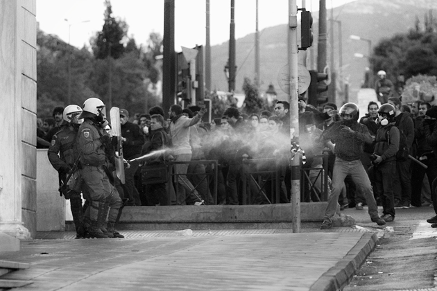
There are some moments in everyone’s life in which words don’t count. In these moments you realize that explaining a concept out loud or writing it down don’t work; even trying, you notice soon that the names and adjectives coming out from your mouth can’t really describe what you have in your head. The photos shot in Athens during the last three years, published on world-wide media, can cause this effect. Increasing protests, ever increasing number of poor people and the syringes scattered on the streets of Exarchia – the rebellious district of the most important Greek University – leave you speechless. The tourist attraction beloved by millions of people has turned into a dangerous destination that’s more likely to be avoided. Athens is collapsing: photos of temples kissed by the sun, golden sunsets and beautiful shores are getting pulled next to ones of violent clashes between civilians and the army force, and the ones of junkies injecting themselves with battery liquids.
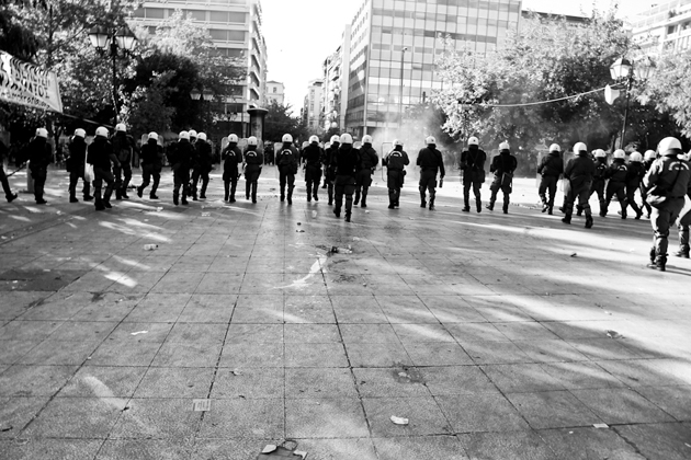
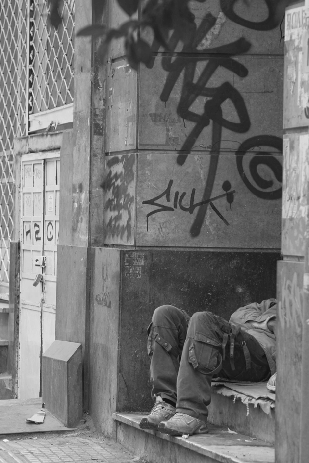
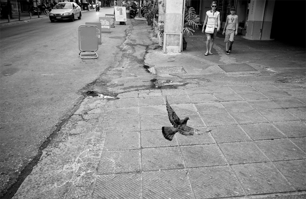
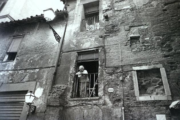
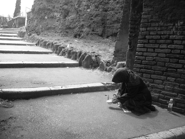
Also Rome is having hard times. The Capital is always going to remain one of the most fascinating cities in the world: Colosseum, St. Peter’s Church and Vatican Museums are there to prove this. It would be madness to advise against a vacation in Rome, even if it is more and more assuming the aspect of a dirty, tired and old city. There are shabby neighborhoods, such as Garbatella and Trastevere, and there are even real favelas in the heart of the city, next to Parioli, one of the most chicest zones. Even slightly more plentiful rain is sufficient to block the sewers and inundate the streets with leaves and sewage. But you won’t find, unlike what happens in Athens, much more increasing poverty or rebellions. The Roman – and the Italian in general – ruins are of an invisible kind, the result of decades of corrupted politics and inactivity of institutions. Rome is the emblem of a beautiful country that now appears without faith for a better future.
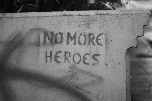
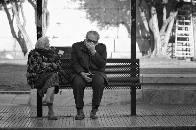
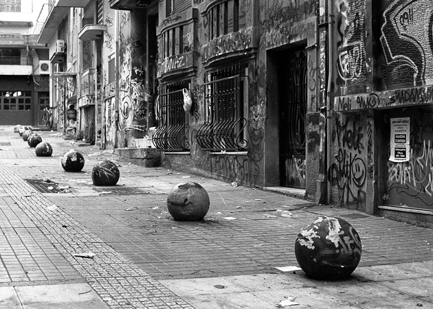
Who would have guessed that two cities of that size, history and potential would have ended up in this kind of situation? In 2011, according to a study published by Eurostat, Athens and Rome have been the very last in line of the European cities in investments in culture and education. As a sort of poetic justice, the two cities that were the cradle of Western culture find themselves no longer worthy of a new world that is evolving quickly. Their infrastructures are old and inefficient. Most of their inhabitants are afflicted and discouraged, especially after the crisis that affected the whole Europe since 2008, Italy and Greece in particular. And now, while the powerful watch incapable what happens on the streets, Rome and Athens slowly die. In the past, they fell and rose up again. Will they be able to do it again?
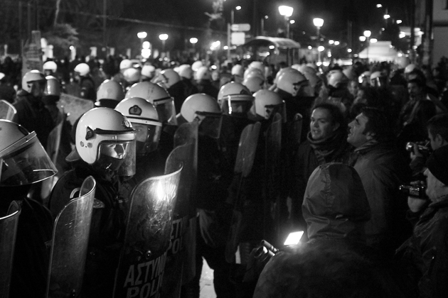
Antonio Leggieri – Images Galinos Paparounis, Dimitris Papazimouris, Mehran Khalili, Francois “Mister Pink”, “Giorgos”, Armando Moreschi, “MIchelle” 
Share: Facebook,  Twitter  
31/05/2013

Mike Kelley – Eternity Is A Long Time

It’s a sure thing: from a certain point of Mike Kelley‘s (1945-2012) career it hasn’t been any more possible to explain social or aesthetic American phenomena without referring to his view. 
Few figures like the one of Kelley have been able to embody and reflect that multitude of signs and visions, which are the sediment of the American culture made of remains, interstitial spaces, vernacular aptitudes and secret traces apparently impossible to map.
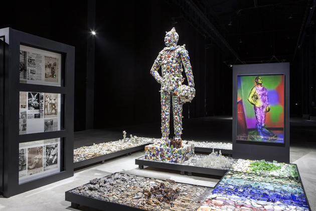
 Who overlooks his work, even only superficially, knows the cult allure surrounding his figure and his ability to surf on different languages that connect different artists crosswise, from masters as Paul Thek and David Askevold to the companions of the road as John Miller, Tony Oursler and Paul McCarty, to the indie rock music of Sonic Youth and the noise of Morton Subotnick or the Destroy All Monsters. Here’s why Mike Kelley keeps on being the most influential role model for young artists, who learn the assemblage practice more from his Memory Ware than from the Schwitters Merzbau.


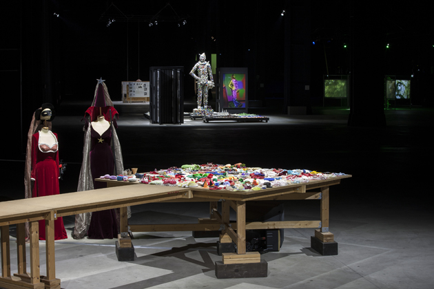
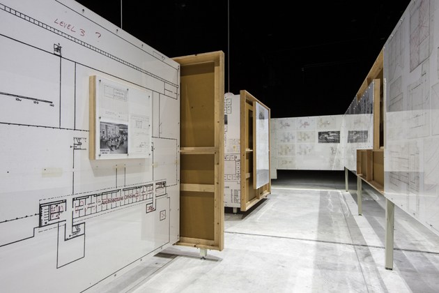
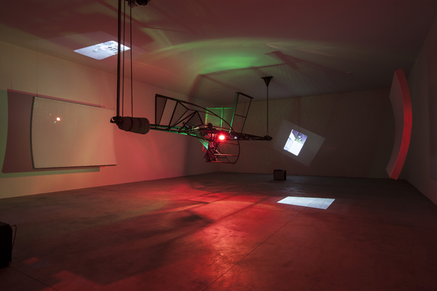
Eternity Is A Long Time is a great exhibition thought specifically for Hangar Bicocca and curated by Emi Fontana and Andrea Lissoni, which celebrates, after one year since his passing, the absolute centrality of the artist on the contemporary art scene. There are macro-themes that go through his whole production as the continuous evocation of adolescence, the contrast between education and coercion, the intrusion from fiction to reality, the relationship between artistic and popular culture, the blue and black sense of humor mixed to the vaudeville and that gloomy tone that seems to brush each work.


The exceptionality of this show is not only due to the symbolic value of the ten selected works, but to the idea of conceiving the space as a body. A place has never been more appropriate for paying tribute to a such complex personality as the one of Mike Kelley: the huge spaces of Hangar host, in a darkness full of expectancy and evocations, ten carefully chosen works, decisive to sketch out his poetic. And it’s not rare to bump into “grottoes” “caves” “shrines” that, unconsciously or not, allude to openings, body cavities, sphincters, which confer to this particular solo show the complexity and physicality of a living body, where sex, eschatology, but also reflection and memory coexist. Pulsating “organs” that release a force – that’s sometimes dark, some other times vital and subversive – which tells us about a presence much more than an absence.

The exhibition will run until 8th September, 2013

Riccardo Conti, Editor’s thanks to Monica Lombardi – All Mike Kelley works © Estate of Mike Kelley. Courtesy Fondazione HangarBicocca. Installation views photographed by Agostino Osio 
Share: Facebook,  Twitter  
30/05/2013

New Talents of 2013 | Beckmans

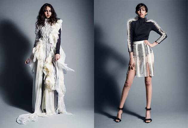
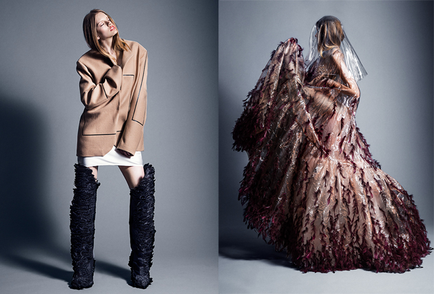
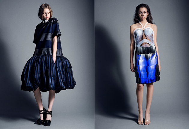
Beckmans College of Design opens the month of the final shows of the most important European fashion schools. On the 20th May at Berns (Stockholm), twelve BA students showed their collections, which were then showcased for a week at the last floor of their school at Brahegatan 10 – Stockholm. The variety of students’ works testified how Beckmans does not spasmodically aim to create a common-branded identity but let students’ minds and hands develop through a maieutical dialogue during their three years of education. The aim is to develop “their own clear personal and inquisitive perspectives”, says the departing director Tom Hedqvist.


This method generated very different fashion reflections that move from the role and nature of contemporary aesthetics, to introspective speculations, passing through commentaries on the technicality of fashion design. 
Among all these creations, it is possible to admire the architectural geometries by Lisa Laurell Amandonico who works on minimalistic and classical shapes sewn together by a sort of white spinal bones connections, or Alina Brane’s impressive “Dreamward” where plastic and feathers are constructing dream-like enclosures. To be notice also the collections by Per Gotesson, Emmy Andersson and Lamija Suljevic. The first formulates an experimental discourse on shapes and materials through the construction of a contemporary pirate, while the second mixes extraordinary accessories with clean cuts that, to some extent, resemble the work of Ann Sofie Back. Impressive were also the work by Slijevic who created hand-weaved gold ribbon armors and hand-folded hats made of PVC sequins and clear rhinestones.

Indeed, Beckmans’ students show how schools are not only places of individual sufferance and struggle but also incubators where critical creativities are formed, shaped and developed. Discipline and creativity walk hand in hand in fashion design and they are crucial skills especially in the attempt to enter the fashion field in these hard days for the market. However, to use the words of the departing director Tom Hedqvist: “Tough times can, at best, bring about the formulation of constructive ideas. At best”.

Marco Pecorari 
Share: Facebook,  Twitter  
30/05/2013

The Rules of Double Denim

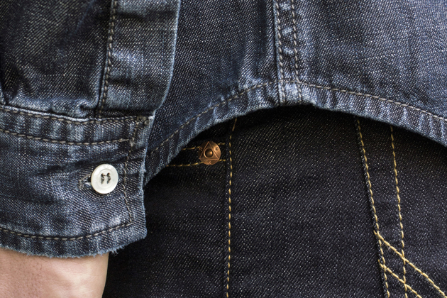
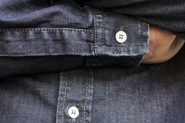
At The Blogazine there is a certain fondness for all things denim, in all its shapes, sizes, shades and splendor. Without getting into too much of denim history – a subject that would deserve more than one article and probably would keep any denim connoisseur tangled up in debates and devoted discussions, we had a look at the latest double denim looks to hit the streets.

It’s by no means a new trend – you only need to take a look back to the early work wear to see how these head-to-toe denim suits haven’t changed essentially. Functionality, style and attitude are what make this iconic fabric move through the decades, painlessly adapting and sitting happily next to any other item of apparel. So how about when it’s teamed together with a fellow piece of denim – denim on denim?
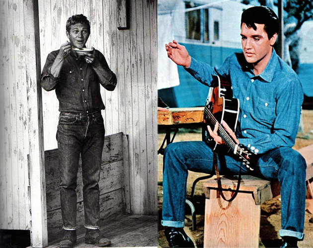
There’s a few denim style icons who really do deserve a mention when talking of double denim: Elvis, Steve McQueen, Debbie Harry and of course the denim icon James Dean are but a few who all wore it well through history.

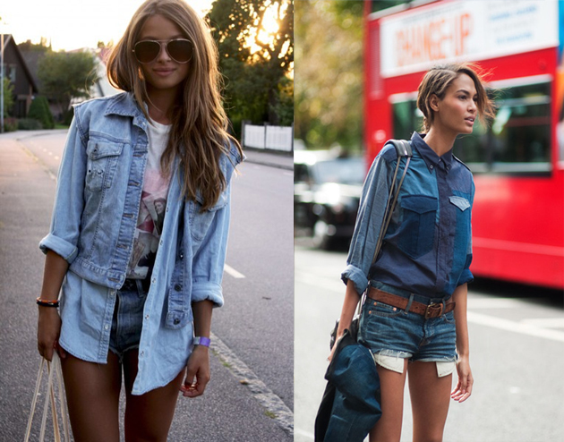
Leaping forward to 2013 one could question how relevant these looks are today and how different shades of denim could be worn in the best way together? Lately, double denim rules seem to be topping the list of style advice in fashion magazines: mix dark denim shades with light, don’t wear the same wash together, mix slim and loose silhouettes, and it goes on. Looking at it from another angle, we believe it is more about the wearers’ personal style and attitude than about applying strict rules to an outfit.


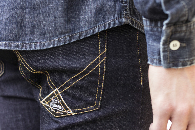
Modern references can be found in the looks of brands such as Roy Roger’s, the historical denim brand produced in Tuscany since the early 50’s. The brand mixes shades, shapes and washes as much as they use different weights and structures in fabrics – denim on denim comes naturally to a brand used to match its favourite material to infinity.

Sometimes we have to forget about finding the right washes or worn-out looks to match but also about daring to stay off and go back to the mono-coloured pieces to bring out the best in both and let them shine on their own, but together. It’s time to look at the history and get inspired by the icons, to play with the mix of modernity and authenticity and to put your personality into it – then, there are no rules!

Tamsin Cook 
Share: Facebook,  Twitter  
29/05/2013

The Great Gatsby: A Fashion Comparison

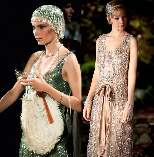
What seems so far to be the real protagonist of the newest version of The Great Gatsby is undoubtedly the costume design.
 Before the current Baz Luhrmann’s adaptation, Jack Clayton’s version in 1974 was the most known and successful one. 
Making a short fashion comparison between one and another can make sense if you think that both have been released long time after the era they talk about and, consequently, they share a vision and an interpretation of the decade. 
Gatsby’s party is one of the most iconic scenes, when all protagonists are present and everyone is dancing. 
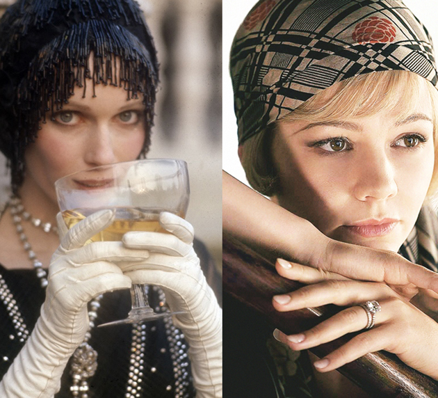
In the previous version, Theoni V. Aldredge – the costume designer – went so close to the 20s atmosphere, recreating sparkling clothes, pastel tones on drop waist dresses, fringes everywhere – you can even hear the noise -, feathers along with long gloves. 
On the opposite, the almost total absence of those knee-long fringed dresses is the first thing one may notice in the most recent interpretation.


The clothes worn by Daisy Buchanan are so sophisticated that they seem quite far from the era they want to represent. Catherine Martin, the designer and the wife of the director, was stuck in some of the 20s trends melting them with modern and dark styles, though. 
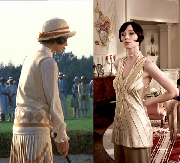
A quite evident presence of out-of-context garments is shown in 1974, nevertheless more revealed in 2013. On Jordan Baker‘s character, the two designers went off-track: in Clayton’s version the young golfer woman is dressed in typical 60s geometrical shapes and in Lurhmann’s she wears even palazzo pants.
 To better highlight Myrtle Wilson‘s role as Mr. Buchanan’s lover, she must be malicious. But in 2013 film her clothes are not just vulgar and bright but modern and cheap. 
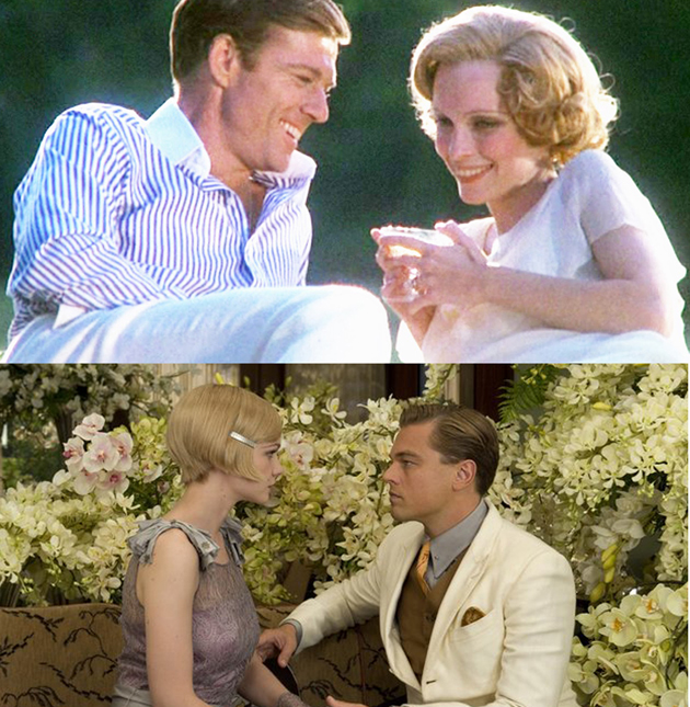
Men’s style seems more in tune: a lot of white, straw boater hats, pinstripe suits. The directors didn’t forget about the pink suit, which plays a key role in the novel: it is what differs Gatsby from the real gentlemen.
 All in all, Theoni V. Aldredge and Catherine Martin were enough accurate in choosing costumes. The visible differences depend from two different times, therefore from two different perspectives of the same past.


Francesca Crippa 
Share: Facebook,  Twitter  
29/05/2013

Arne Svenson’s “The Neighbors”

In Rear Window, Jimmy Stewart’s character L.B. Jefferies starts spying on his neighbors after breaking his leg and ending up confined to a wheelchair in his cramped Greenwich Village apartment. Jefferies can’t help it, he’s an adventurous travel photographer, but his curiosity gets him into all sorts of trouble: he sees a man’s wife disappear, a dog get its neck broken, jeopardizes his girlfriend’s (Grace Kelly’s!) safety on multiple occasions. One neighbor nearly kills him.

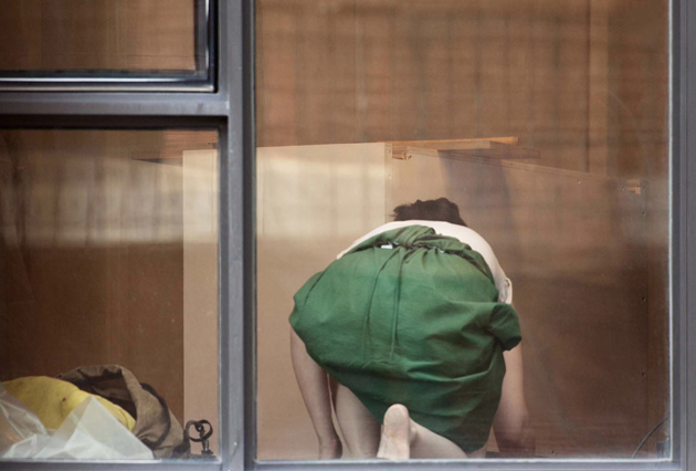
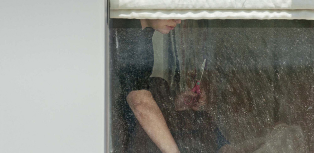
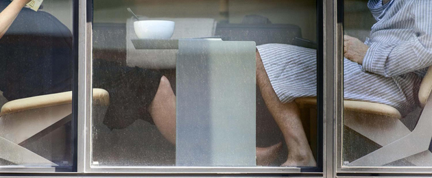
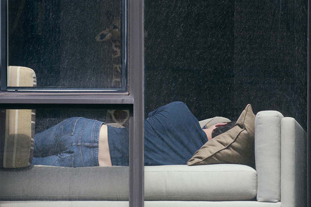
New York photographer Arne Svenson shares a certain affinity with Jefferies, only his obsessions are real. “The Neighbors”, his new exhibit at Julie Saul Gallery on West 22nd Street, is made up of photos Svenson took of people living in the Zinc Building, the glitzy glass tower that sits across from his apartment in Tribeca. The people in the photos had no idea and stand to make no money off of the photos, which are fetching up to $7,500 a pop. Some are disturbed, others are furious. Most are curious to see if their bodies made it into the exhibit.

Like Jefferies, Svenson stumbled into voyeurism by accident: A birdwatching friend died and left him with a CT-501 500-mm Nikon telephoto lens. Svenson didn’t have much interest in birds, nor did he like the idea of leaving his apartment — most of his other photo work happens in his home studio. But, as he told The New Yorker’s Raffi Khatchadourian, he wanted to learn how to use the camera, and so turned his attention to the window. Obsession ensued. He stopped going out, preferring to wait for his subjects to come home and open their curtains. “New Yorkers are masters of being both the observer and the observed,” Svenson recently told Slate. “We live so densely packed together that contact is inevitable — even our homes are stacked facing each other. I have found this symbiotic relationship between the looker and the observed only here — we understand that privacy is fluid and that glass truly is transparent.”

Of course, not everyone agrees, particularly the tenants at Zinc Building. The legalities are murky, and Svenson’s gallery photos are anything but offensive — no faces, no nudes, little hint of identity — but many are disturbed by the process Svenson used. After all, he likely has thousands of photos of people will never see, of people doing things they thought were being done in private.

For Svenson, the rush of watching people who don’t know they’re being watched seems to be the point. A problem? Probably. Indicative of the direction our society is heading? Sure. Voyeuristic art isn’t anything new. Talking about Jefferies, Svenson told Khatchadourian, “He sits and he waits. I feel a certain camaraderie with that.”

Lane Koivu 
Share: Facebook,  Twitter  
28/05/2013

The Man And the Sea

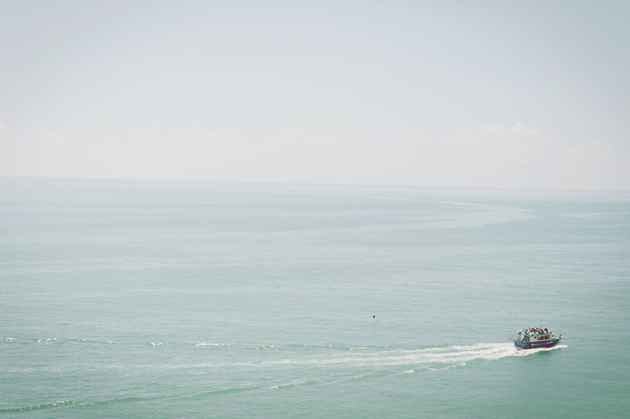
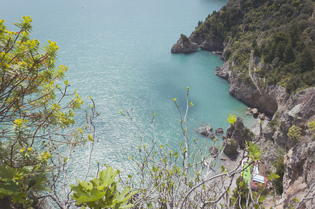
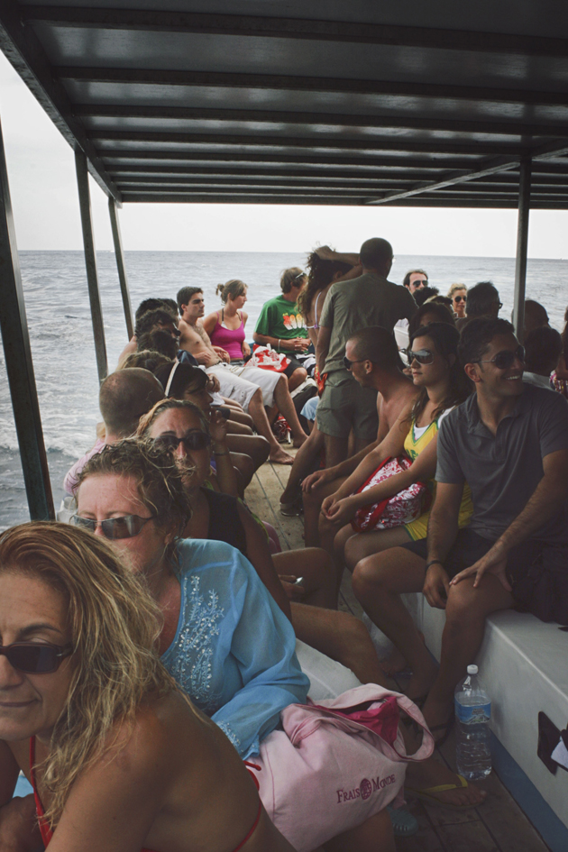
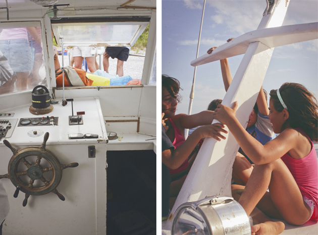
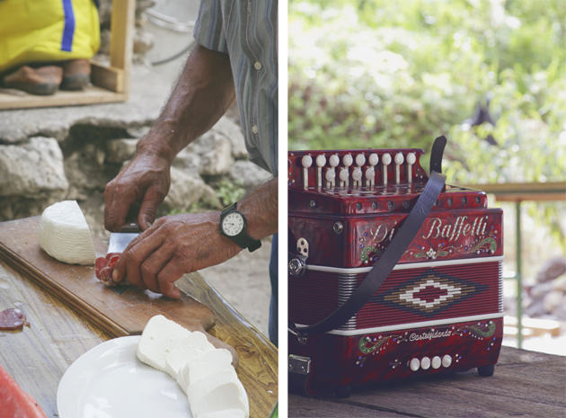
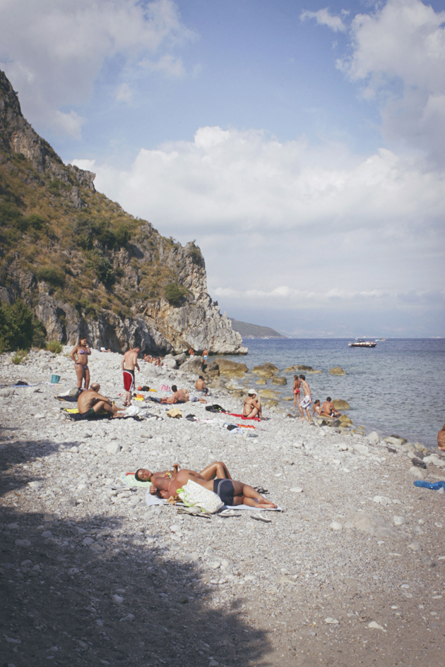
There’s a small and beautiful region in Italy between the end of Campania and the beginning of Basilicata called Cilento. The sea is salty and wild and the men are living on their own, looking at the sky with glazed eyes. Saverio is one of these men. In the morning he goes down the mountain to a small beach, through the familiar trails. The water is emerald green and the wind is blowing through all the little yellow flowers. Saverio takes his old motor boat and reaches the small harbor of Scario. The boat collects a handful of people and brings them on his small beach. There are few rules: speak with a whisper, no music, no phones, only the silence broken by the sound of the sea.


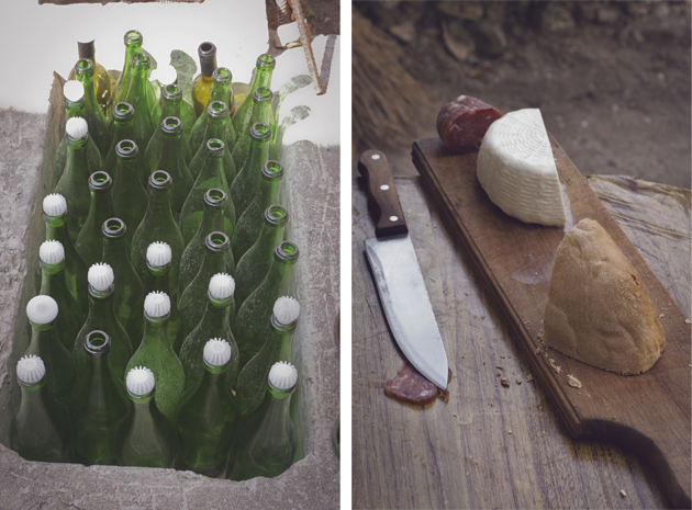
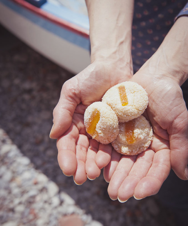
Saverio offers cold cuts and cheese produced in the mountain village of San Giovanni a Piro. Wine is home made, it’s a kind of a red sparkling wine, very fresh and sweet. The bread is soft with a great crust baked in a wood oven; special, because it remains soft for days. But the most wonderful specialty are the small sweet marzipans garnished with candied orange peels, that Saverio’s wife prepares every week for their guests. We were lucky enough to discover this distant corner of paradise. You have to know how to listen and keep your ears open down to the harbor to know when Saverio will come back to pick up another group of people to give them half a day of serenity.


Stefano Tripodi 
Share: Facebook,  Twitter  
28/05/2013

Donald Judd Home And Studio Restoration

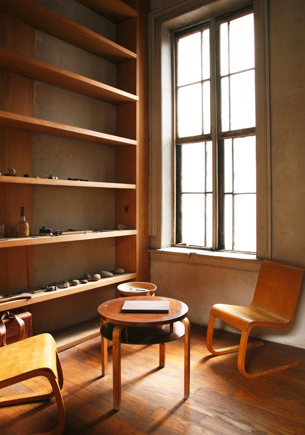
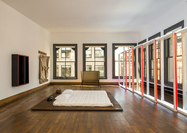
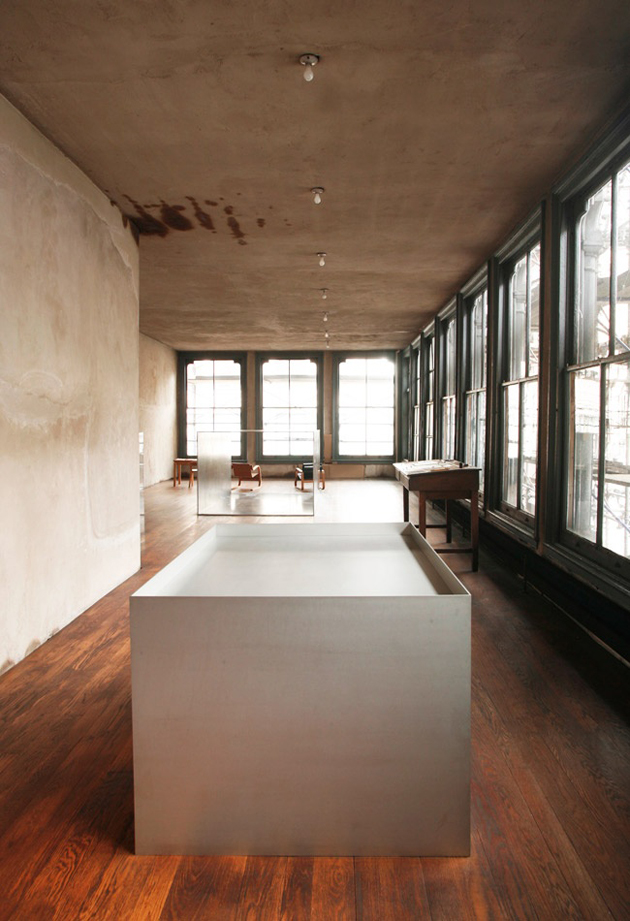
It is a well-known truth that the environment that surrounds us, necessarily defines both who we are as well as what we do. And it is even more true that our environment influences our perception of things and objects, a well known fact to the late American artist Donald Judd. In fact, when he bought a five-storey building in New York, Judd started to place his work in a more permanent manner, which would later lead him to refuse temporary exhibitions and the art system that gave major relevance to the environments designed by the curator, and less to the artwork itself.


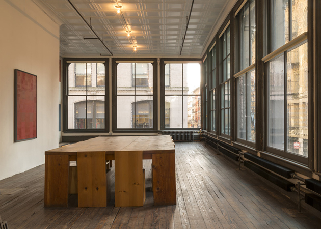
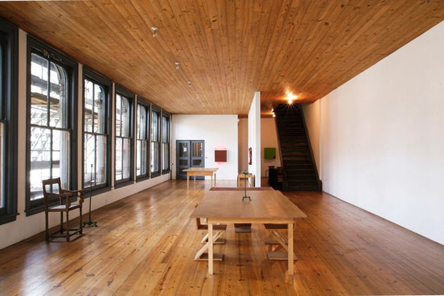
For this very reason, the opening of Donald Judd’s New York studio and home, following a three-year restoration process, comes as a significant event in the contemporary art world, not least because it houses a collection of over 500 artworks created by the artist. The restoration was lead by New York-based Architecture Research Office, whose goal was to maintain and preserve the open-plan layout designed by Judd (who has, at the end of his career, also designed a series of wood and metal furniture, embracing industrial production).

The team meticulously catalogued the situation of every sculpture, painting and object in the house, including pieces by Judd himself (among which must be noted not only his artworks but the interior design as well) as well as works gifted by artist-friends such as Claes Oldenburg, Carl Andre and Dan Flavin, together with older artworks by Marcel Duchamp, Ad Reinhardt and more. Following the restoration, each object was returned to its exact position.

The building is currently the home of Judd Foundation, who will offer its visitors a unique insight into Judd’s life and work, experience the home and studio as originally installed by the artist, with the goal of promoting not only his material legacy, but also his ideas and beliefs of how art should be experienced, seen and, ultimately, understood.


Rujana Rebernjak 
Share: Facebook,  Twitter  
27/05/2013

Krakow Photomonth Festival 2013

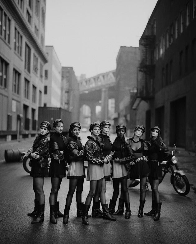
It’s all about fashion. And just fashion is the leading theme and keyword of the 11th edition of the Krakow Photomonth Festival, started in May 16th, which investigates the different definitions, forms and roles of style, in the broadest sense, analysing fashion as a cultural phenomenon. What we wear, how and why, is part of our being; clothes become more and more instruments of conformism, or ways to distinguish ourselves from the mass. But, at the same time, they are essential factors that could help understanding contemporary culture, since our style reflects also our attitude as a member of communities.


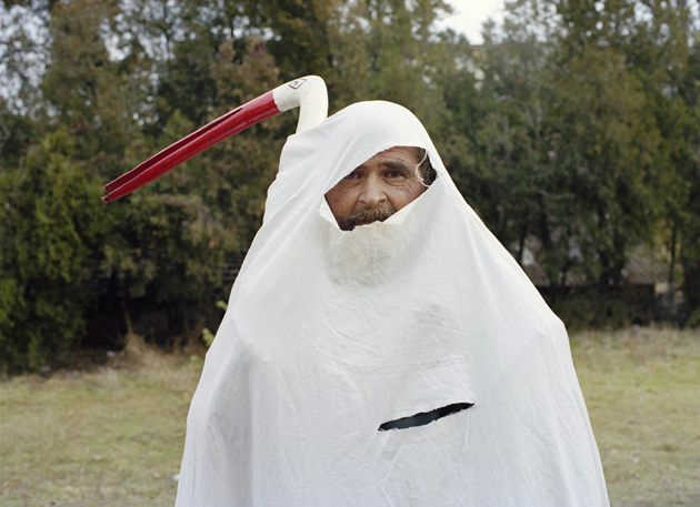
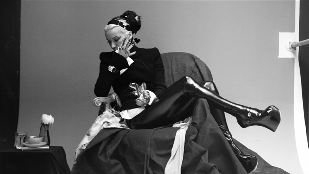
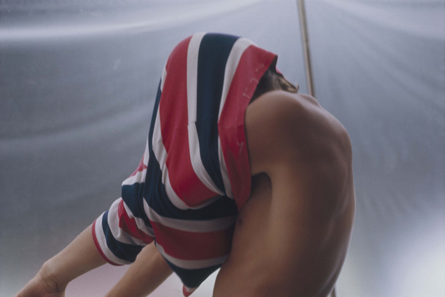
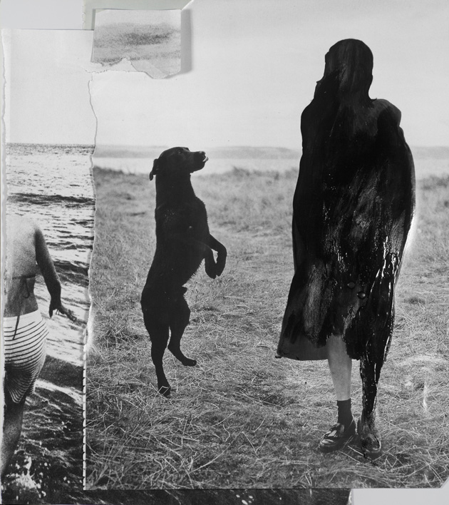
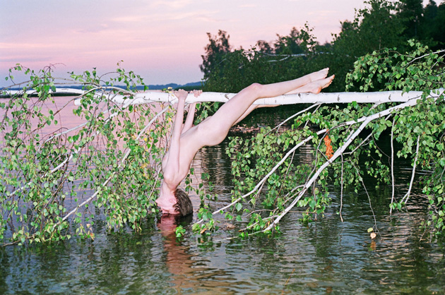
The theme is undoubtedly up-to-date and the wide agenda of exhibitions and events scheduled during Krakow Photomonth offers food for thought. The Limits Of Fashion is one of the ten shows scheduled in the festival’s Main programme. Arranged at the Bunkier Sztuki Gallery of Contemporary Art, it presents portraits of people dressed with colourful eastern ‘vintage’ sweat suits and patterned sweaters, camouflages, Stasi agents’ uniforms, ceremonial African masks and 70s queer culture street outfits, mixing private and public, personal and social viewpoints. Among the other events included in the Main programme we mention the solo show dedicated to the Swiss artist Walter Pfeiffer (b. 1946, Zurich), who depicted unknown people on the street, but also close friends and lovers, beautiful naked boys in provocative and sexy poses, influencing numerous fashion photographers of the 1990’s; the unseen pictures of Corinne Day (1962 – 2010, London), one of the pioneers of the trend of photographing imperfect beauty, who opens here her private archive; a dive into the world of the Polish journalism photography by Tadeusz Rolke (b. 1929, Warsaw); and the ‘crypsis’ experience by the young Ukrainian artists Tania Shcheglova and Roman Noven, who work under the name of Synchrodogs, and create bucolic images with saturated colours through the use of analogue cameras.


Besides the Main programme, Krakow Photomonth counts an Experimental Section that has taken the form of a 200-pages printed magazine conceived by fashion professionals, entitled May Magazine, which features articles, illustrations, photo editorials and visual essays, and the ShowOFF Section where 10 young emerging Polish artists – Kaja Dobrowolska, Yurko Dyachyshyn, Anna Kieblesz, Aleksandra Loska, Piotr Macha, Sergey Melnitchenko, Ondřej Přibyl, Dominik Ritszel, Alexandra Soldatova and Milena Soporowska – collaborate with experienced curators to exhibit their works to the festival’s visitors.


Krakow Photomonth Festival 2013 will run until June 16. If you end up in Krakow don’t miss it.

Piotr Niepsuj – Images Hanania, SHOWStudio, Peter Lindbergh, Magdalena Buczek, Aleksandra Loska, Kaja Dobrowolska, Walter Pfeiffer, Synchrodogs 
Share: Facebook,  Twitter  
26/05/2013

Sunday Breakfast by Love For Breakfast

It’s amazing how just colors and flavors can condition a day. I’m floating on a pink sea on a red and white striped mat.

Alessia Bossi from Love For Breakfast 
Share: Facebook,  Twitter