31/10/2012

The Editorial: Oh, Sandy!

The Editorial: Oh, Sandy!

At least fifty people have died. Thousands have lost homes and millions remain without power. Yet another catastrophic storm has pummelled a world metropolis– and while minor when compared to the havoc wrought on Japan by last year’s tsunami, for instance, it’s no coincidence that this type of devastation has almost become commonplace, an annual event. There is no more tangible sign that the past dozen decades of carbon-methane-dirty-dirty-black-smoke-belching has resulted in some pretty major climate change.

It is a great coincidence, however, that a crucial presidential election is being held next week in the Western country most touched by climate-related disasters in the recent past: the USA has endured the levelling of Joplin, Missouri by tornadoes, the apocalyptic destruction of Louisiana and the Gulf Coast by Hurricane Katrina, the drowning of Miami by Hurricane Andrew and several other major events.


So in the midst of the current havoc of a drowned New Jersey and a crippled New York, the American candidates’ differing views on climate change could not be more important: Romney, the Republican, downplays its very existence and would pursue policy that would allow for more (not less) carbon accountability, while Obama, the Democrat, has made green energy a major pillar in his platform.

And while it’s still somewhat of a stretch to blame weather directly on politics, the importance of world leadership who will at least acknowledge the almost unequivocal existence of human-caused climate change cannot, cannot, cannot be overstated. Greener policy now could very well mean less devastating climate change in the future, and admission is the first step towards recovery, after all. That Romney and seemingly every party-line Republican stooge continues a three-ring circus of denial in the name of religious conservatism, corporate interests, stubbornness and sheer, unabashed stupidity is flatly inexcusable. And beyond a litany of absurd social and fiscal policies Republicans continue to stand behind (all also inexcusable in the second decade of the 21st century), there is simply no more room for their anachronistic, ill-informed, self-interested agenda on the world stage.
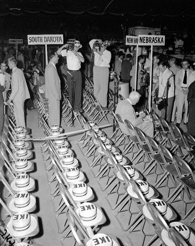
Romney is a man who would, because of his slavish belief in the dubious powers of the “private sector,” abolish the very organisation charged with large scale disaster relief in the USA. Of course, he realises there is a need for such services, but like every Republican who dreams of a corporate world where access to anything is based on ability to pay, he would hand the scraps to the private sector. Disaster relief for a profit.

Of course we’ll save your life! That’ll be $199.99 plus tax, please. All major credit cards accepted. Oh, your wallet was blown away? Well, come visit us when you find it. Have a nice day!

Obama may be far from perfect. (Where’s the fiery, polemic, contrarian the world rejoiced in 2008?) But it’s clear in any case that he’s a good, pragmatic man willing to listen to good advice and act decisively in the best interests of the most people. In a dynamic, deeply uncertain world, that’s a damn good start.

Please get your American friends out to vote. This election is way, way to close for comfort.
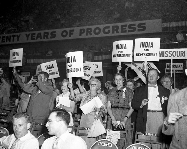

Tag Christof – Photos courtesy of These Americans

Share: Facebook,  Twitter  
30/10/2012

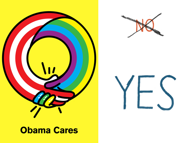
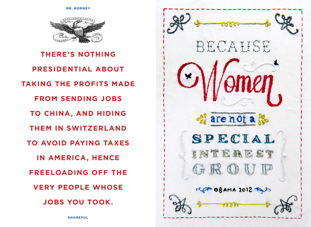
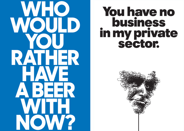
30 Designed Reasons to Vote Obama

30 Designed Reasons to Vote Obama

As the USA presidential elections get closer and closer, we can all witness an almost frightening hustle and bustle going on around us. Every minute of each day, hundreds of web posts, articles, statistical analysis and other types of information are being poured in our heads with the one and only intention – to gain some precious votes. It is reasonable to believe that this information overload is surely confusing and that we might appreciate it much more if it was handed out in a different way.


This is where designers step in, reunited under the initiative called 30 reasons – an email and internet poster campaign due to last 30 days (with more or less 10 days left to go). The campaign isn’t an un-biased source of information, but gives an intimate interpretation of why we all hope the Americans might re-elect Mr. Obama. It is well known that, by the very nature of the profession they serve, graphic designers are left-wing oriented. A socio-democratic political orientation stands at the very foundation of their work, coherently based on Modernist ideals of democracy and equal distribution of means and resources.

30 posters shown on the initiative’s website don’t try to make a rational political evaluation of pros and cons for voting a candidate, but let us peak inside an intimate designer’s world. More importantly it also shows how this profession, often seen as extremely frivolous, might actually serve quite urgent causes in our society. Hence, the works promote Obama’s attention for women and gay rights, social service and health care, education and social equality. While we aren’t going to judge graphic quality of these works, we completely agree with the founders of the project who believe that “designers have the duty to stand up, speak out and help promote social justice”.


Rujana Rebernjak – Images courtesy of 30 Reasons and respective authors

Share: Facebook,  Twitter  
29/10/2012

Castles in the Air

Castles in the Air

There is always a good reason to move from the centre to the suburbs of Milan to visit Hangar Bicocca, one of the few urban realities seriously involved in furthering contemporary languages.

Entering the huge post-industrial cathedral and crossing the nave, which offers a glimpse on the unique setting created by Carsten Nicolai and Anselm Kiefer’s installations, neatly in a line, you come near to the close space that hosts the latest Tomás Saraceno’s installation.

The Argentine, Saraceno – class 1973, coming from San Miguel of Tucumán – undoubtedly knows about the concept of space. Actually he perfectly knows how to create and order it, how to challenge and match it according to its unexpected forms and evolutions. Being maybe more an architect than an artist, he learned from a mentor such as Peter Cook the necessities of architecture to tend to more radical and utopian shapes and dialogue with the living part of art, and not only with its tradition. For this reason, Saraceno’s artistic alphabet is structured on primary terms that he revisits through a stubborn and scientific study of concepts like shape, space and emptiness.

On Space Time Foam is the latest of these both super complex and simultaneously minimalist constructions, which seems to face off buildings and spaces that host them: going up the scaffold stairs, the visitor gets to an altitude of 20 meters, and once there, he/she can “plunge in” a see-through membrane, suspended in mid-air. A jump, an emotion, an euphoric feeling of lapsing unconsciously into the gravity, but also the bizarre emotion of swimming in a mysterious swimming pool whose surface is influenced by presence, weight and movements of other visitors. Certainly experiencing On Space Time Foam allows you to enjoy the surrounding space in a different way, while on an unconscious level, it helps you to feel tensions and the limits of our body.

An invisible city, a hang structure (made of 99% air) apparently simple, but actually elaborate and stratify, not only from a technical point of view: the three layers that compose the work cover a wide area – almost 1200 square meters – and it has been commissioned to the same firm that works with ESA (European Spatial Agency); but also from a formal/”sculptural” side, along with the conceptual one. Saraceno’s installation is the result of an intense planning work (at the moment 20 people is working at his studio in Berlin), which updates the thousand-year relation between art and science, adding and placing side-by-side the importance of science fictional imagination as a critical element for the Tomás Saraceno’s creations.

Riccardo Conti, Editor’s thanks to Monica Lombardi

Share: Facebook,  Twitter  
28/10/2012

Sunday Breakfast by Love For Breakfast

Sunday Breakfast by Love For Breakfast

Between a layer of sweetness and one of reality I find the reasons to leave my bed. That ray of sunshine will be the destination I want to reach today.

Alessia Bossi from Love For Breakfast

Share: Facebook,  Twitter  
26/10/2012

Time & Space

Time & Space

The ex-colony has colonised the coloniser! Well, not exactly. But the long and sordid history of the UK and Australia has certainly created a fascinating symbiosis between the two cultures, and a strong cultural osmosis from both sides. On Tuesday, Bargehouse opened a 15-artist exhibition, Time & Space, to showcase a cross-section of Australian artists, each of whom has completed a residency in London and many who continue to practice in the UK. The exhibition spans most conceivable medias and mixes artists of different generations to very good effect.


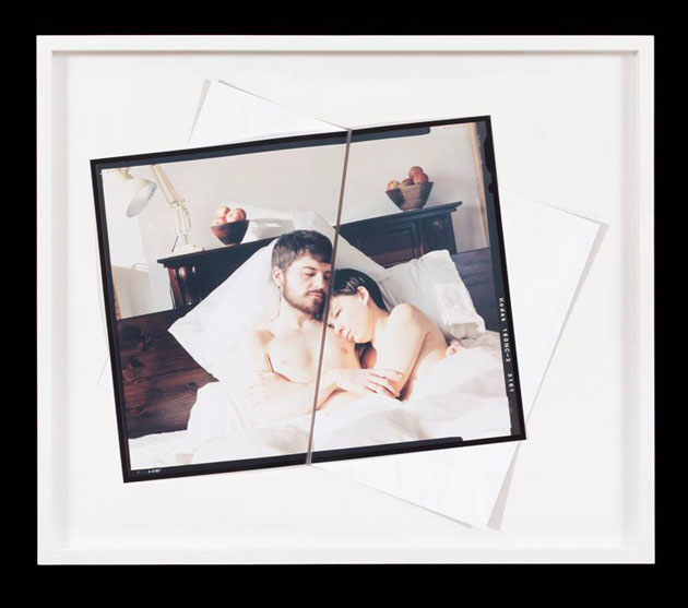
Included in the exhibition are Paul Knight’s intimate, erotic large-scale photographs, a participative painting by Tom Polo and ceramic sculptures by Michelle Ussher, a site-specific tribute to Bargehouse’s former use as factory by Lyndall Phelps and works by Daniel Crooks, Nicole Ellis, Patrick Hartigan, Jacki Middleton, Vanilla Netto and others. The overall effect is compelling, and one gets a sense of a very definite cultural signature that is at once uniquely Australian but clearly informed by British and European sensibilities.


The exhibition is currently running in the Bargehouse space on the South Bank, and is open until this November 11.

Tag Christof

Share: Facebook,  Twitter  
25/10/2012

Let It Rain

Let It Rain

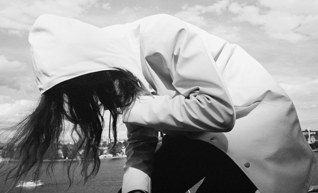
It’s the end of October with November on the march in. On the northern hemisphere that means the leaves turning yellow, dropping degrees and a few, or in worst-case scenario pretty many, rainy days. The season soundtrack goes from chirpy to melancholic and when those first raindrops hit the ground, half of the wardrobe is dismantled. That is unless you choose to embrace the autumn with its amazing colour palette, layers of clothes and don’t give a damn about the rain.


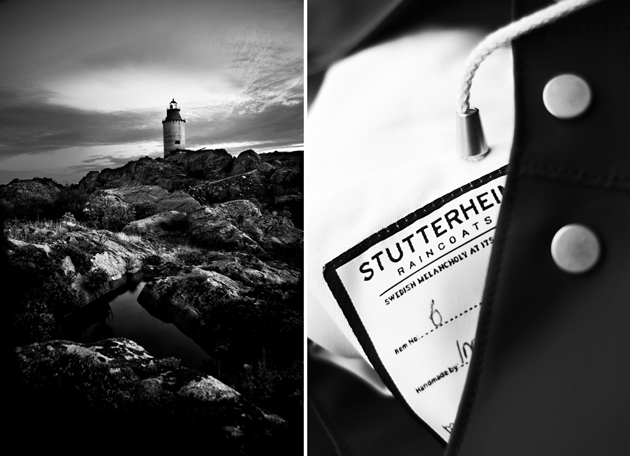
Someone who truly has embraced the rain is Alexander Stutterheim, founder and creative director of Stutterheim Raincoats. “I love the fall. Summer’s demands on amazing parties, relations, experiences, well; these expectations on everyone to really LIVE these few months of the year are pretty heavy for me. I don’t like the anticipation I guess. Besides, the light during fall is much more pleasurable and you can put on good-looking clothes”, he said when The Blogazine asked him about his relation to the season. The brand’s story has its starting point in the archipelago outside of Stockholm and its only focus is to keep their customers dry while staying stylish. “What we want to achieve is very clear; to make people feel pretty (and dry of course!) even if the weather is ugly. We want to show that life can become more bearable even if the surrounding conditions do everything in their power to accomplish the opposite.”


Scandinavia has understood the demand of making autumn prettier, dryer and more lovable. Their instinctive feel for superior quality is just another plus. Norwegian Rain, hailing from the rainiest city of Europe, has won several awards for their design excellence where the high-tech is hidden, and we can’t wait for the release of the Stutterheim matte black rain boots (which, according to our sources, soon will be in store).

Christopher Bailey, sitting at the helm of Burberry, is someone else who knows how to handle a cloudburst. Maybe it’s his British heritage that has accustomed him to the weather forces, but whatever the reason, looking back at his A/W12 runway show, he knows how to evoke more than one smile out of a pour down of rain.

So maybe we should stop complaining about the poor weather, put on a nice pair of rain boots, a stylish coat, fold up our umbrellas and head out to enjoy a day of good fun.

Lisa Olsson Hjerpe – Image courtesy of Stutterheim Raincoats

Share: Facebook,  Twitter  
24/10/2012

The Editorial: I Vignelli / Design Is One

The Editorial: I Vignelli / Design Is One

It’s difficult not to speak reverently about Massimo Vignelli. He’s one of the living greats and a reminder that Italy was once ground zero for good design. You know his work, even if you don’t know him. And every student of design, graphic or otherwise, (at about the same time he or she falls madly in love with the “rationality” of Helvetica) has fleetingly considered him an idol.

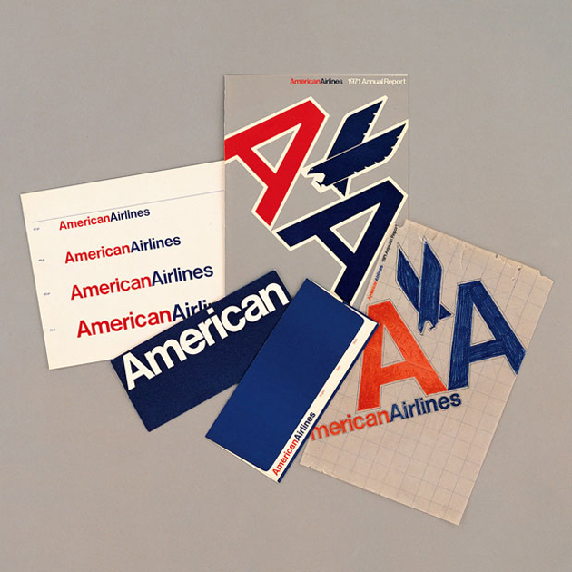
And while his design’s appropriateness for today is not so clear, it’s been sad to see it systematically begin to disappear from the common landscape. Most recently, his logo for department store JCPenney – pure nostalgia for tons of 80s and 90s kids – was recently jettisoned in favour of a bizarre reinterpretation of the American flag. American Airlines, for which he designed their once revolutionary identity, is bankrupt with many speculating that it will be eaten up by another company and disappear in short order. And the gorgeous 1960s and 1970s Vignelli designed and/or inspired signage still visible in Italy’s tube stations, streetcars, roads and public spaces is decaying, busted or covered by graffiti. Arrivederci once again, modernism.

His NYC Subway map is long gone, and while it could have used some tweaks, it is in my opinion the only transit map in the world that ever approached the level of functional, iconic simplicity as Harry Beck’s London Tube map. (Those things must be hell to design: have you looked at the tiny Milan metro’s pitiful spaghetti pot?)

Although his designs were striking, beautiful and salient, they were almost always in the service of massive corporate clients. His works were thus stamped out by the millions and became synonymous with the unthinking, relentless profit mongering of late 20th century capitalism. Many, including a great many designers, are ecstatic to see it go. (Ironically enough, University of the Arts London – of which Central Saint Martins is a part – have rebranded under a new, Vignelli-inspired logo earlier this year. Everyone hates it.)

But as his ubiquity fades, Vignelli is gaining a new sort of cultural traction that he had always lacked. He’s spoken candidly about his work, most notably with Debbie Millman on her seminal show, Design Matters, and has revealed a great deal about his integrity as a designer. And a new film, which premiered just this week at the Architecture & Design Film Festival in New York aims to tell the lesser known personal story about Vignelli, his wife Lella and their extraordinary collaborative legacy. (It’s about time someone crafts a narrative to give the Eames’ some real design power couple competition!)

Love or hate his work, the man is a genius. He – together with Lella – has left a mark on modern society that we’re only beginning to understand.

Tag Christof

Share: Facebook,  Twitter  
23/10/2012

From A Non-Place To A Public Library

From A Non-Place To A Public Library

Every day we are confronted with the left-overs of our overly designed, but not always functional, corporate world. If you’re turning your eyes on the idea of reading another article against the big bad corporate guys, maybe at the end of these lines you’ll understand why, in cases like this one, it’s really hard not to be political. But let’s get to the point: what we are speaking about here, are the non-places built, and often abandoned soon after, by various corporations and short-sighted impresarios. Naturally, this scenario is usually staged in the USA, even though the rest of the world isn’t quite immune to the phenomenon.


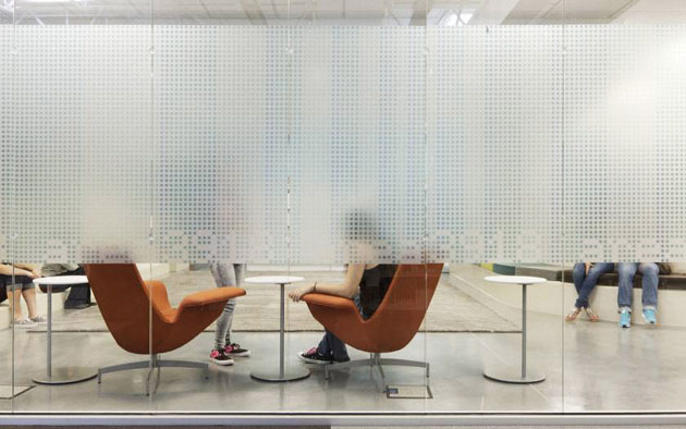
Fortunately, there are a few examples that show how these abandoned buildings, ghosts of our consumerist culture, can be given a completely new life. The latest project is a public library in McAllen, Texas, built in an ex-Walmart store. The forgotten warehouse, one of the 130 empty former Walmart stores available throughout United States, has been transformed by the architectural firm Meyer, Scherer & Rockcastle, an office specialized in designing libraries, in a beautiful public space.

The architects have maintained the original outer shell, dividing the internal zones in a glass-enclosed space and adding rows and rows of bookshelves. The McAllen Public Library is claimed to be the largest single-story library in the country, since it’s two football fields large. To confirm the project’s excellence, McAllen Public Library has been awarded the 2012 Library Interior Design Competition prize. Even though design prizes don’t always guarantee the excellence of a project, in this case, the conversion from a vast warehouse to a perfectly functioning library was rightly awarded. But what is even more important than posh design judges’ opinion, is the feeling of local public, who has clearly expressed its preferences with new user registration rise in 23% within the first month of library’s opening.


Rujana Rebernjak

Share: Facebook,  Twitter  
22/10/2012

A Different Point of View

A Different Point of View

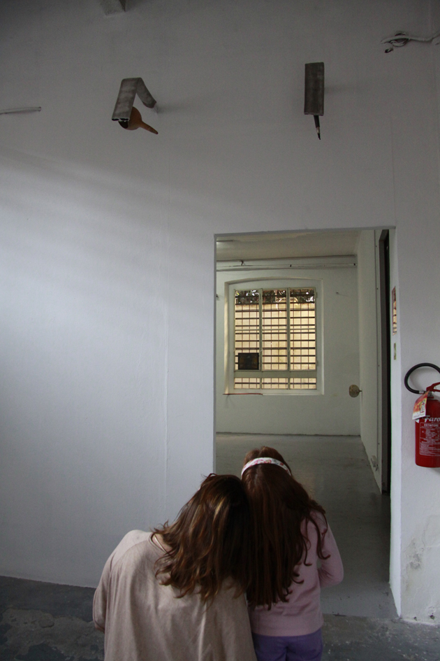
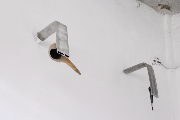
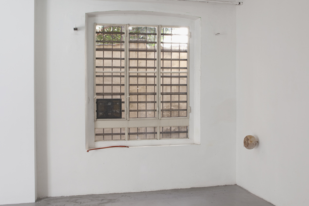
Usually I pick the show I will talk about on Monday art spot following the instinct, my previous knowledge or speaking with the other team guys, but this time things went in another way. I selected five exhibitions I’ve already seen still on view in Milan for a special guest and let her make the choice. My different point of view comes from below, even though it is just a matter of height. The ‘critic in bud’ is Sofia G. (5 years old). Midway between a surprise and a pleasant confirmation – she is too smart to stop in front of something that could challenge her imagination – she chose to visit the not-so-easy show by Michael E. Smith (b. 1977, Detroit) at Zero with two amazing ‘nannies’ Emanuela Torri and Luisa Lanza – both part of the fresh and ingenious DOREMILAB’s project: L’arte raccontata dai bambini (art told by children) – and gives us her impressions.

Looking at the images on the galleries’ website Sofia opted for something that would stir her curiosity: “there is any canvas that means that I will do a treasure hunt (…). If the painter paints canvases, M.S. is an artist who makes objects, and these objects are neither old nor new, because if they were old somebody would have thrown them away, and if they were new, they wouldn’t be here.”

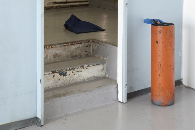
The exhibition path starts with Pillowcase (Untitled, 2012): “somebody must have forgot his/her blue blanket here; night is cold…” My mind goes to the artist’s research connected to the rests of a wasteful culture – our one – and his ability to make use of useless things to give them a new life. I’m reflecting upon Smith’s radical re-thinking of objects, a manipulation and a re-allocation that give them new structures and functions.

Another sculpture caught Sofia’s attention, it has to do with an orange metal cylinder with an antenna and a blue cap overboard; it is part of the previous work: “there is an umbrella stand but it is too high, it is not for children. The cap got jammed into an umbrella stick. Maybe the wind tore it. I wonder whose cap is that? The artist must love blue.”


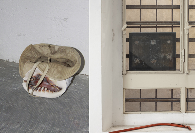
The visit goes on. A piece of red varnished metal on the windowsill with a framed see-through image hanging on the close window moves Sofia’s view: “there is a piece of a drying rack; it looks like an open fence, and above it, there is the picture of the ghosts; M.S. must have hung it there to see the ghosts, it looks like those papers you find in hospital to see if you have broken your bones.”

The works by Michael E. Smith are not figurative, nevertheless his creations – also thanks to his capacity of playing with materials – have such an evocative power, which gives to things new identifiable meanings albeit suggesting the sense of their temporarity and abandonment. “M.S. left a small potato stuck on the wall with a nail, which remains the same while the potato has grown. Look at it sideways, it reminds me a pumpkin or, maybe a pate… “

Curiosity is ruling the roost and replaces superstructures I usually turn to while reviewing an art show. Untitled, 2012 (shell, hat) “could be a mouth with the hat, both the objects have a hole” – they are disposed in the same way in a united pile – “and could be put on one’s head, they have the same folds.”

The installation in two parts made of an altered fridge door, a painting (wood and fabric) and a hinge “is a kind of springboard without water, like a skateboard jump,” while always according to Sofia’s free imaginative flow, coming out the ‘shell room’ and looking onto toward the ceiling “there are two shower tubes: one with a jug from which it could drop soil and the other one, with a microphone from which electricity could be sourced from. Soil + electric current = earthquake.”

The exhibition path is almost ended. A “tool with a fish face and a nest head, which would be turned into a lamp, putting a light bulb in it” (Untitled, 2012 – stuffed catfish, milling machine), and a “lengthen ball” – made of urethane foam and rubber – “able to move in circle and chose who will be its shooter.”

“I think that this show could be good both for boys and girls, but not younger than me.”

Monica Lombardi & Sofia G. – Many thanks to Doremilab’s staff and Gallery Zero, Courtesy the artist and Zero, Photo: © Filippo Armellin

Share: Facebook,  Twitter  
19/10/2012

The Design Philosophy: Looking Back To Look Forward

The Design Philosophy: Looking Back To Look Forward

Let’s take a look back to 2 weeks ago, here at The Blogazine we reported on some key trends from the SS13 runway shows. It got us thinking: where do designers get their inspiration from? What drives them to dive deep into previous decades of fashion trends? Or, on the contrary, leap into the future and use futuristic fantasy to create contemporary collections for next summer?


Every season there is a hype of an era or decade; “70s is back” or “30s glamour” for example. This season saw key trends emerging strongly from the 60s, 80s and 90s grunge and even a hint towards the early “noughties” period.

Of course fashion is influenced by many factors; economic changes, current affairs, music and youth culture amongst many, so fashion trends are subtly moving all the time. When it seems that everything is possible, designers are looking back to their own careers as a way of celebrating their own story and drawing inspiration from their own archives to strengthen their message.

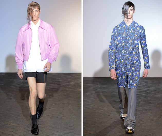
As an example, Raf Simons, recently appointed to Dior, looked back at his past 17 years as a starting point for his own menswear label. He looked at Nirvana and the grunge scene, claiming his aim was not to imitate that era but to take iconic elements from this period and re-work them to a contemporary look. Talking on his inspiration he says “There was a nostalgic feeling but also a futuristic feeling, in psychology but also in materialization”.

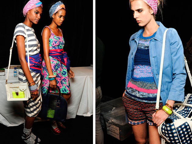
Marc Jacobs is known to only look back to look forward. His “Marc” by Marc Jacobs line pulled uplifting outfits from the early 80s and were re-worked to a modern fresh and fun collection.

A time perhaps when style and fashion are becoming less and less identifiable, the fascination with the past for designers seems to be a nostalgic pot to draw from, a kind of safety net to build on for the future. In any case, whatever your generation, these memorable style moments from the past will always make us smile, evoking memories and nostalgia of outfits we may have all worn and wouldn’t dream of wearing again, but as what goes around comes around, let’s see who opts for the 80s look next summer!

Tamsin Cook

Share: Facebook,  Twitter