29/05/2015

The New Scandinavian Maximalistic Minimalism

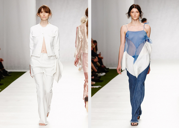
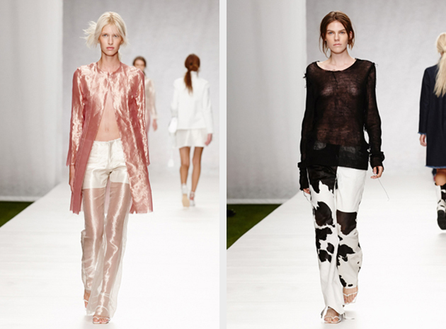
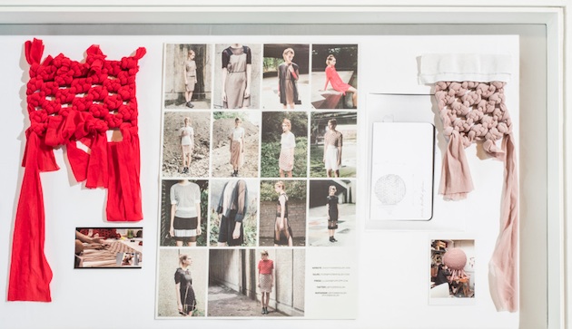
Fashion design graduates from one of Sweden’s most respected and valued design schools, Beckmans College of Design, recently showcased their collections. The results of their studies that were sent down the catwalk gave a promising look on the future. Although each collection had its own distinct style and approach, a common tendency emerged. Scandinavian style, often defined as simple, clean and crisp aesthetics seems to have been replaced by a less commercial and more ”maximalistic” perspective. The well detailed and conceptual pieces were reminiscent of the point of view often seen on European mainland, rather than the simple aesthetics that Scandinavian style is commonly identified with.
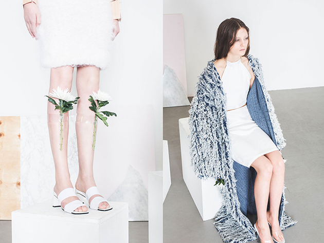
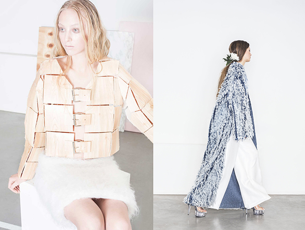
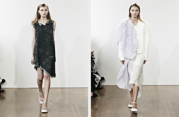
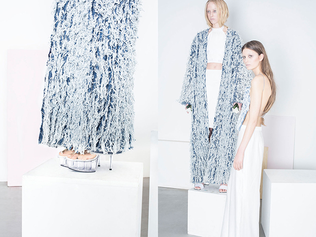
Hanna Björklund Olsson is one of the many talented and creative designers graduating from Beckmans College of Design this Spring. Her approach is inspired by the balance between elegant and more rough aesthetics and she is often working with different surfaces and materials. Her work challenges the notion of wearability – while the designer takes everyday use in consideration in the process of creating, she also states that it does not necessarily have to mean that her pieces are functional.
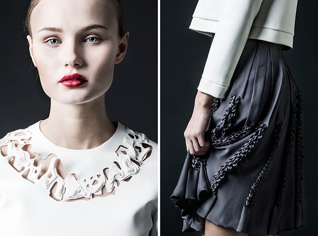
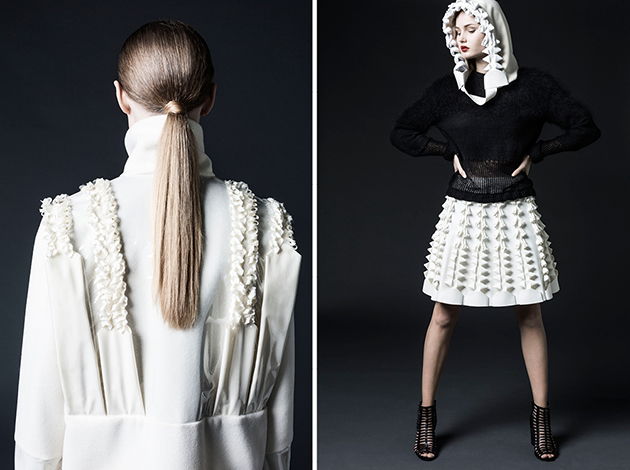
Another interesting upcoming designer is Annika Lunneskog. Interested in fashion as a balancing phenomenon often inspired by its opposing forces, Lunneskog works with unique surfaces created by manipulating fabric and using progressive cutting techniques, combining exclusive materials, like leather, with more unusal fabrics. While Beckmans College graduates often tend to focus on the visual and creative part of the design process, designers such as Björklund Olsson and Lunneskog have been able to develop their unique personal approches seen. When their work is positioned within a wider perspective of classic Scandinavian minimalism, it becomes an alternative modern classic – a maximalistic minimal aesthetics.
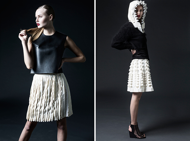
Hanna Cronsjö
Share: Facebook,  Twitter  
28/05/2015

Style and Scent: Designers as Testimonials

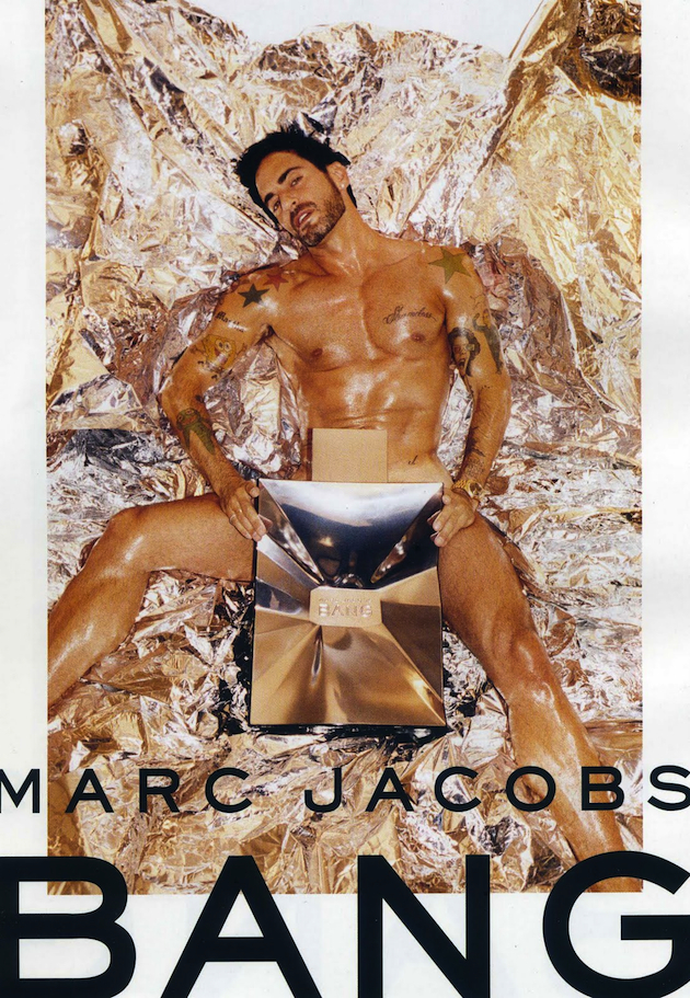
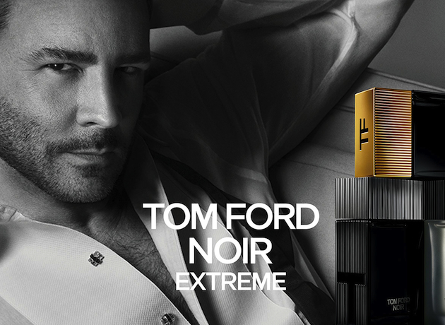
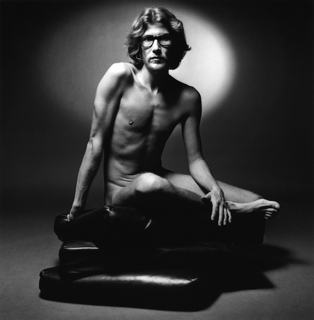
The link between fashion and perfumes is tight and long-dated. Since the beginning of the century, designers have pulled the production of fragrances alongside their clothing and accessory lines, and nowadays they have incredible economic importance, sometimes even sustaining the sales volume of the whole brand. Their importance is shown in the adv campaigns, which sometimes place the designer himself on stage to promote the fragrance. The forerunner of this was Yves Saint Laurent. In 1971, he decided to use himself as a testimonial for his first fragrance, eau d’homme: the shoot of him naked, directly looking into the camera, by photographer Jeanloup Sieff, is almost legendary. The intention of YSL was to shake and shock the public at the beginning of the seventies, with an image both powerful and unexpected. In turn, instead of merely promoting a fragrance, he presented himself. In a moment, the shy designer became a symbol of the lure for transgression that was in the air at the beginning of the seventies and together with him, the perfume he was fostering became the scent associated with that crave.

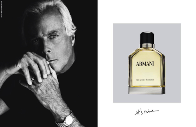
Since 1971, designers have been protagonists of campaigns for their own clothing lines, putting as much of themselves in the name of the brand, as in its public image; Vivienne Westwood was the first, and after her, many others. However, with fragrances the situation is different: the perfume is something designers do not ‘design’ personally, but it is a communicative tool as immediate as it is inconsistent, and has to sum up the philosophy of their brand in a scent. After YSL, many other designers have put their persona on stage to promote their fragrances; among them, Tom Ford, Marc Jacobs and Giorgio Armani, all of them communicating something of themselves in the photos: sensuality for Ford, racy playfulness for Jacobs, rigorous refinement for Armani. Advertising campaigns are primary made to sell something physical. Together with the product, campaigns are shaped to make the product the most desirable, adding elements, telling a story, and inevitably selling something more than the product itself. So, the real question here is: what are designers really selling, putting their faces of the billboards?

Becoming ambassadors of their own philosophy and work, and the world they think about while designing clothes, they actually ‘sell’ themselves. It is a matter of identity, captured in the ethereal qualities of the combination of many components. Mr. Armani, for example, referred to his perfume as ‘My style in a box’, so it was a natural move for him to put his own image in the adv. Italian sociologist Alberto Abruzzese said the testimonial is not informative, but attractive and seductive; however, the kind of seduction these men have put in their campaigns informs of their private lives, their tastes and choices. It makes the designer in contact with the widest public, because everyone can easily step inside a perfumery and try the scent on, get the feeling of the perfume on the skin, and virtually enter in the world of a design house. The reasons of this kind of choice, which is primarily aesthetic, are numerous: branding, sales and – why not? – a good dose of narcissism; but again, they all have to do with a project. To design something means having a clear idea of the place, the world, in which these designs fit. It is about establishing a certain style coming from an idea, a reflection, a thought; which, ironically, has the same consistency of a scent.

Marta Franceschini 
Share: Facebook,  Twitter  
27/05/2015

Thomas Struth: The Act of Journeying

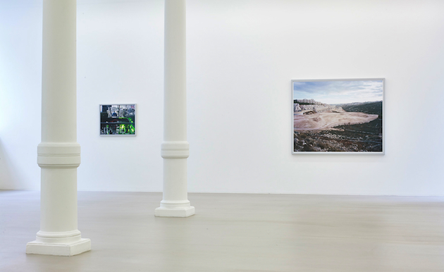
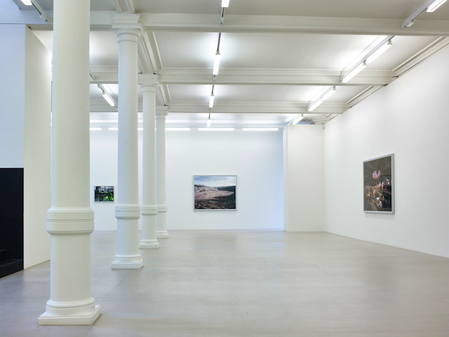
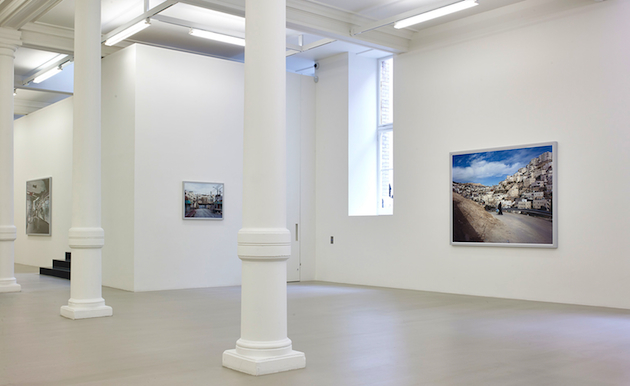
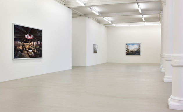
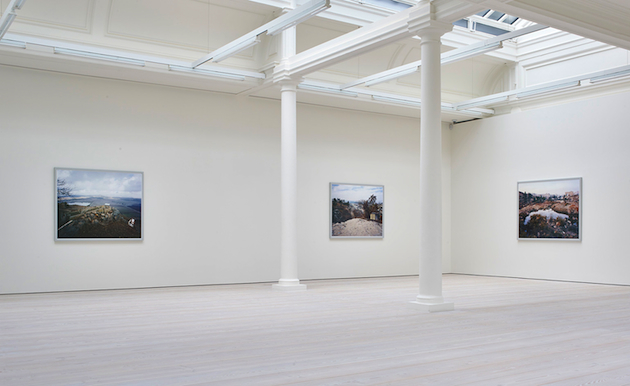
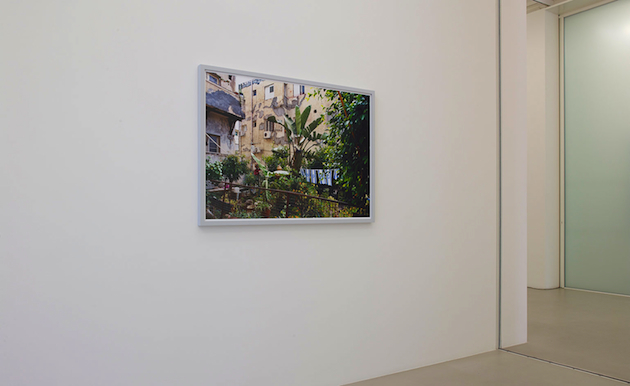
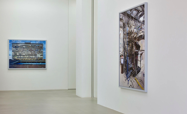
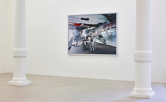
Traveling is an act of meditation and transformation; it is a way of coming to terms with reality and with different shapes and twists it can take; it is as much a process as it is a final goal. For contemporary photographer Thomas Struth, the ‘act of journeying’ is a vital part of his production process, through which combines a personal analysis of an instinctive sense and narrative of a place with a formal topological view, to create a composition that elucidates something revelatory. In his recent exhibition at Marian Goodman Gallery in London – coming to a close on June 6th – Struth takes us to two completely different journeys – one through Israel and Palestine and the other to spaces of scientific research in California. Both places are scrutinized by Struth’s photography, returning images that present two different dimensions of the human existence, that easily coexist not only for their singular outline, but because they both envision a view of what our society might or should be.

Images courtesy of Thomas Struth and Marian Goodman Gallery 
Share: Facebook,  Twitter  
27/05/2015

And the Winner is…Marques’ Almeida

Last week Delphine Arnault announced this year’s winner of the LVMH Prize: none other than the London-based brand Marques’ Almeida. The fashion duo have always put forward attitude in their work, straightforwardly mimicking a raw effortlessness, yet demonstrating that there is so much more to the brand than simple aesthetics.
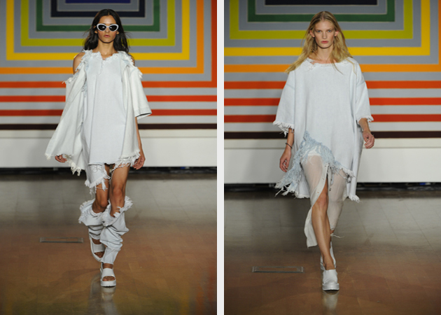
Looking back at their collections over the past seasons, the focus has definitely been denim, specifically shredded denim in all shapes and forms. The interesting aspect of the brand is their ability to reinvent the essence of 1990s trends with 21st century flair, updating both the grunge look and minimalistic tendencies into a new unique quality through layering and more exclusive materials. It displayed the brand’s capability to be both in the time and of the time. Marques’ Almeida has also alluded to a stylistic juxtaposition by bringing together two materials and styles in one, either in a completely unison color scheme or with an added splash to elevate the simplicity and showcase intricate work.

Marta Marques and Paulo Almeida are both from Portugal. They met when attending the local Fashion School, from which they both graduated in 2007. In 2009 they moved to London where they were given separate opportunities at Vivienne Westwood/Anglomania and Preen. The same year, they began the highly regarded Fashion MA at Central Saint Martins starting, in London, their now established partnership. The launch of Marques’ Almeida came in April of 2011 after their graduation from Central Saint Martins. Despite their established position within fashion circles, LVMH Prize is the first big prize for the house.

The couple responsible for both deconstructing minimalistic look has recently been expanding their creative zeal into working with new textiles and accessories. As they are now 300,000 euro heavier and about to embark upon a year-long mentorship from fashion giant LVMH, the question on everyone’s lips is, what will happen next?

Victoria Edman 
Share: Facebook,  Twitter  
26/05/2015

Style Suggestions: Animal Instinct

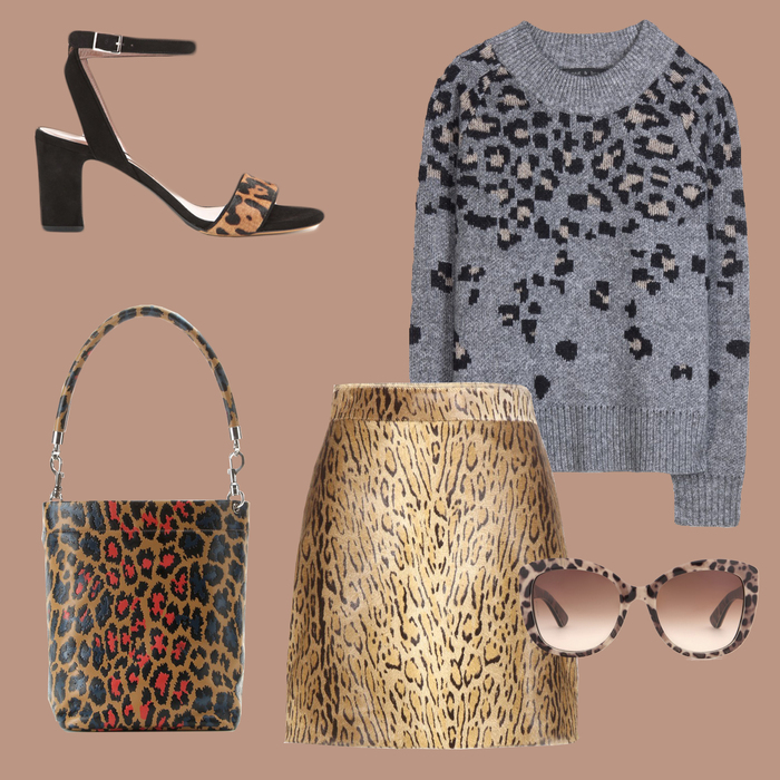
Release your inner animal with this season’s leopard print trend. This is a print that never ages so choose one piece that you love and keep it for years.

Sweater: Rag&Bone, Skirt: Saint Laurent, Bag: Christopher Kane, Shoes: Tabitha Simmons, Sunglasses: Dolce&Gabbana

Styling by Vanessa Cocchiaro 

Share: Facebook,  Twitter  
26/05/2015

Offprint Book Fair in London

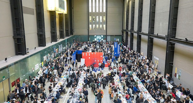
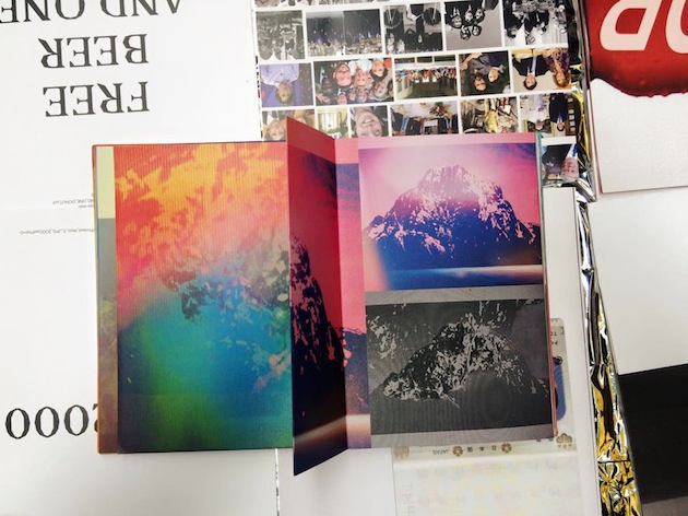
There is something particularly special about printed word – its is both lasting and timeless, as it is fragile and of its time – which shields it from ever becoming oblivious. As Umberto Eco once said, reading books is a way of making one’s life a bit richer by living the experiences of others through books – “It’s a little reward for not being immortal”. That the world of books will not be easily dismissed (if we were to borrow the title of another Eco’s work), was made visible this weekend in London. Offprint publishing fair moved to the windy island for the first time – Offprint Paris is already a traditional annual appointment every November during Paris Photo fair – taking over the beautiful Turbine Hall space at Tate Modern.

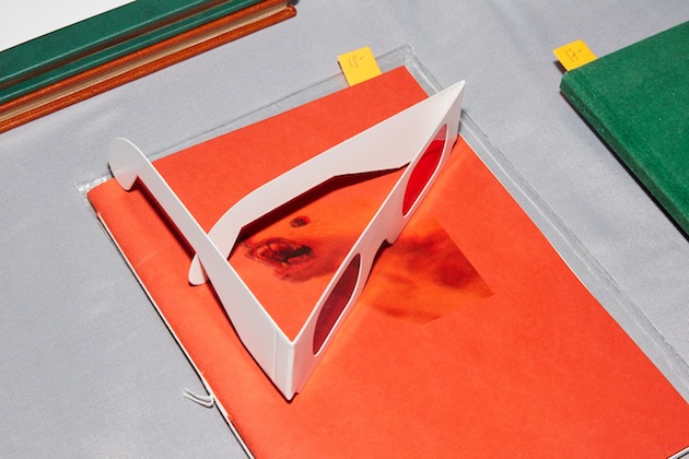
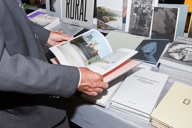
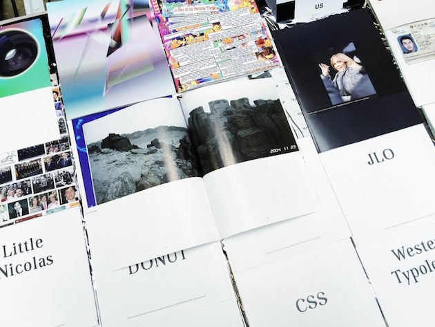
Held in the occasion of Photo London, Offprint London was a vibrant and lively meeting with, mostly, art and photography publishers. Strikingly, the event has shown how much the world of ‘independent publishing’ has changed in the past couple of years, swiftly moving from rebellious photocopied-zine producers to elaborate, sophisticated volumes whose physical appearance and rich materiality is as important as their content. With more than 50 publishers filling the tables laid out within Turbine Hall’s rough concrete walls, this gradual change in focus, style and intent of contemporary independent publishing couldn’t have been more striking. If rebellion against digital technology gave way to exaggeratedly polished books, what does its say about the very scope of the movement? How do we judge its shift into a (very) profitable industry? Is there even room to make such a judgement?

Perhaps what Offprint London pointed to most vividly is precisely the vibrant plurality of independent and not-so-independent publishing today. Established publishing houses like MIT Press or Semiotext(e) perfectly coexisted with Nieves’ cult zines or student publications amassed on overcrowded tables. In the same way, visitors to the fair ranged from obvious young hipsters to older art lovers, in a perfectly apt mix of point of views, interests and ideas. What brought projects like sticker-tattoos, produced within Self-Publish Be Happy project space, and retired college professors together during four days of publishing exuberance, was nothing less than the particular magic of the printed word.

Rujana Rebernjak 
Share: Facebook,  Twitter  
25/05/2015

Colour as Life: Sonia Delaunay at Tate Modern

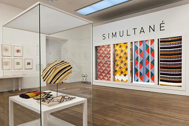
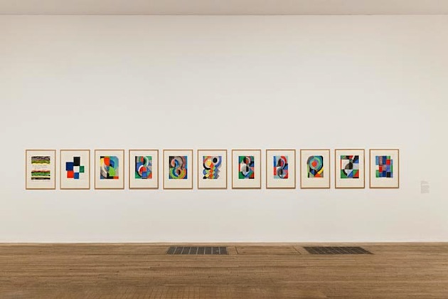
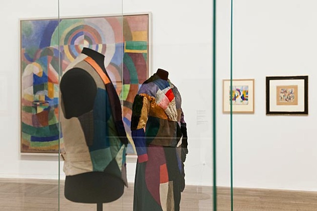
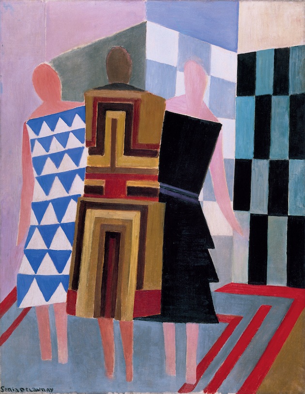
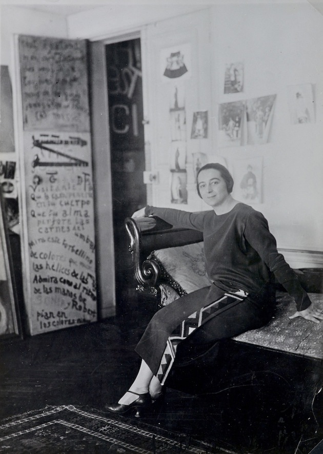
Sonia Delaunay (1885–1979) was a key figure in the Parisian avant-garde, whose vivid and colourful work spanned painting, fashion and design. A new exhibition at Tate Modern presents the first UK retrospective to assess the breadth of her vibrant artistic career, from her early figurative painting in the 1900s to her energetic abstract work in the 1960s. This exhibition offers a radical reassessment of Delaunay’s importance as an artist, showcasing her originality and creativity across the twentieth century. Born in Odessa and trained in Germany, Sonia Delaunay (née Stern, then Terk) came to Parisin 1906 to join the emerging avant-garde. She met and married the artist Robert Delaunay, with whom she developed ‘Simultaneism’ – abstract compositions of dynamic contrasting colours and shapes. Many iconic examples of these works are brought together at Tate Modern, including Bal Bullier 1913 and Electric Prisms 1914. Her work expressed the energy of modern urban life, celebrating the birth of electric street lighting and the excitement of contemporary ballets and ballrooms.

The EY Exhibition: Sonia Delaunay shows how the artist dedicated her life to experimenting with colour and abstraction, bringing her ideas off the canvas and into the world through tapestry, textiles, mosaic and fashion. Delaunay premiered her first ‘simultaneous dress’ of bright patchwork colours in 1913 and opened a boutique in Madrid in 1918. Her Atelier Simultané in Paris went on to produce radical and progressive designs for scarves, umbrellas, hats, shoes and swimming costumes throughout the 1920s and 1930s. Clients included the Hollywood star Gloria Swanson and the architect Erno Goldfinger, as well department stores like Metz & Co and Liberty. The exhibition reveals how Delaunay’s designs presented her as a progressive woman synonymous with modernity: embroidering poetry onto fabric, turning her apartment into a three-dimensional collage, and creating daring costumes for Diaghilev’s Ballets Russes.

The diverse inspirations behind Delaunay’s work are also explored, from the highly personal approach to colour which harked back to her childhood in Russia, to the impact of her years in Spain and Portugal where she painted The Orange Seller 1915 and Flamenco Singers 1915-16. The show also reveals the inspiration provided by modern technology throughout Delaunay’s career, from the Trans-Siberian Railway to the aeroplane, and from the Eiffel Tower to the electric light bulb. It also includes her vast seven-metre murals Motor, Dashboard and Propeller, created for the 1937 International Exposition in Paris and never before shown in the UK. Following her husband’s death in 1941, Sonia Delaunay’s work took on more formal freedom, including rhythmic compositions in angular forms and harlequin colours, which in turn inspired geometric tapestries, carpets and mosaics. Delaunay continued to experiment with abstraction in the post-war era, just as she had done since its birth in the 1910s, becoming a champion for a new generation of artists and an inspiring figure for creative practitioners to this day.
Rujana Rebernjak – Images courtesy of Tate Modern 
Share: Facebook,  Twitter  
22/05/2015

Floating, Falling, Drowning, Flying in Fashion

Ever since British designer Phoebe English launched her own brand in 2011, she has created womenswear collections with a distinct, unique and dramatic design aesthetic. Her fondness of draped silhouettes and hand-woven fabrics has been translated into art in the exhibition “Floating, Falling, Drowning, Flying – An Introspective of Process” currently showed at NOW Gallery in London. English sees the exhibition as a way of showing her creative design process, and describes the work shown in the exhibition as both an exposing and, at the same time, wonderful experience.

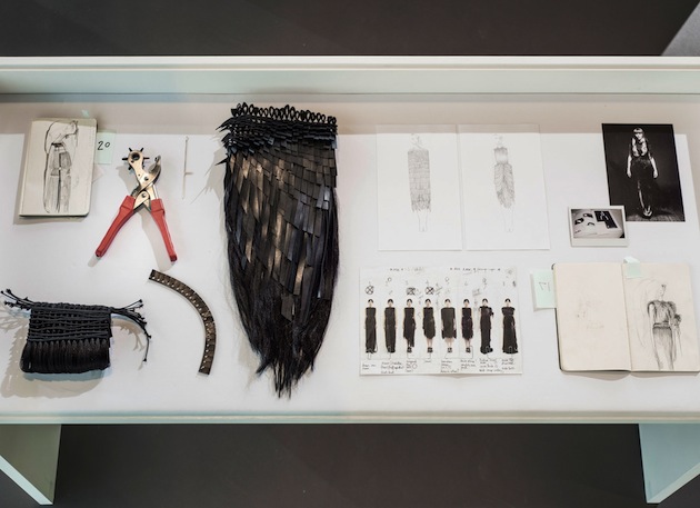
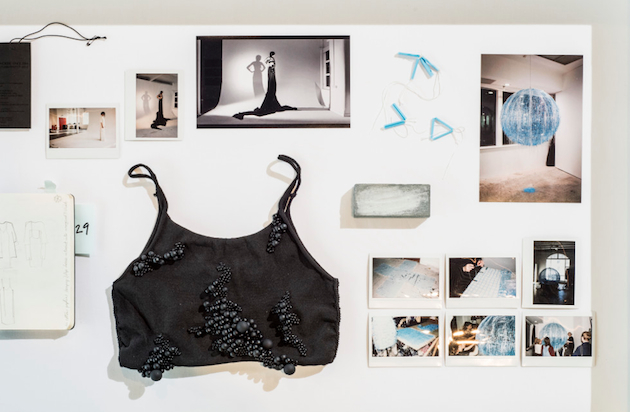
The exhibition includes an experimental and diverse collection of objects- from toiles, never before seen sketches to innovative fabric swatches and artisan tools. Every object exhibited tells a story not often told in a fashion context. The aim is to create and show something more raw and real than the fashion world usually might tend to show. English means that, despite this being a side of fashion not often exposed, these objects were invaluable to her and the team behind her when creating the collections.
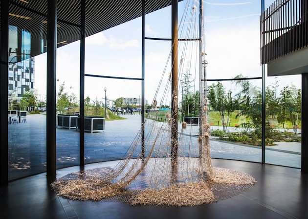
Besides showing the designer’s work processes and creations through staged looks and looped video montages, the viewer will also be able to experience a large textile installation, created by hand and made from over 60,000 metallic glass beads. It is a beautiful and subtile interpretation of fashion and its close relationship to art, making it hard to categorise the installation as either one of the two. This idea about a flowing and undefined line between fashion and art, might also be representative of the exhibition in whole, due to the fact that it is as unique as the designer’s pieces and therefore differs from most other fashion exhibitions – in a much welcomed and exciting way, of course.

Hanna Cronsjö 
Share: Facebook,  Twitter  
21/05/2015

Frederik Vercruysse: Tempo Polveroso

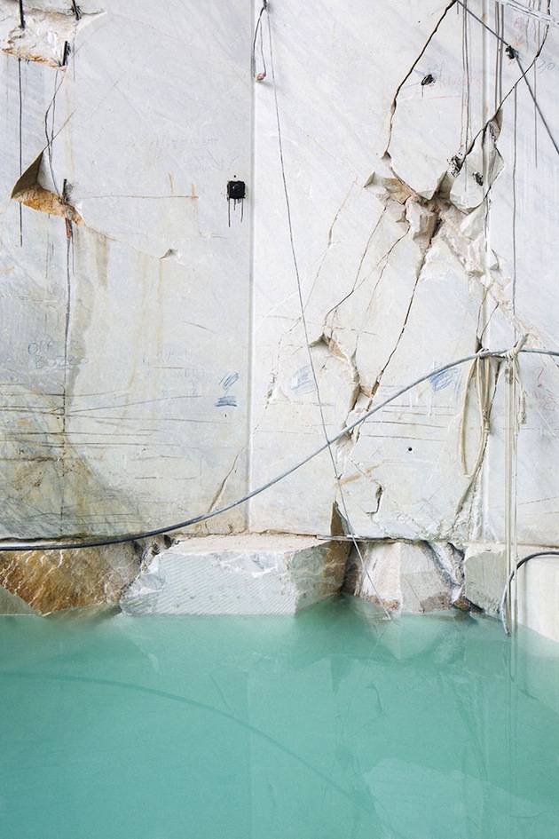
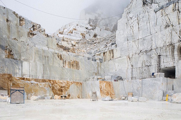
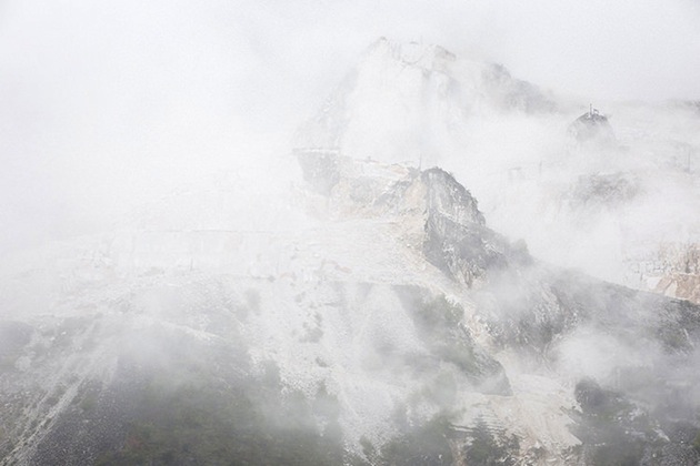
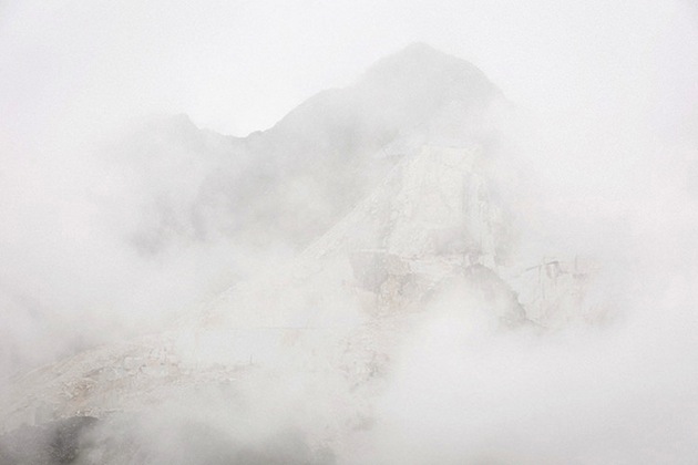
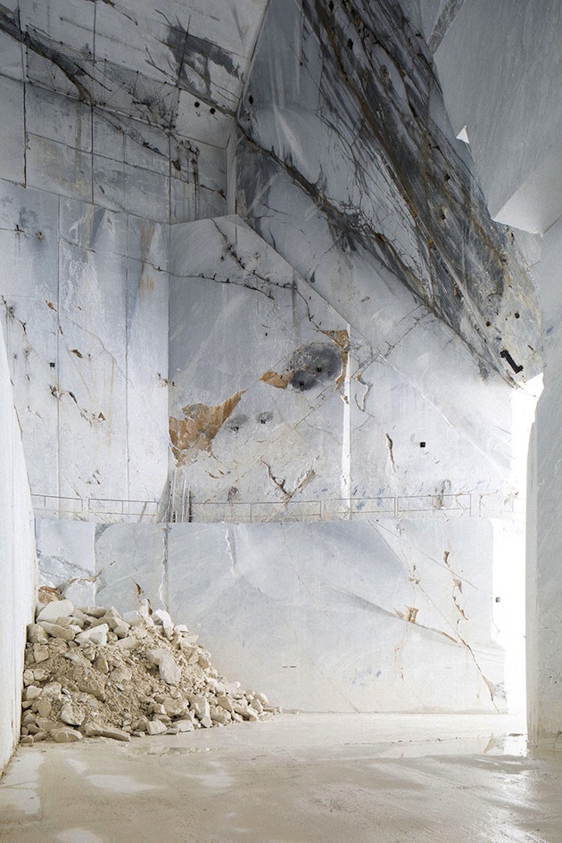
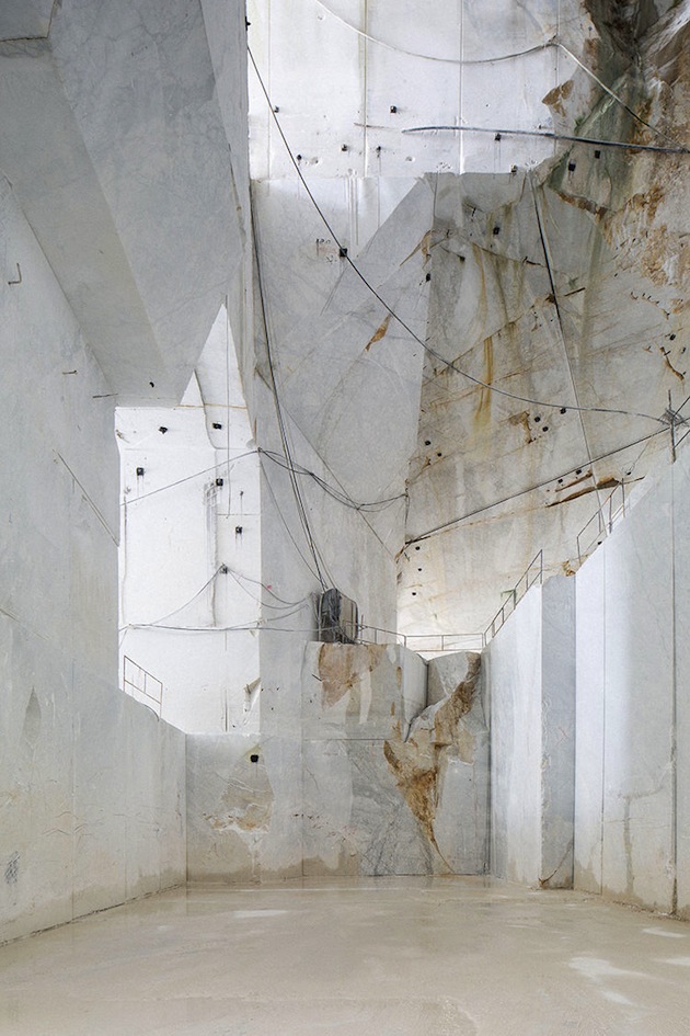
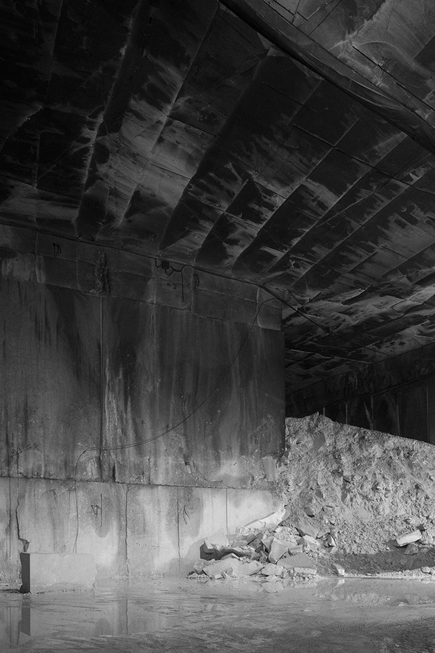
Mystic imagery and out-of-time landscapes populate Frederik Vercruysse’s photographs. Taken in Carrara, Italy, they depict an apparently un-romantic world of marble caves. And yet, “Tempo Polveroso” manages to capture that otherworldly spirit, hidden beneath layers of precious stone. “Tempo Polveroso” is now an exhibition currently running at Graanmarkt 13 in Antwerp, Belgium, showing the series of 16 unique still lifes that came to life during an artist in residency project in Villa Lena, Tuscany.

Images courtesy of Frederik Vercruysse 
Share: Facebook,  Twitter  
20/05/2015

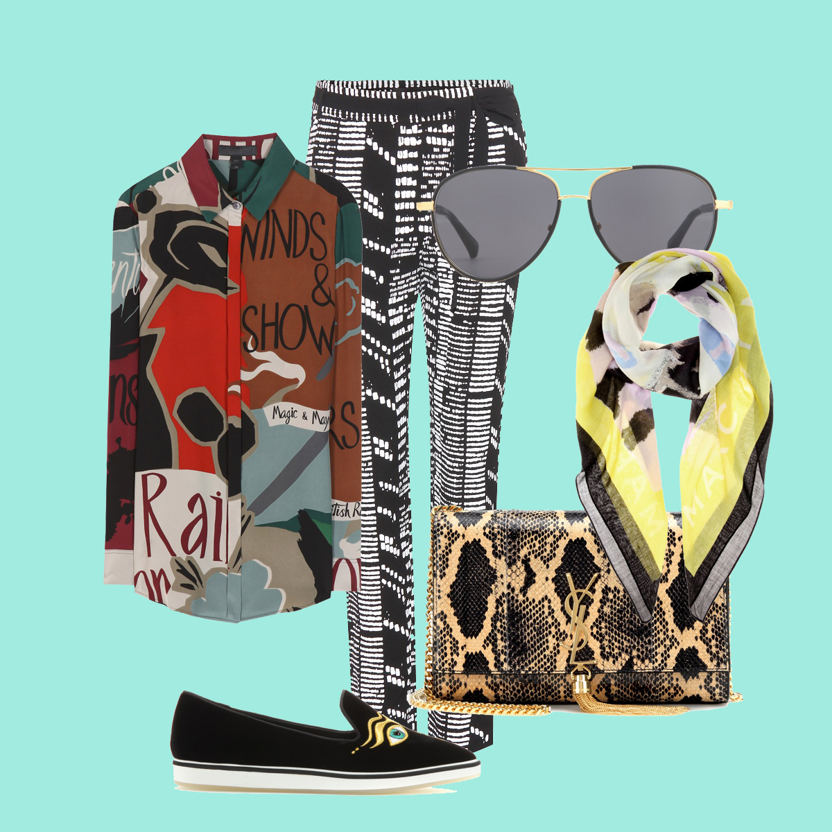
Style Suggestions: Clashing Prints

Clash is back, so make sure to make a statement by not looking perfect. This trend lets you express your inner fashion eccentric and have some fun mixing bright colours and prints.

Shirt: Burberry Prorsum, Trousers: Proenza Schouler, Scarf: Kenzo, Purse: Saint Laurent, Shoes: Nicholas Kirkwood, Sunglasses: The Row

Styling by Vanessa Cocchiaro 

Share: Facebook,  Twitter