28/04/2011

William Kentridge / Galleria Lia Rumma

.

William Kentridge / Galleria Lia Rumma

In the International Year for People of African Descent, the versatile South African artist William Kentridge (Johannesburg, 1955) has conquered Milan.

If – unfortunately – you missed the shows at Palazzo Reale (William Kentridge & Milano. Arte, Musica, Teatro) and Triennale (What will come, has Already Come) or the extraordinary version of the Mozart’s opera the Magic Flute at Teatro Alla Scala, staged and directed by Kentridge, you still have the opportunity to see the genius of one of today’s foremost contemporary artists at Galeria Lia Rumma in Milan.

Man with Trumpet, 2010 – Tapestry by William Kentridge, woven by Marguerite Stephens Weaving Studio. Edition of 6.

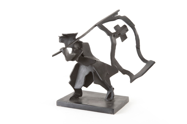
Man with Flag, 2008. Bronze. Edition of 20.

The ground floor of the huge art space hosts 8 video projections inspired by the political and social changes connected with the Russian Avant-garde and by Gogol’s absurd satirical short story “The Nose,” which influenced most of the works displayed in the show. A nose is, in fact, the subject of the small sculptures made of bronze, and a nose is the rider, who travels – mounting a Don Quixote-esque horse – across the fantastic lands depicted on the big tapestries hung on the walls of the first floor. Through his pieces the artist reflects his opposition to the legacy of apartheid in South Africa and his interest in culture of the 19th century and the turn of the 20th. From a pre modern context of writers and intellectuals like Büchner and Gogol he learnt how to understand and portray our chaotic era.

Kentridge uses different media and techniques and embraces all artistic fields: music, movie, theatre and sculpture convey in a total work of art that resume his poetic.


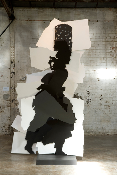
Fire Walker, 2009. Painted steel. Edition of 5.

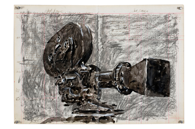
On display at the second floor of the gallery, apart from the sculptures, there are watercolours – sketches for mosaics – Indian ink and charcoal drawings representing olive trees, mythological figures, motion picture cameras, self-portraits, noses and studies for the Magic Flute. The relationship between the drawing and the act of drawing is strong and brings directly to performance as much as tearing paper in small pieces and reassembling them in new shapes is strictly connected with mosaics.

A drawing is always the starting point for William Kentridge, because the flexibility of drawings is like the flexibility of thinking, they have the same speed for him. It is like think aloud.

Camera (Central Boiler Station), 2010. Indian ink, charcoal and pastel on page from central boiler station ledger book.

The exhibition will run until May 14 at Lia Rumma Gallery, Via Stilicone, 19 Monday-Friday 10 am-1.30 pm/2.30-7.30 pm.

Monica Lombardi – Images courtesy Galeria Lia Rumma, All photos credit John Hodgkiss

Share: Facebook,  Twitter  
27/04/2011

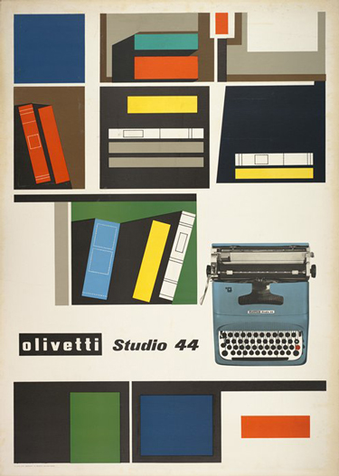
The Typewriter Lives / Rand, Sottsass & Pintori

.

The Typewriter Lives / Rand, Sottsass & Pintori

The typewriter is officially dead. Well, not really. It was widely reported to have died in 2009 when, ostensibly, the last company to produce them, Godrej & Boyce from Mumbai, discontinued production. But the world this week was quick to lament its symbolic and final passing, as Godrej sells its final stock. But as several respectable sources report, such as Canada’s National Post, several producers remain. Because, after all, prisoners and the Amish will always need something to write letters with.

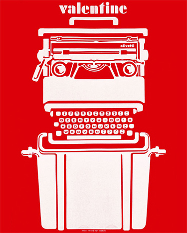
Today, we’re far from the days of the gorgeous Olivetti Valentine and rock-solid, anvil-heavy Smith Corona. It’s not rocket science to understand the lack of demand for the old workhorses over the past several years (or, y’know, decades). But the typewriter is is such a potent archetype that, even though it’s faded almost entirely from use, its complete abandonment is difficult to swallow.

We watched its form merge with that of the computer over the seventies and eighties. And today inside almost anything with a typing interface – mobile phones, computers, car navigation systems – the typewriter’s QWERTY archetype (or AZERTY for you crazy Frenchies) lives on. But as we’ve explored before, the loss of tactility in our new, predominately digital environments isn’t always easy to deal with. Not to mention the exponentially increasing complexity of the objects themselves. The typewriter’s death – real or exaggerated – signals a further uncomfortable detachment from the past.


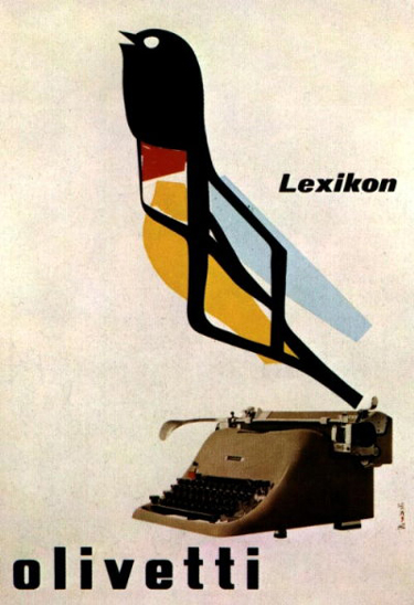
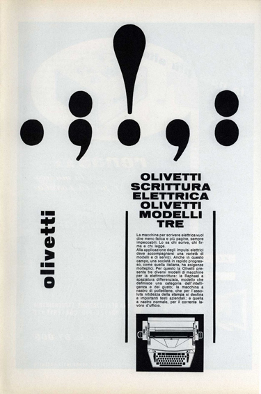
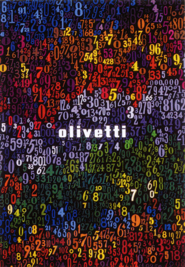
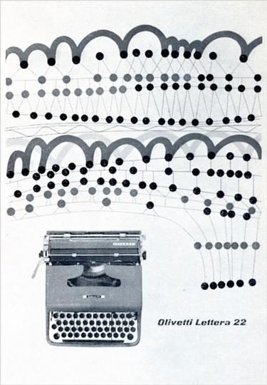
And although we’re most certainly not technophobic Luddites, the culture of the typewriter deserves its due. Its sheer brilliance was capped off by its 1960s and 1970s pinnacle as Ettore Sotsass, Mario Bellini and George Sowden turned them into functional high art. The typewriter was inextricably a part of the creative and visual cultures that made some corporations bastions of good design: think of Paul Rand, Giovanni Pintori and even Sotsass’ gorgeous and imaginative graphic works for the likes of Olivetti and IBM.

Typewriters were sources of great innovation in ergonomics and the relationships between object and user. They brought women into more dignified jobs and paved the way for equal workplaces the world over. The personal computer, in a design sense, can be thought of as an evolution of the typewriter…

Without the typewriter’s influence, it’s impossible to imagine the form the objects we use today might have taken on. Or if they’d even exist. And while not completely dead yet, it’s death is imminent, indeed. Should we fight for it, like Impossible did for Polaroid? Something tells me that wouldn’t amount to a typewriter revival…

Tag Christof – Images courtesy Olivetti, by George Rand, Ettore Sottsass and Giovanni Pintori

Share: Facebook,  Twitter  
26/04/2011

Fifth Avenue Shoe Repair / Autumn 2011

.

Fifth Avenue Shoe Repair / Autumn 2011

From jersey cocoon to aluminium butterfly…”

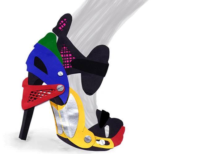
In seven years, V Avenue Shoe Repair has gone from a small-scale jersey-experimenting designer duo to one of Stockholm’s most intriguing couture houses. And one of Vogue Italia’s design talents of 2010. All without abandoning its traditional craftsman ideals. Quite the contrary, in fact. With the recently revealed Autumn 2011 collection, The Shoe Repair duo, consisting of designers Astrid Olsson and Lee Cotter, has delved deeper into its own aesthetics than ever before.

“We started to look what the great creative minds we admire had done before, and realised that…it wasn’t close to our own idiom, which was kind of a blow…”

Olsson spoke during the recent Stockholm press event about how the team, in its home inside a 19th-century brewery, approached this new collection. They started by trying to use the old fashionable inspiration-tool. To the process, they added a hint of mint, and some strategic benchmarking. But in the end, the most crucial part of the collection’s journey became the use of the archetype archive. By throwing a respectful eye into their own rear-view mirror, they could move their heritage forward. Bring new life to their own past.

“We have realigned our priorities. We needed to deliver a stronger sensation and expression with the collection, we needed a new tone, a new voice.”

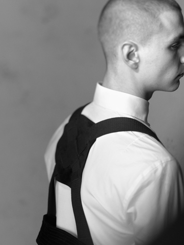
Their usual cocoon-silhouette has been forced to make way for an edgier sex appeal, with a new focus on accentuating body parts instead of treating them as a unit. And where black has always been the label’s dominating colour, some grey, beige and other neutrals have entered the picture.

”We realized that even though black is our signature colour, it creates an optical illusion but no details. We’ve worked with pale white, the shade you see before your eyes when squinting…”

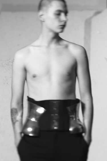
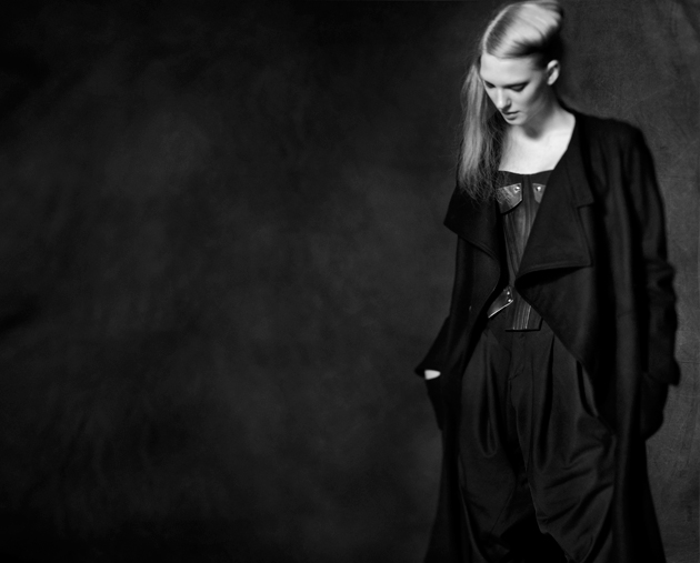
The most significant parts of the collection are the atelier pieces all made of aluminium, originally intended to be made out of plexiglas. The hand made corsage is a collaboration with an art student located in Stockholm. We also find spiral shaped armlets, metal shoulder detailing, and a fringed top with aluminium edges.

This collection explores a new world of fabrics and materials. Besides old stalwart cotton, the periodic table is very much present, and represented by elements such as aluminium. Other than that, we find skyscraper platforms in rubber – with rabbit fur-details, some steel, plastic and leather.

“I used to have the idea that stitchery was defined by the amount of time used in the process, but with this collection, I draped some pieces on a mannequin in 30 minutes…”

Highly advanced avant garde meets easy breezy draping-techniques – Olsson sums up the collection with these words. VASR are pushing the boundaries of minimalism, to the very sharp edges of a knife. Where they once drew a line between their prèt-à-porter and V Ave Shoe Repair By The No.-couture line, the boundaries are now much less clear… The usually arduous sewing-technics and materials such as cotton and wool are now sharing the runway with the atelier-designs. The “a button here, a pocket-there”-utility standard hooks up with a modern Pierre Cardin-fembot to unite in holy matrimony, utill the next collection do them part!

Petsy von Köhler – Images courtesy Fifth Avenue Shoe Repair

Share: Facebook,  Twitter  
21/04/2011

Bruna Kazinoti & Ana Murillas / Malthe for Hero

.

Bruna Kazinoti & Ana Murillas / Malthe for Hero

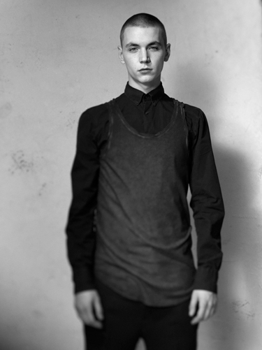
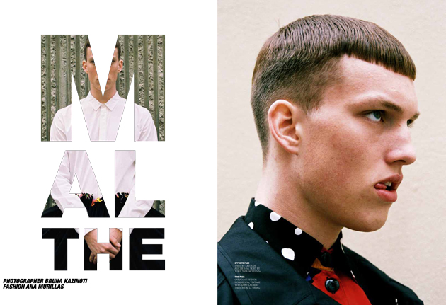
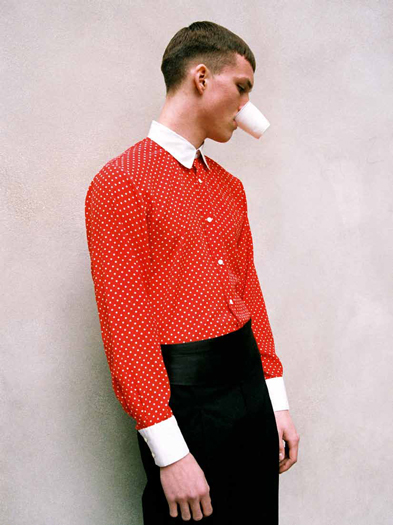
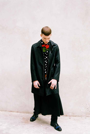
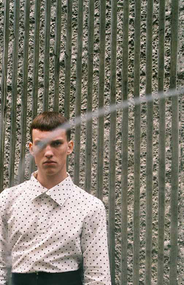
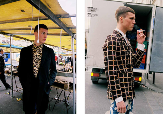
We’re enjoying lots of new magazines this week! Issue 5 of Hero, the young UK zine packed to the brim with gorgeous guys. The art direction is excellent, as always – bold, brash and British – and new issue are always a treat, as they come out only twice a year.


2DM’s photographer Bruna Kazinoti, whose bad boy editorials are a fixture in Hero, shot this feature on model Malthe Lund Madsen from Ford, together with rockstar stylist Ana Murillas. And the two make quite the team!


We’ll let the photos speak for themselves. The mix-up, forward fashion comes courtesy Givenchy, Dries Van Noten, Yamamoto, YSL, Paris Vintage, Dior Homme, Raf Simons and others. Hooray for Hero!

Tag Christof – Images courtesy Hero

Share: Facebook,  Twitter  
20/04/2011

The MegaPhone

.

The MegaPhone

After our editorial rant last week about the decline of tactile, purposeful objects, we hit Salone del Mobile to see designers’ take on the future. What we found was mildly depressing: hundreds of plasticky, computer-generated chairs, mediocre devices from upstart Chinese electronics companies, and show stopping grandiose installations with little bearing on producible objects. The word “artisanal” was thrown about everywhere, but most objects described as such were either high-priced luxury trinkets (as usual) or ignored the influence of modern technology altogether. Not that there wasn’t a lot of excellent work, but this year didn’t give the impression that many boundaries were being pushed.

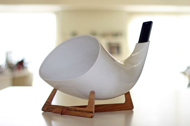
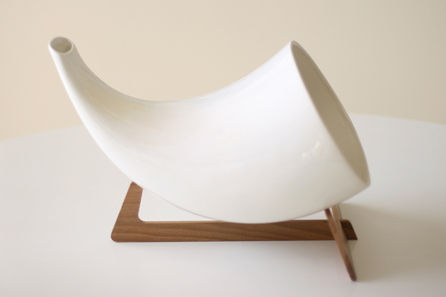
But sometimes a design is so elegant, so straightforward that it stops you in your tracks. Or sings to you. The MegaPhone from Italian design duo en&is for iPhones and iPods is brilliant.

It is exactly the kind of concrete, semi-analogue solution that we crave to see as product design merges with interface design. It is a simple ceramic amplifier on a wooden stand, utilising natural acoustic principles to play music (or inversely, to make speakerphone calls). Its sound is full and earthy, and its form recalls the bells of tribal instruments, antique hearing horns and conch shells. It uses the iPhone’s existing hardware to its advantage (and that’s good design). And while it won’t charge your device, it looks a hell of a lot better than anything that will.

I couldn’t help but looking at Yves Behar’s much-hyped Jambox (also revealed in Milan last week) and thinking that, despite its technical prowess, the MegaPhone is a far superior design. Efficient. Timeless (insofar as the iPhone keeps the same general configuration). Desirable.

It cleverly unites low-tech with high tech, and it transforms the iPhone (while using it to listen to music, at least) into a 21st century take on the parlour phonograph. Now that’s progress.

Tag Christof – Images courtesy en&is
Share: Facebook,  Twitter  
20/04/2011

Vicky Trombetta / Wonderland

.

Vicky Trombetta / Wonderland

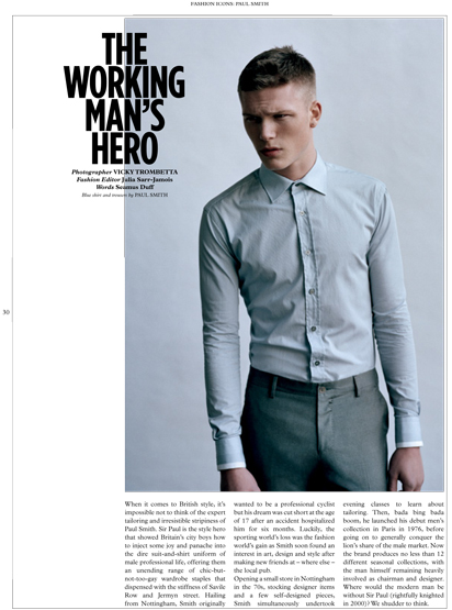
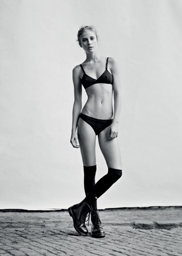
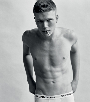
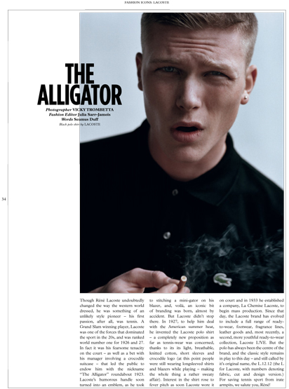
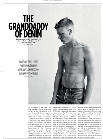
New issues of Wonderland are always killer. And the latest, The Reality Issue” is covered in pop siren Sky Ferreira (or Tyler, The Creator). And to make it even better, Vicky Trombetta shot five pages for the opening of the issue, all styled by Julia Sarr-Jamois. Utilitarian icon was the name of the game, with features The Alligator (Lacoste), The Accidental Genius (Dr. Martens), Master of the Bulge (Calvin Klein), The Working Man’s Hero (Paul Smith) and The Grandaddy of Denim (Levi’s). And Tommy and Tasha Franken from Elite modelled gorgeously.


In addition to Vicky’s series are editorials by Rafael Stahelin, Daniel King, Kevin McIntosh, John Balsom, and Driu & Tiago. Plus, two fantastic interviews with the covers stars, cheekily called “The Creation” and “The Sensation.” And since the issue deals heavily with pop culture’s current obsession with reality (departing from Editor-in-Chief Huw Gwyther’s thought-provoking editor’s letter), there is a thick section of features on Gaspar Noé, Wim Wenders, and a host of photos and words of individuals dubbed Reality Royalty.


Tag Christof

Share: Facebook,  Twitter  
19/04/2011

Karin Kellner / Casamica

.

Karin Kellner / Casamica

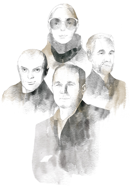
Corriere della Sera’s latest issue of Casamica, Quale Design, was out just in time for Salone del Mobile. As usual, the comfy and of-the-moment magazine features excellent reading: there are features on Enzo Mari, Andrea Branzi, Faye Toogood, and Cappelini. There’s a look at the furniture branches of some of the big fashion houses – from Hermès to Margiela – and a look at that ever-divisive, über-iconic cross, through design eyes. 2DM’s Marco Klefish once again pops up throughout the issue, with hand-drawn portraits of the maker-shakers whose works are featured.

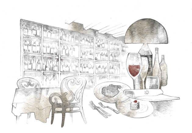
Karin Kellner, 2DM’s master of texture, made her debut in the magazine with a series of feature illustrations. For a roundtable discussion called “Design per il futuro,” she illustrated Rossana Orlandi, Denis Santachiara, Alessandro Vecchiato, and Carlo Urbinati. She also did a two ambient interior illustrations, one for a short article on the restaurant Gran San Bernardo. Karin, herself was once a student of design, and had a great time drawing the portraits, calling it a great way to “breathe creativity.”

“I love to capture expressions in watercolour… emphasising light and shadow,” said Karin. We’re thrilled with her work and can’t wait to see the next issue.

Tag Christof

Share: Facebook,  Twitter  
18/04/2011

The Editorial: Barbapapa / Propaganda

.

The Editorial: Barbapapa / Propaganda

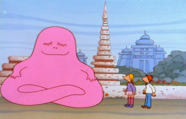
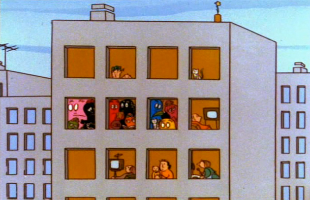
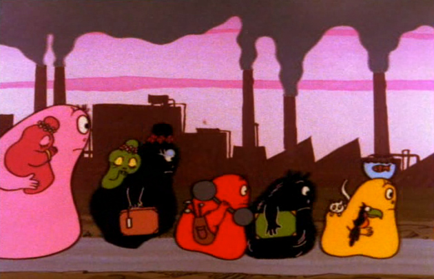
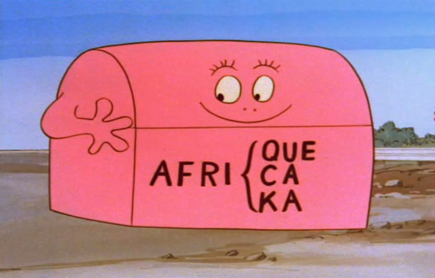
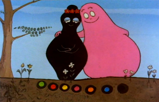
The drug fuelled 1970s was a time of discovery. Western cities dealt with swelling populations, skyrocketing crime and rampant pollution. Oil crises choked infrastructures and caused tension between nations. Recession after recession increased the gap between the richest and the poorest. Fashion rid itself of previous limitations and veered off on never before seen tangents; artistic conventions crumbled. And exactly like today – a decade of unprecedented complexity and extreme uncertainty – the 1970s was a time of discovery and reevaluation. It was and is once again a time in which we must take long, hard looks at ourselves and evaluate our systems, our values, ourselves. Barbapapa, the gorgeously kitcshy, cheaply animated 1970s cartoon did it for us forty years ago.


The amorphous pink blob, grown like a magical potato, is the manifestation of the modern human condition. He has supportive and nurturing friends, Claudine and François, but finds himself fundamentally alone, forced to seek meaning, as so many of us do, in a voyage around the world. Barbapapa is the commensurate self-aware individual, caught between his environment and himself: his awkward shape, size and colour set him apart, but his utility and benevolence endear him to those he is able to help. And although he uses literal and impossible solutions for immediate problems (such as transforming himself into a submarine, staircase or hot-air balloon), he serves as a magical metaphor for the wildly transformative power of imagination.


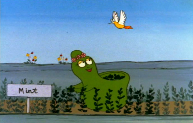
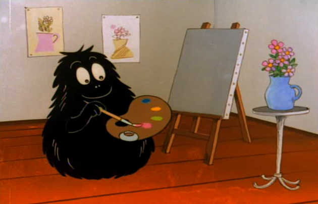
But forty years later, Barbapapa is as relevant as ever. The cartoon dealt openly with issues of depression, racism, displacement and inequality. And in a roundabout way with issues of homosexuality, gender identity, drug use and marital strife. The show dealt frequently with issues of pollution, environmentalism and animal rights. Barbapapa even tackled the dehumanisation, isolation and misery of anonymous midcentury public housing! Barbouille, the artist offspring, fights for creative freedom. And he and his family (while perhaps a bit unrealistically fond of one another) celebrate their differences, each helping the group along with their talents and sensibilities.

Generations of kids across the world have grown up listening to Barbapapa in a smattering of languages. And mostly none of them realised they were being schooled in tolerance and imagination. Perhaps Barbapapa is progressive propaganda. But the progressive, human values he represents are all too often overlooked in times of uncertainty. And with a future that looks more uncertain than ever, I think exactly what we all need is a little more gorgeously kitschy, cheaply animated 1970s good nature and humanity.

Tag Christof

Share: Facebook,  Twitter  
16/04/2011

Essen: Eat Love / Marjie Vogelzang

.

Essen: Eat Love / Marjie Vogelzang

Marjie Vogelzang does not like to give plates only a beautiful shape. For the Dutch food maven Marjie, the great hoax of our times is food design. Food has a perfect shape by nature – so what matters for the Amsterdam “eating designer” is “to think of food in different cultures, food history, the realisation of food, transportation, agriculture, the ‘industrialization of food, psychology of eating.”

Marje believed it so much that within the span of a few years, she has founded two restaurants called Proef (one in Rotterdam, the other in Amsterdam), organized a studio, participated in exhibitions throughout the world, written two books (Love to Eat and Lunch Box) and had two babies (!). One of these babies is still (for just a tiny bit longer!) in Marjie’s womb, but just before her maternity stop, she graciously talked with us about her projects, her thoughts and love.
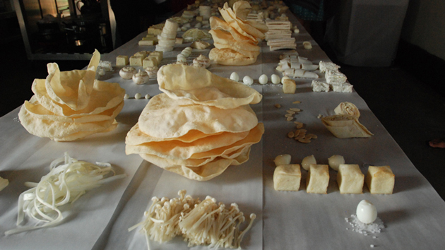
The uninitiated widely know you as a creative and innovative food designer. But you’re not. Since food is perfectly designed by nature, you consider yourself as an “eating designer,” who is investigating the content background. It’s a fascinating thought. What if a food designer became an eating one? What would he or she have to do?
In order to answer, could you tell us about the sort of Decalouge a food designer must follow to become an eating designer?

That’s an interesting question. Well it’s all about giving things a name and I thought the name food design didn’t fit me. But sometimes I’m not sure about eating designer either.

What I think an eating designer should explore is the full potential and meaning of the subject of food and eating. I think an eating designer should look beyond only the obvious visual aspects and taste aspects of food. These obvious choises are making designers to make something that looks nice, tastes good etc. But I think the world of food is so much larger and touches everybody’s life and therefore is far more interesting to explore. Think about food in different cultures, food in history, the making of food, the transportation of food, agriculture, the industrialization of food, the psychology of eating. These are just a few examples of inspiring subjects that can be explored and used. Also the meaning of the word design can be discussed. I think the word should be used to mean “creative thinking” when it comes to eating design instead of just giving something a nice shape.

Design as a shaping device is a tool. Not the final goal. The final goal is creative thinking and to communicate the creative idea you need esthetics as a tool.
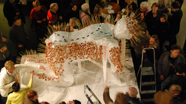
Following this idea of “what if”, if you were the rector of an Eating Design Faculty what will be the main subject?
I think we could make a program according to my 7 points of inspiration:
- Senses
- Psychology
- Culture
- Nature/education
- Science
- Technique/ material
- Society

It’s been less than a year that you’ve founded your second Proef in Amsterdam. This project seems more linked with your Philosophy of food with more plants and organic food than a design approach. What is changing in your work?
I founded Proef Amsterdam 5 years ago. At the moment it’s a restaurant in it’s own and the design studio moved out to somewhere else.
I wanted it to be a relaxed place how I personally would like a restaurant to be. I got a bit bored by formal dinners but also by overdesigned dinners! I wanted things to be fun and easy drinking coffe from empty jars. That’s what works for a restaurant. It’s almost impossible to run a highly conceptual idea as a restaurant and I would also find it boring.
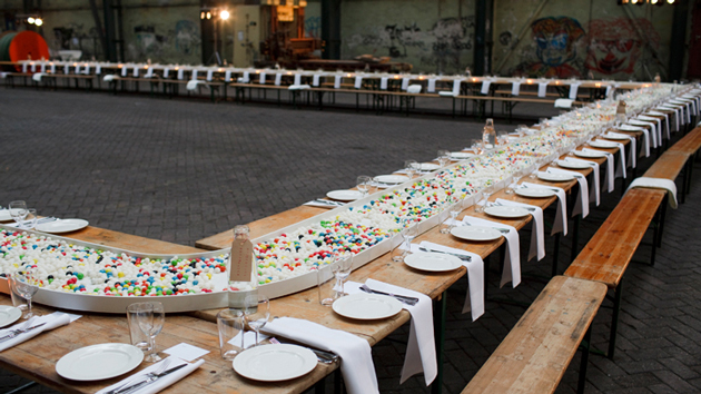
Speaking about organic, there’s a lot of “buzz” about it and lot of speculation. According to you what is missing in oursociety to reach a good level of organic approach?
I think we’ll get there but it need time. The government should lower taxes on organic produce and give more support. Eventually things shouldn’t be labeled ‘organic’ anymore but ‘non-organic’ should be labeled and be the odd choice.

You stated that “Food goes to the stomach, but it can also activate the brain and can rouse strong memories and emotions” and you experiment food memory world serving World War II recipes to people who survived the Rotterdam Hunger Winter during the war stimulating their memories from more than 60 years ago. What are your very first taste memories? Is there any food or dishes that immediately recall your past?
I was speaking to a young journalist about taste memories not so long ago and she said that you remember everything you have put in your mouth as a young child. That doesn’t have to be food. The way of getting to know the world and materials is to put things in your mouth. That happens before you use language and is a very intruiging fase. When she said that she challenged me to imagine the taste of wood in my mouth. Of plastic, hard and soft, of textile and sand. When you think about a material, many times you can recall how this material feels in your mouth. I was very fascinated by her story and since I’m very much aware of materials and before I touch or even see them I know how they feel in my mouth. Wire, a plastic phone, rib-velvet (I’m a 70’b baby).
Food memories are very closely linked to smell. Sometime they surprise you. Going into someones house and suddely you catch the smell of grandma’s bedroom. I have food memories on these frozen lollypops that you can suck the taste out of. They were just lemomade packed in plastic sticks to freeze yourself.

What’s next for you? Any upcoming projects?
My first upcoming project is giving birth in about 4 weeks. (Actually this interview is the last thing I’m doing before plugging out!)
Giving birth and having children is very inspiring to me and very close to my philosophy as an eating designer. Food and love are linked together. They are the first to things that a mother gives her child.Then in autumn I will be back with some big plans.I’m being the guest editor of design indaba Magazine’s food edition and I’ll go to south Africa to promote and do some lectures. We are doing a food event in Hong KongI’m working on an exhibition in TaiwanWe’ll do some events in Moskou and Hungaria.I have plans for at least 2 new books so I have to find some time to do that too!
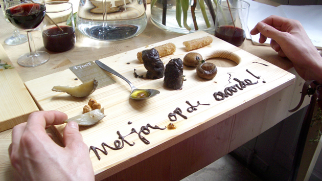
And last up is a recipe from Marjie:
-1 banana
Take a pen, draw a mobile phone on your childs banana. Give it to them to take to school.

Visit Essen for more fantastic insight into the world of food.

Cristina Zaga
Share: Facebook,  Twitter  
15/04/2011

Guest Interview n°27: Hanna Albrektson

.

Guest Interview n°27: Hanna Albrektson

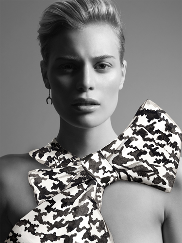
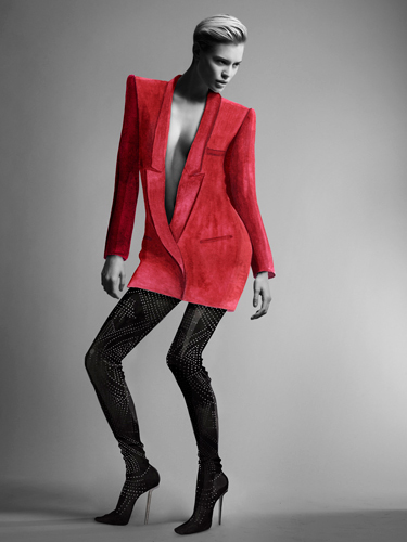
“I’m the kind of person who was born with a pen and a pair of scissors in hand,” says illustrator Hanna Albrektson – aka Weekendform. “My mum used to go crazy when the fruits in our kitchen became a victims of my markers…” The illustrator from the south of Sweden talks to us about her love for paper and how she made Chanel, Yves Saint Laurent and Hermès bags into something super recyclable.

She loves the feeling of complete freedom, and considers her work to be just that, free. With studies in graphic art and different printing techniques, she likes the fact that she doesn’t have to be limited by a specific method. And that she has the ability to mix paper collages with gouache and markers. Her studio is in Malmö, the Swedish city known for being the most artistic and inspiring. Below her sky-high ceiling and surrounded the humming from the pedestrian street just outside her window, she is content.

When starting new projects, she always begins by hand. To Hanna, it’s important that you understand the work that lies behind each drawing, and the fact that it’s made by an actual person, not just a computer. “I want my drawing to express honesty and direct, she says.”


She’s inspired by simplicity and optical illusions. She prefers a “less is more” style while also having a huge passion for patterns: they are endless and can go on forever.

What’s the most entertaining project you’ve done so far?
Hmm… Difficult to say! I enjoy the variations in my job! However, I did a super fun fashion story for the magazine Gravure. I illustrated clothes in watercolour, then I pasted it on top of a nude model. Time consuming and intricate but fun! I was so pleased with the feeling of the images! Emma Dysell, the photographer did an amazing job with the photos.

Tell us about the project of your dreams!
There are many of projects I would love to do. I want to illustrate porcelain, create wallpapers, textiles, book covers, you name it! I think I want to do as many different kinds of works as possible.


Your paper bags are fascinating! What’s the story behind the project?
The story of the paper bags is simple. I got a request to create a fashion relation job for The Block magazine. I liked the idea of building classic, expensive designer bags in a material as simple as paper. The bags were photographed by Emil Larsson. I’m amused by paraphrases. To create my own interpretation of already exiting pieces of art or other objects is a part of my artistry.

When not working, what do you prefer to draw?
When not working, I draw from my mind. Like possible new projects. Anything from new wallpapers to research of new kinds of papers.

Who are your personal favourite illustrators or designers?
That would be Jane Bark. David Shirgley. Toni Lewenhaupt. Stig Lindberg. Lovisa Burfitt. Poul Ströyer And probably another 100 people…
If you could have coffee with any one person, dead or alive, who would it be?
I would have my coffee with the DJ Larry Levan, but it would just be for an quick espresso since he is about to have a gig at “Paradis Garage.” So we knock back our coffees and hit the club! He DJs and I dance, drinking cocktails all night long! The year is 1982…

Thanks, Hanna!

Emelly Blomqvist
Share: Facebook,  Twitter