27/02/2015

Stilnovo: Lights for Italian Practical Grace

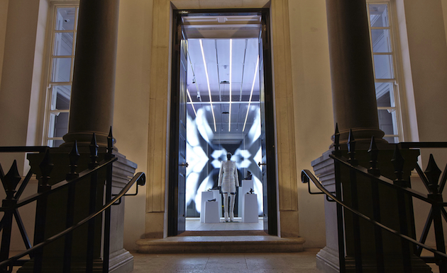
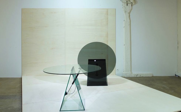
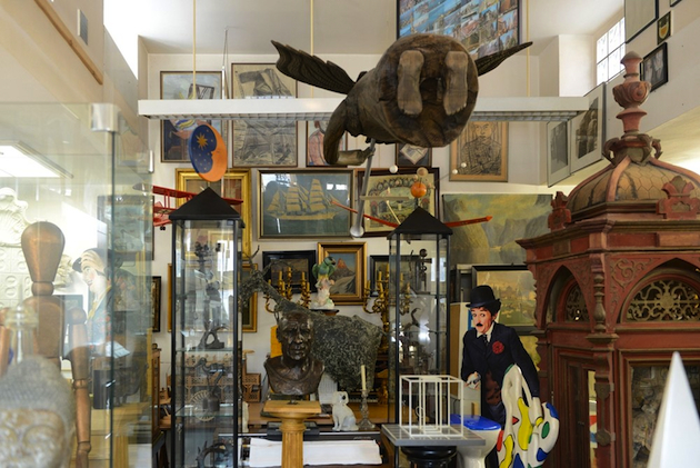
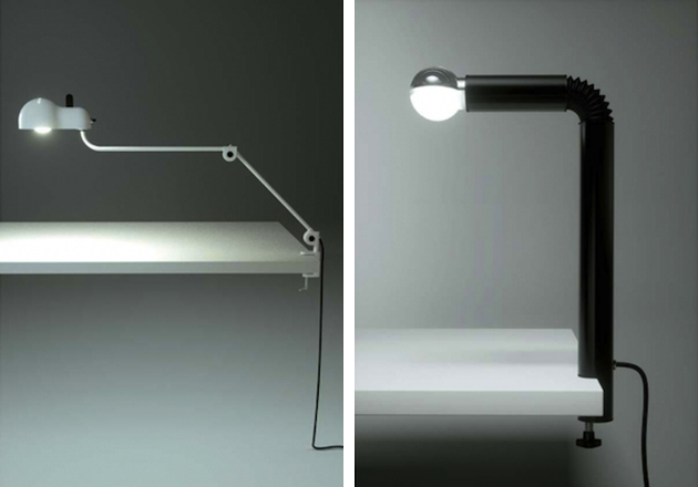
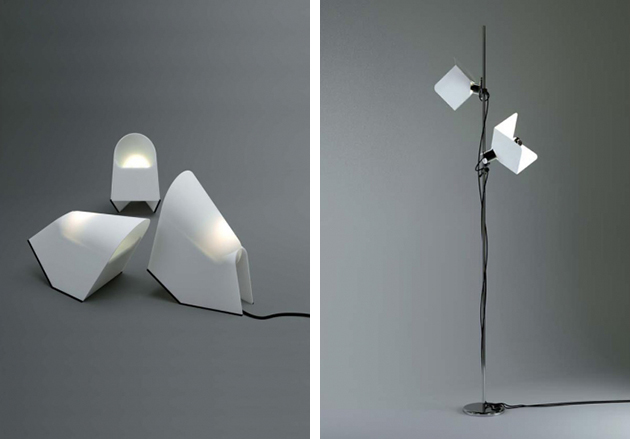
Re-editions in design are the new black. No matter if this happens because our times seem unable to express a new, totalitarian total look, or because they are enchanted by a reassuring, long-lasting vintage mania: in any case, an increasing number of companies – Molteni with Gio Ponti, e15 with Ferdinand Kramer, and Vitra with Jean Prouvé, just to mention a few – have been seduced by the idea of updating the past as an effective and desirable strategy for attracting new business niches. Lighting companies are not excluded from the fray. After Le Corbusier’s Projecteur 365 by Nemo Cassina, it is up to an Italian icon from the Maestri generation, Stilnovo, to officially unveil its upgrades with an exhibition at Galleria Carla Sozzani in Milan. Here the numerous, nostalgic public of this protagonist of the “bel design” has the chance to discover a new collection of re-editions and new prototypes finally gone into production after forty years.
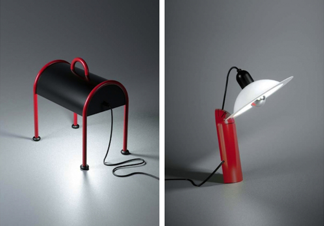
Founded in 1946 by Bruno Gatta, Stilnovo rose to prominence as one of the most successful Italian lighting companies of the post war period. In a time of great economic and social rebirth for the Belpaese, Stilnovo stood out with its search for a new bourgeois taste, both practical and sophisticated, and yet keen to experiment the ultimate technological innovations. After being confined to the realm of auction market for a long time, the company has been relaunched by two Italian entrepreneurs, Massimo Anselmi and Roberto Fiorato, who aim at protecting its great cultural heritage. A scientific committee, composed of design historians, sociologists and architects, has been established to enhance its industrial heritage and to lead its brand values to the XXI century. Stilnovo’s revival, thus, is not limited to a technical update but becomes – as the committee has written in the company’s manifesto – an “advanced laboratory and cultural stimulus: a facilitator of and testimony for Italian design around the world.”
This transformation, by no accident, reflects the very meaning of the company’s name. In the history of Italian literature, Dolce Stilnovo is the most prominent movement of XIII century, which refined the Italian “volgare” (the language spoken in the peninsula after Latin disappeared) transforming poetry into a sophisticated and symbolic linguistic expression. Thus, is Stilnovo the new “angelic woman”, a new model for inspiration and contemplation in the contemporary age? It is hard to say, but for sure its “sweet new style” – what the name literally means – represents a new inspiring protagonist for Made in Italy desirability.
Giulia Zappa – Images courtesy of Stilnovo 
Share: Facebook,  Twitter  
27/02/2015

London Fashion Week: New Talents from CSM

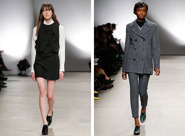
As every other year, during London Fashion Week, the Central Saint Martins graduate show represents the future of fashion. This year, the whole impression of the show was promising, but there are certainly four designers that stood out a bit in the young CSM niche.

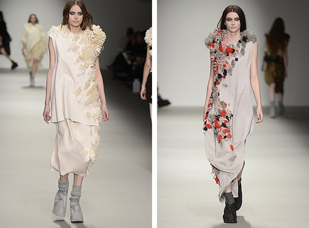
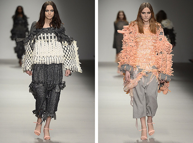
Hayley Grundmann showed exceptional technical knowledge when sending her graduation collection down the runway. By combining voluminous, knitted material with sleek and more anonymous fabrics, she created interesting silhouettes and shapes, that expresses the postmodern idea of combining different and unexpected influences into something new. Pieces like the grey sweatshirt with knitted details became a great reflection of this peculiar desire to be both included and stand out, all packaged within a beautiful collection.
Paul Thomson seemed to be influenced by the same ideas as Grundmann, since the mix of materials played an important role in his collection, as well. Instead of focusing on playing with different shapes, Thomson has mainly used the knitted fabrics as details to create patterns, play with finishes and draw attention to clean cuts. The result is a collection that feels both luxurious – with the sober color scheme and in the choice of fabrics – and in the same time cozy, thanks to the knitted fabrics. This impression is strengthened by the styling which is topped with grey knitted socks.

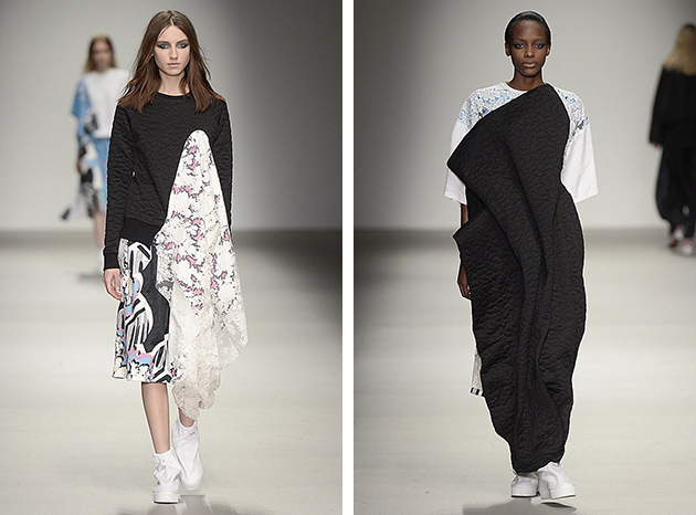
Catriona Mcauley-Boyle’s collection is colourful and experimental: it is obvious that she is not afraid of exploring or realising her design visions and that she does it without compromising. It is a refreshing collection that feels optimistic both in the amount of colour, combinations of patterns and the execution. We look forward to seeing what McAuley will be doing next.

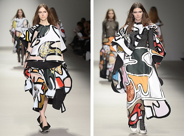
Beth Postle has drawn clear references to the art world in her graduation collection. The abstract patterns and the clean cuts are two elements repeated systematically throughout the collection. The art influences, nevertheless, do not feeling dated. Instead, Postle has taken them and transformed into contemporary mood, while, at the same time, adding her style to it. These are two aspects that we are interesting in seeing developed in her future designs.

Hanna Cronsjö 
Share: Facebook,  Twitter  
26/02/2015

Plastic Army: Gareth Pugh at Galeria Melissa in London

Many times we have heard about fashion as an instrument to face the day, to win everyday challenges, to master all kinds of situations. So, it is not hard to believe that many designers have reflected upon the theme of the armour, declining it into their personal aesthetics and offering to their audience always different proposals; be it typically western or with a deep oriental taste, historically-inspired or conceptual, the design of these armours often deals more with the sensibility and attitude of the person who designs it than to the requests of the market.

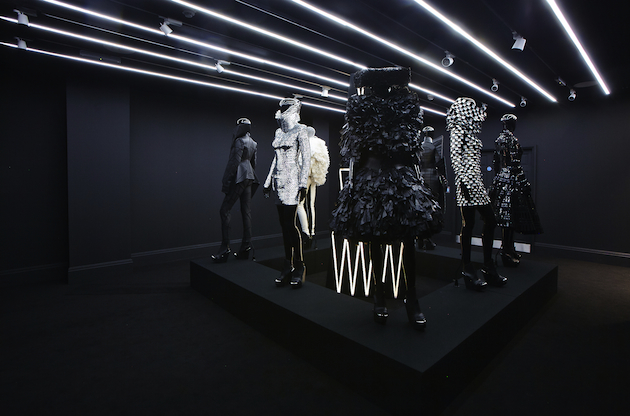
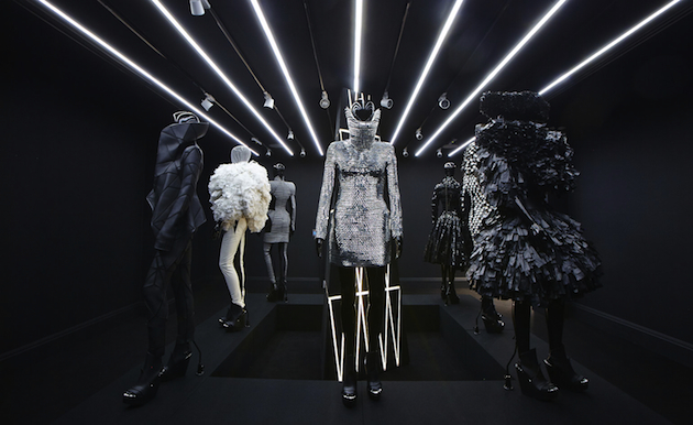
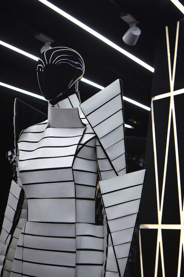
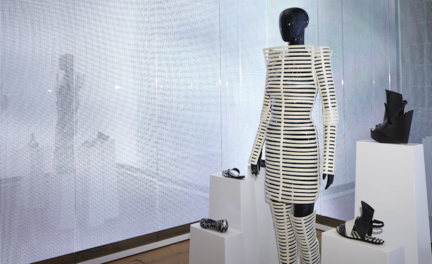
Since starting his label ten years ago, Gareth Pugh decided to work in order to shape his own ideal armour, ‘modern’ as he himself defines it. An ideal made of all the recurrent elements of his designs: repetitive, almost obsessive patterns, geometrical and neat cuts, impossible volumes and materials unusual for fashion. Gareth Pugh stated that plastic is the medium of expression for his armours, and now his army is being deployed. Indeed, an exhibition in London is showcasing the results of this verdict, celebrating the bond between Pugh’s designs and the possibilities of plastic as a malleable – and wearable – material.

Held at Galeria Melissa in London, the exhibition celebrates the 10th anniversary of the brand and the collaboration between Pugh and the Brazilian shoe brand Melissa. The selection of clothes, or better, the manipule is very small – from six to eight dresses, all paired with shoes the designer has created in collaboration with the Brazilian brand, which started in 2008 – but it well exemplifies the themes Pugh has most explored in his practice. It is hard though to call it a retrospective; it is more a glance at Pugh’s own world of references, inspirations, manias developed during the years of his creative activity – of course, in plastic.

The recovery of the past seems to be at the basis of this exhibition, as well as of the decision to go back to show his collection in London, the city that formed him professionally and hosts his ‘creative family’. Moreover, ten years may seem a small amount of time but, fashion-wise speaking, are perfect to establish an image and send a clear message: in few words, to place steady roots. It is then interesting that Pugh went back to the roots and reflected upon his archive, isolating subjects and opposed forces in his works; all the elements that have merged into these armours on display, so fierce, forceful and fascinating, that he has shaped them as the core of his army.

Marta Franceschini – Images courtesy of Galeria Melissa 
Share: Facebook,  Twitter  
25/02/2015

Window-Shopping through the Iron Curtain

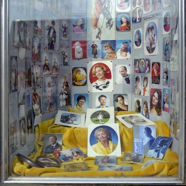
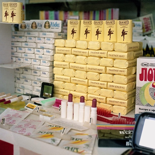
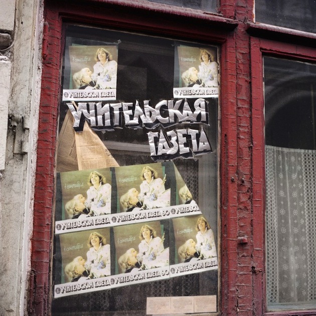
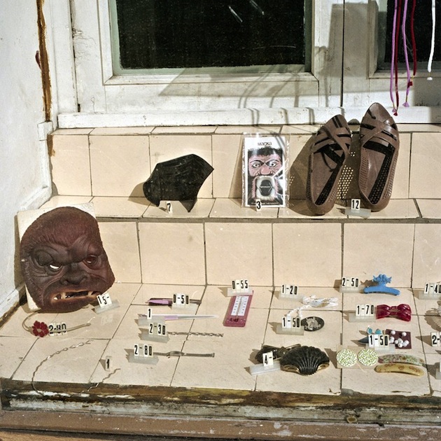
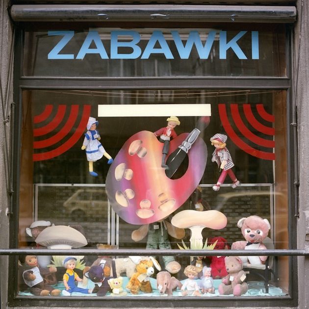
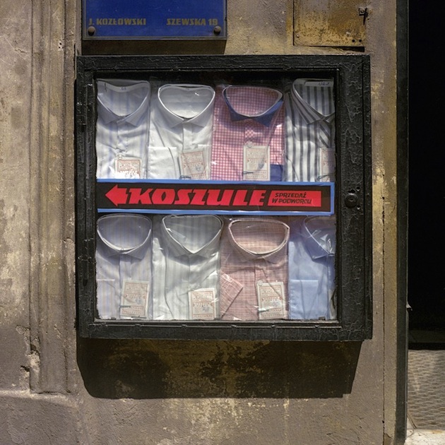
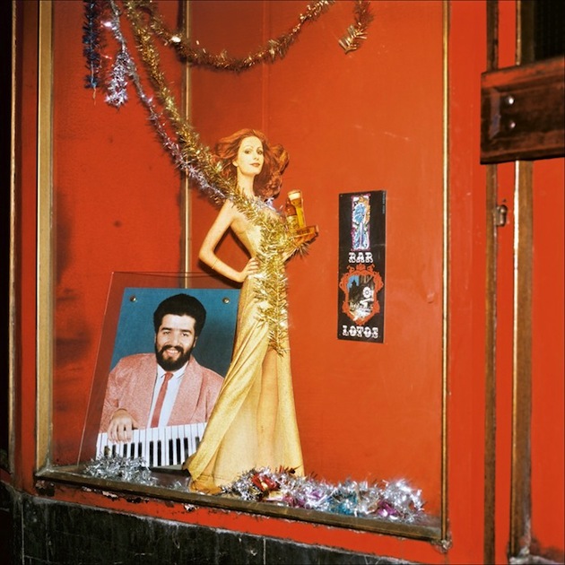
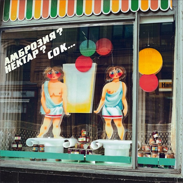
Window-Shopping through the Iron Curtain is an upcoming book, published by Thames and Hudson, that presents a selection of more than 100 images of shop windows shot by David Hlynsky during four trips taken between 1986 and 1990 to Poland, Czechoslovakia, Hungary, Yugoslavia, Bulgaria, East Germany, and Moscow. Using a Hasselblad camera, Hlynsky captured the slow, routine moments of daily life on the streets and in the shop windows of crumbling Communist countries. The resulting images could be still-lifes representing the intersection of a Communist ideology and a consumerist, Capitalist tool—the shop window—with the consumer stuck in the middle. Devoid of overt branding or calculated seduction, the shop windows were typically adorned with traditional yet incongruous symbols of cheer: homey lace curtains, paper flowers, painted butterflies, and pictures of happy children. Some windows were humble in their simple offerings of loaves and tinned fishes; others were zanily artistic, as in the modular display of military shirts in a Moscow storefront; and some illustrated intense professional pride, such as a sign in a Prague beauty salon depicting a pedicurist smiling fiendishly over an imperfect sole.

The Blogazine – Images courtesy of Thames and Hudson 
Share: Facebook,  Twitter  
24/02/2015

London Fashion Week: Three Dashing Trends

“Go where we may, rest where we will, Eternal London haunts us still.”, is a quote borrowed from Thomas Moore that seems fitting for days following London Fashion Week. Below are some of the high points caught on the city’s runways that will probably ‘haunt’ us for the upcoming year.

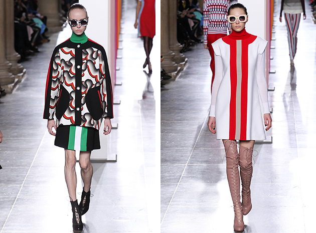
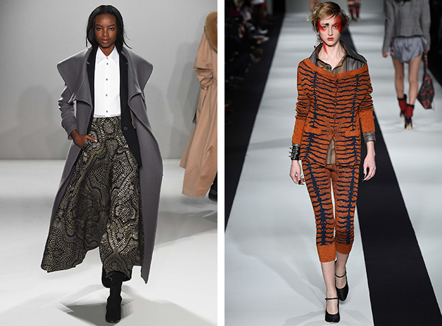
Flashbacks: Walking down the memory lane is an important framework for fashion in any era, as it moves from point A to B. Several of the designers presented collections reminiscent of past decades, yet echoing the zeitgeist of 2015. At Jonathan Saunders, 1960s mod and an excellent mix of patterns was displayed. Temperley London proved a master at the glamour era of the 1970s. Long flowy dresses, kaftans and coats in sequins and tribal patterns brought comfortable elegance, as feminine pieces were updated with a dash of masculinity, in a perfect balance between his and hers. Vivienne Westwood Red Label showed, on the other hand, that the 1980s power dressing can still be relevant today, even without looking too much like an extra from Working Girl.

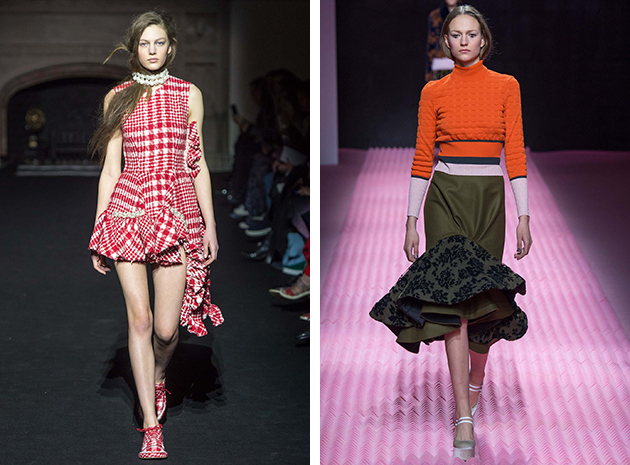
Ruffled Feathers: Mary Katrantzou added a flamenco-style ruffle to the bottom of many of her skirts. It was a frill that might seem trivial, but that made the look more voluminous and in control: a sort of a power dress for the 21st century. A mini version of this skirt could be found at Simone Rocha, but with the change of material with something a bit more regal and English.

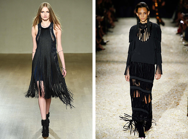
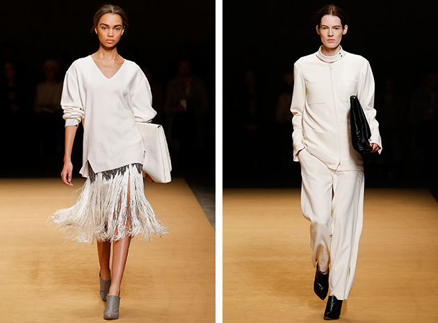
Fringe Affair: At Issa, the fringe became part of several looks creating an interesting juxtaposition of old and new. It added flair to coats and movement to formfitting dresses without giving up on urban elegance. Tom Ford used the layered fringe effect in both light and dark dresses mimicking a modern take on the Western-style. Even though the fringe is no stranger to the runways, both Issa and Tom Ford added playfulness to the mix keeping the pieces alive.

Victoria Edman 
Share: Facebook,  Twitter  
23/02/2015

Style Suggestions: Sports Inspired

Sports proved to be the big theme this season, with the upgrade of tracksuit pants leading the runways. What was once a humble sports attire is now getting a stylish makeover and is worn outside of gyms.

Jacket: Saint Laurent, T-shirt: President’s, Backpack: Freitag, Shoes: Acne

Styling by Vanessa Cocchiaro 

Share: Facebook,  Twitter  
23/02/2015

Designs of the Year 2015

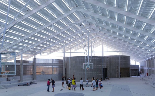
For the eighth year in a row, the Design Museum in London has revealed 76 projects for its “Designs of the Year” award. From architecture to digital design, the projects included range from socially responsible, environmental systems like “The Ocean Cleanup” or “Air-Purifying Billboard” to monumental buildings such as Frank Ghery’s Foundation Louis Vuitton or Herzog & de Meuron’s gymnasium in Brazil. Divided into 6 disciplinary categories – architecture, digital, fashion, graphics, transport and product – the shortlisted projects were chosen by the Design Museum’s team among 200 nominations put forward by industry experts. Commenting on the breadth of the award and its accompanying exhibition, the curator Gemma Curtin explains: “We want to show the whole spectrum. For every huge designer they started off as a smaller, new person on the block with a great idea or a new technique or vision. I think when we whittled down these selections to what we have in the exhibition, it was to give an inspiring and innovative showcase of design.”

Perhaps as any other award, Designs of the Year is known for its controversial choices which, in the past, divided both critics and professionals. Most notably, last year’s overall winner, Zaha Hadid’s Heydar Aliyev Center in Baku, Azerbaijan, was widely criticized for its reluctance to engage with the context within which it was commissioned, designed, built and is now used. Awarding the top prize to Hadid meant that Designs of the Year had somewhat departed from its previous dedication to ‘design for the greater good’. As Patrick Burgoyne wrote in his review of the last year’s awards, “Briefing for the nominees was always somewhat, er, brief with an admirable degree of trust bestowed on nominators to come up with appropriate suggestions. […] Whether by accident or (sorry) design, it has carved out a position for itself with successive winners rooted in social causes or design for the public good. […] The emphasis was on the aspirational: design as we may like it to be rather than as it is for the majority of practitioners.”

Read through this lens, it is easy to understand why Designs of the Year often brings together such diametrically oposed projects. To emphasise this eclectic approach, Curtin has decided to arrange this year’s selection around loose themes in order to reflect the way these projects would be perceived in everyday life – where each element of the artificial landscape shapes relations and connections to other objects that surround it. “I think there are actually great similarities between some projects in their intent, if not in what they are trying to do. Obviously a magazine that comes out twice a year is very different to a piece of architecture that may have taken ten years from idea to finished building. But, I think that some of the processes, some of the intentions, some of the desires, unify these projects”, Curtin says. In fact, this curatorial choice is a step forward in reflecting how design is experienced today. Nevertheless, it poses a question as to how such a juxtaposition might contribute to the understanding of meaning, context and significance of each of the selected projects. In fact, can we even speak of a design of the year today?

Rujana Rebernjak – Images courtesy of the Design Museum 
Share: Facebook,  Twitter  
20/02/2015

New York Fashion Week: Four Upcoming Designers

New York Fashion Week has officially turned off its spotlights and sent all the greedy style-hoarders home. Reflecting on the week’s hottest highlights, here is our selection of four bright new stars.

Sally LaPointe, born in Massachusetts and now based in New York, is a name to remember. The young designer already counts celebrities such as Katy Perry, Kim Kardashian and Emily Blunt among her fans, as she made a name for herself with a minimalist aesthetic and distinct cuts. Her collections are both designed and produced in New York, which contributes to make them modern on another level, giving locally produced pieces a new meaning. Her latest collection proposes well-designed pieces for the woman of today, with the purpose of making her look both edgy and chic.

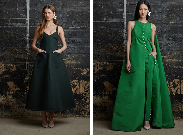
Rosie Assoulin began her design career at the age of thirteen, experimenting with her grandmother’s sewing machine and exploring different patterns, textures and styles. Several years later, after a brief time at Fashion Institute of Technology and working under childhood idols such as Oscar de la Renta and Alber Elbaz, she has become one of New York’s most talked about young designers. She developed her design expression into a mix of what can be best described as ‘evening meets everyday’. In tune with trends seen this year, this approach is a reflection on the postmodern society and the ever-changing definitions and identities of our daily lives. This combination results in feminine, wearable and fresh pieces that speak to a wide range of modern women.

Creatures of the Wind was founded in 2008, by Shane Gabier and Christopher Peters. Their first collection was born in Chicago, but New York is now the home of both the brand’s production and distribution. Their aim is to combine influences from subcultures, mythological themes, and youth culture. Their A/W 2015 collection is as strong as previous ones, as they mix traditional pieces with more playful details, such as colourful patterns and interesting cuts.

Daniel Silverstain, is an Israeli designer, now based in New York, who works with the aim of uniting fashion, art and architecture in his designs. Silverstain’s pieces come from a futuristic point of view where innovation and minimalism are essential. He explores high-tech materials and uses them to create unique shapes and finishes. The combination of industrialism, innovative materials and creating pieces that are comfortable and made for being worn feels right in time, and so does his latest collection. The metallic color palette and simplified shapes are reflect his design philosophy, as it connects art to its neighboring disciplines.

Hanna Cronsjö 
Share: Facebook,  Twitter  
19/02/2015

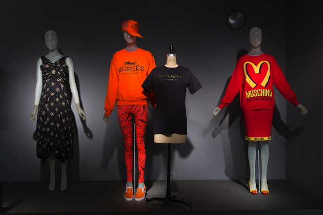
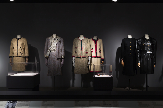
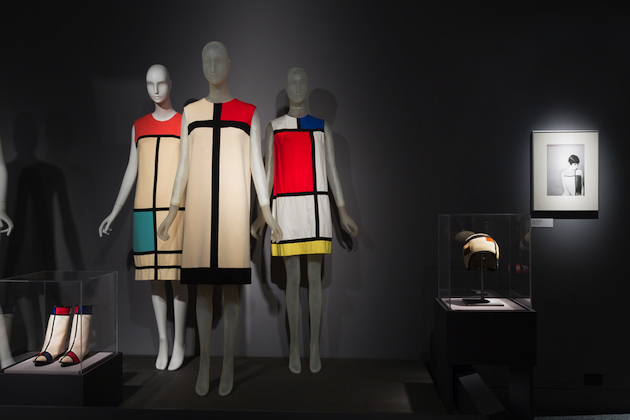
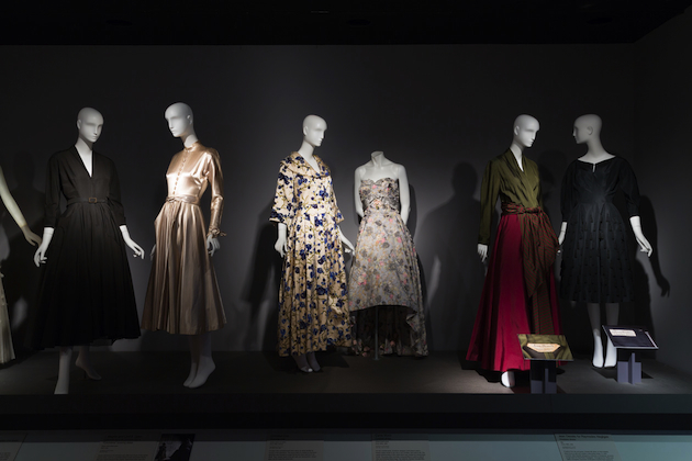
Faking It: Originals, Copies, and Counterfeits at FIT Museum

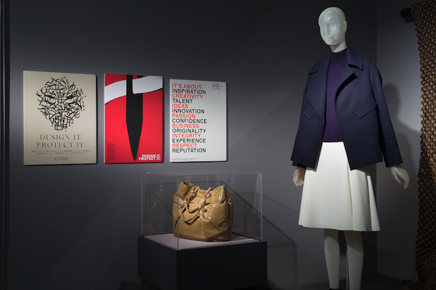
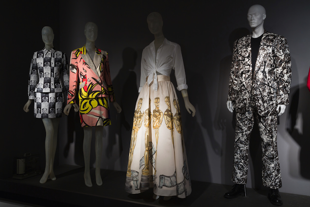
At the beginning of century, fashion was considered as an elite world, a small niche only open for the lucky few. Back then, plagiarism was taken very seriously, not that today is not, yet with the growth of fast fashion the boundaries of authenticity are becoming weaker. Faking It: Originals, Copies, and Counterfeits aims to investigate the dynamic behind this process of creation, authenticity and violation of creative rights. An exhibition hosted by FIT in New York City, traces crucial moments in history of fashion and their relationship to the process of copying.

From the comparison of an original 1966 suit by Gabrielle “Coco” Chanel to its perfect reproduction, the show underlines the thin line between what is legal and what is not. Madeleine Vionnet, on the other hand, tried different initiatives to stop the production knock off her designs; she even marked her label with a thumbprint to authenticate each creation she produced. Phenomena like the 1947 Christian Dior collection became so viral that everyone wanted such a piece of clothing, resulting in a big amount of unauthorized copies being sold all around the planet.

Structured around comparison and a specific time path, Faking it: Originals, Copies and Counterfeits brings to life and sheds historical perspective on one of fashion’s most urgent issues today. The exhibition will remain on show through April 25th 2015.

Francesca Crippa – Images courtesy of FIT 
Share: Facebook,  Twitter  
19/02/2015

Daily Tips: Collecting Obsessions

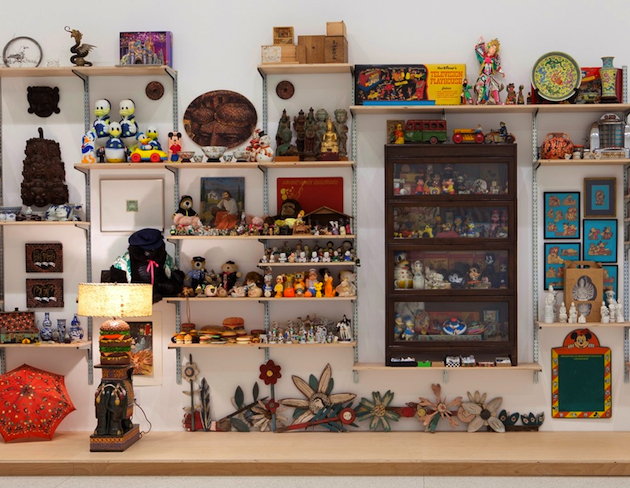
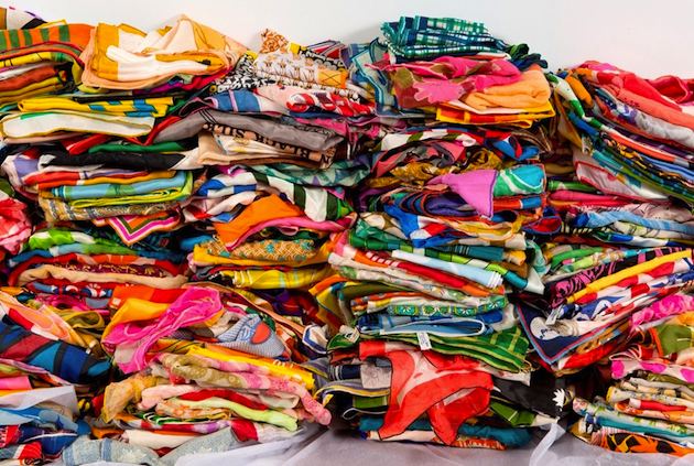
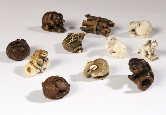
When last Spring Martino Gamper set up his vision of design as a ‘state of mind’ at the Serpentine Sackler Gallery, he invited a number of designer friends to exhibit their personal collections of objects. While the entire show focussed on design of bookshelves, they were examined in an unexpected way – as a sort of a metaphysical objects, a place where ideas, memories and recollections are collected together. A new show, now open at the Barbican in London, disregards the physical space where collections are stored – boxes, bookshelves, rooms, cellars – and focusses on the concept itself. Here, you have Damien Hirst’s skulls and tropical birds, Peter Blake’s enamel elephants and toys, Edmund de Waal’s Netsuke figurines, or Andy Warhol’s cookie jars. “Magnificent Obsessions: The Artist as Collector”, running through May 25th 2015, wishes to propose a new reading of artists’ work through, perhaps, one of the most revealing aspects of their everyday lives – their personal collecting compulsions.

The Blogazine 
Share: Facebook,  Twitter