28/11/2014

Iris van Herpen: When Fashion Meets Technology

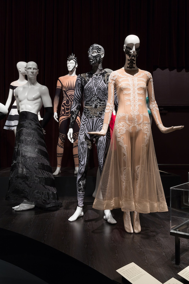
A first look at Iris van Herpen’s work might leave you overwhelmed: at the crossroads between fashion, art, sculpture and technology, her work doesn’t fit comfortably within traditional cannons of neither one of these fields. What is, then, the meaning of van Herpen’s work? Should her technically sophisticated and formally sculptured garments push the boundaries of art, fashion or technology? A recent exhibition at Design Museum Holon tries to present a possible answer to this question by presenting an extensive exhibition of Iris van Herpen’s collections.
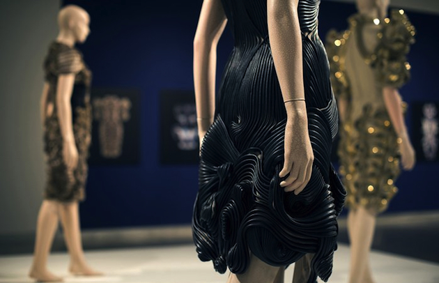
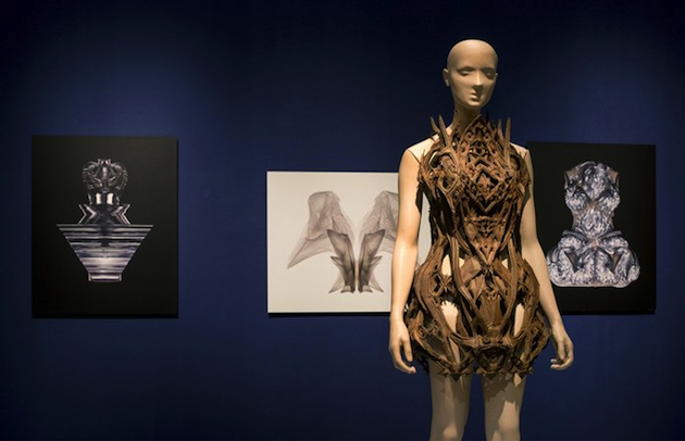
Iris van Herpen studied fashion at ArtEZ Institute of the Arts before undertaking an internship at Alexander McQueen. It is possible that McQueen’s radical approach built the foundation for setting up her future approach to fashion through her own label, created in 2007. Iris van Herpen’s design aesthetics is characterized by a mix of organic and futuristic elements which are used to build her unique and sculptural pieces. Her focus is primarily on the appearance and technical innovation rather than wearability and everyday use, pushing the boundaries of what fashion design can really mean. In a continuous dualistic dialogue between natural and artificial, past and present, van Herpen mixes together 3D printing and traditional crafts in order to convey the evolving nature of her projects. Van Herpen is a conceptual designer whose collection arise from a deeper vision of what clothes might mean today: an obvious example is her Radiation Invasion collection which communicates the extensive use of invisible radiation and signals that surround us, making telecommunication possible.
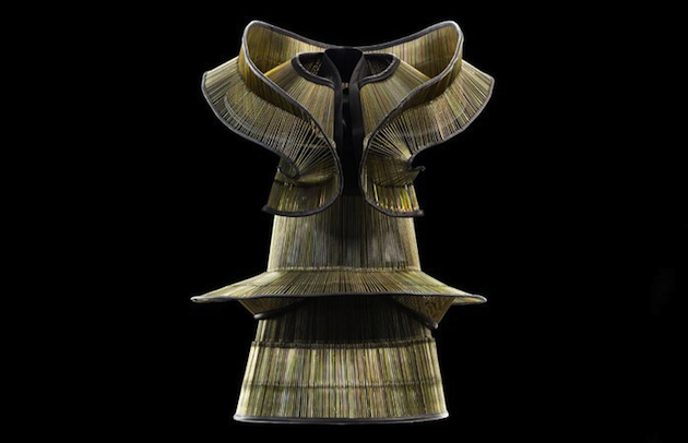
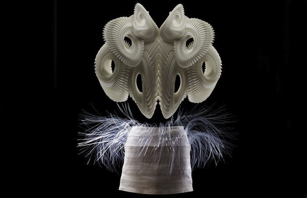
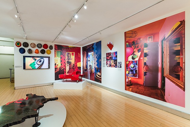
A true contemporary designer, set in-between tradition and modernity, Iris van Herpen is the protagonist of a new exhibition at the Design Museum Holon. Organized in collaboration with the Groninger Museum, the exhibitions features pieces from its rich collection, proposing a reading of van Herpen’s pieces through their sculptural and conceptual qualities that stimulate further reflection on the phenomenon of fashion. The exhibition will run until March 7th 2015.
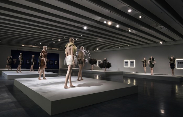
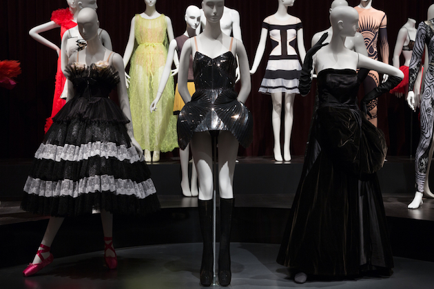
Hanna Cronsjö – Images courtesy of Design Museum Holon 
Share: Facebook,  Twitter  
27/11/2014

The Dancing Meaning of Fashion

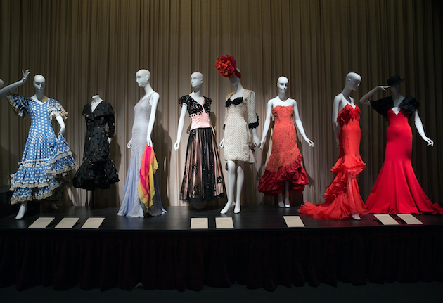
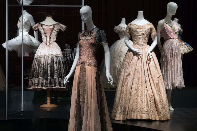
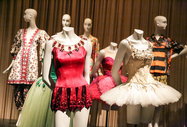
Kate Vaughan, twirling with her skirt made of 100 yard of fabric; Loie Fuller and her Serpentine dance, based on the effects of light on the gauze fabric of her dress; Josephine Baker shaking her frayed, sparkling dress doing Charleston on stage: history of fashion offers many examples of how tight is the bond between dance and fashion. The Fashion Institute of Technology in New York puts this tie on stage with an exhibition that celebrates the contacts between these two creative forms. Curated by Valerie Steele, “Dance and Fashion” features nearly 100 pieces that range between dance costumes and fashion designs inspired by dance, that reconstruct a path of institutional and revolutionary dance from 1930 to now, told through a physical exhibition path designed by the architect Kim Ackert.

The exhibition starts with ballet costumes from the romantic ballet era, paired with fashion designs from around 1830-40; followed by oriental pieces from the iconic Ballet Russes, which began to influence designers since their arrival in Europe in 1909, charming fashion personalities from Paul Poiret at the beginning of the century, to Yves Saint Laurent, who dedicated an entire collection to the Ballet Russes in 1976; collaborations between dance institutions and fashion designers are also displayed, with pieces form Valentino, Riccardo Tisci, Isaac Mizrah, Prabal Gurung, Olivier Theyskens, to name a few; the modern dance section reflects mainly on the collaboration between Halston and Martha Graham, one of the pioneers of modern dance, but also includes pieces from collaborations between Merce Cunningham and Rei Kawakubo; flamenco is celebrated too, and even some of Rick Owens’ designs from S/S 2014, inspired by American ‘Vicious’ step dancers.

When talking about the concept of the exhibition, Steel refers to both fashion and dance as ‘embodied arts’, and the choice of this precise word is in no way random: it brings all back to the materiality of the body, which is at once a real body and the image of a fictitious character. By placing together these two disciplines, the exhibition puts the lights on a third one, directly spawned from the other two: costume design for ballet and dance in general. Costume design for dance deals with many issues: not only is it about studying a personality, but it has the added task of making the character communicate by enhancing the movements of the body through clothes; designing a costume for the stage is a way to make a character who’s dancing, talk. This exhibition gives the chance to examine dance ensembles in a way that is impossible when they are on the stage: to appreciate the seams and embroidery, the details and the manufacture in the complete stillness of a mannequin.

But, by taking the clothes off of the context they were designed to fit in, and were supposed to be seen and then understood, runs the risk of loosing the reasons of their particular design. While dance is alleged as the real protagonist, the exhibition is actually more about fashion than dance itself, and works perfectly with the fashion designs, but less with the costumes: it negates movement, and thus the very meaning of dance: admiring the clothes, beautiful and dreamy as they are, we consider all of them as ‘simply’ fashion designs, while we can only guess their real essence.
The significance of a garment, or in this case, a costume, is tied not to dance in the wider sense, but to a specific kind of dance, be it ballet, traditional, modern or post modern dance; therefore, it relates to a specific kind of movement, which cannot be frozen and displayed in a museum, but has sense only when alive, on a well-lighted stage, displaying its power through performance. The exhibition will remain on show until January 3rd 2015 at FIT in New York.

Marta Franceschini 
Share: Facebook,  Twitter  
27/11/2014

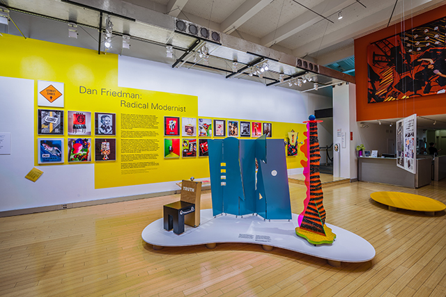
Dan Friedman: Radical Modernist

In a playful personal text written for Dan Friedman’s 1994 book “Radical Modernism”, Alessandro Mendini writes: “It was after visiting his house (this wonderfully coherent integration of design and life) in 1986, with Pierre Restany, that I made up my mind to consider Dan Friedman ‘one of my masters’. I have very few masters and I don’t like having them, but when I do come across one, I want him or her to be much older than me (Kandinsky, Legér) or much younger (…for instance, Friedman). Masters serve this purpose: to be envied and imitated. What I envy Dan is his highly coherent merging of art and life.” For Friedman, it was precisely a significant shift in life that brought about his most revealing work, and it was an equally meaningful change in his approach to work that altered the course of his life.

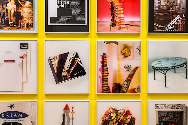
Dan Friedman (1945-1995) studied graphic design at Carnegie Mellon, followed by a study fellowship in Europe, first at Ulm, until its closure in 1968, and later in Basel. It was Basel’s design school, with its prominent teachers Armin Hofmann and Wolfgang Weingart, that introduced Friedman to Modernism and its rigid rules, which he would subsequently push to the limits and subvert. Upon his return to the United States, Friedman started teaching at Yale, a career he would pursue until 1974, the year he moved to New York to start working in commercial graphics. After working at Pentagram on complex corporate projects – the most notable of which is surely the identity of CiticorpFriedman’s firm belief in Modernism’s ethical values and ideological framework lead him to abandon the professional design sphere.

It was Friedman’s refusal to accept the exploitation of Modernist visual codes within the commercial sphere that brought the most profound change in his life and work. In the second half of the 70s, Friedman changed everything. “He shaved his head, purged his body with a macrobiotic diet, openly embraced a homosexual lifestyle and joined the downtown art scene,” wrote his friend and colleague Chris Pullman, explaining how this radical shift in lifestyle, ultimately led to Friedman’s new approach to design: “In just a few years Dan had made good on his personal vow to experience a whole new side of culture, one which he found full of energy, fantasy and optimism. […] In the end, as a student, a teacher, a designer and an artist, what set Dan apart, and accounts for his amazingly diverse but coherent body of work, is that Dan pursed an approach not a style.”

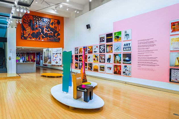
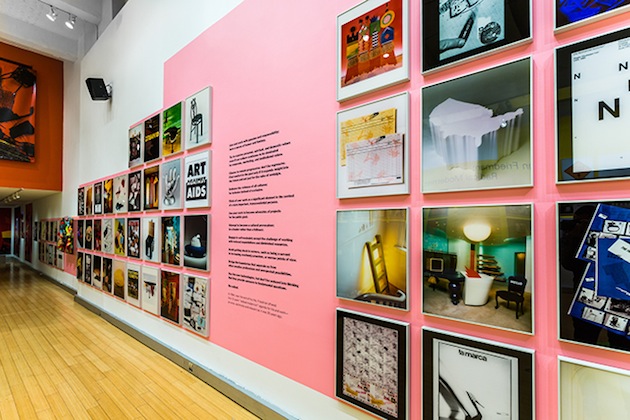
Borrowing the title from his book, AIGA, the professional association for design, celebrates Friedman’s work with an exhibition titled “Dan Friedman: Radical Modernist”. Curated by Chris Pullman, the exhibition traces Friedman’s vibrant work, from academia to corporate culture, from experimental art projects to his ever-evolving laboratory and home. “Dan Friedman: Radical Modernist” runs until January 9th 2015 at AIGA Design Center in New York.

Rujana Rebernjak 
Share: Facebook,  Twitter  
26/11/2014

Fashion in Motion: Sibling

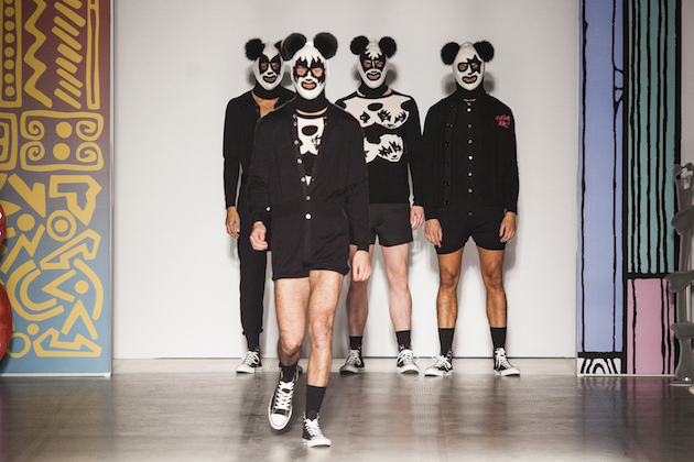
The brief moment of “fashion” seen in its most true and authentic sense – meaning, that concentrated blow of novelty and creativity that will come to fuel trends and many other fashion moments – is precisely the most ephemeral of all “fashion moments”: the fashion show. The live fashion series Fashion in Motion at the V&A Museum in London introduces the pleasure of high fashion runway to a larger audience. It originally started in 1999 with a showcase of Alexander McQueen’s Spring/Summer collection, followed by a long stream of designers – from Yohji Yamamoto to Erdem Moralioglu, from Roksanda Ilincic to Christian Lacroix – the last of which was last friday’s showcase of London-based, knitwear-obsessed brand Sibling.

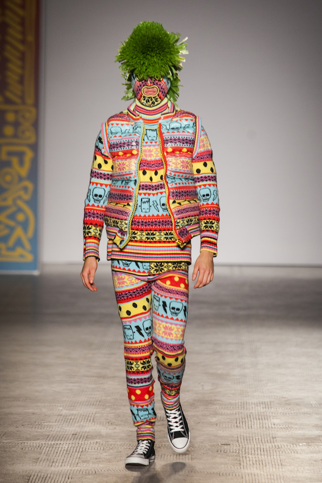
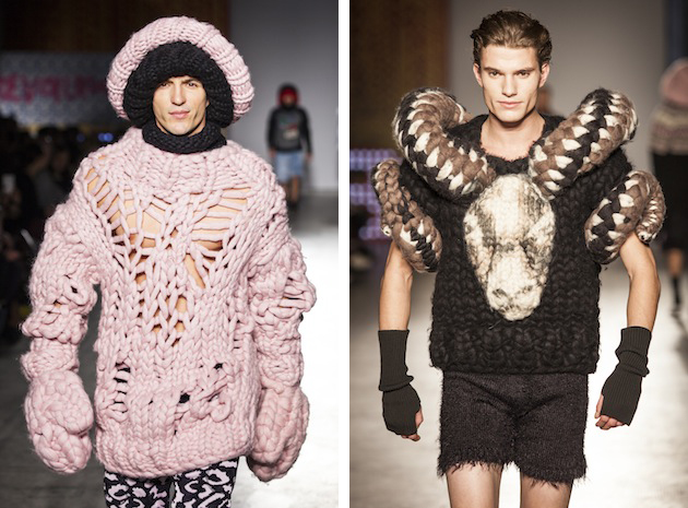
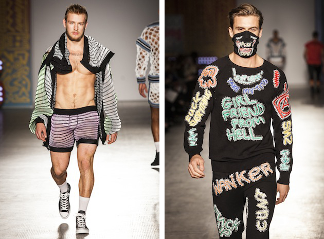
Sibling was founded in 2008 by Joe Bates, Sidney Bryan and Cozette McCreery. As individual designers they had previously worked with fashion houses such as Alexander McQueen and Lanvin. The foundation of Sibling was, therefore, set for the trio’s fashionable progression. The brand had its first fashion showcase in 2009, sponsored by Newgen Men. Finding inspiration from a vast range of sources, everything in Sibling’s surroundings, from their everyday life in London to youth tribes and photography, ignites a vision and guides their creation. It is easy to understand how Sibling’s signature style, which mixes color and glamourous knitwear with eccentric playfulness, might result from such a varied world of references. The label’s unexpected designs continually propose a new spin on knitwear, presenting it in many different forms and shapes, from basic menswear pieces to knitted denim jackets and decorated leopard twinsets.

During the retrospective runway show staged at the V&A, one could spot different showstoppers from the brand’s past collections as Sibling brought back some of their favorite looks from past seasons. In the iconic Raphael Gallery of Victoria and Albert museum buff male models strutted energetically down the runway smiling, laughing and even high-fiving to the beats of pop music. The show perfectly captured the essence of the label, creating a lively and colorful show that mimics the brand’s true colors as an iconic ‘playful rebel’.

Victoria Edman – Images courtesy of the V&A 
Share: Facebook,  Twitter  
26/11/2014

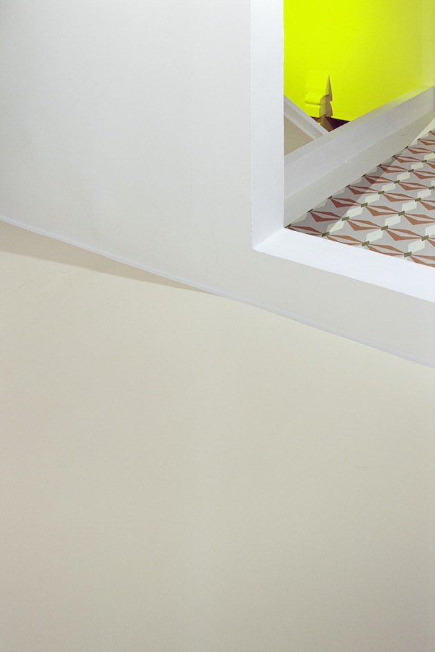
Through the Lens of Andrea Grützner

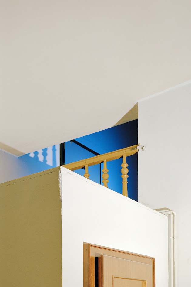
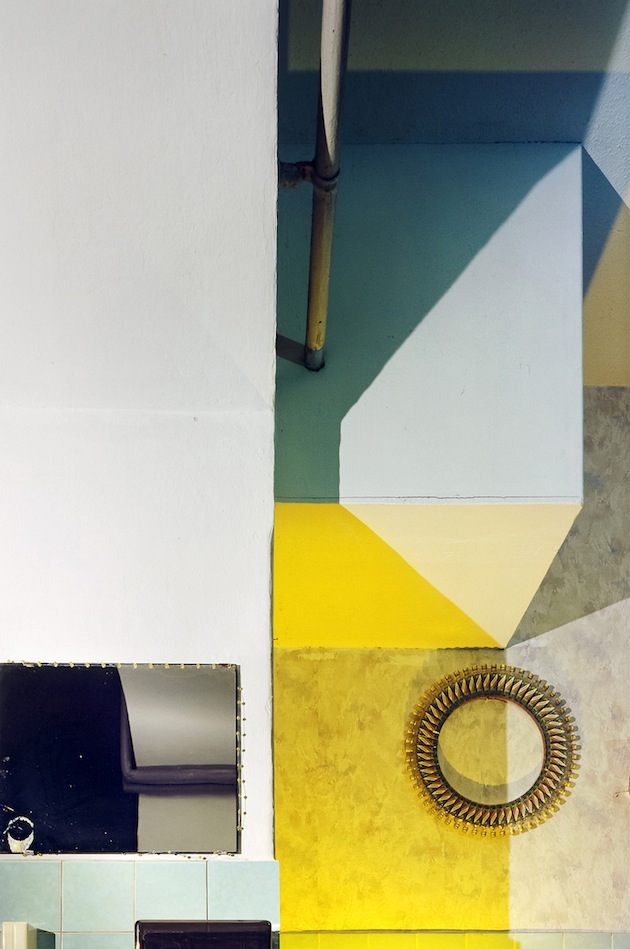
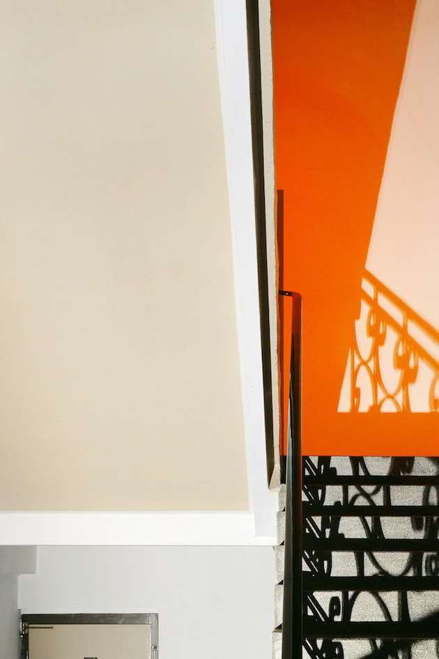
Images courtesy of Andrea Grützner
 
Share: Facebook,  Twitter  
25/11/2014

Vests for Late Autumn

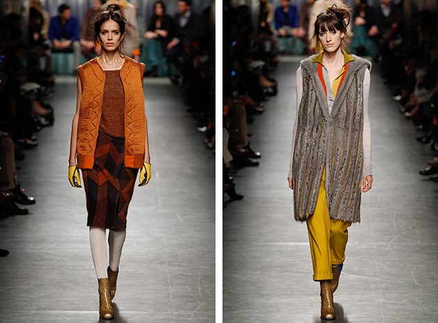
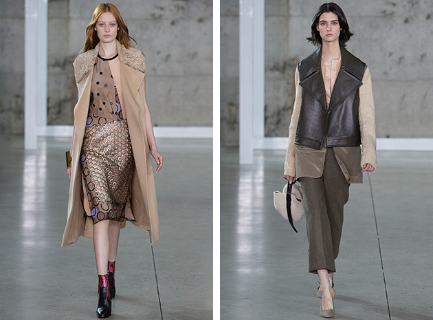
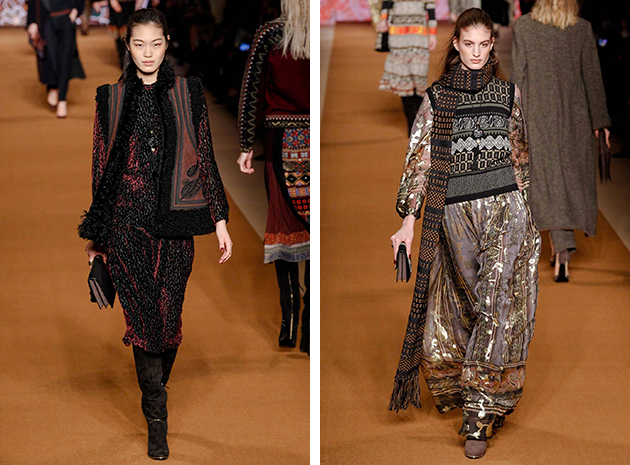
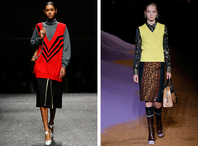
The term vest derives from the Latin word “vestis”, which, originally, referred to a completely different type of clothing from a sleeveless coat, wool V neck sweater or even the traditional garment men wear under their suits, designated today with the term. And yet, the vest, has a long standing tradition as a typical menswear cloth, first popularized by King Charles II of England. Today, the vest remains one of the most popular items on the autumn runways, designed as much for women as for men.

On Milan’s catwalks we saw it in various versions: the ones by Missoni were fluffy and long, short and padded, rendered in a warm and autumnal palette for an interesting twist. Definitely less romantic and more urban, were the ones designed by Reed Krakoff. From small to bigger silhouettes, the approach remains the same: easy yet refined. Etro, instead, has decided to play with shearling for a short, but completely decorated result. For a second version, Etro chose wool, rendered in a retro mountain pattern and styled with cool long skirts. Prada took a similar path, with an extra large version of a mannish vest, proposed in different variations for Miu Miu Resort 2015 and even for Prada SS 2015.
Francesca Crippa 
Share: Facebook,  Twitter  
24/11/2014

Style Suggestions: Singing in the Rain

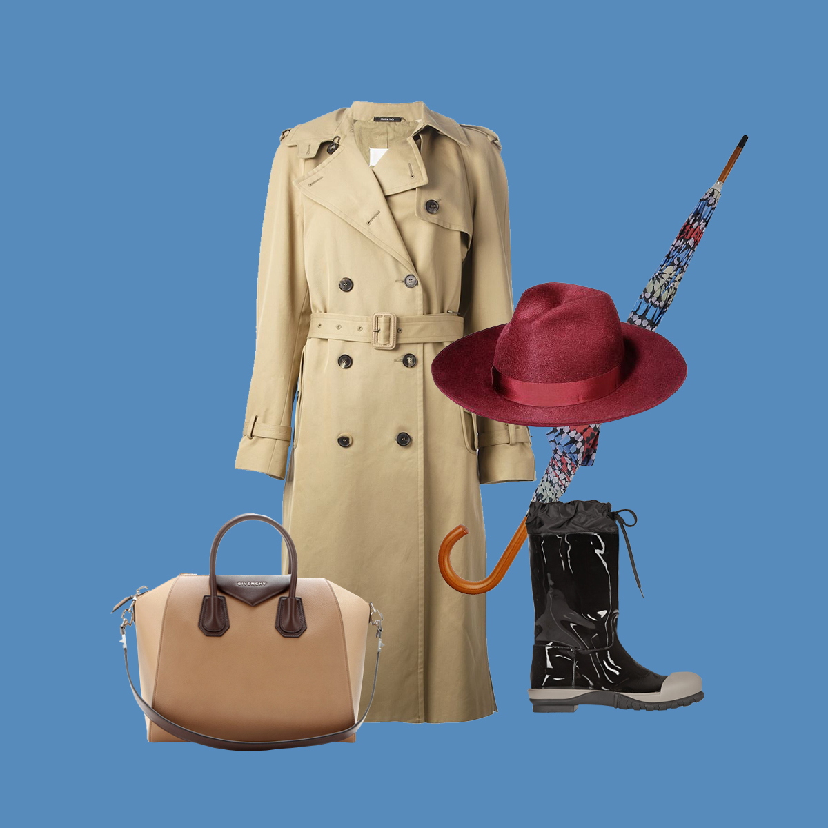
The long season of rain and cold is ahead of us, yet you don’t have to fear the gloomy weather if you learn to pick the right accessories. An elegant trench coat and a pair of cool rain boots should be matched with a classy hat and a colorful umbrella for a perfect rainy-day rhapsody.

Trench coat: Maison Martin Margiela, Hat: Super Duper, Bag: Givenchy, Boots: Miu Miu, Umbrella: Borsalino

Styling by Vanessa Cocchiaro 

Share: Facebook,  Twitter  
24/11/2014

Cecily Brown | The Rule Of Paint As Flesh

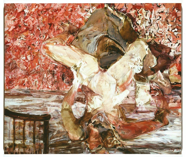
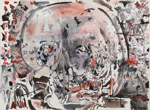
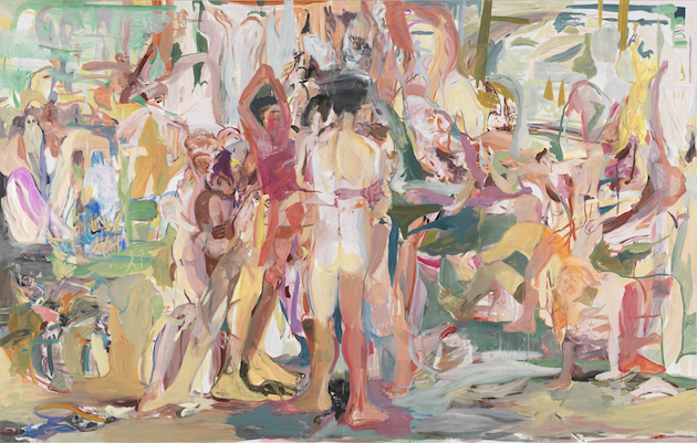
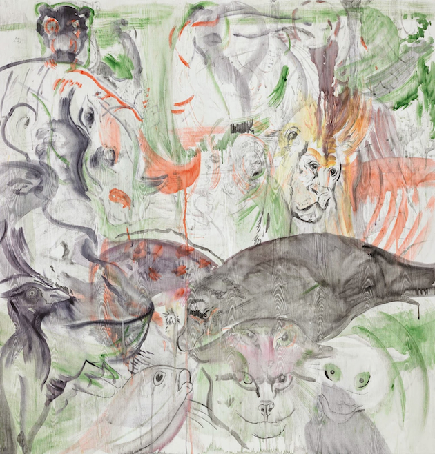
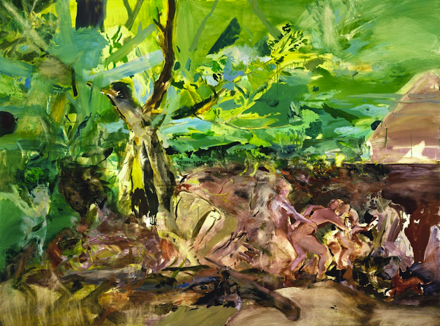
Cecily Brown (b. 1969, London) holds a place of honour among contemporary artists who work with painting, contributing to its continuous rebirth and experimentation. Praised in different cultural environments and able to get great market quotations – tough job for woman, even today –, Brown is an extremely expressive painter whose work is characterised by an intense chromatic language, mid-way between abstraction and figuration. Dialoguing with the history of painting, the English artist creates tangled compositions where distinctly identifiable and loosely outlined human figures sink and emerge from a chaotic, physical background. The distorted naked bodies with their fleeting nature and the overall structures reveal the influence of several artistic experiences, from Lucian Freud and Francis Bacon to Willem de Kooning, El Greco or the Impressionists, giving life to a piercing, gestural and layered painting. Brown’s wild, animal-like dimension is both suffering and joyful, there is no space for romanticism, while sexuality and eroticism prevail in most of her works. Sex and death are connected in acts of orgiastic pleasure, carnivals where rude and sharp emotions seem to carry on and enhance the “De Kooningesque” rule of paint as flesh.

For those keen on deepening their knowledge of Cecily Brown’s work, GAM – Civic gallery of modern and contemporary arts in Turin has arranged a significant retrospective devoted to the artist. Curated by Danilo Eccher, the exhibition follows the previous show organised at Macro in 2003. The exhibition counts about 50 works realized with different techniques such as large-scale canvases, ink and pencil on paper, gouaches, watercolours and 7 monotypes that encompass Brown’s complex research, giving the viewer the unique opportunity to admire pieces coming directly from the artist’s studio, besides the ones belonging to European and American private collections.
The exhibition will run through February 1st 2015 at GAM in Turin.

Monica Lombardi 
Share: Facebook,  Twitter  
21/11/2014

Banknotes and Passports, Norway Leads the Way in Institutional Branding

It’s comforting to know that these days, design is not necessarily relegated to the private domain of single consumers, ubiquitous designers and corporations, but it can be usefully employed to shape our experience of the world to the benefit of the public sector. Institutions, in fact, are primary players when it comes to ordering commissions or promoting a contest in the design field. In a few cases, however, their role is really irreplaceable, especially when they remain the only legitimate player who can use design as a means to inclusively represent a community in an accurate, engaging, and hopefully progressive way: beyond the status quo and through unpredicted and future-oriented solutions.

Norwegian institutions have recently proved capable of fulfilling these duties with courage and originality. Two months ago, in fact, Norway’s Central Bank announced the winners of a competition for the realization of new banknotes for the Scandinavian country. The graphics elaborated by architecture and design studio Snøhetta has been spotted by all magazines and design blogs worldwide: their geometrical patterns, inspired by the sense of boundary between land and sea and expressed through a pixelated, abstract texture, represent a clean change from the past. They archive, in fact, the celebratory language usually chosen by nations to represent themselves – the rhetoric of “a nation of saints, poets and sailors”, the worlds that Mussolini engraved in the Square Coliseum he built in the EUR district – by choosing to omit illustration and depiction.

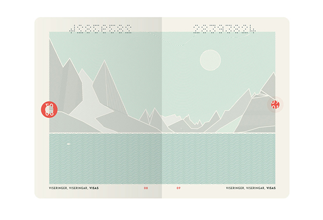
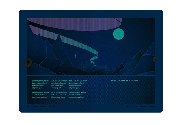
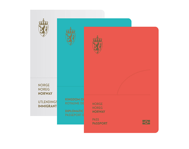
Just a few days ago, then, Norway’s National Police Directorate has selected the best proposal of the contest it had launched in February to renovate the image of Norwegian passports and ID cards. The first price was won by Neue Studio from Oslo, which has chosen abstract signs to represent what, according to their words, is a key element all Norwegian people are engaged with in the same way: the bond with nature and with national landscapes. However, their project didn’t hesitate to go for a true coup de théâtre: under UV light, the landscapes within the pages turn into a positive representation of themselves, and thanks to photosensitive ink, they are transformed into a night-time view that evokes the magical charm of a nativity scene background. Thus, an unexpected narrative dimension is included: the passage between day and night, the true genius loci of all Nordic countries.

Giulia Zappa 
Share: Facebook,  Twitter  
21/11/2014

Ann-Sofie Back: Everything Must Go

Ann-Sofie Back, internationally recognised for her unconventional pieces, is the first Swedish fashion designer to be awarded the Torsten and Wanja Söderberg Prize, that includes a hefty monetary prize and, more importantly, an exhibition at the Röhsska Museum in Gothenburg. Ann-Sofie Back grew up in a suburb of Stockholm, which – together with her parents’ bad taste in fashion – effected her unique take on craft. It made her see fashion from a perspective of someone who feels ashamed or insecure, therefore uses clothes to become someone else in order to fit or feel a part of a group. This feeling has influenced much of her work, expressed and interpreted in various collections through themes such as plastic surgery and fear.

Back studied fashion at the Beckman’s College of Design before taking an MA in Fashion Design at London’s Central Saint Martins in 1998. After graduating, she worked as a designer for Acne (she won the Elle Designer of the Year prize during this period) and held styling jobs for fashion magazines like Self Service and Purple Magazinee. Three years after graduation, she founded her eponymous label (which is currently on hold), followed by a secondary label, named Back, created in 2005. Besides designing for her own brand, Ann-Sofie Back is also the head of design at Cheap Monday. During her almost 15-year-long, successful career, Ann-Sofie Back has never been afraid to stand out and lead her own way. Her design aesthetic is far from the clean style Swedish designers often are related to; Back’s approach has been described as uncommercial and conceptual. Her whole image is built on unconventional ideas which question both the fashion world and the rest of society. She designs clothes for women who dress for themselves or to appeal to other women, rather than men. In fact, unsurprisingly, among her fans she can count bold women like Lady Gaga, Kate Moss, Rihanna and HRH Victoria, Crown Princess of Sweden.
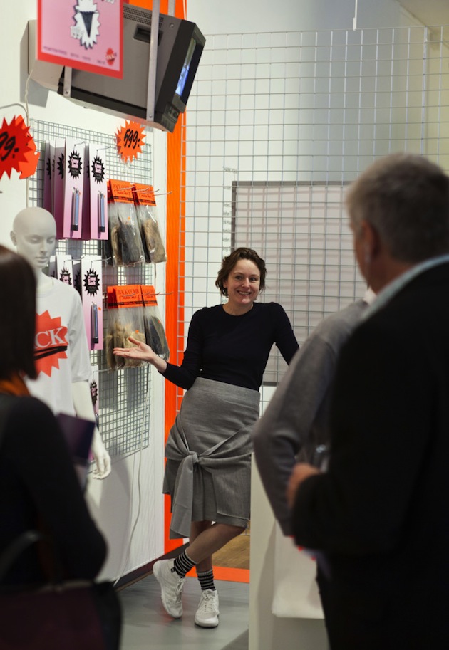
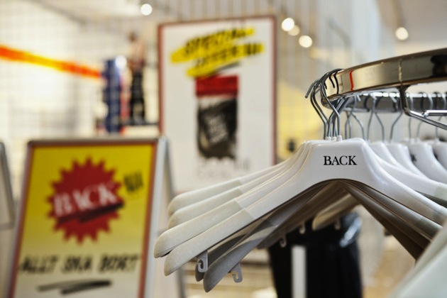
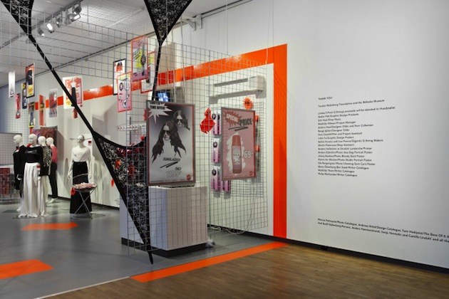
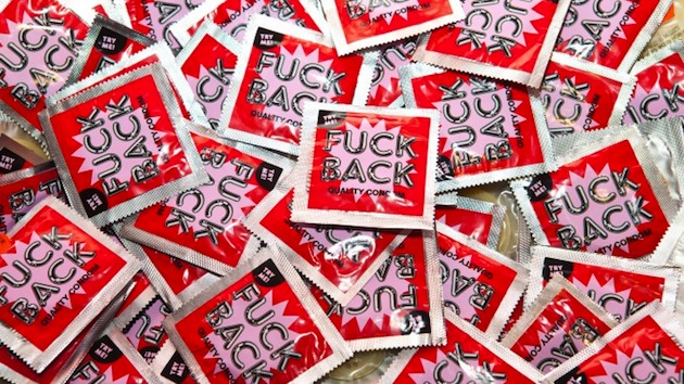
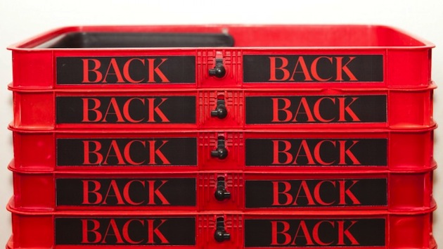
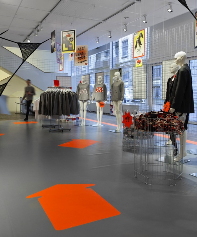
Back’s exhibition at the Röhsska Museum is created with the same conceptual base as her collections.The theme is “one pound shops” with sale-signs and specially-produced products such as T-shirts, toilet paper and lighters put on display in connection to her previous collections, together with key pieces from past lines. The exhibition “Back. Everything Must Go” intends to create Back’s dream shop, the one she will never probably never be able to have, resulting in a witty combination of unconventional design and the most mundane version of mass consumption.

Hanna Cronsjö 
Share: Facebook,  Twitter