12/10/2015

From Global to Local – the World Goes Pop

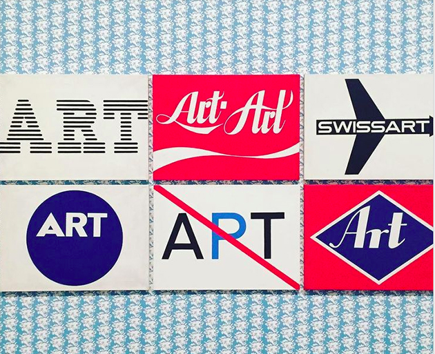
What is there to know about pop art that we haven’t already seen before? One of the most iconic art movements of the 20th century, pop art is widely associated with personal and professional exuberance of Andy Warhol, or ironic, repurposed cartoon images of Roy Lichtenstein. And yet, one must wonder whether their apparent obsession with the banality of the everyday is really the only language that pop art knows how to speak. A new show at the Tate Modern in London aims to dispel the understating of pop art as a largely North American movement, instead showing how the iconographic, visual vocabulary of pop art was appropriated around the world – from Japan to Brazil, from Yugoslavia to Spain – in the 1960s and 1970, and used to tackle issues that reach beyond critical engagement with consumerism.
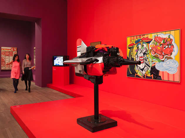
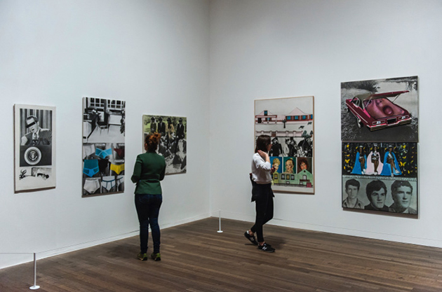
“The World Goes Pop” greets you with a brightly coloured room that states that “pop was never just a celebration of Western consumerism, but was often a subversive international language for criticism and public protest across the globe.” This initial statement is further explored through thematic rooms that deal with politics, domesticity, bodies, feminism and public protests, along with three sections dedicated exclusively to the work of Eulàlia Grau and Joe Tilson, Jana Želibská, and Cornel Brudaşcu. Using well-known visual devices of US-crafted pop – and sometimes even referencing its most famous works – artists gathered in this exhibition explored issues related to political dominance of the US, the position of the female body in popular culture and the role of female figure in society, the blurry relationship between censorship and propaganda, civil rights movements, or political dictatorship.
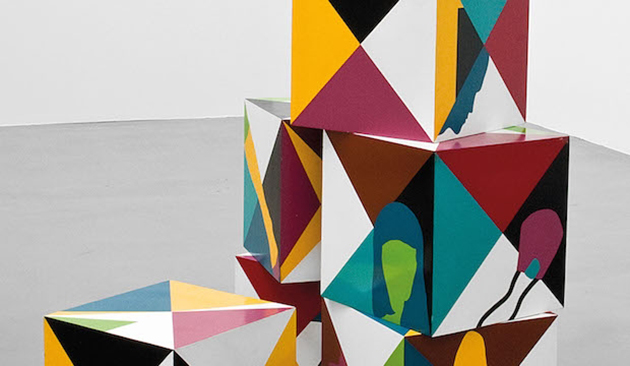
A cacophony of references, between commercial messages and overt political critique, “The World Goes Pop” shows how artists used this visual language to “critique its capitalist origins while benefiting from its universal mass appeal and graphic power” to discuss issues that were relevant to specific geographical context in a very specific historical moment. “The World Goes Pop” runs until 24 January 2016.
The Blogazine 
09/10/2015

The Future of Parisian Fashion

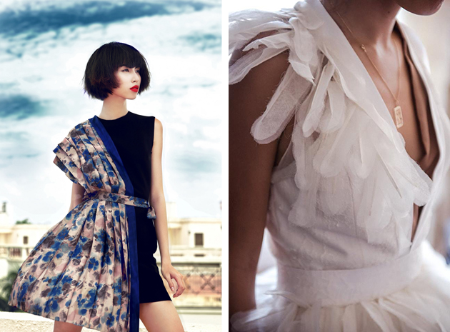
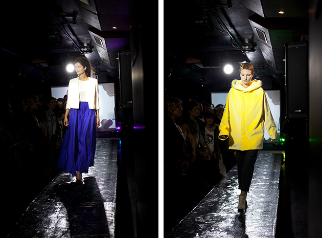
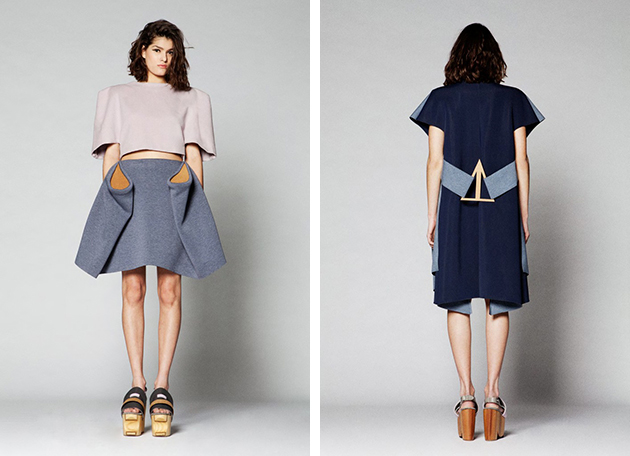
What to say about Paris, the home of haute couture and a city that is so closely related to fashion, that they have almost become synonyms? The French capital has played an important role in fashion history and some would even go as far as calling it the birth town of fashion. Despite the fact that other cities have found their own place in the world of contemporary fashion, Paris will always have it’s history and a whole bunch of international brands. It is, therefore, also a place where many new designers choose to educate themselves and start their careers. So even though Paris has closed the Fashion week tour for this time we can’t leave the city before summarising the best upcoming designers seen last week in the French metropolis.

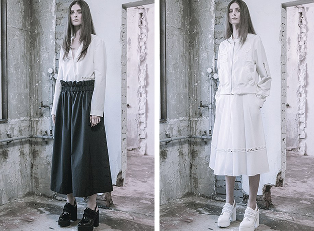
Lucie Brochard graduated from Ecole de la Chambre Syndicale de la Couture Parisienne in 2005 and is now merging all her experience from traveling through Asia, America and Europe into her own brand. Her design is all about the modern, creative, elegant and spontaneous travelling women. Her collection draws inspiration from well dressed women she has seen at airports all over the globe, who succeed in dressing impeccably without compromising with comfort.

Arnaud Lazérat is a Paris-based brand that combines the traditional French handcraft with urban influences. It is both eccentric, powerful and fun – inspired by stage costumes and custom-made dresses, resulting in pieces that address both women and men and encourage free movement and comfort.

Karen Topacio is a designer who recently graduated from IFA in Paris and now has founded her own, self-titeled brand. She defined her style at her graduating show in January 2015 and has continued with that approach in her most recent collection, which can be best described as innovative, crisp and playful. She combines an architectural take with technological influences – all with the aim of creating wearable, cool and original pieces.

Jasmin Brar is another designer who recently graduated from her fashion studies at Istituto Marangoni. She is now based in Paris and makes all her pieces by hand, aiming to make luxury womenswear with focus on unexpected and at times a bit odd details – resulting in pieces that brings couture to the contemporary fashion.

Hanna Cronsjö 
08/10/2015

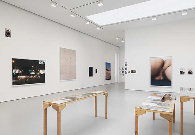
Wolfgang Tillmans: PCR

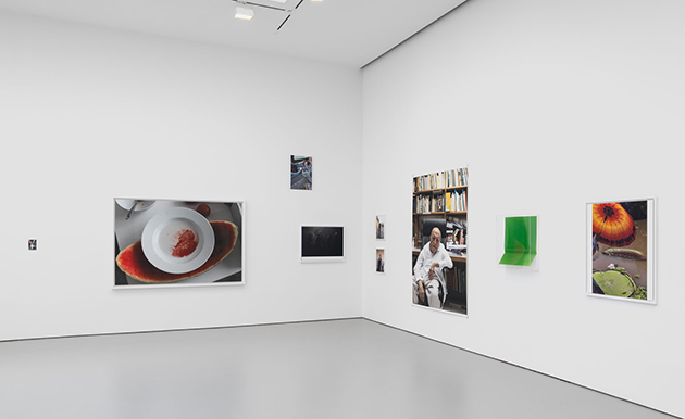
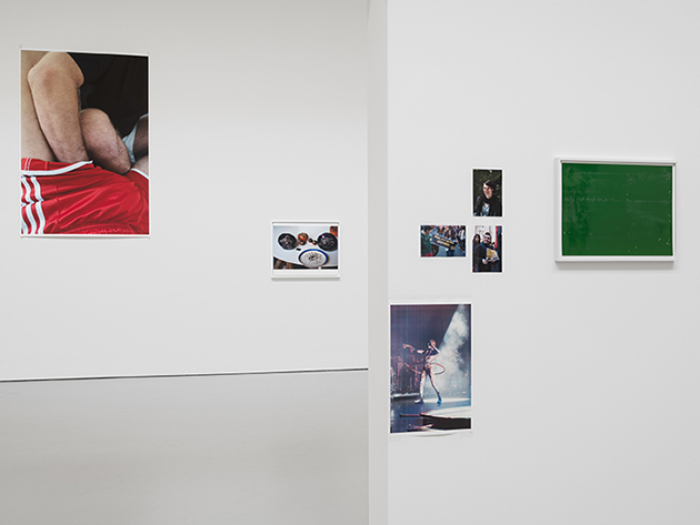
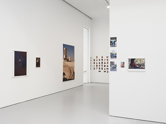
Since the beginning of his career, Wolfgang Tillmans has taken an active interest in the display of his works, using the exhibition as a distinct medium in its own right. Meticulous wall installations of photographs in greatly varying sizes, often hung unframed or taped directly to the wall, allow for a multitude of aesthetic as well as social relationships to crystallize. Each installation is arranged in dialogue with its particular space as well as the city it is in. For his latest exhibition at David Zwirner gallery in New York, Tillmans has arranged over one hundred recent works, spanning a comprehensive selection of the major themes and processes in his oeuvre.

Bringing together pictures taken across the world of friends and strangers, as well as the natural and built environment, the present exhibition addresses one of the main questions explored in Tillmans’s recent practice: as photography becomes increasingly ubiquitous, and as ever higher resolution yields unprecedented views of our surroundings, how do pictures continue to shape our knowledge of the world? The artist proposes that there is still a space for perplexity, mystery, and emotional relevance. Throughout the installation, photographs of activists in New York, Berlin, Osaka, Santiago de Chile, and St. Petersburg coexist seamlessly with glimpses into the artist’s private life, reflecting the broader tension in Tillmans’s oeuvre between the political and the personal. Extending this thematic, new nightlife pictures present underground club venues frequented by the artist as sanctuaries for free expression and even protest, offering a subtle counterpoint to the flood of uniform party pictures that now clutter social media.

PCR, the title of the exhibition and an abbreviation for “polymerase chain reaction” (a technique in molecular biology of amplifying a DNA molecule), also echoes a principle interest in Tillmans’s oeuvre. Whereas PCR can determine the overall genetic identity of an individual from a trace amount of starting material (a single hair follicle, for example), each work is for the artist a sample from a seemingly infinite pool of possible subject matter. The question of when a picture becomes a picture, and when certain developments become noticeable, has remained a central concern throughout his career. The exhibition runs through 24 October 2015.

The Blogazine – Images courtesy of David Zwirner 
07/10/2015

Paris Fashion Week SS16 – Trends

The wide range of Paris Fashion Week showcased the infinite possibilities looming in the future of fashion. The inspiration was everything – from punk princess to clean minimalism. However, three main trends stood out in terms of materials, technique and accessories.

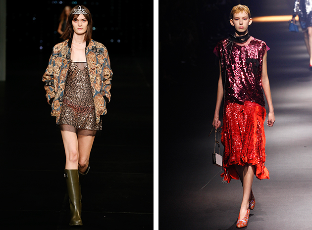
Seeing Sequins – If you can think of anything to cover in sequins or mosaic – you’re on the right way to mimic what was presented at Paris Fashion Week. Dresses, cardigans, tops and bottoms were all sparkling. Loewe presented a loose fit pant with big mirror mosaic on them that added another dimension to the trend of sporty chic. Lanvin and Saint Laurent both presented sparkling dresses in combination with something more casual like a bomber jacket. Sonia Rykiel blended in sequins on long sleeved tops with a formation that created the illusion of coordinating jewelry. It was an interesting comment to the evolution of street style: adding something that was once considered appropriate only for partying to the everyday wardrobe is now the fashionable thing to do.

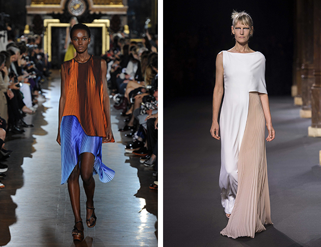
Pleats Please – A popular technique used when playing with shape and volume, pleats were presented at several Parisian runways as a way of adding complexity to something simple, a final extra twist to catch the eye. At Vanessa Seward A-line tops and shift dresses were made more interesting with the addition of pleats, making them stand out instead of blending in the crowd. Vionnet stayed true to its roots and experimented with a somber colour scale – letting pleats and more structured parts intertwine brought the notion of what’s going to be important in 2016. Finally Stella McCartney proved that pleats can be a fun way to play with colour and imposed an ombré effect without actually using ombré, producing, in turn, depth without moving from the surface.

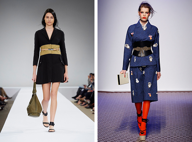
In the Middle – The discussion lingering on after Rick Owens’ fashion show was focused on the human accessories hanging from some of the models, but this functioned as a humoristic or critical accent to leather details other models wore around their waist. A wide or asymmetrical obi-belt was viewed at other runways as well, like, for example, Olympia Le-Tan. At Longchamp they also presented a trompe de l’oeil version by belting a contrasting effect of the coat.

Victoria Edman 
06/10/2015

The Voice of Things

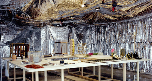
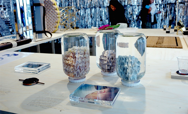
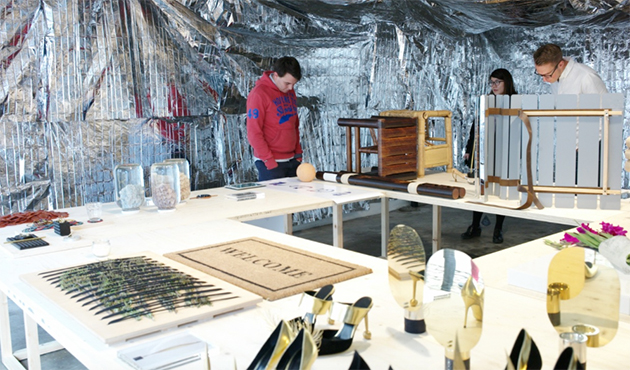
In an unassuming garage in Brompton Design District, sits a room apparently filled with futuristic incongruences. For London Design Festival, Platform 18 – a group of students from the Royal College of Art, led by tutors Sarah van Gameren and Philippe Malouin – presented The Voice of Things, an exhibition exploring the subject of reproduction. The Voice of Things is a celebration of Platform 18′s activity in the Design Products Department and the group of talented designers that it has nurtured. As the platform completed its third and final year, graduates from across the three years come together to complete a common brief for an exhibition curated by platform tutors.

The participating designers have been asked to find a person who can describe a functional object to them solely through spoken word. The designers cannot see, touch, smell or taste the authentic object but are expected to recreate it according to the descriptions received. Visitors to the exhibition had the opportunity to view both the originals and their interpretations, which were be presented side by side – creating unexpected juxtapositions and offering an insight into what reproduction, translation, imagination might mean.

In fact, the Voice of Things is an exhibition about description, translation and interpretation. It also aims to showcase the common qualities developed by graduates of the platform developed through the tutoring by Van Gameren and Malouin, who expected their students to be thinkers and makers; meticulous, methodical, adventurous and fanatical individuals with a sensibility to both artistic and aesthetic values.

The Blogazine 
05/10/2015

Paris Fashion Week SS16 – Prints

Prints in Paris – it almost sounds like the title says it all in itself. There have been a number of prints seen at the Parisian runways that, as expected, we also caught quite a few surprises.

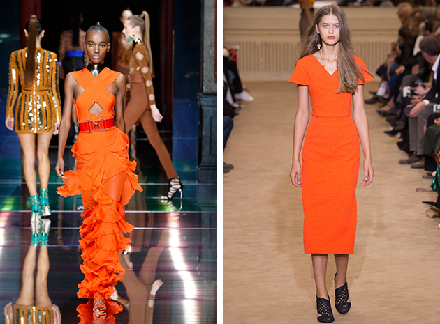
As Clockwork, Orange – Although not a print, this solid colour was seen not only on several runways, but as a fixed feature on several fashion week runways. The Parisian take on orange was a bright shade forming the focal point of the look it was featured in. Whether it was on a jumpsuit, as seen at Mugler, or on a dress, as seen at Roland Mouret and Balmain, orange was definitely the colour of the season. Even though orange may not be the new black – it is still a strong contender.

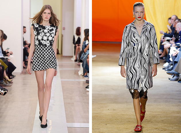
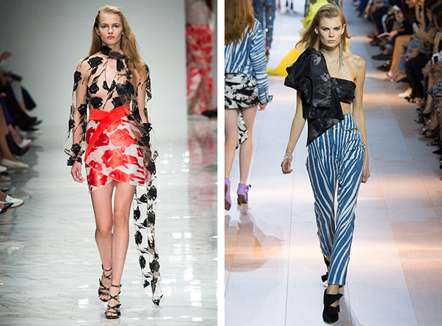
Monochromatic Peak – Black and white is always right, and the Parisian designers were not about to change that fact for Spring/Summer 2016. Instead, several designers sent out their own versions of prints in black and white to add to the wardrobe repertoire. At Céline the standout piece of the collection was an elusive coat in a black and white print. The silhouette was of itself simple, but was raised to incredibly interesting through its print’s abstract nature. Emanuel Ungaro gave a different element to the floral print when presenting it in black and white as both a stand-alone print and in association with solids and a gated pattern. As if playing with shadows, Ann Demeulemeester revealed an abstract monochromatic look that gave an intricate illusion of fluidity.

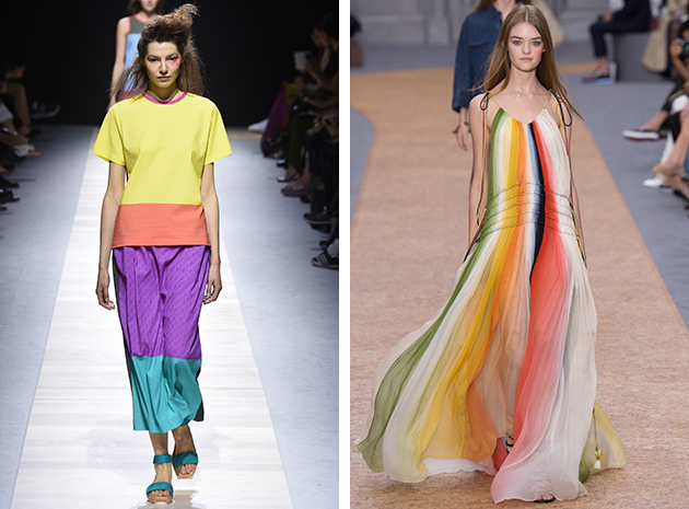
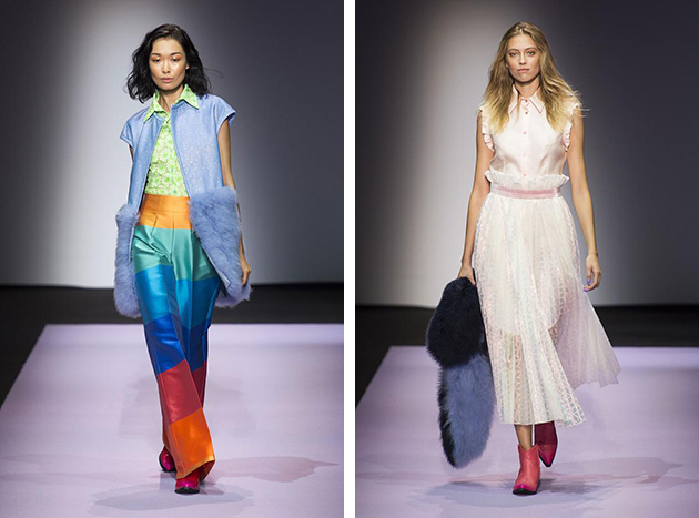
Somewhere Over the Rinbow – In tilted or vertical stripes or through the work of color-blocking, an array of colours were present in Paris. The magnificent colour spectrum was a surprising twist to an otherwise low-key colour story when viewing many of the fashion week’s runways. Manish Arora paired a ruffled asymmetrical dress with rainbow stripes infused with some black elements. Chloé gave a dropped waist maxi dress a fun yet romantic quality by adding faded yet colorful rainbow-stripes, and Issey Miyake presented a vibrant look with the effect of a contrast dip dye. Colourful yet pragmatic is the key description.

Victoria Edman 
02/10/2015

The Future of Milanese Fashion

Milan is continuing its effort to become the new key fashion city for young talents. The recerly held Fashion week and the events held during the week, are just some recent examples of a long mission to draw new talents to the Italian fashion metropolis. So even though the shows have closed for this time and moved on to Paris, we had to summarize the best upcoming designers from the week in Milan before moving on to France.

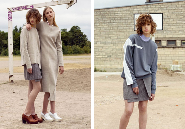
J Koo, a Korean brand founded by designers Jinwoo Choi and Yeonjoo Koo, presented a Spring collection inspired by the youth culture. They embraced the cool aspects of street wear and combined them with tailoring and lace – an interesting fusion that makes them a brand to look out for in the future.

Aalto, a brand founded by Finish designer Tuomas Merikoski, was also participating in Milan Fashion Week as one of the designers that took part in Italian Vogue’s selection at Palazzo Morando. Finland is not often mentioned alongside other Scandinavian countries such Sweden and Denmark when the topic of Scandinavian fashion is treated. Merikoski proves, on the other hand, that hat is a big shame, since he and many other Finish designers deserve to be included in that discussion. Aalto’s latest collection is inspired by the sun which is shining most of the day and night during Summer in Northern parts Sweden, Finland and Norway. The collection is also a celebration of youth and freedom, a theme that captures his design aesthetic where urban, modern, architectural and international are some of the key words to categorise it.

Daizy Shely, an Israeli designer, is the winner of Italian Vogue’s talent competition ”Who is on next” from 2014. She founded her brand in Milan in 2009 and showed her Spring/Summer 2016 collection at Giorgio Armani’s Armani/Teatro. While her latest collection can be compered to J Koo and Aalto’s, it represents a third, different take on the youth culture theme. Built around colours, patterns and mixing materials, the final result is a collection that succeeds in being both wide and narrow in terms of pieces and concepts, making us wonder whether the future of fashion isn’t indeed in Milan.

Hanna Cronsjö 
30/09/2015

Milan Fashion Week SS16 – Trends

An explosion of both colour and creative imaginationa were certainly the expectation for the Milanese fashion shows – and we are happy to say that they were delivered. Three trends in particular stood out as infiltrating and pushing fashion forward, without playing it safe.

Mismatch – Letting pieces as well as styles emerge together to create a perfect unity was represented in many ways during Milan Fashion Week SS16. Blumarine married two different colours of the same print with the top having a much sheerer effect than the bottom or keeping everything exposed and adding a biker jacket to the mix. With an accentuating sash, the effect was much more bold and vivid. Roberto Cavalli and Les Copains both brought together mismatched elements of hard and soft. At Roberto Cavalli a romantic drape or ruffle met more rocker-style pieces which, in unison, created a fetching juxtaposition.

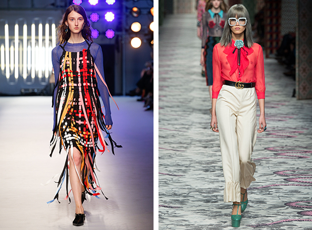
More on less is more – This upcoming season, an extra add-on carries all the weight on how to elevate a look from plain to perfectly fashionable. By starting with a rather simple silhouette, such as a blouse and pants at Gucci, a fashion forward look was thereafter created by adding more and more, such as ruffles on the pant leg and frills on the blouse until the finished product was not just exaggeratedly over the top, but interestingly original. Finding key pieces and adding unexpected elements was also a key trend presented at Fay. For example, a navy blue trench coat with an accompanying piece reminiscent of a corset made it go from safe to exciting. MGSM presented dresses in colour explosions and layered them on top of another piece, bringing a new thought to the concept of not only more colours but more layers.

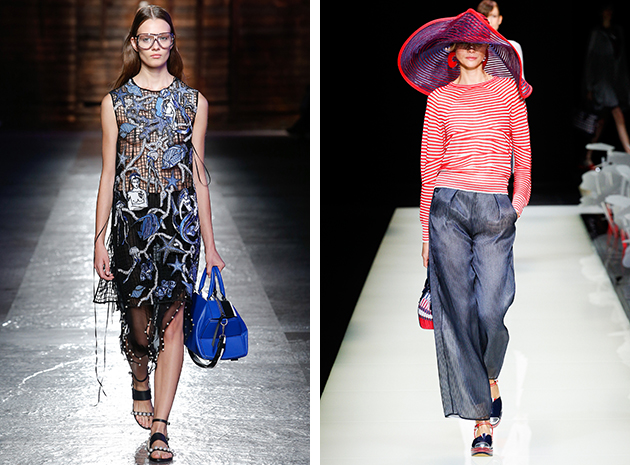
Oceanic theme – By the ocean or in it, several of the Milanese runways showcased preference for nautical themes from stripes and wide brim hats, as seen at Giorgio Armani to sailor and seashell embellishments showcased at Emilio Pucci. This trend was clearly making a big splash.

Victoria Edman 
29/09/2015

Milan Fashion Week SS16 – Prints

At the Milanese runways for the upcoming Spring/Summer season, this year it was all about technique and pushing creative boundaries. The print trends fluctuated, but there were a few standouts – as outlined below.

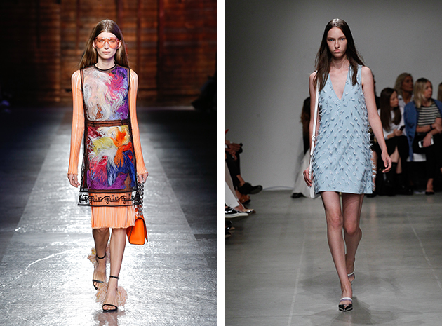
Feathers – Real or manufactured, this fashion week feathers were used as embellishments producing unique prints, movement and quite imaginative looks. Fashion label Marco de Vincenzo showcased looks where shredded textile in tone with the overall look had been added as a supplement, giving an illusion of feathers. The addition was fascinating and almost created an ombré effect. Emilio Pucci added colorful feathers to cover a pastel pleated dress – with the maison’s know-how, it was pure artistry. Iceberg chose the romantic route, bringing feather details to traditional pastel dresses letting the application move and speak for itself.

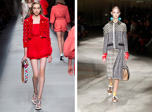
Gated Community – A weaving technique that created the pattern evocative of gates and fences was spotted on many Milanese runways. At Fendi, jackets were presented and recognized as instant statement pieces. Fausto Puglisi as well as Moschino, opted for an overlay with big grids generating a similar pattern. Over naked skin it was almost as an expansion of the cut-out trend. At Prada, a netting accessory affirmed the gate print trend as it added a grid to an otherwise finished look.

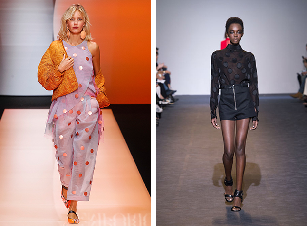
Spotted – Polka dot as well as eclectic circles were observed at many runways. Emporio Armani showcased a metallic spot that elevated a casual look to pure elegance. Tod’s presented a look where holes had cleverly been punched in a white skirt with a paper bag waist, almost becoming an ironic comment on office attire. Costume National offered a black silk spot that on top of sheer material gave a sporty elegant touch to an otherwise simple look – minimalistic with a twist.

Victoria Edman 
28/09/2015

Style Suggestions: Pre-Fall Accessories

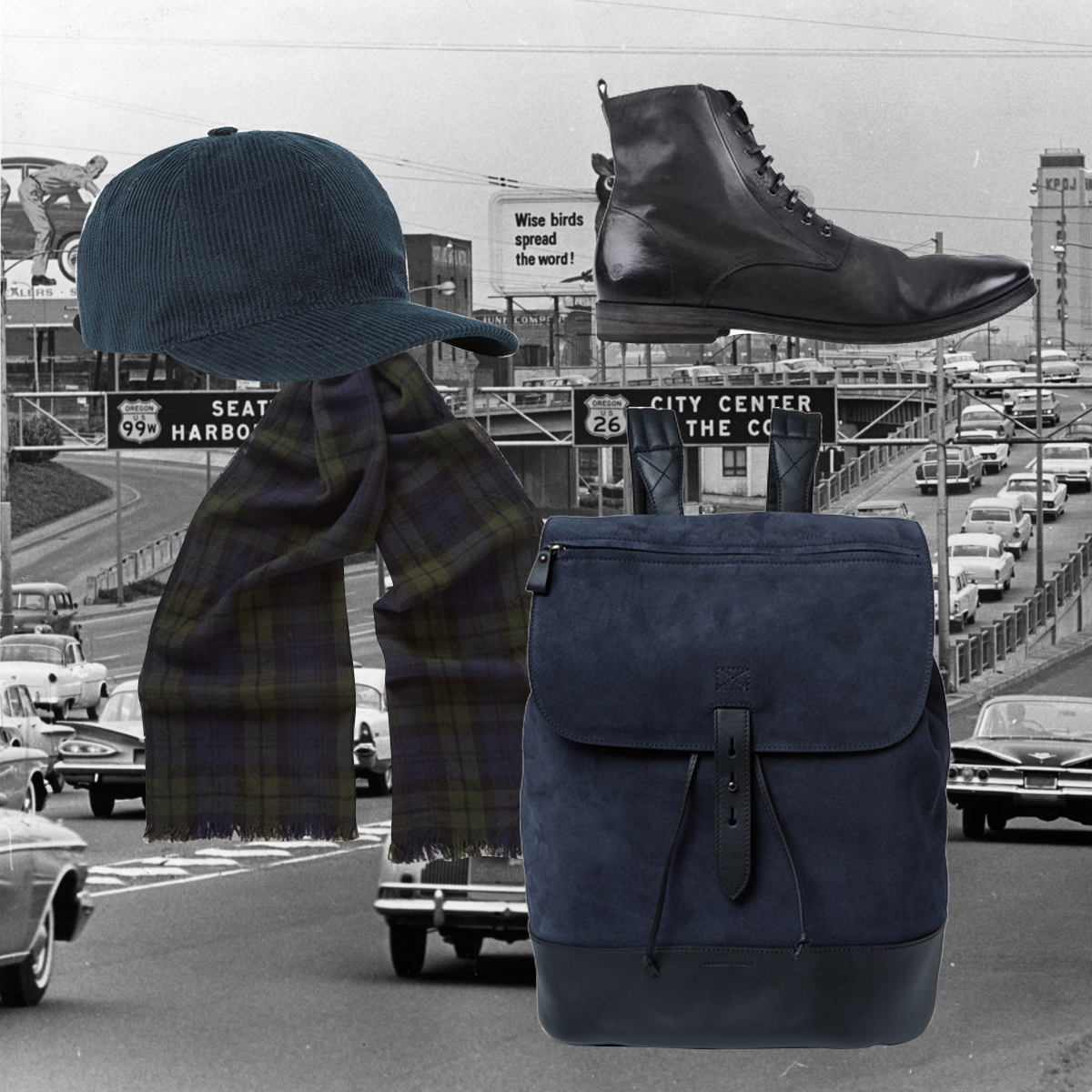
Going from the Summer to Winter mood isn’t always easy, so the best way to do it is in style. Here are some pre-Fall accessories that can ease you in to the change of seasons.

Cap: A.P.C., Shoes: Marsèll, Scarf: Drake’s, Backpack: Tomas Maier

Styling by Vanessa Cocchiaro