04/12/2013

The Disappearing crafts in the North

In the beginning of this fall, Form, the popular magazine for Nordic Architecture and Design, informed the design world about “the fall of the Crystal Kingdom” in Sweden. The news, that the centre of the Nordic glass industry Orrefors Kosta Boda has been shut down and that 80 percent of the production will be moved to Thailand, has a sorrowful undercurrent and is discussed with a nostalgic sadness.
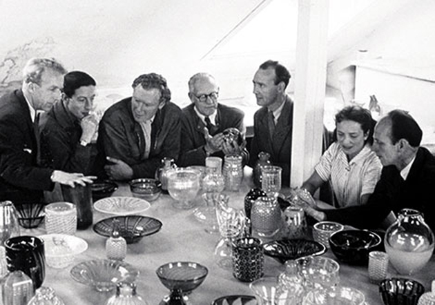
In the south Swedish Småland, Orrefors Glassworks has produced utility glass and crystal art glass since 1898 on the same site where ironworks operations had been run since the early 1700s. In the early 20th century, artists (and designers) became part of the product development process, starting with Simon Gate and Edward Hald in 1916 and recently with Karl Lagerfeld.
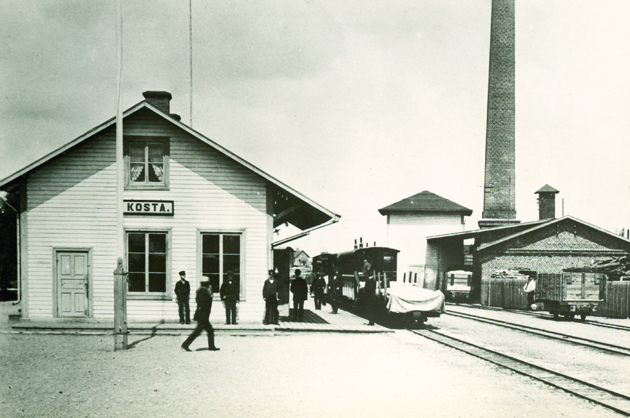

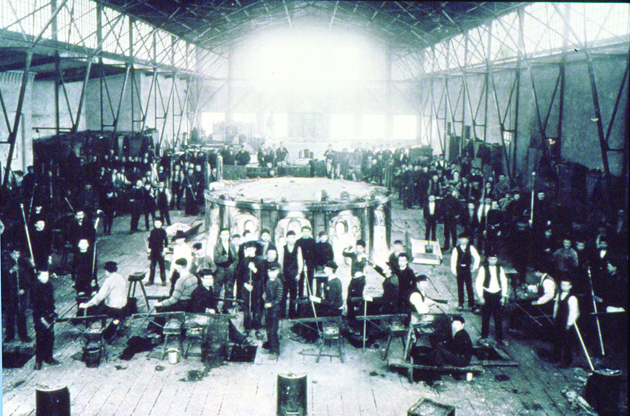
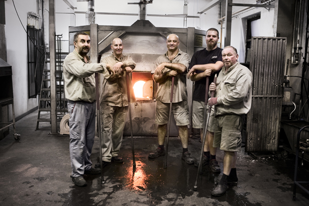
However, the craftsmen who have bore the industry are now sent home after the decision to turn off the kilns in the glassblowing shops in Orrefors and Årfors. The once glassmaking region is left behind empty. Now cheap labour in Thailand is considered to be the only way out of the present economic uncertainty of the Swedish glass industry.
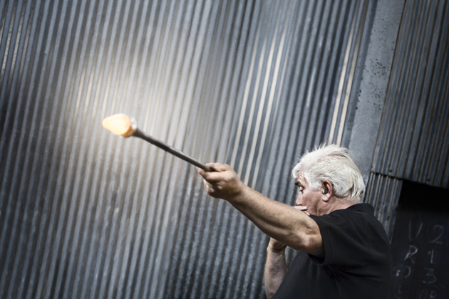
Even though there is a trend of re-evaluating the localism and traditional crafts these days, the fall of the Crystal Kingdom is yet another example of disappearing crafts in Northern Europe. So, what does this mean? Isn’t the thought that we are moving all of our knowledge about traditional crafts to Asia a bit frightening? For now this might seem the only thing for companies to do in order to survive financially, yet is remaining with the knowledge, but without the skills, enough for the future? And although crafts are still taught in the North, it seems to be our persistent demand for cheap products what is killing the job opportunities for skilled craftsmen nearby. And with that, we risk to lose generations of wisdom, skills and crafts if we don’t find alternatives to preserve our artisanal industries.

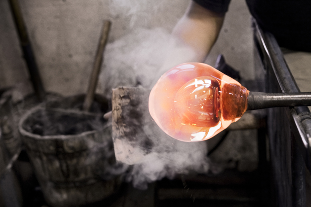
Lisanne Fransen – Image courtesy of Orrefors 
03/12/2013

Serpentine Sackler Gallery by Zaha Hadid

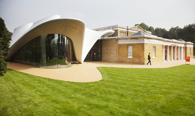
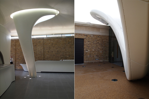
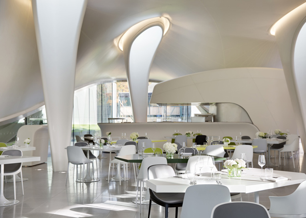
Nearly three months ago, on the 25th of September, Serpentine Sackler Gallery opened its doors in Hyde Park, in London. A short walk away from the main Serpentine Gallery, sitting just across the Serpentine bridge, the Sackler gallery was designed by startchitect Zaha Hadid. More than a simple gallery space in the middle of London, the new Serpentine Sackler Gallery is a bold statement: as much an expression of power as it is a monument to contemporary architecture.


In fact, Serpentine Gallery is widely known for its commitment to architecture through their annual commission of a temporary pavilion, the first of which was designed precisely by Hadid, back in 2000. But while the pavilion is always designed by an architect who hasn’t previously built in the UK, since her first collaboration with the Serpentine, Hadid has completed a few projects in London, such as the Olympic Aquatics Centre and Evelyn Grace Academy, in Brixton.


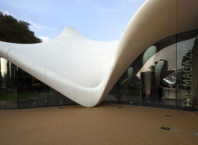
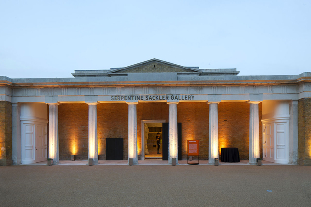
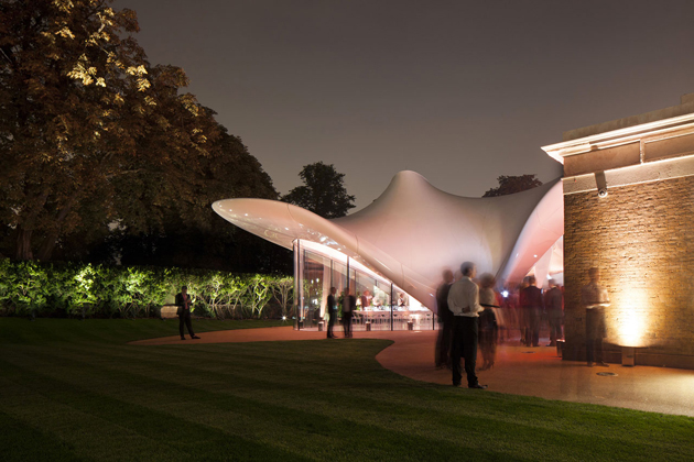
At first glance, it is obvious that the Serpentine Sackler Gallery is a “status symbol of luxury and political posturing”, borrowing Owen Pritchard‘s description of Hadid’s practice. While the main gallery space is situated in a restored former Powder Room, it is the extension added to the 19th century building that sparked all the criticism. It is a classic Hadid piece: a sinuous structure that from far away might appear as a wedding tent, while from up close it changes appearance from every angle. But what strikes the most is not the presumptuous character or the striking dissonance between the two structures of the Sackler Gallery; it is the undeniable feeling that, while the Powder Room building is as contemporary as ever, the extension already seems too old.


Rujana Rebernjak – Image courtesy of Serpentine Gallery and Luke Hayes 
02/12/2013

Style Suggestions: Dressing White

Wearing white in winter doesn’t need to be a challenge. Play around with rich textures and shades of white and with so many wintry hues. We’re sure you’ll find the right style for you. If you don’t feel confident to create a head to toe look, then combine a winter white coat with a colourful or even classic black look.
A.P.C. coat, Carven sweater, Bottega Veneta ankle boots, Eugenia Kim hat, Pamela Love ring, Andrea Maack perfume, Band of Outsiders pants, Gucci Vintage Bag

Styling by Vanessa Cocchiaro 

02/12/2013

Adam Nathaniel Furman’s intimate ceramics

It is quite unusual to think about ceramic as a mean to tell a story. Can we conceive a proper narrative dimension inside a vase collection? Can we see it as an uncommon tool of introspection? If we take for granted that objects have their own language characterized by a specific semantic and syntax, we may be more reluctant to believe that they can be transformed into the vehicle of a fictional self-representation.


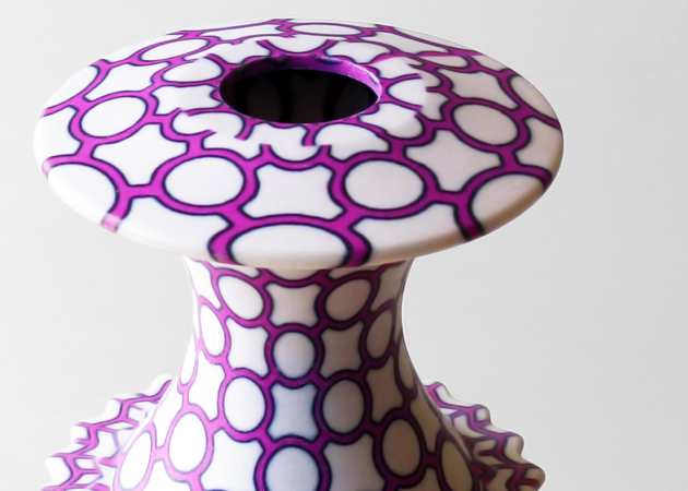
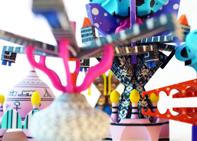
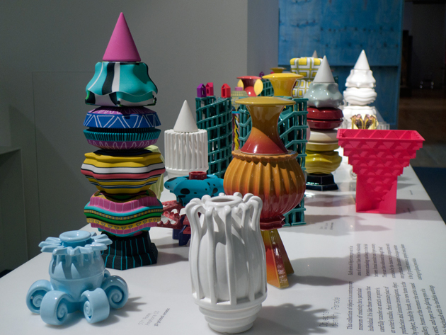
Adam Nathaniel Furman, designer in residence at London Design Museum in 2013, has pushed the limit further trying to express through his creations the variable shadows of his moods and thoughts. The tangible result of his research is an original ceramic collection that transposes his personal obsessions – technological compulsiveness, kitsch, human-driven disasters, convulsed techno and joyous angelic jubilations- into a fluid overlapping of layers and concentric stairs. The intangible dimension, on the other hand, is entrusted to the pages of his digital personal journal entitled Identity Parade, a hypnotic flux of consciousness where he gets himself over a barrel, revealing his bittersweet, fluctuating emotions. The link between these two dimensions is more than deeply interconnected: the physical and the digital worlds share the same ups and downs, the same soarings, the same sinkings.


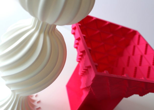
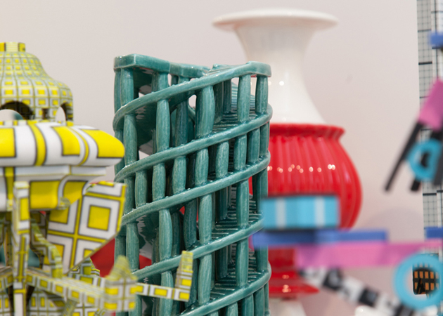
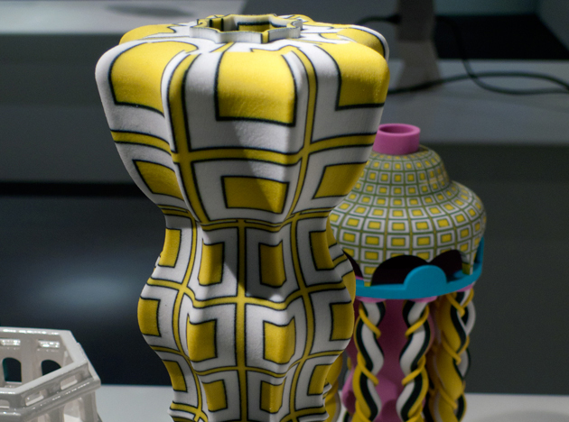
Nevertheless, what is even more remarkable is the understated attitude that Furman’s works demonstrate from the point of view of technological development. In fact, his vessels alternate the use of traditional cast with that of 3D-printing technologies (such as nylon laser-sintering and 3D-printing) with very homogeneous results: at first sight, it is basically impossible – also thanks to the hand painted cladding- to recognize which of the two techniques has been used. Thus, technology seems to be once again a critical tool to express new aesthetics: only the use of 3D-printing techniques, for instance, offers the chance to recall Maurits Cornelis Escher’s world and his impossible feats of architecture. Then, it’s up to colours and patterns to strengthen what morphologies have already suggested: a dizzy but exalting state of mind.


Giulia Zappa 
29/11/2013

Upcoming Artists | JAWS

Hello, how are you and what have you done today?
Hey! Today I have been shopping in Birmingham. It was cold.

Who are the JAWS and how was the band born?
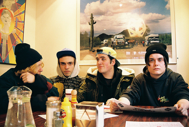
The JAWS are Eddy the drummer, Huddy the guitarist, Jake the bassist and me, Connor. We all met at the Halesowen College and shortly after decided to create the band!

Tell us about your musical background.
We’ve all been in and out of bands, before JAWS. Eddy and I used to play the drums in metal bands and Jake was a drummer in a pop punk band. Can’t go wrong with 3 drummers, right?

Has Birmingham influenced your music? If so, in which way?
I don’t know, I guess it has influenced my music somehow… A lot of things that happened in my life, happened in Birmingham. That’s the reason why I write songs about it.

What do you think about the B-Town?
No one from Birmingham actually says B-Town! In terms of scene it’s pretty great and the shows are always full of familiar faces and friends.

Is this music scene something real or is it just a kind of hype created by the media?
It’s real.

How was the experience of taking part in the Reading & Leeds festival? Was it your first time at a crowded festival? Were you scared?
It was something else! We didn’t expect the reactions that we got and I think that’s what made it all even better. It was our first time at Reading & Leeds so we were all really nervous. To me a bigger crowd is easier to play for, so when I saw how many people it turned out to be, it became such an easy show to play and a really fun one.

How has the tour in the UK been?
Now that it’s over I realize that it has been so much fun. The London show has been a crazy one. I can’t wait to go back on 2014.

You guys really take care of the graphic aspects of your videos, album covers and merchandising in general, isn’t it? Is it just one person taking care of it, or is it the whole band?
A little bit of both. Sometimes it’s me coming up with the ideas, but if the rest of the band doesn’t like them, then we don’t develop them. In the end, it’s always the whole band coming to a decision.

What are the JAWS preparing for 2014?
We are preparing a tour and hopefully we’ll present our debut album, so fingers crossed!

Enrico Chinellato 
28/11/2013

Dressing dangerously

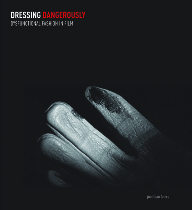
It’s undeniable that clothes have a powerful impact in movies, not only because of their glamorous side, but for the key role they play in a concrete scene or even in an entire story. Jonathan Faiers, fashion theory reader at the Winchester School of Art, at the University of Southampton, decided to go deeper and wrote Dressing Dangerously, a study about the “cinematic negative wardrobe”.

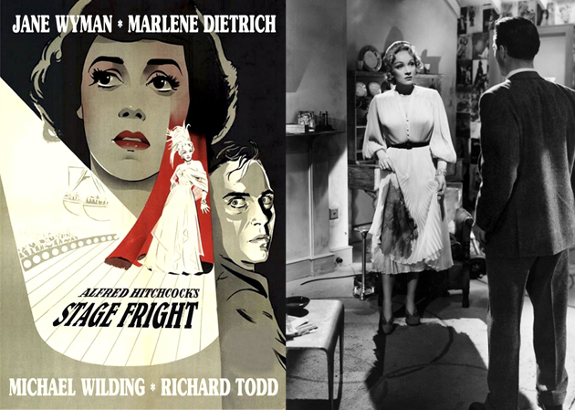
Professor Faiers gives us several examples, starting from the white Dior dress worn by Marlene Dietrich in Alfred Hitchcock’s Stage Fright. The huge blood stain, on the candid and classy pleated skirt, inevitably catches the eye. Faiers continues with an example from The House on Telegraph Hill by Robert Wise. In this film, the stained glove illuminated in the dark is a clear sign of guilt – the image also chosen as the cover of Dressing Dangerously – while in movies such as Leave Her to Heaven, all the costumes bring you to a complex set of emotions.


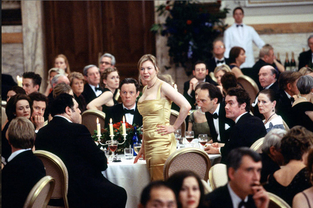
To step out of historical cult movies, the author also talks about Bridget Jones‘ appearance at the Law Council dinner. Dressed in a long golden robe she is completely out of context, while surrounded by formal dresses and suits – a scene that emphasizes a quite clear shade of shame. Fashion manages to communicate through movies and Dressing Dangerously traces a path from glossy photos to the most dangerous of fashion moments. The book will be released on December 3rd.

Francesca Crippa 
27/11/2013

The empire of Giorgio Armani

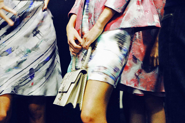
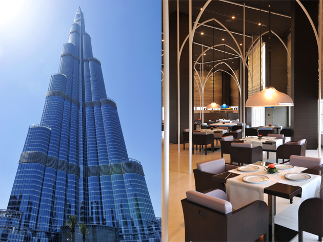
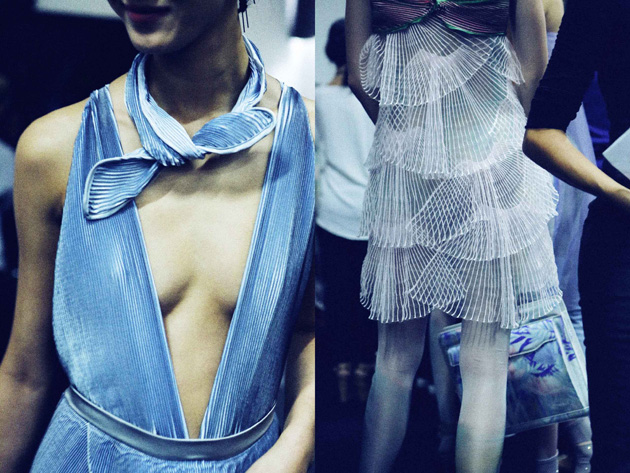
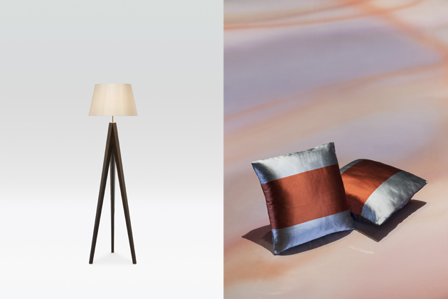
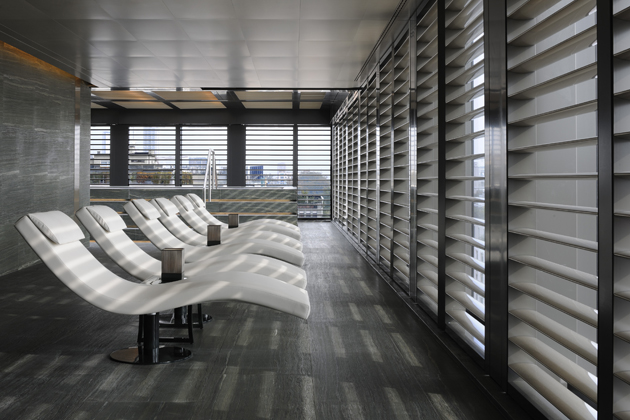
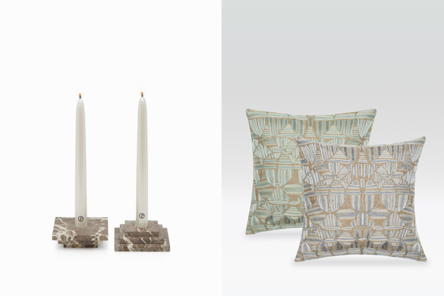
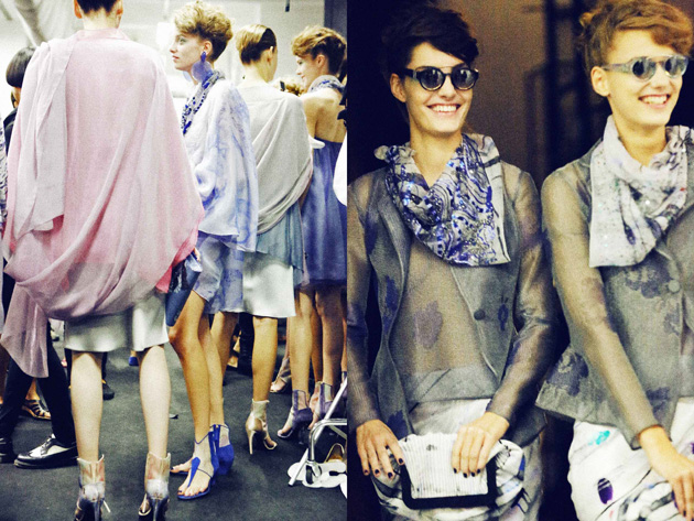
Fancy some fashion-branded sweets, a relaxing massage with custom blended essential oils, an aperitivo with a view over Milan or just a pair of slick jeans? For quite some time now fashion brands have been offering a whole lot more than hip clothes. But while brands like Diesel, Acne, Missoni or even Zara have limited their production to homeware, Giorgio Armani has been taking a completely different approach. From the humble beginnings back in the 70s, Mr. Armani has made the phrase “from spoon to city” his own, and has built an exceptionally unique empire.


Giorgio Armani was born in 1934 in Piacenza, Italy and has entered the world of fashion in 1965, initially working for La Rinascente, and later for Cerruti and Sicons. The latter collaboration, which resulted in Armani by Sicons line of clothing, will lead him to create his own brand – Giorgio Armani – in 1975 together with his partner Sergio Galeotti. With a clear vision of what his brand should embody, Giorgio Armani has through the years created a dozen different clothing lines, opened over 250 shops around the world, developed a series of beauty products, perfumes, jewellery, watches, homeware collections, hotels and restaurants.


But while sheer breath of his work might leave us speechless, one must wonder what is the common thread that keeps it all together. What does a luxury spa in the centre of Milan have in common with simple, de-structured jackets that have become Mr. Armani’s statement pieces? The answer is apparently simple. Since the very beginning of his career Giorgio Armani’s products have all been designed with a clear, neat style that hasn’t changed in more than 35 years. His products seem to stand the test of time because they are uniquely timeless and follow a single, pure inspiration: Armani himself.


But whereas this may be true for his clothes, declining the same empowering, classically elegant lifestyle on furniture, interiors, restaurants and hotels might not be as easy to accomplish. In fact, while we appreciate the silent luxury hidden in the impeccable sartorial quality of his clothes, his furniture, lavish homeware or even the extravagantly richness of his Milanese hotel seem to privilege style over substance. Even though fashion and design often speak the same language, the core of each discipline is grounded on a set of completely different rules, making it difficult to successfully hop from one practice to another, even for a grand master of Italian design like Giorgio Armani.

Rujana Rebernjak 
Backstage images by Matteo Cherubino / Lifestyle images by Armani, Gionata Xerra and Stefano Guindani 
26/11/2013

Ace Hotels – Past, present and future

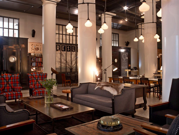
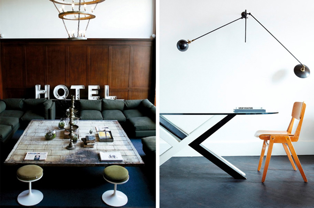
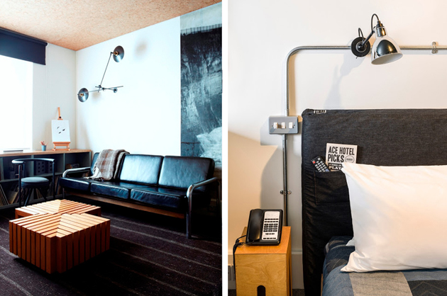
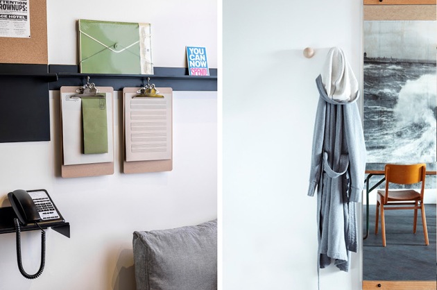
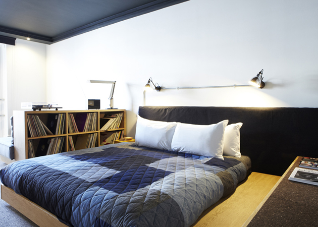
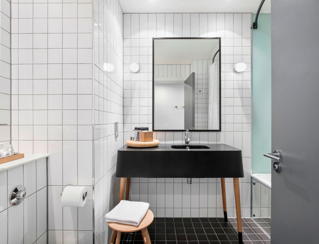
Have you ever been in a hotel that made it impossible to remember the town, or even the country, you were in for a split second upon entering? Marble paved lobbies, fake golden columns, lavishly decorated yet impersonal rooms, cold and unfriendly bars are usually part of this landscape, whose apparent lack of hospitality and warmth fuelled the success of Ace Hotels. Defining itself “A friendly place, continually new”, the first Ace Hotel opened in Seattle in 1999 and immediately set a new benchmark for hospitality.


Taking distance from polished, but cold modernist aesthetics, Ace Hotels were created with the idea of merging iconic local elements, businesses and styles in a unique blend of hospitality and warmth at an affordable price. Working with local design firms, chefs, decorators, or even florists, each Ace Hotel was equipped with a selection of hip furniture, crafty detailing, great food and relaxed atmosphere, offering an unusually cosy place for its clients, as well as a trendy gathering place for the town dwellers in New York, Portland, Los Angeles, Palm Springs and, recently, London.


Unfortunately, one of the founders of Ace Hotels, Alex Calderwood, has passed away on the 15th of November, only six weeks after opening his first branch outside US. Calderwood was the creative genius behind Ace Hotels’ success, interested in humanizing big businesses by “rescuing things, not just discarding everything”. His love for icons of the past and local traditions which fuelled the explicitly retro aura of his hotels, will remain a strong reminder of the fact that while we may feel globalised at home, when abroad we are still looking for that local charm, beauty and warmth we may find in the streets of our hometown. Hopefully, Ace Hotels will continue to nurture that approach with the same passion, quirkiness and wit of their founder.


Rujana Rebernjak 
25/11/2013

Style Suggestions: Layering in Winter

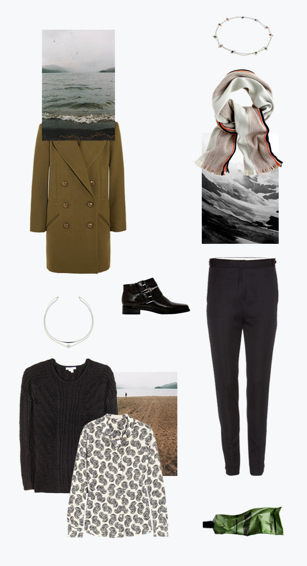
This year, there is no need to look and feel like a snow ball. Layer wisely, go to work feeling confident and don’t let the winter blues take control.

Isabel Marant coat, Acne trousers, Helmut Lang knit sweater, Stella McCartney shirt, Kenzo boots, J.Crew scarf, Aèsop body balm

Styling by Vanessa Cocchiaro 

25/11/2013

AndréBUTZER at GiòMARCONI

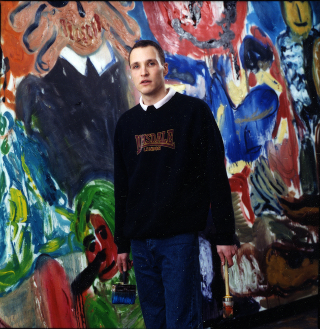
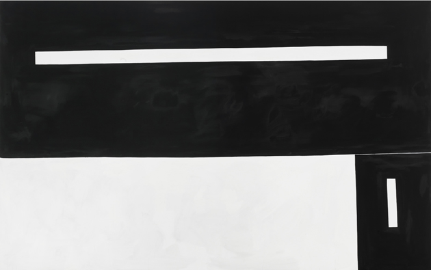
Entering the Giò Marconi‘s total white-walled gallery, illuminated through cold neon tubes, you feel the urgent need to rub your eyes, hit by a blinding, snowy white light. The almost aseptic, immaculate rooms of this prestigious art space seems to actively contribute to value the concision of the forms of the latest works by André Butzer (b. 1973 Stuttgart, Germany).

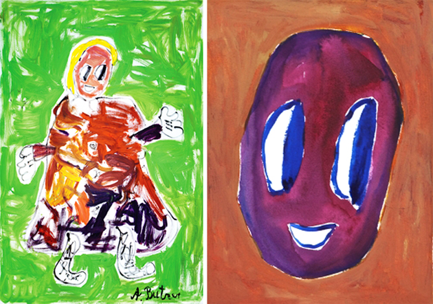
For his third solo show at the Milanese gallery, the semi-abstract German painter – well known for his roughly executed repetitions of ugly, extremely coloured cartoon character paintings -, presents a series of the so-called N-paintings, in which he has abandoned figurations and showy tones for rectangular black and white shapes. These works, which name “N” stands for an imaginary destination, a non-place situated on the edge of abstraction where all colors are conserved, are made of flat stripes that creates strong geometric contrasts. Even though they look like machinelike iterations, getting closer to them you can see deep differences in the brush strokes and colour intensity, as well as in the shades and the use of space: perfectly horizontal and vertical lines alternate slightly curved contours, that create optical illusions.


Along with the N-paintings, Butzer exhibited here also some works belonging to the Post N-Paintings; small canvases that call to mind the artist’s earlier hectic compositions, featuring cartoonish renderings of various characters and objects, clearly influenced by artists such as James Ensor, Willem de Kooning or Phillip Guston. With the dark symbolism and the abstract and neo expressionism as first references, Butzer makes use of coloured motifs, hollow-eyed faces, grotesque and anxious masks mixing them with the monochrome newest researches. The exhibition will run until 1st February 2014.

Monica Lombardi – Many thanks to GiòMARCONI Gallery