12/04/2013

Salone 2013: Studio Formafantasma

We met Simone and Andrea, authors of some of the most challenging yet exciting design projects, at Triennale di Milano in the midst of the hectic design week Salone del Mobile 2013. The duo, working under the name Formafantasma, was invited to participate in Triennale design museum’s latest exhibition called “The Syndrome of Influence”, where they were asked to interpret and play with Roberto Sambonet’s work. Even though Simone and Andrea’s work got us chatting for quite some time and there would be much more to say about them, here are a few lines that might clarify their role as one of the most promising designer brand of the future.
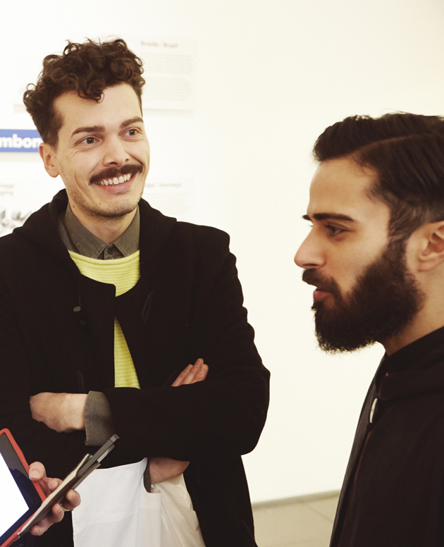
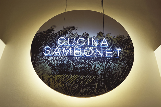
Could you tell us something about your project for the Triennale, “Cucina Sambonet”?

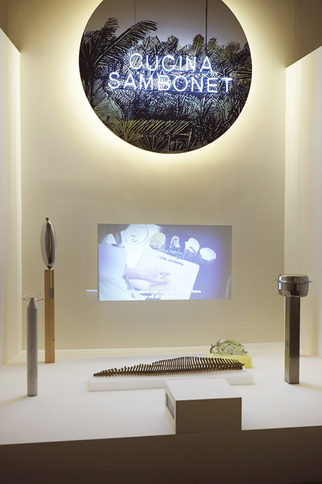
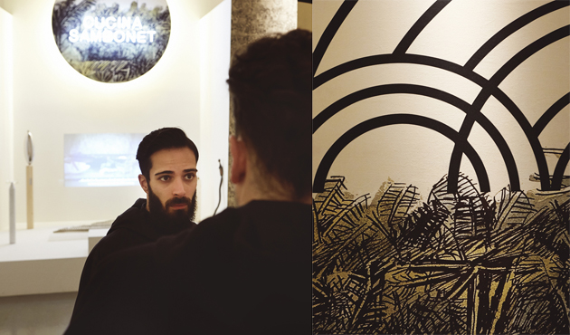
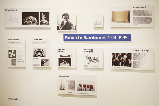
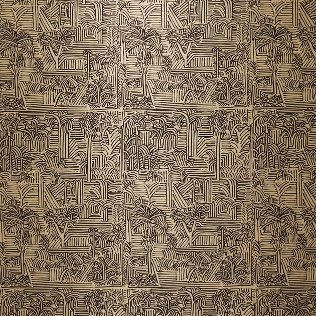
We were invited to interpret and develop the project on the work of Roberto Sambonet, who was in a way one of the last famous Italian designers. The reason why it is called Cucina Sambonet is because he designed a lot of objects for the kitchen, he was also a good cook and had a column in “Il Sole 24 ore” about cuisine and food. While the overall concept for the Triennale was very interesting, we also fell that we wanted to use this possibility to say something that goes beyond the work of Sambonet himself. We needed a fictional project where his works and drawings, drawn from his archive, could become scenographies. We worked with a movie director and an actor interpreting Sambonet, basically preparing a dish using his most famous piece within the same scenography. The text used comes from an interview he gave in 1994, where we selected some parts and kept on writing it, imagining him thinking about what would happen with design in the future. So, we are more or less making a statement on the necessity, for instance, of no longer talk about national design, while also trying to push back history, since the tendency in Italy is to keep on reviving what happened in the past.
How has this design culture influenced your work, seen that you have studied abroad?

I think you can see there is the Italian influence in most of our projects, but it is mixed with more conceptual projects related with Dutch design. We really enjoy not belonging to anything or anywhere. We always say we’re bastards, because if you put together Dutch and Italian design, it seems like nothing can come out of it or have a strong identity. That’s why we are so sick speaking about national identity or national design. It’s absolutely irrelevant.

So, let’s take a step back. How did you two meet and started working together?

We met when we were both studying at ISIA in Florence. We started to collaborate when we had a little bit of freetime because, even if ISIA was a product design school, we were interested in graphics design. We worked together on preparing our portfolios for two different schools where we wanted to continue our studies at. In the end we decided to go to Eindhoven because we could really relate to what was happening in the Netherlands. 
The story of how we got there is actually really nice, because we sent only one portfolio! Since the beginning, we applied as a team and when we came there we discovered that it was quite an exception.
What would you say is the most important characteristics of your work?
It’s critical and conceptual and not really formal. Of course it is formalized, but we don’t start by sketching a lot of shapes. That’s not the point in our work. We are really interested in the ideas and the expression of ideas and concepts through our work and not only the formal qualities of an object.

You often experiment with new or unusual materials, showing the process of your work. Why do you think it is important to also show the process of the design and not only the final product?
I think that in recent years, we displayed production, because things are produced elsewhere and you don’t know where they come from, you don’t know how they are produced. It’s a way of giving information. I think people nowadays want to be more involved and knowing where things come from and how they are produced. Showing the process is really about transparency.
You don’t work with the industry but mostly with galleries on specially commissioned projects. Do you feel this as a necessity or is it a conscious choice for you? What does this type of production allow you to do?
No, not really, because we are now, hopefully, starting to work with companies. It’s not a choice, it’s an option we investigated in the beginning. Let’s say that the way we worked until now is really much more speculative and galleries fit in much more with this type of production. Galleries are a place for discussion.

Let’s finish with your thoughts on this years Salone. Do you have any other projects displayed around Milan?
We have a couple of other projects displayed but we are more focusing on September and February when we will have two solo shows. We actually haven’t seen so much of the Salone yet, but we have a strange feeling of calmness. There is the crisis, and it’s visible. That’s nice though, because it’s not about big bold statements but about the human scale in things.
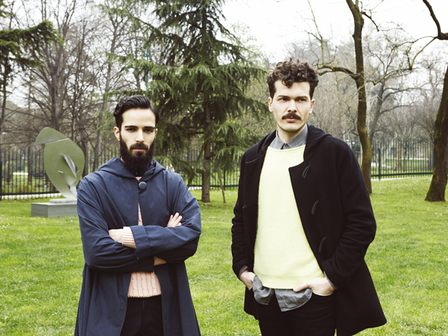
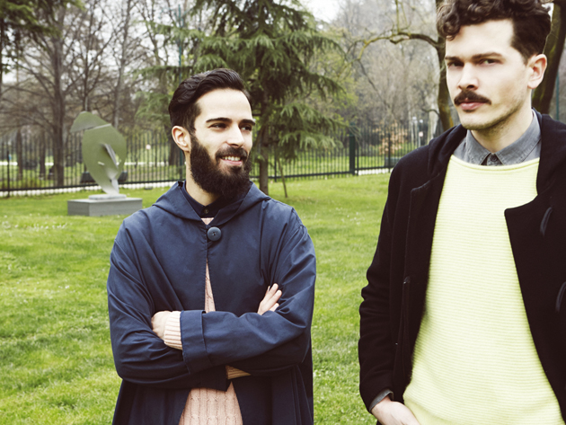
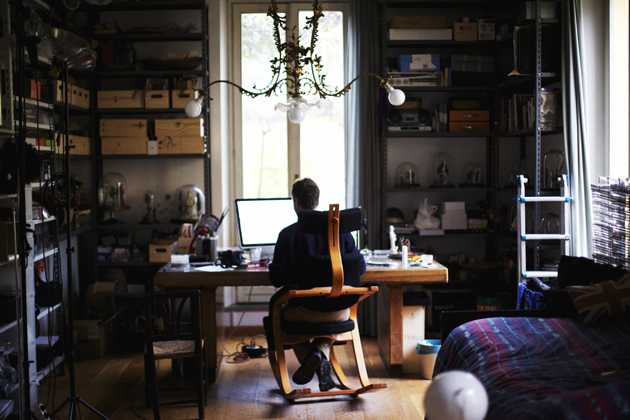
Rujana Rebernjak & Lisa Olsson Hjerpe, photos Alessandro Furchino 
Share: Facebook,  Twitter  
01/04/2013

4 Questions To – Sebastiano Mauri

4 Questions To – Sebastiano Mauri

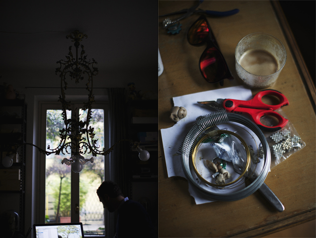
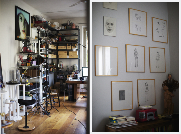
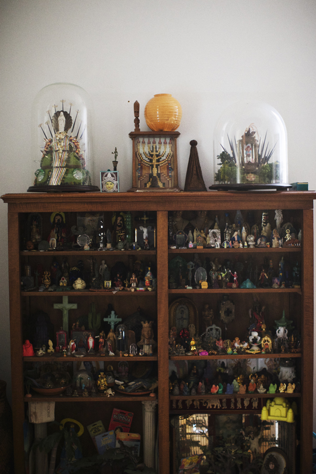
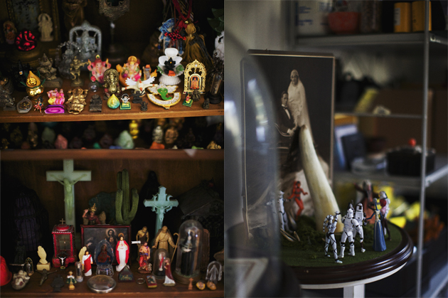
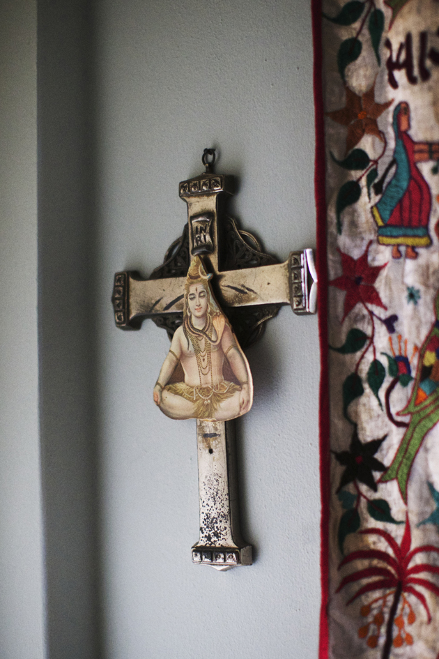
We met Sebastiano Mauri, the Italo-Argentinian versatile and charismatic visual artist, graduated in cinema, who faced less than 1 year ago the literature world issuing his first brilliant and acclaimed book “Goditi il problema” (Enjoy the problem), Rizzoli, 2012. Sebastiano opened the door of his eclectic house to the photographer Paul Barbera‘s photo-documentary project “Where They Create”, telling us about his personal and unique life.


You are a visual artist, but also a writer, and you worked in cinema too, how do you manage all these different roles together?
It depends. Sometimes I dive into a specific project and there’s no room for anything else, it’ll all have to wait. Other times, probably far from any deadline, I manage to work, let’s say, on my screenplay for a couple of hours, structuring, jolting down dialogues, then I might dive into one of my altars, and get lost in painfully slow processes such as composing mosaics or creating flower arrangements made of hundreds of tiny roses, and finally write a few pages of my new novel.

As much as I can, I try not to loose touch with any of these activities, so that I keep alert that part of the brain and/or body. But then reality kicks in, and this productive sounding, eclectic schedule is swept away by being unable to stop applying tiny lilacs to Ganesh’s temple, walking the dog who’d do anything not to return home, or answering emails about matters you thought resolved a year ago. Basically you end managing it day by day, the best you can, hoping nobody will realize you don’t have a master plan.


I’ve noticed that most of your previous interviews dealt with the countries you are more attached to and your multicultural education, along with your interest in spirituality. Is your creativity related to any special places? What’s the role of religion in your works and in contemporary cultures?

I have lived extensively between New York, Milan and Buenos Aires, different languages, very different realities, very far geographically. I wouldn’t say that my creativity relates more to one place than the other, I’d rather think that it is stimulated by the juxtaposition of differences. Change per se is a great tool to put things into perspective, reconsider your habits and even beliefs. Movement, doubt and fluidity have become the greatest influence on my work.

In the past four or so years, religion has been the main subject of my research. I look for similarities between the different credos, a common space where we’re all welcome, and that does not invite judgement, conflict or exclusion. Still today, religion can offer a great deal of comfort in the form of psychological support, social interaction with like-minded people, stress releasing mantra practices, recurring rituals that break our habits, making us concentrate for a moment on something that isn’t our daily schedule, something that might be greater than us. The goal is, like with everything else, to take what is good, positive, life enriching of this experience, and leave out all that separates us, that makes us feel different from one another, that brings judgement and cultural isolation. My (good) God against your (bad) God, the Geroge W. Bush view of the world. Religion can be the opium of the people, but it can also be a caress, a held hand, a shoulder to cry onto, an ear to talk to. Not something to look down onto.


Do you think that human beings still need amulets or icons to believe, or do faith and firm belief stand alone?
In the age of digital reproduction of images and globalized production of goods, amulets and icons are seen, distributed and sold now more than ever. Faith and firm belief need help from the marketing department like anything else.

Do you think that sexuality can still offer original food for thought and research?
Anything that has to do with our daily lives is always going to be original and nurturing food for thought. Our lives are engaged in a daily duel between habit and innovation: our reading of them is forced to constantly adapt. It will never arrive a final word on human nature.

I’d say that the telling of hidden details, as far as I am concerned, has to do with the attempt to share thoughts and facts that one is naturally (and unhealthily I might add) drawn to keep to oneself. I have found that if you dare open up to others, most probably that’s exactly what they will do with you. A liberating act.

Monica Lombardi – Images Paul Barbera

Share: Facebook,  Twitter  
28/02/2013

Guest Interview n°45: TT

Guest Interview n°45: TT

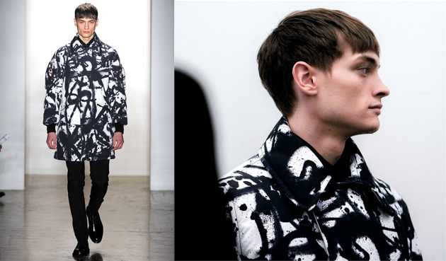
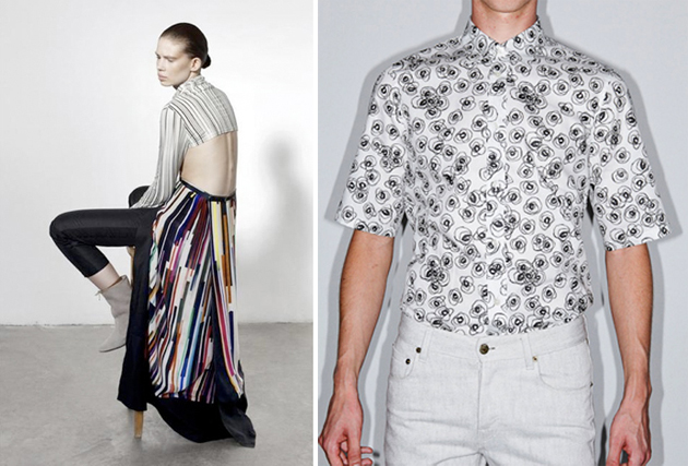
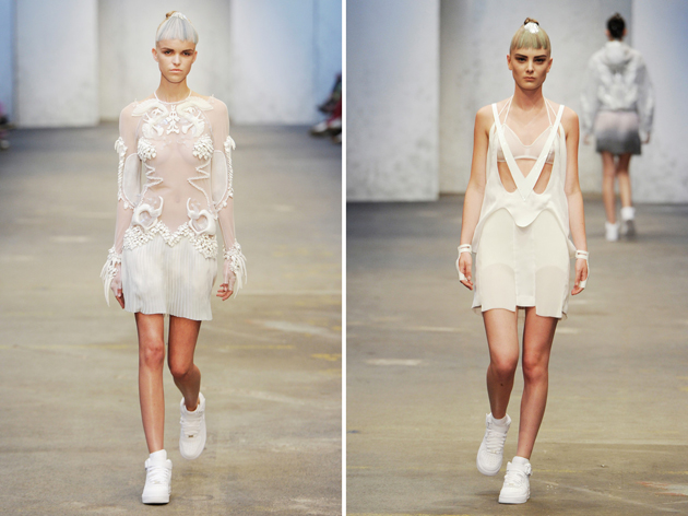
With his bold graphic work recently shown on the runway shows of Tim Coppens and Y3 during the AW13/14 fashion shows, Tom Tosseyn is not just a graphic designer. He is more of an artist, but one who can visualize and create graphics for his client; a TT piece of art but also a creation which reflects and compliments the client.

TT has a very clear handwriting and identity which is very contemporary and unique to him. The bold simplistic graphics are very distinct and simple at first glance but go behind his thoughts, and the sophisticated and intellectual way he works starts to shine through giving his work another angle.


You mainly design graphics and art for fashion right now, but how did you get into design?
I studied for 2 years product design at the Henry Van de Velde Institute in Antwerp, but wanted something more creative, so I switched to graphic design at the Royal Academy of Fine Arts in Antwerp. Three years later I graduated from the Higher Institute of Fine Arts in Antwerp. I then moved to Italy and started my career in fashion, and worked for 4 years in the creative team at Diesel, followed by 55DSL. I was then recruited to create the graphics for the Hugo Boss Orange line in Germany. Two years later I returned to Belgium where I set up as a freelancer working for companies such as Eastpak, Fred Perry, Jil Sander, Acne studio, Y-3Tim Coppens and Raf Simons.

Besides fashion, do you create graphics and artworks for any other industries?
I make a lot of work for the music scene, I’ve designed album covers and logos for R&S Records, the original techno label in Belgium, and also for some bands from America like Crossover. I recently started exhibiting and collaborating with other Belgian and international artists at Z33 in Hasselt, Annette De Keyser gallery and MX7 gallery in Antwerp.

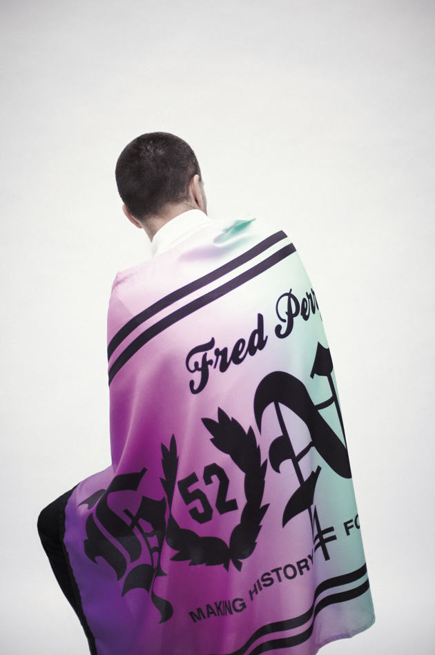
Last year I made my own series of T-shirts and silk foulards under my TT label which I produced and sold. The foulard was initially part of a project and exhibition.

You also teach fashion and textile design at the Gent Academy of Art. What do you enjoy about tutoring students?
The best thing about teaching is to be able to guide young people in their creative processes as well as in their personal development and life path. Freedom for me is very important and I like first to show them how to deal with this liberty, especially for the young kids of 18 years old, as most of them are lost when you give them complete freedom. They should exploit this to the max; get the best out of it creatively as well as personally. It’s their journey but it gives me a great feeling when I see them evolve, struggle and yet find their way by absorbing and interpreting the information which I’ve given them. Like this I hope my work with them adds some positive & constructive value to their life.

You’ve recently been part of the project of 60 years celebration of Fred Perry, can tell us about this?
To personalize a reproduction of 1952 Fred Perry shirt I chose to design a flag, a medium often used to represent one’s devotion to a ‘group’ or subculture – whether it’s to a boy’s club, a football team or country. The design is inspired on hooligan flags, that explains the use of a gothic font that shouts out the word HONOR and the ‘O’ I changed into the Laurel Wreath symbol. The background base of the flag is a gradient of colours, this breaks the hardness of the graphic and gives it a more contemporary feel.

What influences you in your work?
Anything and everything. It can be a sign, a broken window which has been taped up. Other artists inspire me, art streaming, 1920s, the Bauhaus, 80s music, new wave. I’m in the city a lot so my urban surroundings inspire me a great deal. It can also be a person or even just how I’m feeling at that moment.

Tell us about your thing with numbers.
I don’t wear a watch but if I ever do see the time, digitally somewhere, it always has a sequence. For me it’s a graphical representation of time and it catches my eye, it’s a reminder for me to live in the moment without rushing after tomorrow or dwelling on the past. It’s about the here & now.

Which 3 words sum up Tom Tosseyn?
Unique, perfectionist, stubborn and bold. That’s 4!

Tamsin Cook – Photos: 1-2. Tim Coppens, 3. Capara – AnotherMagazine and Raf by Raf, 4. Fred Perry, 5. Tom’s logo. Courtesy of: Kris de Smedt, Yannis Vlamos, Betty Sze, Thomas Lohr

Share: Facebook,  Twitter  
06/02/2013

Guest Interview n°44: Stine Riis

Guest Interview n°44: Stine Riis

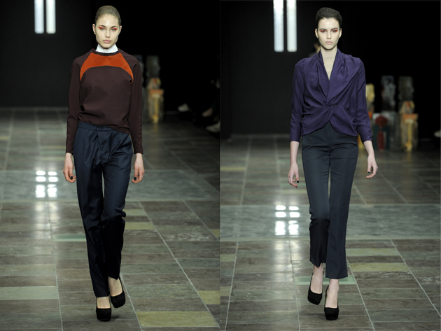
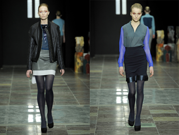
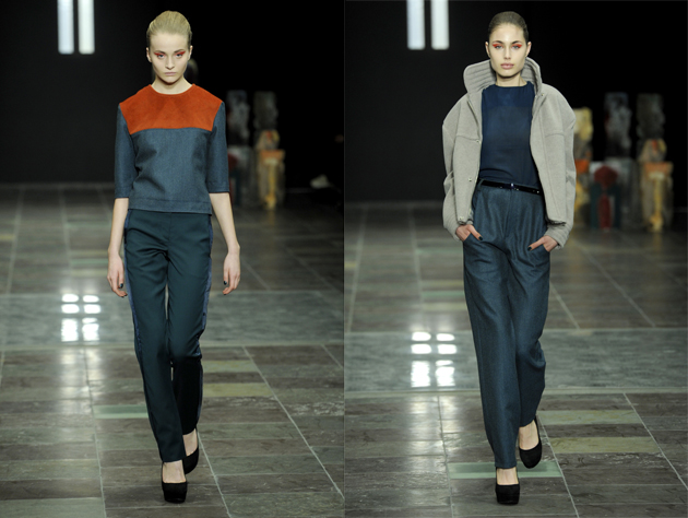
R II S is the brand created by the Danish designer Stine Riis in 2011, the same year as she graduated from London College of Fashion and was chosen as one of The Best Student Worldwide by Vogue Italia. In 2012, she was also the first winner ever of H&M Design Award and did, besides the small collection for the Swedish fast-fashion chain, a collaboration with the Italian luxury store Luisa Via Roma. To say the least, things have been going good for Stine Riis. The Blogazine met with the designer after her A/W13 runway show during Copenhagen Fashion Week to talk about expectations, inspiration and the future.

2012 was a big year for you: the H&M Design Award among other things. Did you feel any pressure or anxiety over expectations while creating this collection?
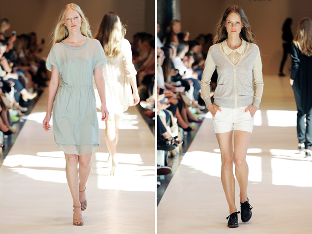
Well, the collection I did right after the H&M Award was definitely a challenge because I thought I had a lot to live up to and as well, I had a lot of projects going on: I did the collaboration with Luisa Via Roma, I did the collection for H&M and then again, my own collection. Simply, there was a lot going on but with this collection I had more time, and more time to work into details, which I think really shows!

So you felt more relaxed about this collection?
The fall/winter season certainly is my comfort zone and last season was my first spring/summer collection ever, so in that way that was a big challenge. Today, with this collection, everything really came together and I am very pleased. I’m…I’m just speechless!

What was the process up to this A/W13 collection like? What was your main inspiration?
I was looking at geological studies of different materials and that is where the inspiration to do colours came from. I was also looking a lot at still life paintings and the symbols often used in them, such as hourglasses and other symbols that reference to the fast pace of life, which also links into fashion for me.

What is your philosophy looking at fashion from this time perspective?
Fashion changes so fast and that’s my constant dilemma as a designer because I’m trying to design these items that you want to wear more than one season, and that’s also why I really look into the materials I use.

And now, what lies ahead for R II S?
I try to make time to sometimes step away from my everyday life to try to see the big picture and plan for the future, I think that is really important.

Can you give us any hints on what the future holds?
Not yet, but definitely going abroad, that’s a plan.

Lisa Olsson Hjerpe – Image courtesy of Copenhagen Fashion Week®

Share: Facebook,  Twitter  
13/12/2012

A Way Of Being Oneself

A Way Of Being Oneself

A project by students a bit over their twenties which became a brand. Born in Germany in 2009, although in a few years it conquered the most niche European markets, A Kind of Guise cares to maintain its design office and production in Deutsche territory. Their biggest talent? Knowing how to communicate strong. Communicate what? A lifestyle. Through video, teasers, images and slogans. The style is nice, the language intelligible and the quality of garments excellent. In today’s world that runs at 2.0 speed, it is not enough anymore to get your hands on a good product, you must be able to generate the public’s desire to own it.


Tell The Blogazine how and when did A Kind of Guise start? Nobody knows who you are nor how many you are. This is an intention to focus only on clothes and not on the designer, or what?
Well, first of all, we want our products to be in the spotlight, not the persons behind it. And secondly it has never seemed important for us to publish our names or see them printed somewhere. But it’s not a secret, we are 5 people coming from different backgrounds (like fashion, music, art, film etc.) who try to translate all their influences into the products. The whole thing started off in the summer of 2009 in Munich, as a little student-project, but soon more people joined the team and we are still growing (slowly but strong).

Your taste of style is very precise and coherent. This is a trend overflowing around the world, but in particular way in Europe. Such a country, old school, fifties, mormons attitude. Where do you look for your inspiration?
Inspiration comes from everywhere. Books, music, photographs, the people around us, our family and our friends (who we still want to design the stuff for).


Communication. It is a massive point of strength in fashion today, and you work on it very well. How do you manage your communication and image strategies, that are so funny and powerful as well?
Honestly we don’t think so much about strategies. Of course we set schedules and release-dates, but style-wise it’s just us you see in the pictures. There is one important word that may sum it up: Passion.

Proudly Deutsche production. DNA and quality fashion could be a way for young designers to capture and ride on the market? What’s your personal experience and your point of view about it?
Well it’s a basic decision you make before you start. And for us it was clear that we want to build strong, long-lasting and honest quality products. So you start searching for a proper production which is regional, close, easy to communicate with etc. There you go, we found that in Germany.

Sum up in three words A Kind of Guise.
Analyse. Solve. Believe.

Antonio Moscogiuri Dinoi

Share: Facebook,  Twitter  
05/10/2012

Global Fashion Show Trend Overview – Summer 13

Global Fashion Show Trend Overview – Summer 13

Here at The Blogazine, we’ve been following the SS13 runway shows from the fashion capitals; New York to London to Milan and rounding off in joli Paris. Each city is unique and creates its own buzz and attitude. We’ve been analyzing closely the key trends and have selected some of our favorites.

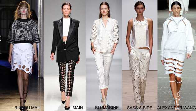
CUT OUTS

Cut outs are popular this season with designers creating slick laser cut geometric shapes, from rounded geometric shapes at Rue du Mail to harlequin diamonds at Balmain or more nature inspired leafy cut outs at Sass & Bide on leather and crisp cottons. Layered or simply worn against the skin, it seems to be the next move on in a more bold form of the lace hype.

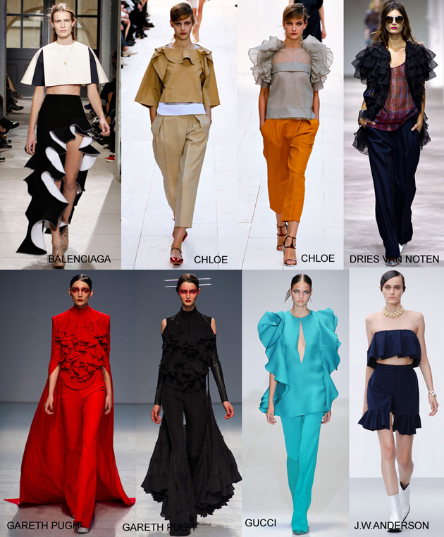
RUFFLES

Ruffles came cascading down the runways in many shapes and forms. From romantic flounces in chiffon at Chloe and Dries Van Noten to more structured and sculptured voluminous shapes at Balenciaga which created a more dramatic “Flamenco” style.

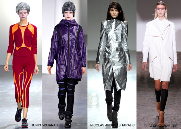
FUTURISTIC

There was a definite shift towards a futuristic space-like trend for some designers. Incorporating metallic and high-tech fabrics in Star Trek-like silhouettes, colour-blocking taking on a 90s clubwear look from London and Tokyo at the time from Junya Watanabe. You could also spot alien like make-up, all of which created a back to the future zoom.

50 SHADES OF ORANGE
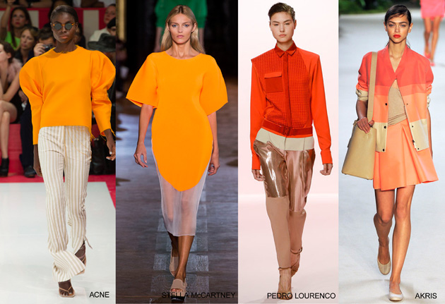
We mentioned orange being hot in our NY fashion week report. Across the globe orange has still been standing out as a key bright for next summer. From acidic orange to peach, pumpkin and rusty orange, all possible shades are creating a vibrant positive note to the season.

SWEATSHIRTS


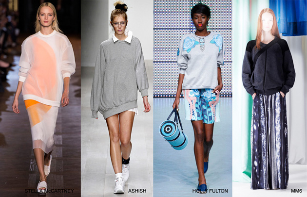
The humble sweatshirt is still looking strong for next season. Designers interpret the item into sheer structured silhouettes at Stella McCartney to more Sloppy-Joe style at Ashish or embellished and decorated at Holly Fulton. This versatile item can be transformed into any look.

JAILBIRD STRIPES

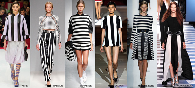
Black and white jailbird stripes could not go un-noticed this season. It was a must-have amongst many hitlist designers. Translated into many forms from 60s mini dresses at Marc Jacobs, 80s paper-bag waisted trousers at Balmain, square boxy shape suits at Acne and Devastee to more feminine dresses and long flowing pleated skirts at Kors and Victor & Rolf.

SPORTSWEAR


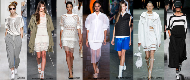
Sportswear continues to be a big influence to many designers. Designers have created molded volume shapes using functional details like zippers and draw-strings and combining sporty fabrics such as airtex mesh and light weight performance nylons. In some cases a more luxurious attitude was mixed in using sequins in sporty shapes combined with sweatpants giving a 90s feel to the silhouettes.

80s ICONS AT JEAN PAUL GAULTIER

And last but not least, we couldn’t resist picking out Jean Paul Gaultier’s show, with this theatrical tribute to some very recognizable 80s music icons. We’ll leave you to guess who’s who!

Tamsin Cook

Share: Facebook,  Twitter  
04/09/2012

Carlo Scarpa at Le Stanze del Vetro

Carlo Scarpa at Le Stanze del Vetro

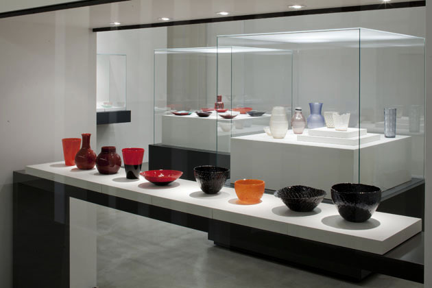
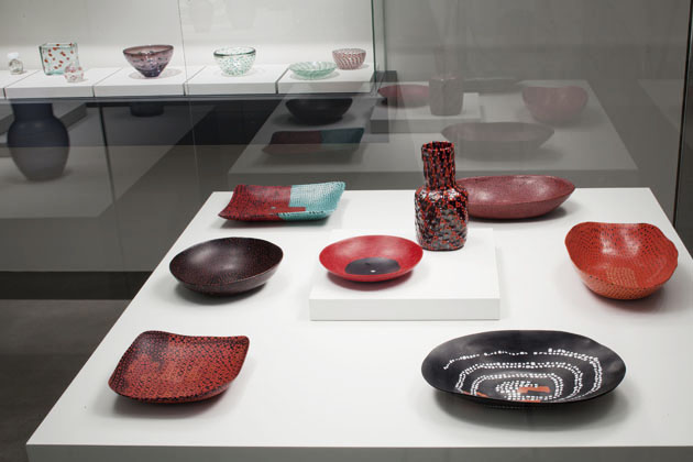
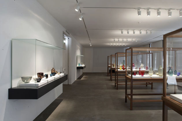
Carlo Scarpa’s work has been widely praised in all of its forms in Venetian area and its surroundings. The famous architect’s legacy is firmly tied to the city and its cultural history and traditions, as it can be seen in the latest show about his work. Titled “Carlo Scarpa. Venini 1932-1947.”, the exhibition is being hosted at Le Stanze del Vetro, a new exhibition space dedicated entirely to the Venetian glass mastery, founded as a joint effort between Fondazione Giorgio Cini and Pentagram Stiftung, with the idea of bringing this (almost forgotten) craft at the centre of contemporary cultural discussion.
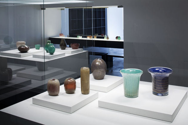
The first exhibition that inaugurated the project space, tries to tell the story of the incredible experimental work developed by the grand master Carlo Scarpa during the years he spent as artistic director of Venini, one of the most famous Muranese manufacturers. That Scarpa wasn’t just a normal designer is a well known fact that this show only reconfirms. Through more than 300 objects on display, it is possible to see Scarpa’s curiosity and depth of his research, that involved not only formal experimentation, but an inquiry into the glass blowing production processes and its possible developments.
Besides showing around 30 beautiful series of vases and glass objects (plates, glasses, containers, perfume bottles) roughly organized according to different production methods – sommersi, murrine, corrosi – the show includes a series of technical drawings that were believed lost in a fire at Venini’s archives a few decades ago. Thus, the exhibition shows both the professional and technical mastery, as well as the incredible creativity of one of the most important Venetian modern masters. “Carlo Scarpa. Venini 1932-1947” is on display until the 29th of November at Le Stanze del Vetro, Isola di San Giorgio Maggiore, Venice.


Rujana Rebernjak

Share: Facebook,  Twitter  
10/08/2012

Copenhagen FW Day 2: Scandinavian Promises

Copenhagen FW Day 2: Scandinavian Promises

Everyday wear to detailed pearl embroideries, joyful colour dashes to super simplicity – day number two at Copenhagen Fashion Week offered contrasts. Always within the format of the Scandinavian vision but where the ‘One-To-Watch’, Anne Sofie Madsen, was the one who invited to dance on the international floor, proving that the time spent working for John Galliano & Alexander McQueen was not a waste.


Noa Noa was neither a surprise, nor a disappointment. In Vision’s beautiful show venue they brought out fresh, simple and natural models dressed in what the brand does best – everyday wear. Having developed into a brand pleasing a chic, younger audience as well as a confident woman who knows her choices, Noa Noa’s S/S 2013 collection gave it all. Comfortable and loose fitted in a balanced mix between detailing, patterns and uncomplicated colours, topping off the look with masculine shoes. As expected, the contrast to next attending at Anne Sofie Madsen’s show was big. One year after being the opening act of Copenhagen Fashion Week, Madsen was back at the official show venue. If we yesterday were looking for someone to push the boundaries, this was the show, today. A faded poster of various deserted holiday paradises – melted ice creams, candy crystals – those are the designer’s own words about the collection.

“This collection has been a great challenge; we have worked with much more detailed and really small scale embroideries, and we have tried to change the look from previous seasons a little bit,” Madsen told The Blogazine when we met backstage few minutes after the show. When talking about the brand’s international presence, the designer mentioned the previous London shows, the upcoming show in Milan and also revealed that she will do a show in New York this year. “We’re really starting to spread around! I’m really happy about showing in Copenhagen and I think I will always do one show here, but it’s important for me to get out and around!”

Two other designers who wanted to spread out and try the ground on new markets were Petter Hollström and Gorjan Lauseger, behind the Stockholm based brand Odeur. Yesterday evening in Copenhagen they showed a collection in all simplicity. The Blogazine met both designers after the shows to get the story behind, and to pick their brains about the future. “When starting to work on this collection, we were in the discussion about what our inspiration always is, the stories, and worlds, we build up around a collection. We really felt a need of going back to the essence of what we like; which shapes and silhouettes, materials, and just really wanted it as simple as possible. There’s a reason why the collection is called Plain!”

About why after three shows at Stockholm Fashion Week they chose to come to Copenhagen they said, “It’s both time and fun to show for a new audience and try out a new market. It’s a part of growing and it’s a part of having a goal. Also, we worked with a lot of Danish people for this season so in one way it wasn’t a choice, it just came natural to come here.” The future for Odeur holds further expansion. “We are working on new projects and new products; shoes, leather accessories and complete silhouettes. We want to be able to show what the brand is breathing. Actually we are looking for locations for our first concept store which we hope to open within a near future!”

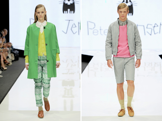
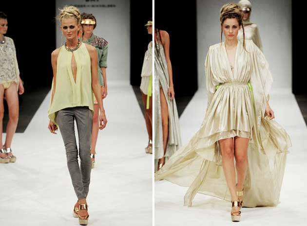
The colours and the variety in show came first from Peter Jensen and later in the evening, DAY Birger et Mikkelsen. Jensen showed preppy looks where the few black outfits got forgotten and lost fast among the joyful colours. DAY showed just as many outfits in complete variety that one could expect out of the Danish family company. Breaking down the regular runway, the brand had instead chosen a well rehearsed choreography for the show, creating a live show room of mannequins, bringing out look, after look, after look, giving the audience time and thoughts of the complete collection.

Lisa Olsson Hjerpe – Image courtesy of COPENHAGEN FASHION WEEK®

Share: Facebook,  Twitter  
09/08/2012

Copenhagen Fashion Week: Democratic Design

Copenhagen Fashion Week: Democratic Design

Scandinavian fashion has since long been on The Blogazine’s radar, and yesterday we went to Denmark for the inaugural of Copenhagen Fashion Week. Together with the three fairs, which will also take place during the week, the audience in Copenhagen can go from commercial looks to designers that are pushing the boundaries. Though, Scandinavian fashion might rather be known for being ‘democratic’ than avant-garde. During our first day of shows we saw adaptable collections of fine Scandinavian design and ended our day on a rooftop in the meatpacking district of Copenhagen.


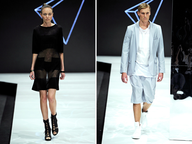
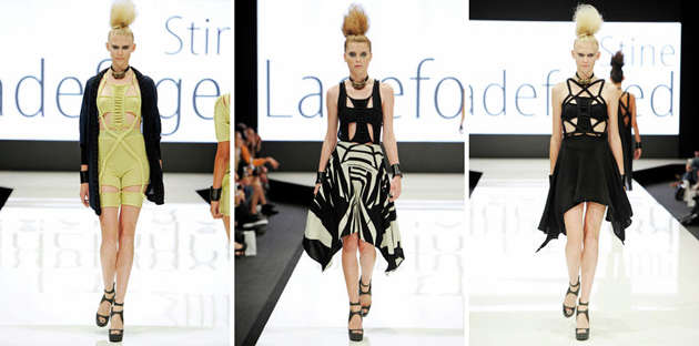
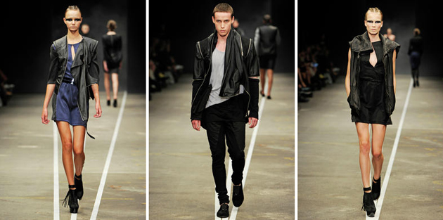
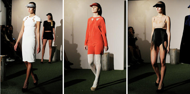
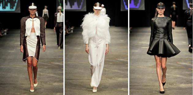
The honours of doing the official opening show was given to Freya Dalsjö, the designer hailing from the Antwerp Royal Academy of Fine Arts and known for uniting fashion with art. The models were walking the runway to the rhythm of a heavy beat and in company of an army, a video projected to the backdrop. The powerful yet simple looks draw attention to military shapes in both sun visors and garments, and presented the attention to details in the cuts and concord of colours. From Freya Dalsjö’s Scandinavian commanding simplicity, to Stine Ladefoged‘s detailed and playful knits. The work between heavy and fine gauges was creating interesting silhouettes, shaping and volume.

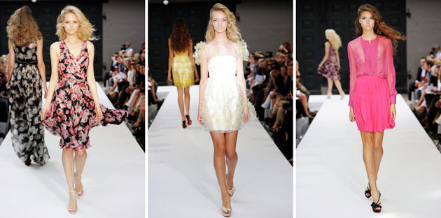
From two fairly powerful shows to the most innocent one of the day; YDE. With the show being held outside in a beautiful courtyard and light, romantic and sensual yet glamorous, looks in colours going from soft yellow and green to strong pinks and lilac, the inspiration wasn’t to be mistaken. “I was very much inspired by flowers and wanted to create a sort of Garden of Eden,” the designer Ole Yde told the Blogazine after the show. YDE makes, beside the regular prêt-à-porter collections, also custom made pieces. “I have to emphasize that what we do is not haute couture, it’s something completely different. We create one of a kind pieces for special customers, but it can be anything from a day dress to evening wear, the important is that we make them feel good and comfortable.”


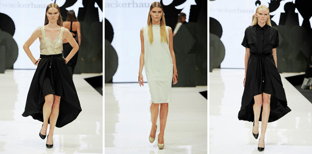
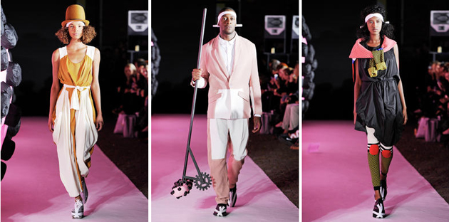
From the light and glamour, back to a dark collection at David Andersen. Both the men’s and women’s collections were carried out on the runway, and the similarities in the shapes in between were present. Tailcoat cuts, layers and material mixes presented in clean silhouettes where a little sequins, shimmer and sparks brought a pleasant life to the otherwise dark collection. The evening’s crowd pleaser came in Wackerhaus, who filled the house to the brim and presented an astonishing collection where the ‘wearability’ went from day to evening. Despite a long day behind us, we couldn’t miss the Henrik Vibskov show, which was a performance of its own, and where the graphic prints were carried out by models whose ebony skin colour brought an effective contrast to the vivid colours.

For the evening’s final stop, The Blogazine went to the meatpacking district and Soho House rooftop for Hubert‘s show with a live musical performance and models in slow motion. A collection where all the impressions of the day came together and confirmed the Scandinavian S/S 13.


Lisa Olsson Hjerpe – Image courtesy of COPENHAGEN FASHION WEEK®.

Share: Facebook,  Twitter  
03/08/2012

Guest Interview n°42: Miista

Guest Interview n°42: Miista

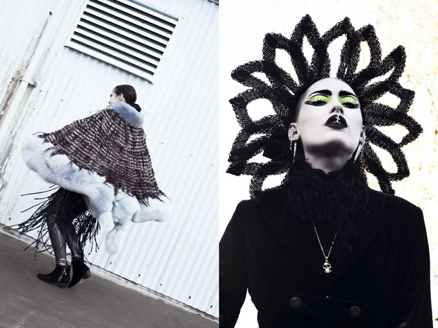
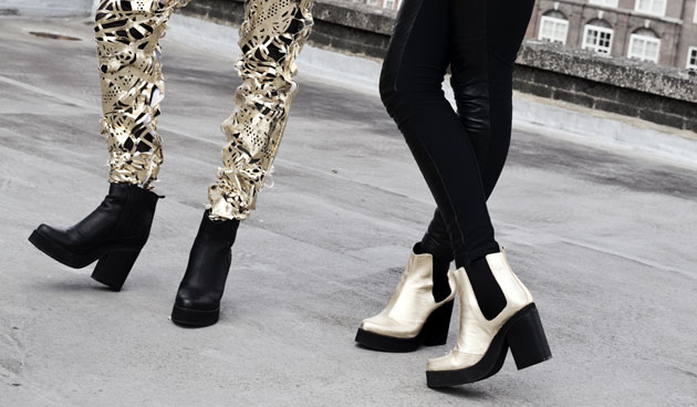
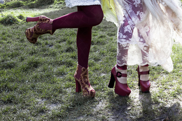
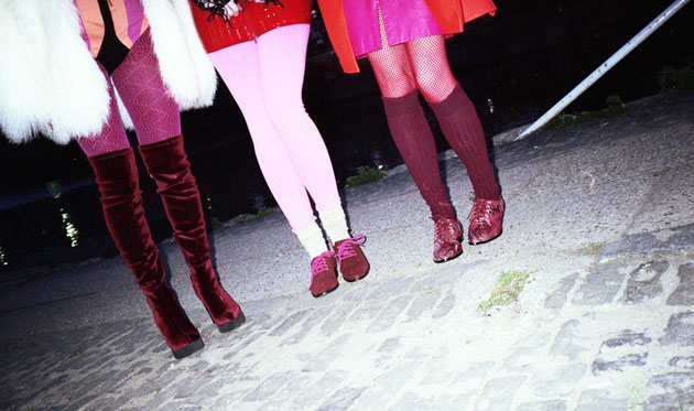
Miista is an East-End London footwear brand that likes to break the rules, but always pays respect to the craftsmanship. Independent, charmingly irreverent and curious, the brand is mixing elegance with crazy in every thinkable mix of materials. The Blogazine had a chat with the founder Laura Villasenin and talked about madness, Galicia and social media.

Miista’s signature as a brand is ‘measured madness’. Do you have to be a bit mad to be in the fashion industry?
Well, I can’t speak for the industry as a whole, but you certainly have to be mad to start and maintain a shoe line! I mean, I’m living out my dream but it’s definitely a nonstop whirlwind of insanity day in and day out.

You experiment a lot with new techniques and unexpected design combinations. Do you like to surprise?
I think as a designer that is ultimately the goal. You always want to present something new, something unexpected. Derivative design is something foreign to Miista; we march to the beat of our own drum and while we spend a lot of time trending and combing the web, glossies and the streets for inspiration we try to not look too much at what other designers are doing.

You’re originally from Galicia but today you live and work in East-End London. How are you mixing the best of ‘your worlds’?
It’s interesting because these two places couldn’t be more different from one another. Galicia where I grew up is a very traditional place. The culture is strong, so naturally the fashion and really the overall social vibe are very classic and conservative – people do not really dress outside the box so to speak. What’s incredible is the local markets that are filled with handmade goods – old world artisans are creating things using techniques that have been passed throughout centuries! It’s incredible to see the craftsmanship and quality, two markedly important elements of Miista.

In London I immediately fell in love with the freedom of expression that permeates the city. East London in particular is an ‘anything goes’ kind of place and I found that to be so inspirational – there is experimentation going on everywhere; art on every wall, music from every window, and the fashion is out of this world. Exposure to all of this helped me to really tap into my own personal style. ‘Measured Madness’ as the cornerstone of our design can certainly be attributed to London’s influence, while the traditional production, quality and techniques are derived from my upbringing in Galicia. Miista is all about unexpected juxtapositioning, so really my natural view into London style through the lens of traditional Galician sensibilities is Measured Madness in and of itself! In that way I think my two worlds have combined quite nicely and I’ve really worked to showcase the best elements of each.

What part of the creative process is the most essential one, for you personally?
For me it’s always been about the initial research. I love the process of searching high and low for inspiration, and I always tend to look equally outside of fashion as within. For example, our upcoming SS13 collection is heavily influenced by biological structures, organic textures and outer space. The process of collecting all of these ideas and then editing them down to key themes and beautiful mood boards is just such a cool inspiration journey. And this time around I put together a massive board on Pinterest with all of my favourite inspiration images so it’s been really fun to be able to share that with our customers early on, and kind of give them hints at what to expect while still remaining utterly obtuse.

Talking about Pinterest, Miista have really embraced social media. Is it a PR tool you truly enjoy or a ‘necessary pain’?
We love social media and we’ve really just been having so much fun with it. We’ve always worked to remain highly interactive with our customers, and building that relationship with them through social media platforms is a fantastic way to create a legion of loyal, involved ladies. We are obsessed with the little community we have and it’s incredible to see how they relate to the collections. Basically, anyone who keeps up with us online really gets a sense of who the Miista team is and what we’re all about.

So it’s mostly just a lot of fun!
Don’t get me wrong – it’s a lot of work. There has to be a constant flow of content and a sincere rapport going on or no one will care. We make sure to keep things as interesting as possible by working new promotional angles – people want to be engaged! Also, our social media Miista, Chloe, is stationed out in NYC, so on top of having all of London to play with, having representation in both Europe and the US doubles our network of possible collaborators. It has really cemented our international brand status. American brands seem to have caught onto social media much more quickly than those across the pond, so we have a bit of a leg up on our local competition in that regard. Chloe is our secret American weapon!

A lot of what you showcase seems to be about a full styling experience and about creating a feeling for Miista, rather than only showcasing the shoes. What is the emotion you want to evoke in the recipient?
We definitely aim to breathe as much life as possible into our collections; we want them to go way beyond just another pair of shoes in your closet. Our Fall 2012 collection Electric Witches was deeply inspired by ‘90s rave culture, Boy George and elements of Victorian detailing, we’re moving back to our roots after SS12 where we dabbled in a more classic, feminine realm. Each of our four collections emanates a certain power, be it sly and wily or subdued and feminine, we live for strong statement shoes. Miista is all about strength and freedom and personality, so above all else we want our customer to feel a sense of irreverent cool.

Lisa Olsson Hjerpe – Image courtesy of Miista

Share: Facebook,  Twitter