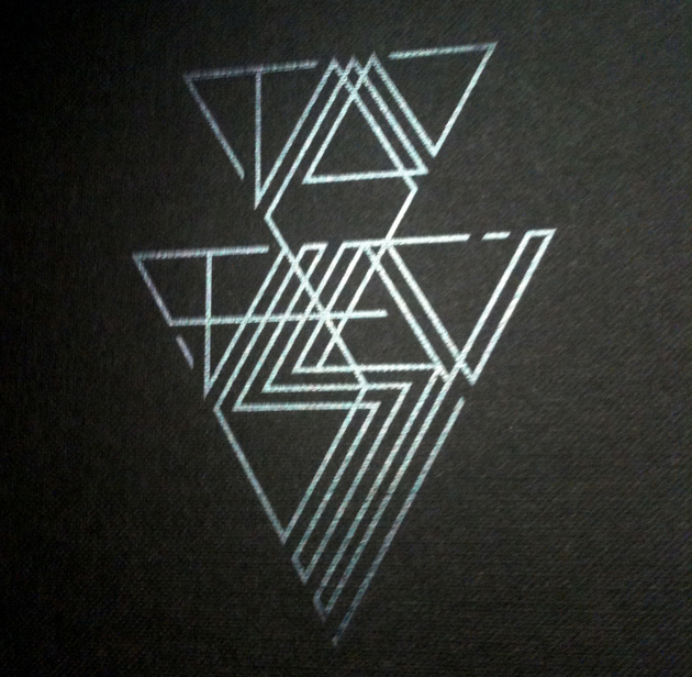
Guest Interview n°45: TT
With his bold graphic work recently shown on the runway shows of Tim Coppens and Y3 during the AW13/14 fashion shows, Tom Tosseyn is not just a graphic designer. He is more of an artist, but one who can visualize and create graphics for his client; a TT piece of art but also a creation which reflects and compliments the client.
TT has a very clear handwriting and identity which is very contemporary and unique to him. The bold simplistic graphics are very distinct and simple at first glance but go behind his thoughts, and the sophisticated and intellectual way he works starts to shine through giving his work another angle.
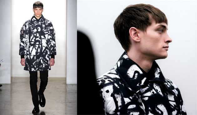
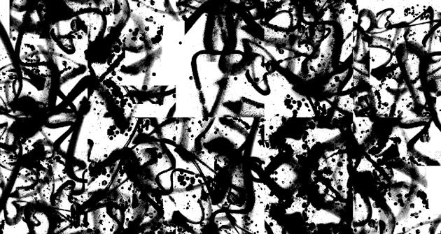
You mainly design graphics and art for fashion right now, but how did you get into design?
I studied for 2 years product design at the Henry Van de Velde Institute in Antwerp, but wanted something more creative, so I switched to graphic design at the Royal Academy of Fine Arts in Antwerp. Three years later I graduated from the Higher Institute of Fine Arts in Antwerp. I then moved to Italy and started my career in fashion, and worked for 4 years in the creative team at Diesel, followed by 55DSL. I was then recruited to create the graphics for the Hugo Boss Orange line in Germany. Two years later I returned to Belgium where I set up as a freelancer working for companies such as Eastpak, Fred Perry, Jil Sander, Acne studio, Y-3, Tim Coppens and Raf Simons.
Besides fashion, do you create graphics and artworks for any other industries?
I make a lot of work for the music scene, I’ve designed album covers and logos for R&S Records, the original techno label in Belgium, and also for some bands from America like Crossover. I recently started exhibiting and collaborating with other Belgian and international artists at Z33 in Hasselt, Annette De Keyser gallery and MX7 gallery in Antwerp.
Last year I made my own series of T-shirts and silk foulards under my TT label which I produced and sold. The foulard was initially part of a project and exhibition.
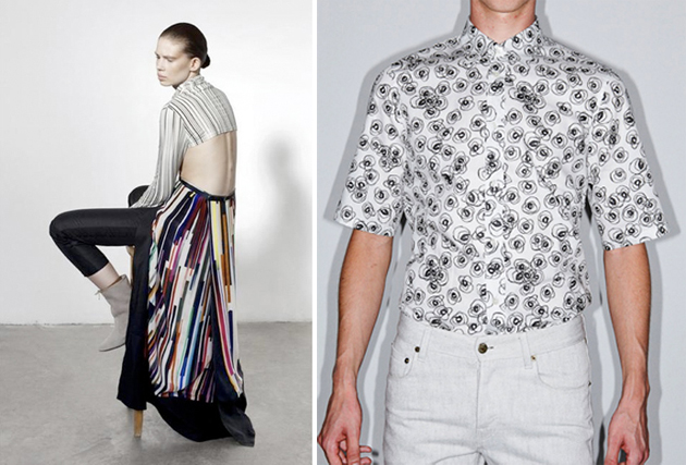
You also teach fashion and textile design at the Gent Academy of Art. What do you enjoy about tutoring students?
The best thing about teaching is to be able to guide young people in their creative processes as well as in their personal development and life path. Freedom for me is very important and I like first to show them how to deal with this liberty, especially for the young kids of 18 years old, as most of them are lost when you give them complete freedom. They should exploit this to the max; get the best out of it creatively as well as personally. It’s their journey but it gives me a great feeling when I see them evolve, struggle and yet find their way by absorbing and interpreting the information which I’ve given them. Like this I hope my work with them adds some positive & constructive value to their life.
You’ve recently been part of the project of 60 years celebration of Fred Perry, can tell us about this?
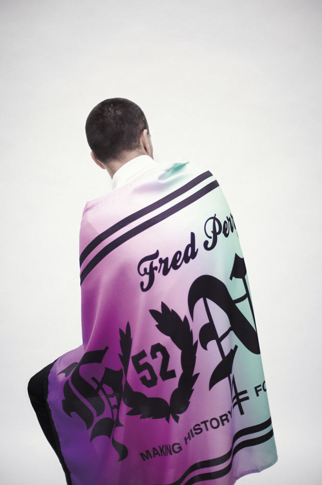
To personalize a reproduction of 1952 Fred Perry shirt I chose to design a flag, a medium often used to represent one’s devotion to a ‘group’ or subculture – whether it’s to a boy’s club, a football team or country. The design is inspired on hooligan flags, that explains the use of a gothic font that shouts out the word HONOR and the ‘O’ I changed into the Laurel Wreath symbol. The background base of the flag is a gradient of colours, this breaks the hardness of the graphic and gives it a more contemporary feel.
What influences you in your work?
Anything and everything. It can be a sign, a broken window which has been taped up. Other artists inspire me, art streaming, 1920s, the Bauhaus, 80s music, new wave. I’m in the city a lot so my urban surroundings inspire me a great deal. It can also be a person or even just how I’m feeling at that moment.
Tell us about your thing with numbers.
I don’t wear a watch but if I ever do see the time, digitally somewhere, it always has a sequence. For me it’s a graphical representation of time and it catches my eye, it’s a reminder for me to live in the moment without rushing after tomorrow or dwelling on the past. It’s about the here & now.
Which 3 words sum up Tom Tosseyn?
Unique, perfectionist, stubborn and bold. That’s 4!
