06/11/2015

Why has Alber Elbaz left Lanvin?

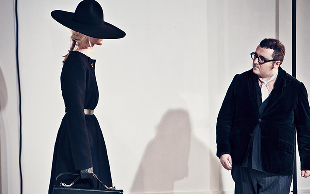
After more than 14 years at Lanvin, Alber Elbaz is now leaving his position as Creative Director for the French luxury brand. Despite apparently leaving without much fanfare, his departure has not passed unnoticed, either by Lanvin’s 330 employees or the rest of the fashion world.
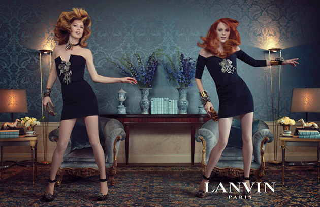
It all started a week before the departure went official. Elbaz received the Superstar award at Fashion Group International’s Night of the Stars and spoke about the pressure creative directors and designers are put through today. He did also speak about how the design profession has changed during the last couple of years as he remembered the days when a designer created dreams and thought about the women he or she designed for, instead of focusing on what will look best in pictures. The nostalgia was hard to miss and the rumours didn’t slow down by the fact that the position of Creative Director at Dior now was free after Raf Simons had announced his departure for similar reasons.
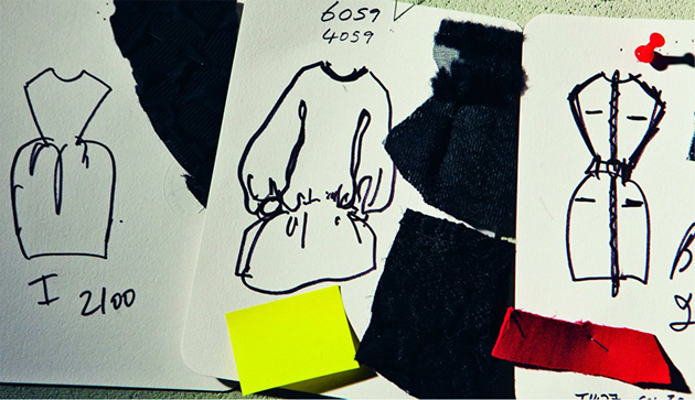
There was however truth behind the rumours because Elbaz confirm his departure shortly after in an emotional Instagram post – the ultimate means of communication today. He explained his exit in a statement published in BoF where he said that the decision hadn’t been his and instead was made by Lanvin’s owner, Shaw-Lan Wang. He also took the opportunity to celebrate his co-workers at Lanvin and thank them for the great time they have had together restoring Lanvin’s position as one of France’s most luxury fashion brands.
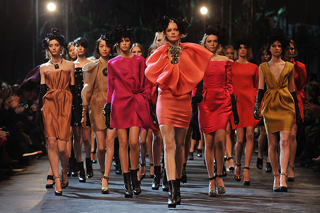
Elbaz’s impact on contemporary fashion is huge, even though he seems to be quitting unhappy with the progression of design profession. Elbaz will not just be missed at Lanvin by the fashion world, the employees have taken the news with sadness and complained to its owner. Jack Lang, the former French minister of culture is the latest to complain against Shaw-Lan Wang’s decision, WWD reports. It does unfortunately not seem to have made them change their minds even though we suspect and hope that we haven’t heard the last of the story. The protests from employees do however matter and prove that Elbaz isn’t just a creative designer but also a great leader. The only question that now remains is – what will be his next step?

Hanna Cronsjö 
05/11/2015

Daily Tips: Ethically-Made Sneakers

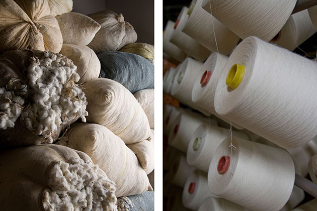
For quite a while now, there has been a growing desire for our clothes to be not only beautiful and carefully crafted, but also to respect ethical, ecological and human values in production. And, while many brands have embarked on the journey of making ethical clothes, only a few were, strangely, able to give their impeccable work on materials and production processes, an equally compelling form. French fashion brand Veja is one of those rare breeds who have managed to fuse together thoughtful production processes with impeccable design. Their meticulous work with local produces is carefully documented on their website and forms the central aspect of their advertising – which, interestingly, Veja refuses to otherwise use. Used to heavy branding strategies and even heavier product prices, looking at Veja’s products we can only ask, how do they actually do it?

The Blogazine 
04/11/2015

Ryan McGinley’s Fall and Winter

Over the years, Ryan McGinley’s camera has become more a tool for invention than documentation, conjoining the corporeal, narrative aspects of photography and cinema with their more orphic qualities. His images hover deliriously between reality and utopian fiction, characterized as much by apparent authenticity as obvious impossibility. This shift is crystalized in his most recent exhibitions at Team gallery
: Winter at 83 Grand Street in New York, and Fall at 306 Windward Avenue in Los Angeles. To create this work, the artist and his team photographed nude figures in upstate New York during the eponymous seasons. While the resultant images have precedent in the oeuvre — both thematically and aesthetically building upon McGinley’s expansive and culturally pervasive Road Trip pictures — they also represent a multifariously momentous change within his practice. Past works have been created across the country during summer; by concentrating on a single region during specific times of the year, McGinley transposes the axis on which his works operate: rather than exploring the American landscape through the lens of geographical variation, these images scrutinize and poeticize its temporal metamorphosis.

The Blogazine – Images courtesy of Team Gallery 
03/11/2015

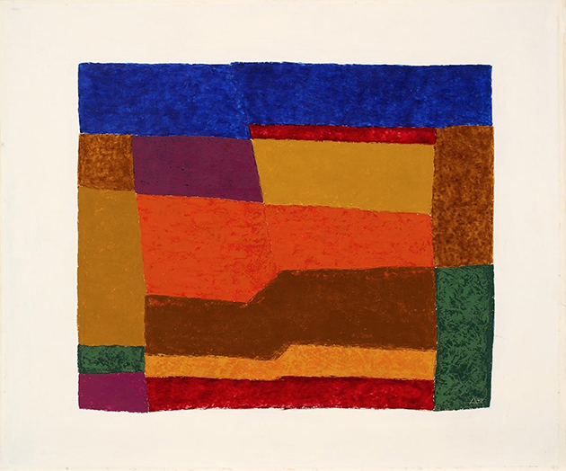
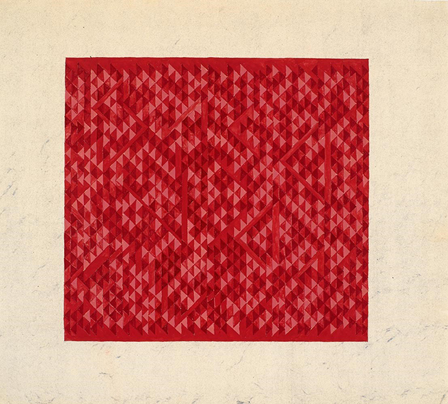
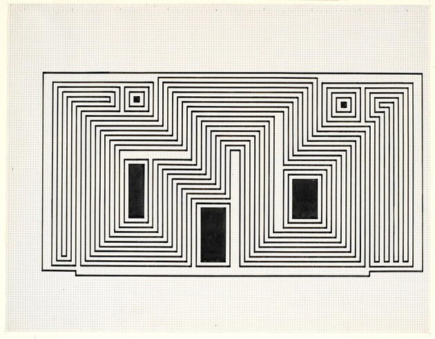
Daily Tips: Anni and Josef Albers in Milan

Forced into exile in the United States after Bauhaus’ closure in 1933, Anni and Josef Albers found a curious form of ‘consolation’ for their displacement. Influenced by a museum collection they saw in Berlin, Anni and Josef would travel from their home in North Carolina to South America over the course of their life. Convinced that “art is everywhere” in the countries of Central and South America, they developed a rich personal collection as well as a direct artistic dialogue between their own work and pre-Columbian objects they found. Shaped by their personal and artistic interest, this rich collection is currently part of an exhibition that opened last week at Museo delle Culture in Milan. Titled “A Beautiful Confluence”, the show “reveals the very similar visual and artistic interests and personal passions of Anni and Josef and the native people of the world that became their haven.” The exhibition runs until 21 February 2016.

The Blogazine – Images courtesy ofJosef and Anni Albers Foundation 
03/11/2015

Punkt – Re-designing Use

When the first telephone was patented by Alexander Bell in 1876, despite all imagination and possible futurologist thinking of the time, scarcely anyone could have predicted that – a hundred and forty years later – it would have become such an epoch-defining device. In many aspects, telephones are currently at the forefront of innovation, with their use spanning areas like medicine, for early diagnosis and to help patients attain to therapies, to everyday life, to order food, book train tickets and flights or engage with artwork in museums. Telephones and related technologies are central to economic growth, while sheer existence of infrastructure necessary for their use speaks volumes about the level of development in society.

Due largely to Apple’s revolutionary yet secretive attitude towards product development, telephone design seems almost an alchemical process involving careful combination of perfectly studied curves, subliminal sounds and elusive tactile qualities. The resulting concoction gives origin to not only a beautiful material product, but – as we are able to witness daily – to a whole set of new habits, social relationships and values, that were morphed by and evolve with our phones’ titanium, glass and plastic shells.

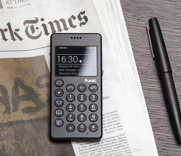
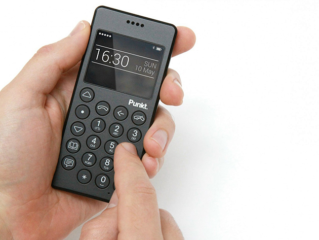
Despite smartphones’ addictiveness – both on social, cultural, economic and personal levels – a brave new product aims at reforming the very culture of telephone use we have acquired over the years, bringing it back to its original – and today archaic – functionality. Punkt, designed by Jasper Morrison, is the simplest of mobile phones. Its design could be described as minimal, defined by a black plastic shell, rectangular shape, well-rounded edges and round, easily identifiable keys. Were it not for the year of its release, Punkt would be nothing else but an unassuming mobile – or cordless – phone. And thus, what is revolutionary in Punkt is not its design per se, but the context within which it is being framed, that allows its design to make a subtle, ironic point about its use. Namely, it shows that products like Punkt have for a long time been obsolete.

For such a product, it was only natural that the company would commission Jasper Morrison to develop its design. Know for his “supernatural” approach to designing, Jasper Morrison is a proponent of undesigned design as creation of objects that look immutable, as if they’d been the same for centuries. He is the designer of archetypes – objects that will unlikely require a redesign in the near future and which seem to stand at the origin of an object category and their specific form. Punkt was designed to defy the current trends on the market. It can only serve two functions – make calls or send text messages – and such reduced, austere functionality – austere, that is, if compared to current smartphones and their functional exuberance – is reflected in its strict black shell. Punkt mobile phone, in fact, looks as if it were almost physically uncomfortable to use. And yet, when you pick it up, its carved volume and slightly rugged surface fits perfectly, seamlessly into your hand, anticipating the straightforwardness of its ‘archaic’ use. It invites you to hold it up close to your ear, rather than blankly stare at its screen.

But what is the point of Punkt beyond an obvious defiance of current market trends? Can its users surpass contemporary social pressures? Can its design help to make us a bit less intoxicated by all that is digital? Morrison’s intent was certainly not to make ‘classic’ telephone use appear sexy, glamorous or fashionably appealing; Punkt’s shell is not bright yellow or clad in rose gold. As such, Punkt is perhaps bound to remain just a utopian proposition – an object designed to speak about design and the values it confers when it is nothing more than what it is.

Rujana Rebernjak – The Blogazine 
02/11/2015

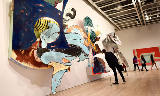
Discovering Frank Stella at the Whitney

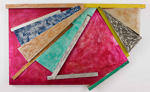
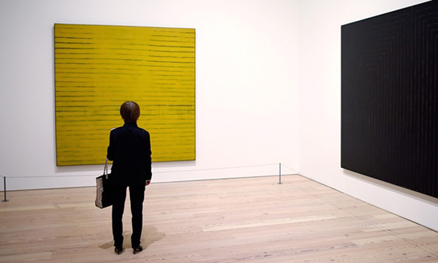
What is the role of major public museums? Among others, to bring those artists that might have been neglected by both the mainstream or niche cultural tendencies to the forefront of public attention. It was precisely this consideration that led to one of the most anticipated art shows of the season – Frank Stella’s retrospective at the recently opened, Renzo Piano-designed, Whitney Museum in New York. As it goes, when the Museum’s curators asked what major artist hasn’t had a retrospective in a long time – as questionable as it might seem as a curatorial strategy – ‘the surprising answer, among others, was Frank Stella,’ according to Michael Auping, the chief curator at the Modern Art Museum of Fort Worth, one of the minds behind the exhibition. As the artist’s most comprehensive retrospective to date, Frank Stella: A Retrospective brings together his best-known works installed alongside lesser known examples to reveal the extraordinary scope and diversity of his nearly sixty-year career.

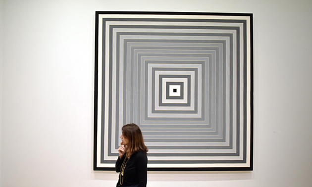
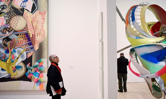
Approximately 100 works, including icons of major museum and private collections, will be shown. Along with paintings, reliefs, sculptures, and prints, a selection of drawings and maquettes have been included to shed light on Stella’s conceptual and material process. Throughout his career, Stella has challenged the boundaries of painting and accepted notions of style. Though his early work allied him with the emerging minimalist approach, Stella’s style has evolved to become more complex and dynamic over the years as he has continued his investigation into the nature of abstract painting. Although the thrust of the exhibition is chronological, the artist, who has been closely involved in the installation, has juxtaposed works from various periods allowing some rooms to function as medleys. The presentation highlights the relationships among works executed across the years, suggesting that even the most minimalist compositions may invite associations with architecture, landscapes, and literature.

Frank Stella: A Retrospective underscores the important role Stella’s work plays within the art historical framework of the last half century. It provides a rare opportunity for viewers to discover the visual and conceptual connections within the extraordinarily expansive and generative body of work of an artist restless with new ideas. “A Stella retrospective presents many challenges,” remarks Michael Auping, “given Frank’s need from the beginning of his career to immediately and continually make new work in response to previous series. And he has never been timid about making large, even monumental, works. The result has been an enormous body of work represented by many different series. Our goal has been to summarize without losing the raw texture of his many innovations.” The exhibition will remain on show until 7 February 2016.

The Blogazine – Images courtesy of the Whitney Museum 
30/10/2015

Kyrja Puts Iceland on the Fashion Map

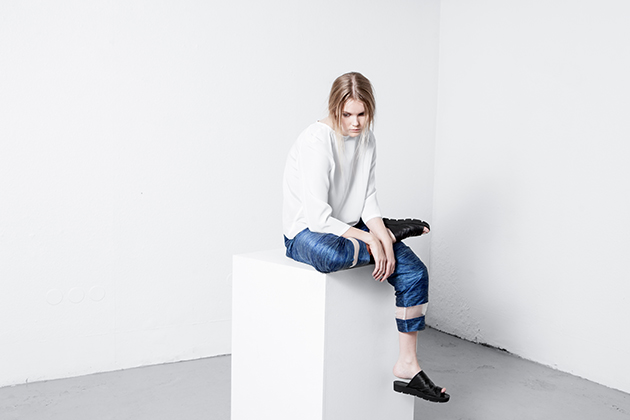
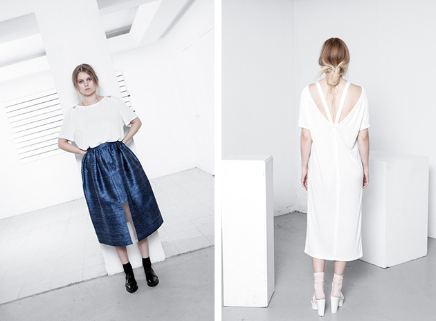
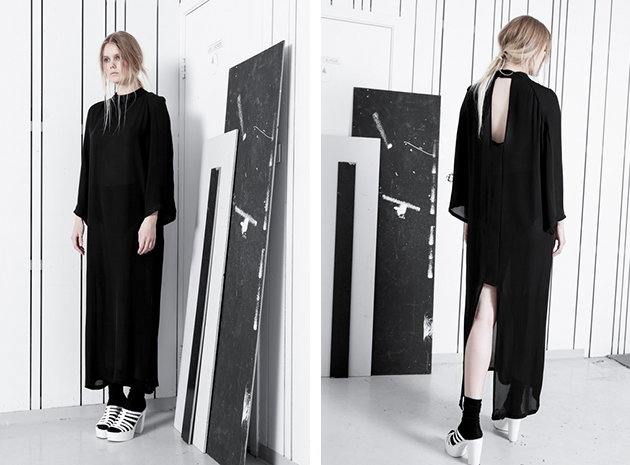
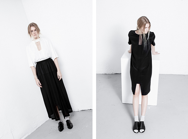
We are really passionated about celebrating new, talented designers and we believe it to be especially interesting with young talents that help put their countries – that traditionally wouldn’t be considered fashion-forward – on the fashion map. The designer behind the upcoming brand Kyrja is Iceland-native Sif Baldursdóttir. She graduated from Istituto Marangoni in Milan in 2010 and founded her own label two years later. Her debut collection was launched for A/W 2013, which led to Kyrja’s first award, with the prestigious “Looking forward to in 2014…” prize at the Reykjavík Grapevine Design Awards.

The brand has captured the raw and clean design aesthetic that often is referred to as Scandi-chic and combined that style expression with natural and exclusive fabrics such as silk, mohair and bamboo. The result is high quality design that feels urban and contemporary, minimalistic without being boring. The focus is placed on details such as great cuts, interesting see-through details and, last but not least, Baldursdóttir’s amazing sense for materials. The whole feeling of the brand is based on an effortless, yet chic look that can be spotted on the streets of any big city in Scandinavia. It’s the typical look for a genuine cool girl that succeeds with looking cool without even trying. Baldursdóttir has found her own expression among many Scandinavian design references with a style that will put both her and Iceland on the fashion map.

Hanna Cronsjö 
29/10/2015

Daily Tips: 2015 Stirling Prize Celebrates Education

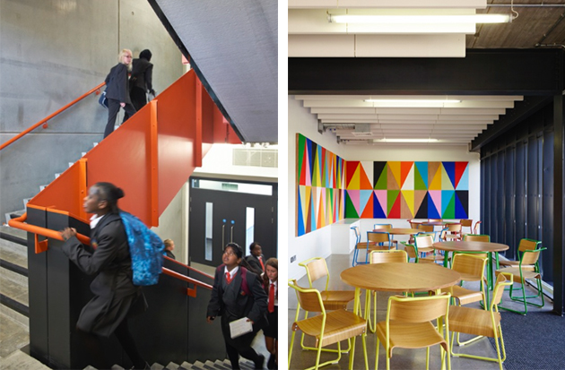
“The new building has made me more excited and motivated to come in each day. It’s just such a lovely environment to work in.” – one of the students of Burntwood School told the Guardian. With this simple phrase, it is easy to understand why it was Burntwood School to receive the Stirling Prize for 2015. Designed by Allford Hall Monaghan Morris (AHMM), the project added six new buildings to the existing school campus in Wandsworth, designed in 19532, creating a coherent space of teaching blocks and sports and arts facilities, interspersed with public squares and lawns. The project was awarded not only for its formal architectural qualities, but more importantly, since it serves as a bold reminder for the power of design in education.

The Blogazine 
29/10/2015

The Art of (Shoe)Making: André Perugia

The best stories are often told by small details. When thinking about a look, shoes are often something complementary, something that goes along and completes other – more important, more visible – choices. But looking at the past, the diversity of the history of fashion can only be caught by individuating the net of relationships between great personalities, some exalted, some forgotten, that have given shape to fashion as a multifaceted experience we consider it today: a balanced ensemble of clothes, accessories, fantasies, myths and desires.

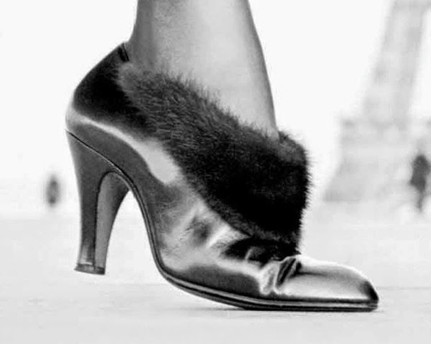
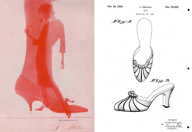
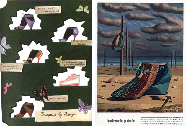
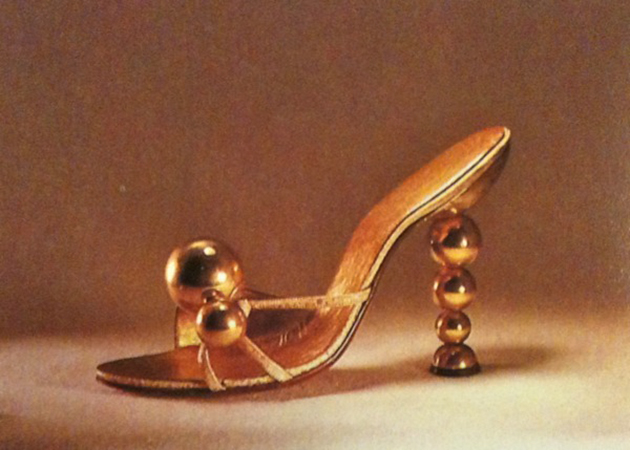
Andre Perugia is surely one of these personalities. Perugia is remembered as one of the first acclaimed shoe designer and maker whose name has been synonymous with style and inventiveness for an extremely long period of time. His career spanned from the 1920s to the 1960s, He was quite revolutionary, not only in the designs themselves, but also in the way he approached shoe design. After learning the technical skills from his father, he set up his own boutiques, the first in Nice, his hometown, and then in Paris. His abilities as a maker developed working in an aircraft factory during First World War. The precision needed in that sector opened up his mind to the possibility of applying ‘science’ to shoemaking; this made him halfway between a maker, an engineer and, of course, a master createur. He collaborated with the designers who ‘made’ history of fashion, from Paul Poiret to Elsa Schiaparelli and Christian Dior; he was also a collector of art, and many of his designs are hommages to his favourite artists, from Braque to Picasso. His last collaboration was with Charles Jourdan – he acted as consultant to the company between 1960 and 1966 – to whom Perugia left his personal archive after his death in 1977.

Most interestingly, he was a pioneer in giving value to his design by patenting his models. This denotes the growing consciousness of makers in their own capabilities and, above all, their inventiveness and creativity. As a common raise of consciousness, many designers from the 1920s onwards started to care about copies and looked for ways to protect their work. Madeline Vionnet, maybe the most remembered case, used to make videos of her apparently simple designs, in order to safeguard not only her products, but also, and more importantly, her creative process. Thinking about material property, it is interesting to see how these designers started to reclaim the authenticity of their products, as symbols of craft, quality, value and identity. Perugia’s designs were extremely precise and considered the aesthetics and the use as well, confirming that to shape a shoe is to shape a walk, and of course the confidence of the person who wears them. Infamous is his quote: “A pair of shoes must be perfect as an equation and adjusted down to the last millimetre, like a piece of engine”. It is difficult to point out one feature that can characterise Perugia’s works. Each piece shows a different skill, and his keenness to put ahead a concept. Some of his ‘inventions’ – this is maybe the best way to call them – are incredible in their consideration of both ‘wearability’ and look; for instance, the Desappearing Pump or ‘Vanishing Vamp’ made for Givenchy in 1955 was a visual adjustment to make the foot more elegant, playing on what was visible while walking.

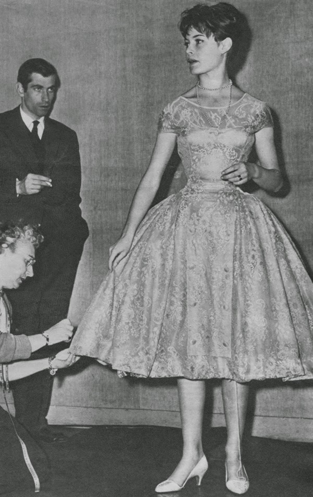
Shoes designed by André Perugia are kept in museum collections all over the world –in the Bata museum in Toronto, in the Met in New York, in the V&A museum in London, in the Kyoto Costume Institute, among others – and jealously possessed by private collectors, but his story has never been publicly told. It is interesting to know that the exhibition ‘Shoes: Pleasure and Pain’ at the Victoria & Albert Museum in London showcases many pieces designed by Perugia, alongside typical, historical and contemporary iconic pieces. His name pops up in the exhibition, catalysing the attention of who looks for a fil rouge in the historical development of shoes in the 20th Century.

Marta Franceschini – Images courtesy of the Historialist 
28/10/2015

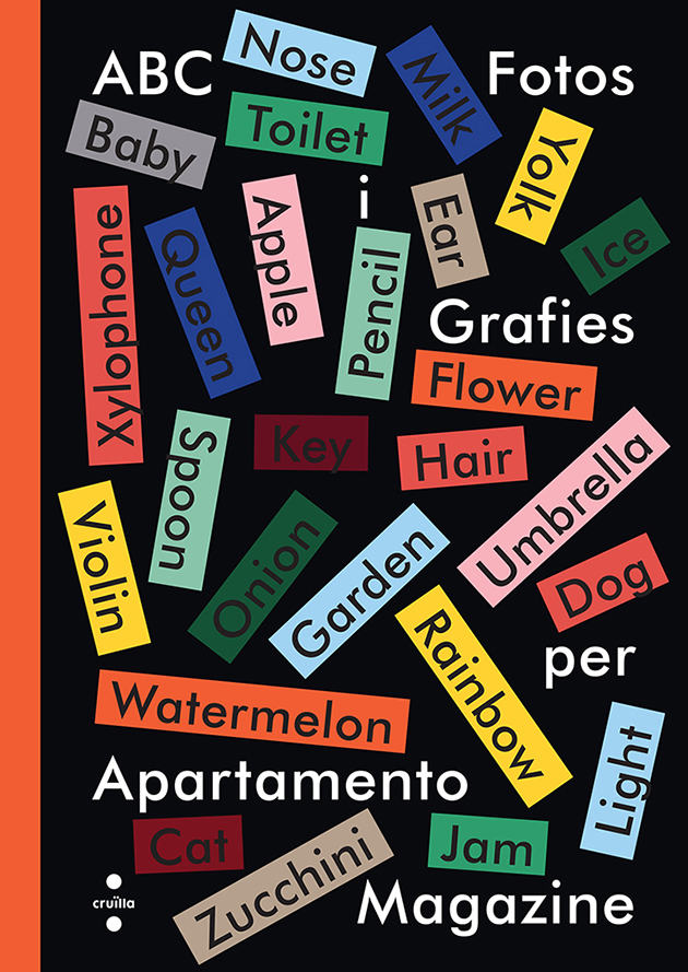
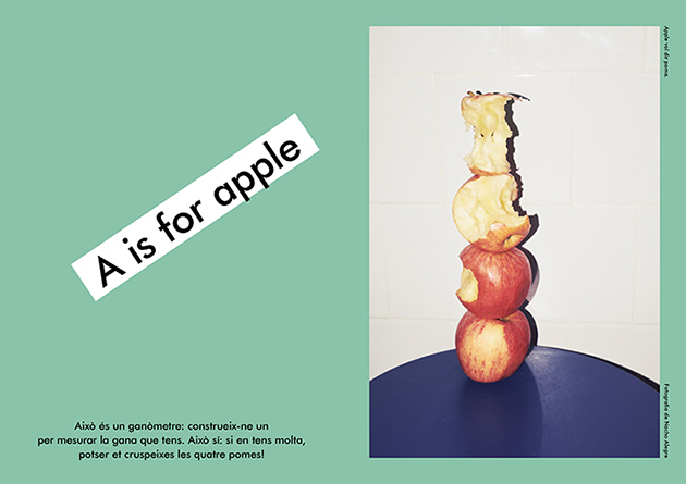
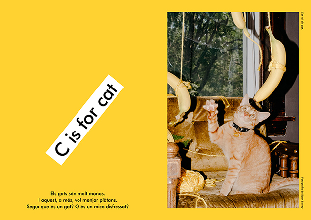
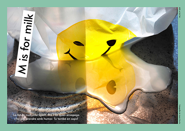
ABC: Letters, Words and Images by Apartmento

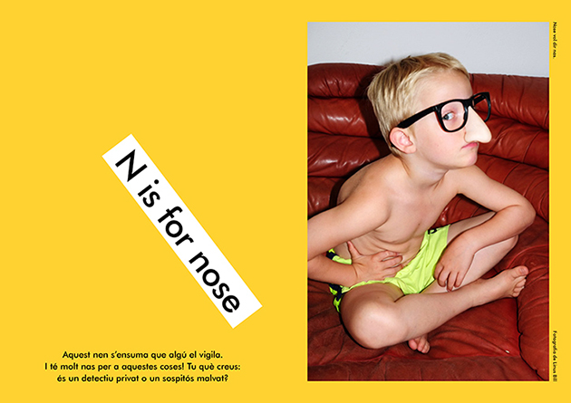
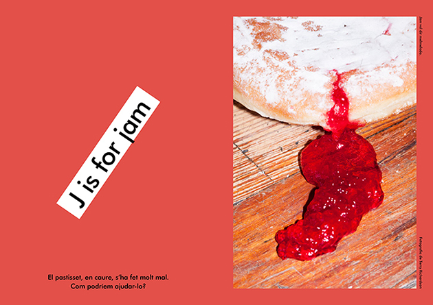
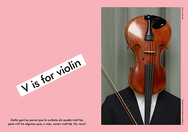
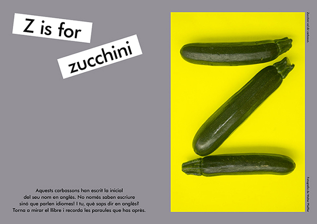
How can letters be transformed into words, words into ideas, concepts and thoughts? The latest publishing endeavour coming from Apartamento magazine transforms letters and words into images in a uniquely delightful children’s photo book. Gathered from the magazine’s rich roster of incredible photographic collaborations, the book brings together photographs from Juergen Teller, Wolfgang Tillmans or even Terry Richardson, as literal, yet curious, illustrations of its alphabet. From zucchini to milk, from cats to noses, the photographs are representative of the subtle visual language Apartamento became known for over the years. Apartamento’s co-founder Nacho Alegre explains, “We tried to find pictures that could, through some narrative, involve the kids in a story. The accompanying words ask questions about the images, like what’s behind them and what they make you dream of.”

The Blogazine – Images courtesy of Apartamento Magazine