24/05/2012

Retro – Recycling or Innovation?

.

Retro – Recycling or Innovation?

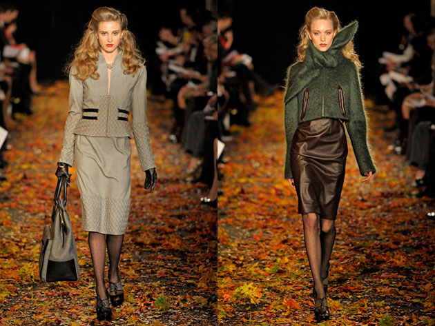
Retro and vintage are not unusual expressions when talking about design, fashion and style. The interest for the 20th century is an obvious reference and affecting point in the current fashion, as well as styles and outfits are copied right off through a mix of vintage clothing and retro trend pieces. While innovation, new thinking and uniqueness normally define fashion, it’s also a part of historic continuity where a constant progress also includes the revival of elements. Discussed from a historical angle, the reinterpretation of styles could be taken all the way back to when the Romans ‘reinvented’ the ancient Greek dress.


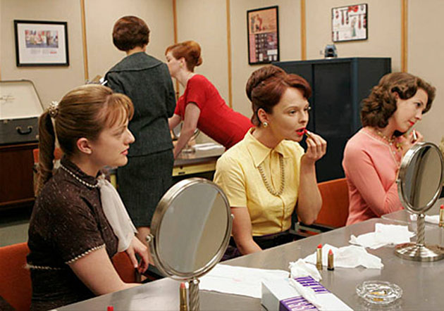
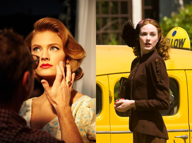
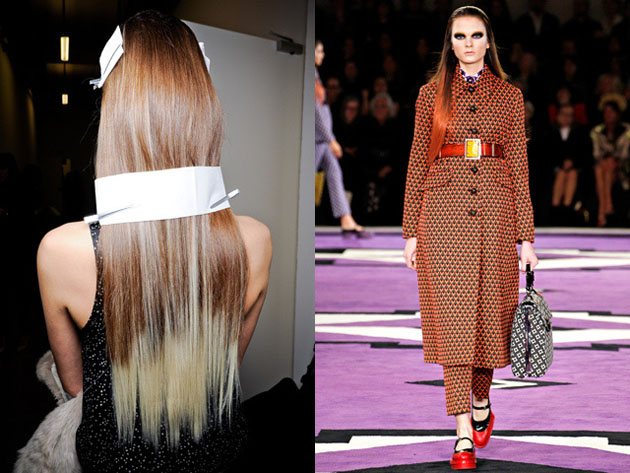
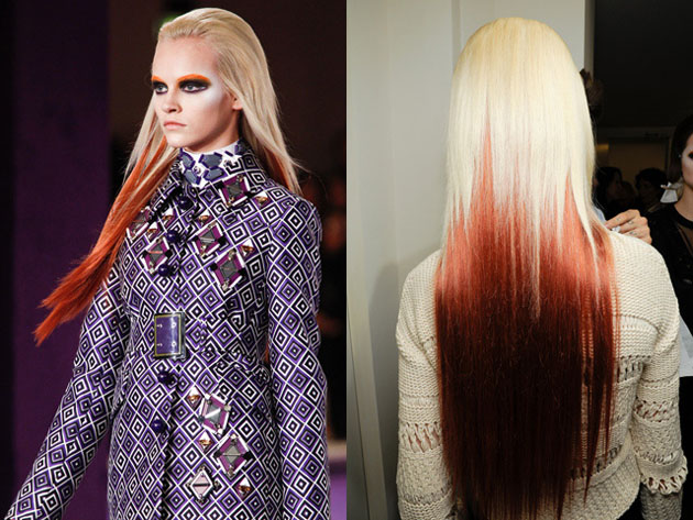
Lately the 30’s and the 60’s have been strong influencers in fashion. TV-series like Mad Men and Pan Am create nostalgia and somehow the decades are looked at as a ‘simpler time’, creating a window of escape for the audience. Even though not every woman will wear figure-hugging dresses and the men’s fashion might not become that much more slim, the inspiration is definitely noticeable.

The Röhsska Museet, the only museum dedicated solely for design and craftsmanship in Sweden, is hosting a vintage exhibition to specifically talk about how today’s trends are inspired by the 30’s and 60’s and how the era is affecting us. With a backdrop trailer from the film W.E. (about Wallis Simpson) the exhibition will together with fashion and interior design pieces also show exclusive vintage cars, borrowed to the museum from private collectors.

Even though both vintage clothing and the inspiration from the history are well accepted, the fashion industry is all about novelties. Some see retro trends as “old news by new designers” while others mean that ‘new’ should be seen as more than complete innovation. As a trend, retro is caught up in contemporary debates and becomes more than a static expression. Instead of looking at it as pure recycling, it might be the different ways of using ‘retro’ that become the innovation.

The Cars, Fashion and Design exhibition will be displayed at Röhsska Museum in Gothenburg, Sweden, between 26th of May and 9th of September 2012.

Lisa Olsson Hjerpe – Image courtesy of style.com

Share: Facebook,  Twitter  
24/05/2012

Walking in the woods and unleashing ones thoughts

Walking in the woods and unleashing ones thoughts

Il faut cultiver notre Jardin
Voltaire

“We must cultivate our garden” concluded Candide – the character of Candide: or, The Optimism, one of the well known novel by Voltaire – condensing the idea of life of the French writer, historian and philosopher who rejects Leibniz’ mantra “all is for the best in the best of all possible worlds” in a very direct and sarcastic way. According to it, all human beings can do is to try to let their world become as good as possible and fulfilling it with their own experiences and values, independently from external influences.


Exactly this sentence seems to frame the sense of Gerda Steiner (b. 1967) and Jörg Lenzlinger’s (b. 1967) art. Tangles of seeds, stems, branches along with animal bones, artificial plants, toys and unusual objects are picked up from different environments where the Swiss artist couple has lived. The objects inhabit their unique, imaginary and epistemological cosmos. With any apparent connection you find kitsch and worthless things: a toy robot, pieces of Chinese fountains, old stuffed animals or small plastic spiders. They coexist with biological and personal elements in a harmonic and poetic way.

The old bag of Jörg’s mother, hung on the ceiling in the middle of the library, contains a climbing plant which tends to the overhead lighting (Handtasche). A suspended twisted installation made of spawns, branches, plastic flowers and a pink teddy bear (Luftfisch) welcomes the visitors at the entrance of Buchmann Galerie in Lugano, Switzerland.

The whole venue is dipped in a flourishing garden full of artworks – Tony Cragg’s sculptures, works by Lawrence Carrol, Giuseppe Pentone, Felice Varini and Lawrence Weiner just to mention a few.

This amazing gallery building, a block of cement and glass, hosts also a collection of Steiner and Lenzlinger’s visionary walking sticks, a bizarre Chinese cave and a huge web, which embraces a room with its loaded tentacles. The artists, with their naïve and genuine allure, embody a sort of aesthetic of frugality full of content and able to intrigue viewers. It’s hard not to admire the brightly coloured organism (photo below) treated with a synthetically produced fertiliser that’s generally used in the agricultural industry, that grows fast as if it has been fed with the cakes of Alice in Wonderland (Isabel Friedli, Cultural Goods, text in the catalogue of the show).

The exhibition entitled Im Wald spazieren gehen und die Gedanken von der Leine lassen (“To go for a walk in the woods and unleash ones thoughts”) is a perfect merger of experimentation and research of an original language hovered between science and imagination both joyful and unsettling.

The solo show by Gerda Steiner and Jörg Lenzlinger will run until July 2012, open by appointment.

Monica Lombardi – Images courtesy Buchmann Galerie 

Share: Facebook,  Twitter  
23/05/2012

Dual Colours – A Trend That Sticks

.

Dual Colours – A Trend That Sticks

Fashion forecasters say that a trend goes through three stages. Fringe, the phase where it’s novel, inventive and only the top trendy people or companies are taking part in it. When the trend then moves in to the stage of trendy, awareness is built and fashion-forward companies and retailers dare to enter the arena. Then comes the mainstream – the public join, the visibility of the trend increases and after a while in the spotlight, micro trends are born out of it; countertrends, backlashes, twists or reinventions.

The two last mentioned are particularly true with the dual hair colour trend; dip-dying, bi-colouring, bleaching, washed out colours… It has been seen throughout the last seasons in various combinations, with the ombré trend (dark roots with light ends) being one of the larger ones to hit the mainstream. Colours come in cycles, and the repetitions in colour popularity and preferences are the machinery of boredom; the market gets tired, so new colours are introduced. It’s a phenomena that works the same in fashion as for hair colours. Just when you thought this bi-coloured trend was starting to get tired, large fashion houses like Prada and Jean Paul Gaultier brought it back to the catwalk for Fall/Winter 2012, with a twist.

The models walking the runway in Milan and Paris have been compared to virtual dolls being the ‘avatars of fashion’s digital age’. Leyla, a colour technician at Toni&Guy in Stockholm, confirms that the trend is taking a slightly more powerful and futuristic turn during fall.

“Absolutely! If you take a look at the Jean Paul Gaultier and Prada shows, you will see the same colour pallet but with a slightly different approach where Gaultier used colour spray in the roots, creating a quite powerful colour statement”. When asked why she thinks this particular trend keeps on reappearing the response was: “Because it works! The trend for hair colours is still that it shouldn’t look too ‘alone’ and this is a colour style that doesn’t get a re-growth. Also, it keeps on coming back in different modes. Last season it was more pink and yellow and at the moment it’s more red and blue. The techniques vary as well; now we’re using a lot of extensions and colour spray that washes right off”.

The fashion weeks in Milan and Paris showed that the trend is growing stronger and coming back for the fall, but it’s not withdrawing for summer either. The creative team at Toni&Guy writes in their trend report that one of the biggest trendsfor SS 2012 is the stretch roots and dip-dyed colours, taking us back to the 90’s and 70’s, before progressing into the fall trends. Summer earth tones will be replaced by less low-key colours like eccentric orange, cobalt blue and icy whites. When talking about the trend working both ways for men and women, Leyla explained us: “There are not that many men that can carry so many colours, but the ones who can; go all in! We will be playing with full bleach, silver tones”.

Fringe, trendy or mainstream, this style has been reinvented, swivelled around and gone through the evolution of a trend more than once. The runway inspiration allows the interpreter to play whole new vibrant colour game and it will be intriguing to see how far one tendency can take a whole trend.

Lisa Olsson Hjerpe – Image courtesy of style.com

Share: Facebook,  Twitter  
22/05/2012

Kristina Gill: Italians Do It Better

Kristina Gill: Italians Do It Better

I’ve often asked myself why Italian food producers don’t get in to the attractive packaging and labels you see in other places, like Waitrose (UK) or Whole Foods (USA). It would take so little for them to conquer the world if only they made that one per cent effort, I think. But then I realize that Italians are right to think they don’t need any special packaging with a special typeface (no matter how simple) to help draw people in to their foods. Nature’s packaging is the simplest there is, and in Italy’s case, nature has rewarded Italy disproportionately with the conditions to grow exemplary almost anything. Having the best primary ingredients ensures that anything you make thereafter will be great.

I don’t condone the pervasive upturned nose at anything that isn’t Italian cuisine because there is a lot of good food in the world that isn’t Italian. But when you come home from a nearby farm or food market in Italy with local foods like these, can you really blame anyone for thinking Italians do it better?

Kristina Gill

Share: Facebook,  Twitter  
22/05/2012

Solution Series

Solution Series

Even though graphic designers are keen on thinking that their profession makes a difference and that it’s politically, ethically and culturally relevant in our society, it’s a rather uncommon phenomena seeing this idealistic approach actually at work. Especially when it comes to Italy, graphic design is still considered an ‘artistic’ outtake on the artifacts we encounter on a daily basis. On the other hand, designers themselves generally profess a more politically active attitude but aren’t capable of actually putting it into practice.

There are, however, a few practitioners that try to take the matter in their own hands. One of the projects that was born from this kind of approach is Solution Series – a series of books published by Sternberg Press and curated by Ingo Niermann with the precious contribution by Zak Kyes (a graphic designer we have already praised in one of our articles).

The Solution Series has quite a definite – and also a bit pretentious – ring to it. What it does is developing highly critical cultural proposals in a tumultuous era of geopolitical instability that should function as stimulus for rethinking some of the urgent problems present in the area the single book refers to. Some of the titles in the series are “Finland: The Welfare Game” by Martti Kalliala with Jenna Sutela and Tuomas Toivonen, “The Book of Japans” by musical artist and writer Momus, “United States of Palestine-Israel” by Joshua Simon, “America” by Tirdad Zolghadr and “The Great Pyramid” edited by Ingo Niermann and Jens Thiel.

Ironically by using the word ‘solutions’ the editor mocks the well-established critical discourse by ‘inviting the authors to develop an abundance of compact and original ideas for countries and regions contradicting the widely held assumption that after the end of socialism human advancement is only possible technologicaly’.

The latest outtake related to the project is “Solution Greece?”, an exhibition of the work developed by Kyes for the Solution Series. Hosted by Ommu, a bookshop and project space situated in Athens, the exhibition tries to demonstrate the power of cultural production and the kind of solution it might offer in a country that is coping with a difficult political and economic crisis. Finally a socially and politically relevant, even though slightly utopian, approach of contemporary graphic design practice towards the problems of our society.

Rujana Rebernjak – Images courtesy of Sternberg Press

Share: Facebook,  Twitter  
21/05/2012

Bauhaus: Art as Life

Bauhaus: Art as Life

Hearing there’s a new exhibition about the notorious German school opening its doors might provoke dubious and not at all enthusiastic feelings. We all think we’ve already heard almost everything there is to know about Bauhaus, seen or read massive coffee table books depicting it, we know how its glorious masters look like and maybe even possess some of its heritage.
 When Barbican Art Gallery – in itself a massive brutalist post-war patrimony – announced the first major Bauhaus’ retrospective in Britain after forty years, the zest outside the narrow experts’ circle could have been quite mild.


The history of the revolutionary school, traced from it’s founding in Dessau in 1919 by Walter Gropious until the forced closure in 1933 has already been told from many points of view. 
Nevertheless, “Art as Life” exhibition takes a new insight on the school’s artistic production and the undercurrent legacy. While Bauhaus was duelling between classical take applied arts and its new industrial counterpart, what emerged was a collaborative spirit between (almost) all teachers and students.


“Art as Life” brings to our attention the playful and yet undiscovered side of the progressive modernist school – the famous Bauhaus parties, the commonly unknown photos of fashionable students, the unseen work where professors’ mastery gets mixed with the young students’ idealism and naivety. Unveiling the diversity of Bauhaus’ production, the works displayed are as disparate as Nivea adds, table lamps and ceramic pots, school party invitations, coffee machines, chess sets and spinning tops designed by characters like Johannes Itten, Josef and Anni Albers, Walter Gropious, Hannes Meyer, Paul Klee, Laslo Moholy-Nagy, Ludwig Mies van der Rohe and August Schlemmer alongside with their students.

Running until the 12th of August, “Art as Life” opens quite a straightforward look on Bauhaus that makes us understand Modernism was much more than plain rigor.

Rujana Rebernjak – Images courtesy of Bauhaus-Archiv Museum

Share: Facebook,  Twitter  
20/05/2012

Sunday Breakfast by Love For Breakfast

Sunday Breakfast by Love For Breakfast

Relaxing pale color and the scent of flowers inebriates the air. Nothing better than an outdoor breakfast overlooking the wide countryside. Taste and breathe.

Alessia Bossi from Love For Breakfast

Share: Facebook,  Twitter  
18/05/2012

A Plus A – Centro Espositivo Sloveno

A Plus A – Centro Espositivo Sloveno

Venice is the world known city of art and culture, where not only you can visit historical sites like Gallerie dell’Accademia or Scuola Grande di San Rocco tracing the history of fine arts, but where every year worldwide visitors rush to see La Biennale di Venezia. Since the buzz around Biennale usually fades out after the opening, the city quickly returns to its natural slow pace. Fortunately enough, the old beauty has still some eager enterpreneurs that try keeping the city alive all year long.


One of those, if not the only truly worth mentioning, is A Plus A, Centro Espositivo Sloveno. The gallery, situated in one of the most beautiful campos in Venice – Campo Santo Stefano – has quite a full schedule all year long. Besides hosting the Slovenian pavilion during the Biennale, following all of their events you might leave you with a full agenda. Dubious as you may be wondering whether quality shouldn’t be confused with quality, A Plus A can guarantee for both.

Not only it organizes successful exhibitions, the space is also committed to promoting culture in all of its faces, thus hosting concerts, 24-hour performances, talks and a course for curators named Corso in Pratiche Curatorial e Arti Contemporanee.

We have had the occasion to visit the gallery last week during the opening of “Robotica” exhibition involving the exploration of robots as holders of innovation and cultural content. The upcoming events, on the other hand, include “No Title Gallery” collective exhibition and a book presentation. The latter one is the product of Ignacio Uriarte‘s collaboration with Automatic Books, a young but productive independent publishing house based in Venice. The book is named Three Hundred Sixty and will be presented during a brief talk with the author next thursday.

If you find yourself in Venice any time of the year and the marble and pietra d’istria aren’t the only things you’re in search for, pop by at A Plus A for a nice chat with its director Aurora Fonda while taking a peak at their first quality projects.

Rujana Rebernjak

Share: Facebook,  Twitter  
17/05/2012

May Reading List – Jürg Lehni & Alex Rich

May Reading List – Jürg Lehni & Alex Rich

Introducing a reading list may be quite a demanding task, as lately it seems to be quite difficult to actually find books that are readable in the conventional sense. “Looking at and understanding the meaning of written or printed matter by interpreting the characters or symbols of which it is composed” isn’t the primary activity to throw ourself in when opening the books listed below. The experience they offer is mostly of a contemplative kind.

The following four books are part of the archive documenting Jürg Lehni’s and Alex Rich’s collaborative work that started in 2008 with a series of emails. The emails revolved around the issues of communication and technology, the gap between the user and the technologies of communication. The archive itself is named “A Recent History on Writing & Drawing” and it was exhibited at ICA in London involving a series of performances. All of the books have been published by Nieves.

Things to Say

“Things to Say” is a book documenting the drawings made by Victor and Hector. The mechanical brothers are actually relatively simple spray-can output devices driven by two motors. The devices are a collage of other tools, giving them the characteristics of being malleable for interaction and interpretation. 
“Things to Say” brings together the drawings that appear like simple in-line illustrations, thus hiding their origins and confirming the authors’ ideas.

Research Notes

“Research Notes” is a book born with the idea of celebrating “how we find ourselves doodling while on the phone, testing pens in stationery shops, with our belief in folklore, with the need to misuse technology or thinking whose idea it was to fly aeroplanes in formation to write messages across our skies”. The book is an ode to the human necessity of documenting our thoughts and ideas.

News

“News” is a simple title that unveils the content of this clever book. The artwork presented in the book is a series of anonymous phrases taken from the newspaper headlines reproduced with a Speed-i-Jet, a mobile hand printer. While you start doubting the utility of the object itself, the beauty of the book might actually give its existence an actual meaning.

Empty Words

“Empty Words” is another word-play (and also a tech-play) with a series of phrases cut out with another mechanical device. The actual device has been brought to almost industrial perfection making it suitable for mass production of dotted posters and texts, drilled at a controlled speed. According to the authors, it should be almost as solid as a Linotype.

Rujana Rebernjak – Images courtesy of Nieves 

Share: Facebook,  Twitter  
16/05/2012

Kristina Gill: Courgettes

Kristina Gill: Courgettes

A couple of weeks ago I wrote about tomatoes, one of my favorite summer foods. Courgettes (zucchine in Italian) are tied at the top of my list with tomatoes. I like them so much that I eat them year round. I know eating out of season is so 20th century, but I just can’t get over how much I love them, even when they aren’t at the top of their game. My favorite way to have them is lightly sauteed with garlic and onion, and in summer I add some tomatoes – sometimes sauteed together and sometimes fresh. Sometimes I eat them with pasta, sometimes I slice them paper thin and eat them alone. Today I put it all together and it was an early taste of summer.

Kristina Gill

Share: Facebook,  Twitter