30/07/2015

Art that Redeems Fashion (From Being Fashion)

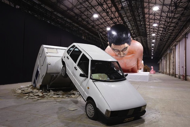
The relationship between fashion and art is old and accounted for, and notwithstanding this, it always seems to be in need of further explanation. The ways in which this relationship has developed in history are diverse and well documented: the links between the designs ‘à l’oriental’ of Paul Poiret and the work of Leon Bakst for the Ballets Russes; Mademoiselle Coco Chanel and Jean Cocteau working together for his play Le Train Bleu; Elsa Schiaparelli and Salvador Dali bringing surrealist symbols on clothes and accessories; Yves Saint Laurent paying an homage to De Stijl with his Mondrian Dress; Gianni Versace turning Warhol’s portrait of Marilyn Monroe into embroidery; Marc Jacobs teaming up with Stephen Sprouse to customize Louis Vuitton iconic bags and luggage sets, and so forth. This incomplete excursus is enough to prove that fashion has been influenced by art since almost forever, and all these examples are useful anytime we need to impress and confute someone who thinks fashion is superficial and futile, just a matter of rags.
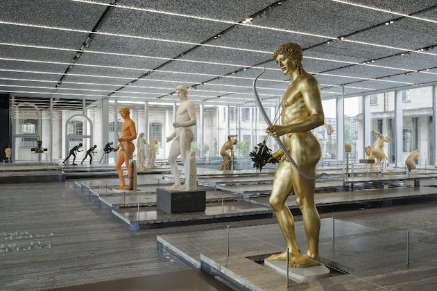
By saying so, it seems clear that the relationship puts fashion in a conceptually subordinate position. This sort of dependence changes its form in the dimension of the art foundation. More and more big fashion houses, mostly European ones, are investing their capitals in art foundations: a tendency quite recent, but surely already a trend. To name a few, Fondation Cartier and Fondation Louis Vuitton in France are the majors – and surely not the only ones – while in Italy Prada, Trussardi, Ferragamo and Zegna are the most renown brands promoting art under their own name. The most interesting thing about foundations is that they have little to no links with the fashion brand they bear the name of. Fashion has always had problems dealing with the theme of identity – primarily, with its own hybrid identity, that of being a ‘creative industry’. Postmodernism fragmented culture, putting each of the ‘minor’ arts under its spotlight and giving dignity to each form of expression. Foundations refuse this postmodern precept by sharply dividing their ‘name’ – which is the name of the brand actually paying the bills – from the art they collect and showcase: they substitute the patrons of XVI century, but most of the time without even daring to ask to put their portrait inside the work they commission.
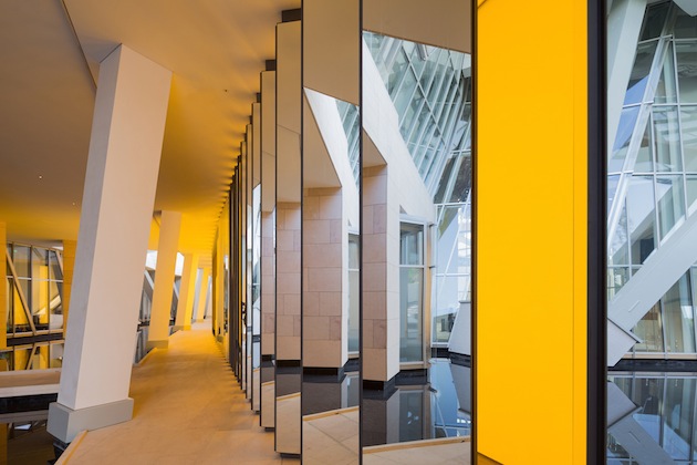
“The Fondation has given Cartier a positive image in the eyes of people who are not interested in jewellery or who would never in a thousand years wear a Cartier bijou. But now they look at Cartier more positively, with respect, and that’s exactly what I wanted.” The most resounding of the words used by Monsieur Perrin, founder of the Fondation Cartier pour l’Art Contemporaine which opened in 1984, is one and only: respect. Fashion needs art to be respected not only by the art world – notoriously a caste – but by people in general, whose education makes them distinguish the value of different forms of expression. The patronage fashion actuates seems to be just a way to redeem fashion from its status, and this opinion is motivated by the permanent collection of the foundations, which Jonathan Jones defined as ‘boring’, saying that ‘fashion houses merely follow art world’s tastes and add to corporate tedium’ in one of his articles published in The Guardian.
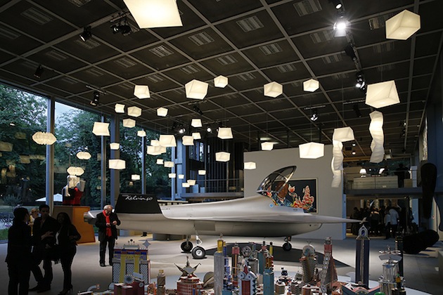
The support fashion gives to art and to artists – both well-known and newcomers – is mostly financial. It is not a matter of commissions, not at all a matter of collaboration. It seems another way to ennoble a name – to promote, aka to sell – hiding the practice producing the money which actually pays for the masterpieces. Rather than fulfilling its scope, this move does nothing but confirm the status of fashion as a money-making industry not conscious of its theoretical value; but above all, by just collecting and opening without links to the history and practice of the brand itself, they are not complicating the discourse between the two disciplines. Thus, they are losing the possibility to generate new and compelling ways to further their antique relationships.

Marta Franceschini 
Share: Facebook,  Twitter  
13/01/2015

Daily Tips: Window Shopping

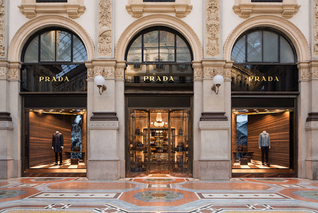
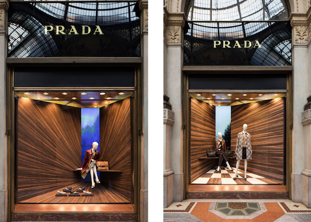
The most delightfully painful past-time – window shopping – has taken on a new tone with Martino Gamper’s recently unveiled window displays for Prada. The adored fashion powerhouse led by Miuccia Prada, known for her active engagement with contemporary art and design, offers playful shopping-not-shopping experience with windows clad in various types of woods which explore the notion of perspective. The project can be traced back to Gamper’s beginnings and an initial project which explored the idea of corners as a geometric space where the three dimensions meet: “It’s a very underused space in the domestic environment. It’s a place where the dust collects. Or maybe it’s a space for a plant. It’s a meeting for the X, Y and Z in terms of the three dimensional and a very defined 90° space. I wanted to work with perspective and create a way that when you look into a shop window you create a new space,” says Gamper. Well, those who have always avoided stopping in front of Prada’s shops fearing its inaccessible prices, now have a good excuse to linger in front of window of wonders.

The Blogazine 
Share: Facebook,  Twitter  
28/02/2014

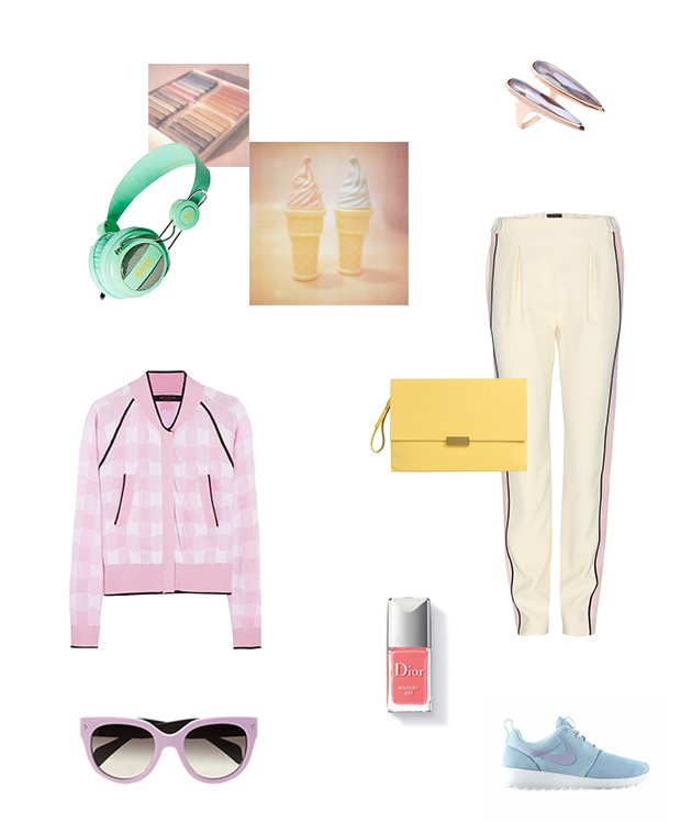
Style Suggestions: Pastels

Pastel hues and sherbert shades have crept their way in this season and these exhuberent tones are on trend and easy to wear. You dont have to go the whole hog but it is nice to pair pastels with pastels and add some neutral accesories and jewllery to complete a perfect outfit for any occasion.

Prada, Nike, Fendi, Stella McCartney, Dior, WeSC, Katie Rowland

Styling by Vanessa Cocchiaro 

Share: Facebook,  Twitter  
22/01/2013

AMO and OMA for Knoll and Prada

AMO and OMA for Knoll and Prada

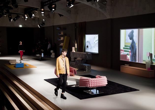
We knew about the design-architecture-fashion love triangle for quite some time now. It has, by now, taken many different shapes, from Marni’s 100 chairs made by Columbian ex-prisoners, to more than a few no-brainers where a fashion company provided the textiles and a design company thoughtlessly applied them to their furniture. Nevertheless, the collaboration we have witnessed last week could hardly fit in any of the previously imaginable categories.


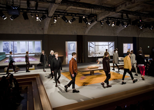
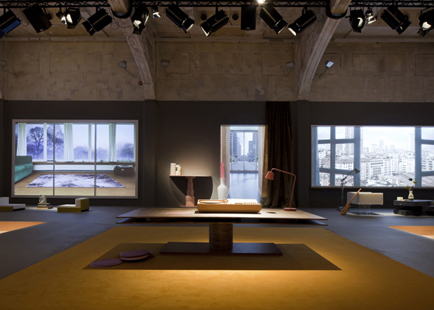
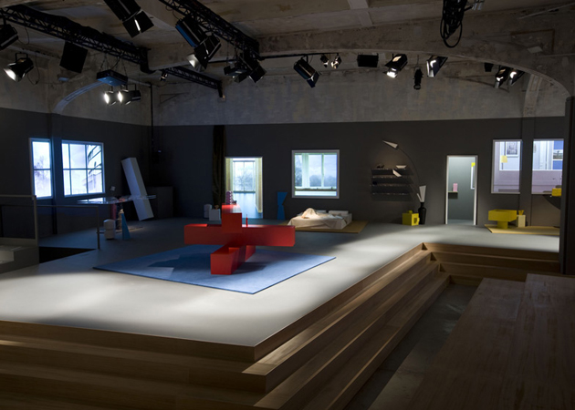
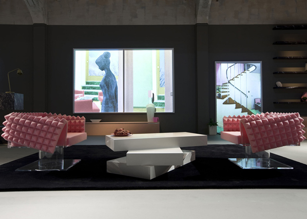
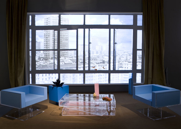
It is the widely appreciated love story between OMA and Prada that has managed to surprise us once again, but maybe this time, not in a very good way. During Milan’s Men’s Fashion Week, Prada presented their new line of clothing on a specially designed runway, arranged around the theme of the ideal home. And even though this might seem quite nice, the best part of this story is yet to come: the fabulously designed runway featured some of the most un-fabulously designed furniture, this time by AMO, the research counterpart of OMA, for the American company Knoll.


This explicitly post-modernist furniture, if judged strictly in the context of a fashion week, could definitely be appreciated. But, it is the fact that the furniture displayed on Prada’s runway, to be officially presented by Knoll on another high-profile Milanese event, Salone del Mobile, isn’t just a conceptual inquiry into post-modernist design, but an actual line of furniture to be sold and used in our more than un-perfect homes, that leaves a sense of doubt. Made from shiny plexiglas, carefully masked wood and colourful foam, these geometric swivel armchairs and stacked coffee tables aren’t something anyone should aspire of having in their ideal house. The only way this furniture might be understood is in the highly fashionable circles of ‘conceptual’ and ‘radical’ design where it is supposed to be looked, thought about and admired, but not actually used.


Rujana Rebernjak

Share: Facebook,  Twitter  
09/07/2012

“The Small Utopia. Ars Multiplicata”

“The Small Utopia. Ars Multiplicata”

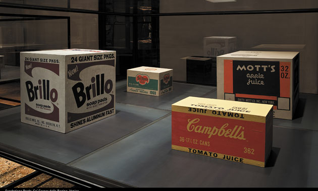
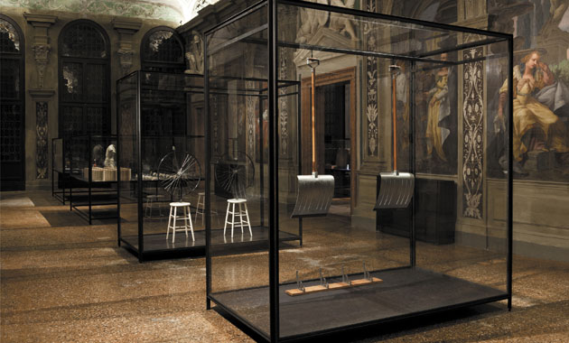
When recently an article published the list of most influential art collectors in the world, unsurprisingly only one name was Italian. Miuccia Prada and Patrizio Bertelli have created an empire both in fashion and art industry. So when last year Ca’ Corner della Regina, a historical palace on the Grand Canal in Venice, became a new temporary home for Fondazione Prada, the announcement came almost as a relief.

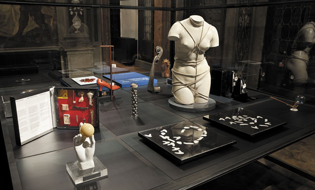
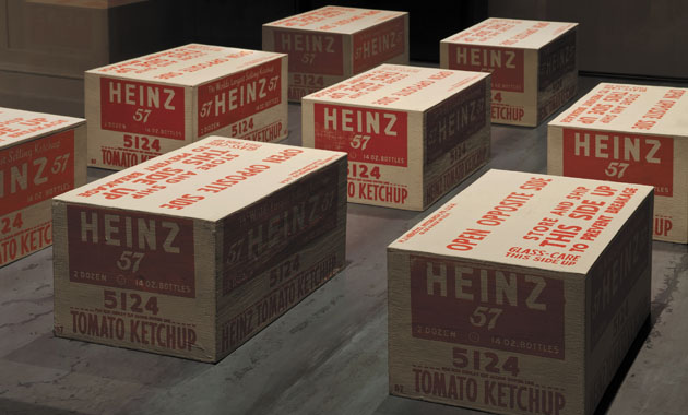
Fondazione Prada, under the artistic direction of the superstar curator Germano Celant, has successfully opened its second exhibition in the Venetian venue last thursday. Titled “The Small Utopia. Ars Multiplicata”, the show is one of the most beautiful ones Venice has offered in a long time. The title of the exhibition refers to the idea, born at the beginning of the 20th century and pursued until the 1970s, that art should pervade the society through ‘the multiplication of objects, experimenting with unprecedented aesthetic and social uses for them’.

Thus, the exhibition, spread throughout the 2 floors of the beautiful Venetian palazzo, presented over six hundred editions – objects familiar across cultures – that ideally should have enabled the artist in creating connections with the society through industry, technology and systems of popular distribution. The exhibition traces the transformation of the idea of uniqueness in art starting from the early 20th century Avant-Gardes – Italian Futurism, Russian Constructivism, Dutch Neoplasticism and German Bauhaus, through pop and optical art, ending with contemporary ‘dematerialization’ of art in the works by Sol LeWitt, Laurence Weiner, Ed Rucha, Dieter Roth.

This language of art, involving the common, banal and everyday, both as medium as well as way of expression, far from being a small utopia, has surely touched the way we perceive both art as well as our daily routine.

“The Small Utopia. Ars Multiplicata” runs until the 25th of November at Ca’ Corner della Regina, Venice.

Rujana Rebernjak – Images courtesy of Fondazone Prada. 

Share: Facebook,  Twitter  
23/05/2012

Dual Colours – A Trend That Sticks

.

Dual Colours – A Trend That Sticks

Fashion forecasters say that a trend goes through three stages. Fringe, the phase where it’s novel, inventive and only the top trendy people or companies are taking part in it. When the trend then moves in to the stage of trendy, awareness is built and fashion-forward companies and retailers dare to enter the arena. Then comes the mainstream – the public join, the visibility of the trend increases and after a while in the spotlight, micro trends are born out of it; countertrends, backlashes, twists or reinventions.

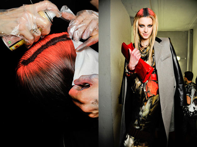
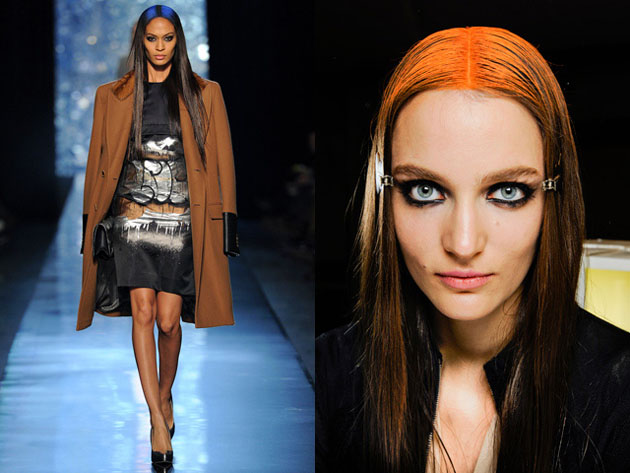
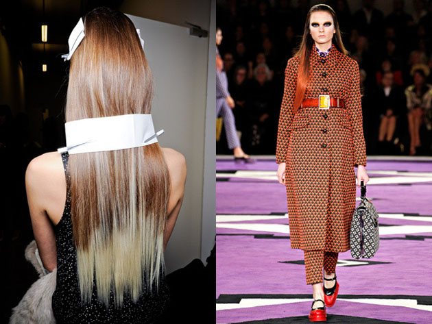
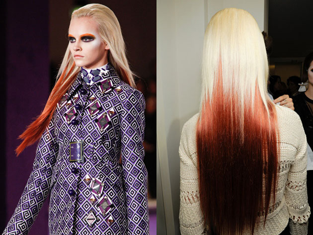
The two last mentioned are particularly true with the dual hair colour trend; dip-dying, bi-colouring, bleaching, washed out colours… It has been seen throughout the last seasons in various combinations, with the ombré trend (dark roots with light ends) being one of the larger ones to hit the mainstream. Colours come in cycles, and the repetitions in colour popularity and preferences are the machinery of boredom; the market gets tired, so new colours are introduced. It’s a phenomena that works the same in fashion as for hair colours. Just when you thought this bi-coloured trend was starting to get tired, large fashion houses like Prada and Jean Paul Gaultier brought it back to the catwalk for Fall/Winter 2012, with a twist.

The models walking the runway in Milan and Paris have been compared to virtual dolls being the ‘avatars of fashion’s digital age’. Leyla, a colour technician at Toni&Guy in Stockholm, confirms that the trend is taking a slightly more powerful and futuristic turn during fall.

“Absolutely! If you take a look at the Jean Paul Gaultier and Prada shows, you will see the same colour pallet but with a slightly different approach where Gaultier used colour spray in the roots, creating a quite powerful colour statement”. When asked why she thinks this particular trend keeps on reappearing the response was: “Because it works! The trend for hair colours is still that it shouldn’t look too ‘alone’ and this is a colour style that doesn’t get a re-growth. Also, it keeps on coming back in different modes. Last season it was more pink and yellow and at the moment it’s more red and blue. The techniques vary as well; now we’re using a lot of extensions and colour spray that washes right off”.

The fashion weeks in Milan and Paris showed that the trend is growing stronger and coming back for the fall, but it’s not withdrawing for summer either. The creative team at Toni&Guy writes in their trend report that one of the biggest trendsfor SS 2012 is the stretch roots and dip-dyed colours, taking us back to the 90’s and 70’s, before progressing into the fall trends. Summer earth tones will be replaced by less low-key colours like eccentric orange, cobalt blue and icy whites. When talking about the trend working both ways for men and women, Leyla explained us: “There are not that many men that can carry so many colours, but the ones who can; go all in! We will be playing with full bleach, silver tones”.

Fringe, trendy or mainstream, this style has been reinvented, swivelled around and gone through the evolution of a trend more than once. The runway inspiration allows the interpreter to play whole new vibrant colour game and it will be intriguing to see how far one tendency can take a whole trend.

Lisa Olsson Hjerpe – Image courtesy of style.com

Share: Facebook,  Twitter