01/11/2013

Upcoming Artists | M + A

Hi guys, how is it going?
Hi. Everything’s fine, thank you.

Who are you, and where are you at the moment?
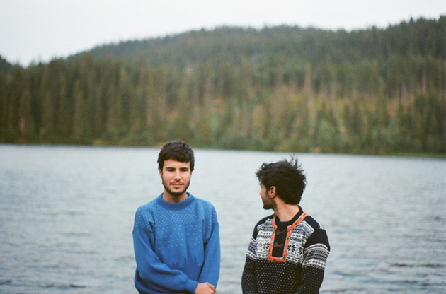
We’re Michele Ducci and Alessandro Degli Angioli, and at the moment we are in London, we are on a small tour to present the new album here in UK.

When was the project born?
Mmh, almost five years ago now.
How are your songs born usually?
I don’t know, we don’t have a precise algorithm. We send each other a lot of emails with drafts and structures of possible songs, the rest is almost a game. Usually one sketches an idea and sends it to the other who, in turn, adds other stuff and resends it back and so on.. This sort of loop, done at a distance, colors the song with all the different shades that both of us breathe in his own life.

How did the meeting with the Monotreme Records happen?
Via email. It was very fast: we sent them some of our songs and after a while we were already signing the contract.

How is your UK tour going?
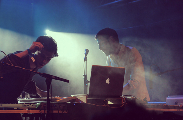
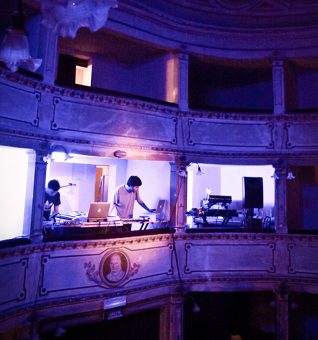
It’s going very well. We did not expect such an enthusiastic audience, that already knew the songs by heart. We enjoyed it a lot. In UK people dance at concerts so much more. For the type of music we play, seeing hopping people during our live gigs is quite helpful.
You have a very recognizable and well-studied image for your album cover, merchandize and videos. Who is behind it?
Still M+A. Alessandro takes care of the visual side. Let’s say that all these things are kind of a prosthesis to what we do with the music. The realm of imagination we succeeded to create around us made us more easily recognizable and, considering how many people approach to our merch stand after our concerts, we think we’ve made it. At the same time we’ve chosen not to show our name M+A on the t-shirts, just because we don’t see them as a mere marketing item by which we make money, but rather as a second-side of M+A, almost as if it was a fashion brand totally independent form the rest. We sell loads of t-shirts even to people who don’t really listen to our music or that never got to listen to it, and this shows our purpose.

Did you expect this interest by the Japanese market?
Yes, in the sense that we worked hard to be able to release the album there as well, but at the same time we did not expect such a positive response. It is a new market for us and certain dynamics are totally different, but it seems that people really like our music there. Now we are working to set up a Japanese tour for next summer.

What’s in the future of M + A?
Other frames, other countries, other albums.
Enrico Chinellato 
01/11/2013

Shoreditch: Design Studios = Shopping Destinations

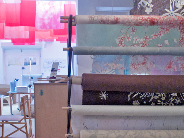
Multitasking is not just about mental organization. Our most widespread attempt for simultaneous multiplicity, a true synonym of contemporary weltanshauung, is also investing in the space we live in, transforming our environment into an hybrid place open to different targets and expectations. A visit to Shoreditch, London’s East-End epicentre of creativity, is a chance to observe how this phenomenon has been affecting design studios’ identity.


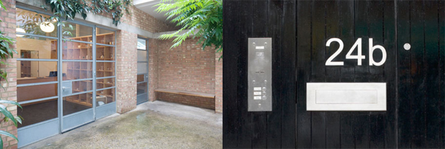
The most acclaimed British interpreter of minimalism, Jasper Morrison was among the first to move his office to this neighborhood. His headquarters, hidden behind an anonymous street door, rubs shoulders with a shop devoted to his “Supernormal” collection of ordinary but essential objects, and a design studio, inaccessible for clients. When you ring the doorbell and enter the white, tiny court, it feels like accessing a secret, suspended world: the discovery of the place or its offers isn’t due to serendipity. On the contrary, both the interior design and the products selection are no-frills but accurately conscious, and every object has more of a fetish than its plain look would suggest at first.

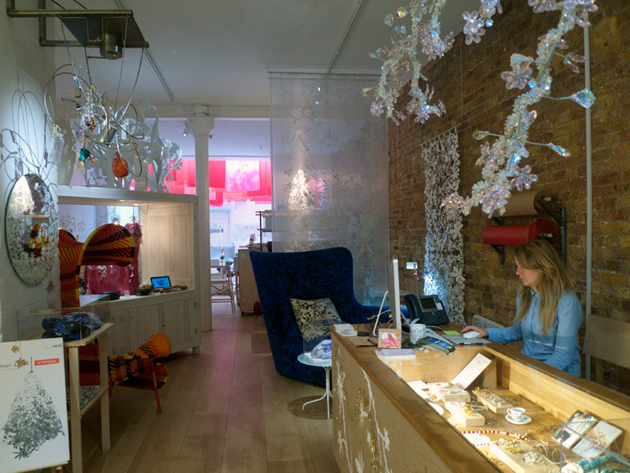
Few blocks away, Tord Boontje welcomes the followers of his laser-cut floral world into a wide open space. Its layout is similar to traditional shops: all its multi-branded creations are on sale, and their display is as accurate as if we were in a luxury department store. Yet, on a closer inspection, the presence of computers on the back suggests us that a few designers are working side by side to customers. Their presence is discreet and their glances silently observe our preferences: are they there to gather our wishes and interpret our unknown desires?

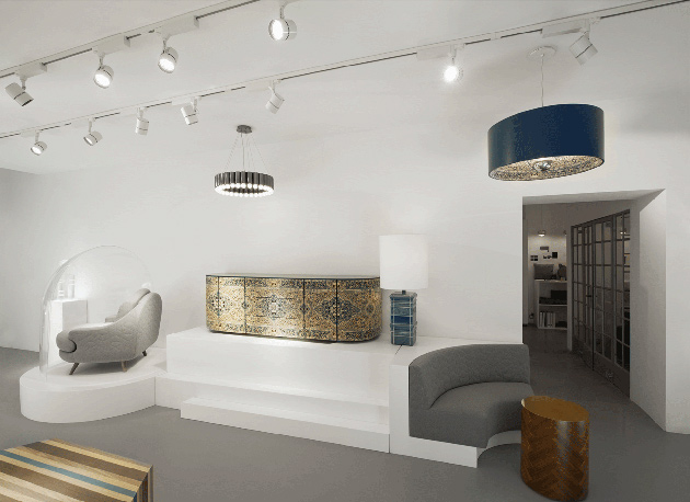
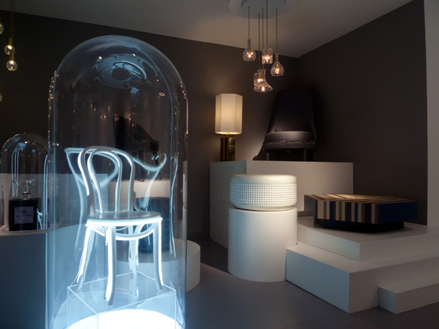
Lee Broom, enfant prodige of interior design and interpreter of the XXI century posh punk, is the latest to choose Shoreditch as a base. His brand new “Electra House” hub is both a showroom and a design studio: two contiguous rooms, each with a specific function, interact through an open door which leads to communication and exchange. Customers have their own dedicated perspective, like the audience of a play, and are free to observe how ideas and sketches take shape around the conference table and the moodboards on the walls. Thus, design is no more a segregated working attitude, as commerce is no more about buying: melted together, they are turned into a sophisticated and often intangible form of entertainment.


Giulia Zappa 
31/10/2013

The Horrors of Irony

Irony is the master of horror. That humiliating moment of sharp existential pain that comes with the realisation that everything you once took for granted, the total spectrum of your understanding of things, is not just inaccurate, but totally laughable; ripping a crack right through the comfort of your everyday consciousness to the very depths of your cold unfamiliar subconscious (where no man has been before) and unveiling an army of skeletons in the closet, waiting to devour you.

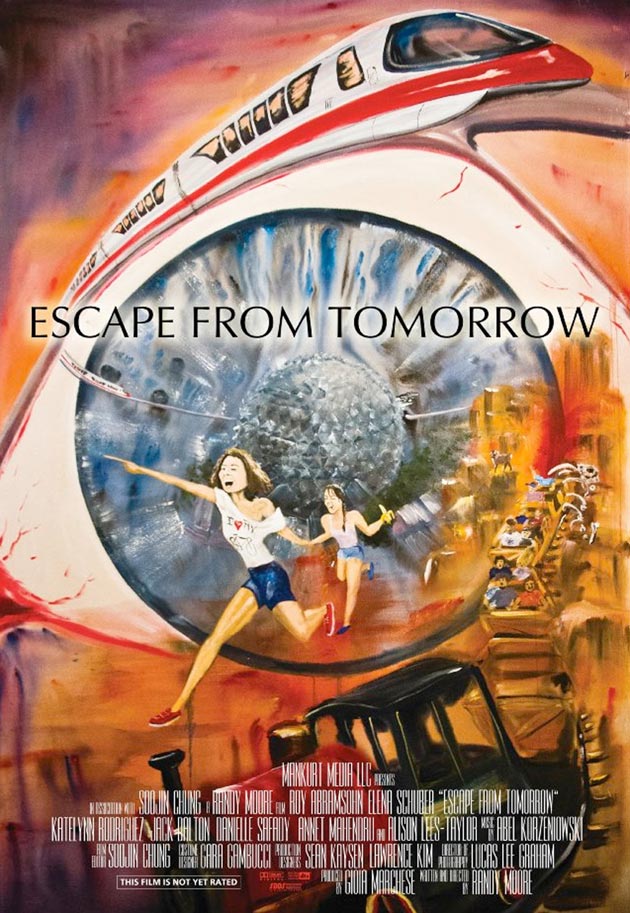
Escape from Tomorrow is the story of Jim White, an ordinary American Joe visiting Walt Disney World with his family (the title references the 60s Walt Disney project EPCOT – Experimental Prototype Community of Tomorrow – a planned ‘test city’ intended to serve as an experimental platform for new innovations in city life that was never realized). On the last day of their vacation Jim receives a phone call from his boss informing him that he has been laid off. This becomes the catalyst for the floodgates of his subconscious to tear open, unleashing his demons and revealing another side to Disney World, a side Disney would certainly not want us to see. Hence why the film was shot in complete secrecy, by writer-director Randy Moore, using advanced guerrilla filmmaking techniques.

Other similar subversive attempts have been made before in Disney World. See Missing in the Mansion and Banksy‘s Exit Through The Gift Shop. The former is about a marriage proposal going horribly wrong on one of the rides and the latter includes a guerrilla project set in Disney World about the inhumane detention of terror suspects in Guantanamo Bay. All three films present the ‘super happy’ setting of Disney as a platform for the horrors of irony; the horror that things may not be as ‘super happy’ as they seem. Happy Halloween!

Peter Eramian 
30/10/2013

The Poetry of Castelvecchio

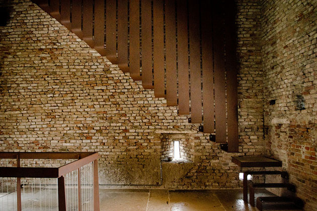
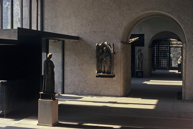
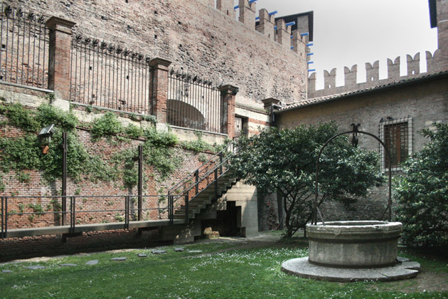
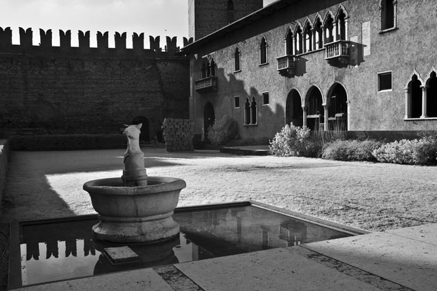
Castelvecchio Museum is a jewel located in Verona, northern Italy. It was built by Cangrande II della Scala in the middle of the fourteenth century, and was restored by Carlo Scarpa, between 1959 and 1973.

Oriental or Gothic character emerges in this project – both influenced by built traditions of Venice, which was a cosmopolitan city with trading history, but also by an Eastern influence due to Scarpa’s admiration of Japan.


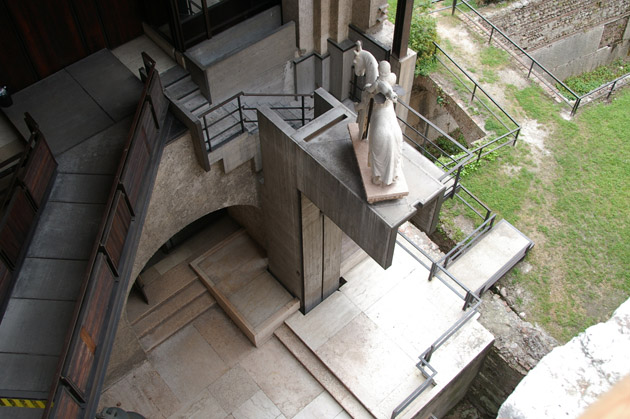
“Castelvecchio was all deception,” said the venetian architect in 1978, with regard to the elevation which leads to the courtyard. “I decided to introduce some vertical elements to break up the symmetry as the Gothic demanded. Gothic, especially in his Venetian form, is not very symmetrical.”

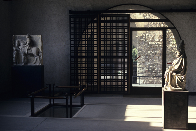
Castelvecchio shows more than anyplace else how Scarpa’s architecture is based on juxtaposition and reconnection of the spaces with distinctly modern elements and his choice to expose, rather than brush over, the differing layers of history. Complexity is often perceived as counteractive to good modern design. It does not constitute the safe course, but within the work of a great artist/architect, well-handled complexity lends a project virtuoso quality.


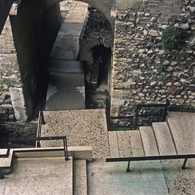
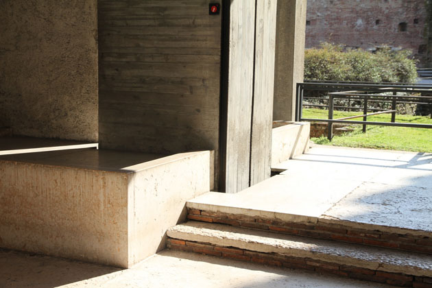
Through a simple variation in levels and falls, Scarpa has created a deeply felt separation of the elements, within an area in which many parts converge. This is because (in psychological terms) level paving and steps feel completely different, and even though the steps are extremely shallow, they still register to our brain in a similar way to conventional steps. It is interesting to compare the entrance stairs with prints by the Venetian artist, Piranesi. These dramatic scenes illustrate a series of structures in which landings project forth into subterranean spaces. They are ‘architectural dreams’, and the space that Scarpa created, is an example of the poetic character that resonates through much of his work.


The pattern used and the walls adorned with square sets of various colours of Prun stone, a limestone from Verona, reflect the architect’s interest in the work of the modern artists, Piet Mondrian and Paul Klee and in vernacular materials (the roughly textured finish, emulate the character of historic walls). Manipulation of the qualities of the materials, the sophisticated grammar of his paving pattern and the details of the steps are good examples of his ability to imbue junctures with a profound beauty. The point at which two points meet can often be perceived as a problem by architects or designers; a problem that needs to be solved. Within Scarpa’s work, the joint is an opportunity that provides detail and can expose the nature of an object. Any seemingly unnecessary gesture, which may have had a practical purpose in protecting some parts, appears as a poetical touch.

Scarpa’s sensitive consideration of materials and details helped his work to achieve a sense of continuity with the several historical layers. As an example of the way in which tradition can form an integral part of modern design, Castelvecchio is a masterpiece.


Giulio Ghirardi 
29/10/2013

Alan Fletcher and the Art of Looking Sideways

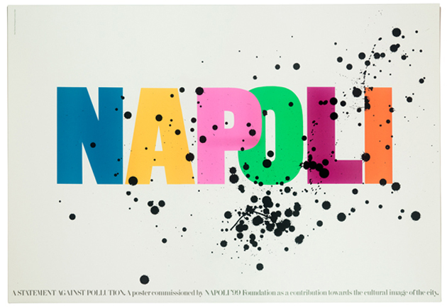
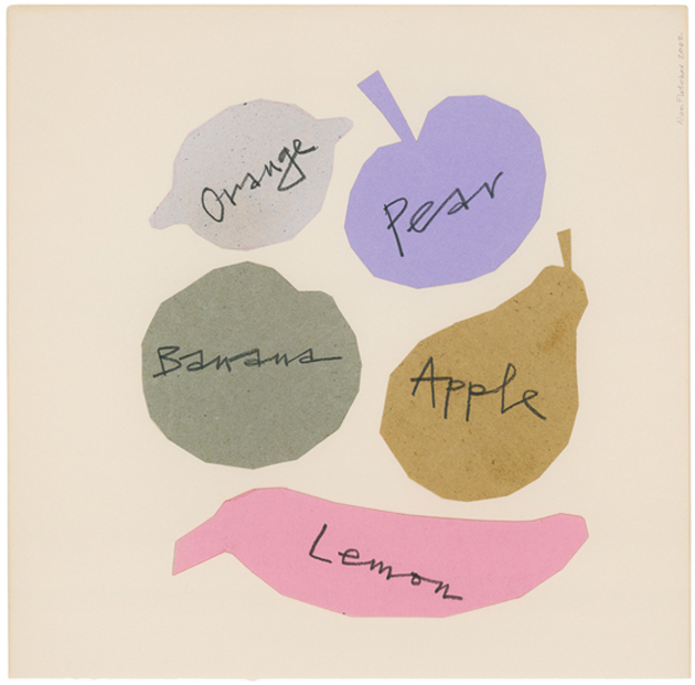
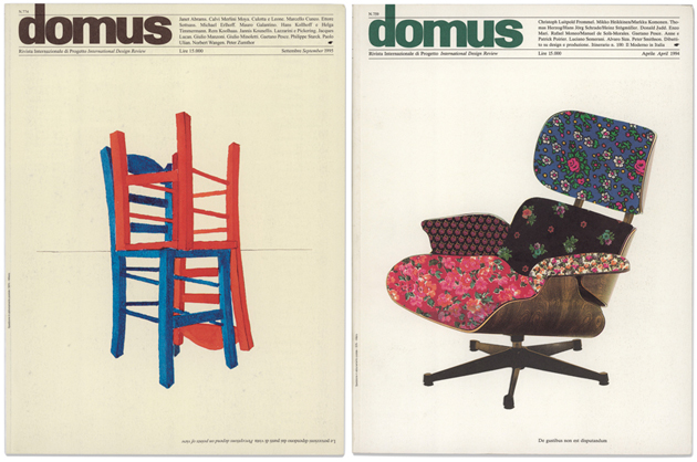
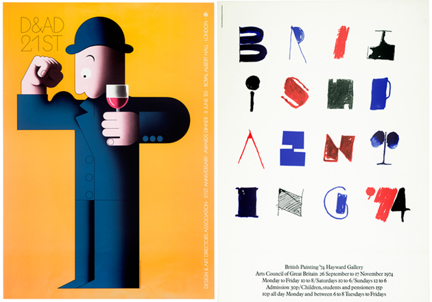
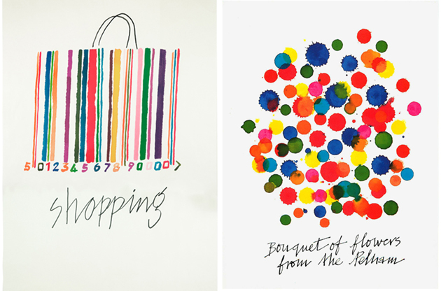
Even though the very nature of their work implies being committed to wider public and its understanding of the world, it is rare to find designers of such depth, wit and intelligence whose work speaks directly to the hearts and minds of those unfamiliar with design practice. Alan Fletcher, the great British designer who passed away 7 years ago, was one of those rare exceptions. During his long and prolific career, Alan Fletcher had created some of the most eloquent visual interpretations of our material culture, our environment and the very human nature, through posters, logotypes, postcards, billboards and books.


Fletcher was born to a British family in Kenya in 1931 and, having moved to England at the age of five, went to study art during the post-war years. After years of studying and, later, teaching in the UK, Fletcher was awarded a travel scholarship to Yale University where his astute thinking and fascination with visual culture was merged with a fairly American sense of advertising and its appealing pop-culture. After his return to the UK, Fletcher founded one of the most important design firms, Fletcher/Forbes/Gill, which would later change its name to Pentagram. During those years Fletcher had created some of the most iconic graphic design projects such as Victoria and Albert Museum‘s classically elegant logotype, advertising projects for Pirelli, designs for Penguin books, Reuters or the Institute of Directors‘ logotypes.


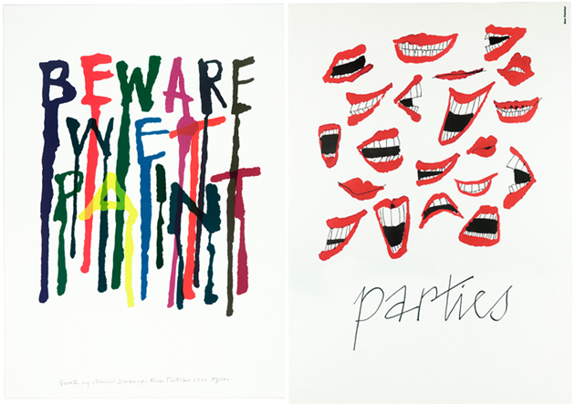
Tired of commercial projects, Fletcher decided to leave Pentagram in 1992 and commit to his personal work, collaborating on commercial projects only if they appeared to be ‘fun’. In this period, two of his exceptional books, “Beware Wet Paint” and “The Art of Looking Sideways” were published by Phaidon, a publishing house for which he worked as creative director. The latter of two books was defined by Emily King as “an unfailing source of wit, elegance and inspiration. At over a thousand pages, it is a spectacular treatise on visual thinking, one that illustrates the designer’s sense of play and his broad frame of reference”, and is a conundrum of visual, literary, cultural and historical references that teaches us how to really look and see.

An opus of such depth and volume is surely difficult to grasp, especially knowing that Fletcher frowned upon the use of computers and digital tools throughout his life. For this reason, it is particularly significant the meticulous work done by his daughter Raffaella in publishing a digital archive
of his work, where Alan Fletcher’s creativity, intelligence and wit can inspire the future generations of designers and admirers.

Rujana Rebernjak – Images courtesy of Alan Fletcher Archive. 
28/10/2013

The Fashion World of Jean Paul Gaultier

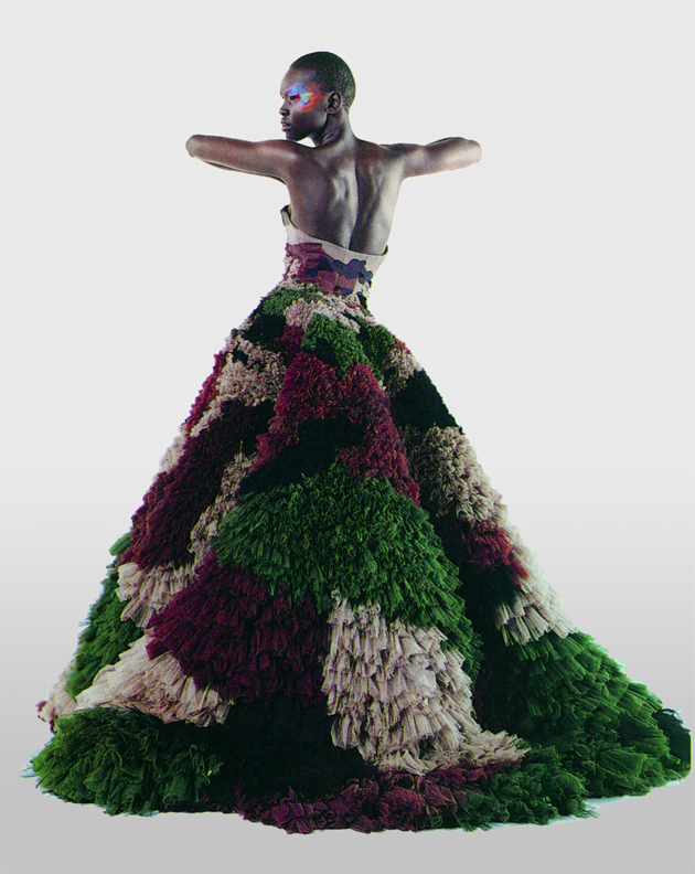
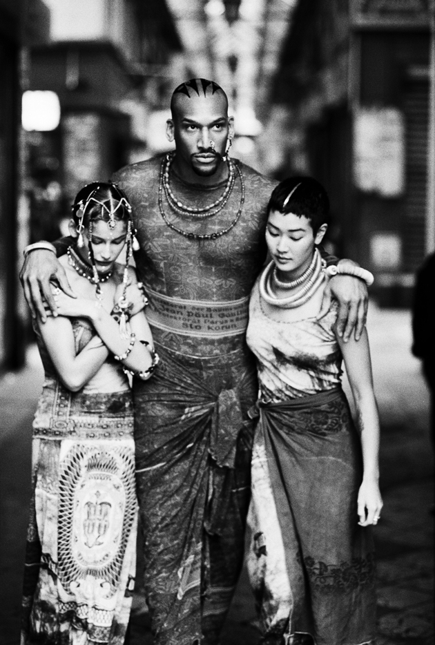
Few days ago a fashion exhibition was inaugurated, dedicated to the Enfant Terrible of fashion, the French couturier Jean Paul Gaultier. The Fashion World of Jean Paul Gaultier: From the Sidewalk takes place at the Brooklyn Museum, displaying almost 140 of the designer’s haute couture and prêt-à-porter ensembles from the beginning until the latest collections. The show has been organized around seven different themes, which feature the most important influences that have had an impact on Gaultier. From Parisian street life to the world of cinema, the path starts with The Odyssey, continues with Punk Cancan, The Boudoir, Urban Jungle, Skin Deep and finishes with Metropolis. The exhibition is not only about garments, but also sketches, stage costumes, documentation of runway shows, concerts – how to forget the friendship with Madonna? – as well as images taken by both fashion photographers and contemporary artists.


To better recreate a striking atmosphere, interactive faces customize all the mannequins and make them look quite realistic. Organized by the Montreal Museum of Fine Arts, in collaboration with Maison Jean Paul Gaultier and curated by Thierry-Maxime Loriot of the MMFA, the exhibit will last until the 23rd February, tracing the poetic yet transformative approach of one of the most avant-garde designers of our times.

Francesca Crippa 
25/10/2013

French Flavour

Paris is the ultimate playground for the peckish, flavor-savvy and culinary curious. A world of tradition and creativity, many travel the globe for the chance to savour Parisian cooking.

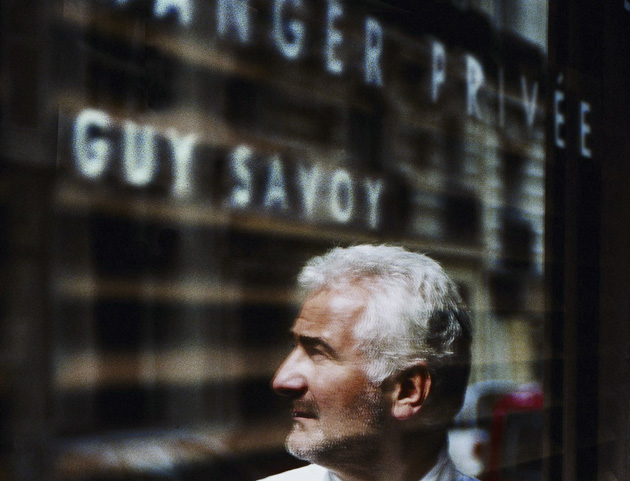
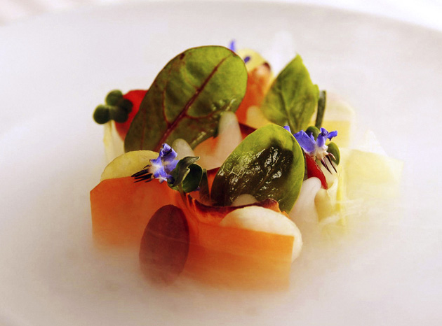
For the ultimate foodie indulgence make for Guy Savoy, the three-star namesake restaurant of a French Master chef. There’s something about Savoy’s rich yet unique style – each dish develops as you devour it, taking you on a creative (and at time unexpected) culinary journey. Many of the remarkable dishes that make up the lunchtime degustation menu look like miniature works of art. Case in point, the carrot and lobster bisque hidden beneath a lace-like web of beetroot and flowers. With all the dishes constructed at your table, Guy Savoy makes theatre from food (and deserves a round of applause).


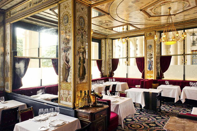
Similarly magnificent and history-drenched is Le Grand Véfour. Tucked away in an elegant corner of the Palais-Royal gardens, and once the coveted haunt of Victor Hugo, Sartre and Napoleon, this was the place to be seen during the Belle Époque and a site of political, artistic and culinary intrigue for over 200 years. The original interiors remain, with seats marked with the names of those who once called them their favourites (I had Maria Callas’, across the way from the spot once filled with Balzac).


And then there’s Angelina. Founded in 1903 by Austrian confectioner Antoine Rumpelmayer and named in honour of his daughter in law, Angelina has been the favourite meeting place of Parisian gourmets for over a century. The Belle Époque interior is the epitome of charm and refinement while their world famous hot chocolate (L’Africain – impossible to drink without a generous dollop of cream) and Mont Blanc (an intricate pastry made from a secret recipe) have attracted Coco Chanel, Proust and contemporary explorers keen to experience the Paris of yesteryear.

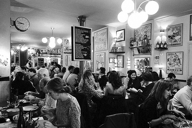
If you’re after a less formal, thoroughly French experience then Chez Janou, a mere amble from Place des Vosges, is for you. Always packed with clued-up, wine sipping locals, this time-forgotten venue serves up traditional provincial fare. Its real selling point is the chocolate mouse, which arrives at your table in a huge bowl, from which you serve yourself. Self-control, and booking ahead, is a must.

Or you could just wander the city’s ancient streets and flower filled gardens snaking on crepes, pastry or falafel (the pita falafel at Sarl Daphne is a must) and feel truly blissful. Food and France, what more could you want!

Liz Schaffer 
24/10/2013

Design Runways by Famous Designers

Short but rhythmic, visually compelling, emotionally engaging: the recipe for a good runway is all about returning a memorable, breath-taking show. Thus, fashion catwalks have always been entrusted to visionary event managers – Etienne Russo, Alexandre de Betak, Thierry Mugler, just to mention few of the most revered fashion producers – committed to combine an out-of-the-box creativity with a flawless direction of a complex ensemble choreography.


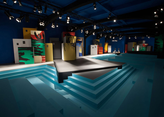
However, a subtle but significant shift has recently revisited these implicit laws. That’s what has silently been changing: on tiptoe, industrial designers have been called to rethink the scenic space as a new architecture of objects and volumes. Today, their role in the overall fashion biz is that of back actors. Tomorrow, they could be transformed into main characters engaged to redefine the way we represent meanings and metaphors in the fashion world.

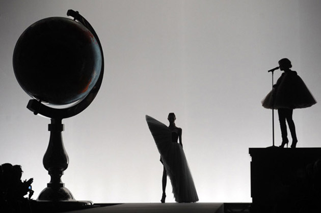
The first to burst on the runways scene was Studio Job, called to support the iconoclast genius of Viktor & Rolf for the launch of their 2009 “Cutting Edge Couture” collection. Thanks to a creative affinity that ties the two couples as a result of their long-lasting friendship, Nynke Tynagel and Job Smeets were set free to design a huge Swarovski crystal-covered globe, a mean to establish a new sense of proportions between clothes and items on stage and thus subverting the giant allure that models usually personify in this context.


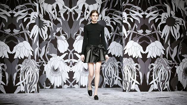
Their collaboration hasn’t slowed down in the following years: in 2011, “Rebellious Sophistication” associated the issue of youth intolerance to a black and white backdrop showing withered flowers. Then, their latest exploit was Viktor & Rolf SS14 collection: openly inspired by Pink Floyd’s “The Wall”, Studio Job recalled the issue of rebellion transforming it into a tiled, iconic scenario whose insurrectionary message is meant to be aggressive up to an metaphorical point break.

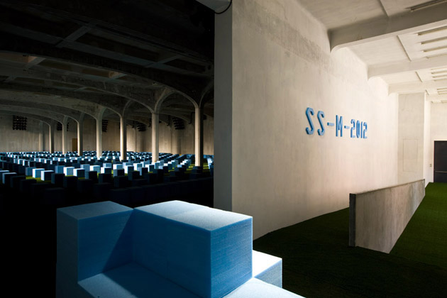
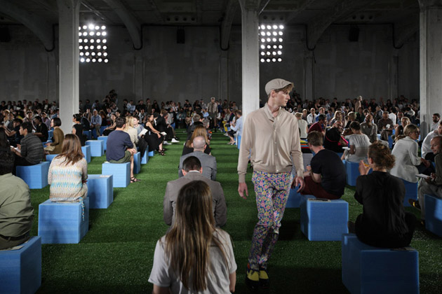
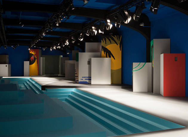
However, the conceptual affinity between fashion and design is not necessarily a matter of compatriots. In the last couple of years, Miuccia Prada committed to her trusted cultural think tank, Rem KoolhaasOMA/AMO, to set up an intriguing runway concept for her collection. First, an inedited exhibition offered a premise for this new collaboration: “Ex Limbo”, commissioned in 2011 by Prada/Koolhaas to the Belgian collective Rotor, redefined the space and the paths of Fondazione Prada in Milan through the use of dismissed catwalk platforms. Later on, in 2012, OMA got rid of the idea of catwalk reconfiguring it into an unstable, enlarged volume. Up to an apotheosis: the inclusion in Prada’s AW13 runway of the new OMA’s prototypes designed for Knoll and named “La Casa Ideale”: a true short circuit between fashion and design, calling into question priorities and mutual expectations from these two worlds.
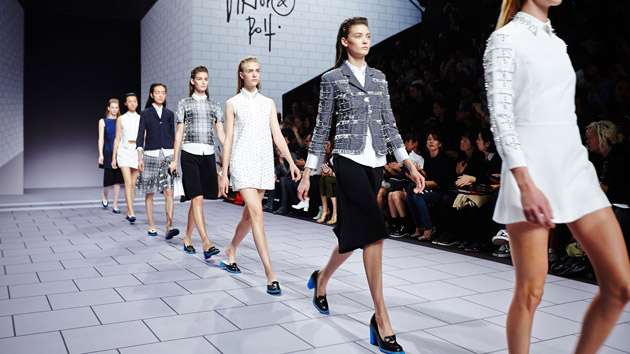
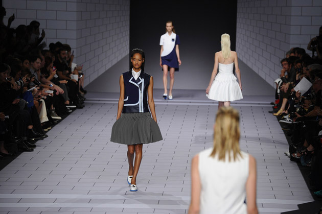


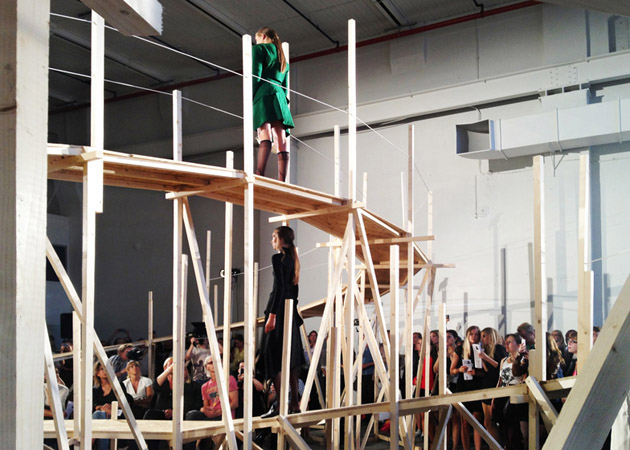
The collaborations between designers and the fashion world are not limited to long lasting, conspirational friendships. Recently, the Japaneese cult fashion designer Issey Miyake chose an unexpected partner, Sir James Dyson, to set up a wind machine to inflate the catwalk of his “The Wind” collection. More underground, but highly spectacular, the suspended, looping catwalk designed by Gartnerfuglen-Arkitekter transformed a no-profit event celebrating emerging Norwegian fashion talents into a worldwide viral phenomenon.
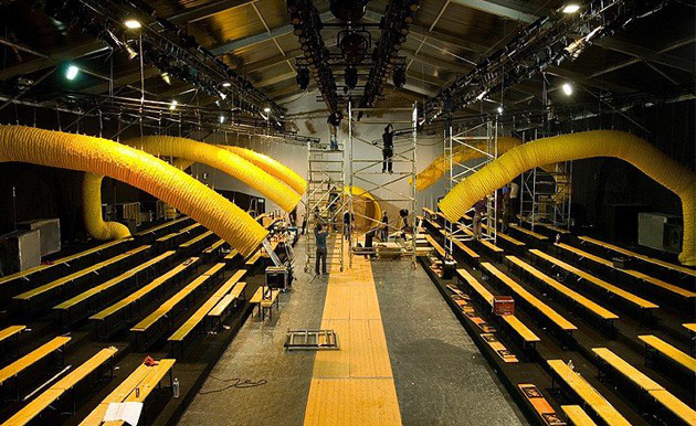
Could design for fashion soon unveil its full potential? For sure, let’s expect it to gain a bigger role in transforming fashion events into an unforgettable – and brandable – opportunity.

Giulia Zappa 
24/10/2013

Adding Another Coat

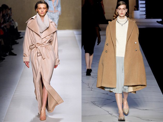
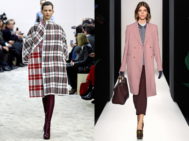
As the chilling Autumn wind becomes colder, the question of outerwear becomes increasingly crucial. Since this season’s coats paraded on the catwalks some time ago, we decided to refreshen our memories and list some key trends for AW1314: a review on coats that can help the undecided narrow down their search on which piece to invest in.


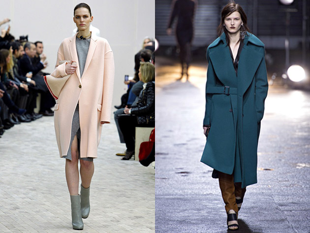
Think pink – This year pastels have lingered from Spring to Fall. The by far most popular color for coats is pink. As if viewed in the dimming winter light, a dusty rose pink is a beloved color choice amongst many designers. The pink color is preferably tailored in a long yet classic silhouette as seen at the runways of both Mulberry and Blumarine. Cashmere or wool are the materials at hand constructing a simplistic grace to each piece.

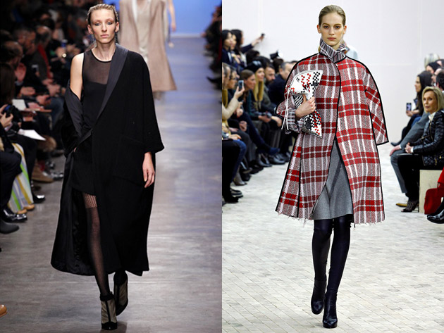
Me Tartan – Moving on from previous seasons’ “checkmate”, the square was given a bigger influence in the Autumn attire through the tartan print. The tartan, having a relation with the punk trend that is sweeping nations, was during the AW13 fashion shows represented on everything from pants and scarves to coats of all shapes, as seen at Saint Laurent and Céline. Used as an accent to black, or layer on layer, the tartan coat is more than a family matter this season.

All maxed out – the biggest thing trending in coats at the moment is the maxi coat. The floor length silhouette was spotted on the AW13 runways of 3.1 Phillip Lim, Max Mara and Rochas, just to name a few. This key item comes in all colors, but is kept simplistic without unnecessary detailing, letting the length bring both mystery and drama keeping up perfectly with the classical cinematic vibe of many Fall collections.

In short, sheltering oneself from the cold Fall wind, which can this season be nothing but a breeze, can be simple with a classic neutral silhouette, that one can update with something unexpected such as a tartan print, pop of color or dramatic length.

Victoria Edman 
23/10/2013

Through the Lens of Sati Leonne Faulks


Sati Leonne Faulks