17/06/2014

Ever Changing Stripes

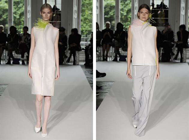
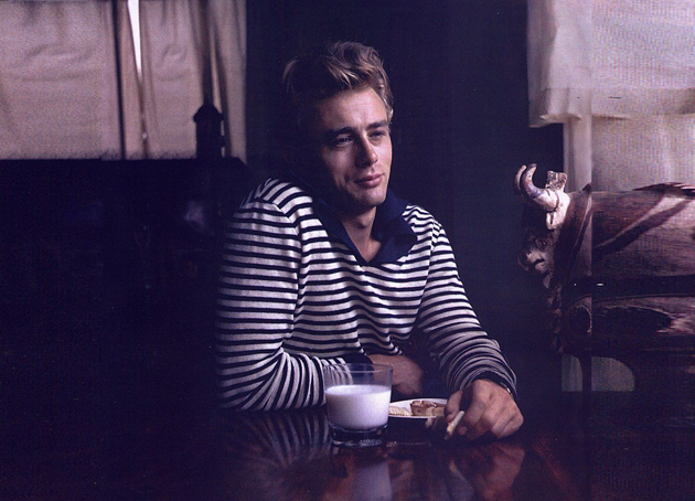
Stripes are considered both a fashion classic and a fickle trend. Right now light blue and white stripes are the stripe to strive for. In the resort collections of 2015, stripes were seen on the runways of Mulberry, 3.1. Philip Lim and Gucci who updated the famous Breton sweater by introducing embroideries and different colors. However the novelty and classical aspect of the stripe does not change its tragic past: a history of décor that originates in politics and death.
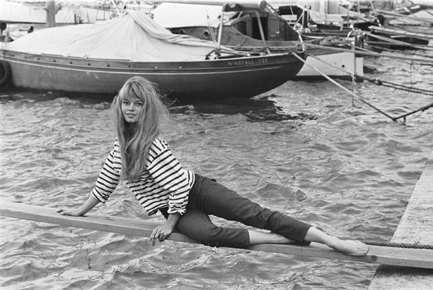
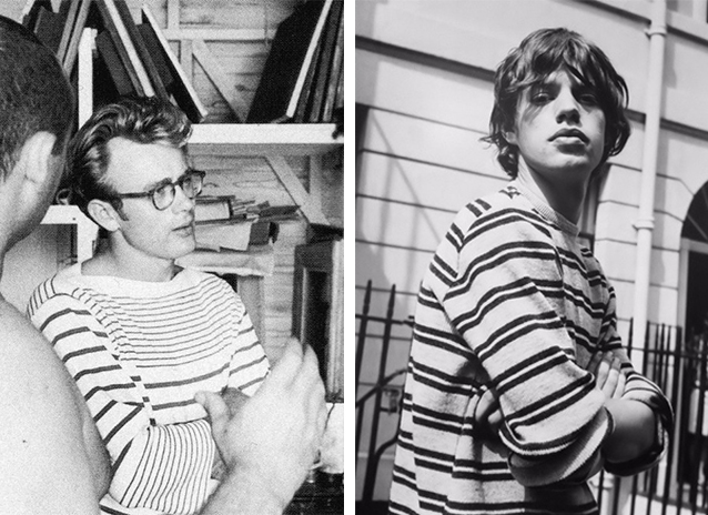
During the Middle Ages – when the striped pattern first appeared – a discontent for the chaos the stripes mimicked grew, thus leading to a restriction in their use. Stripes became known as the pattern of evil, even causing people to be killed simply for wearing stripes, with the only people allowed to wear them being criminals and prostitutes. Then, during the late 1800s a fashion shift occurred and the nautical stripes became widely popular after Queen Victoria dressed her four year old son in a sailor suit with stripes. The Queen’s popularity brought the stripe out of the shadow.
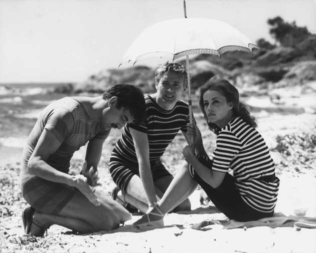
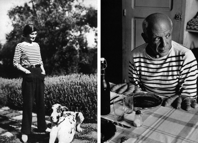
However, we had to wait for the fashion genius Coco Chanel to bring the stripe into the 20th century. Referencing the French marine uniforms, Chanel created a collection which made the stripe a pattern of elegance and sophistication during the 1920s. Artists such as Picasso and Warhol helped immortalize the pattern further, reviving it in the male wardrobe. During the 1960s the stripe became the pattern of choice for hippies and movie stars alike and would become a symbol of the Beatnik Generation. In the 1990s the stripe made a statement of professionalism as it made its way into the business world. However, even though the sophisticated, slender version of stripes could even be seen on suits, its iconic flair remained a symbol of subculture groups, especially when paired with plaid shirts for the grunge-obsessed.
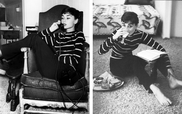
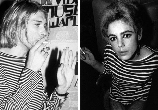
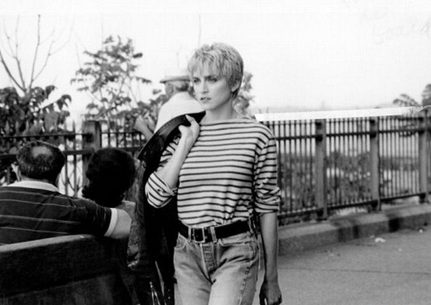
Based on its rich history and stratified evolution, the versatility of stripes makes it interesting even today. From catwalk to street style, the stripe has become timeless, minimalistic and elegant while still representing subtle rebellion, creating unity across genres and styles. The appeal resides in the simplicity and adaptability of this everlasting pattern, undoubtedly keeping it around for many more seasons to come.
Victoria Edman 
16/06/2014

Style Suggestions: Sports

Summer has arrived and its time to get in shape. Here are some key pieces that we suggest to help you on your way.

Top: Adidas by Stella McCartney, Shoes: Nike, Shorts: T by Alexander Wang

Styling by Vanessa Cocchiaro 

16/06/2014

Gregory Crewdson And His Perfect, Magic Moments

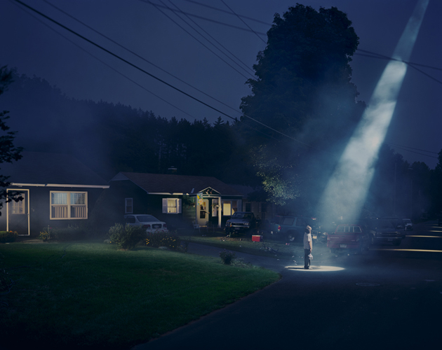
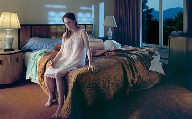
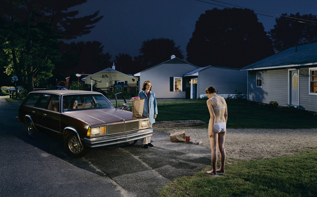
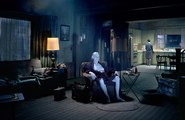
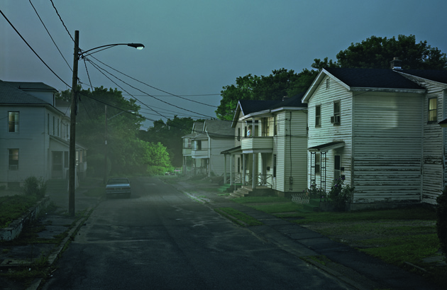
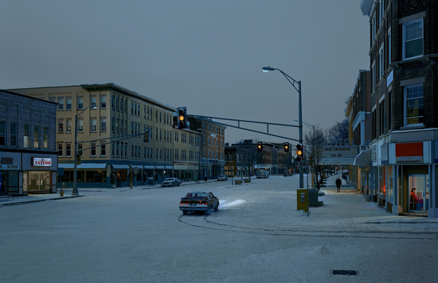
Unanimously recognized as one of the most brilliant photographers of our time, Gregory Crewdson (b.1962, New York) is often compared to other renowned American artists working in different fields (among which Stanley Kubrick, David Lynch and Edward Hopper) for his obsessive control of the composition – every single element of the frame is accurately selected – and the ability to portrait American suburban every day life through an unnerving, visionary hyperrealism.

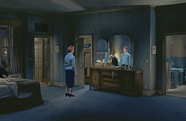
The juxtaposition between a certain kind of cinema and Crewdson’s photographs is not a mere coincidence; indeed, the creation of his images is a long process, which involves a solitary and slow location scouting – the most important part of the entire process – and a regular cinematographic troupe that painstakingly builds the wanted set and light to get the perfect shot. Each picture is a frozen and mute slice of life, mid-way between reality and fiction, beauty and decadence. They are fixed but incomplete moments, without before and after, that allow viewers to get drawn into the scene, projecting their experiences and free interpretation to generate personal narratives.

The stages offer rarefied atmospheres where everything is perfectly contextualized – nothing has been left to chance – and seems to be definitely real, but filtered through artificial, dreamlike and surreal lights, which give a pictorial aspect to the works. Crewdson depicts deserted streets, supermarkets with neon signs during twilight and dawn, parked or overturned cars in the boulevards, motel beds and private living rooms inhabited by puzzling characters, lost in thought and leading a very solitary existence. They are stills from the world of unconscious ghosts that remind us of Short Cuts by Altman rather than the incomparable Raymond Carver’s Cathedral novels.

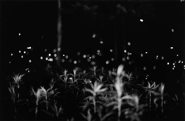
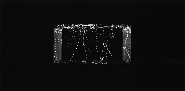
But beyond this type of work, which is undoubtedly Crewdson’s most widely known, we cannot avoid mentioning a special series of photographs made by the artist during the summer of 1996 in rural Massachusetts, entitled Fireflies: 61 black and white introspective photographs showing the magic fleeting light of the nocturnal creatures in a simple, poetic and direct way. Wave Hill in New York is now giving the wider audience a rare opportunity to see, for the first time ever, the complete collection of amazing images in a special exhibition which will run until 24th of August 2014. Do not miss it if you are around!

Monica Lombardi 
13/06/2014

Upcoming Artists: Frankie Cosmos

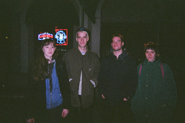
Hi Greta! Could you explain your background a bit? When did you start playing and how come you became a musician?
I started playing piano when I was around six years old. My family supported my brother and I in our music studies, which started at a very early age.

With what kind of music did you grow up with? Your sounds reminds me of The Moldy Peaches or Daniel Johnston.
I grew up hearing James Taylor, The Police or The Beatles, which is the music my parents always used to listen to at home. Later, when we were a bit bigger, my brother started showing me some music and I first heard about The Moldy Peaches or Daniel Johnston when I was around 12, so this sound has been with me for a very long time.
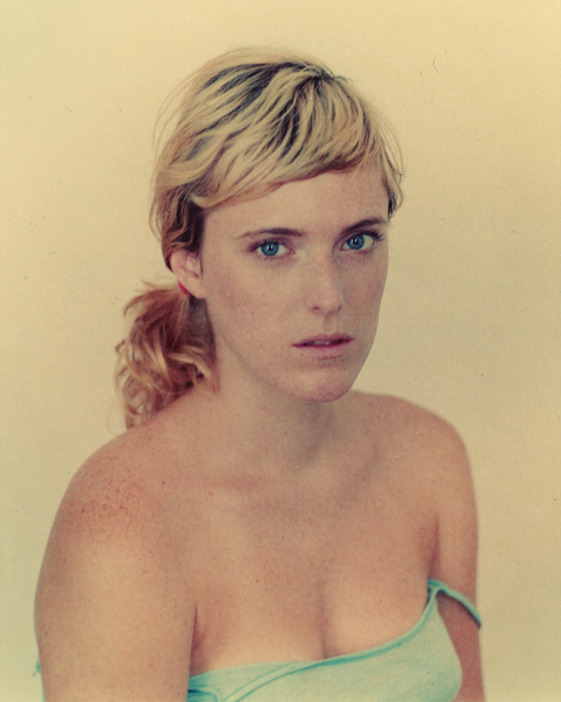
You’re very young but you’ve already recorded many songs, something like 50 EPs in only years. Where does this desire to record come from?
It might come from a compulsive place. It’s just an urge to keep track of my life and have a sort of an archive through music. I started playing music as a game, and it still kind of is a game for me, that is why I make so many songs, because, for me, it is just fun. If it weren’t fun and something I enjoyed, I wouldn’t be making music in the first place.
The choice of the name Frankie Cosmos is not accidental; your real name is Greta Kline (that would still be a nice name for a band)…
The name comes from an nickname that my boyfriend made up after I showed him the poet Frank O’Hara, by whom I was very fascinated at the time. Then the band name grew from that.

What role does art play in your life? It looks as it were extremely important to you…
This is a tough question! It plays a huge role, both in what I personally make as well as for the people I surround myself with. All the people I know are in some way artists or care deeply about art. I don’t think I know anyone who doesn’t care about it, so it is sort of my basic environment in which I live and work every day.

You play a lot of instruments…During your concerts do you play all of them or just one? And when you record, what kind of equipment do you use?
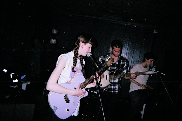
We have a full band when we play live, I play guitar and sing, Aaron plays drums and sings, David plays bass, and Gabby plays keyboard and sings. When I record at home I use mostly an acoustic guitar and a keyboard, on garageband. We had access to a lot more equipment for the making of Zentropy.

In the last years Manhattan has been overwhelmed by young bands. Do you consider it a good or a bad thing?
I don’t really know any other young bands in Manhattan, so I guess this question is not applicable. But in general I say the more bands the better! It’s always good to have an environment where everyone feels safe making and sharing art no matter what their resources or backgrounds are.

Enrico Chinellato 
13/06/2014

Bare – the Quest for Truth in Fashion

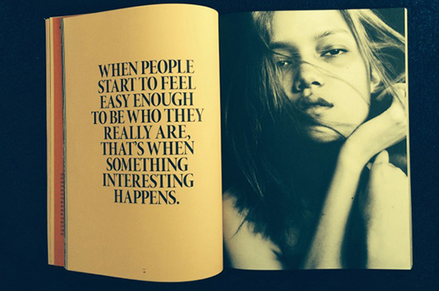
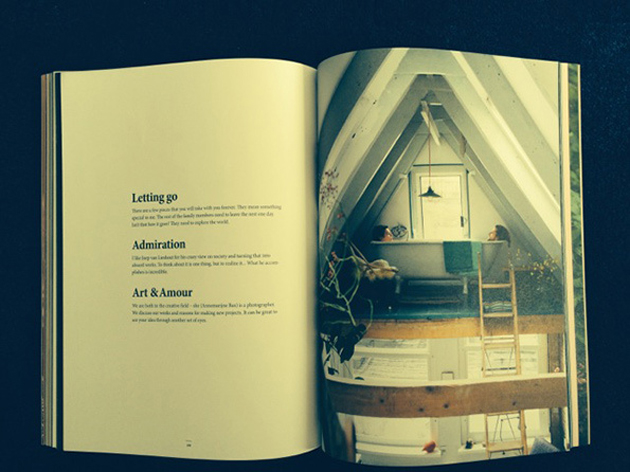
Fashion can, as most subjects, be seen through different perspectives. Some people categorize fashion as a commercial matter, others believe it to be so much more. Bare, a new magazine about the culture of fashion, takes on the second stance. The goal of the magazine is to offer an alternative to the traditional view of fashion as a highly polished, guided and mediated environment, by proposing a publication that explicitly seeks the raw storytelling, liberty of expression, imperfection and, most of all, reality.

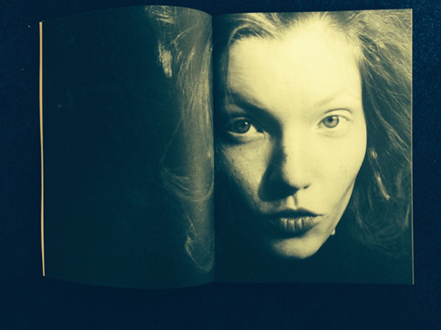
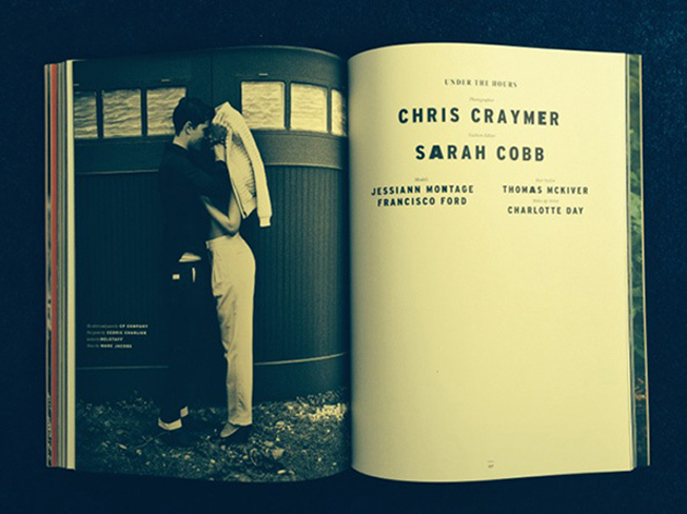
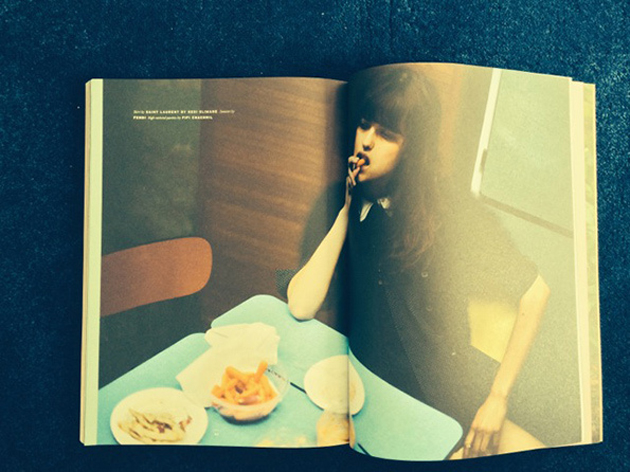
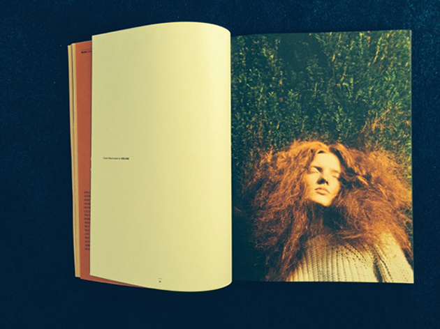
The willingness to distance itself from the superficiality of traditional fashion magazines, permeate the publication: from Bare’s layout to its selection of articles, photographic essays and interviews, the magazine as a whole is dedicated to “the unadorned moment of truth”. For this reason, the magazine has no brief, leaves their contributors – photographers, architects, designers, filmmakers – tell their own stories, where the process becomes as fascinating as the product and the readers are free to draw their own conclusions, participate in the story or even re-tell it in their own words. From a technical point of view, Bare does not use retouching or the artificial manipulation of photography typical of the traditional fashion media – an admirable and ambitious goal in a world full of mediated imagery and false representations.

The quest for rawness and reality might feel almost as a political stance in the competitive world of fashion media, where authenticity, imperfection, realism and verity are often concealed. In a difficult world of publishing, where so many quality publications are destined to die even before they are born, what might be the future of Bare? Hopefully, its readers will recognize its honesty and genuine touch as not only a fresh alternative, but a necessary shift for a brighter future of the fashion industry.

Hanna Cronsjö 
12/06/2014

When Hiroshi Sugimoto Does Good Architecture

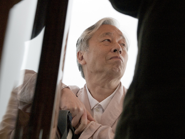
The Japanese artist and photographer Hiroshi Sugimoto made his first architectural work for Le Stanze del Vetro on San Giorgio Maggiore island in Venice that opened on June 6. Known throughout the world for his photographic works in black and white, Sugimoto for the first time in Venice designing a structure after opening his architectural firm just few years ago.

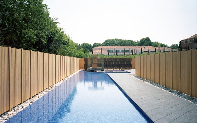
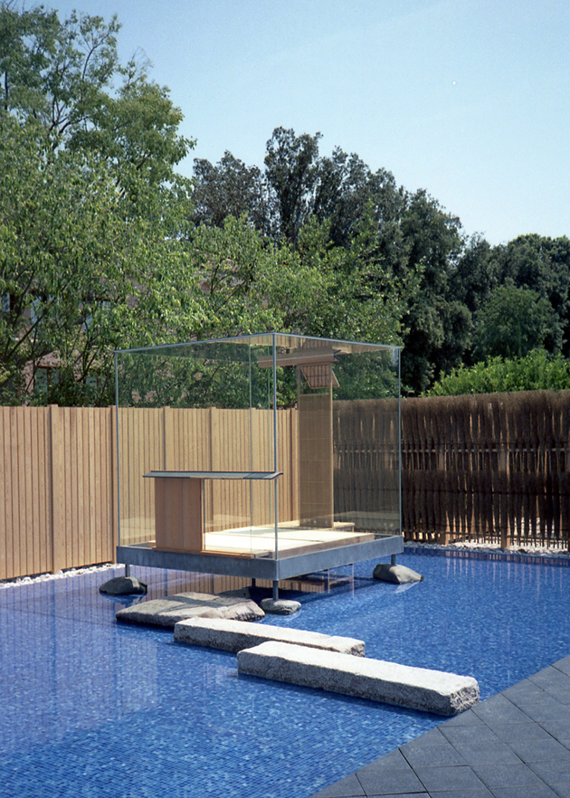
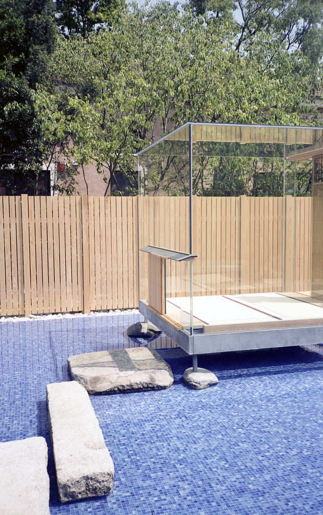
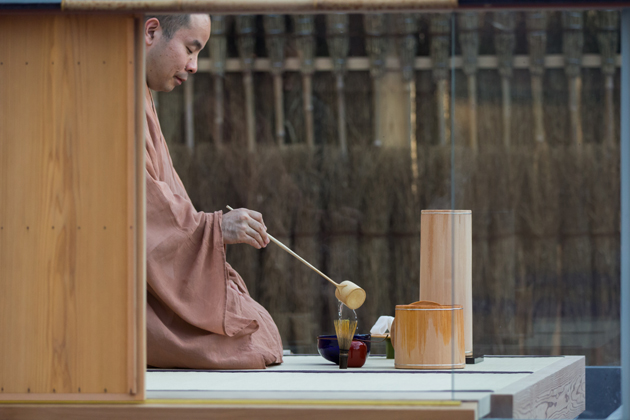
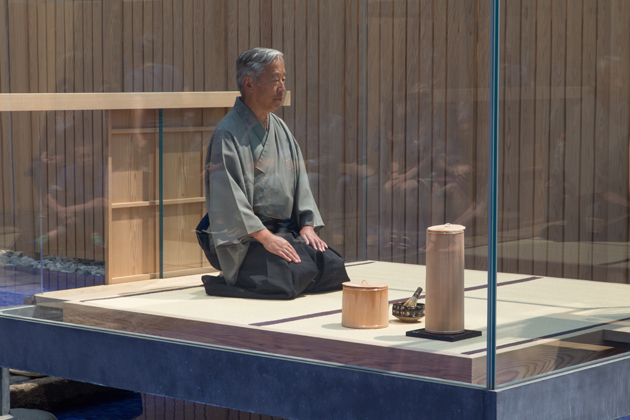
“Glass Tea House Mondrian” is inspired by the tradition of the Japanese tea ceremony, as it was reformed by the master Sen no Rikyu. The pavilion consists of two main components, one outdoor and one indoor. The uncovered structure (about 40 meters long and 12.5 meters wide) winds through a path that includes a long pool of water, which leads the visitor into a glass cube (2.5 x 2, 5 meters), where on a regular basis, there a Japanese tea ceremony will be held. The glass cube welcomes, together with the master of ceremony, two visitors at a time, while the public may attend and take part in the ceremony gathering at the sides of the glass cube. The tools that will be used for the tea ceremony were all designed by Hiroshi Sugimoto and produced by artisans in Murano.

The flexible structure of the pavilion and its temporary nature, will also transform the garden where it was built, so far unused, in a versatile space, able to accommodate meetings and debates, and encourage visitors to freely determine their own experience with the pavilion. The innovation of “Glass Tea House Mondrian” lies in its ability to suggest a space for exhibiting and experiencing architecture, where the pavilion itself becomes exposure – innovation to which is added the autonomy of the artist to propose a theme and a project free from restrictions, but rather open to the possibility of experimenting with shapes, place, building technologies and materials.

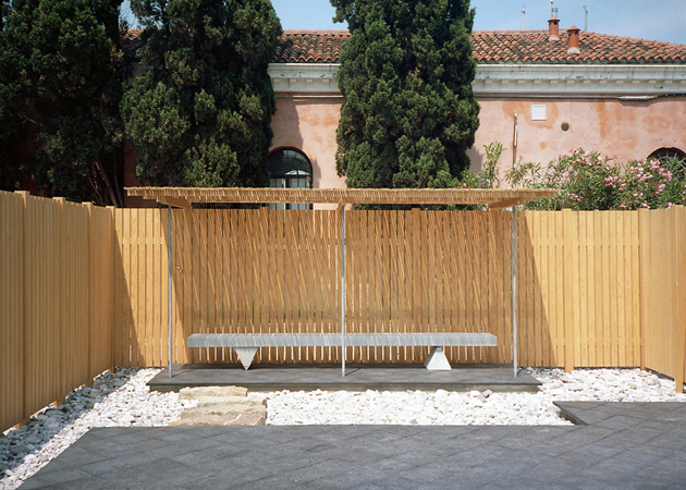
The external structure is built entirely of cedar wood from Japan, and realized by Sumitomo Forestry Co. Ltd. Chosen by Hiroshi Sugimoto for their efforts in contributing to the reconstruction of the areas devastated by the Tōhoku earthquake and tsunami of 2011 and instrumental in the construction of “Glass Tea House Mondrian” and the external enclosure, which is inspired by the Shrine of Ise. In the frame of the Island of San Giorgio Maggiore, the “Glass Tea House Mondrian” also acquires a symbolic value by encouraging the visitor to interact freely with the place, and also requiring you to find the right balance between personal and artifice architectural and the natural environment that surrounds it.

“Glass Tea House Mondrian” builds a strong dialogue between interior and exterior, nature and artifice, closed and open, light and heavy, water and land, a relationship that results in the use of timber from Japan – for the external path – , mosaic – for the hot water – and glass – for the deputy to the experience of Japanese tradition.

Images and words Giulio Ghirardi 
11/06/2014

There Is Something About Thomas Tait

Last week Thomas Tait was announced winner of the inaugural LVMH prize sealing his position as fashion world’s newest darling. Being selected as winner among 12 creative finalists by a prestigious jury that included designers Karl Lagerfeld, Raf Simons, Nicolas Ghesquière and Marc Jacobs, must mean there is clearly something about the clever Mr. Tait. But what?

The native Canadian has previously attained a technical diploma from Collage La Salle in Montreal. He began his career in 2010 after graduating as the youngest graduate ever from London’s Central Saint Martins, an indisputable hub of fashion talents. Tait’s graduation collection was shown in London during AW 2010 runway shows and introduced his particular focus on geometric shapes and basic colors. While he often restrains to black and white, Tait’s designs are made playful and frisky by slightly oversized shapes and exaggerated lines. The play with geometry of the garments became Tait’s signature trait, seen on his later collections where the color scheme remained unchanged, but different materials and processes were applied to create movement and structure – such as pleats mixed with smooth counterparts on skirt designs.

In his first spring collection the designer added more colors, with pastels and a mix of materials used to create a layered yet relaxed sportswear look – with sports as the operative word for all of Tait’s collections. With each season, bolder colors and more exaggerated shapes were used in direct reference to the neon trend and the idea of merging future with the present. However, just as we managed to wrap our mind around Tait’s designs, the new SS 2014 collection showcased an unpredictable and entirely new train of thought. The features he previously treated separately – namely, colors and shapes – were fused together under his distinctive aesthetics, perpetually reinventing pieces that have become staples in his work.

Thomas Tait has a certain je ne sais quoi, as the French put it, that charges his apparently simple designs with a bold personality – a personality able to tell a story in many different languages and styles. The constant ability to rework what has already been done, might just be the characteristics that made him stand out among the 12 finalists. Turning something expected into an unexpected treat is a very special kind of gift – almost as if you were spinning straw into gold.

Victoria Edman 
11/06/2014

Through the Lens of Charles Lu

Images courtesy of Charles Lu 
10/06/2014

Did You Say Monochromatic?

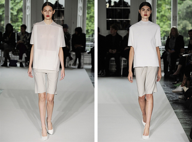
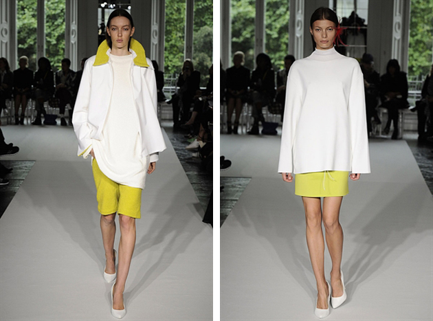
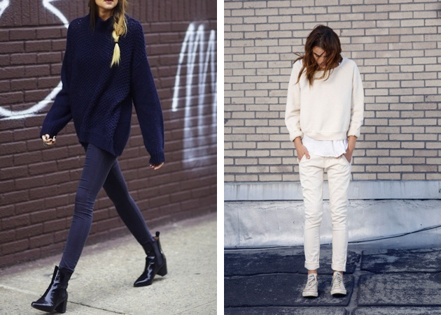
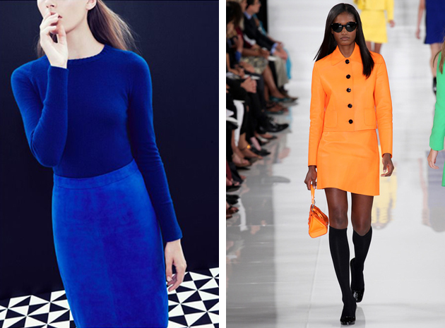
The definition of monochromatic in fashion simply means featuring a lighter and darker version of the same color. Or even choosing all the pieces of the exactly same shade. Although we recently saw a big come back of color blocking, the difference between the two trends is substantial. The first one requires creating a bright and effective combination between two different tinctures, which is not as easy as it may seem. In the second case, instead, your goal is just choosing the right hues of the same color and combining them together. It monochromatic trick might be simple and elementary when the colors are neutral, a little bit more difficult if you aim for bolder tones.

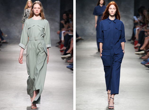
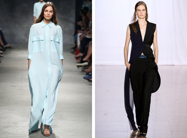
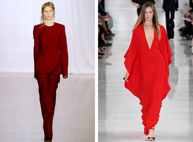
For the ultimate inspiration, one should have a look at the last fashion shows,for Spring-Summer 2014, where, in fact, many designers have chosen a monochromatic approach. In New York we saw a sequence of bright colors at Ralph Lauren’s show, from freesia yellow to venetian red; in Paris we took a long calm breath at Felipe Oliveira Baptista who created relaxing shades of green and blue, giving space both to jumpsuits, long dress and extra large coats.

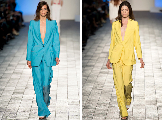
Paul Smith continued on his colorful path, the one started with Autumn-Winter 2013-14 collection, where he showed his mastery in powerful color blocking. This time around he made it simple by combining the exactly same shade of a single color on his masculine and comfy suits. Maison Martin Margiela has always supported the trend and for SS 2014 gave us a few looks composed of trousers and long sleeved shirts, for a minimal yet chic result, especially in burgundy.

Francesca Crippa 
10/06/2014

Fundamentals: 2014 Venice Architecture Biennale

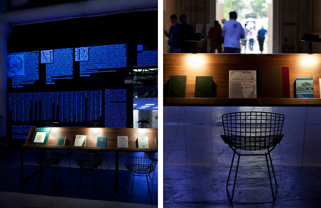
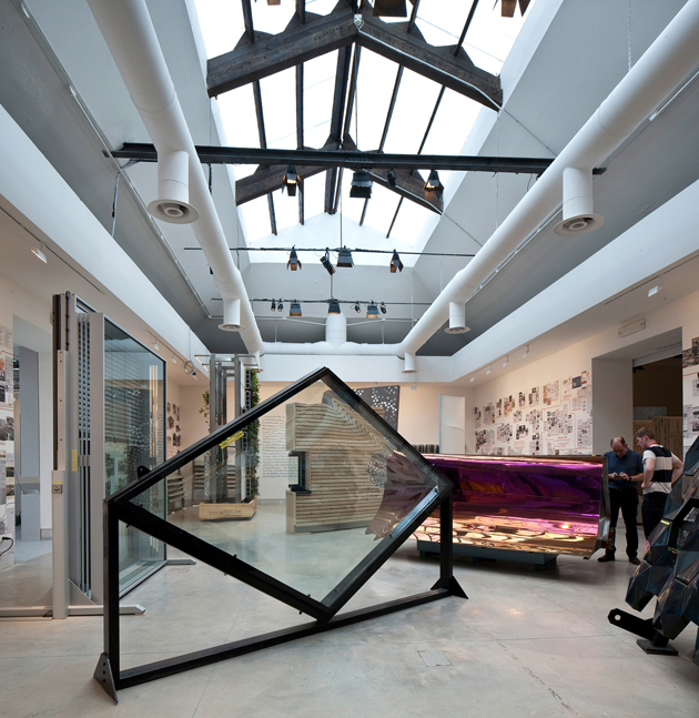
For the visitors of this year’s Venice Architecture Biennale, the exhibition was a though nut to crack. Not because it was particularly challenging or deep, rather because the usual radical-chic architecture crowd roaming the Arsenale and Giardini during the opening days couldn’t easily decide if they loved it or hated it. Titled “Fundamentals”, the exhibition, under the guidance of Rem Koolhaas, was divided into three separate projects: “Monditalia” set at the Corderie dell’Arsenale, “Elements of Architecture” staged at the central pavilion in Giardini and “Absorbing Modernity 1914-2014”, the unique theme elaborate by all the national pavilions.

“Monditalia” was conceived as an overview of Italian in a moment of crucial political change. Thus, the exhibition presents an eclectic mix of architectural projects, films, critical reflections and historical moments that deliver a chaotic understanding of the country’s past and present contradictions, problematics, curiosities and characteristics. For the first time, Koolhaas has also brought together the Biennale’s different sections, merging together architecture with dance, music, theatre, film and art.

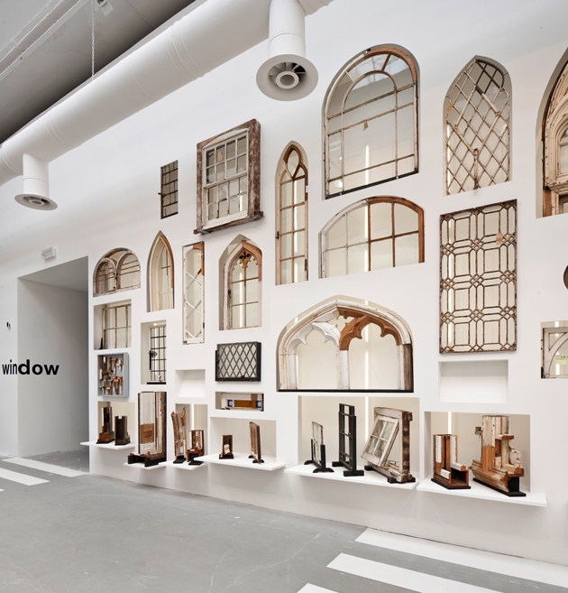
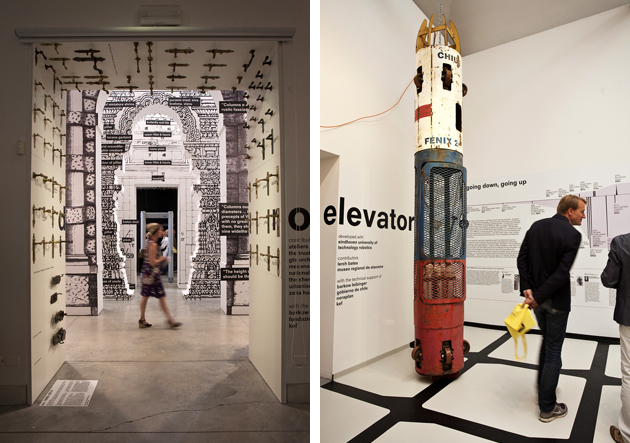
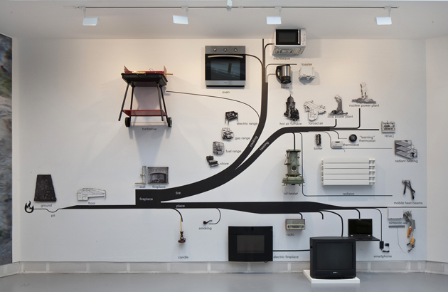
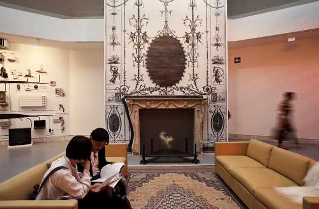
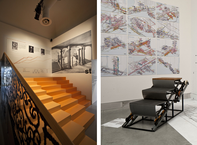
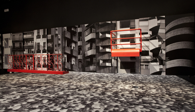
“Elements of Architecture”, on the other hand, looks under a microscope at the fundamentals of buildings, used by any architect, anywhere, anytime: the floor, the wall, the ceiling, the roof, the door, the window, the façade, the balcony, the corridor, the fireplace, the toilet, the stair, the escalator, the elevator, the ramp. While many have lamented that this section appeared more like an introductory course to architecture rather than a ‘state of the art’ exhibition, the projects presented were often lined with political, social and cultural implications inherent in any built environment that are all too often forgotten by architects. Spaces like sad hospital corridors and waiting rooms, stairs and elevators, socialist-style ape’s nest balconies, were shown to reveal what the discipline happily overlooks.

For “Absorbing Modernity 1914-2014”, 65 countries – in the Giardini, at the Arsenale and scattered around the city – were asked to examine key moments in a century of modernization, revealing how diverse material cultures and political environments transformed a generic modernity into a specific one. Set as one of the most ambitious Architecture Biennale ever, Koolhaas’ “Fundamentals” may not have entirely reached its initial goal, but it would be a mistake reading it as a crowd pleaser that misses addressing issues that concern the social, the political or the marginal in our everyday experience of architecture.

Rujana Rebernjak