03/11/2015

Punkt – Re-designing Use

When the first telephone was patented by Alexander Bell in 1876, despite all imagination and possible futurologist thinking of the time, scarcely anyone could have predicted that – a hundred and forty years later – it would have become such an epoch-defining device. In many aspects, telephones are currently at the forefront of innovation, with their use spanning areas like medicine, for early diagnosis and to help patients attain to therapies, to everyday life, to order food, book train tickets and flights or engage with artwork in museums. Telephones and related technologies are central to economic growth, while sheer existence of infrastructure necessary for their use speaks volumes about the level of development in society.
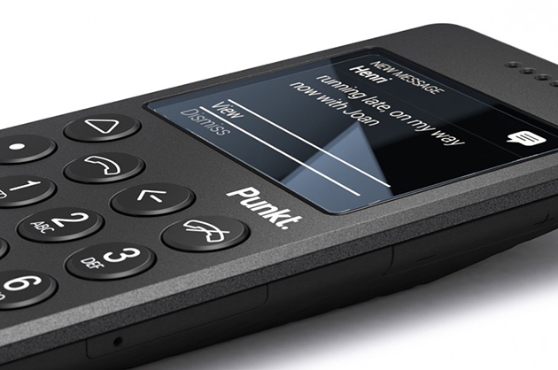
Due largely to Apple’s revolutionary yet secretive attitude towards product development, telephone design seems almost an alchemical process involving careful combination of perfectly studied curves, subliminal sounds and elusive tactile qualities. The resulting concoction gives origin to not only a beautiful material product, but – as we are able to witness daily – to a whole set of new habits, social relationships and values, that were morphed by and evolve with our phones’ titanium, glass and plastic shells.
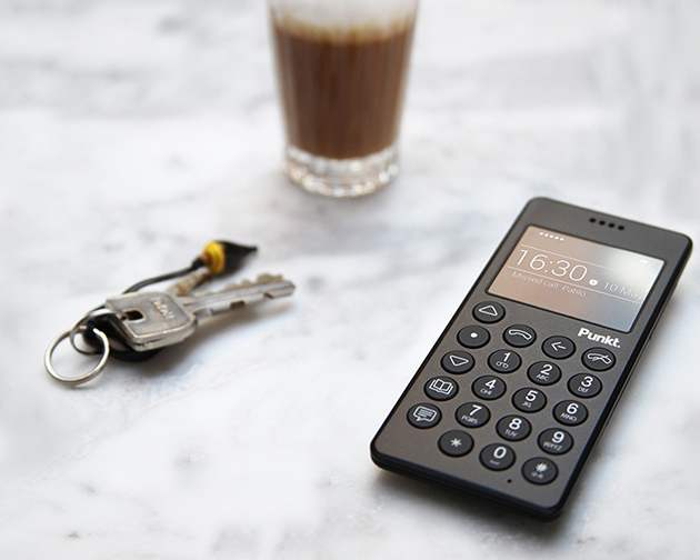
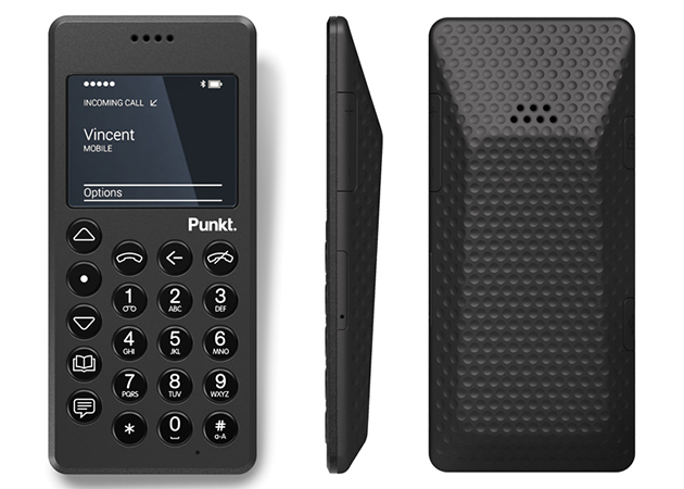
Despite smartphones’ addictiveness – both on social, cultural, economic and personal levels – a brave new product aims at reforming the very culture of telephone use we have acquired over the years, bringing it back to its original – and today archaic – functionality. Punkt, designed by Jasper Morrison, is the simplest of mobile phones. Its design could be described as minimal, defined by a black plastic shell, rectangular shape, well-rounded edges and round, easily identifiable keys. Were it not for the year of its release, Punkt would be nothing else but an unassuming mobile – or cordless – phone. And thus, what is revolutionary in Punkt is not its design per se, but the context within which it is being framed, that allows its design to make a subtle, ironic point about its use. Namely, it shows that products like Punkt have for a long time been obsolete.
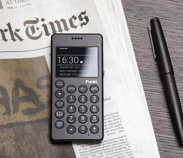
For such a product, it was only natural that the company would commission Jasper Morrison to develop its design. Know for his “supernatural” approach to designing, Jasper Morrison is a proponent of undesigned design as creation of objects that look immutable, as if they’d been the same for centuries. He is the designer of archetypes – objects that will unlikely require a redesign in the near future and which seem to stand at the origin of an object category and their specific form. Punkt was designed to defy the current trends on the market. It can only serve two functions – make calls or send text messages – and such reduced, austere functionality – austere, that is, if compared to current smartphones and their functional exuberance – is reflected in its strict black shell. Punkt mobile phone, in fact, looks as if it were almost physically uncomfortable to use. And yet, when you pick it up, its carved volume and slightly rugged surface fits perfectly, seamlessly into your hand, anticipating the straightforwardness of its ‘archaic’ use. It invites you to hold it up close to your ear, rather than blankly stare at its screen.
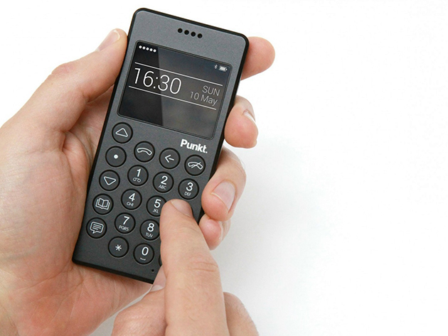
But what is the point of Punkt beyond an obvious defiance of current market trends? Can its users surpass contemporary social pressures? Can its design help to make us a bit less intoxicated by all that is digital? Morrison’s intent was certainly not to make ‘classic’ telephone use appear sexy, glamorous or fashionably appealing; Punkt’s shell is not bright yellow or clad in rose gold. As such, Punkt is perhaps bound to remain just a utopian proposition – an object designed to speak about design and the values it confers when it is nothing more than what it is.

Rujana Rebernjak – The Blogazine 
Share: Facebook,  Twitter  
18/05/2015

Jasper Morrison: Thingness

Jasper Morrison designs objects that we love to live with but whose qualities might go barely noticed: he believes that good design has less to do with making products noticeable than with making sure they are useful. For 35 years, thus, Morrison has designed objects that range from chairs, tables and sofas, to tableware, toasters, telephones or bus stops, working with some of the most interesting and renowned manufacturers, among which Sony, Samsung, Alessi, Flos, Magis, Muji and Vitra.

Jasper Morrison was born in London in 1959 and studied design first at Kingston University and later at the Royal College of Art. He opened his Office for Design in London in 1986. Morrison’s approach to design gained a public face with the publication of the Super Normal manifesto, a sort of a design philosophy outlined in collaboration with the Japanese designer Naoto Fukasawa. In it, Morrison and Fukasawa refer to the normality that goes beyond the principles of standardisation, more akin to a form of universality, arrived at by understatement and a touch of humour, qualities that many can relate to. In fact, Jasper Morrison’s work – whether sofa, watch or drinking glass – is
characterized by lines that are simple yet rigorous. His concern is to serve function, to be true to the object itself.

At the pinnacle of his profession, Jasper Morrison has put key moments of his career on display, crossing between furniture, kitchenware and home electronics, at Grand Hornu Centre d’Innovation et de Design, in Belgium. Titled “Thingness” the exhibition sets on stage – the exhibition design was created in collaboration with Michel Charlot – the work created from the 1980s to the present. The chronological outline of the exhibition follows reproductions of designs and drawings, archive documents, ephemera and photographs to illustrate the process that accompanies the creation of each project, celebrated, ultimately, in a new monograph of Morrison’s work that accompanies the show.

“Jasper Morrison. Thingness” will run until September 13th 2015 at Grand Hornu Centre d’Innovation et de Design.

The Blogazine 
Share: Facebook,  Twitter  
01/11/2013

Shoreditch: Design Studios = Shopping Destinations

Multitasking is not just about mental organization. Our most widespread attempt for simultaneous multiplicity, a true synonym of contemporary weltanshauung, is also investing in the space we live in, transforming our environment into an hybrid place open to different targets and expectations. A visit to Shoreditch, London’s East-End epicentre of creativity, is a chance to observe how this phenomenon has been affecting design studios’ identity.


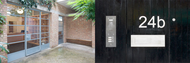
The most acclaimed British interpreter of minimalism, Jasper Morrison was among the first to move his office to this neighborhood. His headquarters, hidden behind an anonymous street door, rubs shoulders with a shop devoted to his “Supernormal” collection of ordinary but essential objects, and a design studio, inaccessible for clients. When you ring the doorbell and enter the white, tiny court, it feels like accessing a secret, suspended world: the discovery of the place or its offers isn’t due to serendipity. On the contrary, both the interior design and the products selection are no-frills but accurately conscious, and every object has more of a fetish than its plain look would suggest at first.

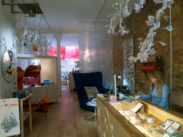
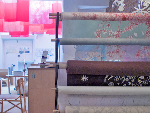
Few blocks away, Tord Boontje welcomes the followers of his laser-cut floral world into a wide open space. Its layout is similar to traditional shops: all its multi-branded creations are on sale, and their display is as accurate as if we were in a luxury department store. Yet, on a closer inspection, the presence of computers on the back suggests us that a few designers are working side by side to customers. Their presence is discreet and their glances silently observe our preferences: are they there to gather our wishes and interpret our unknown desires?

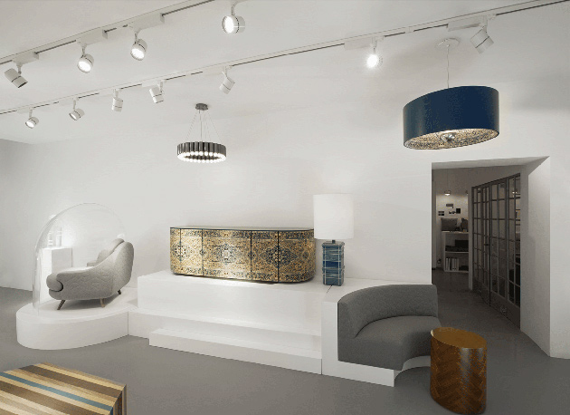
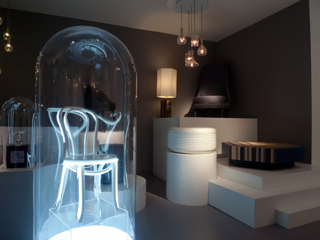
Lee Broom, enfant prodige of interior design and interpreter of the XXI century posh punk, is the latest to choose Shoreditch as a base. His brand new “Electra House” hub is both a showroom and a design studio: two contiguous rooms, each with a specific function, interact through an open door which leads to communication and exchange. Customers have their own dedicated perspective, like the audience of a play, and are free to observe how ideas and sketches take shape around the conference table and the moodboards on the walls. Thus, design is no more a segregated working attitude, as commerce is no more about buying: melted together, they are turned into a sophisticated and often intangible form of entertainment.


Giulia Zappa 
Share: Facebook,  Twitter  
29/05/2012

Found Muji

Found Muji

Muji is a worldwide known brand famous for denying having a brand identity at all. Or at least, hiding it. The power of the un-branded, almost thirty-year-old company has always been the strong focus on the product quality. The quality pairs with extreme simplicity, a ‘supernormal’ quality – as Naoto Fukasawa, a company associate, and Jasper Morrison would put it. 
The designs Muji has put on the market have never been publicized by its famous designers’ names, although the company wouldn’t have hard time showing off, seeing the impressive list of its collaborations.

Among the designers working with Muji, you can read names like Konstantin Grcic, Enzo Mari and the two design superheroes mentioned above. These pop-stars of design have conceived some of the simplest objects of our everyday use such as an umbrella or a mug. Not quite a posh assignment for this elite of creative engineers.


As we may argue endlessly about how this un-branded strategy has actually created one of the most powerful contemporary brands, Muji has moved forward to developing a new project. Muji has taken the role of the collector and the distributor of some of the finest local crafts, thus promoting a kind of design heritage handed down to us from the tradition of our popular culture. 
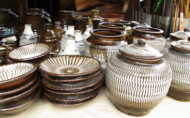
The found collection comprises a series of jugs, brooms, toys, ceramic sculptures and gardening kits among others, all so essential and well conceived that they might have actually been designed by some of the Muji’s creatives. The utmost proof of the importance this concept represents for the no-brand company is the opening of the Found shop at the first ever Muji Tokyo store in Aoyama.


Rujana Rebernjak – Images Muji

Share: Facebook,  Twitter  
30/05/2011

The Editorial: Type Is Personality / Matthew Carter

.

The Editorial: Type Is Personality / Matthew Carter

Humans have a strange relationship with type. We stare at it literally all day, yet it generally goes completely unnoticed – letters are letters are letters. Except that they aren’t. Subtle differences in their form means big differences in how we feel about what we read. About whether a text shouts or whispers. Some type is so functional it becomes invisible (Helvetica). Others luxurious. Some vulgar, maybe old-fashioned. We associate places, things, eras with type. Type is sacred. It would be nothing less than cruel to carve out a tombstone in Comic Sans.

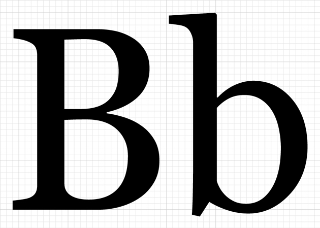
Big Caslon and Georgia, designed by Matthew Carter.

And while we may not notice type much in day-to-day life, the subtle, calculated changes designers make to centuries-old letter archetypes speak to our deepest sensibilities. In the most human of senses, type is personality. Think of the highly stylised “R” in Prada, the formal rigour of Mercedes Benz‘s Kurt Wiedermann-designed “Corporate A,” the iconic script of Alfa Romeo, the cryptic typewriter-look of “Maison Martin Margiela.” The forms of these letters tell you exactly the attitude of the products behind them.

And since computers have infiltrated every facet of life over the past two decades, we’ve all become at least peripherally aware of type’s power. We are able to give style to our written content far beyond that of our own handwriting. Our letters are no longer written in the oppressive uniformity of the typewriter (even though, like using Hipstamatic to fake old film photography, we often insist on Courier to fake retro). We now have a huge degree of control over our written environment through the power of desktop publishing. And as publishing itself is revolutionised by the wireless mobile technology of instant gratification, our personal relationship to type will continue to become richer and more complex.

Type is inseparable from place.

Appropriately, type designer Matthew Carter was awarded the lifetime design achievement award by Cooper Hewitt national design museum this month. (And this comes on the heels of a 2010 MacArthur Genius Grant.) Among designers in all fields, his work’s importance was singled out for its huge impact. Like the good, invisible design of “Super Normal,” the book and 2006 Triennale exhibition by Naoto Fukasawa and Jasper Morisson, the power of Carter’s work lies in its unassuming functionality. It is ubiquitous and looked over, even though when measured by use, the infinite reproduction of the internet means he is probably the most prolific type designer of all time.

Chances are you didn’t notice that you’re reading a text set in Georgia. It’s a serif that looks nice both big and small, and without getting into technical mumbo jumbo like “x-height” and “stroke,” it is an absolute masterpiece. Matthew Carter designed it. He also designed Tahoma, Bell Centennial, Big Caslon, and the most widely-used typeface on the internet, Verdana, as well as several others. The names may or may not mean anything to you, but their effectiveness is extraordinary and you’ve most definitely interacted with all of them. As typography nerds who work extensively on the web, we’re very happy to see a type designer honoured with such an enormous award.


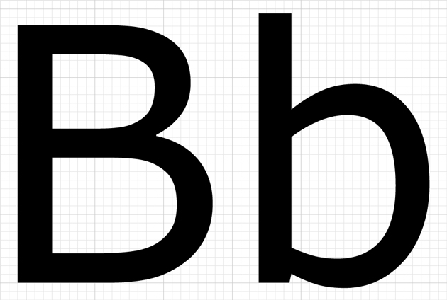
Big Caslon (Top) and Verdana (Above).

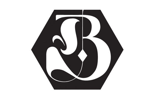
Earlier this year, we revealed a new logo as the beginning of a top-secret revolution that’s happening at The Blogazine. We spent weeks in the studio considering typefaces for the logo alongside expert calligrapher Luca Barcellona – we leafed through stacks of 20th century style books and drawers of Luca’s beautiful 19th century wooden type. We wanted a logo that was at once smart, worldly, fashionable, bold and clearly bespoke – essentially, our brand in logo form. Barcellona’s end product combines our signature hexagon with a hybrid B that brilliantly combines elements Gothic and modern type into a powerful whole.

Our identity has been thoroughly enriched.

The Blogazine’s Luca Barcellona-designed logo.

Earlier this year, I was stricken by a banner I saw in a newscast that was being brandished by several Egyptian protesters just before Mubarak’s fall. It was scrawled in bubbly characters and looked like it had come straight from a 1940s Warner Brothers cartoon. In its careless presentation, the protesters’ gravely serious message had lost all effectiveness.

Type is personality. Force. It speaks loud, just like fashion. And like fashion, its signs and significance must be taken seriously. Let’s all take a lesson from master Carter and listen to it – and use it – with care.

Tag Christof 

Share: Facebook,  Twitter