.
The Editorial: Type Is Personality / Matthew Carter
Humans have a strange relationship with type. We stare at it literally all day, yet it generally goes completely unnoticed – letters are letters are letters. Except that they aren’t. Subtle differences in their form means big differences in how we feel about what we read. About whether a text shouts or whispers. Some type is so functional it becomes invisible (Helvetica). Others luxurious. Some vulgar, maybe old-fashioned. We associate places, things, eras with type. Type is sacred. It would be nothing less than cruel to carve out a tombstone in Comic Sans.
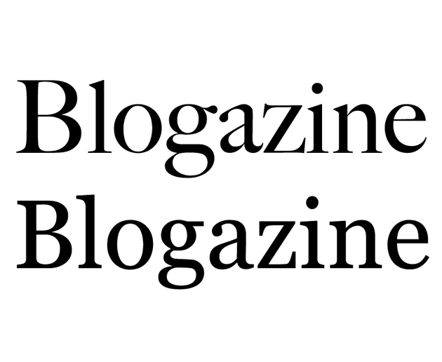
Big Caslon and Georgia, designed by Matthew Carter.
And while we may not notice type much in day-to-day life, the subtle, calculated changes designers make to centuries-old letter archetypes speak to our deepest sensibilities. In the most human of senses, type is personality. Think of the highly stylised “R” in Prada, the formal rigour of Mercedes Benz‘s Kurt Wiedermann-designed “Corporate A,” the iconic script of Alfa Romeo, the cryptic typewriter-look of “Maison Martin Margiela.” The forms of these letters tell you exactly the attitude of the products behind them.
And since computers have infiltrated every facet of life over the past two decades, we’ve all become at least peripherally aware of type’s power. We are able to give style to our written content far beyond that of our own handwriting. Our letters are no longer written in the oppressive uniformity of the typewriter (even though, like using Hipstamatic to fake old film photography, we often insist on Courier to fake retro). We now have a huge degree of control over our written environment through the power of desktop publishing. And as publishing itself is revolutionised by the wireless mobile technology of instant gratification, our personal relationship to type will continue to become richer and more complex.
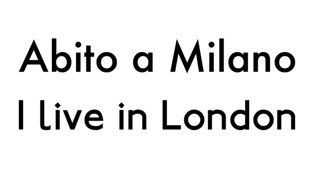
Type is inseparable from place.
Appropriately, type designer Matthew Carter was awarded the lifetime design achievement award by Cooper Hewitt national design museum this month. (And this comes on the heels of a 2010 MacArthur Genius Grant.) Among designers in all fields, his work’s importance was singled out for its huge impact. Like the good, invisible design of “Super Normal,” the book and 2006 Triennale exhibition by Naoto Fukasawa and Jasper Morisson, the power of Carter’s work lies in its unassuming functionality. It is ubiquitous and looked over, even though when measured by use, the infinite reproduction of the internet means he is probably the most prolific type designer of all time.
Chances are you didn’t notice that you’re reading a text set in Georgia. It’s a serif that looks nice both big and small, and without getting into technical mumbo jumbo like “x-height” and “stroke,” it is an absolute masterpiece. Matthew Carter designed it. He also designed Tahoma, Bell Centennial, Big Caslon, and the most widely-used typeface on the internet, Verdana, as well as several others. The names may or may not mean anything to you, but their effectiveness is extraordinary and you’ve most definitely interacted with all of them. As typography nerds who work extensively on the web, we’re very happy to see a type designer honoured with such an enormous award.
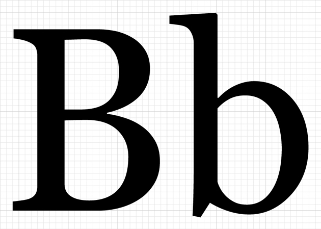
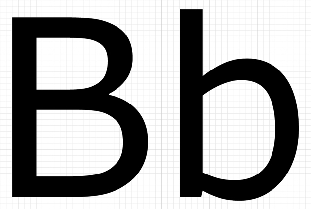
Big Caslon (Top) and Verdana (Above).
Earlier this year, we revealed a new logo as the beginning of a top-secret revolution that’s happening at The Blogazine. We spent weeks in the studio considering typefaces for the logo alongside expert calligrapher Luca Barcellona – we leafed through stacks of 20th century style books and drawers of Luca’s beautiful 19th century wooden type. We wanted a logo that was at once smart, worldly, fashionable, bold and clearly bespoke – essentially, our brand in logo form. Barcellona’s end product combines our signature hexagon with a hybrid B that brilliantly combines elements Gothic and modern type into a powerful whole.
Our identity has been thoroughly enriched.
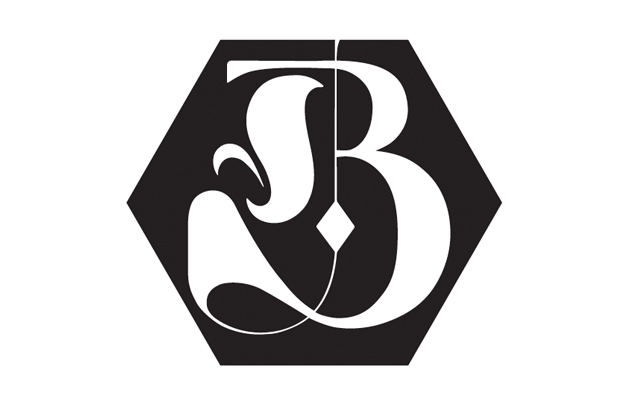
The Blogazine’s Luca Barcellona-designed logo.
Earlier this year, I was stricken by a banner I saw in a newscast that was being brandished by several Egyptian protesters just before Mubarak’s fall. It was scrawled in bubbly characters and looked like it had come straight from a 1940s Warner Brothers cartoon. In its careless presentation, the protesters’ gravely serious message had lost all effectiveness.
Type is personality. Force. It speaks loud, just like fashion. And like fashion, its signs and significance must be taken seriously. Let’s all take a lesson from master Carter and listen to it – and use it – with care.
Tag Christof
