18/06/2012

Art Basel – Design Miami/Basel

Art Basel – Design Miami/Basel

Speaking about collectible design is almost a contradiction in terms. The idea of design we might have inherited from modernist ideology, differs significantly from the one seen at Design Miami/Basel. Even though the space offered by design galleries, a reality from complexities of industrial production, is surely an incredible platform for inquiry and experimentation, Design Miami/Basel doesn’t exactly leave you with your mouth open.

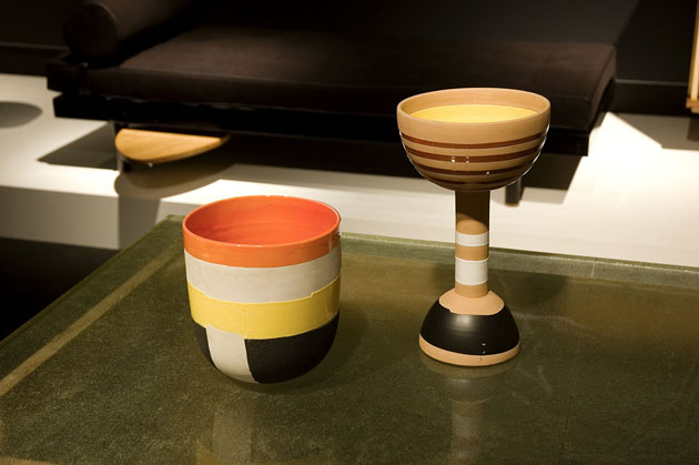
The line-up of this year’s fair was a mix between European and American galleries, extremely different in nature and attitude. The exhibitiors ranged from Gallerie Kreo, the ‘institution’ that raised to glory many of today’s most important designers, commercial giants such as Fendi or Italian jewels, like Milanese Nilufar, showing both modernist Italian furniture as well as pieces of contemporary designers, among whom the incredible Martino Gamper.
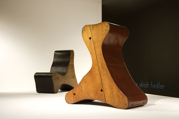
In a long list of exhibitors there were a few that stood out. The British Gallery Libby Sellers has shown a chess set project, insipired by a 1944 exhibition titled “The Imagery of Chess”. While Gallerie Kreo has dedicated its stand to lighting projects, one of the true highlights of the show was Galerie Ulrich Fiedler showing two Frederick Kiesler pieces designed for Peggy Guggenheim.

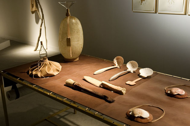
Among a very shy selection of contemporary pieces, two projects have to be mentioned. The first, and most obvious one, was Formafantasma’s performance Craftica, showcasing a collection of objects made with leather. The second one was Matali Crasset’s “Cutting” project exhibited by the Parisian Granville Gallery. “Cutting” is a collection of glass vases which take their shape from pieces of a tree personally chosen by the designer.

If collectible design, as much as a contradiction in terms, must also be an inevitable reality, maybe our culture might gain a bit more if the idea of design promoted by events like Design Miami/Basel would shift from a burgeois attitude towards the idea of design as a democratic place of research and critique.

Rujana Rebernjak 

Share: Facebook,  Twitter  
28/02/2012

Christien Meindertsma Knows Sustainability

Christien Meindertsma Knows Sustainability

Although sustainability has become quite a catchy word when speaking about design, it seems rather difficult to understand what it should actually mean. As the undiscussed master Dieter Rams said already in 1987 “Good design conserves resources and minimizes physical and visual pollution throughout the lifecycle of the product,” it is rather difficult to accept the expression ‘sustainable design’ as a 21st century neologism.

Fortunately not all designers apply sustainability as a marketing etiquette. Christien Meindertsma takes the fact for granted, as an obvious quality of every designed product. Since her first projects Christien has put particular accent on the importance of understanding the whole industrial process, from the recovery of raw material to distribution and the final cost of the product.

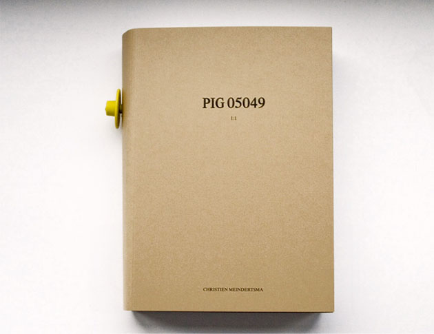
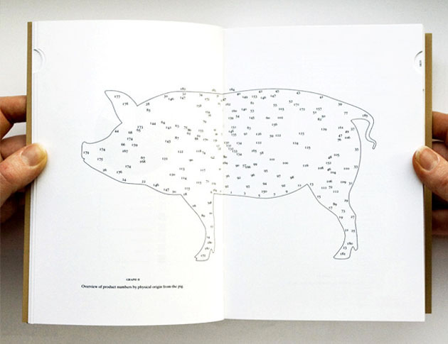
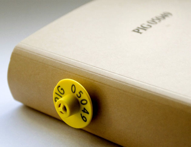
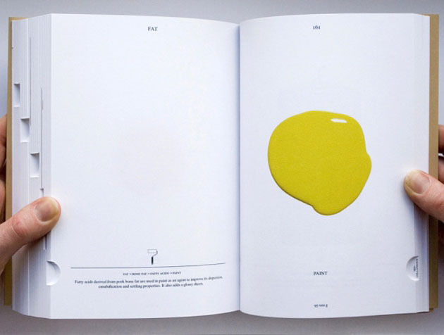
One of Christien’s most acclaimed projects is the book “PIG 05049” that catalogues 185 worldwide products which contained various parts of a single dutch pig. The book can be taken as a manifesto of Christien’s work as she always tries to make visible the link between traditional local production and contemporary industrial design; the relationship often considered taboo in design culture. As Christien declares “I’d like to make transparent the product that also makes sense. It’s kind of a documentary way of designing, and that’s become my working method”.

Taking this path isn’t as simple as it seems, though. Selling locally produced objects often doesn’t walk hand in hand with the capitalist market. In order to avoid that the work of designers like Christien becomes just a utopian dream, while we as consumers should become more aware and finally stop falling off our feet hearing the word ‘sustainability’.


Rujana Rebernjak – Images courtesy of Christien Meindertsma

Share: Facebook,  Twitter  
15/02/2012

Ward Shelley: Unreliable Narrator

Ward Shelley: Unreliable Narrator

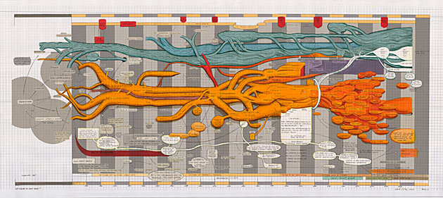
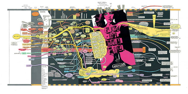
Ward Shelley likes to make maps. Not of cities, countries or continents, but of cultural trends, literary genres, and social movements. And he likes to fasten his topographical expeditions underneath the skin, within the realm of the body, exploring and tracing his curiosity through the highly intricate human network of arteries, veins, and internal organs. His fascination lies in exploring the existential question posed by David Byrne over thirty years ago, and with the same shrug-of-the-shoulder immediacy: “Well, how did I get here?”

The only difference is that Shelley takes the question a bit more literally, preferring to explore every detail to the most minute edge of his conscious mind. All of which leads us to his current exhibit, Unreliable Narrator, which will be on display from February 17th to March 18th at Pierogi Gallery in Brooklyn—the same gallery that first showcased his live-in installation We Have Mice (where Shelley spent a month living between the walls) and has represented Ward for years. Pierogi first opened its doors in 1994 to painters, sculptors, film and multi-media artists, and has spent much of its time and effort showcasing New York-based underground notables whose work you’ve seen but probably never heard about.


Shelley is equally allusive—he started his life as an artist around the same time period, having his first show in 1990—although no less notable. There’s no reason for him to be “underground”, nor is he “difficult” or hard to get in any sense of the terms. Shelley is, in a nutshell, of the now. He’s quite straightforward, at least as far as history and pop culture are concerned, preferring to obsess over, cut up and document the history of downtown New York, science fiction, and Williamsburg—101 topics for anyone with a fascination with Gotham City.

He is the first to admit his role as an unreliable narrator, having done so nearly a year ago in an interview with Slate, saying “It would be easier to do [my paintings] on a computer than by hand. But the reason I do it by hand is that one of the important ethical points to make here is that, in the end, this is one person’s point of view. It has no real authority.” In that quote he was ramping against (and in support of) the level of criticism he received for his piece The History of Science Fiction that left many ardent followers of the genre—enthusiasts, forum geeks, under-performing fathers—with a lot to say of their own personal taste. To Shelley, that’s the point: We all have opinions; no history or taste can ever be absolute. If his goal was to spark controversy and conversation in regard to the subject in question (in this case, science fiction), then he certainly succeeded.

Unreliable Narrator will provoke similar emotions. As the title suggest, these familiar infographic formations—intestinal charts, diagrams, intricate histories—lay bare Shelley’s acute attention to detail, putting his observations and private fascinations on full public display, for all to scrutinize and obsess over.

Ward Shelley’s Unreliable Narrator at Pierogi Gallery, 177 N. 9th Street, Brooklyn, NY, from February 17 to March 18, 2012 .

Lane Koivu – Images courtesy of Pierogi Gallery & Ward Shelley

Share: Facebook,  Twitter  
11/07/2011

The Editorial: Trash Handcraft Treasure / Mexico

The Editorial: Trash Handcraft Treasure / Mexico

Mexican drugstores don’t sell rolls of film. Nice digital cameras, probably. But rolls of film, not so much. When you ask, shopkeepers seem always to give an expression that says “why on Earth would you still have any need for that?” It’s a surefire sign that the country is still pretty far from the cultural hegemony of hipster that we wondered about in May’s A Mexican Hipster & Her Acapulco Bike. Mexican culture marches on, as of yet diluted much less than most.

And like in India and China, two other nominally rich countries with exorbitant income disparities, handcraft in Mexico is alive and well. It’s an integral part of the country’s design patrimony – from musical instruments to pottery to hand-woven textiles. And there’s an honest unpretentiousness to all Mexican craft that makes even its cheapest examples something entirely different from the over-adorned, silky sparkly stuff in street markets around the world. Gorgeous hand-painted glassware, embroidered garments, hand-carved sculptures.

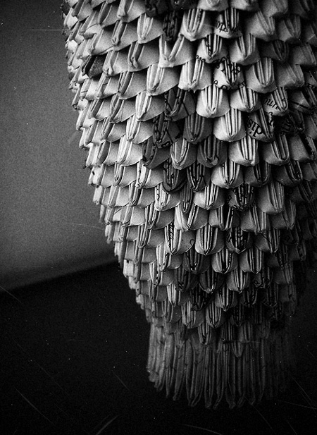
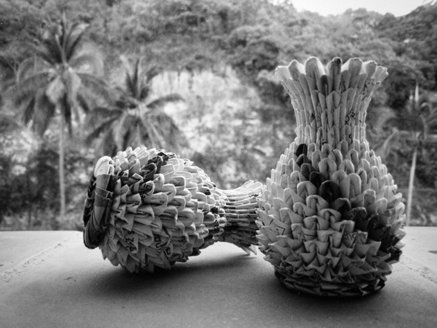
We came across a particularly upbeat artisan who makes elaborate decorative vases out of only scraps of meticulously cut-out paper from magazines. He spends his days creasing, placing, weaving at a table on a pedestrian sidewalk. Making pattern, form, shape and texture from former trash. And for his hours of hard work, he asks for almost nothing – one small piece that might take up to five hours is sold for no more than 3€.

He learned the technique from his father-in-law, but continues to develop it and play with new forms and ideas. Figurines. Perhaps water-tight paper weavings that could hold and keep flowers alive… Oh, possibility! His work has become more complex over time and he’s developed his own “style” (quite different from others who work with similar principles and material). And his trajectory seems uncannily like that of a classic designer-artisan like Lino Sabbatini: learn a material, experiment, then make it your own. Even if he works in as “poor” a material as recycled paper, good craft is good craft. And in a small way that this maker almost certainly doesn’t realise, his work is design.

Still, his son – who sat attentively by his side as we chatted – said he wants nothing to do with his father’s profession. He wants school. Knowledge. An improved life. His father wants it for him, too. And who can blame them? In a country relentlessly caught between rich and poor, upward mobility can be everything. Both of them have no doubt that there will be no paper folding in his future.

But we should hope that future generations don’t allow the tradition of Mexican handmade to fade away. If Mexico follows the pattern of other rich countries as its economic health continues to improve (and hopefully begins to be spread around more evenly), these one-man makers are likely to mostly disappear. But the country’s rich uniqueness is tied closely to these gorgeously lo-fi, refreshingly imperfect and unpretentious objects. They can be every bit as beautiful as a great number of good design pieces, but carry the extra validity of rich cultural context and skilled manual construction.

Their best hope for survival is probably a recognition by the rest of the world of their charm and distinctiveness, perhaps alongside a selling structure that would allow their makers a bit more to get by on. With a new generation of extraordinarily talented Mexican designers, artists and thinkers eager to steer a fresh course for their country’s cultural patrimony and place in the world, the question of handcraft’s should be a rather interesting one to tackle…

Tag Christof

Share: Facebook,  Twitter  
07/07/2011

Kenneth Grange / Design Museum London

.

Kenneth Grange / Design Museum London

Anyone even remotely interested in design knows Jasper Morrison. Tom Dixon. Zaha Hadid. Philippe Starck. But as talented as they all are, they are celebrities before they are designers. Rockstars. That’s why everyone knows them – not because they’ve managed to transform the world. (Check out Design Observer’s fantastic article “The Poverty of Starchitecture” for some interesting perspective.) Kenneth Grange, on the other hand, has worked for decades in relative obscurity yet has probably impacted lives more profoundly than any other designer of his generation (especially if you find yourself in Grange’s home country of the UK).

It’s easy to take for granted that everything in our built environment was designed. Everything from the Jonathan Ives-designed computer you’re probably reading this on down to more institutional things such as the sturdy benches lining your local park. Those things, like the park bench, which hide in plain sight are arguably the most important designed objects that make up our built environment. Endlessly more than the conceptual, witty, exquisite “design” trinkets we all-too-often think of as design, these things actually have shaped our lives.

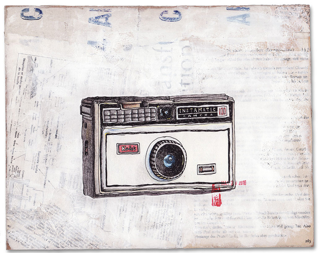
This month, Design Museum London is at long last opening an exhibition on Grange and his long career’s work. And while he doesn’t necessarily have a signature style, his chunky, function-above-all ethic shines through in all of his enduring work. He was the designer of Kodak’s seminal Instamatic cameras, the iconic London Taxi, the Intercity 125 train, and several household appliances like irons and mixers that every British household once (and sometimes still) uses, as well as postboxes, park benches (!), computer monitors and others. He even designed the UK’s first parking metres (which must be why he never reached star status…). Oh yeah, and he co-founded the Holy Grail of design firms, Pentagram.

Opening July 20th at Design Museum London, and running through October 30th. Not to be missed!

Tag Christof – Images courtesy Sprungseven & Olivier Goupil

Share: Facebook,  Twitter  
01/07/2011

Direktorenhaus / New Textile Craft

Direktorenhaus / New Textile Craft

Next Tuesday Direktorenhaus will present a fresh exhibition of textile works. We last visited Direktorenhaus in November during Illustrative, and in the spirit of that event “New Textile Craft” is to be a celebration and exploration of a particular craft. New technologies and the the revival of old techniques has breathed new life into the medium, and it is showing enormous potential as a creative canvas.

It will be the first time Berlin outing for designers Signe Emdal from Copenhagen, Hao-Ni Tsai of London, Ruth Duff of Glasgow and Izumi Sato of Stockholm. It’s being called a labyrinthine “wintergarten of knitted materials, woven textiles, organic objects and hand-stitched fabrics – sounds lovely!

Opening party on Tuesday, July 5th starting at 8:30pm with DJ Siopis and Kyros, with the exhibition running through the 30th. (And since it’s during fashion week, it’s running alongside the Fashion Week Opening Party at Münze Berlin next door!) If you’re in Berlin, the event is not to be missed!

From the Bureau 

Share: Facebook,  Twitter  
30/06/2011

Wheel Of Nutrition

.

Wheel Of Nutrition

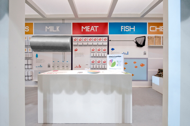
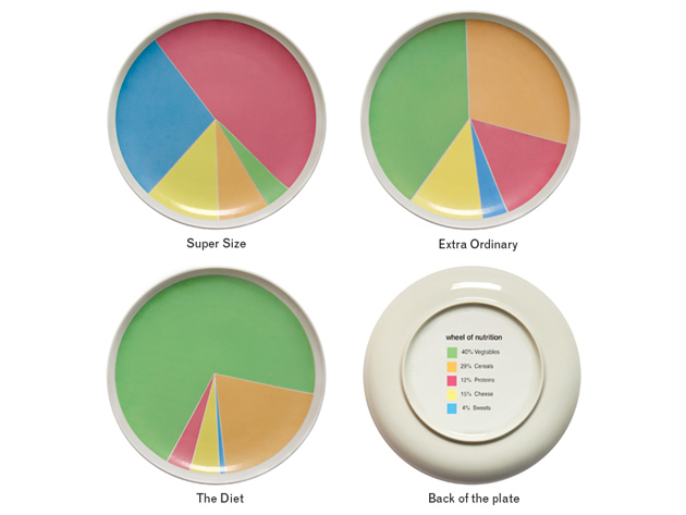
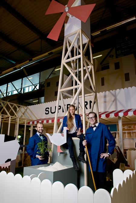
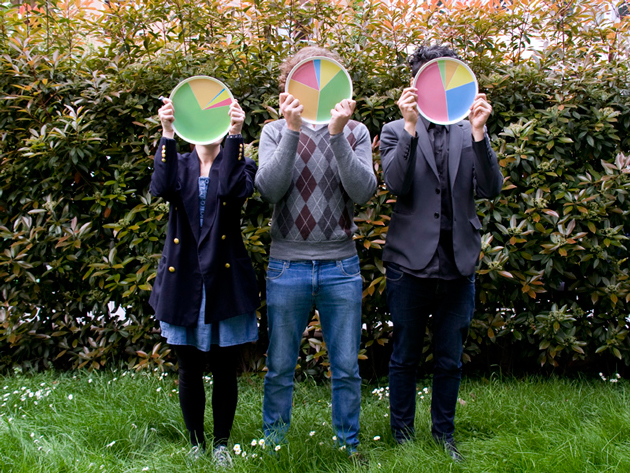
We first came across Wheel of Nutrition at this year’s Fuorisalone as part of the excellent Superfarm project. A novel and deceptively simple idea, Wheel of Nutrition is a plate whose pie-chart decoration makes for a clever dietary guideline and game. While it might seem counterintuitive that a straightforward graphical solution can compel change, designers have recently found, for instance, a huge behaviour-bending potential with engaging graphical interfaces to encourage drivers to use their cars more economically (driving becomes a race to ‘green’). So, it stands to reason that when a meal feels like a game, there is increased incentive to eat according to the rules. And because the plate’s guidelines are more a playful suggestion than a forced imposition, the fun of eating remains fully intact.

As diabetes and obesity ravage both developing and rich nations, the imperative to create creative, engaging solutions for the world’s dismal eating habits is intensifying. Designers Rui Pereira and Hafsteinn Juliusson (whose intriguing growing jewellery we saw at Instant Design in February) in collaboration with Joana Pais, who are behind the plate (and Superfarm) are leading a charge for their generation. With Wheel of Nutrition, they’ve had very positive feedback from around the web, and the plate has even been given the thumbs-up by nutritionists and doctors. (Well done!)

And in a rare feat for a design introduced at Fuorisalone, Wheel of Nutrition is going into production in Diet, Extra-Ordinary and Supersize. The designers will get their hands on the first factory prototype by weeks’ end, and beginning in September it will be produced in Portugal and distributed by Iceland-based HAF.


From now on, it’s definitely okay to play with your food.

Tag Christof – Images courtesy Rui Pereira and Superfarm

Share: Facebook,  Twitter  
22/06/2011

Guest Interview n°28: Rosaria Rattin / Kose

.

Guest Interview n°28: Rosaria Rattin / Kose
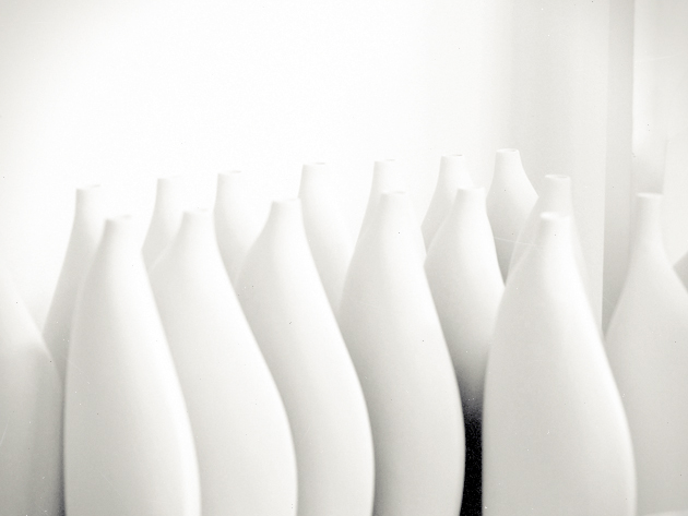
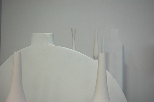
Rosaria Rattin is an intensely sentient being. Truly straddling the line between designer and artist, she charges her objects for Kose with deeply social, political and human questions. Their provocation, however, is brilliantly hidden behind their minimal forms and delicious tactility. Along with her partner Graziano Azzolini, she has built the entirely artisanal brand from the ground up based on a belief that the value of handcraft is an indispensable tool for humanity going forward. She began her design career at Max Mara in an era where fashion was an entirely different animal, and her work for Kose continues to be informed heavily by her roots in style.

Rosaria is proudly Italian and hopeful for her country’s future. She is a visionary, and like every great designer, is possessed of an intense curiosity and humanity: strong, single-minded, critical, intelligent, and a voracious connoisseur of knowledge.
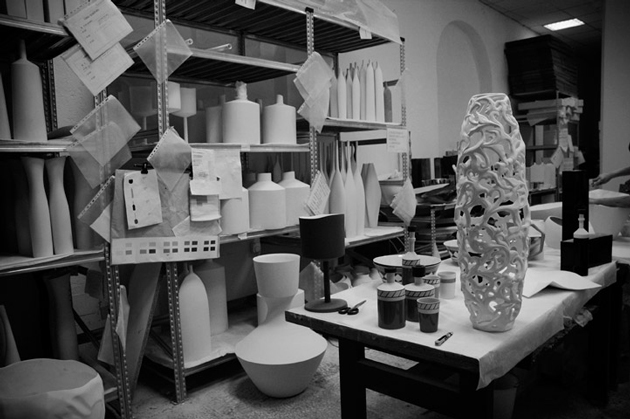
The Blogazine had the pleasure of spending two afternoons in Kose’s Milan studio, where we talked everything from form-giving and the importance of materials in design to Italy’s future, humanity’s past and the power of childhood…

Kose pieces are entirely handmade, unique objects made using “ancient handicraft techniques.” Share with us a bit the story and idea behind the company.
I’ve always considered the “human animal” a marvellous wonder of Nature. A mammal that evolved being able to transmit a thought, a feeling, emotions through words and through doing. And throughout their history, humans invented and passed down through memory their discoveries, their personal thoughts, their personal experiences… the very essence of the experience of life. This all in a constant labour to continually evolve, for posterity’s sake… small beings for a big Being.
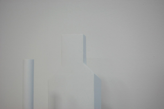
I wanted for this reason to recapture ancient memories of “artisanal technique.” Those that came about in the 3rd millennium and were such an integral part of human life .. The artisanal is considered old-fashioned in a society that tends to simplify an few groups and homogenise everything in the name of industrialisation and mass consumerism. A rebirth of the artisanal is, in my opinion, a recuperation of memory and history. The recovery of uniqueness of the individual, of thought, of emotion and of sentiments.

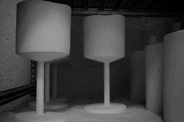
Every Kose object transmits a part of the person who designed it, worked-over and even loved it… because clay (earth), you must handle it with care. You must touch it with sensitive hands and care. Otherwise, it breaks.
Since handcraft is inherently “anti-design” because of its opposition to mass-production, what is Kose’s design process like?
I wanted to demonstrate that the “antique,” if brought up to date is modernity itself. Design. Because man’s evolution has been to constantly “modernise,” humans through their constant pushing forward make projects in the present that… well, they become the future!

Their pared down simplicity recalls Japanese and Scandinaian aesthetic – but also perhaps Lino Sabbatini’s metal work. What are the inspirations for their forms?
The simplicity of the objects in the Kose canon represent for me a love for the elemental. The nature of objects. The flow of thought without , and beauty that is always extremely natural.
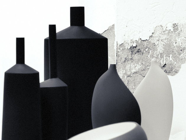
The process that goes into creating objects for Kose is a storytelling of emotions. And Kose objects are principally cities. The Note line is New York, and the Geometrie line is Berlin… Their “peripheries” (in both a physical and contextual sense) represent an end to the industrial age…

And the materials used? Glass, wood… even gauze. Why these in particular?
We use earthen clay, wood, glass, gauze for texture… quite simply because they’re natural. Natural compliments people. Natural for the people.

What do you think the future holds for handmade?
I think that handmade is the future. For decorative products it is a gift of uniqueness to another uniqueness.
I also believe that for a more “correct” trajectory of our species – and I consider global to include both the world and the entire universe – we must re-appropriate, take back for ourselves “doing,” “making” in order to reacquaint ourselves with… ourselves! To recognise ourselves. And to truly create.
Tag Christof – Very special thanks to Rosaria Rattin & Graziano Azzolini
Share: Facebook,  Twitter  
17/06/2011

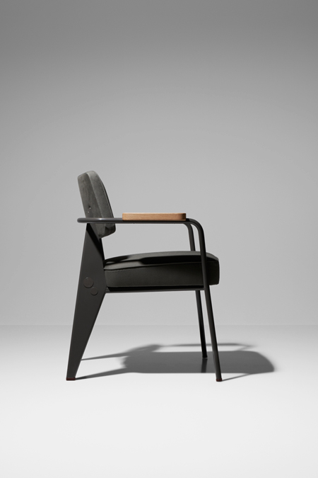
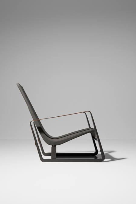
Jean Prouvé / G Star Raw + Vitra

Jean Prouvé / G Star Raw + Vitra

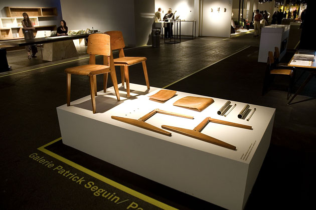
Modernism is here to stay. Dieter Rams’ design has never been more esteemed or influential, and planners and strategists are looking towards the utopian spirit of modernism to model our connected, collaborative future. And the continued influence of quintessential modernist Jean Prouvé is refreshing reassurance of just that, especially in our post postmodern, fragmented world where design headlines are grabbed by the likes of Gaetano Pesce’s writhing, tenuous pieces and Zaha Hadid’s amorphous, computer-generated forms.


In this spirit, always forward fashion house G Star Raw is teaming up with Vitra to re-imagine several iconic pieces from the designer’s archive for the new Prouvé RAW line.

G Star Raw itself has been on a rationalist, intellectual streak as of late, having used chess wunderkind Magnus Carlsen in a recent campaign to drive the point home. The Prouvé RAW line is a is an excellent extension of the message, and much like their denim continue the designer’s propensity to use pure, raw materials. The re-imagined Prouvé pieces mostly maintain their original forms, but are made ever-so-slightly more contemporary through colour palate variations, different textures, details and are every bit as gorgeous and precious as their first-run siblings. Even Catherine Prouvé has given them her endorsement.


The pieces are on public show from this week until July 31 at the Vitra compound in Weil am Rhein, and will be available in very limited edition beginning October/November in select Vitra showrooms around the world.

Tag Christof 

Share: Facebook,  Twitter  
27/04/2011

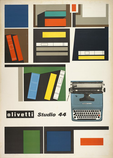
The Typewriter Lives / Rand, Sottsass & Pintori

.

The Typewriter Lives / Rand, Sottsass & Pintori

The typewriter is officially dead. Well, not really. It was widely reported to have died in 2009 when, ostensibly, the last company to produce them, Godrej & Boyce from Mumbai, discontinued production. But the world this week was quick to lament its symbolic and final passing, as Godrej sells its final stock. But as several respectable sources report, such as Canada’s National Post, several producers remain. Because, after all, prisoners and the Amish will always need something to write letters with.

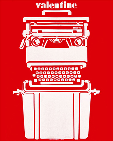
Today, we’re far from the days of the gorgeous Olivetti Valentine and rock-solid, anvil-heavy Smith Corona. It’s not rocket science to understand the lack of demand for the old workhorses over the past several years (or, y’know, decades). But the typewriter is is such a potent archetype that, even though it’s faded almost entirely from use, its complete abandonment is difficult to swallow.

We watched its form merge with that of the computer over the seventies and eighties. And today inside almost anything with a typing interface – mobile phones, computers, car navigation systems – the typewriter’s QWERTY archetype (or AZERTY for you crazy Frenchies) lives on. But as we’ve explored before, the loss of tactility in our new, predominately digital environments isn’t always easy to deal with. Not to mention the exponentially increasing complexity of the objects themselves. The typewriter’s death – real or exaggerated – signals a further uncomfortable detachment from the past.


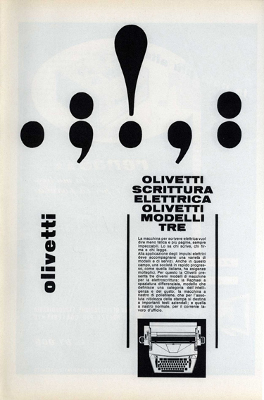
And although we’re most certainly not technophobic Luddites, the culture of the typewriter deserves its due. Its sheer brilliance was capped off by its 1960s and 1970s pinnacle as Ettore Sotsass, Mario Bellini and George Sowden turned them into functional high art. The typewriter was inextricably a part of the creative and visual cultures that made some corporations bastions of good design: think of Paul Rand, Giovanni Pintori and even Sotsass’ gorgeous and imaginative graphic works for the likes of Olivetti and IBM.
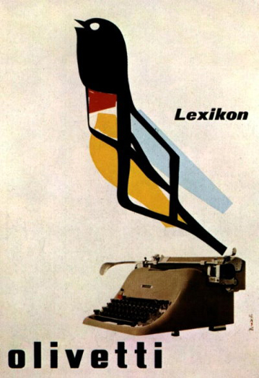
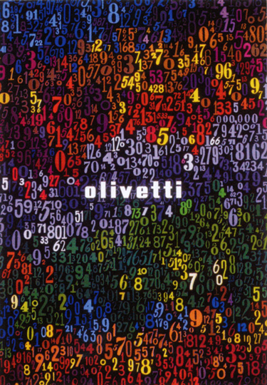
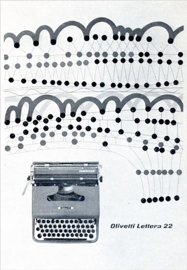
Typewriters were sources of great innovation in ergonomics and the relationships between object and user. They brought women into more dignified jobs and paved the way for equal workplaces the world over. The personal computer, in a design sense, can be thought of as an evolution of the typewriter…

Without the typewriter’s influence, it’s impossible to imagine the form the objects we use today might have taken on. Or if they’d even exist. And while not completely dead yet, it’s death is imminent, indeed. Should we fight for it, like Impossible did for Polaroid? Something tells me that wouldn’t amount to a typewriter revival…

Tag Christof – Images courtesy Olivetti, by George Rand, Ettore Sottsass and Giovanni Pintori

Share: Facebook,  Twitter