26/03/2013

Behind the Shades

Behind the Shades

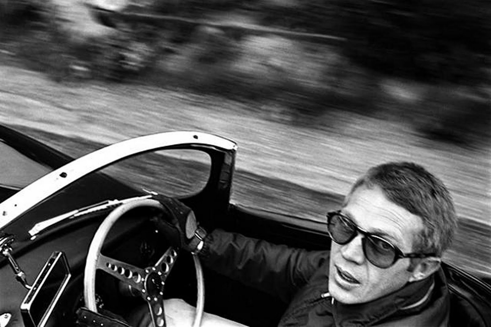
Pastels, metallic or just basic black – even though sunglasses work as a shield from the sun, in today’s society they function even more so as a way to reflect your personality. Choosing shades has become a way of choosing the identity for the season. A pair of Wayfarer’s has been branded classic chic whilst the cat eye pair flirts like the 50’s pin up. No matter the season, people will be seen in their shades and one might ask: why has this piece of plastic become such an important part of an outfit?
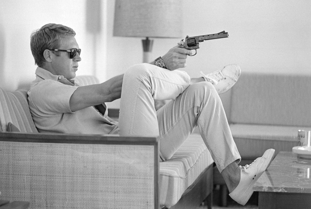
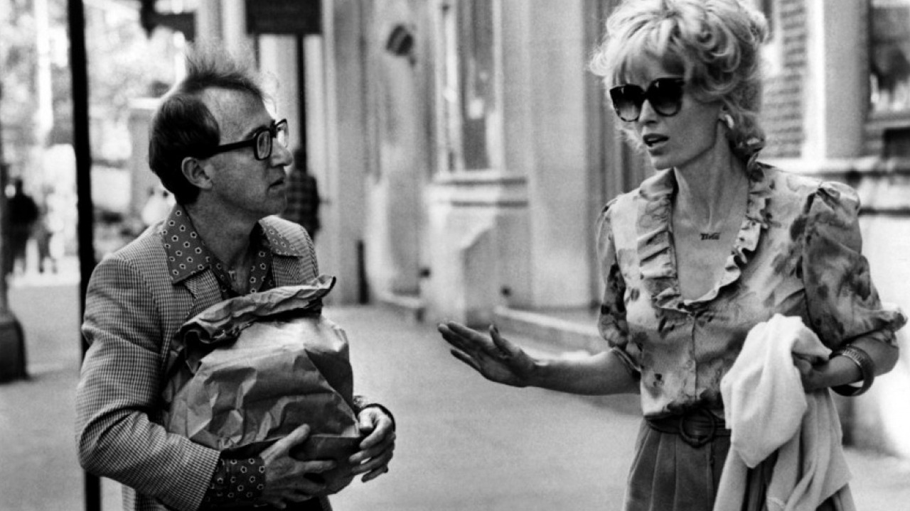
The essence of incognito can be found in any pair of sunglasses. It was in fact a Chinese judges who started to wear smoke colored glasses around the 1300’s to hide their eye expressions. Though, the sunglasses of today were created much later, in 1929, by Sam Foster and had then, as now, the main function of sheltering the eyes from the sun. However, celebrities soon copied the ancient judges and used sunglasses to stay unnoticed when walking amongst the regular ‘mortals’. Shades state to give a sense of privacy while making a fashion statement, putting the exclamation mark – of what a strong wearer can give – between brackets. On the other hand, the right pair of sunglasses can also add a sense of harmony to a bold print or vivid outfit.
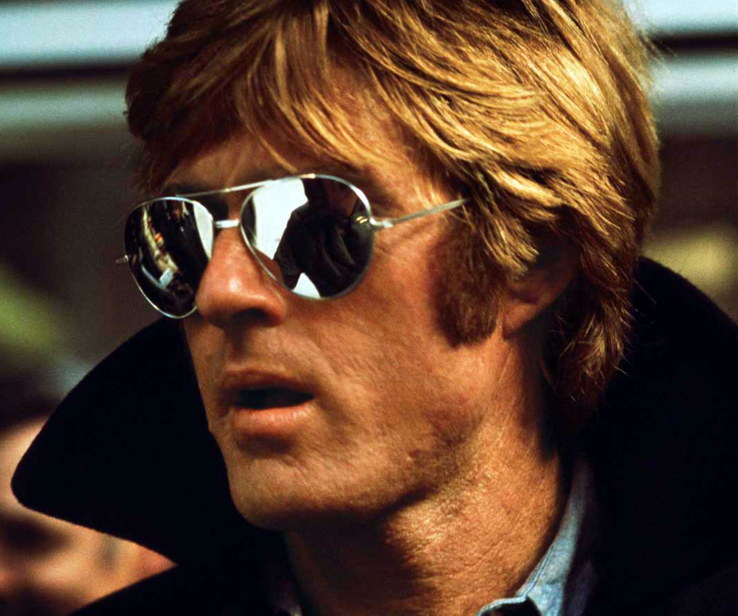
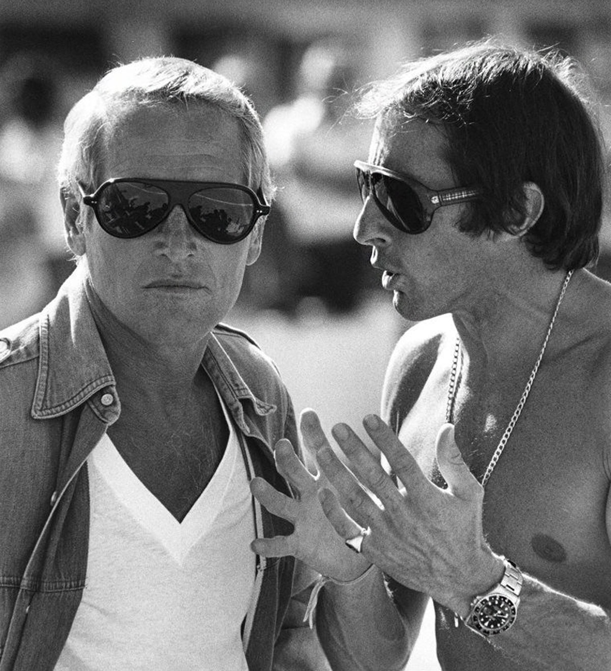
More than putting the wearer at ease, sunglasses have also become the affordable way for people to discover and take part in the world of the fashion houses. Hearing from the red carpet the designer that a celebrity is wearing is probably not going to generate a vast increase in sales at the haute couture department, but more likely it will be the make-up and sunglasses sales that are affected: it is the affordable luxury.

All in all, sunglasses may just technically be a piece of plastic but the meaning to the wearer can be a number of things which makes them a key accessory in anyone’s wardrobe.
Victoria Edman

Share: Facebook,  Twitter  
19/03/2013

Men in Skirts

Men in Skirts

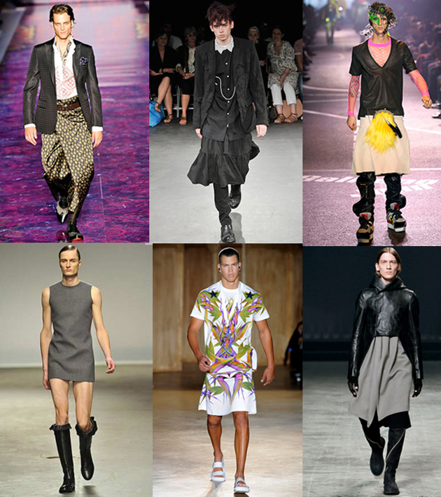
What would you say if we told you that Alexander the Great conquered half of the planet wearing a skirt? You would probably laugh, but it’s true. Back in the days, really back, wearing a skirt was routine, it didn’t matter if you were an emperor or a slave, a woman or a man, no difference at all. That was true until 1760. Later on, someone created trousers for riding horses easier, and they quickly became the standard apparel for working men, identified as the symbol of masculinity in the Western culture.


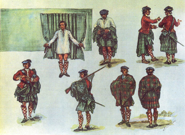
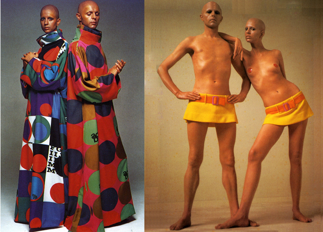
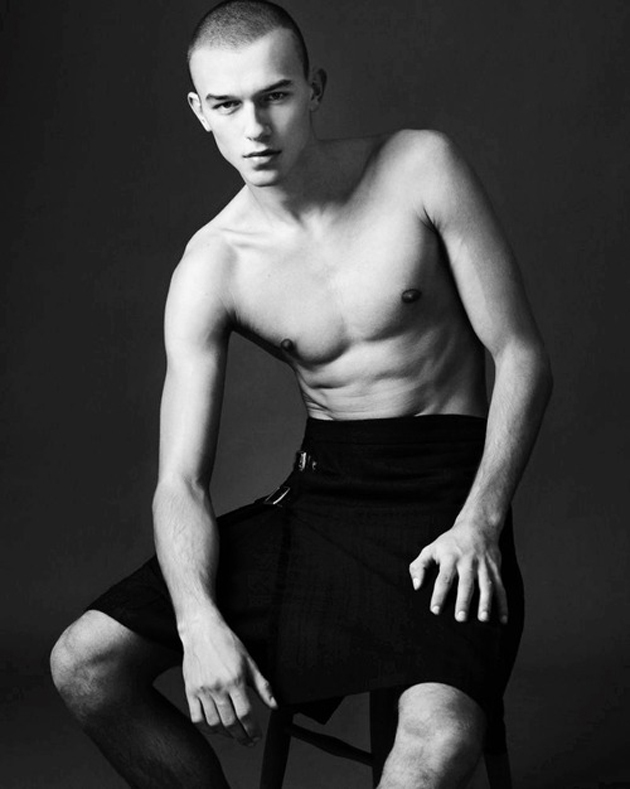
Except for the kilt, which was invented in 1720 by an Englishman, industrialist Thomas Rawlinson, and emerged as one of the main symbols of Scotland and Ireland, which was probably the latest official tradition of skirts in the male wardrobe. But there have been and always will be some rare exceptions. During the 60s appeared a kind of a unisex fashion movement, well represented by a designer indicated as the responsible for unisex clothing concept: Rui Gernreich. He conceived interchangeable clothes for men and women such as floor-length kaftans. His goal was to break down boundaries between genders.

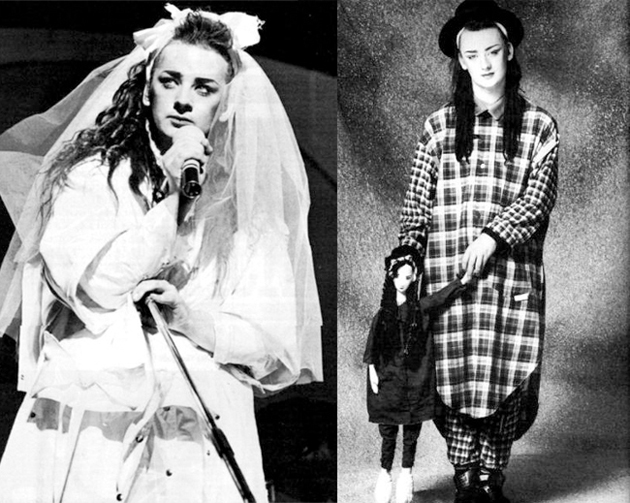
After him there was London in the 80s. A group of cool, young people, tired of conservative and glossy fashion, created a movement called Buffalo, where random guys on the street turned into models wearing a mix of couture and second hand clothing. The leader of this revolutionary wave was the pioneer of stylists: Ray Petri. Not only was he mixing high fashion and recycled clothing, the look he created for men was tough and androgynous, feminine and very virile in his primordial way. Meanwhile the concept of gender-benders started rising thanks to Boy George and New Romantics who used to dress up with medieval and feminine clothes.


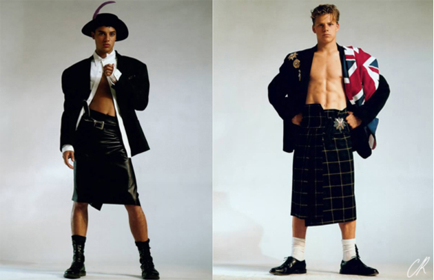
Some years later, in September 1984, Jean Paul Gaultier credited Buffalo creating a whole collection of men in skirts, “Et Dieu Créa L’Homme”. Another, Walter Van Beirendonck, during his Autumn/Winter 1999-2000 collection called “No References”, gave tribute to men in skirts. As Gernreich in the 60s, Beirendonck is considered a highly visionary designer using skirts to challenge the traditional idea of masculinity. He strongly believes that skirts on men are more than simple garments, they are statements.

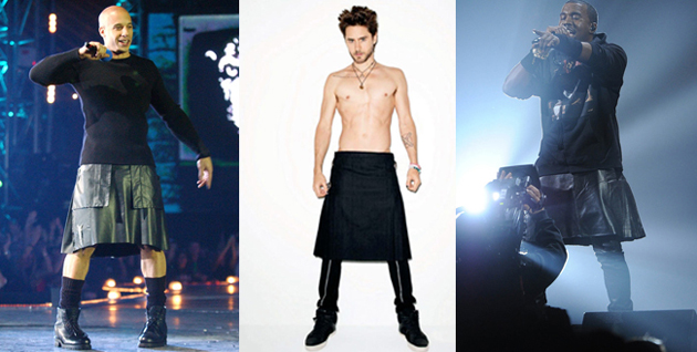
In 2003 The Metropolitan Museum of Art in New York honored the masculine skirt dedicating a whole exhibition to it. Outside the MET building there was a march of hundreds of men: “We have the right of wearing skirts as women wears trousers”, they declared. Recent years see skirts as protagonists again, on for example actors Jared Leto and Vin Diesel, designer Marc Jacobs and rapper Kanye West. Fashion gave them the chance to re-discover the item, thanks to Comme des Garçons, John Galliano, Etro, Rick Owens, Givenchy, J.W. Anderson and many others following the same path.

So, skirts have already been the item for the masculine men in the past, will they some day be that again?

Francesca Crippa

Share: Facebook,  Twitter  
11/03/2013

White Socks in Men’s Wardrobe

White Socks in Men’s Wardrobe

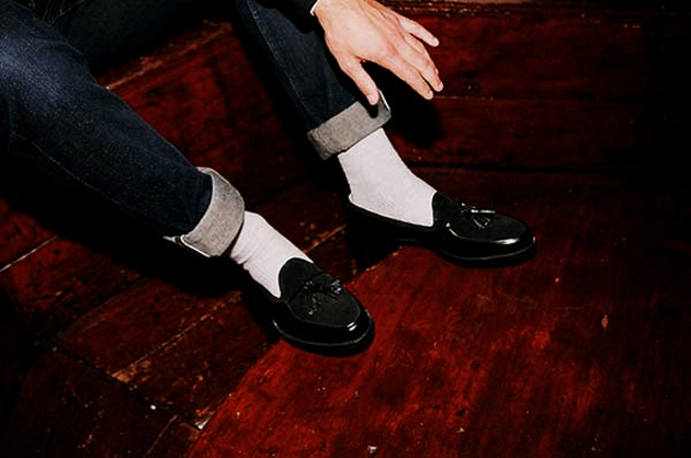
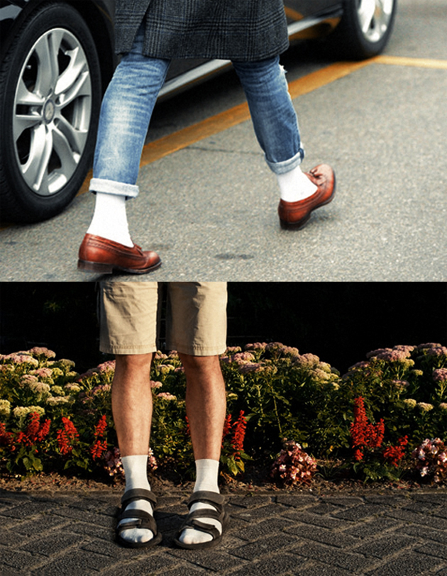
Socks are that kind of stuff fashion universe loves to experiment on or make it disappear in turn. It depends on the year and on the single designer. They are a part of the so-called details of a whole look; they can make the difference, or not. Apart from that, there is always something related that remains ambiguous, something that keeps dividing opinions: men who wear white socks. Are they actually cool or just geek?


It may sound corny, but reality shows that although people are not scared of wearing colored patterned socks, many of them feel very uncomfortable about wearing the white ones. Most of us do not really know about the history of this curious element of men’s style, which can really be hard to match with, but on the other hand, give you a very personal and strong impact.

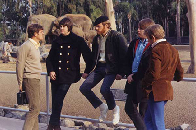
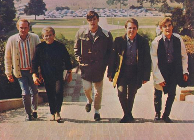
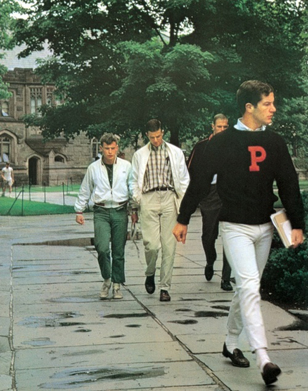
White socks have been identified until 60s as the classic, comfortable and better choice for worker men, and they have been called for years “athletic”, since everyone used them in sports. Around the end of 50s the term preppy became even more known and it was in 1961 that The Beach Boys came out. Buttoned-down shirt, chinos, penny loafers and white socks: male youth wanted to look exactly like them.


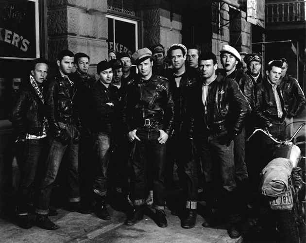
So if you were young, American and going to college during the end of 50s/beginning of 60s, wearing white socks was a must. It remained as a hit for several years till mid-60s, when they disappeared again. Some time after one noticed a shift from white to black, thanks to the upcoming era of urban look. Everyone, back then, aspired to dress up like Marlon Brando in the 1953 movie The Wild One. There was not more space for preppies.

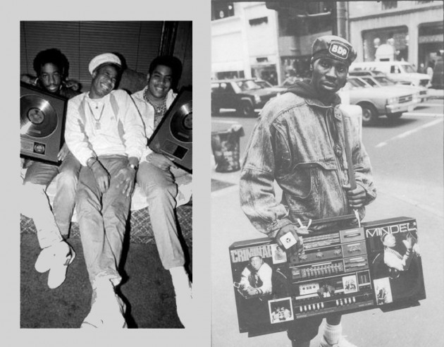
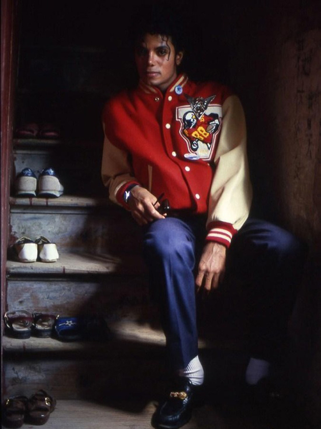
After almost ten years, white socks came back. This time it was because of the black American youngsters who were going to school dressed up in a urban-sporty way but wearing, very proudly, their white socks. The socks started being popular among the very “cool” people again. The 80s arrived and Michael Jackson made them part of his own signature style.

You may love or hate them, in any case they have been, and still are, an interesting trend in the male fashion universe.


Francesca Crippa

Share: Facebook,  Twitter  
07/03/2013

The Spotlights of Paris for AW1314

The Spotlights of Paris for AW1314

La ville lumière strikes again, and for next winter seems to tell us that when everything seems to be already said and done, and you can’t go too forwarding, then, let’ s all go emotional, doesn’t matter if you have to do it in a minimal or in a chaotic and apparently messed way. Note to self: always stay masculine and wear dark tones.

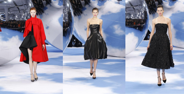
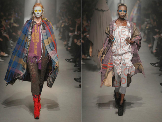
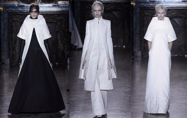
What we have seen on the catwalks is a particular emotional side of clothes, which embraces you subtly, then gently whispers to your ear. These voices are embodied in the warmer and rounder clean lines of Celine, in the combination of the mesmerizing set and perfection of the clothes Raf Simons creates for Dior, or in the colorful “over layered” chaos of Vivienne Westwood, up until the theatrical and monastic vibes Ann Demeulemeester, Rick Owens, and his pupil Gareth Pugh have shown.

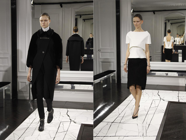
Minimal is a long time trend in more recent years, especially in these so called crisis days. More than ever, this season, there is no space for too frivolous or baroque volumes and details, at all. Damir Doma takes all off, leaving just the simple shape and just few important enlightened details; somehow similar to what Alexander Wang has done, his own way, in a B/W palette for his first collection at Balenciaga (very Cristobal indeed), keeping the traditional curved volumes of the house. The absolute certainty “less is more” has reached everyone, gets when an enfant terrible like Jean Paul Gaultier goes rather simple and serious with his dummy-like corsets and long chiffon skirts, or John Galliano’s former label flirts with discipline and a clean lines and volumes.

Chaos, a clash of moods and styles, is the key for the historical/ethnic pastiche of Madame Westwood, but also for the grunge meets 70s bohemian collection of Saint Laurent or the fil rouge at Junya Watanabe, where biker perfecto meets punkish tartan and tweed to become patchwork dresses. On the other side, at Givenchy, Riccardo Tisci is able to create a well balanced “Victorian meets gipsy meets flamenco meets punk and… Bambi prints”.

The trend of trends, this season, is being feminine on masculine wardrobe. If you have a quick look through, you’ll bump into several classic pinstripe fabrics, and you’ll see trousers winning over skirts 10-1. One collection says it all: Stella McCartney, after getting us used to a very feminine line, following the body curves, now, showing on the catwalk a strong pinstripe/tartan collection, deeply inspired by a savile row touch on classic men pieces with a sort of Japanese exaggerated sheltering volumes approach to them.


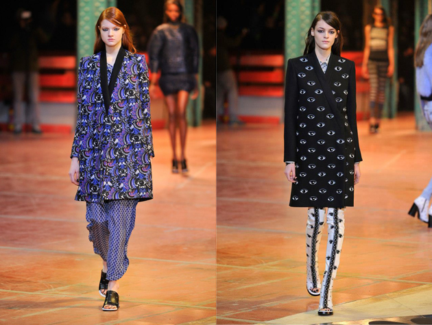
Last but not least: black is still up. We know it’s A/W, but for what we see on the catwalks, there is not much chance for bright plain colors: if designers are not going for dark tones, then it will be white or classics like tartan, brocade or floral prints and interesting surreal/playful patterns like the stylized eyes we have seen at Undercover, Givenchy and Kenzo. On the catwalks just few pale or acid pastels survives this “army” of B/W.

In the end, what counts more than trends, is that Paris sees a more-than-ever strong, subtly dressed, and self-confident woman coming for winter, even if she likes sneaking stuff by her man’s wardrobe.
Nicolò Parisi

Share: Facebook,  Twitter  
07/03/2013

Black And White Is Always Right

Black And White Is Always Right

Few colors have been used in fashion as much as black and white. Separate or together it seems like these two are a safe bet for any occasion. However, why has the combination of black and white been marked classic, while white and green is considered more capricious? As always the answer can be found by studying cultural and historical aspects.

The colors black and white have always been considered opposites within many cultures. In western culture black and white symbolize good and evil, or light and dark. Later, this came to be more apparent by dress code. White became synonymous with innocence and purity, particularly because white clothing or objects are so easy to stain. In most western countries this became a thought which developed the white wedding dress.

Black on the other hand was symbolism for dark times and death, and mourning apparel therefore came in black. In short, it can be said that black and white are colors that are understood through culture, but where does fashion fit in? After losing her beloved Prince Albert, Queen Victoria would naturally wear black making it unintentionally a fashionable color. Nevertheless it was Coco Chanel who introduced the little black dress in 1926, which was the beginning of bringing the mourning color onto the fashion scene.

Where black entered, its counterpart white naturally followed, and thus the black and white outfit of today started to develop. This can be linked to one simple fact: opposites attract. The reason why black and white go so well together has to do with their contrast. They enhance each other, making each of the colors pop, in opposite of what they would do next to a color closer to their own shade. Since both colors are deeply rooted within western culture it seems only natural for fashion to fall back on this color combination, for by looking at history it is not only classic, it is timeless.

Victoria Edman

Share: Facebook,  Twitter  
28/02/2013

Guest Interview n°45: TT

Guest Interview n°45: TT

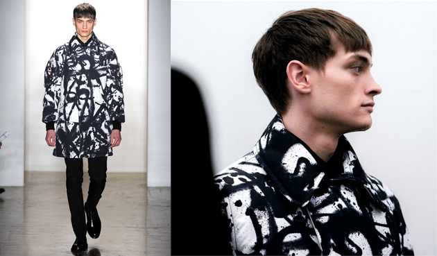
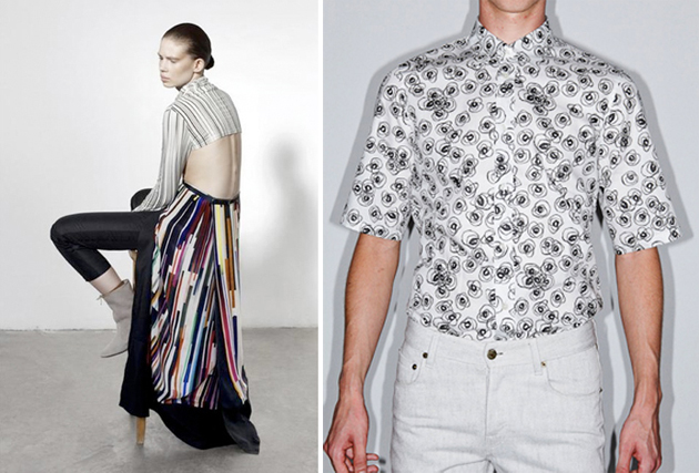
With his bold graphic work recently shown on the runway shows of Tim Coppens and Y3 during the AW13/14 fashion shows, Tom Tosseyn is not just a graphic designer. He is more of an artist, but one who can visualize and create graphics for his client; a TT piece of art but also a creation which reflects and compliments the client.

TT has a very clear handwriting and identity which is very contemporary and unique to him. The bold simplistic graphics are very distinct and simple at first glance but go behind his thoughts, and the sophisticated and intellectual way he works starts to shine through giving his work another angle.


You mainly design graphics and art for fashion right now, but how did you get into design?
I studied for 2 years product design at the Henry Van de Velde Institute in Antwerp, but wanted something more creative, so I switched to graphic design at the Royal Academy of Fine Arts in Antwerp. Three years later I graduated from the Higher Institute of Fine Arts in Antwerp. I then moved to Italy and started my career in fashion, and worked for 4 years in the creative team at Diesel, followed by 55DSL. I was then recruited to create the graphics for the Hugo Boss Orange line in Germany. Two years later I returned to Belgium where I set up as a freelancer working for companies such as Eastpak, Fred Perry, Jil Sander, Acne studio, Y-3Tim Coppens and Raf Simons.

Besides fashion, do you create graphics and artworks for any other industries?
I make a lot of work for the music scene, I’ve designed album covers and logos for R&S Records, the original techno label in Belgium, and also for some bands from America like Crossover. I recently started exhibiting and collaborating with other Belgian and international artists at Z33 in Hasselt, Annette De Keyser gallery and MX7 gallery in Antwerp.

Last year I made my own series of T-shirts and silk foulards under my TT label which I produced and sold. The foulard was initially part of a project and exhibition.

You also teach fashion and textile design at the Gent Academy of Art. What do you enjoy about tutoring students?
The best thing about teaching is to be able to guide young people in their creative processes as well as in their personal development and life path. Freedom for me is very important and I like first to show them how to deal with this liberty, especially for the young kids of 18 years old, as most of them are lost when you give them complete freedom. They should exploit this to the max; get the best out of it creatively as well as personally. It’s their journey but it gives me a great feeling when I see them evolve, struggle and yet find their way by absorbing and interpreting the information which I’ve given them. Like this I hope my work with them adds some positive & constructive value to their life.

You’ve recently been part of the project of 60 years celebration of Fred Perry, can tell us about this?
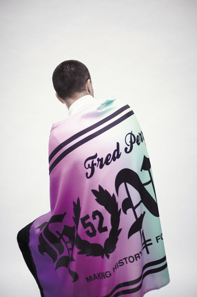
To personalize a reproduction of 1952 Fred Perry shirt I chose to design a flag, a medium often used to represent one’s devotion to a ‘group’ or subculture – whether it’s to a boy’s club, a football team or country. The design is inspired on hooligan flags, that explains the use of a gothic font that shouts out the word HONOR and the ‘O’ I changed into the Laurel Wreath symbol. The background base of the flag is a gradient of colours, this breaks the hardness of the graphic and gives it a more contemporary feel.

What influences you in your work?
Anything and everything. It can be a sign, a broken window which has been taped up. Other artists inspire me, art streaming, 1920s, the Bauhaus, 80s music, new wave. I’m in the city a lot so my urban surroundings inspire me a great deal. It can also be a person or even just how I’m feeling at that moment.

Tell us about your thing with numbers.
I don’t wear a watch but if I ever do see the time, digitally somewhere, it always has a sequence. For me it’s a graphical representation of time and it catches my eye, it’s a reminder for me to live in the moment without rushing after tomorrow or dwelling on the past. It’s about the here & now.

Which 3 words sum up Tom Tosseyn?
Unique, perfectionist, stubborn and bold. That’s 4!

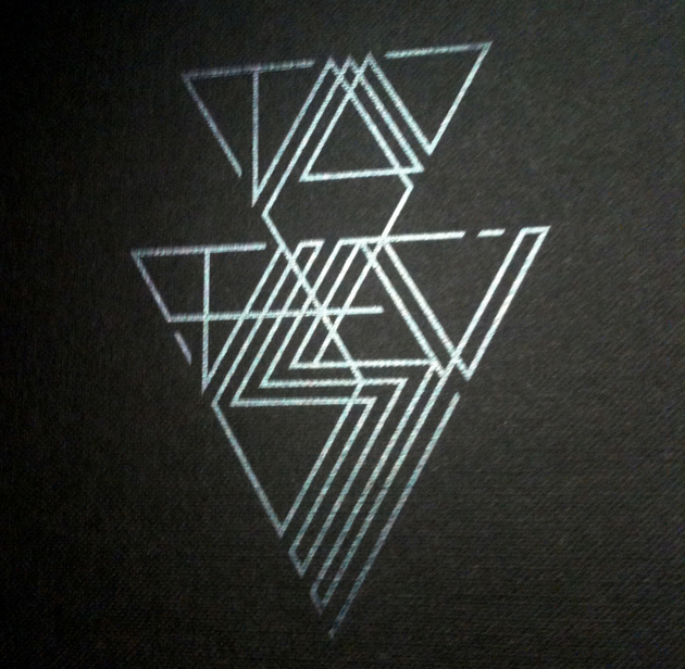
Tamsin Cook – Photos: 1-2. Tim Coppens, 3. Capara – AnotherMagazine and Raf by Raf, 4. Fred Perry, 5. Tom’s logo. Courtesy of: Kris de Smedt, Yannis Vlamos, Betty Sze, Thomas Lohr

Share: Facebook,  Twitter  
27/02/2013

Central Saint Martins Goes Ascetic: Fall 2013

Central Saint Martins Goes Ascetic: Fall 2013

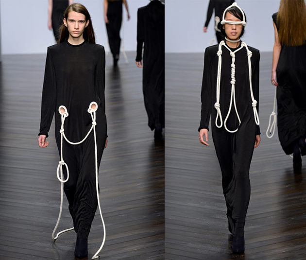
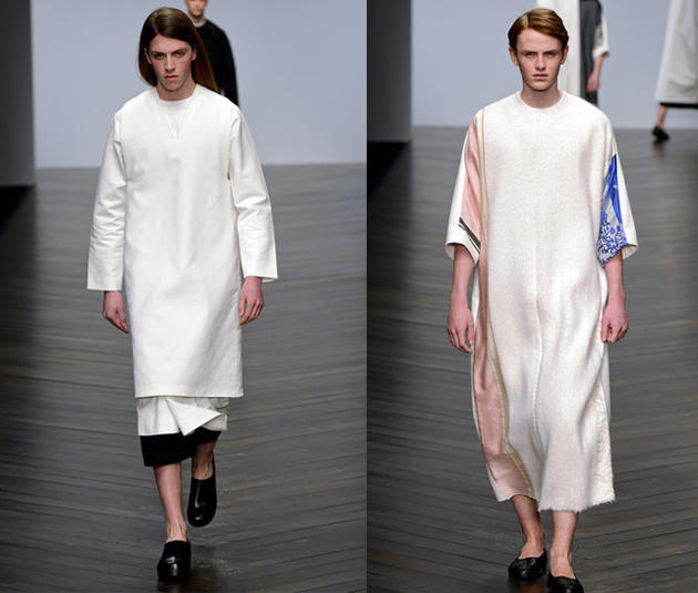
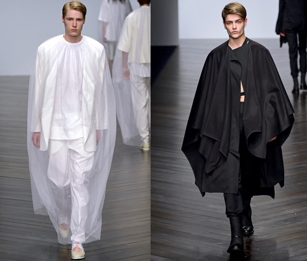
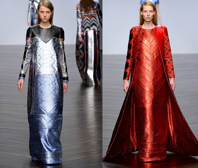
You cannot talk about Central Saint Martins without thinking of the big names that came out from there, John Galliano and Alexander McQueen just to mention a few. It may be for this reason that, once a year, the eye of the fashion system turns around to have a look at promised famous-to-be fashion designers’ final presentations. On the 15th of February there had their last show and it seemed that this time an ascetic, almost religious inspiration struck most of the MA students’ minds.

Eilish Macintosh, with her first group, is definitely part of it, choosing long black tunics decorated only by long ropes; she is also the winner of L’Oréal Professionel Creative Award 2013. Similar path has been followed by Nicomede Talavera, who has shown a minimal approach covering his man with togas, characterized by simple cutting and alternating black and white. Marie Rydland took analogous choices, but she made her vests more feminine adding different print-colored fabrics to the main white one.


While Hwan Sung Park’s man is undoubtedly closer to heaven than to earth, all dressed up in white and covered with a full-body light lace, Hampus Berggren presents, instead, a kind of a dark warrior. They could appear as antagonists of each other.

Last but not least, Sadie Williams can be included in this ascetic field, considering the long, quite large shapes she worked with, presenting themselves in an imposing-severe way, downplayed thanks to shiny glittery robes. We are all curious to see what the future of these young fashion talents will bring, and certainly keeping an eye on their careers.

Francesca Crippa

Share: Facebook,  Twitter  
26/02/2013

Fashion Film

Fashion Film

Matthew Frost’s epic “Fashion Film” is a piss-take of the highest order: a timely, well-executed takedown of the unadulterated self-indulgence of “fashion films” in general. The film parodies the form, Portlandia-style, focusing on a dreamy-eyed model lost in self-involved oblivion. And like any smart, stinging satire, it is charged with a hurtful truthfulness that reveals quite a bit more than it might upon first glance.

Consider Anna dello Russo’s “Fashion Shower,” the pinnacle of the fashion film genre’s bad side. It’s a grating garbage heap, to be sure, and what essentially amounts to two-and-a-half minutes of droning, frightening emptiness. Not funny, not clever, not sexy, not social commentary. Just so sickly self-serving that anyone who doesn’t count Bryan Boy among his/her idols (likely everyone reading this) must wonder whether there is any chance she isn’t flagrantly, publicly mocking herself. (She isn’t.) Ol’ Anna is serious as a heart attack, and not even a well-deserved Fluorosulphric Acid Shower could wash away the sort of deranged smugness it must take to pull off such ego-driven acrobatics

(I’ll bet you sometimes think to yourself in French, too, don’t you, Anna? Profound.)

We all watched it because, like a fiery car crash, we just couldn’t look away. It was hilarious in its blithe ostentation. But is this really what fashion is? Smug stupidity? Thanks to our girl Anna and her fellow brain dead ilk, most people not actually involved with the long, painstaking, rigorous work of fashion’s production can only be led to think just that. After all, we can’t lament the legions of preteens (and grown-ups) whose favourite pastime is traipsing about making fabulous duck faces into their smartphones when we continue to feed them this shit.

So, Matt Frost’s spot-on blague is one hell of a well-deserved slap to a sick system rife with shallow insipidness. It holds up a zoomed-in mirror to all of fashion’s propensity for pimply pompousness. And though the fashion blogger masses seem to get the joke, not a one yet seems wise to the fact that they’re ultimately the butt of it all: he’s calling you out, fashionisti. It’s probably time to start showing the world you’re not just empty narcissists.

FASHION FILM from Matthew Frost on Vimeo.

Tag Christof 


Share: Facebook,  Twitter  
20/02/2013

The Gems of London Fashion Week – Part 2

The Gems of London Fashion Week – Part 2

We are continuing the London Fashion Week tour for next Fall-Winter season. Read the first part here.

Paul Smith

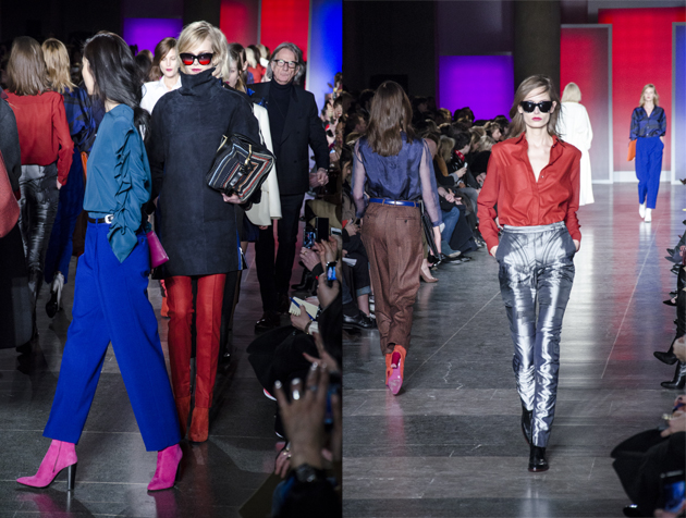
The man himself is known for his cheerful demeanor, and his clothes followed suit, quite literally. Paul smith showed soft tailored trousers and blazers in jubilant colours, ranging from fuchsia and burnt orange to mauve and cobalt.

The bottom halves were finely twilled and either bag-legged or cigarette in style. The jackets were wide on the shoulders and draped, some sported single breasts while others double. The dresses were cut short and patterned only in an architectural trompe l‘oiel graphic. Geometric print found its way on to straight-legged trousers and silken blouses.

There was a resounding 80s overtone to the proceedings, broken up by the Aspen ready shearling polo necks – zipped up the back with tufts of furry curls poking out of the collar.

Clements Ribeiro

Graphic flowers blossomed over at Clements Ribiero on Saturday morning. The husband and wife duo introduced vampy lace, detailed beading and ladylike dresses dappled in florals to their standard offering of sporty luxe looks and cashmere cardis.

Clashing was core to the collection. The flower print was inspired by a Brazilian bloom, from Ribeiro’s native Brazil, while the quilting referenced a recent trip for the pair to Alabama. The scarlet lace was contrasted to Punk-y quilts and tartans.

Christopher Raeburn

Christopher Raeburn is a designer who doesn’t follow fads. In fact, he riles against them. He is promoting ethical production grounds, but doesn’t define his work with it.

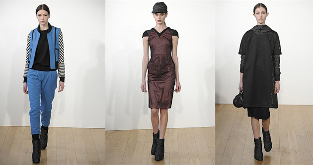
For winter he expanded his offering of outerwear and sporty silhouettes made of up-cycled fabrics and lace. With a rustic feel he took on camo-style textures, felted fabrics and water resistant techno-textiles. Lace – a feature of his SS13 range – popped up again, this time heavier and fitted on bomber jackets and decorating the shoulders of dresses. A metallic palate was served up with navy and army green. The success of a dégradé wool was the collections highlight and found its way from bombers on to jumpsuits. This designer’s quiet determination to produce eco-friendly clothing away from the hemp and scratchy stereotype is surely working!

JW Anderson

Recent news that the Irish designer JW Anderson would be following in the footsteps of PPR’s latest stable, Christopher Kane, to helm Versace’s Versus made many stand up and listen to this London-based label. Known for toying with androgyny, Anderson regularly sends his women out in structured, manly tailoring while his men’s line flirts with dresses and miniskirts.

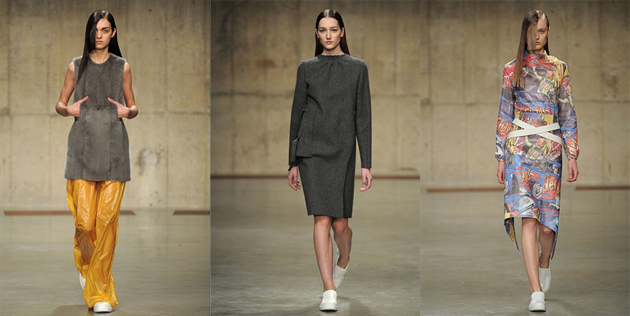
For Autumn in the dank and dark underbelly of the Tate Modern in the space known as the Tanks, he sent out models with slicked-back long hair that bobbed behind tempered tailoring. He played with perception – dresses were open-back smock and long skirts were actually aprons revealing mini skirts from behind. And he toyed with restriction, the mid-length skirts had ties wrapped across the waist and white polo necks were banded with primary coloured strapping that hampered movements. Unusual eyelets and placement holes peppered the collection to show carefully arranged architectural fastenings. In between the restrictive pieces came absurd cartoon strip prints. Almost out of nowhere the patterns found themselves splayed across a sum of two looks.

Fabrics are always a fascinating factor with Anderson. He has always worked with techno-textiles and for winter he experimented with wet look fused fabrics, fur and varnished nylon.

Lucy Morris – First and last photo courtesy of Howard Melnyczuk

Share: Facebook,  Twitter  
20/02/2013

The Gems of London Fashion Week – Part 1

The Gems of London Fashion Week – Part 1

London is still considered as the baby of the fashion month schedule. But, with youth comes energy and eagerness, and the English capital lived up to its reputation. As home to the newest and most experimental, established and respected designers, the five-day showcase was dynamic. Hopping from show to show, the breadth of British design can be summed up by The Blogazine’s favourite London shows. Tune in this evening for the second part.

Vivienne Westwood

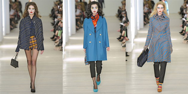
Vivienne Westwood showed just a stone’s throw from her first store on Kings Road at London’s Saatchi Gallery. The location itself was as interesting as the collection. The white walls and bright lights elevated the clothing, and like the art that usually calls the space home, her designs represented modern thinking and conceptual prowess.

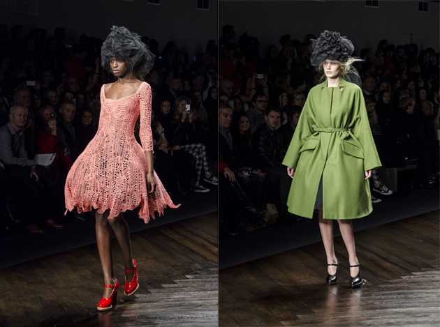
The collection contained all the familiar Westwood touches, like a-symmetrical draping and hourglass silhouettes. Themes of animal prints came through early on, along with whimsical 1950s references, like the bundles of Marilyn Monroe curls the models spotted. Stronger 80s overtones came through in the collections latter half from sequin tops and prom dresses. The decade’s glitz was an unusual inspiration, considering that during the 80s Westwood rejected all of these tropes in favour of a rawer punk vibe.
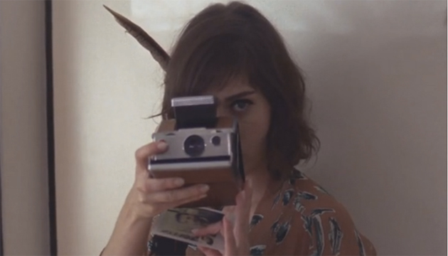
The painterly makeup was a clever statement. It referenced the likes of Picasso with its strong black outlines and solid blocks of colour – eyelids were wet with vivid turquoise and saffron shades, and lips were smeared scarlet.

Marques’ Almeida

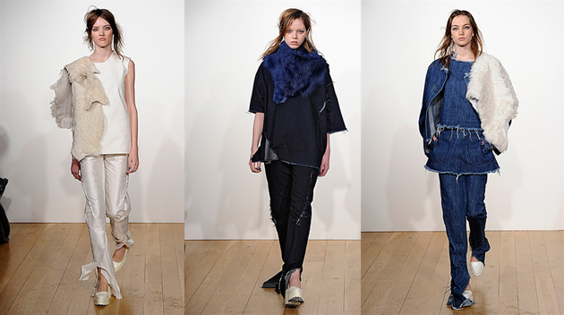
For winter Marques’ Almeida stepped out of their comfort zone. The Portuguese designers brought their street-style aesthetic to formalwear, a first for the pair.
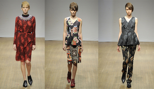
The two-time NewGen winners and Fashion East alumn are an archetype of London’s design scene: experimental but referential. As always, Marta Marques and Paulo Almeida look to the 90s for inspiration – grunge is an obvious trope – and AW13 was no different. They dug deeper and sought the unaffected glamour of Winona Ryder for their reworking of classic eveningwear shapes.

The pair played with typical eveningwear silhouettes. Mimicking the billows of the ballgowns they showed, in jewel tones, wide pantaloons in raw silk. They brought rawness to refined fabrics like ponyhair and leather – marking them with typical Marques’ Almeida nonchalance of torn hems.

Layering was a persistent theme too. Skirts over trousers and fur throws made an appearance. A new jeans look moves their denim offering forward – slim on the leg, the rich indigo denim was torn at the ankle to create a dragging flair. They have again, successfully silenced critics who’ve questioned how Marques’ Almeida could expand their vocabulary away from just torn denim.

David Koma

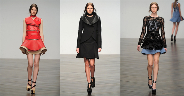
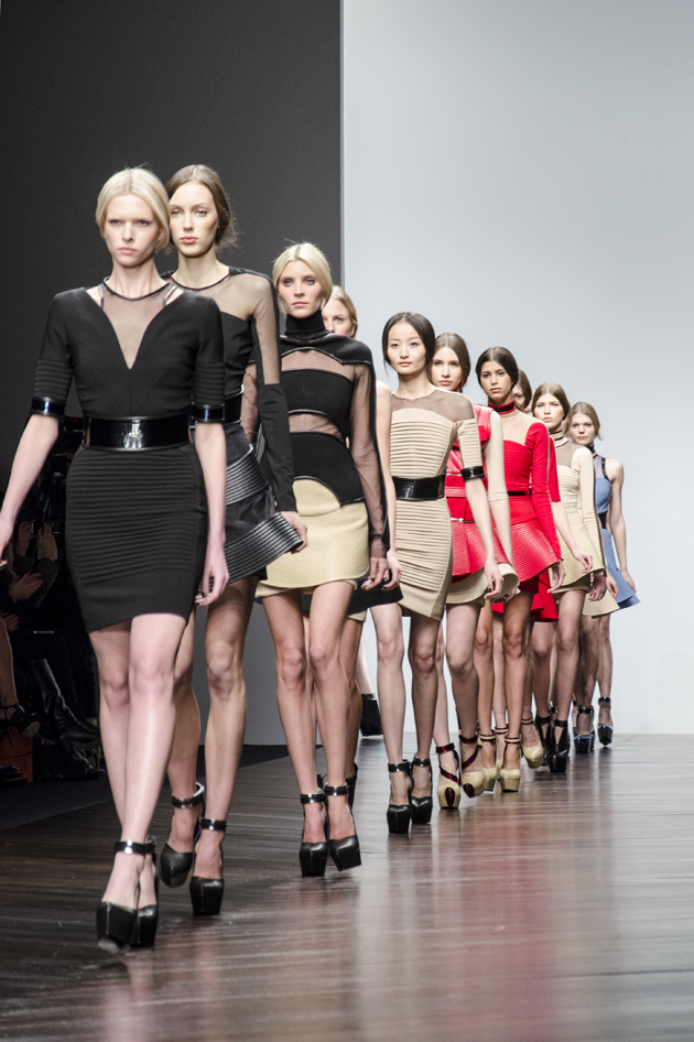
With the front row filled with blonde singers, like The Saturdays and Pixie Lott, Koma presented a collection fit for its audience. Rifting on the vinyl, the Central Saint Martins grad took the LP silhouette and bent, chopped and manipulated it across his collection.

In black, nude and pillar-box red, Koma sent out mini skirts and variations on biker jackets and waistcoats edged with space-age collars that circled the body. Sheer paneling played with the idea of cutouts for winter.

It may not have been a revolutionary outing for the designer, but it was effortlessly sellable – all looks came in black after all.

Lucy Morris – Last photo from Howard Melnyczuk

Share: Facebook,  Twitter