23/06/2015

Breaking the Mould: Serpentine Pavilion by Selgascano

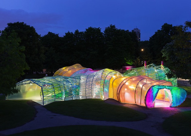
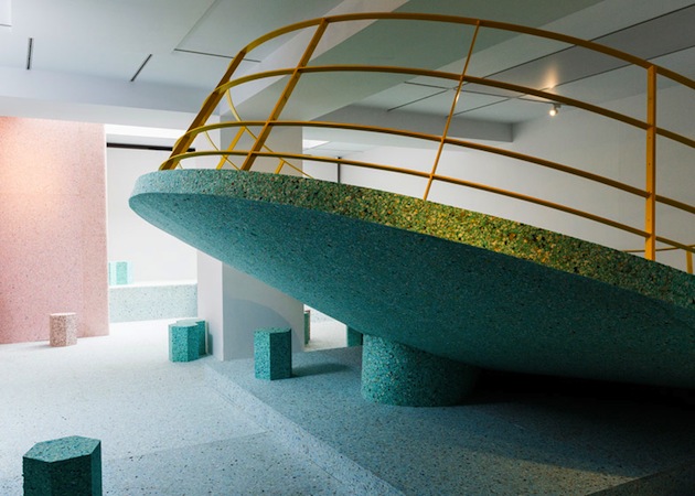
A colourful structure carefully nested among green lawns and trees of Kensington Gardens – the latest Serpentine Pavilion takes on a breezy, playful note as a way of reminding its public of the limited, temporary nature of its purpose. Opening this week and now at its 15th edition, the Serpentine Pavilion has become the Summer cultural hotspot in London as a site of a rich series of “Park Night” talks, lectures and readings. Created by Selgas Cano, a little known Spanish architecture practice based outside Madrid, the pavilion consists of a double-layered plastic skin in a variety of colours, wrapped around a series of metal arches.
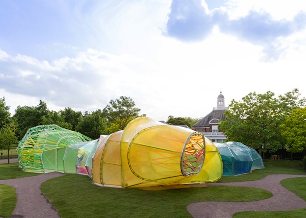
José Selgas and Lucía Cano describe the project: “When the Serpentine invited us to design the Pavilion, we began to think about what the structure needed to provide and what materials should be used in a Royal Park in London. These questions, mixed with our own architectural interests and the knowledge that the design needs to connect with nature and feel part of the landscape, provided us with a concept based on pure visitor experience. We sought a way to allow the public to experience architecture through simple elements: structure, light, transparency, shadows, lightness, form, sensitivity, change, surprise, colour and materials. The spatial qualities of the pavilion only unfold when accessing the structure and being immersed within it.”
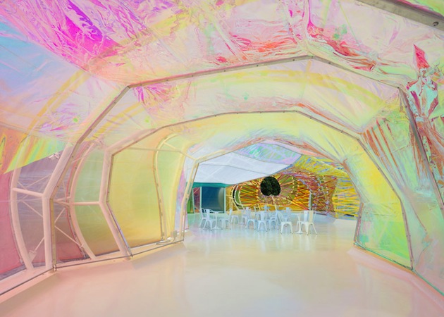
After Smiljan Radic, Sou Fujimoto, Zaha Hadid or Peter Zumthor – all architects who haven’t built in the UK prior to their pavilion commission – apparent disregard for seriousness and theoretical conceptualization distinguishes this work, serves as an antidote to London’s dire weather, as well as a reminder that architecture can be an engaging and boundary-pushing platform for a discussion in arts.

The Blogazine – Images courtesy of Iwan Baan 
Share: Facebook,  Twitter  
16/06/2015

Reassessing Modernism? The Brutalist Playground

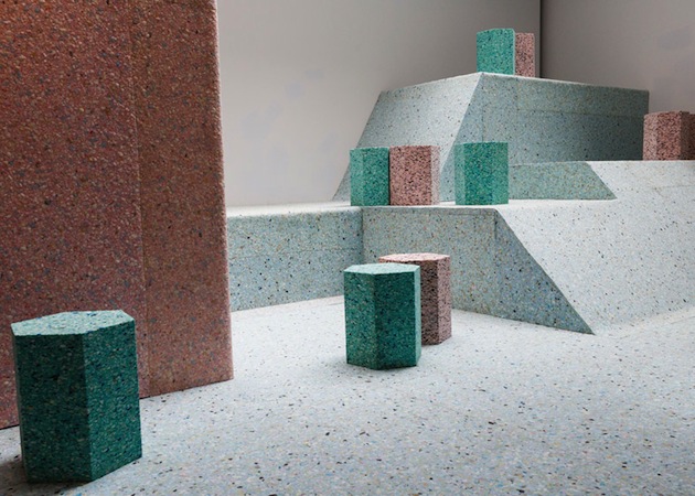
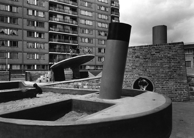
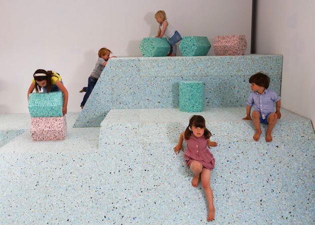
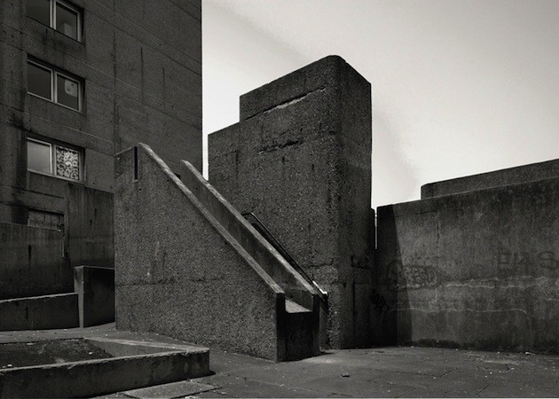
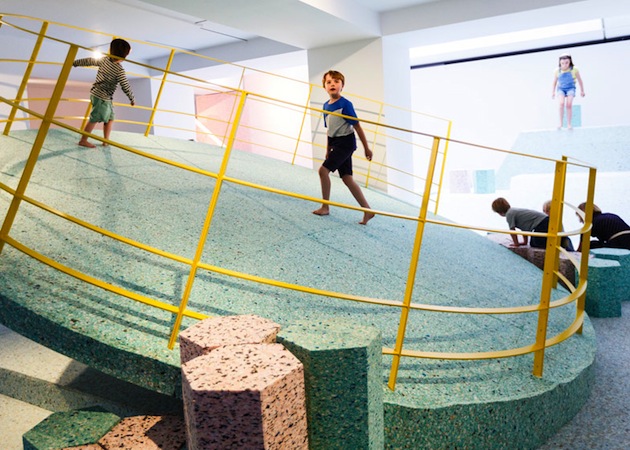
The Brutalist Playground is an exhibition that is part sculpture, part architectural installation, which invites people of all ages to come and play, the Brutalist way. Occupying the entire Architecture Gallery at RIBA in London, the immersive landscape is a new commission by Turner Prize nominated design and architecture collective Assemble and artist Simon Terrill. It explores the abstract concrete playgrounds that were designed as part of post-war housing estates in the mid-twentieth century, but which no longer exist. They became playgrounds unsuitable for play. The exhibition draws on features from a number of London estates including Churchill Gardens, the Brunel Estate and the Brownfield Estate. The playgrounds were often made from concrete, cast into sculptural forms, which presented a distinct move away from previous playground design. They were envisaged as a key aspect of the estate layout and design and as such reflect the preoccupations and social theories of society at that time.
“The challenge of reconstructing elements of now forgotten Brutalist play structures within the RIBA gallery is an exciting opportunity for us to explore contemporary issues surrounding play, by looking at the often surreal objects from the past. Working closely with the RIBA collections and the artist Simon Terrill, the interpretation of these spaces has allowed us to ask questions around materiality and the nature of risk in play, while also giving greater visibility to the incredible original images of the playgrounds that can be found in the collections.” said the collective.

Assemble and Simon Terrill have drawn inspiration from photographs and visual material in the RIBA’s collections, documenting the playgrounds when they were newly built and in use. The exhibition installation will recreate visual elements from the playgrounds in reconstituted foam, creating an interactive, contemporary space where the viewer becomes participant and in this way completes the work. Archive images of the original playgrounds will be projected on the walls. The playground will remain on show until August 16 2015 at RIBA in London.

Rujana Rebernjak 
Share: Facebook,  Twitter  
12/06/2015

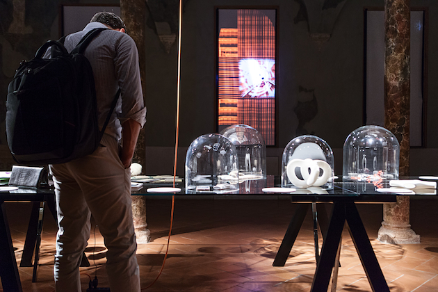
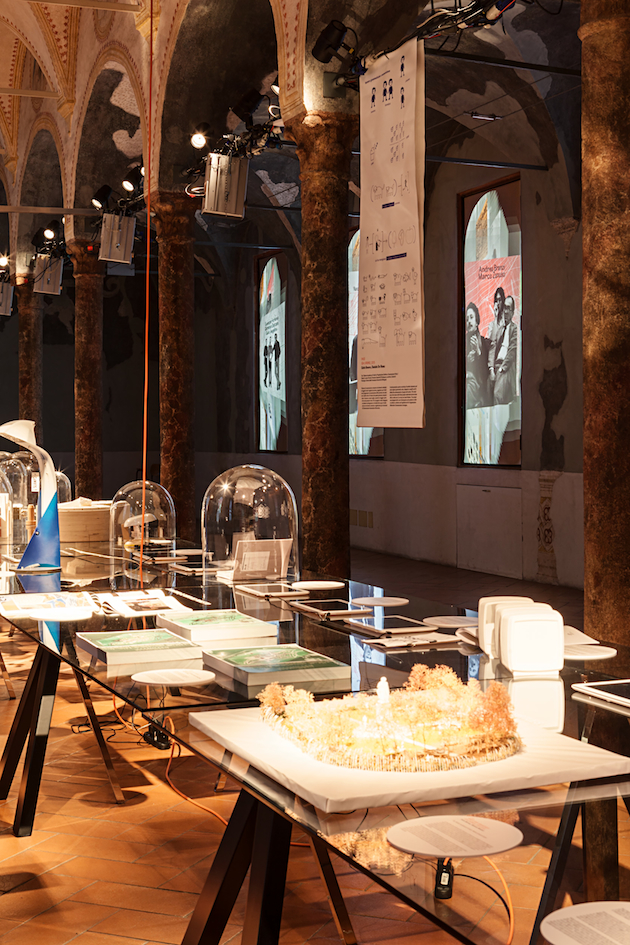
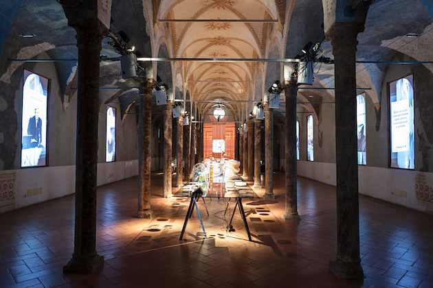
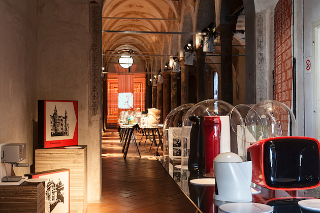
When Dante Inspires Design Knowledge: ISIA Design Convivio

In Italian, a “convivio” is an out-dated synonym for banquet, a cheerful meeting around a table reuniting the joys of food and conversation into a unique framework. This archetype, deeply rooted in the Italian culture and beyond, vaunts a noble literary reference: before dedicating the rest of his life to “La Divina Commedia”, Dante Alighieri spent his first years of exile from Florence writing “Convivio”, an essay dedicated to the representation of the whole spectrum of human wisdom. According to the Sommo Poeta (lit. “Highest Poet”, which is how Italians use to call their most illustrious writer), knowledge can be conceived as a banquet, where every dish is a philosophical topic that table-mates need to appreciate and “digest” one after the other.

Back to our time, where food debates have become ubiquitous and represent the new obsession both in terms of function (a resource to be distributed) and form (of culinary research, of self expression), the first Italian design university to be founded in Italy in 1975, ISIA, has decided to go back to Dante’s work to presented in Milan the showcase of its students’ projects exploring new perspectives on food and social responsibility.

The metaphor of knowledge as a table laden with ideas and proposals animates ISIA’s quest for learning: how can design nourish the planet, serving every man’s right to be fed? Is design a means of knowledge for all? How can a project involve our senses? Can design inspire new virtues? In the time of Expo, design seems curiously willing to go back to the same great questions that marked the shift from the Middle Ages to Renaissance, expressing the need for a new humanism which, once again, gets human and user centred.

Giulia Zappa 
Share: Facebook,  Twitter  
08/06/2015

Matali Crasset: We Trust in Wood

Any discussion about design inevitably starts from the final product: the material qualities of a chair, a table, a lamp, a book, a poster, are thoroughly scrutinized in search of traces that, by revealing how such an object was made, might also tell a story about why it was made – transcending the apparently simple and direct purpose of the object itself and giving shape to a wider story about our world. Nevertheless, some projects are able to reveal this wider purpose by their very design – calling to our attention not so much the subtle curves and minute details, but the process that brought them to light.

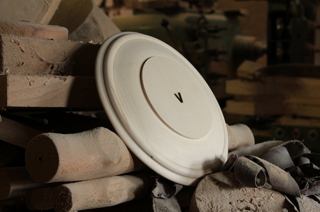
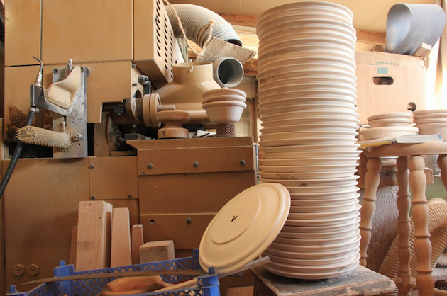
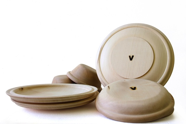
Matali Crasset’s latest endeavour is one such project – designed not so much as a series of objects to be looked at (or, perhaps, even used), but as a media to read into relationships that design can build, systems that it can create in the context of a ‘wider world’. Crasset, whose designs often hint at community engagement and social responsibility, proposes a project that is valuable only as a means of accessing and participating in the network of relationships it builds. “We Trust in Wood” is an exploration of design as a medium of engaging with a community, in this case, local artisans from the Meuse region in the north-east of France. Developed in collaboration with Vent des Forêts, a local organisation of six villages that builds relationships with designers and artists to help develop the identity of the area, “We Trust in Wood” is a series of simple wooden plates and bowls in three different sizes crafted by a local artisan. The design of the objects themselves – if subjected to a quasi-archeological analysis – reveals precisely the intention to focus on the economy of their production.

An archetypical form, the plate is characterised by wide, thick borders and simple curves – almost forgoing any formal distinction or virtuosity, submitting their aesthetic dimension to the needs of the handicraft production. As Crasset put it, “You don’t fight wood. Even when you do something simple like turning it, you have to understand it because the material is irregular. You gain control by understanding how the block is structured. It’s a lot about feeling.”, and the final product – with its subtle irregularities and unique details – reveals precisely the grace of touch of the artisan who made it. “We Trust in Wood”, thus, serves as a textbook example of what design can do – how its three-dimensional form engages with realities that are well beyond its direct materiality. For the designer, “We Trust in Wood” is about shaping a network, from the design, to production, distribution and use. For the artisan, it is about crafting his identity, together with that of his territory. And for the users, it is all about getting a little bit closer to understanding what design could be.

Rujana Rebernjak  
Share: Facebook,  Twitter  
02/06/2015

Food Between Function and Form

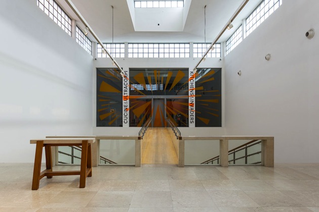
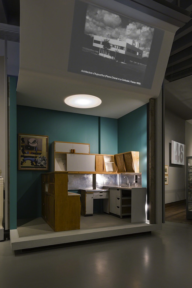
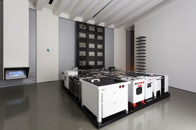
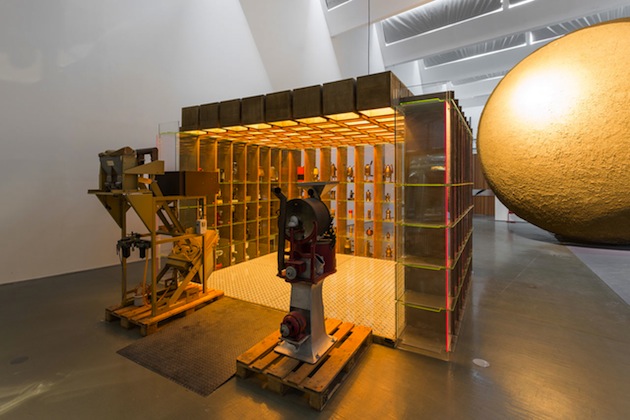
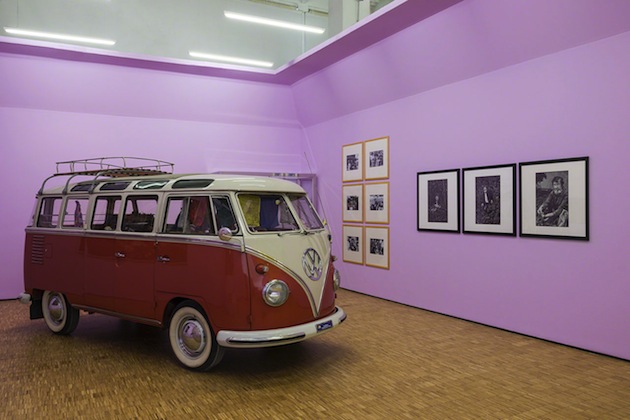
The relationship between design and food is long and elaborate one. The process of cooking itself has often been compared to designing, with a mix of ingredients and different processes serving as an apt metaphor for binging to life material objects of our everyday. The central place that both food and objects have in the everyday – the ‘normal’, ordinary evolution of time – sets them apart as perhaps the most adequate media for tracing the evolution of the perception of the everyday itself through history. The metamorphosis of modernity through the lens of cooking is the main proposal of the latest, eighth, instalment of Triennale Design Museum, curated by Silvana Annicchiarico together with Germano Celant, titled “Kitchens and Invaders”.

Seeking inspiration for its title in Jack Finney’s science fiction novel “The Body Snatchers” published in 1955, the exhibition does not comply to the everyday normality of cooking. Instead, it seeks to turn the ordinary upside-down, revealing the imaginary, the speculative and the fictional in apparently simple, unassuming acts of preparing food. The hidden layers of extraordinary in the everyday are revealed by focussing precisely on the relationship between food and design – between the precision of tools, machines and utensils, which collide with human bodies, actions and thoughts. The evolution of the machine, presented through Celant’s often ironic vision, propels the ordinary world of cooking into a strange constellation of mechanical tools that appear detached from how we usually perceive it. The kitchen, in Triennale’s vision, becomes a paradigm for the evolution of society.

And yet, the precise shape this evolution takes in everyday life remains somewhat hidden. Have we really come to rely on such extensive mechanisation as “Kitchens and Invaders” would want us to believe? Is this “universe of body snatchers – from refrigerators to microwave ovens, coffee makers to toasters, waste disposal units and ductless hoods to kettles and blenders, deep fryers and ice-cream makers” the reality we live today? Perhaps a more nuanced vision is presented in the adjacent exhibition “Art and Food” which explores the intricate relationship between food and creative disciplines. Developed as the only Expo2015 pavilion in the center of Milan, it sets a historical view on the interaction between aesthetics and the act of dining, tracing how these rituals have changed through time – and, more importantly, how we changed with them.

Rujana Rebernjak – Images courtesy of Triennale di Milano 
Share: Facebook,  Twitter  
01/06/2015

Marketing Territory: A New Design Perspective

What does design stand for today? Even if we keep on saying that every age deserves its chair – which means that, despite contemporary oversupply, industrial renovation still makes sense and still needs to be encouraged as a source of evolution and self expression– we are also aware that design needs to challenge its core identity and progressively shift toward new boundaries of meaning and usefulness.

“Design for the other 90%”, “sustainable design”, “service design”: these are all possible design extensions that have recently been identified as new, effective frontiers for contemporary problem-solving. Nevertheless, other perspectives seem to recur quite often, and one, in particular, curiously stands in the middle between economic development and entertainment. That’s the case of marketing territory, a marketing subcategory that has recently looked at design as a privileged method to promote and enhance an area’s cultural and economical potential. Sounds like an effort already undertaken by the wine industry? Yes, when it has been singing the praises of terroir as the most authentic dimension behind a bottle’s goodness and value.

Three casually chosen case studies show what is at stake. Elected cultural capital of Europe in 2015, the Belgian city of Moins decided to invest into an unusual promotion of its partnership with other European towns, including Milan. “Ailleurs en Folie Milan”, curated by Arabeschi di Latte’s founder Francesca Sarti and involving many original voices of the youngest generation of Milanese designers, explores atemporal clichés of Italy’s economic capital – the Negroni cocktail, the dance hall, a trattoria and a bar, just to quote a few examples -, reinforcing their imagery through irony and a new aesthetics.

In a few days, the architecture collective Rihabitat will launch a workshop to be held in Irpinia, one of the most underdeveloped areas of Southern Italy. The goal of their “Rural Design” initiative is to promote design as a means to rediscover local artisans’ expertise and to refresh it through the visions and needs of young designers. In September, the siege of Europe’s most ancient University location, the city of Bologna, will inaugurate the first edition of its design week. In conjunction with Cersaie, international tradeshow for ceramic tile and bathroom furnishings, the fair off will be conceived as a means to present the city’s design vocation – its significant manufacturing industry, for example, but also the heritage of the most prominent Bolognese designer and entrepreneur, Dino Gavina – and to engage local creative industry into a reinforced, performing networking system.

Giulia Zappa 
Share: Facebook,  Twitter  
26/05/2015

Offprint Book Fair in London

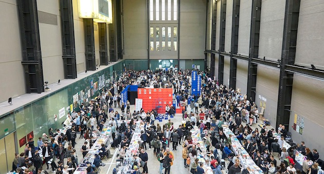
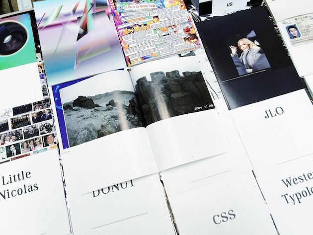
There is something particularly special about printed word – its is both lasting and timeless, as it is fragile and of its time – which shields it from ever becoming oblivious. As Umberto Eco once said, reading books is a way of making one’s life a bit richer by living the experiences of others through books – “It’s a little reward for not being immortal”. That the world of books will not be easily dismissed (if we were to borrow the title of another Eco’s work), was made visible this weekend in London. Offprint publishing fair moved to the windy island for the first time – Offprint Paris is already a traditional annual appointment every November during Paris Photo fair – taking over the beautiful Turbine Hall space at Tate Modern.

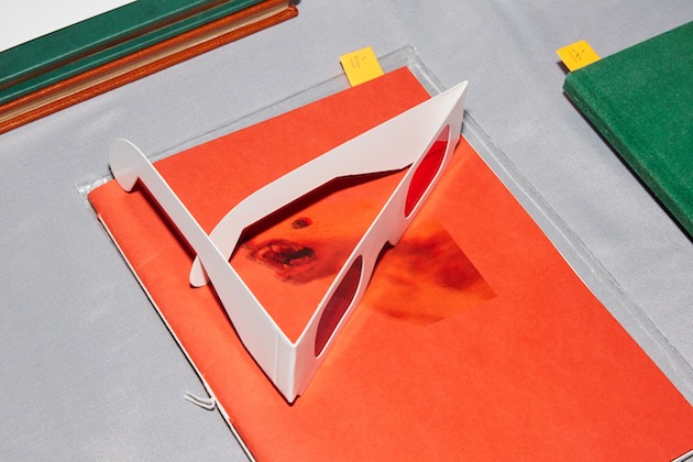
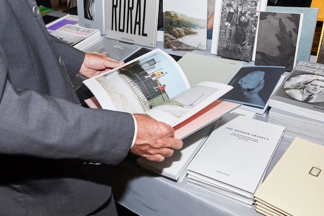
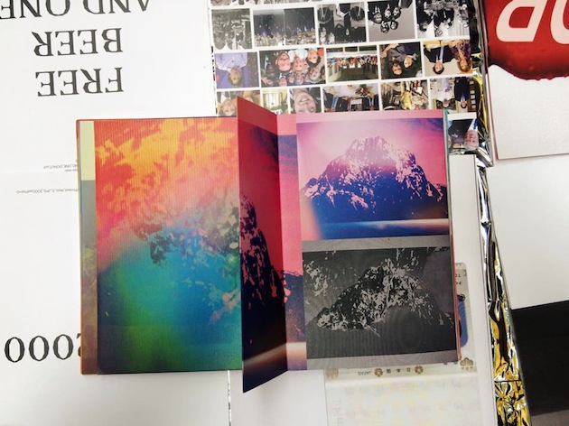
Held in the occasion of Photo London, Offprint London was a vibrant and lively meeting with, mostly, art and photography publishers. Strikingly, the event has shown how much the world of ‘independent publishing’ has changed in the past couple of years, swiftly moving from rebellious photocopied-zine producers to elaborate, sophisticated volumes whose physical appearance and rich materiality is as important as their content. With more than 50 publishers filling the tables laid out within Turbine Hall’s rough concrete walls, this gradual change in focus, style and intent of contemporary independent publishing couldn’t have been more striking. If rebellion against digital technology gave way to exaggeratedly polished books, what does its say about the very scope of the movement? How do we judge its shift into a (very) profitable industry? Is there even room to make such a judgement?

Perhaps what Offprint London pointed to most vividly is precisely the vibrant plurality of independent and not-so-independent publishing today. Established publishing houses like MIT Press or Semiotext(e) perfectly coexisted with Nieves’ cult zines or student publications amassed on overcrowded tables. In the same way, visitors to the fair ranged from obvious young hipsters to older art lovers, in a perfectly apt mix of point of views, interests and ideas. What brought projects like sticker-tattoos, produced within Self-Publish Be Happy project space, and retired college professors together during four days of publishing exuberance, was nothing less than the particular magic of the printed word.

Rujana Rebernjak 
Share: Facebook,  Twitter  
20/05/2015

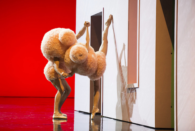
An Impossible Match: Walter Van Beirendonck for IKEA

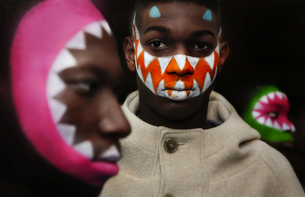
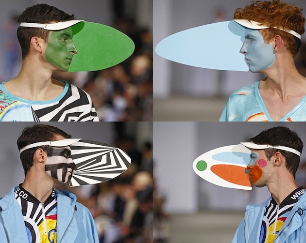
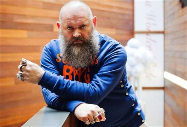
Having, for several seasons, created collections that are both thought provoking and provoking in many other ways, it was an unseen twist when Walter Van Beirendonck and the Swedish furniture retailer IKEA announced the news of a collaboration. The Belgian designer’s latest collection sparked quite a bit of controversy, with butt plugs as accessories as well by using his fashion to respond to the Charlie Hebdo shootings in Paris. The provocation, however over the top as it may be, has always been constructed in an interesting and intelligent way. So even though the designer has an apparent aesthetic interest in male genitals, the collaboration with IKEA is most definitely an exciting upcoming event.

The Swedish furniture giant is famous for its minimalistic Scandinavian touch – an aesthetic that embodies precisely the opposite of what Walter Van Beirendonck has come to represent. Is this to be interpreted as a statement collaboration, of IKEA willing to venture into unexplored paths and borrow the approach of famous fashion-design crossovers already exploited by other brands? Is it ready to renounce on its clean looks, in order to attract different types of consumers?

IKEA’s main designer Marcus Engman discusses the extent of the collaboration, which, apparently, will see the Antwerp Six designer employed in pattern and print design, perhaps shaping the premise for a perfect juxtaposed collection of the minimalistic Scandinavian product design and Van Beirendonck’s crazy antics. A video released by IKEA has Van Beirendonck talking about creating his textiles abound “Wondermooi”, a concept of his own fabrication but which roughly translated from Flemish means “very beautiful”. He elaborates on making up a story about characters that live in the clouds which ignited his creativity by moving from something fun into a more gloomy territory. The story would eventually evolve to different patterns each representing a character’s look, culminating in five different ranges of patterns and fabric.

Nevertheless, Walter Van Beirendonck’s work will not be confined only to flat surfaces, as all five prints will be transferred to a whole collection of interior design pieces, to be released in June 2016.

Victoria Edman 
Share: Facebook,  Twitter  
18/05/2015

Jasper Morrison: Thingness

Jasper Morrison designs objects that we love to live with but whose qualities might go barely noticed: he believes that good design has less to do with making products noticeable than with making sure they are useful. For 35 years, thus, Morrison has designed objects that range from chairs, tables and sofas, to tableware, toasters, telephones or bus stops, working with some of the most interesting and renowned manufacturers, among which Sony, Samsung, Alessi, Flos, Magis, Muji and Vitra.

Jasper Morrison was born in London in 1959 and studied design first at Kingston University and later at the Royal College of Art. He opened his Office for Design in London in 1986. Morrison’s approach to design gained a public face with the publication of the Super Normal manifesto, a sort of a design philosophy outlined in collaboration with the Japanese designer Naoto Fukasawa. In it, Morrison and Fukasawa refer to the normality that goes beyond the principles of standardisation, more akin to a form of universality, arrived at by understatement and a touch of humour, qualities that many can relate to. In fact, Jasper Morrison’s work – whether sofa, watch or drinking glass – is
characterized by lines that are simple yet rigorous. His concern is to serve function, to be true to the object itself.

At the pinnacle of his profession, Jasper Morrison has put key moments of his career on display, crossing between furniture, kitchenware and home electronics, at Grand Hornu Centre d’Innovation et de Design, in Belgium. Titled “Thingness” the exhibition sets on stage – the exhibition design was created in collaboration with Michel Charlot – the work created from the 1980s to the present. The chronological outline of the exhibition follows reproductions of designs and drawings, archive documents, ephemera and photographs to illustrate the process that accompanies the creation of each project, celebrated, ultimately, in a new monograph of Morrison’s work that accompanies the show.

“Jasper Morrison. Thingness” will run until September 13th 2015 at Grand Hornu Centre d’Innovation et de Design.

The Blogazine 
Share: Facebook,  Twitter  
15/05/2015

Oracle du Design: Design Prophecies at Gaîté Lyrique

How can design predict the future? How does it stand for a valuable indicator of our inner moods? Do we need prophecies also in design? And, above all, is design-telling a new promising boundary of the discipline? In our post-modernist and post-industrial world, where ideologies have lost their relevance and rationalism is no more on the forefront of design talks, designers (and consumers?) seem unconsciously attracted by the power that furniture holds to transform itself into symbols and generators of meaning. Oneiric, statuesque, sarcastic, design is the bearer of archaic, long-term archetypes that change their form according to styles but keep intact their ability to express sense and aura.

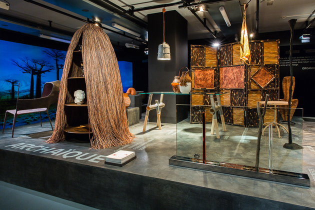
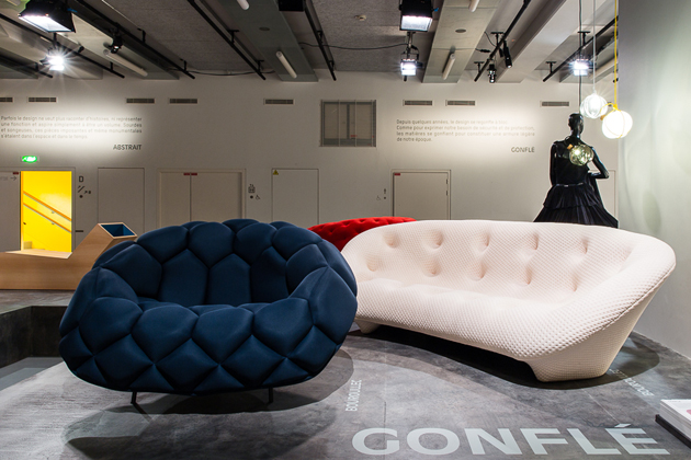
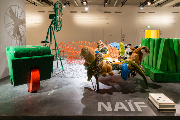
At least, this is the field that one of the most acclaimed worldwide trendsetters, Li Edelkoort, has decided to investigate with a new exhibition, “Oracle du Design”, a search for long-term visions and lifestyles embodied in contemporary furniture. Curated for Gaîté Lyrique in Paris, it showcases a selection of more than a hundred pieces from the Centre National des Arts Plastiques’s (CNAP) collection, which clearly manifest Edelkoort’s predilection for limited edition, Dutch design, spanning from the ’90 to ’10 (does anybody remember her private collection exhibited at Institut Néerlandaise in Paris in 2013?).

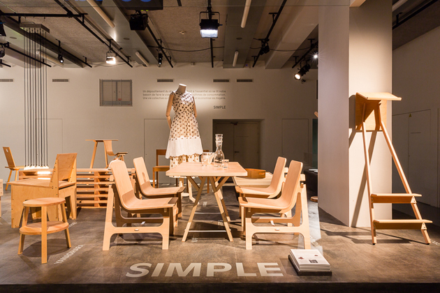
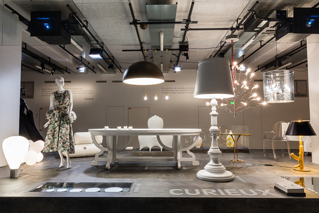
At a deeper insight, however, “Oracle du Design” remains a careful taxonomy attempt that looks at semantics as a lead to investigate and as a research to be kept updated. The objects on show, in fact, are gathered according to ten tags – Archaic, Simple, Nomad, Organic, Inflated, Naïf, Curious, Humble, Abstract, Mutant – each expressing a trend that can be presumed from materials, technology, form, concept and inspirations, attitude.

Ultimately, how does future look like in Edelkoort’s eyes? Not monolithic and alike for all, it’s sure. Everybody, in fact, has the chance to identify himself in at least one of the design visions on show, or to pick what he feels more comfortable with, going beyond the boundaries of each label. As we said, the time of great, collective narrations is over: welcome to the age of multiple singularities, where no trend emerges above the other, but stands with equal dignity and charm according to consumers’ profiles.

Giulia Zappa 
Share: Facebook,  Twitter