13/02/2014

Ontological Still Lifes

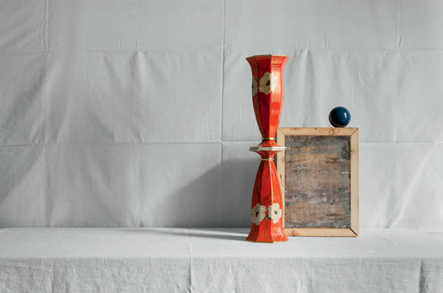
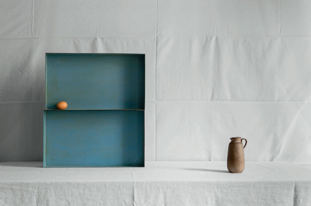
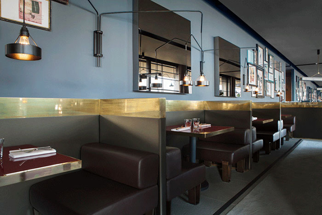
Dimore Studio – aka Emiliano Salci and Britt Moran – embodies one of the most original voices of the new interior design scene. They recently developed Ontological Still Lifes (O.S.L.), a photographic enquiry (pictures by Silvia Rivoltella) about the search of new metaphysics through objects.
How did you conceive Ontological Still Lifes?
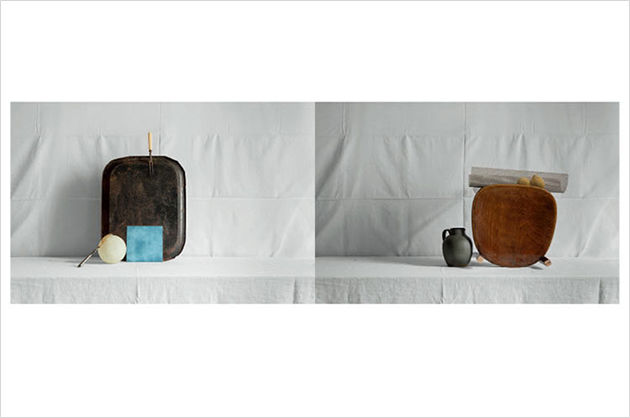
Our concept was to gather all these everyday objects to recreate a series of cabinets de curiosité with a neutral background. We contribute with Anew Magazine, providing them with a personal reinterpretation of everyday interior design.

The O.S.L. set has no artifice: the observer is immediately attracted by the folding lines of the sheet at the bottom.
We really wanted to give the pictures a grid, through the lines of the folds. We wanted to recreate something very linear, geometrical, to be broken with colourful vases or surrealistic objects.

Where did you find these objects? Were they carefully selected or do they respond to a sort of objet trouvé politic?
When you see an object, it calls you and then you know you will use it for a certain environment. What we have selected shares a certain Dimore Studio’s style, but at the same time we’ve tried to make it unique.
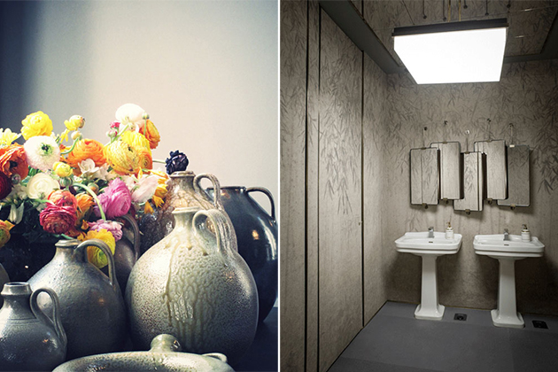
Like many other projects in your interiors portfolio, O.S.L. recalls an oxymoron, in this case the idea of “polished simplicity”. Is there any connection with the metaphysical spirit of this work?
It’s a difficult question, in our opinion the metaphysical concept is a kind of suspension in an image, a certain declination of the idea of still life: we recreated these images with a sort of Man Ray’s approach, we shoot and in that moment it becomes a fish out of time… That’s how we enjoyed working on this theme.

Do you ever feel the risk to become mannerist? How do you defend yourself?
We have very different clients: they want our style, they ask us to interpret a space or to find the right fabric, the right colour that may look predominant but that, when used on every wall, becomes the ideal neutral background for any object, piece of art or texture. That’s what our clients want, so that’s why we succeed not to repeat ourselves. Every project is different, and we change our inspiration also because we have a look at the latest fashion trends. And finally, our natural development: we are exposed to so many inputs and that’s very healthy.
Maison&Objet has just nominated you “Designer of the Year of Interior Scenes”: what made you different from the other candidates?
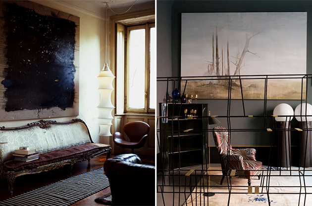
The jury has been very generous. About this topic, somebody recently told me that our style was appreciated for its decorative identity more than for its architectural presence. Thus, from our point of view, we contributed to create an atmosphere, a mood that makes us different from the others. We’ve been lucky to have a commissioner that gave us carte blanche: we really dared in the interiors selection, but we believe that the overall result recreates a reassuring atmosphere.
Giulia Zappa 
Share: Facebook,  Twitter  
12/02/2014

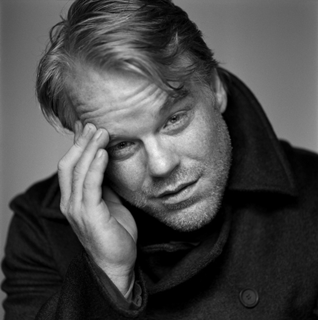
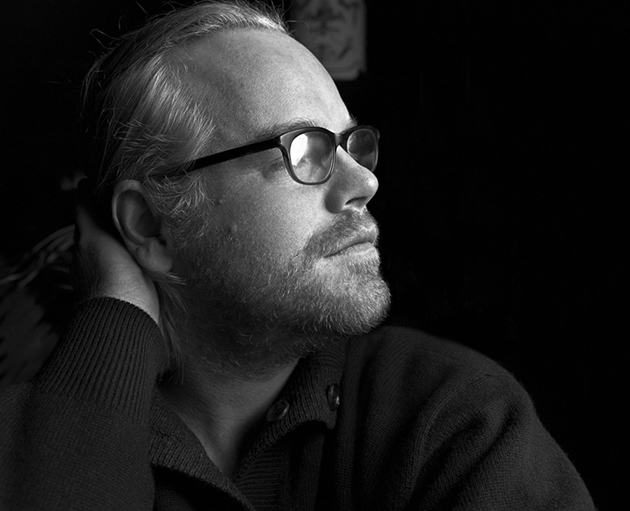
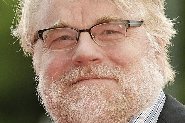
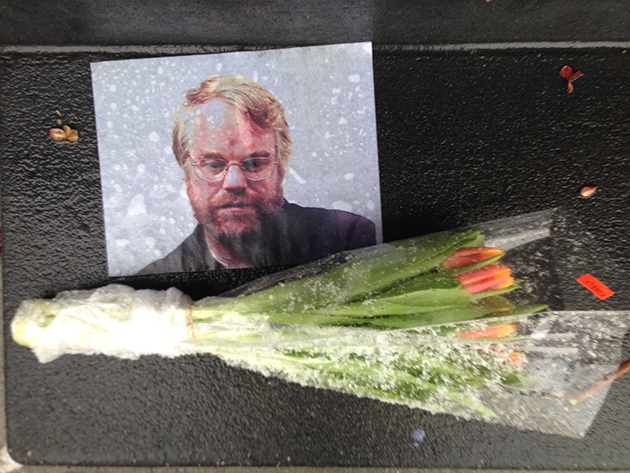
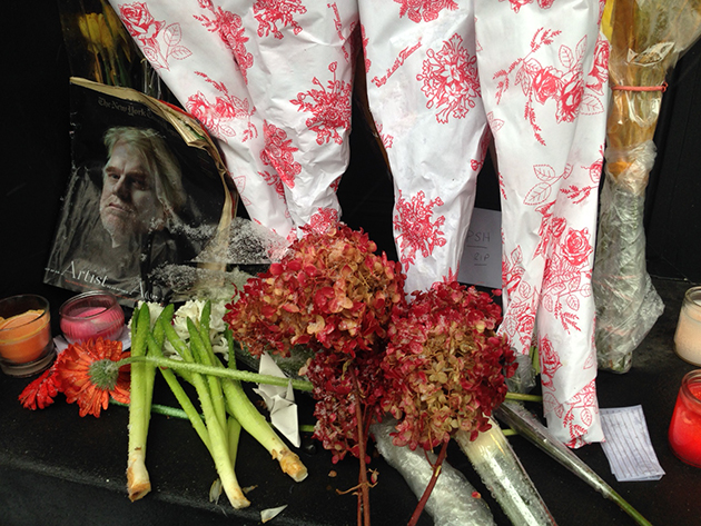
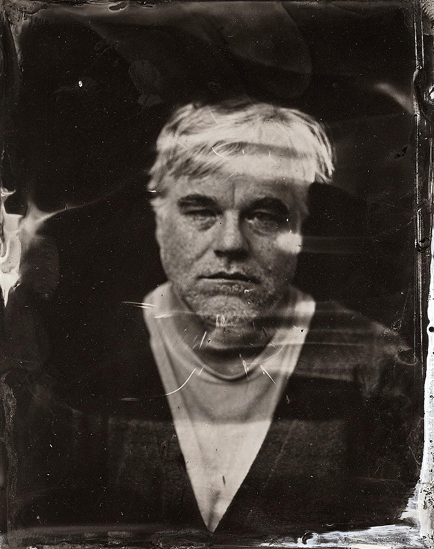
Philip Seymour Hoffman, 1967-2014

Philip Seymour Hoffman once said, “I’m probably more personal when I’m acting than at any other time. More open, more direct. Because it allows me to be something that I can’t always feel comfortable with when I’m living my own life, you know? Because it’s make-believe.” When he died in Greenwich Village on Sunday, from an apparent heroin overdose, those of us who knew him solely through the characters he portrayed on stage and in film couldn’t have been more shocked. It seemed to defy logic that an artist of such magnitude could be taken away so senselessly, especially when his career was going so well.

No actor in his generation shared his sense of depth and willingness to dive into the psyche of slimy and oft-detestable characters. He could disappear into any role, big or small. In Boogie Nights, a film about low-budget porn in the 70s, he portrayed a member of the film crew who was closeted and highly insecure. In Magnolia, he played a sympathetic nurse tending to a cancer-stricken TV producer. As Lancaster Dodd, in The Master, he was a feverish cult leader teetering on the edge of insanity. He took home the Academy Award for Best Actor in 2006, for his intimate portrayal of Truman Capote in Capote. Even in blockbuster films like Mission Impossible: III and as Plutarch Heavensbee in the recent Hunger Games: Catching Fire, it was fun to see an actor of his strength take flimsy characters to the next level. He was also active in the theatre, appearing as Willy Loman in Death of A Salesman in 2012 and opposite John C. Reilly in Sam Shepard‘s True West in 2000. It’ll be difficult to watch movies or go to a play from now on and see the poor actor in a role that Philip Seymour Hoffman would have killed.

It’s a testament to his impact as an actor that the public could be led to believe they actually knew who Philip Seymour Hoffman was. As The Times critic A.O. Scott put it, we didn’t lose a very good actor, we lost the best one we had. He struggled with addiction for most of his life, though was able to stay sober for the majority of his career, from age 22 until about a year ago. During that time, his sheer determination and talent and love for art allowed him to transcend his personal demons, and he leaves in his wake a monumental body of work as a testament to that struggle.


Lane Koivu 
Share: Facebook,  Twitter  
11/02/2014

Designs of the Year 2014 at Design Museum

Every year the Design Museum, in London, celebrates the best projects from the worlds of architecture, fashion, digital, product, furniture, transport and graphic design. Designs of the Year is an international competition that gives an overview of emerging trends and common themes from across different design disciplines through a selection of projects that, in the Museum’s words, range from ingeniously amusing to the admirably innovative.


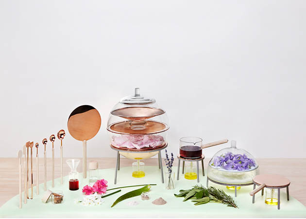
This year’s selection includes international design stars such as Zaha Hadid, John Pawson, Stephen Jones, David Chipperfield, Miuccia Prada or Konstantin Grcic, alongside crowd-funded start-ups and student projects, for a total of 76 nominations. Shown in an exhibition that is due to open on the 26th of March and will culminate with an awards ceremony to be held later this year, the most iconic of the selected projects include a floating school in a Nigerian lagoon, a table that weighs just nine kilograms, a mobile phone made of detachable blocks, a calendar made of Lego, an arts centre at an old shipbuilding warehouse, a dome made by a robotic arm and live silkworms, and a range of tools for producing homemade cosmetics.


Covering a wide range of disciplines and an impressive number of undoubtedly exceptional projects, Designs of the Year should stand as representative of the current developments of ‘creative’ practices. In fact, this year the ubiquity of the smartphone is particularly apparent, as is the disruptive effect of crowd-funding sites such as Kickstarter, with designers seeking to blur boundaries between the digital and physical worlds. Nevertheless, should it really be representative of design’s evolution through the years, in 2014 we feel a little disappointed in seeing the list of the nominees and can’t help but wonder whether Designs of the Year shouldn’t be confused with good designs of the year.


Rujana Rebernjak 
Share: Facebook,  Twitter  
10/02/2014

Marco Bongiorni – EPITOME/HEAD/FEAR

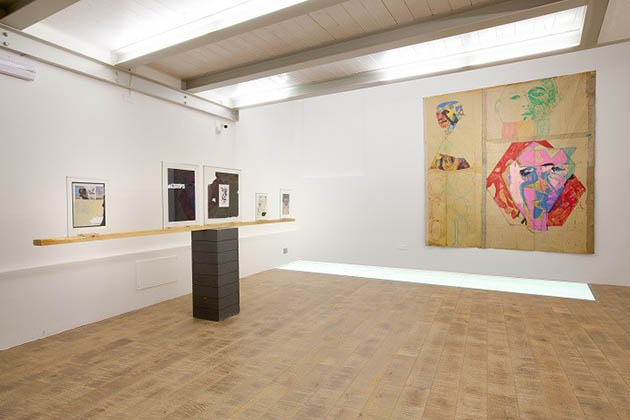
EPITOME/HEAD/FEAR is the enigmatic title of Marco Bongiorni‘s (b. 1981, Milan) solo show, that opens the program of Rivoli2 – Fondazione per l’Arte Contemporanea: the new three-story art venue, placed in the heart of Milan and conceived as a hub for creative sharing and experimentation.

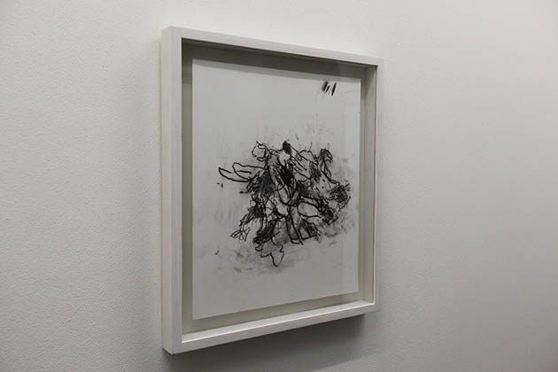
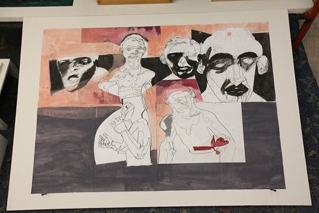
Retracing the last four years of the Milanese artist’s research, the exhibition focuses on the drawing – his main expressive form. But to reflect upon this language, Bongiorni goes beyond his traditional economy of means and preparatory forms: exploiting different materials and supports, he reworks images and found objects, combining sculpture and drawing to create finished pieces that are between flat figures and tridimensional artifacts.


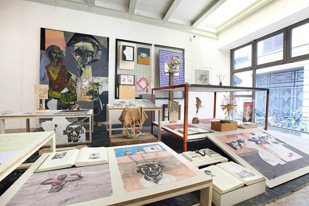
On the raised ground floor, the artist presents Untitled_Teste Nere (2013), a maxi installation that fills the space with small sculptures made of wood sticks, books, historical pictures, fabrics and primitive portraits depicted with oil and graphite on paper and canvas. The complex setting-up, that recalls the artist’s studio, seems to point out an instinctive bond with handcrafted work and the pure act of building. The research of the essential drawing through the use of a linear mark, along with the process of assembling crowded but still balanced compositions, matches with the almost obsessive repetition of shapes and actions.


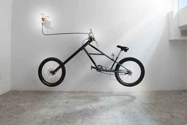
The artist’s presence is strong in each of his works. This is evident in the recurrent attempts of self-portraying – displayed also on the first floor – and it’s even clearer in the basement, where Bongiorni shows the ironic OBAOBABIKE (2013), a curious bicycle turned into a drawing machine that challenges its common characteristics. In a video that accompanies the real tuned vehicle hung on the wall, the artist rides the chopper-like bicycle, trying to find a motor strategy to keep the balance, while sketching a flower fixed on the handlebars. Playing with uncertainty and harmony, Marco Bongiorni gives his works up to their addresses proving that they only exist in the eyes of the viewer.

EPITOME/HEAD/FEAR will run until March 2nd 2014, don’t miss it!

Monica Lombardi 
Share: Facebook,  Twitter  
07/02/2014

California parties (in the 60′s)

In August 2007, after ten months spent scrutinising balance sheets, I decided to reward myself with a three week vacation in California. I chose San Diego as my destination, a city that I used to love so much and that – aside from a couple of hit-and-runs in Rosarito Beach, Mexico – I almost never left. Given that, I couldn’t but do at least a short tour of Los Angeles. After ten days, I took a car with my two travel buddies: it was one of those long and rusty cars that you can rent in California for a few dollars, and drove straight to LA.

Before going back to San Diego, I decided to leave them alone for a while and moved to Claremont, a college town on the eastern border of Los Angeles county. With its seven elementary schools, one intermediate school and two high schools, Claremont was one of the most rated University towns in California and in the whole United States. David Foster Wallace used to teach Creative Writing in Pomona College, the oldest institution, before comitting suicide by hanging with a black belt. I have always wanted to visit an american school, and the fact that one of the most virtuos and controversial writers in the world was a teacher there, represented a good reason for me to come in.


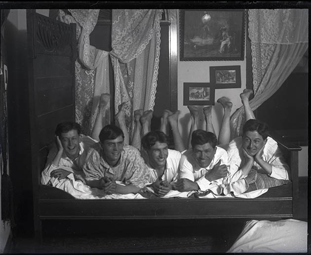
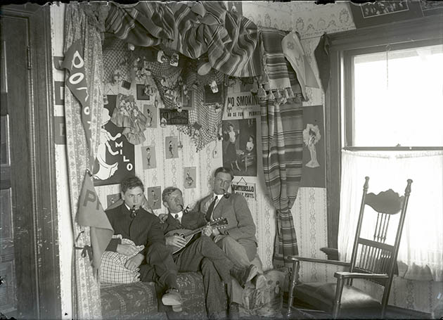
Claremont was riddled with trees, something that mitigated the temperatures, although it was august – in 2007 the CNN rated Claremont as the fifth best place to live in the United States – and that electric blue light that only exists in California. But the feature that really struck me were the pictures of the old alumni that were hung on the walls of Pomona College. For a moment, I felt like in the Dead Poets Society movie, in the scene in which Professor Keating showed to his students the pictures of their predecessors while explaining to them the meaning of the expression “Carpe Diem”.


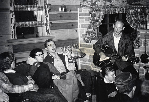
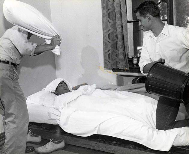
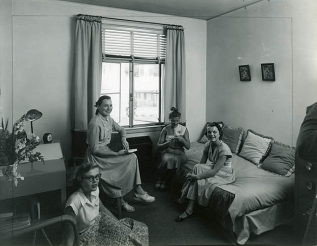
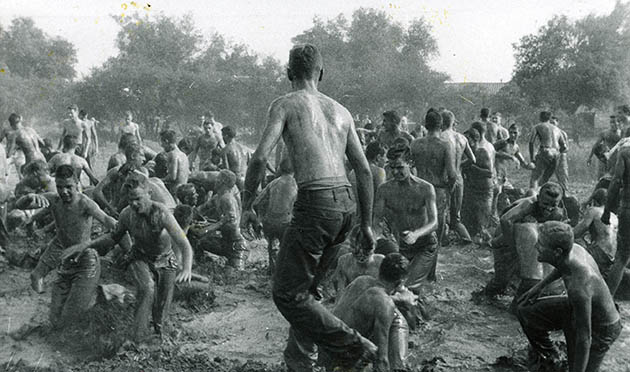
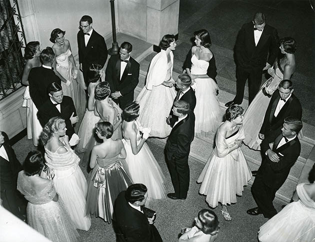
Several pictures portrayed some of the students of Pomona College back in the 60′s, during their parties and celebrations. Those images were shocking compared with the ones of today’s savage parties, the reason why american colleges are worldwide known: that made me smile! But my favourite one was the portrait of a boy, the male version of Tilda Swinton, who was entertaining some friends by playing his guitar. In some of them, probably, students were posing, but this did not subtract any beauty or chastity to the pictures, that immortalized people that today are fertilizer for soil, as Professor Keating said. That day in Claremont was a day that I won’t forget.


Antonio Leggieri – Image Courtesy of Claremont Colleges Digital Library 
Share: Facebook,  Twitter  
06/02/2014

Pre-Fall 2014 Back to Boldness

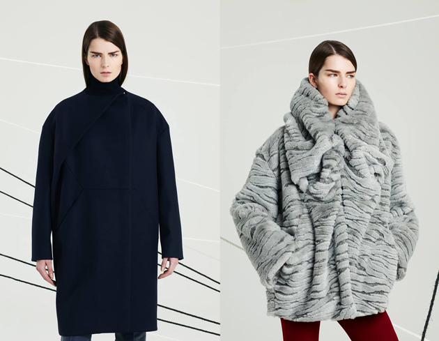
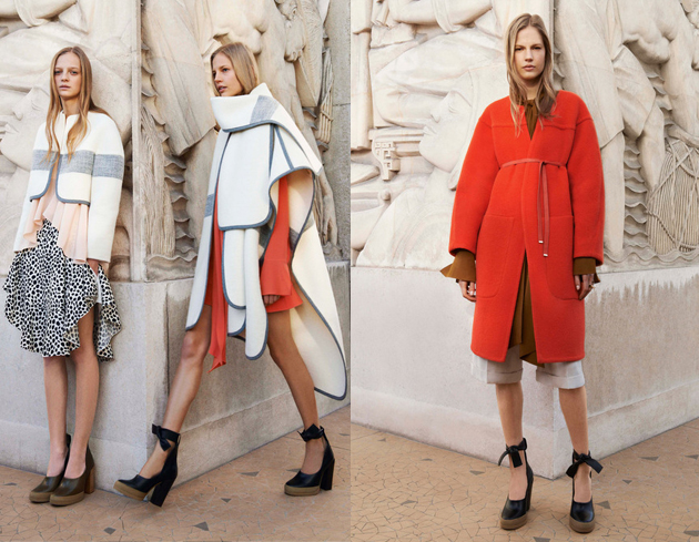
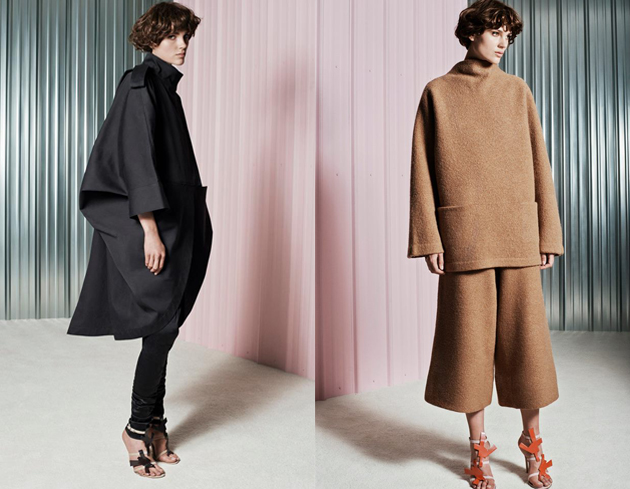
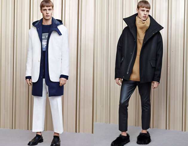
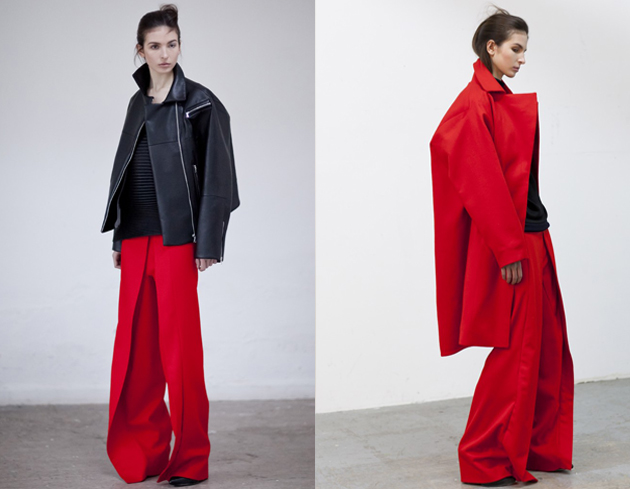
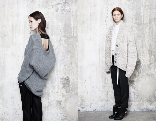
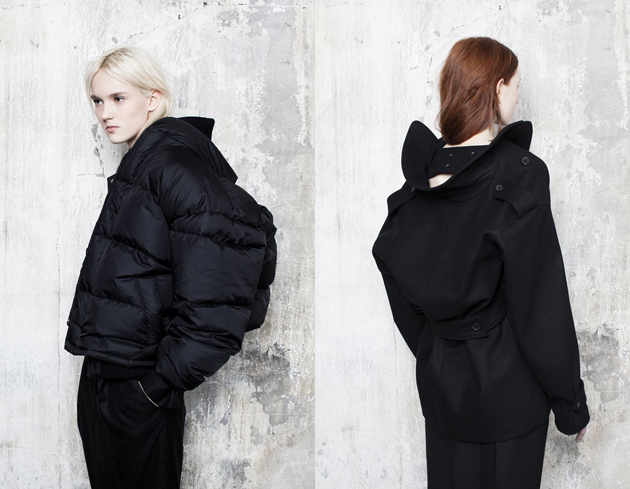
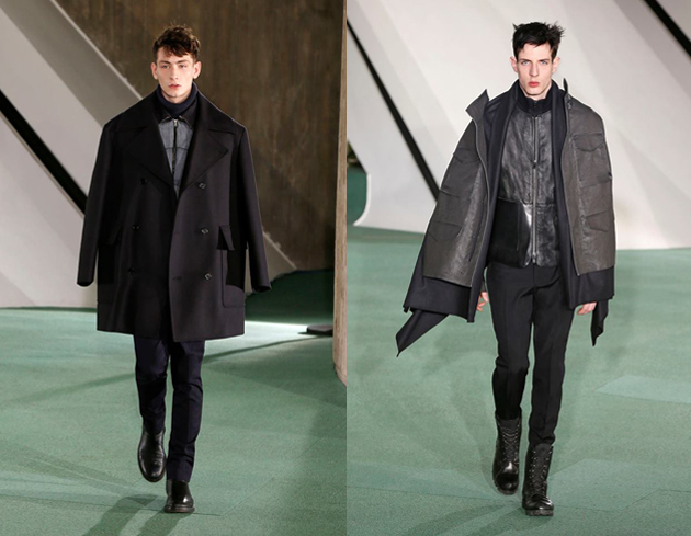
When the new collections are shown on the runways, we look out for some key points which are strong trend indicators for the coming season. Silhouettes are one of them. With the pre-fall 2014 shows in full swing, we have been catching up with the new trends for next pre-fall 2014. A particular silhouette which has caught our eye so far is the architectural upper silhouette, with bold square voluminous angles which are formed in various ways combined with a tailored slimmer lower shape. The trends have lent towards a more sculptured silhouette the last few seasons anyway but what is updated this season is the wrapped and tied idea with a protruding back.


Designer Jonny Johansson at ACNE Studios has created some bold combinations with clean cut lines, molded and sculpted in new forms for the upper body, creating juxtaposed design lines.


At Thomas Tait, oversized shapes and extreme proportions set the scene in bold colours. New proportions for the biker jacket created a rather masculine feel to the style. Longer coats were cleverly cut to give angular shapes, re-shaping the female form and accentuating the back.

At MMM; Maison Martin Margiela, Renaissance inspired shapes were hinted at. Colours were tonal and subdued, as expected but the textures and forms cleverly made a bold distorted statement to the female form with the back clearly being a focus point.


Tamsin Cook – Image courtesy of Jonny Johansson for ACNE Studios, Thomas Tait and Maison Martin Margiela 
Share: Facebook,  Twitter  
05/02/2014

Through the Lens of Chiara Tocci


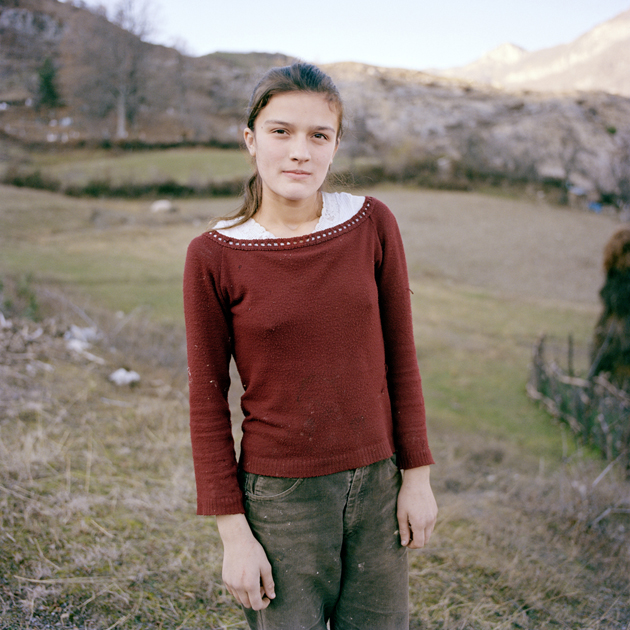
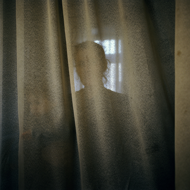
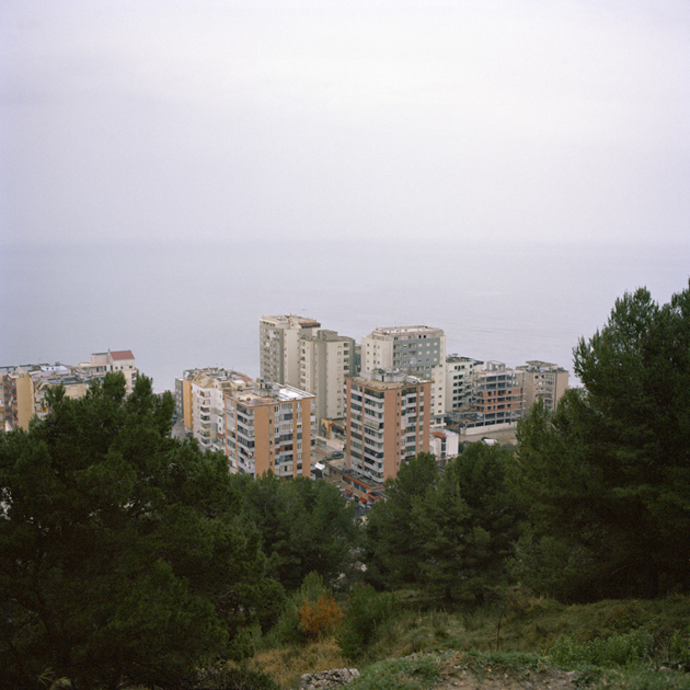
Chiara Tocci – Image from the project Life after Zog and other stories 
Share: Facebook,  Twitter  
05/02/2014

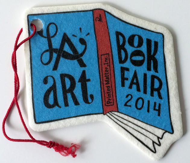
LA Art Book Fair 2014

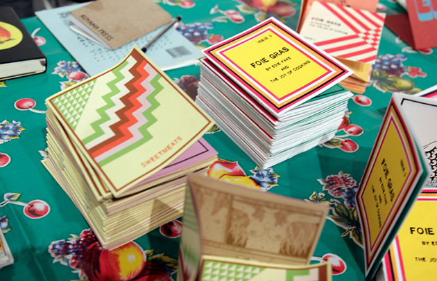
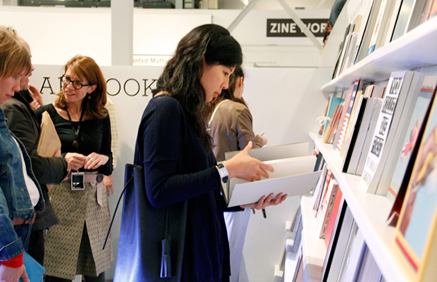
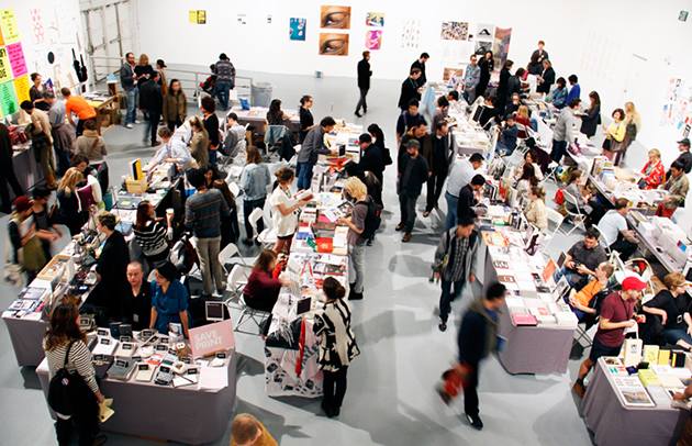
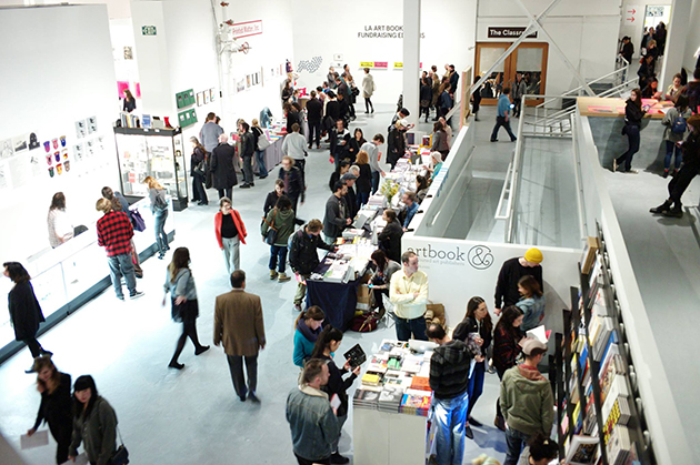
Sol LeWitt once said: “Buying books was a way anyone could acquire a work of art for very little”. Starting from 1966, following his interest in seriality, Sol LeWitt produced more than 50 artist’s books and was one of the founding members of Printed Matter, an organization established to publish and disseminate artist’s books, which would grow to become the most significant institution in the field. Printed Matter currently organizes two annual art book fairs, one in New York, usually held in September, and one in Los Angeles. The latter has opened its doors for the second time this weekend at The Geffen Contemporary at MOCA.


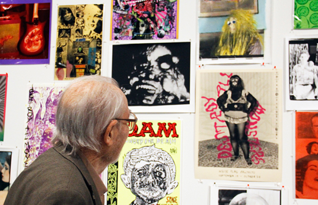
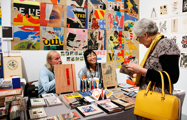
Sol LeWitt’s legacy is apparent, and we can feel his ideas resonate through the words of this year’s curator of the fair, Shannon Michael Cane. Cane, in fact, characterizes the production exhibited at MOCA as “art for the page”, and states that “Art books are retaliation towards the gallery system,” adding that people who can’t get gallery shows have often turned to alternative outlets to communicate with an audience. “It was a reaction against the gallery system, as artists said ‘I want something I can give to people — an object but it’s not a catalogue of my work. It’s more than that.” And, in fact, what LA Art Book Fair offered to its visitors is much more than a catalogue of artist’s works: besides the traditional fair booths, it included a series of special events, exhibitions and talks, such as an exhibition of queer zines curated by Philip Aarons and AA Bronson, Fabulousity, an exhibition of ephemera and photographs by Alexis Dibiasio about 1980s and ’90s New York club kid culture, or Artists Read Baldessari, a reading from More Than You Wanted to Know About John Baldessari, by artists and special guests.


Additionally, this year’s edition of LA Art Book fair brought about The Classroom series of conferences. Already tested at the NY edition, this series of talks was curated by David Senior, bibliographer of the Museum of Modern Art library, and featured talks about feminism by the Women’s Center for Creative Work (WCCW), about new books by Laura Owens, David Hartt or Leidy Churchman, or about art education with Jon Pylypchuk and David Senior.

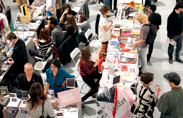
With more than 15.000 visitors, 650 exhibitors applying for only 260 spots, and a mix of hi and low production, ranging from established galleries to antiquarian booksellers and zine publishers, LA Art Book Fair should be the must-see event for aspiring collectors, art junkies and book worms.


Rujana Rebernjak 
Share: Facebook,  Twitter  
03/02/2014

Will Benedict – Picture In The Picture

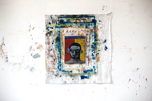
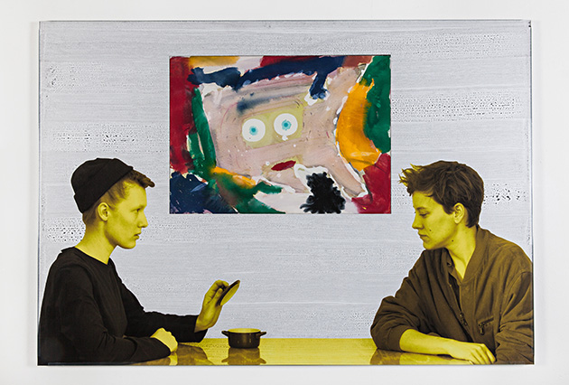
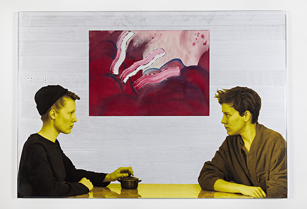
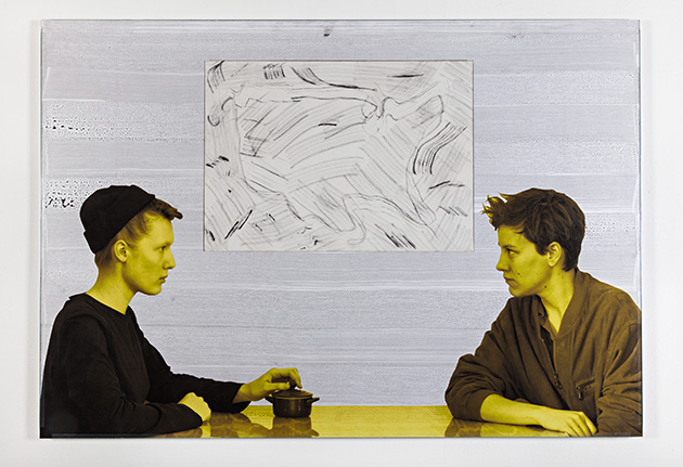
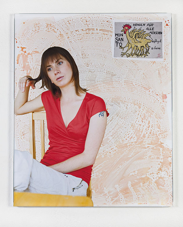
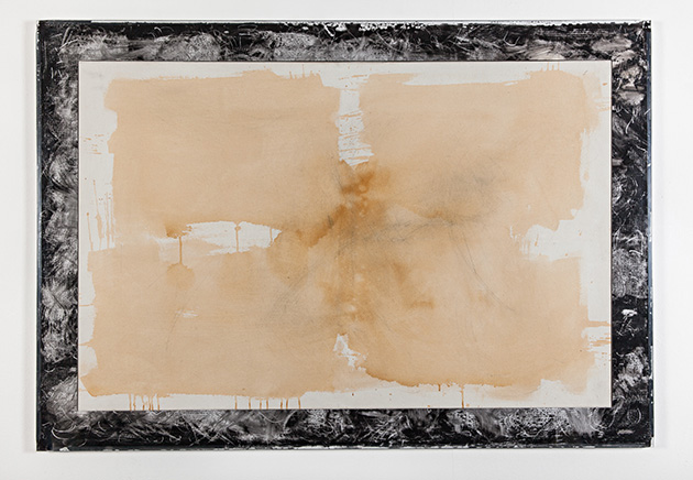
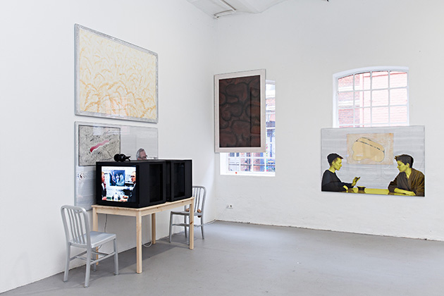
Will Benedict (b. 1978, Los Angeles. He currently lives and works in Vienna) is a versatile artist, who uses different media to create hybrid and complex images and installations that have been defined as “picture in the picture”. After making a name for himself in 2008 with the series Post Card – out-and-out post cards with address, scratched notes and short ironic messages, where small paintings turned into a kind of stamp –, Benedict focuses on various combinations of gouache paintings and cut-out studio portraits, glued and mounted on foam core panels and aluminum frames. Pro Choice (2010), Black Friday (2012) or Bonjour Tourist (2012), are just some examples of his unusual and hardly contextualizable compositions, that represent people, friends and models: they were asked to pose in front of paintings and photographed alone or in couples, seating behind a table or office desk, having dinner, reading the newspaper, smoking, or gazing at each other.


Benedict then prints the photographs life-size, cuts and glues them to the original foam core panel, creating visual hypertexts, in which the background paintings looks like windows overlooking weird landscapes. Building numerous and different layers of reading, the artist faces contemporary issues – from the global tourism to the broadcast journalism, passing through the social networking –, going beyond the established conception of painting, exploring its nature to combine and overlay different media.

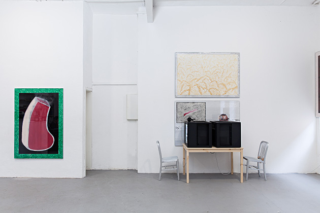
Describing his current show at Halle Für Kunst, entitled TV Dinner: The Narcissism of Minor Differences, Mr. Benedict says: “A slight breeze rustles through wheat fields while bright yellow women look into tiny pots. Things are the same but different. You can’t see radioactivity. The TV is still on but nobody is watching. Behind the televisions are newscasters blocked from view. Directly above the newscasters at billboard height (high up) are various paintings, a meat factory, a painting of the inside of the body (which in my mind is brown), a painting of Tarzan’s loin cloth. It’s soiled. Another bleak brown horizon. But this is also an active place. Within all this stillness there is a ghost of activity. A young woman with a turtle tattoo leans back in a chair twirling her hair while a 12-legged Monsanto chicken hovers overhead.”

Besides this repertoire of “collages”, the exhibition features a new series of videos depicting a photoshoot by Benedict and Julie Verhoeven, with video inserts by Tom Humphreys and David Leonard. One more week to see the show, which will run until February 9th 2014.


Monica Lombardi 
Share: Facebook,  Twitter