11/07/2014

The Future of Swedish Fashion

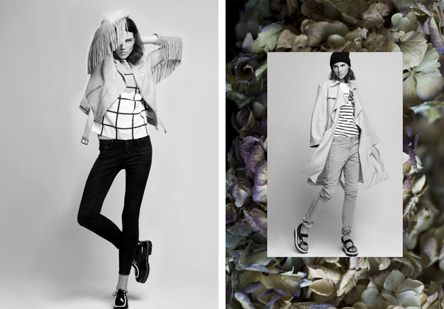
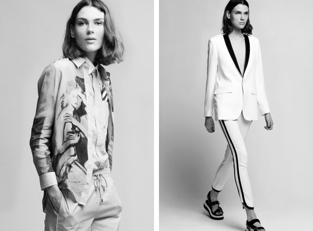
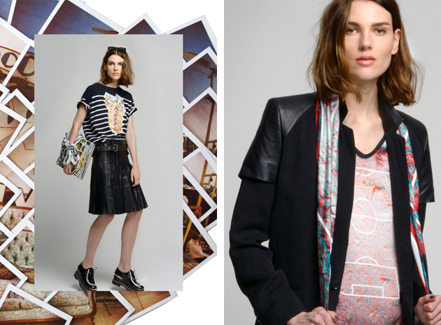
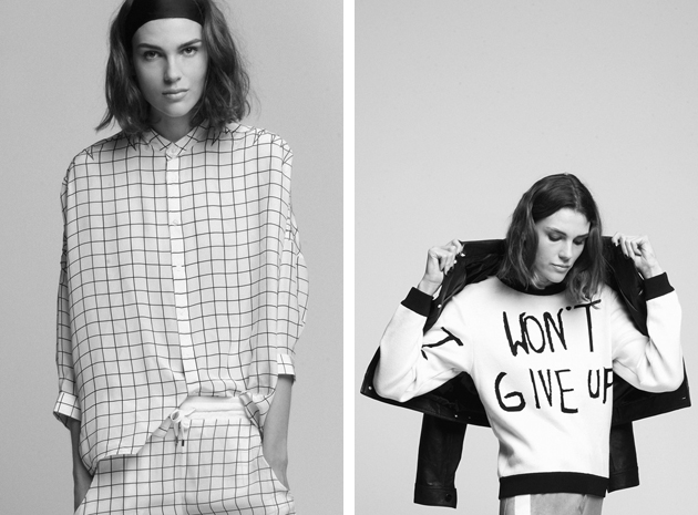
Looking back at 2000, when Swedish fashion shyly took its first steps towards what it is today, no one would have imagined it would come this far, with such strength, boldness and flair. Contemporary Swedish design aesthetics is far from being simple and basic – an attribute often used to describe it in the past – rather, it has become the synonym of courage and audacious research. Even though the local fashion industry was shaken by the bankruptcy of celebrated brands The Local Firm and V Ave Shoe Repair, new talents are now showing innovative collections and predict a successful and bright future. Ida Klamborn, Caroline Kummelstedt and Isabell Yalda Hellysaz are three young fashion talents who are steadily becoming Sweden’s most interesting upcoming designers. They are undoubtedly the future of Swedish fashion.
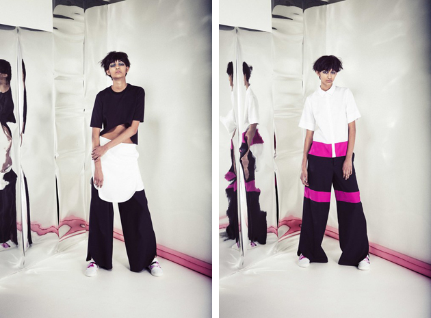
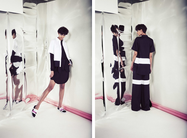
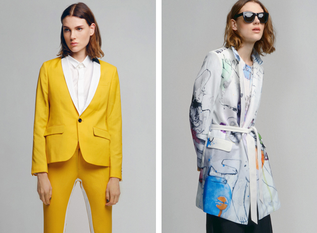
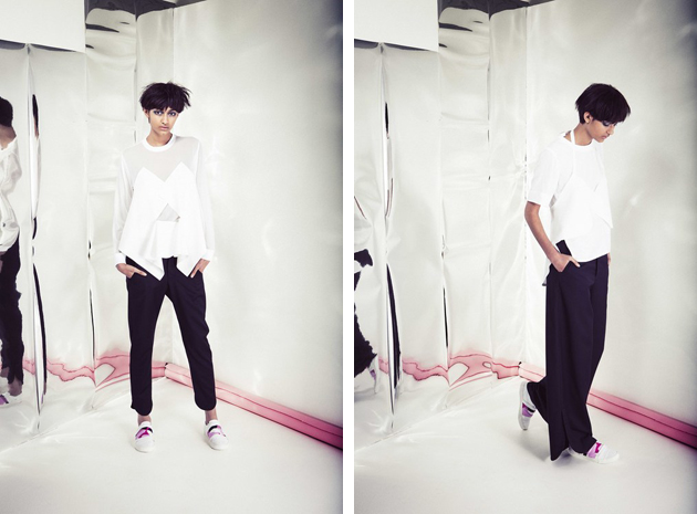
The award winning designer Ida Klamborn, based in Stockholm, is already used to receiving accolades both at home and abroad. A graduate of the Swedish School of Textiles, she describes her design philosophy as “a balanced union between colors, shapes and materials where the momentum is reached by exploring and developing simple ideas into intriguing collections”. Her first official runway show, held during AW 2014 Mercedes Benz Fashion week in Stockholm, remained true to these ideas: graphic and colorful, her collection was in great contrast with dominating natural color palettes usually shown on Stockholm’s catwalks.
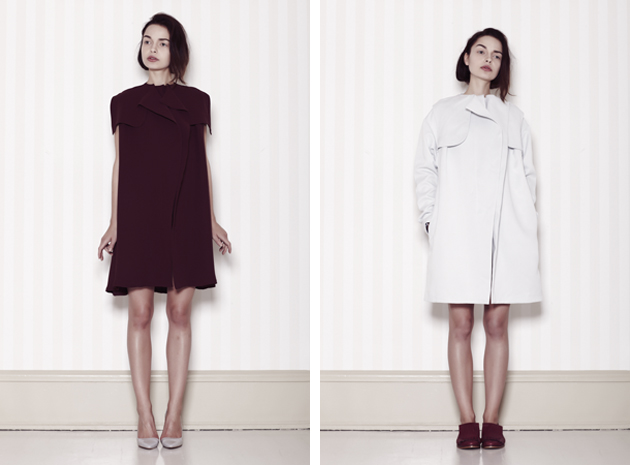
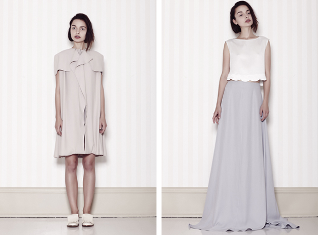
Caroline Kummelstedt is the founder and the designer behind the eponymous brand, currently based in Milan. Nominated for the 2012 Swedish Design Rookie of the Year Award, Caroline Kummelstedt’s design aesthetic is classic and timeless, with a feminine touch. Her aim is to create garments of long lasting quality, with carefully selected details, materials and making. With a background in entrepreneurship and experience in designing both womenswear and menswear design, Caroline Kummelstedt’s brand is bound to last.
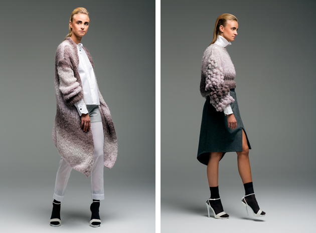
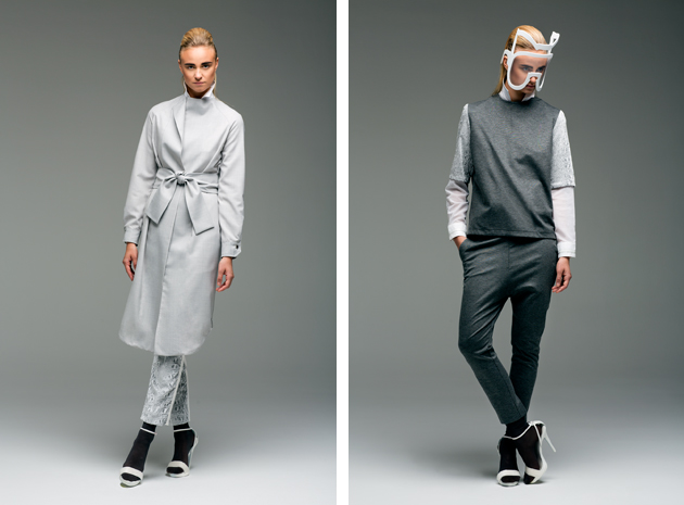
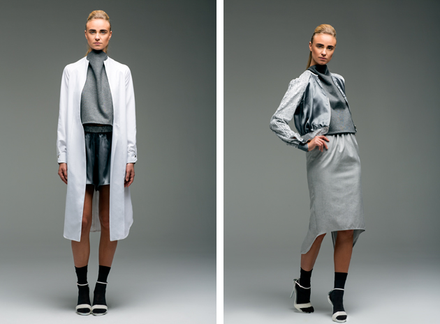
Isabell Yalda Hellysaz – born in Iran and raised in Sweden – is a Central Saint Martins graduate who has already worked with several London-based designers as well as represented the prestigious college at British Fashion Council 2012. She has showed her collections both at the London College of Fashion annual runway show and Mercedes Benz Fashion Week in Stockholm. Her ambition is to slow down the process of manufacturing and her brand is working as a small scale producer, concentrating her projects on the essence of fashion, craftsmanship, details and materials.
Hanna Cronsjö 
10/07/2014

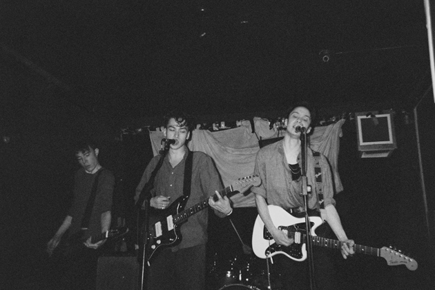
Upcoming Artists: Relics

Tell us how Relics were born…
Individually: probably the same way as you, though it’s possible that one of us might have been delivered via caesarean. I’m not sure. Collectively: Alex and I used to hang out looking moody at clubs in east London when we were 17. Then we formed Relics when we were 18. Then we played around, went on hiatus, went to university, got back together, recruited Theo and Barney and started playing shows.

Relics has post-punk and shoegaze influences from the early 90s. Did you grow up listening these genres?
No, we didn’t. I didn’t like music until I was 15, which is when I started listening to loads of old progressive rock. Alex and Theo used to listen to Metallica and still crack out some pretty gnarly riffs when they’re bored in rehearsal. We all started listening to the kind of stuff that actually influences us now in our mid-teens, I think.

Are you working on an EP or LP?
An EP. Gradually. Probably a single first, though.

What about your summer ‘holidays’? Are you going to play somewhere special?
We’re mostly in London for the summer, actually. We have quite a few gigs booked. None of them are anywhere particularly special, but they should all be pretty fun.

How does it feel to live in London? Has this city influenced your music?
It feels different at different times. I might as well ask you how it feels to live in Milan. Sometimes it’s good, sometimes it’s bad. I quite like the weather but I’m not such a big fan of the enormous disparity in wealth and standards of living. But that’s what cities have always been about, right? However, I think it has probably influenced our music that we all grew up in London. It makes you quite aggressive, quite spiky, quite impatient, which can be both a good and a bad thing and I think is reflected in our music. We’re actually trying to tone down that maximalist, everything-all-the-time feel slightly on some of our newer songs.

What is the coolest place you’ve played at?
Offset Festival was pretty good. We played there in 2010 and it was great to be in a field with loads of great bands and people we knew. That was with the original Relics line-up. Since we started playing shows again, the coolest place we’ve played is The Lock Tavern in north London – it’s so much fun every time we do a gig there. The load-out is a nightmare, though.

How did Straight To The Heart come about? I know that you’ve been to the Total Refreshment Centre…
The song or the video? The song was born in a shitty little basement off Kingsland Road, from the unholy union of a guitar riff by Theo and a chorus by me. (That’s how I remember it, anyway.) The video was born in a warehouse attic a bit further up Kingsland Road called (as you correctly say) the Total Refreshment Centre. There was a lot of coloured ink involved, some of which escaped into the shop underneath the warehouse. The owner was a bit mad about it, understandably, but I think he appreciated it was all in the name of art.

Enrico Chinellato 
10/07/2014

The Talented: Each x Other

If you are even remotely familiar with fashion and should come across a brand describing itself as a ‘fusion between fashion and art’ the least you could do is to frown upon that vague and over-used catchphrase. Unless you had stumbled upon Each x Other, a “unisex and collaborative” Parisian brand whose modus operandi is based on inviting artists, designers and craftsmen to design models for their collections.

Founded by fashion designer Ilan Delouis and artistic director Jenny Mannerheim, Each x Other is characterized by simple, linear, androgynous clothes – designed to be worn by both men and women – decorated by artworks created by artists, musicians, videomakers or designers. Conceived as a ‘publishing house’, Each x Other sees itself as a platform for promoting and ‘democratizing’ art, making it accessible to a wider audience by exploiting fashion world’s broader reach. While this concept may seem naïve if read strictly from an art world perspective, Each x Other’s approach to production and distribution of art multiples “for a price comparable to an item of clothing [...] beyond the classical cultural circuits of galleries and museums” suggests a deeper awareness of both discipline’s dynamics.

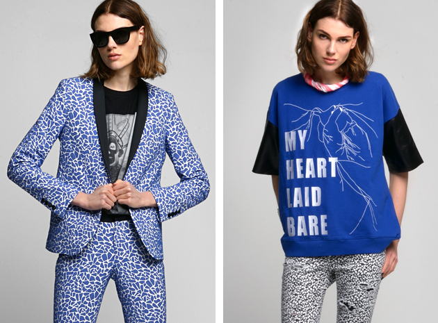
Each x Other’s clothes could be described as timeless classics – elegantly cut suits and trousers, delicate shirts, jackets, T-shirts and jeans – covered in eclectic prints, bold detailing and artsy finishings. Perfectly wearable with a pinch of eccentricity, their designs are utterly appealing and fresh, even though the concept of transforming art to clothes gets slightly lost in the process. Each x Other wishes to act as a magnetic point, “drawing artists from the four corners of the world into an ever-growing creative community, suggesting that for a new generation of collectors buying art may become as regular an activity as buying shoes.”

Rujana Rebernjak 
09/07/2014

Through the Lens of Aaron Rose

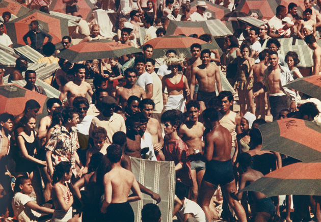
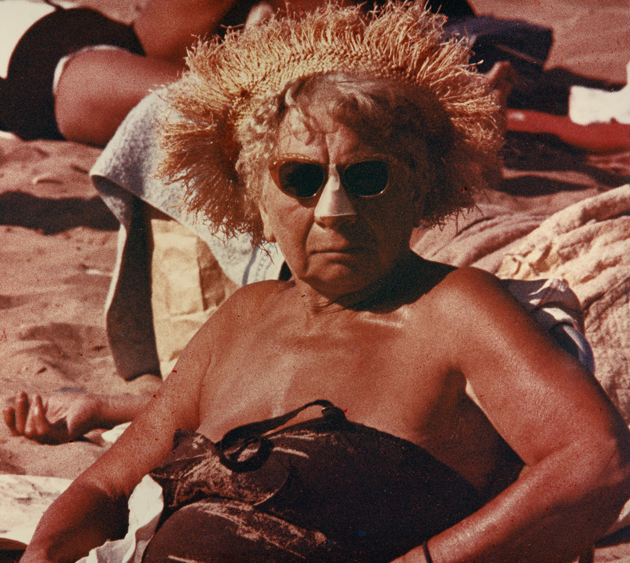
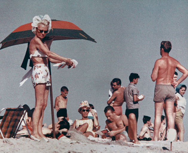
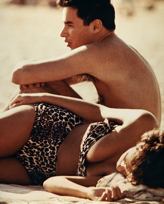
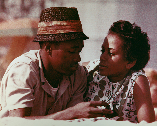
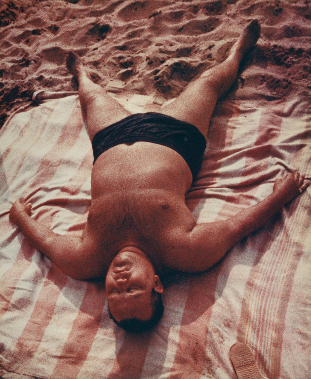
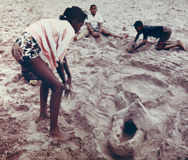
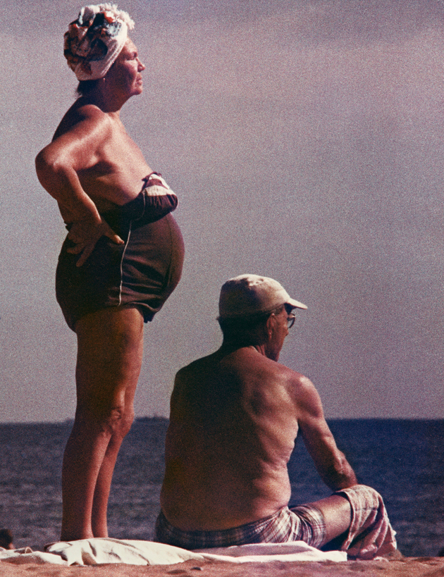
A first glance at these photographs shot by Aaron Rose in his early 20s, might suggest a satirical collage operation – a sort of a mise-en-scene of slightly repulsive and unbearably raw parts of humanity. Yet, these are documentary, rather than staged, photographs, taken by Rose in the 1960s in an attempt to capture Coney Island’s anatomy. Seizing upon technological development, Rose used chromogenic colour film and increased the grain and speed of the film to secretly capture his subjects. An anthropological inquiry into Coney Island’s melting pot, these images are more striking and unusual than any freak show imagery could have been. Fifty years after they were realized, Rose’s Coney Island photographs are shown to the public for the very first time at the Museum of the City of New York. Running until August 3rd 2014, “In a World of Their Own: Coney Island Photographs by Aaron Rose, 1961-1963” captures the essence of universally painful summer life in the city.

Aaron Rose – Images courtesy of the Museum of the City of New York 
08/07/2014

Design Parade 9 at Villa Noailles, Hyères

During the last century, Villa Noailles in Hyères, France, was an evolving experiment in International Style as well as the home of many Mondrians and Brancusis, Giacomettis and Lipchitzs, Dalis and Rays. Designed in 1923 by Rob Mallet-Stevens for Charles and Marie-Laure de Noailles, prominent ‘art collectors and modernism enthusiasts’, the villa went through many changes, following the eccentric taste of its proud owners. Nevertheless, after Marie-Laure’s death, it was sold to the town of Hyères and nearly abandoned for almost 30 years, before it finally became a temporary home for contemporary international talents, like Viktor & Rolf, Raf Simons, Dries van Noten, Walter Pfeiffer and Scheltens Abbenes.

In 1996, after nearly 30 years of slow decay, Villa Noailles was put on disposal of the Association of the International Festival of Fashion Arts. Honouring the villa’s heritage, the Association used the space to nurture new talents in fashion, art and design, eventually setting up a rich cultural program it now hosts. Besides the initial fashion competition, Villa Noailles is known for its annual photography and design festivals, the latter of which took place last week. Design Parade showcases a selection of 10 product designers, offering assistance to young professionals in realizing their projects and developing their careers by a residency program and research scholarship, creating lasting bonds with the laureates.

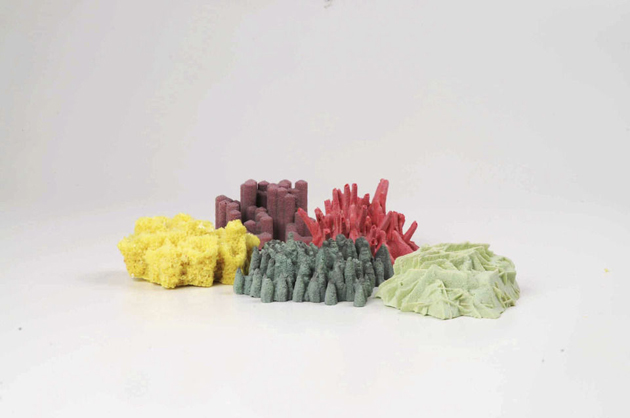
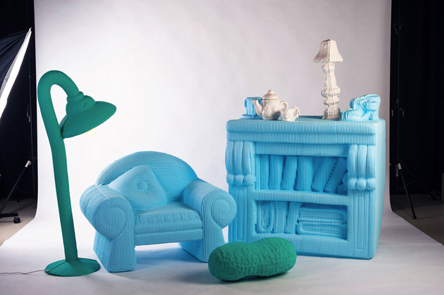
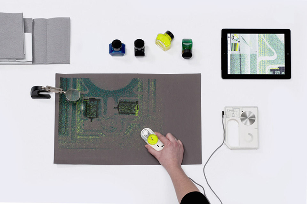
The 9th Design Parade appeared to have broken with the festival’s past. Usually showcasing carefully crafted and formally refined objects, this edition offered nuanced reflections and conceptual research rather than well-defined products. Starting from the winner of this year’s edition, Laura Couto Rosado, the selection favoured a sort of a new wave of ‘critical design’, displaying projects on the “extreme perfection of this technological revolution” with a series of blown-up doll house furniture produced with a 3D printer by Silva Lovatsova, “manifestation of technology in design” with a new printer concept by Axel Morales, rather than “the process of design conception” with a series of imaginary furniture by Malak Mebkhout.

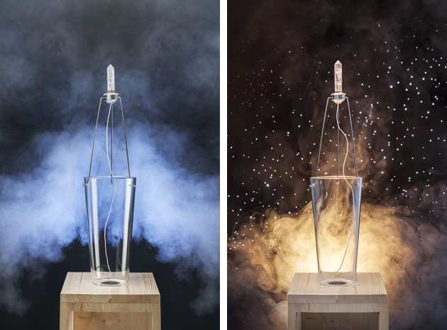
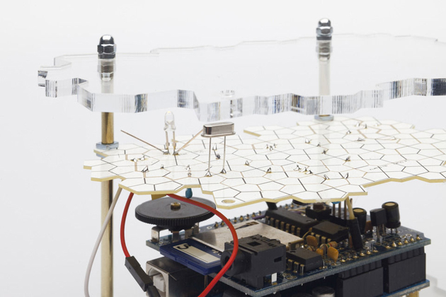
Laura Couto Rosado’s winning project developed a technical enquiry into properties of quartz crystals. Often used for high-tech components, the crystal’s piezoelectric properties were exploited by connecting a frequency generator to an amplifier and a transformer, turning quartz into a 21st century musical instrument. For the author, the project is “magical, not because it is technically advanced, but because it reveals the poetry inherent in existing technology.” Conceptually elegant and formally intriguing, this project seems to signal a new era for design where technological evolution should possibly become ever more concerned with issues of historical continuity, meaning and humaneness inherent in any object, material or production process.
Rujana Rebernjak 
08/07/2014

Letting Things Slip

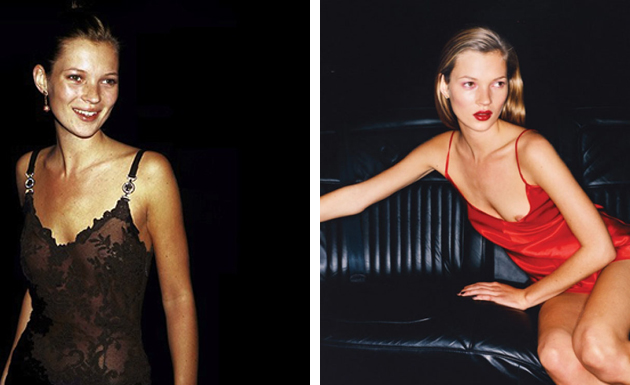
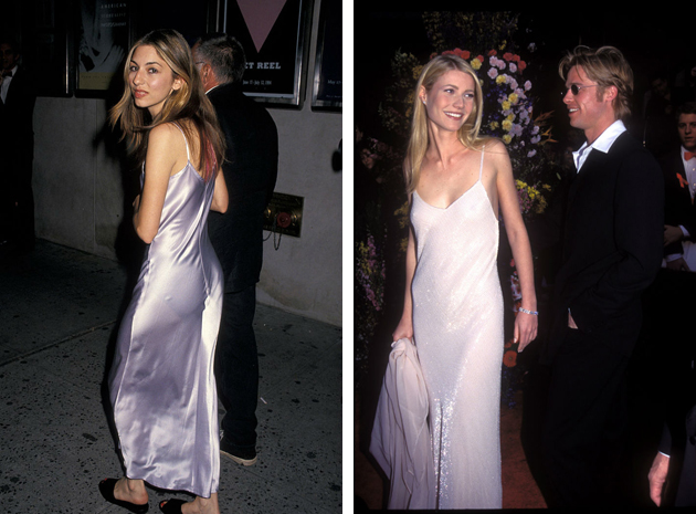
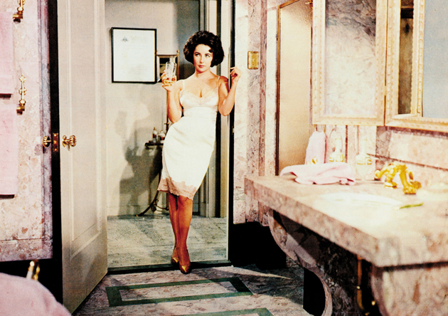
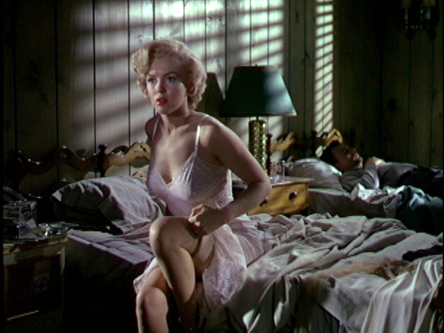
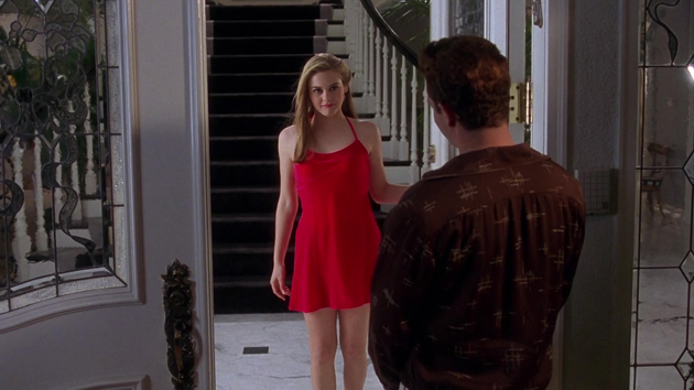
The decade we thought we never would have missed – the feared 1990s – is back with a vengeance. By now, everybody must have noted the relentless shopping-era trends – from grunge to wearing underwear as outerwear – are very much in style. While underwear as outerwear mostly evokes the vision of Madonna and her cone corsets, a much more demure garment was re-introduced in the 1990s, gaining instant success: the slip dress.
A slip dress is a thigh or floor-length gown, first introduced in the 1930s and meant to be worn underneath sheer dresses, preventing them from revealing too much. The slip dress is traditionally cut on the bias, while its key element are the signature spaghetti straps. In the late 1960s, the slip found new popularity especially thanks to Emilio Pucci’s kaleidoscopic designs, which gave the slip a slightly bigger role in women’s wardrobe, though not a leading one. It would take other 30 years for the slip dress to gain fashion momentum, with one of the first John Galliano’s designs for Dior being a lace trimmed, dark blue, slip dress famously worn by Princess Diana in 1996. While the slip dress became a ‘buzz garment’, other designers followed Galliano’s suit, with Calvin Klein and Narciso Rodriguez introducing their own designs. With fashion icons – like Kate Moss – seen wearing the slip dress, it finally became the timeless piece we know and appreciate today.

For 2015 Resort collections, designers like Marc Jacobs, Nina Ricci and Ralph Lauren all presented their take on the slip dress covering it in sequins, creating it from chiffon or sensual black lace – all rigorously kept at thigh-length. The contemporary version of the slip dress is particularly revealing, with a constant play of minimalism and decadence demanding from its wearer not to fear being in the spotlight. At the same time, lightweight fabrics and effortless flair make the dress comfortable and almost casual. In the digital era, making the slip dress work out and about is by layering a contrasting piece. A chunky cardigan worn with a lace trim slip dress creates a stylish and nuanced ‘rolled-out-of-bed’ look, making it more 2014 than 1990.

Victoria Edman 
07/07/2014

Style Suggestions: Weekend at the Seaside

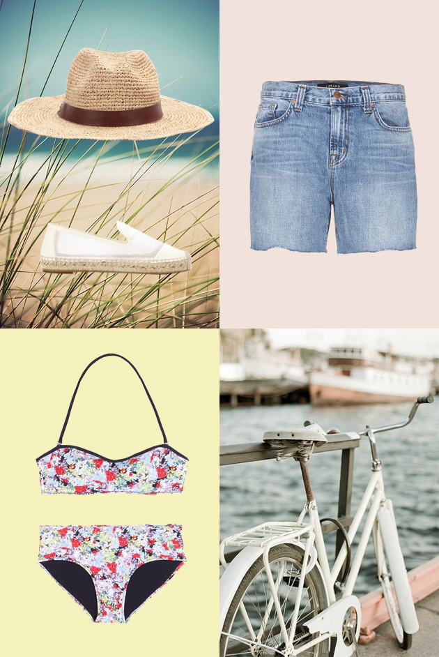
Summer’s finally here, and by now you might be begging for a vacation. The only way to save yourself from the city and the heat are short but sweet weekend trips. Escape to the seaside for a couple of days and all you’ll need is your swimsuit and and some sunscreen.

Hat: Hat Attack, Swimsuit: Erdem, Shorts: J Brand, Shoes: Stella McCartney

Styling by Vanessa Cocchiaro 

07/07/2014

Raymond Pettibon Still Rocks

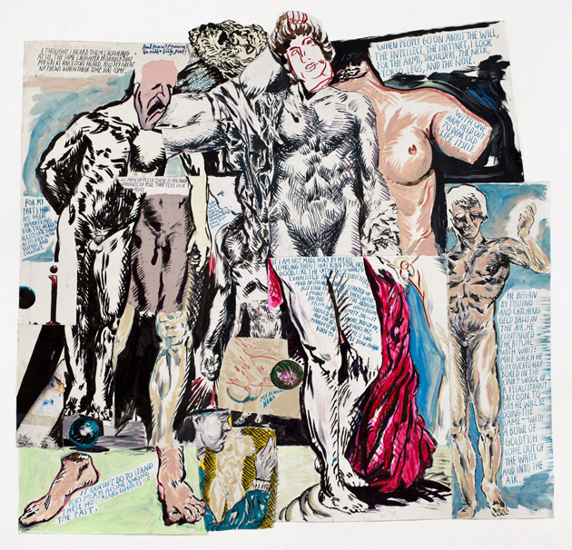
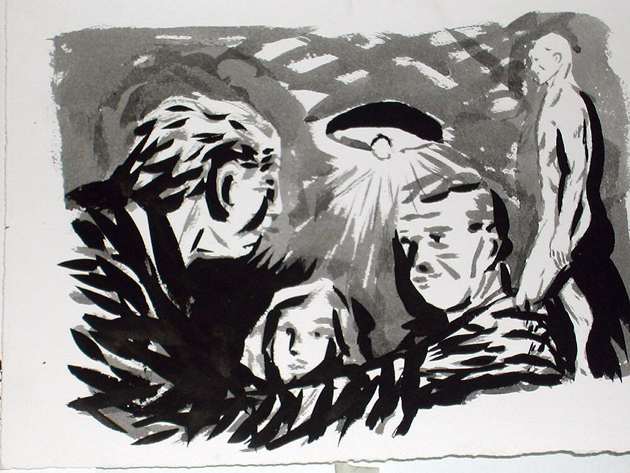
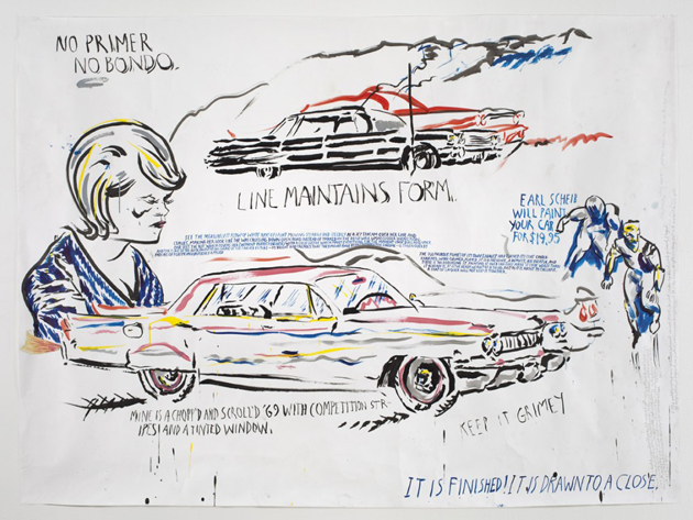
Raymond Pettibon (born Raymond Ginn in Tucson, Arizona, 1957) is recognized as one of most significant and peculiar US figurative artists, despite his outsider nature, maintained since the 80s, when he first emerged on the international art scene.

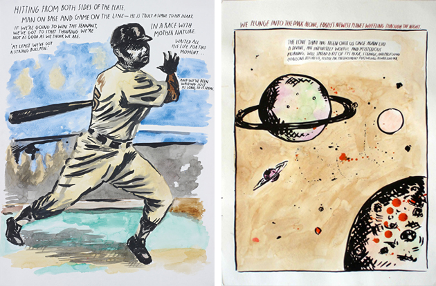
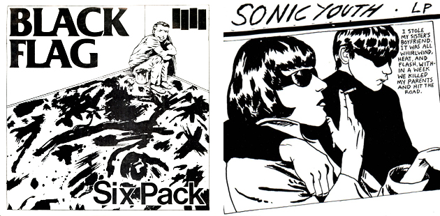
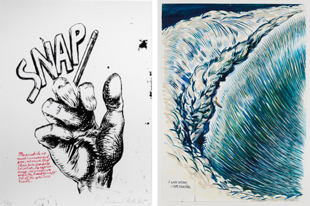
The “petit bon” (good little one) – as Raymond was called by his father – adopted this nickname as surname during the late 70s when he started playing with his brother Greg Ginn, the founder of the famous punk band Black Flag. At that time, Pettibon started creating ironic and irreverent drawings: ink and gouache on paper that mixed fiction literature and comic-like sketches, creating strong, often ambiguous, associations. The artist’s works, which initially appeared on T-shirts, stickers, skateboards, flyers, cover records and such – among which, the most notable was the distinctive four-bars logo designed for the Black Flag and, later on, the cover of Sonic Youth’s 1990 album “Goo” –, at the beginning spread mainly within underground culture, helping to define the punk aesthetics.

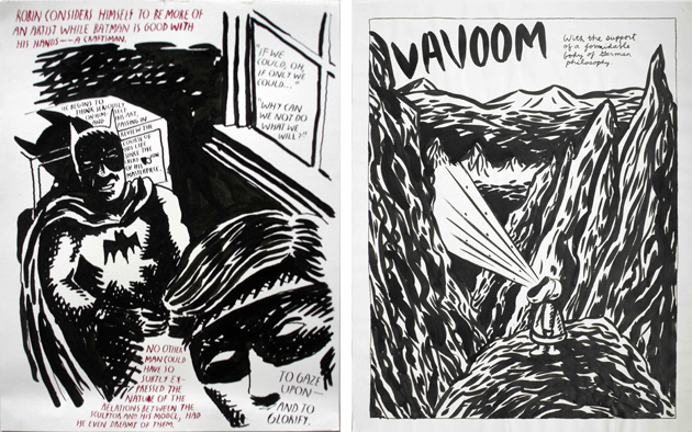
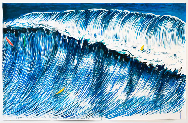
But besides curious drawings and scrawled aphorisms, Pettibon’s copious production includes paintings, collages, books, animation made from his drawings, live action films from his own scripts and fanzines, all works that deal with reading things from the world at large and collecting subject matter from media, television, books and music. The artist’s interests, that span from baseball to literature and surfing, inevitably meet the US popular everyday life and crime news section characters such as Gumby, Vavoom, Batman and Robin, Charles Manson, Patty Hearst, but also US presidents like Nixon or Reagan, almost always accompanied by his own or someone else’s puzzling words.

The long and unconventional career of Raymond Pettibon has never experienced setbacks and, after his umpteenth affirmation at Art Basel and the surfers retrospective at Venus Over Manhattan, the artist is now presenting his new works at the prestigious Contemporary Fine Arts in Berlin: another good occasion to look closely at the artistic research of a great, always up-to-date author.
The exhibition runs until 31st July 2014.

Monica Lombardi 
04/07/2014

Gaetano Pesce, a Kaleidoscope of Diversity

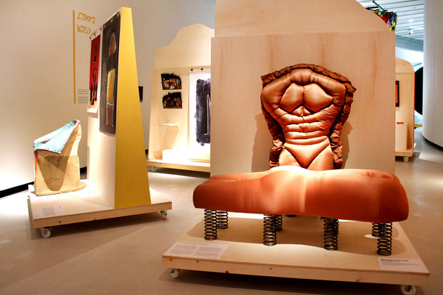
It’s such a surprise when a city that has never called itself a design capital has suddenly something to say about it. The reason for this unexpected vitality is offered by two exhibitions that Maxxi dedicates to Italian designers gone abroad. After “Design Destinations”, the showcase exploring the creative outcomes of young Italian designers migrated to Eindhoven, the Roman museum focuses on the previous experience of radical design to celebrate one of the undisputed maestros of that fortunate, unconventional season: Gaetano Pesce.

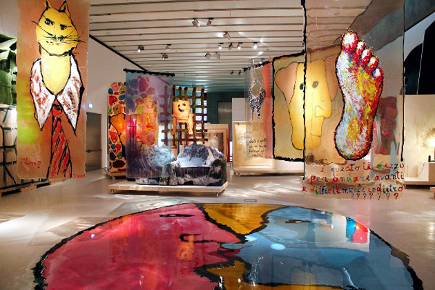
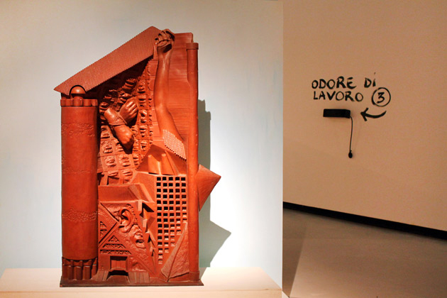
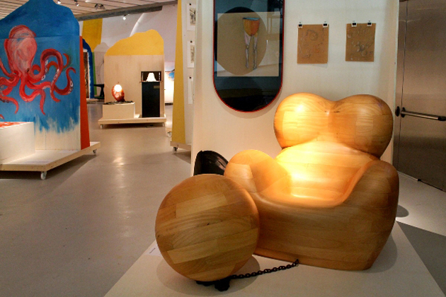
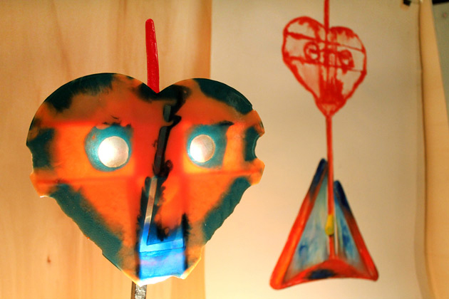
The exhibition, emblematically called “Il Tempo della Diversità” [“The Time of Diversity”], offers the opportunity to dive into an inventory of projects, sketches and products documenting Pesce’s huge yet transversal production. Born in La Spezia and based in New York since the 80s, Pesce has always preached the deconstruction of boundaries between architecture, art and design, expressing through his artworks the breaking up of vertical and monolithic knowledge.

However, it’s when it comes to political dimension of his works that the exhibition unveils unexpected connections and intensity. Each piece of art, in fact, explores in its own way the concept of difference, starting from the critique of rationalism in architecture (“Pugno all’architettura”), to the reconsideration of home partitions (“Manifesto per una casa elastica”), to the celebration of female equality as the most urgent political issue (the historical “UP 5&6” series, but also the re-contextualization of Malala Yousafzai’s speech at the UN in Maxxi’s courtyard).

Pesce’s quest for originality represents, first of all, a celebration of the psychical diversity that imprints us all, and finds in figurative language a spontaneous and immediate means of speaking to a wider public. And when it comes to design, originality cannot but rediscuss the idea of series, offering a cue to reconsider the heritage of recent trends in international design, with a particular reference to Dutch design – and here is an intriguing connection with “Design Destinations” – which recently reintroduced the seed of craftsmanship into contemporary design.

Organized around seven thematic sections – Not Standard, Person, Place, Flaw, Landscape, Body and Politics – the exhibition distinguishes itself for an innovative set-up. All the projects, in fact, are distributed on 40 mobile panels that can ideally be moved from one section to the other, calling into question the cataloguing made by curators Gianni Mercurio and Domitilla Dardi. Pesce himself invites the visitors to accomplish a small subversive gesture: “You are kindly asked to liven up with your physical presence Gaetano Pesce’s elastic objects, to impress your impulse, to watch them while they auto-determine”. Which is nothing but another tribute to diversity and its means of expression.

Giulia Zappa – Images courtesy of Cecilia Fiorenza 
04/07/2014

The Talented: 1205 and its Wearable Unisex

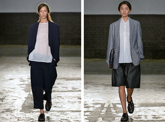
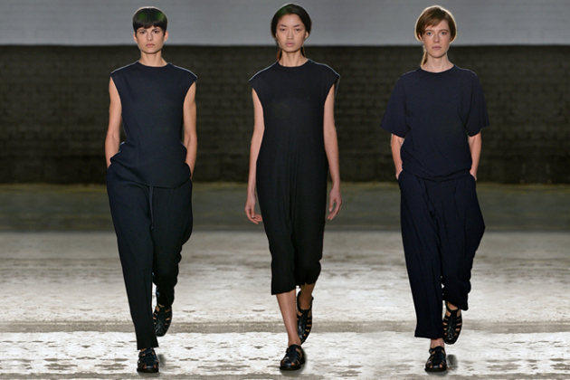
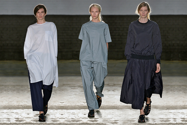
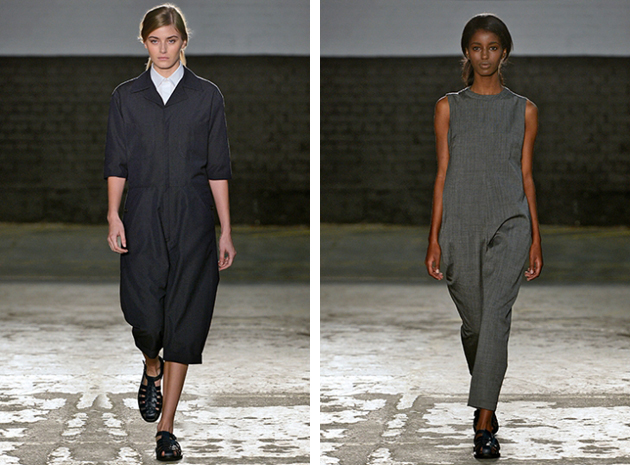
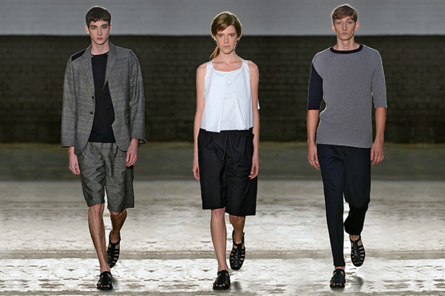
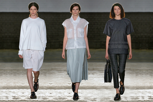
Minimalistic, wearable yet unbearably fascinating: this difficult combination of fashion adjectives was infused into 1205′s collections, by the brands founder and main designer Paula Gerbase. After graduating from Central Saint Martins, Gerbase worked with both menswear and women’s couture before founding 1205 in 2010. Her ‘mixed’ design background has influenced the elegant, clean and androgynous looks which have become the signature of the brand. Paula Gerbase describes 1205’s design aesthetic as defined by “quality of cut, fabric and proportion, emphasising traditional craftsmanship by seeking the essential”.

These design values are showing in every detail of her classy runways – from models’ simple hairstyles to this season’s color palette which include pieces in black, white and different shades of grey. The collection also contains sporadic splashes of color with items in burgundy and dark blue. The cuts, the fabrics and the proportions are as well as the colors, are always uncompromisingly simple but with a stylish, decisively bold twist. These are the details that make the brand stand out, answering the question to why 1205 feels far more interesting than many similar brands. Gerbase’s search for inspiration in the formal precision of geometry as well as the vital elegance of nature gives her work an unexpectedly fresh flair, turning even the simplest details into an occasion for innovation and thoughtful research. 1205 shows an exciting mix, resulteing in an elegant and clean aesthetic which feels both modern, classic and unique in the same time.

It is, thus, quite easy to grasp 1205′s enormous growth since its beginning four years ago. The brand is now being retiled in department stores all over the world, and we have a feeling we will se a lot more from Paula Gerbase and her label in the future. Keep the number combination 1205 in mind!

Hanna Cronsjö