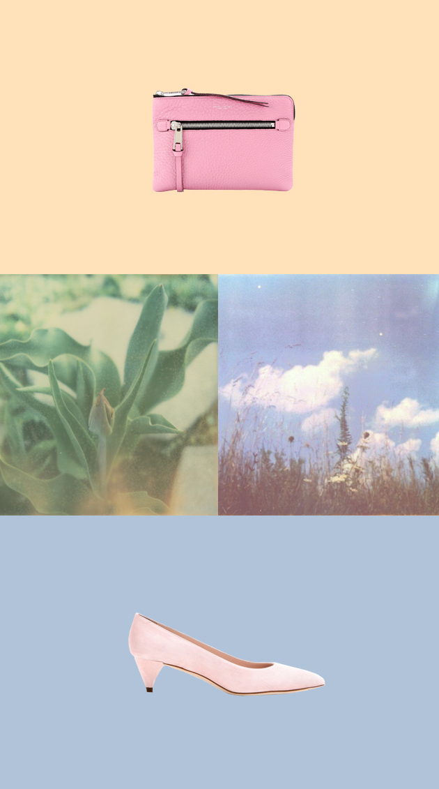
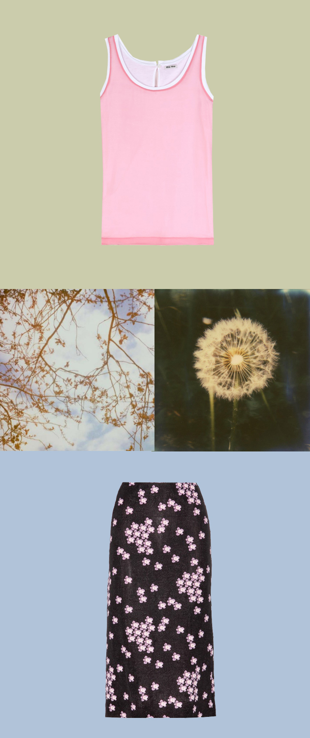
There is more than one way to feel flushed this summer, think of the frosty feel of a gentle pink blush.
Styling by Vanessa Cocchiaro
There is more than one way to feel flushed this summer, think of the frosty feel of a gentle pink blush.


Styling by Vanessa Cocchiaro
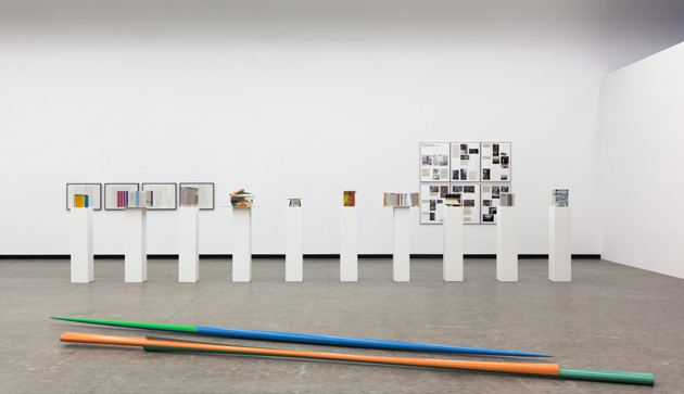
Kunsthalle Wien offers, once again, the occasion to talk about one of the reference points of contemporary experimentation in art. The exhibition “I’m Isa Genzken The Only Female Fool” brings to our attention the varied work of Isa Genzken (b. 1948, Germany): an artist able to turn everything into sculptural material, as stated in the video “This is Isa Genzken?”, produced for her March 2014 retrospective at MoMA Museum of Modern Art in New York, which retraces the entire career of an artist, who was always able to reinvent herself.
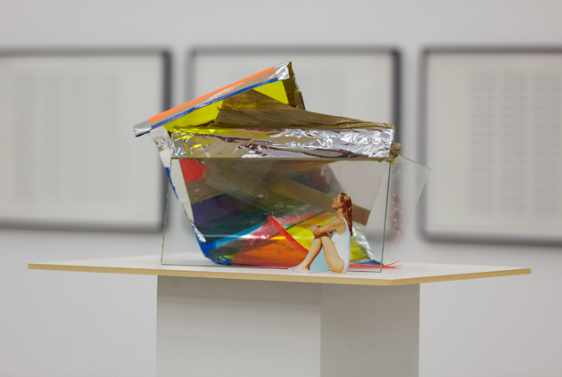
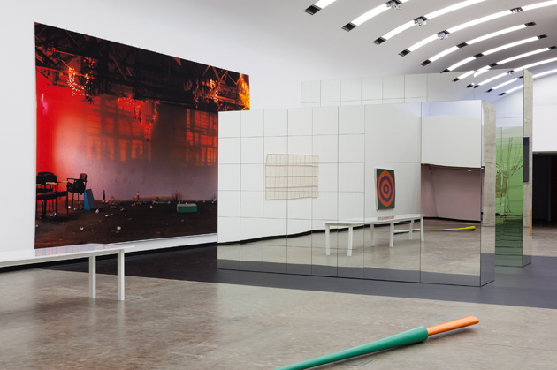
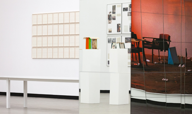
Genzken creates concrete sculptures that express unconscious feelings through essential objects, showing an outstanding sense for volumes and the ability to put together different objects in free new ways that perfectly fit to each other. The show in Vienna displays the distinctive characteristics of Genzken’s research, focusing on the theme of the mirror, the column, the examination of architecture, design, space as a social sphere, along with her collaboration with other great artists. No less than Dan Graham, Gordon Matta-Clark, Jasper Johns, Gerhard Richter (her ex-husband), Wolfgang Tillmans, and Lawrence Weiner are singled out to reveal their mutual esteem.
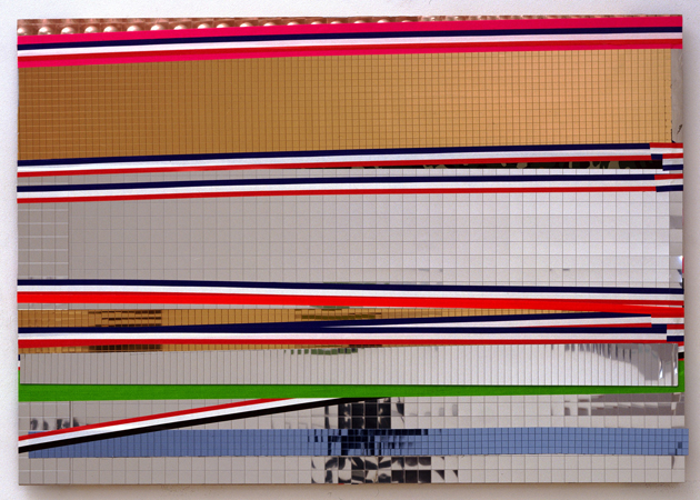
The artist, who represented Germany at the 52nd Venice Art Biennale with a multipart installation, which occupied the entire pavilion, wrapping the building with orange plastic net, uses a range of media that includes three-dimensional sculptures, pictures, movies, drawings, canvases and freestanding assemblages, all unusual and absolutely original. Someone said about her work: “she strikes the nerves”, but we want to add “in a well-proportioned way”. Playing with words, materials and meanings, she jumps from chaos to order and vice versa, combining ready-mades with real experiences.
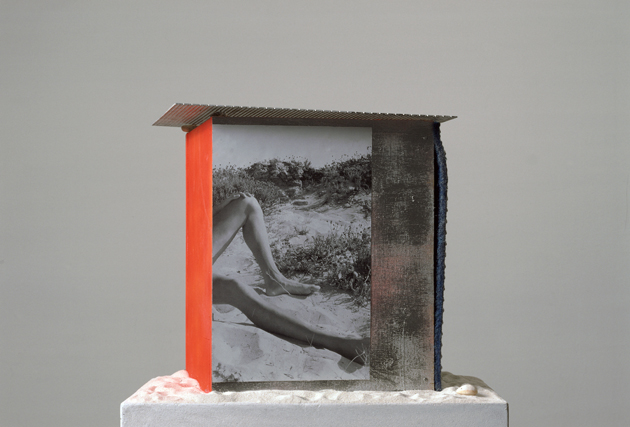
The Exhibition at Kunsthalle Wien will run until 7th September and will be accompanied by a publication with texts by Joshua Decter and Tom McDonough.
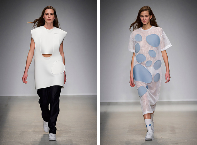
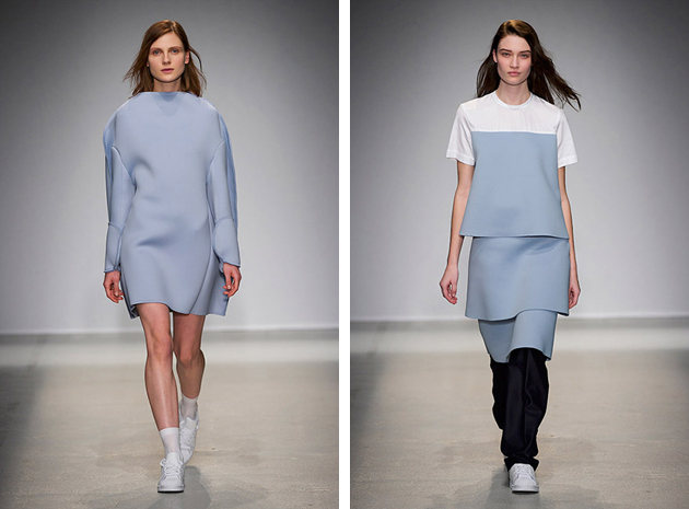
Origins and background story: Simon Porte, the young French designer behind Jacquemus, came under the fashion spotlight following a slightly unorthodox path. Quitting fashion school after only two months, her worked as an assistant in a creative director’s office until 2010, the year when he founded his own brand. A strong proponent of spontaneity, freedom and informality, he started to draw his own line out of his apartments, often sketching ideas while riding the Métro. Yet since debuting his first collection in the spring of 2013, the clothes have stood out and some of the coolest chicks of the Parisian fashion scene have been spotted wearing his creations, while Dover Street Market and Opening Ceremony, the world’s most sought-after stores, started carrying his collections.
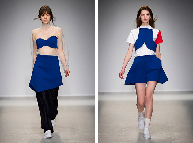
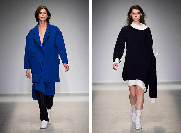
Trademark: One of the key features of Jacquemus’ approach to designing is spontaneity. Simone Porte states: “I don’t like to intellectualise fashion. It’s something very instinctive. Like a child deciding to do something just because they want to. Those circles are like a child drawing something but very badly.” In fact, his clothes are characterized by oversized lines, bold texture and geometric motifs, among which oversized tops and graphic-inspired wear stands out across a couple of collections. Other than his clothes, Jacquemus is also recognized by his way of shaking-up the Parisian fashion week scene with his unorthodox runway style: for his AW 2014 show, he asked all the guests to wear customized hospital scrubs, each having a circular disc stitched onto the torso, while last fall’s presentation was staged at a public swimming pool, where plastic foot-bags were dispensed so that editors wouldn’t sully their shoes.
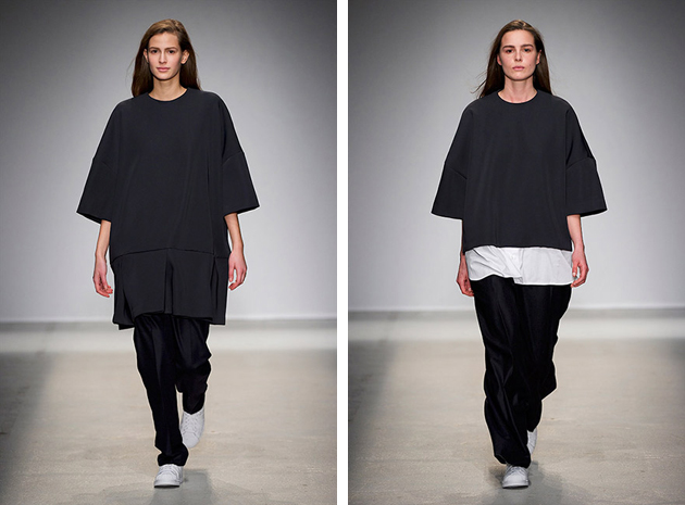
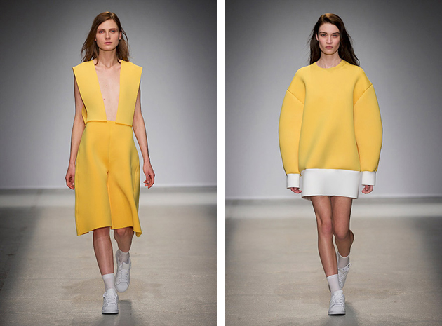
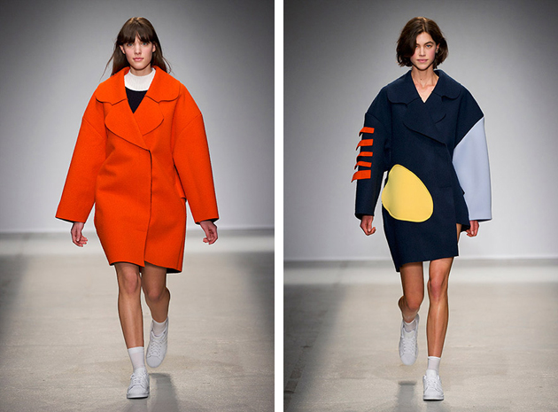
Collections: Jacquemus’ AW 2014 collection started off with white neoprene looks, where one could recognize Porte’s experimental flair. The first piece, an oversized shirt-dress with a rounded back was followed up by overalls worked over a cropped vest and black pants, with oversized details in the form of rounded shoulders and geometric bottoms. Known for his love of the colour blue, the designer proffered three shades of the hue. There were also several pieces in canary yellow and vivid orange – as well as red and striped accents, which contributed to the collection’s screwy theme.
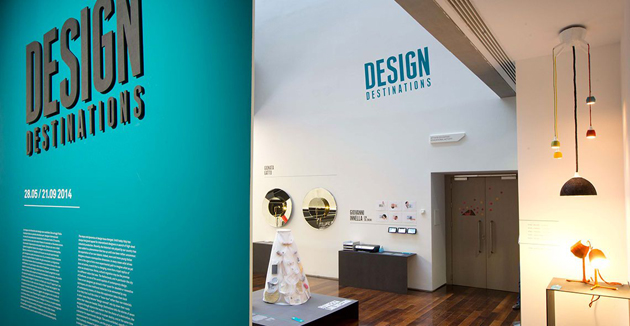
“Design Destinations” is the title of the exhibition dedicated to the new frontiers of contemporary design research by the Roman museum of XXI century arts – MAXXI. The insight developed by curator Domitilla Dardi is curious and fertile: to give voice to a new generation of young Italian designers that studied at Design Academy Eindhoven and then remained to live and work in Holland. Their means of expression: an inedited collection commissioned by MAXXI together with the City of Eindhoven, institutional partner in the project.
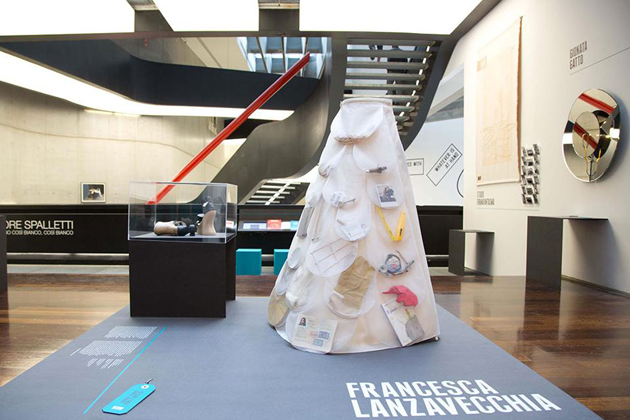
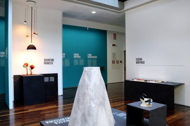
The whole show outdoes the value of single pieces and subtends, instead, a few crucial questions on the future of this discipline: how a “made in Holland” education influences the outcome of every personal research? How is Italian design changed by the new phenomenon of cultural migrations? And, above all, does the idea of a “national design” still make sense?
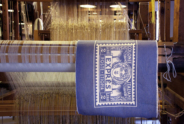
The exhibition does not offer any definitive answers. It’s up to single works to express, each in its own way, an idea of cross-contamination among different cultures. With “Perspectives”, Gionata Gatto gets inspired by Jan Van Eyck’s “Arnolfini Portrait” to design an enlightened mirror that multiplies refractions and points of view. Studio Formafantasma transforms the Bel Paese into a new barycentre between Ethiopia and Holland, updating the cartography of migrations into a new collection of blankets, “Asmara”. On the other hand, “Re-tools” by Eugenia Morpurgo explores the potential of ‘maker’ culture to transform production into a grassroots and transnational opportunity.
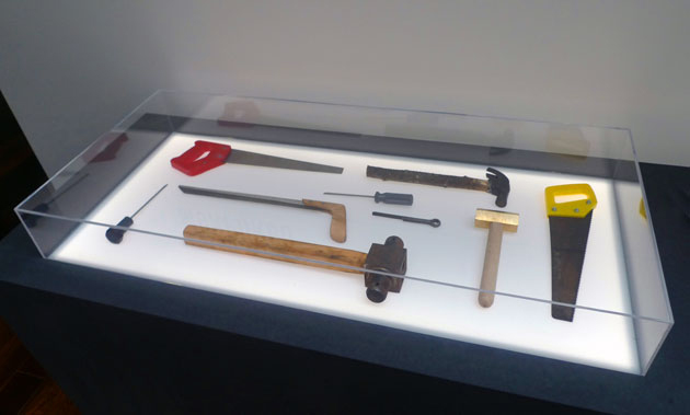
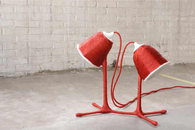
Heterogeneous at first sight, the works nevertheless share a common multiple which bypasses single peculiarities that characterize every designer: the predominance of a concept with a biographical or geopolitical background, which remains the very essence of the Dutch approach to project development. Beyond method, however, these “design destinations” seem above all a matter of liberty, which is the freedom to go through a globalized geographical dimension, but also to overstep the role of companies as commissioners and privileged speakers – that’s to say, the very essence of Italian design since the post-war period. That’s what this young generation seems to have unconsciously learnt: not to put aside the great resources of the Italian productive background, but simply to enlarge our host of opportunities, going beyond the problem-solving method proposed by companies and practising design through new forms and content.
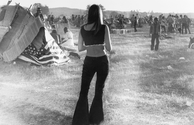
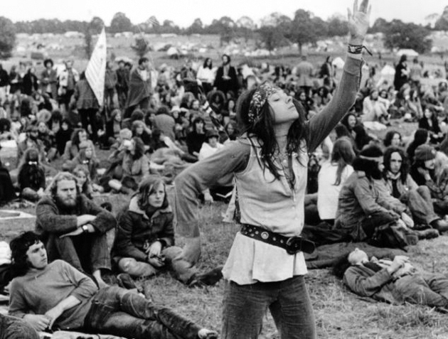
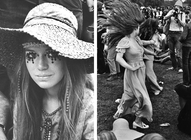
Since the first Woodstock Music & Art Fair was held back in 1969, festival fashion has become a natural segment of the fashion world. There are a few staples in your wardrobe that can be festival essentials and have, through the years, become products of a collective festival fashion history. Let’s take a walk down the memory lane and pick some of the original festival’s key pieces that return season after season.
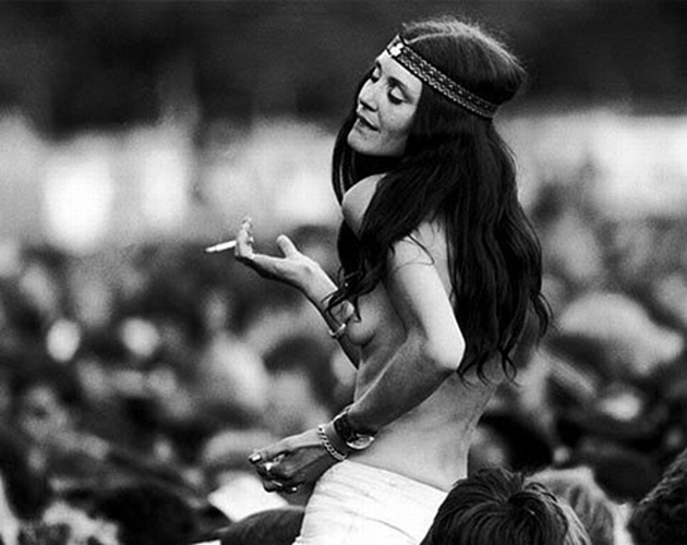
Layered accessories and boho style: A massive trend seen at many festival scenes is the notion that ‘more is more’ especially when wearing several of your favorite accessories together, almost as if making an ironic statement on Marie Antoinette’s decadence. This trend started long before the concept of boho-chic became popular in the beginning of the 2000s. At Woodstock, in 1969, both women and men could be seen sporting this look as a sign of a bohemian laid back glamour. The bohemian hippie was all about being grounded and natural, free and peaceful, showing it by wearing natural materials and having a tendency to lose their shoes.
Leather Jacket from 100 Club Punk Special: Gaining a lot of momentum during the 70s, the punk culture, naturally, arose form a festival as well. However, don’t expect to find the serene, au naturel, bohemian Woodstock style, since studded leather jackets and heavy makeup came into use to proclaim their subcultural dominance. A leather jacket is still in play today, having become a natural accessory which both adds edge and flair to your down-time look.
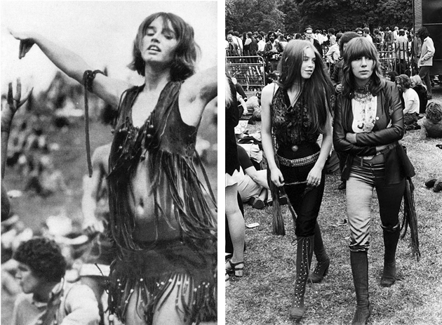
Denim cut offs and oversized shirts from Lollapalooza: In the 90s, grunge was the look that became wildly popular in connection to many youth groups. Musical groups such as Nirvana put the look on the map and at the famous Lollapalooza festival you could spot a lot of distressed denim and oversized plaid shirts. The sporty laid back look of the grunge period is still very much in style, currently more as a stylish break-point to create a twist to a classic easy-going festival look.
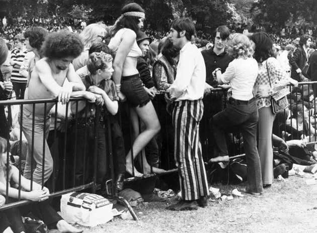
With time, styles generated from genres seem to have blended together, be it through new types of festival music (eclectic musical vibe was created and celebrated), rather than by simply transcending the boarders of fashion. Today, we are all free to blend genres, periods and style in creating our unique festival persona.
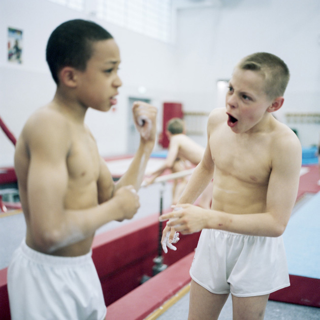
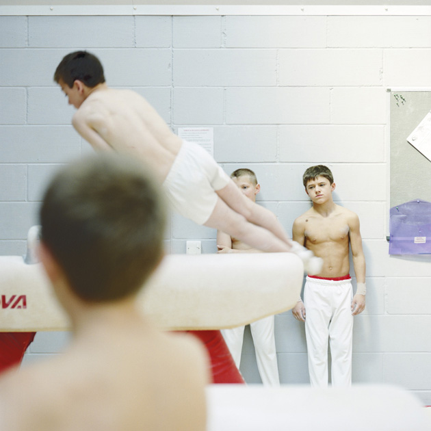
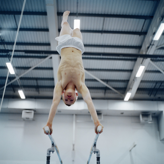
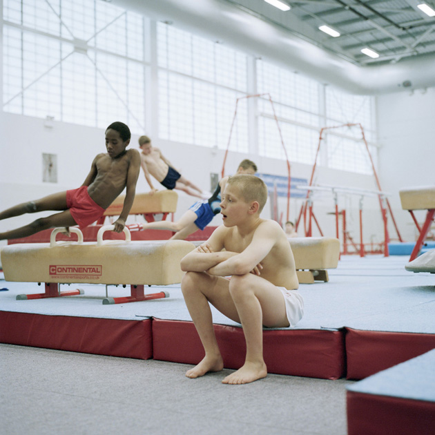
How, when and why did you decide to work as a photographer?
I always liked photography, I remember asking for a roll of black and white film for my 11th birthday and then making my poor younger brother dress up and pose in a field for me. But I never really considered it as a career. I went to University to study Graphic Design, but I wasn’t enjoying it that much. I did one module in photography and just loved the class and the tutors so switched to photography and I guess from then on just followed what everyone else was doing.
How you would describe your work and what early influences you think you had?
I find it really hard to describe my work. That’s one of the reasons I take photographs, so that I don’t have to describe in words what I’m seeing. Early influences..? Dan Eldon, Steffi Jung – a great friend and photographer I studied with, a book about Derek Jarman’s garden, Hannah Starkey and Tom Hunter.
How do you approach your work – how and why do you choose your subjects?
I think my approach is based on creating a personal bond with the person I photograph. I like spending time with people, talking to people, being in their homes, I spend a long time not even taking photos (in fact sometimes I even forget that’s what I’m there for). When I have a slight bond with a person, and if that person is interested in having their photo taken by me, I think that is when I ‘choose’ a subject. And generally if someone is open to talking to me then I’m drawn to take their photograph.
What do you aim to communicate through your work?
It changes with every project so it’s difficult to put it down to a single aim. I usually concentrate on the personal experiences of individuals to humanise a wider and more intangible, political or social subject.
What kind of projects you would be interested in working on next?
If it means meeting new groups of people or traveling to somewhere new I’m interested in working on it! I’m working on a number of different personal projects at the moment. One is about the English/Scottish border. I’ve been doing a series of road trips with a writer looking at the culture of the people living in the area. The Scottish referendum is in September and we wanted to look at people on the English side of the border (who don’t get to vote) looking at how the possible independence in Scotland would affect their life.
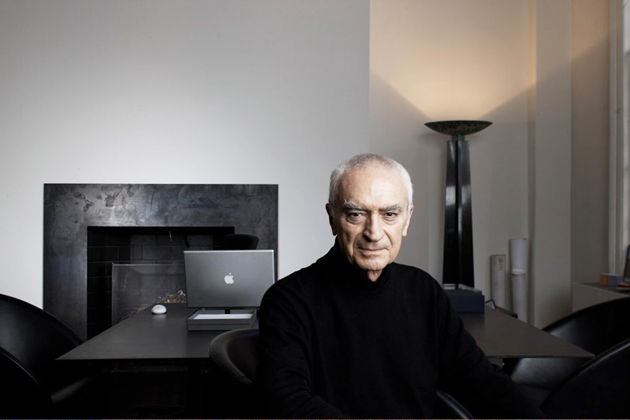
When the news of an open call for letters – to be addressed at Massimo Vignelli – expressing gratitude by all those whose lives had been touched by the great designer, first spread, it was hard to grasp the truth behind it. Massimo Vignelli, the grand master, the soul and conscience of modern graphic design, fell ill. He passed away last Tuesday, 27th of May 2014, leaving many of the said letters unread. Still, those which he did manage to read, spoke about “the quality of the work and the elegance of whatever we were doing in a project,” he said, adding “Let’s say if I died soon, I would die very happy. No regrets.”

Indeed, Mr. Vignelli had nothing to regret. During more than 60 years of work, Mr. Vignelli designed some of the most iconic, bold and lasting graphic design projects. An unconditional proponent of the Modernist Movement, he understood design as a way of reducing the vulgarity of our environment, continuously educating and refining our minds. For Mr. Vignelli, to design “is to decrease the amount of vulgarity in the world. It is to make the world a better place to be. But everything is relative. There is a certain amount of latitude between what is good, what is elegant, and what is refined that can take many, many manifestations. It doesn’t have to be one style. We’re not talking about style, we’re talking about quality. Style is tangible, quality is intangible. I am talking about creating for everything that surrounds us a level of quality.”
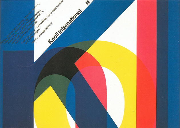
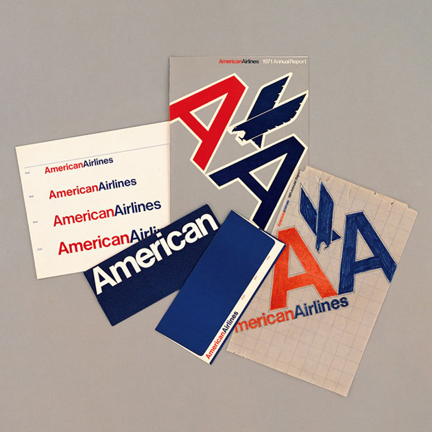
The level of Mr. Vignelli’s quality can be understood simply by mentioning that the visual identity for American Airlines, designed back in the 70s, was replaced only last year, with much rumour from the design community; while other notable projects, developed within Unimark International – the design company he founded in 1971 -, include visual identities for JC Penney, Knoll, Benetton, rather than signage for Milan or New York transport authorities. But more than leaving behind a myriad of great project, Mr. Vignelli left a legacy of young designers eager to follow his lessons about life and work. One of them, Michael Beirut, remembers one of the most significant lessons Mr. Vignelli taught him: “If you do good work, you get more good work to do, and conversely bad work brings more bad work. It sounds simple, but it’s remarkable, over the course of a lifetime of pragmatism and compromise, how easy it is to forget: the only way to do good work is simply to do good work. Massimo did good work.” Dear Mr. Vignelli, your good work will be missed.
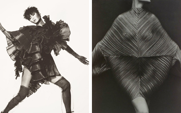
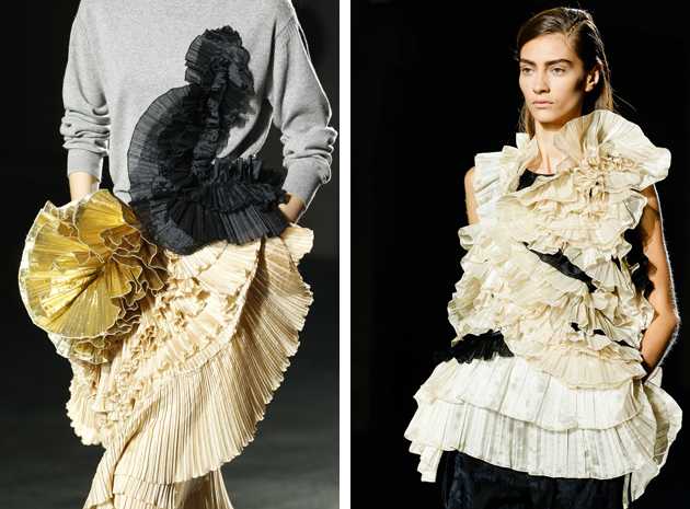
The plissé has conquered SS 2014 catwalks: taking over just every style and form – geometric shapes, a sporty flair, romantic and metal shades – the trend seems to live one of its golden times. As with almost any other fashion trend, the interest in pleated fabrics has a quite long history. Looking as far back as to old Egyptians and ancient Greeks, one can find interesting images portraying long wrap skirts and tunics. At the beginning of the 90s, Issey Miyake, the Japanese designer most known for his perpetual use of plissé, took inspiration from Mariano Fortuny, the inventor of the legendary Delphos robe, in turn a representation of the charioteer of Delphi.
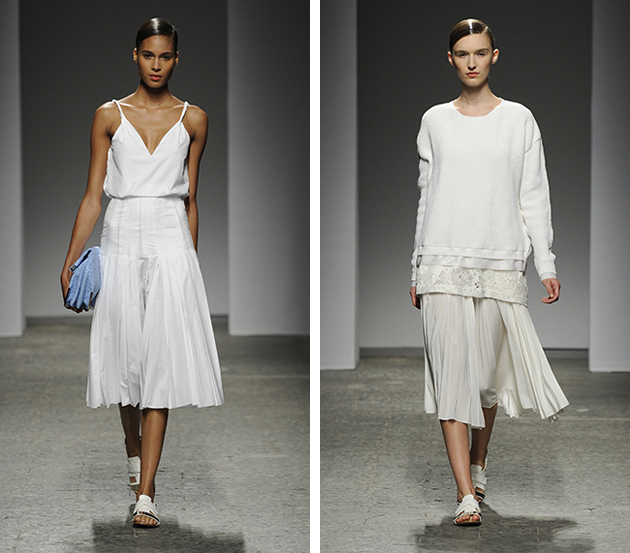
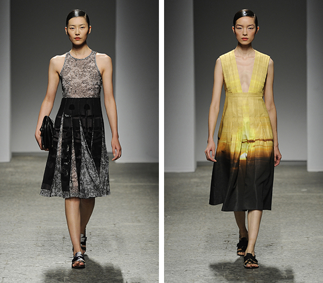
Nearly two decades later, this year we have enjoyed quite a lot of plissé on the catwalks: we admired the sculptured and refined pleated details such as the decorative frills on the clothing of Dries Van Noten; sporty and preppy lines created by Ports 1961; and, again, shimmering yet minimal choices of Proenza Schouler. For Dior, Raf Simons, keeps digging deep into the Maison’s roots, offering a contemporary interpretation of the New Look collection by making clothes shorter with an added modern twist.
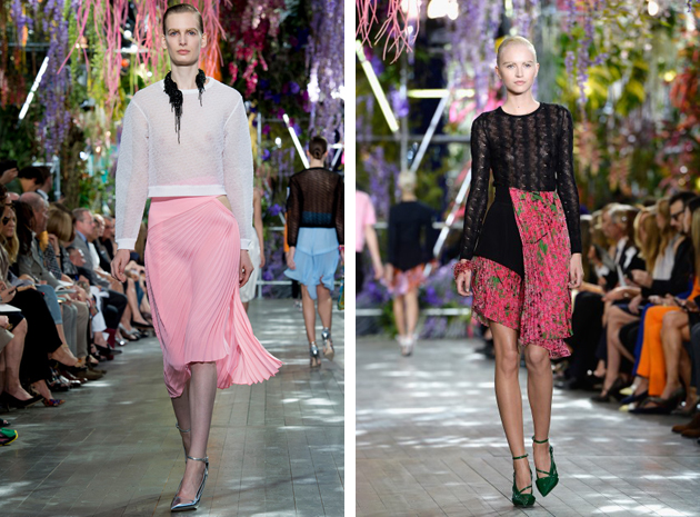
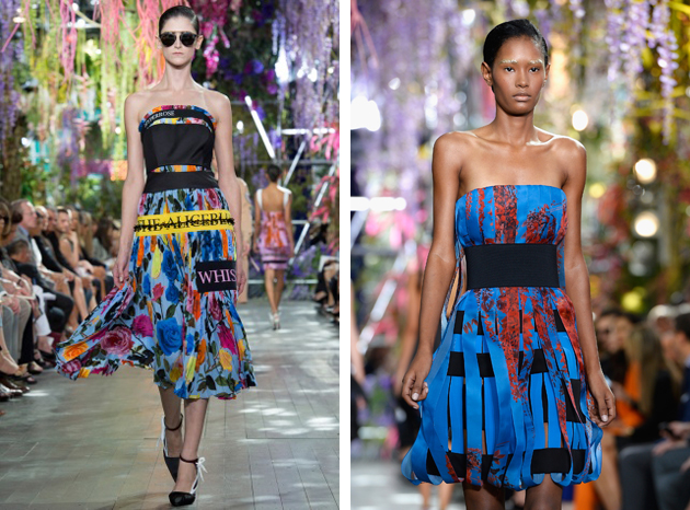
Bringing back the plissé, a technique that requires hours of patience and high ability in craftsmanship, can be understood as a call for bringing the quality back in fashion. Playing with something so hard to obtain, is a sort of a demonstration that deep knowledge and skill should always prevail over colossal industries and low quality.
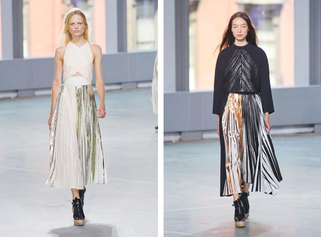
We are quickly approaching men’s fashion week and London is up first! Here are our suggestions of some of our favorite British designers.

Styling by Vanessa Cocchiaro
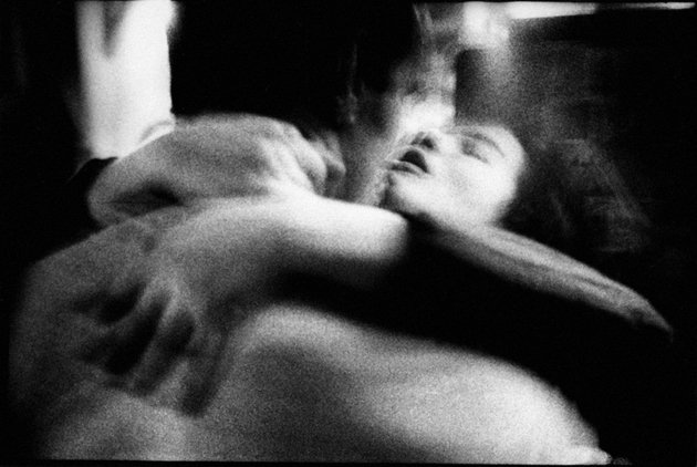
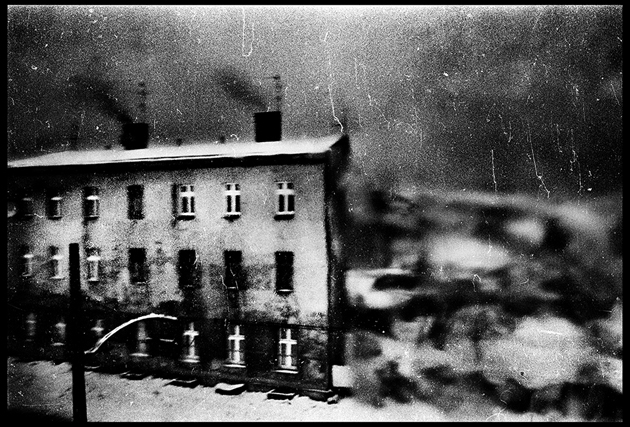
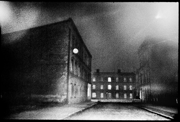
We went to mc2gallery to see the new exhibition of Michael Ackerman (b. 1967, Tel Aviv, Israel. Lives and works in Berlin and New York.) and ask him something about his life and work.
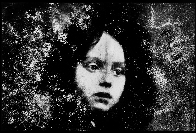
Could you tell us something about your personal story? When did you decide to become a photographer? How and why did this happen?
At university, at age 18 I joined a student photography organization and learned the basics from older students. I was immediately obsessed and unable to focus on my studies. In class I didn’t pay attention, I just waited for it to be over so I could go out to take pictures. I regret that now, but I was too young and immature to learn at that age. Photography ignited my curiosity about the world.
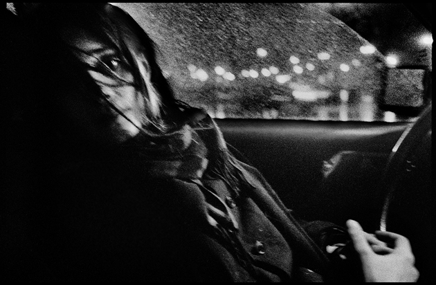
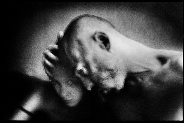
How do you describe your work? What type of camera do you use and how much does the media and printing process influence the final result?
I don’t like to describe my work but I guess it could be summed up as personal documentary. It comes from real life but it’s absolutely subjective. I use small, easy cameras. The printing is crucial and I work very hard on it. I still love to be in the dark room even if it’s lonely and so much of the time I don’t obtain the result I want.
Did/do you have any source of inspiration? Which one?
The same as everyone else. Being alive and being aware of death.
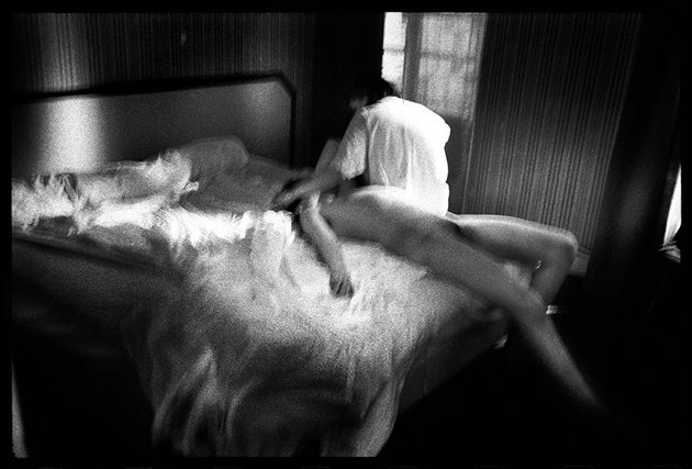
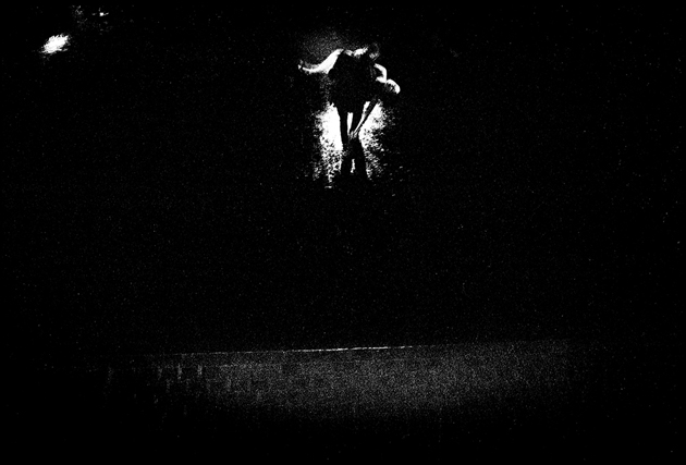
How do you get to a book project? Could you tell us something regarding your previous publications (“End Time City” and “Half Life”), how do these projects come about?
“End Time City” was made after several trips to India between 1993 to 1997. I had a box of prints, I don’t know how many. Through many lucky circumstances I was introduced to Christian Caujolle who pushed to have my work shown and still does. And I met Robert Delpire who agreed to publish the book. And the other ones when I thought they were ready. But it started when a good friend moved from New York to Milan and was showing people my work. He got me my first exhibition in Europe and then one thing led to another.
What do you usually do when you are not working?
Cooking, laundry, cleaning, playing with my kid.
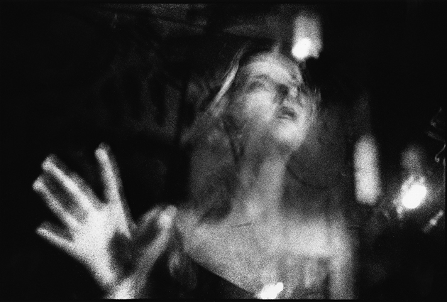
It seems that you are a hard traveller. What are your favorite places in the world and why?
I’m not a traveller. But I feel rootless and homeless. I don’t have a favorite place in the world but I have favorite places in different cities I go to. A small bar in Paris, the Jewish cemetery in Warsaw, the streets of Naples. Things like that.
What do you see in your future? Is there any project that you look forward to undertake?
I’m trying to do some things I haven’t done before. Little film portraits of friends. And finishing some old work. But I am very slow and not good at imagining the future.
