14/01/2015

Shinola: Made in Detroit

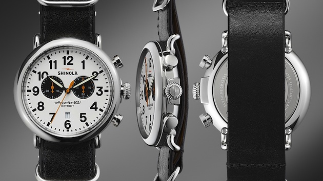
In 2013, Shinola opened for business in Detroit, Michigan. Shinola produces an eclectic line of products, items including stationary, bicycles and, most importantly perhaps, watches. Opening up shop in a city in economical despair seems like an unsolvable equation. However, it also allows businesses to easily find available labor and real estate opportunities blossom; the concept of a new lifestyle brand carrying the stamp “made in Detroit” may be just the key to insert a smile in the depression.

For Shinola, the aspiring dream was to make watches within US borders, working within the frame of luxury. Secondly, as the founder of Shinola, Tom Kartsotis, settled on Detroit as the home for his brand, the company found a fertile ground on which to expand its dream. Shinola has grown to represent a social story, not just of the niche corporate world, but of a wider community. Detroit and its residents had little to lose, getting actively involved in the project and injecting it with a lot of heart and passion. Hard work and challenging communities have become part of the brand’s profile and are often used as a clear indicator of its authenticity as a very real vision of the American dream. Its authenticity and a belief in a failed city, gave Shinola a resonance earlier than one would expect.
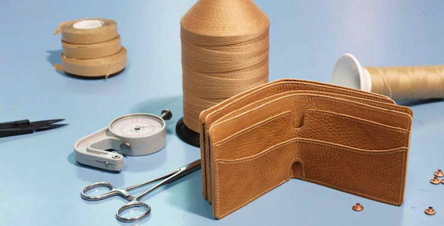
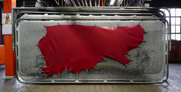
Using social media and other less expensive means allows Shinola to operate on much lower initial profit margins than competitors as well as letting them uphold the image of the people by the people and for the people. It is text book rhetoric, but with a contemporary spin. The story of the brand, its factory as well as the conception of “built in Detroit” may be representing a manual for creating an American lifestyle brand of the 21st century.
Victoria Edman 
Share: Facebook,  Twitter  
14/01/2015

Eric Bachmann: Muhammad Ali, Zurich, 26.12.1971

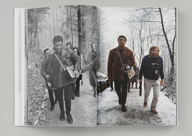
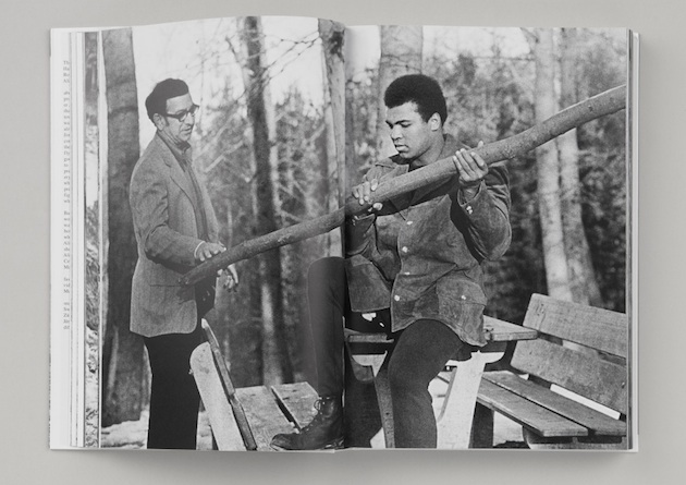
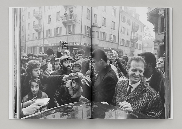
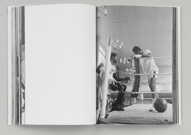
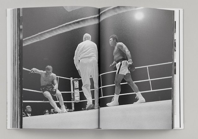
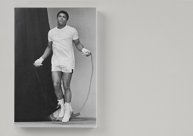
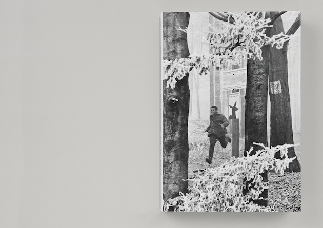
Good projects often hide interesting anecdotes. This is also the case with the book “Muhammad Ali, Zurich, 26.12.1971″, published by Edition Patrick Frey which shows the iconic American smooth-talking rhymester-boxer before and during his prize fight in Zurich against German heavyweight Jürgen Blin on December 26, 1971. Hans-Ruedi Jaggi, a Swiss hustler and promoter, succeeded in bringing the champ to Zurich for the fight. At Zurich’s Playboy Bar, Jaggi made a bet with Jack Starck, a society reporter for the Swiss tabloid Blick, for a bottle of Ballantine’s that, after having already got Jimi Hendrix and the Rolling Stones to give concerts in Zurich, he would now lure the mighty Muhammad Ali to town for a fight. He subsequently flew to the States three times but couldn’t get an “in” with Ali. Eventually he made it through to Ali’s Black Muslims. When asked by the clan’s spiritual leader Herbert Muhammad, “What’s with the dough?” he pulled $10,000 — pretty much all the money he had at the time — out of his silver ankle-boots and a preliminary deal was promptly signed and sealed on a sheet of hotel stationery.
Zurich photographer Eric Bachmann accompanied Ali during his ten-day stay, on his winter jog through Zurich’s woods or buying shoes in a working-class neighborhood, going through his training drills and, finally, during the big fight, which rapidly climaxed in the seventh round when he knocked out the blond German giant Jürgen Blin. Muhammad Ali, Zurich, 26.12.1971 documents the events in brisk chronological order, as befits a boxer who “floats like a butterfly, stings like a bee,” in a rapid-fire succession of impressively intimate and humorous shots against the placid urban backdrop of mid-’70s Zurich. The book is richly illustrated with a great many facsimiled boxing match program pages and newspaper clippings.

Rujana Rebernjak – Images courtesy of Edition Patrick Frey 
Share: Facebook,  Twitter  
13/01/2015

Daily Tips: Window Shopping

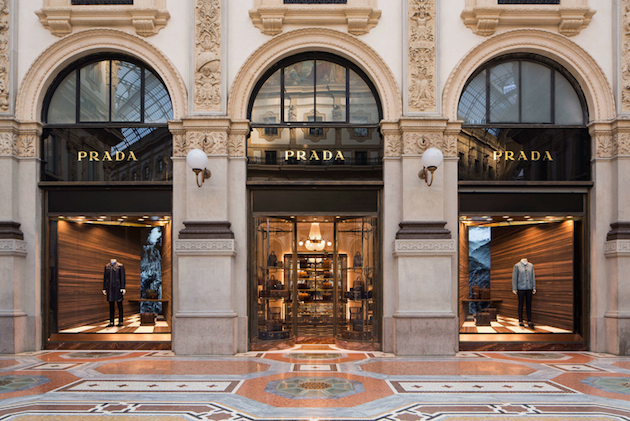
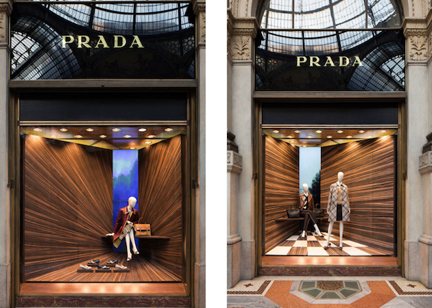
The most delightfully painful past-time – window shopping – has taken on a new tone with Martino Gamper’s recently unveiled window displays for Prada. The adored fashion powerhouse led by Miuccia Prada, known for her active engagement with contemporary art and design, offers playful shopping-not-shopping experience with windows clad in various types of woods which explore the notion of perspective. The project can be traced back to Gamper’s beginnings and an initial project which explored the idea of corners as a geometric space where the three dimensions meet: “It’s a very underused space in the domestic environment. It’s a place where the dust collects. Or maybe it’s a space for a plant. It’s a meeting for the X, Y and Z in terms of the three dimensional and a very defined 90° space. I wanted to work with perspective and create a way that when you look into a shop window you create a new space,” says Gamper. Well, those who have always avoided stopping in front of Prada’s shops fearing its inaccessible prices, now have a good excuse to linger in front of window of wonders.

The Blogazine 
Share: Facebook,  Twitter  
12/01/2015

Style Suggestions: Quilted

Quilted jackets are back in style this Fall/Winter, finally allowing you to stay warm and look great. Nevertheless, try to choose a style that is as streamlined as possible, so you don’t look like a marshmallow while keeping it casual and pair it with jeans and boots.

Jackets, left to right: Valentino, Rag & Bone, Paul Smith, Beanie: Saturdays Surf NYC, Shoes: Church’s

Styling by Vanessa Cocchiaro 

Share: Facebook,  Twitter  
12/01/2015

Blue Times at Kunsthalle Wien

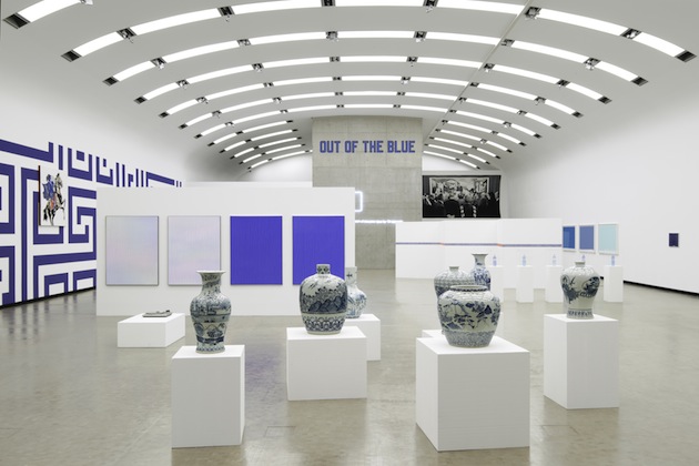
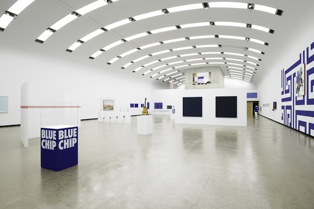
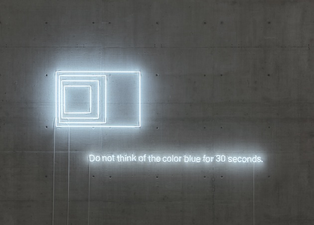
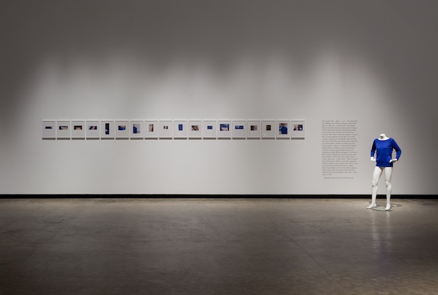
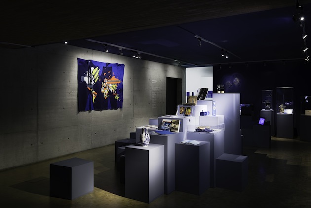
Scattered across Kunsthalle Wien’s hall lay a symphony of blue objects, surfaces, thoughts and ideas, bringing together a cosmology of meanings. Blue Times, a group exhibition featuring more than 30 international artists, presents positions dealing with the uses and meanings of the colour blue in different eras and contexts. Through investigating the specific iconology of the colour blue, the exhibition sets forth transversal ways of approaching the world of art, of images and of representations: How can we use a colour as a way of seeing, as a way of understanding our socio-political histories? The exhibition presents two positions: one that mirrors the overwhelming character of blue, and the other, correlated position, investigates its socio-political function as it shifted towards a certain conformist politics of representation.

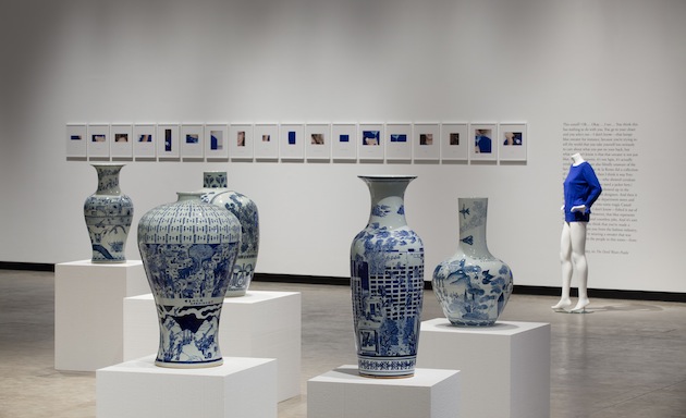
The artists included in the show represent these two positions: for British artist and filmmaker Derek Jarman, blue is a filter in absentia: touched by the HIV virus, he was not able to see the colour blue anymore. He dedicated pop odes to the colour, particularly in the eponymous film Blue. Of course, French artist Yves Klein’s famous International Klein Blue (IKB), which shifted the discourses of the authenticity of the pure idea and the validation of art as creation. Liam Gillick, on the other hand, is not interested in colour and form as such but as legacies of abstraction, as relics of modernist art theory and claims for universality. Most often, American artist Lawrence Weiner’s composed texts describe physical instructions, processes, structures and materials. However, the in-situ piece Out of the Blue plays with the immaterial dimension of the colour blue as well as its presence in or infiltration into our idiomatic language to convey mood and emotions, and can be read as an ironic comment on the whole exhibition endeavour. In a more literal way, EU (2011–2014) by Dutch artist Remco Torenbosch features utterances of different blue shades that circulate in the monolithic European Union, presumably symbolising alliance. Under the title China (2012), Lebanese artist Raed Yassin exhibits a series of seven porcelain vases investigating Lebanon’s struggle to come to terms with the aftermath of its civil war, a struggle marked by uneasy amnesia.
In the West, the omnipresence of blue in the domain of public design and private comfort is rooted in its psychological reception: the European eye apparently considers it to be the most pleasant colour. Hence, blue is both the perfect instrument to control minds and bodies and a tool to trace gender, class and political belongings. Blue is the anti-communist colour par excellence. Blue was also chosen as the colour of the European Union, selected to symbolise unity in difference, as well as the capacity to unite in consensus. Therefore, colour is first and foremost a social matter, a range of codes and values that are marked historically and geographically. Through colour, taboos and prejudices circulate and influence us, our environment, our language and our imaginary.

Rujana Rebernjak – Images courtesy of Kunsthalle Wien 
Share: Facebook,  Twitter  
09/01/2015

The Talented: Carin Wester

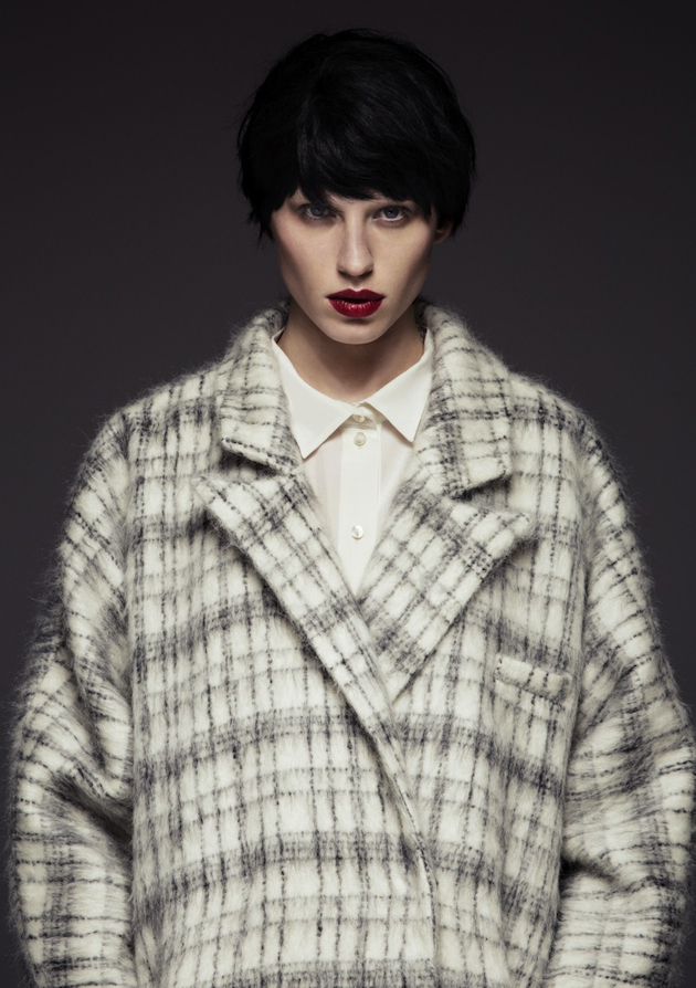
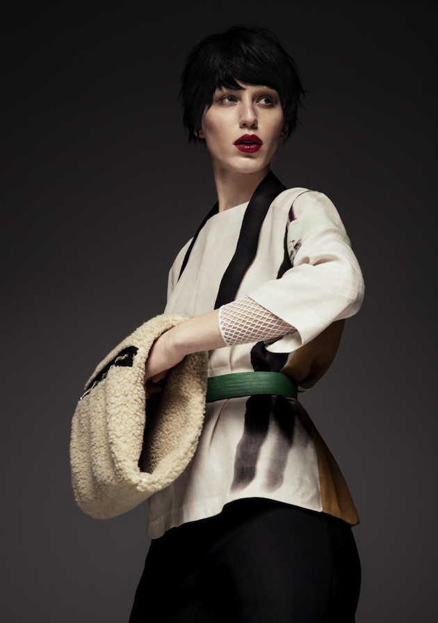
For over a decade, Carin Wester, the founder and designer of the eponymous brand, has pushed both her design limits as well as the norm of what has been considered ‘Swedish fashion’, becoming a symbol of progress and development for the whole local industry. At the beginning of the new millennium, a new generation of great designers were born in the until-then-uninspiring Swedish fashion industry. Among these was Carin Wester, who, after several years working as a designer for other brands, decided to create her own label which has grown over time to become on of the most recognized Swedish brands as well as one of the country’s most recognized international brands. Wester’s booming success has made her an exponent of the rapid development taking over the Swedish fashion industry in the last decade, with her designs capturing the clean yet experimental aesthetic that has come to represent the Swedish fashion today.

To celebrate her brand and long career in the industry, a couple of Carin Wester’s most iconic pieces from previous collections were once again produced as a ‘best of’ “10-years” collection. The collection gathers Wester favorites such as the fox tail pattern, printed on dresses and blouses, together with the perfect bomber jacket “Reva”. Significant for all her pieces are playful details, most visible in her choice of patterns, which welcome a deliberate comic influence and reaffirm Wester’s idea that should be fun. While Swedish fashion is often praised for its minimalism, Carin Wester shows a less serious side with unexpected details, unique cuts or fun prints that re-present the local fashion as clean and simple, but never boring.

Hanna Cronsjö 
Share: Facebook,  Twitter  
08/01/2015

Anonymity as Fashion Power at Martin Margiela

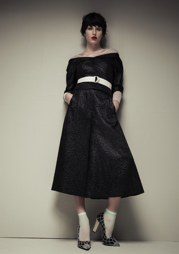
As the year 2015 begins, it is natural to wonder what it might bring. The fashion debate of the year may very well be John Galliano’s return to the industry, as he gets ready to take over Maison Martin Margiela as its creative director. Surely, one of the most surprising choices of the year, Galliano’s return to the fashion world, and no less in charge of the controversial Belgian brand, might be the source of many curious fashion wonderings.

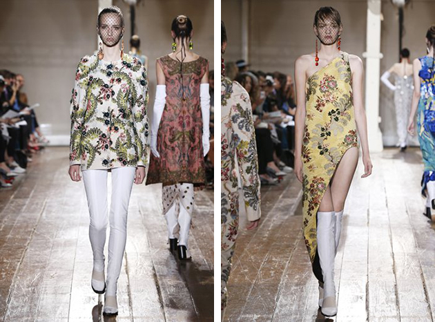
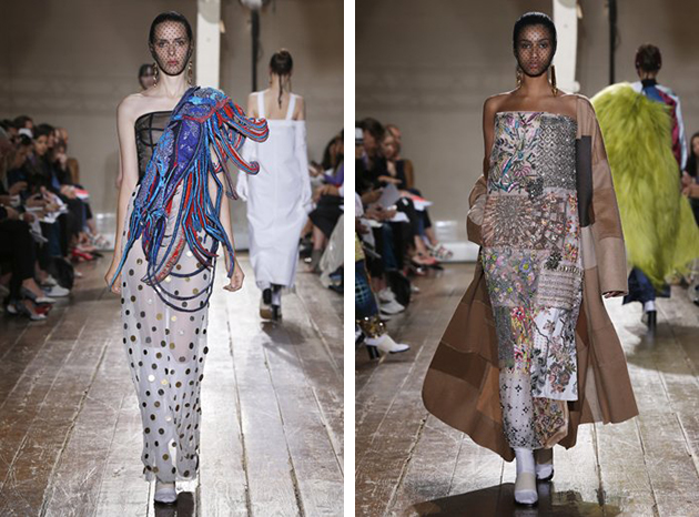
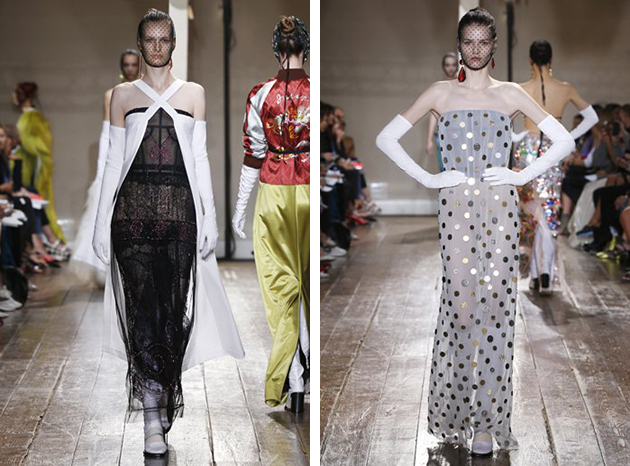
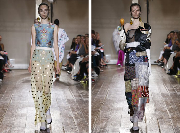
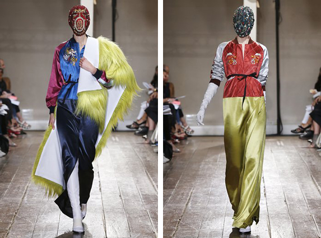
In the roaring Nineties, a dominating force of mass media reigned the public sphere and, in a dismissal of this culture, Martin Margiela embraced anonymity as a designer, for he was hardly ever photographed or interviewed. Instead, he decided that the collective “Maison Martin Margiela” would anonymously front the label. With the founder Martin Margiela’s departure from the brand in 2009, a new “faceless” group continued to generate its typically surreal collections. However, Masion Martin Margiela recently let their Haute Couture show bring the designer Matthieu Blazy out in the spotlight, in a calculated and smart media action – far from the brand’s origins – intended both as a farewell to the young talent (who subsequently apparently moved to Céline) and a clever showstopper which left people wondering about the maison’s future.

It is interesting that the brand shifted from a faceless designer to an infamous creative. After his fall from grace, John Galliano has much to prove, but also has little to lose and may therefore be the excellent vessel for the provocative creativity Maison Martin Margiela desires. Fashion, art and commerce travel hand in hand with this company dedicated to originality and surprise. Even though much can be said about Galliano’s personality, his work has often been provocative and fresh, and yet the question of ‘blending in’ will naturally haunt the designer and the label at least until the first collection is revealed. While having a very public face for the brand may become beneficial, its buzz value is only fictional and must be nurtured through time. Margiela’s determination to eliminate the public face of its design tea shifted the focus on the work itself, while it also brought a powerful blow to the illusion of an ‘almighty’ head designer being singlehandedly responsible for the success of a fashion house. In fact, Maison Martin Margiela proved what the power of collectivity really meant, but may now have fallen dependent to the trope itself.

Victoria Edman 
Share: Facebook,  Twitter  
07/01/2015

The Future of History: Julien Dossena at Paco Rabanne

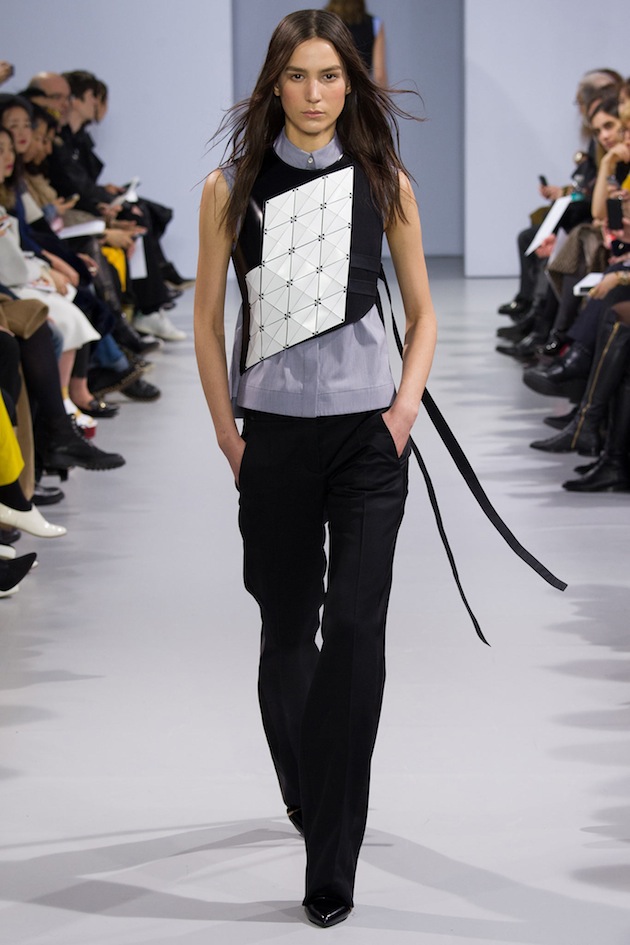
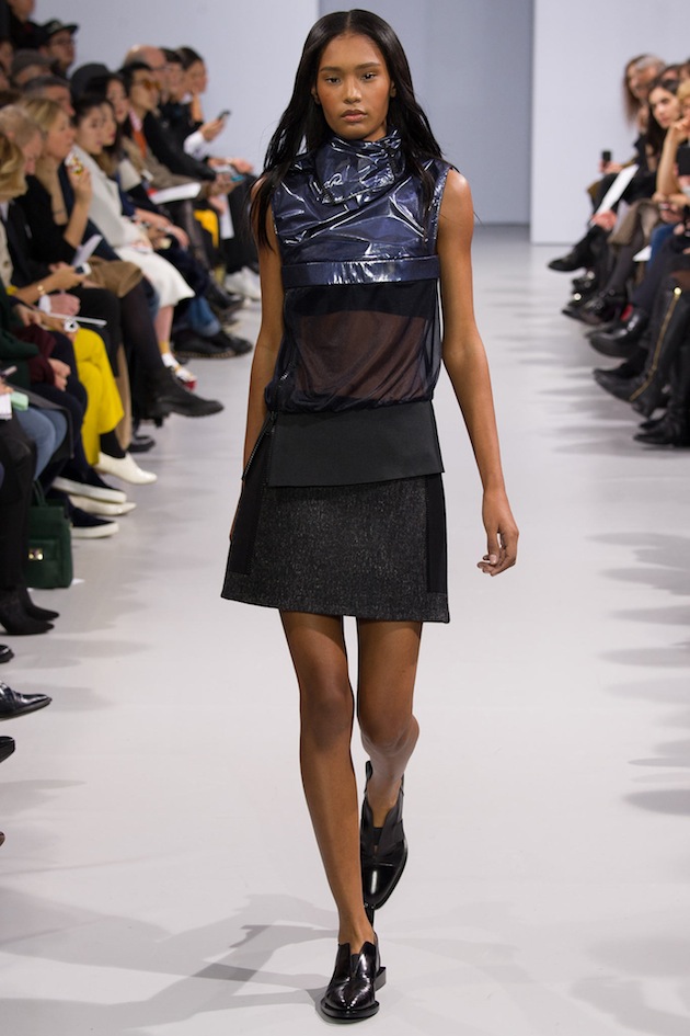
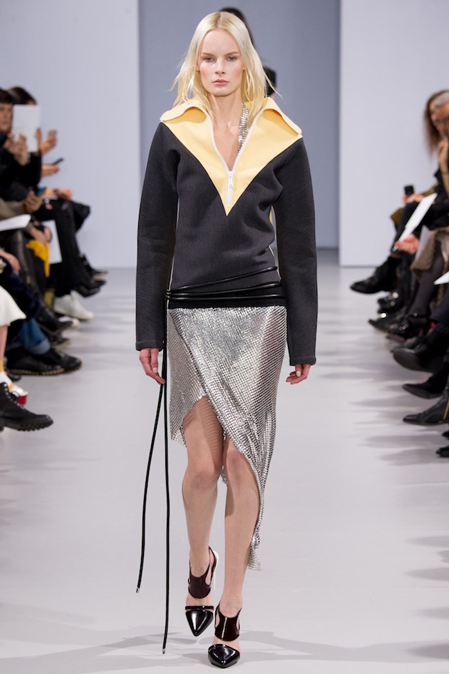
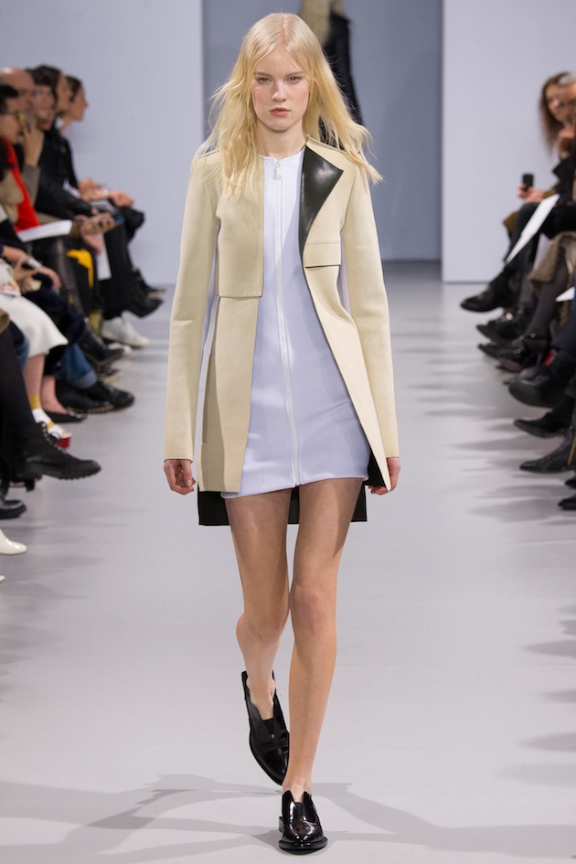
After the departure of Nicolas Ghesquière from Balenciaga, Julien Dossena didn’t want to continue his job as a designer at the French brand, and quit after working there for four successful years. While the choice appeared difficult and even slightly risky, the 31-year-old Dossena was soon rewarded with a consultancy at the historic maison of Paco Rabanne, just a few weeks after his departure from Balenciaga. Paco Rabanne needed a new take on its iconic futuristic design which has been the house’s signature aesthetic approach since the 1960s and Julien Dossena’s innovative take on fashion seemed the right way to lead its future. In fact, Marc Puig, the brand’s CEO soon appointed Dossena as the new creative director.

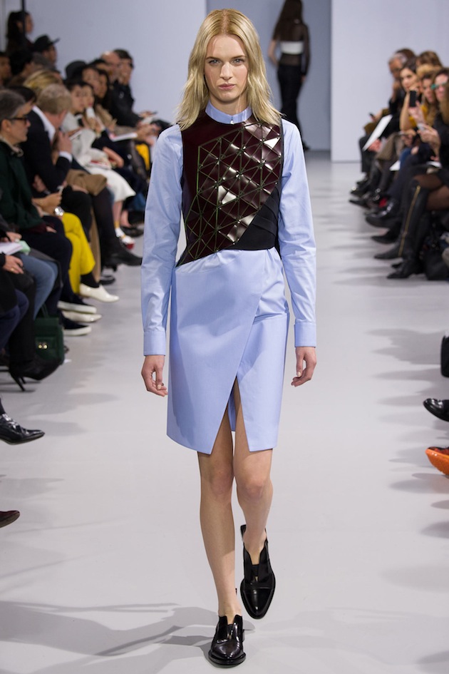
Julien Dossena’s first collection at Paco Rabanne was a celebration of the house’s futuristic legacy with glossy leather dresses, metal mesh tops, and silver jeans as its high points. Dossena seams to always have had a special relation to the Paco Rabanne’s design, understood as a celebration of modernity and rebelliousness – an aesthetics that Dossena wants to develop in the brand’s new collections as well as adjusting it to the modern women of today. This is not an particularly easy task, but we believe Dossena has succeeded with it so far, by showing collections that combine modernity with influences from the brand’s rich history. A key to this fine balanced success are his thoughts about design in general and his new position in particular, as the designer believes in sci-fi and design as a way of creating a whole new world, something that Dossena says Paco Rabanne succeeded in back in the days, and that it is now time for him to do again. Determined to respect the brand’s history while offering bold innovation, who could be better to build on Rabanne’s legacy, than Dossena?

Hanna Cronsjö 
Share: Facebook,  Twitter  
06/01/2015

Trend Watch: Prints for Men

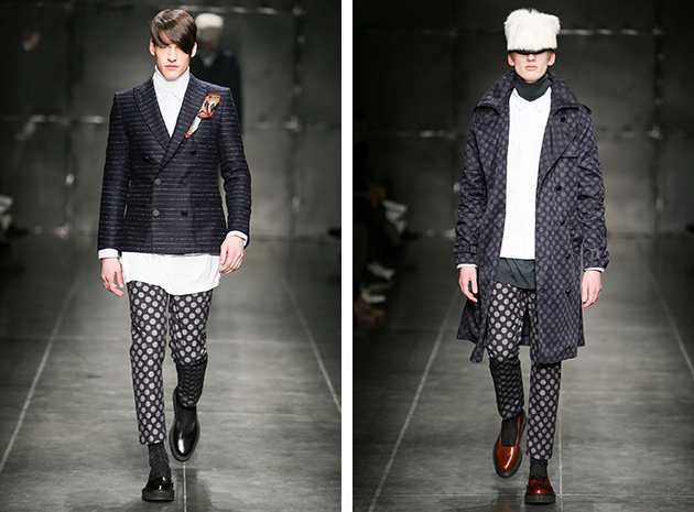
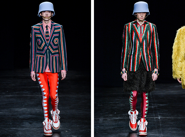
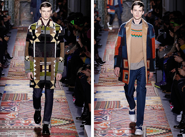
Prints are one of the main trends we recently saw on fashion runways, not only those for the last 2014-15 season, but for the past couple of years, too. From Andrea Pompilio’s contemporary approach, to avant-garde abstraction of Walter Van Beirendonck, up to Maison Valentino’s effortless elegance, prints are a bold highlight in current menswear.

Considered one of the most important creations in fashion history, textile printing was born as duplication of images. In Europe and India the act of printing clothing came before the one on paper. Until the seventeenth century, in fact, symbols and figures were usually printed on silk. The most interesting element in such an ancient phenomena, is the way designers combine the technique: we see medium-sized polka dots matched with narrow stripes, in Pompilio’s subtly ironic version. A different point of view came from Van Beirendonck, with optical prints meeting bright colors, skinny silhouettes and huge sneakers. Whether you look for classy style or a bit of pop extravaganza, prints are such a big tendency, you should not even try to escape from it.

Francesca Crippa 
Share: Facebook,  Twitter  
05/01/2015

Marcin Rusak Tells It With a Flower

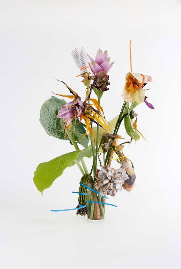
“Oh Rose, thou art sick”(*). London-based designer Marcin Rusak believes that flowers are a good metaphor to describe the way contemporary society feels about consumption. During his studies at Royal College of Art, and now with his own practice, he chose herbs and blossoms as a tool to inspect the multiple shades of our sense of possession, use and abandon. His family was his primary source of inspiration: his grandfather, and his grand-grandfather before him, worked as flowers growers in Poland, and Rusak spent a lot of time, during his childhood, wandering around abandoned greenhouses. This background offered him not only a technical knowledge in the field, but also made him experience the sublime aura, elapsed between ecstasy and decay, that flowers give off when their beauty is about to collapse: “And his dark secret love / Does thy life destroy.”(*)

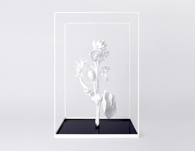
Named Flowering Transition, his series is made up of different projects that share a combinatorial and synaesthetic approach. With Flower Monster, Rusak launched a speculative project trying to imagine a bio-tech plant which may include all possible demands that, as customers, we would like flowers to satisfy: empowered duration, saturated colours, a healthy look. The result is a 3D-printed mash-up that subverts natural order and establishes a new, artificial and hyper-performing dimension.

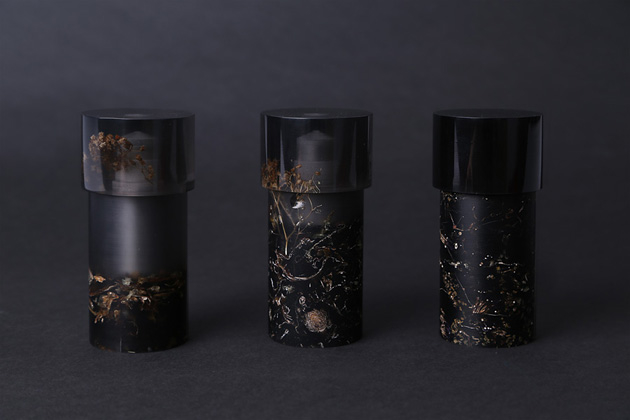
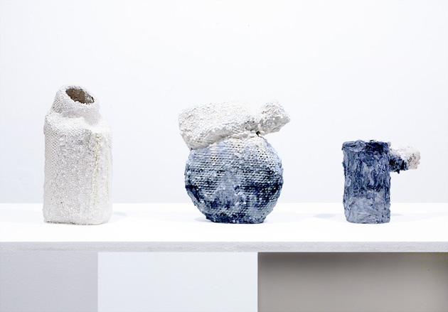
Perishable Vase, instead, calls into question our expectations about objects’ life cycle. Made of waste flowers and organic binders, the vase is not meant to last in time, just like the flowers it is supposed to hold. The world of scents is the subject of Flowering Transition: Fragrance. Its premise is a sad given: because of longer vase life or selected colours, flowers do not smell as much as they did in the past. With this in mind, Rusak distilled three rose scents which come from a different source – a supermarket, a market and a garden – highlighting how designation of origin is now involving all kinds of supply chains. But it is with Trompe l’oeil: Vessels that Rusak abandons the organic domain and transfigures – one more time – his beloved vase to simulate a proliferation of minerals over its surface.

As many other young designers of his generation – with a particular reference to those who completed their studies at the RCA, Rusak is not afraid to play with what could appear as, at least at a first sight, a dystopia. It’s a paradox of our times: while the industry of quality food seems to worship organic production as the only admissible pace of life, design refuses to idealize the pureness of nature and prefers to be tempted by the speculative dynamism of synthetic aesthetics.

(*)“The Sick Rose”, by William Blake

Giulia Zappa 
Share: Facebook,  Twitter