20/02/2013

The Gems of London Fashion Week – Part 2

The Gems of London Fashion Week – Part 2

We are continuing the London Fashion Week tour for next Fall-Winter season. Read the first part here.
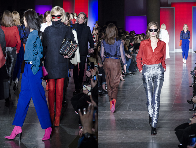
Paul Smith

The man himself is known for his cheerful demeanor, and his clothes followed suit, quite literally. Paul smith showed soft tailored trousers and blazers in jubilant colours, ranging from fuchsia and burnt orange to mauve and cobalt.

The bottom halves were finely twilled and either bag-legged or cigarette in style. The jackets were wide on the shoulders and draped, some sported single breasts while others double. The dresses were cut short and patterned only in an architectural trompe l‘oiel graphic. Geometric print found its way on to straight-legged trousers and silken blouses.

There was a resounding 80s overtone to the proceedings, broken up by the Aspen ready shearling polo necks – zipped up the back with tufts of furry curls poking out of the collar.
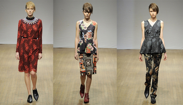
Clements Ribeiro

Graphic flowers blossomed over at Clements Ribiero on Saturday morning. The husband and wife duo introduced vampy lace, detailed beading and ladylike dresses dappled in florals to their standard offering of sporty luxe looks and cashmere cardis.

Clashing was core to the collection. The flower print was inspired by a Brazilian bloom, from Ribeiro’s native Brazil, while the quilting referenced a recent trip for the pair to Alabama. The scarlet lace was contrasted to Punk-y quilts and tartans.
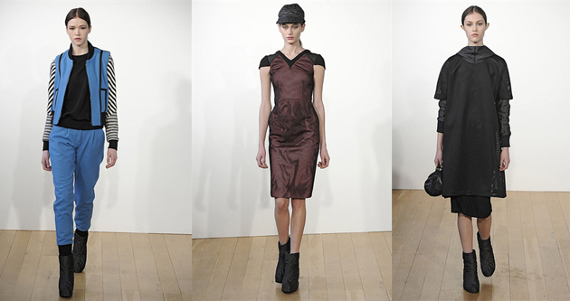
Christopher Raeburn

Christopher Raeburn is a designer who doesn’t follow fads. In fact, he riles against them. He is promoting ethical production grounds, but doesn’t define his work with it.

For winter he expanded his offering of outerwear and sporty silhouettes made of up-cycled fabrics and lace. With a rustic feel he took on camo-style textures, felted fabrics and water resistant techno-textiles. Lace – a feature of his SS13 range – popped up again, this time heavier and fitted on bomber jackets and decorating the shoulders of dresses. A metallic palate was served up with navy and army green. The success of a dégradé wool was the collections highlight and found its way from bombers on to jumpsuits. This designer’s quiet determination to produce eco-friendly clothing away from the hemp and scratchy stereotype is surely working!
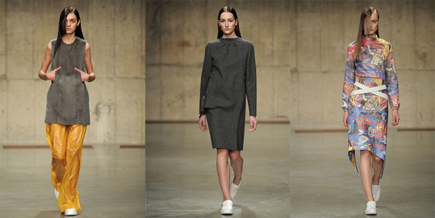
JW Anderson

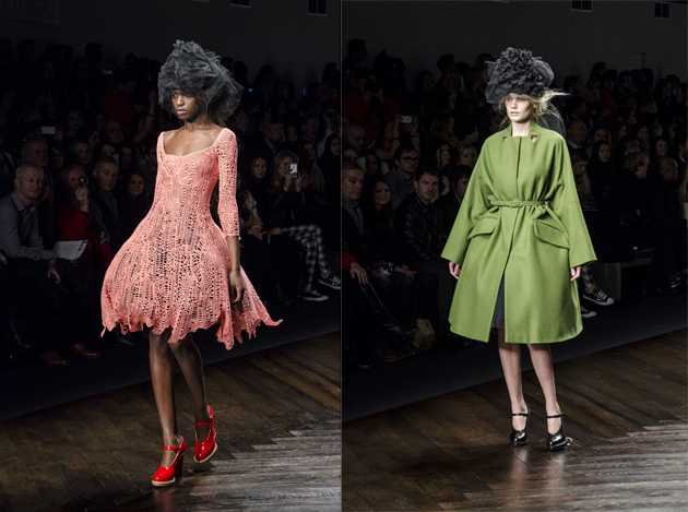
Recent news that the Irish designer JW Anderson would be following in the footsteps of PPR’s latest stable, Christopher Kane, to helm Versace’s Versus made many stand up and listen to this London-based label. Known for toying with androgyny, Anderson regularly sends his women out in structured, manly tailoring while his men’s line flirts with dresses and miniskirts.

For Autumn in the dank and dark underbelly of the Tate Modern in the space known as the Tanks, he sent out models with slicked-back long hair that bobbed behind tempered tailoring. He played with perception – dresses were open-back smock and long skirts were actually aprons revealing mini skirts from behind. And he toyed with restriction, the mid-length skirts had ties wrapped across the waist and white polo necks were banded with primary coloured strapping that hampered movements. Unusual eyelets and placement holes peppered the collection to show carefully arranged architectural fastenings. In between the restrictive pieces came absurd cartoon strip prints. Almost out of nowhere the patterns found themselves splayed across a sum of two looks.

Fabrics are always a fascinating factor with Anderson. He has always worked with techno-textiles and for winter he experimented with wet look fused fabrics, fur and varnished nylon.
Lucy Morris – First and last photo courtesy of Howard Melnyczuk

Share: Facebook,  Twitter  
20/02/2013

The Gems of London Fashion Week – Part 1

The Gems of London Fashion Week – Part 1

London is still considered as the baby of the fashion month schedule. But, with youth comes energy and eagerness, and the English capital lived up to its reputation. As home to the newest and most experimental, established and respected designers, the five-day showcase was dynamic. Hopping from show to show, the breadth of British design can be summed up by The Blogazine’s favourite London shows. Tune in this evening for the second part.
Vivienne Westwood

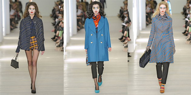
Vivienne Westwood showed just a stone’s throw from her first store on Kings Road at London’s Saatchi Gallery. The location itself was as interesting as the collection. The white walls and bright lights elevated the clothing, and like the art that usually calls the space home, her designs represented modern thinking and conceptual prowess.
The collection contained all the familiar Westwood touches, like a-symmetrical draping and hourglass silhouettes. Themes of animal prints came through early on, along with whimsical 1950s references, like the bundles of Marilyn Monroe curls the models spotted. Stronger 80s overtones came through in the collections latter half from sequin tops and prom dresses. The decade’s glitz was an unusual inspiration, considering that during the 80s Westwood rejected all of these tropes in favour of a rawer punk vibe.

The painterly makeup was a clever statement. It referenced the likes of Picasso with its strong black outlines and solid blocks of colour – eyelids were wet with vivid turquoise and saffron shades, and lips were smeared scarlet.

Marques’ Almeida

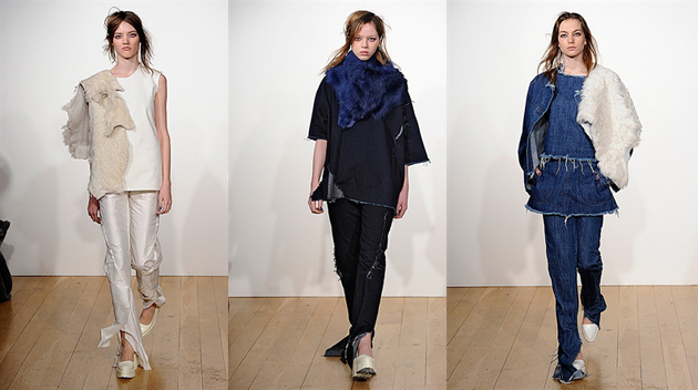
For winter Marques’ Almeida stepped out of their comfort zone. The Portuguese designers brought their street-style aesthetic to formalwear, a first for the pair.

The two-time NewGen winners and Fashion East alumn are an archetype of London’s design scene: experimental but referential. As always, Marta Marques and Paulo Almeida look to the 90s for inspiration – grunge is an obvious trope – and AW13 was no different. They dug deeper and sought the unaffected glamour of Winona Ryder for their reworking of classic eveningwear shapes.

The pair played with typical eveningwear silhouettes. Mimicking the billows of the ballgowns they showed, in jewel tones, wide pantaloons in raw silk. They brought rawness to refined fabrics like ponyhair and leather – marking them with typical Marques’ Almeida nonchalance of torn hems.

Layering was a persistent theme too. Skirts over trousers and fur throws made an appearance. A new jeans look moves their denim offering forward – slim on the leg, the rich indigo denim was torn at the ankle to create a dragging flair. They have again, successfully silenced critics who’ve questioned how Marques’ Almeida could expand their vocabulary away from just torn denim.

David Koma

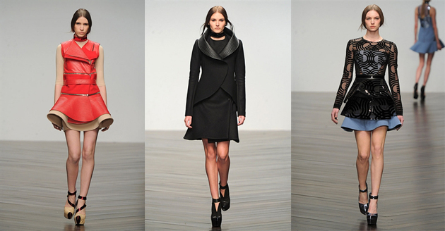
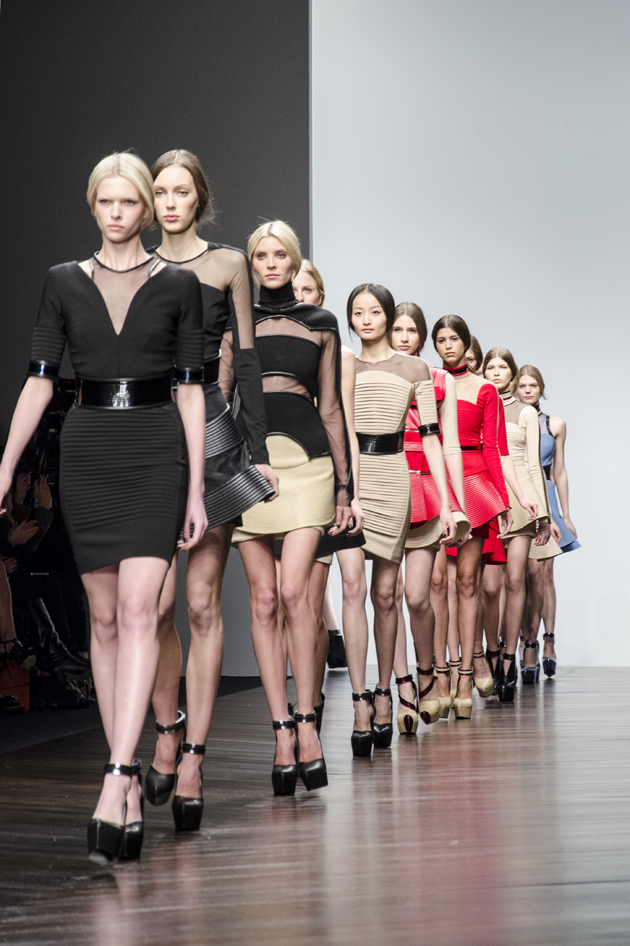
With the front row filled with blonde singers, like The Saturdays and Pixie Lott, Koma presented a collection fit for its audience. Rifting on the vinyl, the Central Saint Martins grad took the LP silhouette and bent, chopped and manipulated it across his collection.

In black, nude and pillar-box red, Koma sent out mini skirts and variations on biker jackets and waistcoats edged with space-age collars that circled the body. Sheer paneling played with the idea of cutouts for winter.

It may not have been a revolutionary outing for the designer, but it was effortlessly sellable – all looks came in black after all.

Lucy Morris – Last photo from Howard Melnyczuk

Share: Facebook,  Twitter  
20/02/2013

Kenneth Anger’s ICONS at Sprüth Magers Berlin

Kenneth Anger’s ICONS at Sprüth Magers Berlin

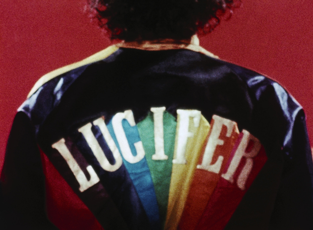
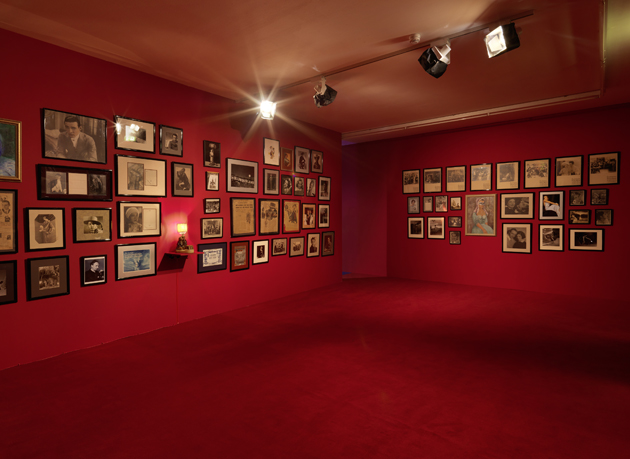
On a particularly cold winter night in Berlin a few weeks ago, Sprüth Magers opened the doors to their latest show – the American experimental film maker and artist Kenneth Anger‘s ICONS – and the gallery was quickly filled up with heavy winter coats and frosty cheeks. Kenneth Anger himself was seen wandering around together with a young assistant, bringing an extra dash of old school movie glamour to the evening. This is the last week to experience ICONS, which is based on an archive of film, photographs, scrapbooks, letters and memorabilia from Anger’s personal collection, and that previously was exhibited at The Museum of Contemporary Art, Los Angeles (2011-2012).


Kenneth Anger was introduced to film at an early age by his grandmother, and has been making his own films since 1937. In 1947 when the dreamy Fireworks was released, Anger got arrested for obscenity charges. Today he is considered one of the original filmmakers of American cinema and a countercultural icon. His films often merge surrealism with homoeroticism and the occult, and have made a big impact on mainstream film directors, post war popular culture in general (anything from queer iconography to MTV) and the aesthetic of music videos.

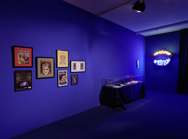
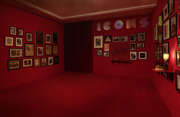
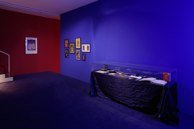
The two exhibition rooms have been painted midnight blue and crimson red to replicate the way the collection was hung in the artists’ own Los Angeles home. Entering feels slightly like stepping into a treasury, where original footage, tabloids and magazines from the early Hollywood years cover the walls, revealing Anger’s fascination with the film industry and the Golden Age of Hollywood. Centered around figures like Greta Garbo and Rudolph Valentino, ICONS airs a fascination with the mystique of classic stars, which also inspired Anger’s infamous celebrity gossip book Hollywood Babylon, published in 1975 and 1984.


In addition to the precious archive, the recent work Airship (2010-2012) is being shown, consisting of three short films based on newsreel footage of airships hovering in the sky. It’s a typical Anger fusion of occult magic, symbolism and mystery, with an almost supernatural quality to it. Stepping out of the exhibition into the very real, freezing cold winter night afterwards, feels like travelling hundred miles away from the glamorous, vintage and sometimes surreal universe that Kenneth Anger created. You better catch a glimpse of it while you can.


ICONS by Kenneth Anger is on view at Sprüth Magers Berlin until February 23rd.

Helena Nilsson Strängberg – Photos courtesy of Kennet Anger and Sprüth Magers Gallery

Share: Facebook,  Twitter  
19/02/2013

Supermarket 2013

Supermarket 2013

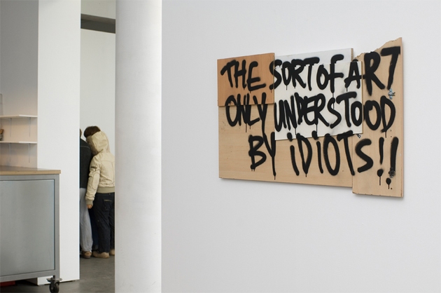
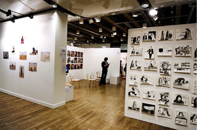
While speaking of art and its commercialization has become all the way a tautology, the Stockholm Fair “Supermarket 2013” proposed a new take on the argument. Hosted at the Kulturhuset from the 15th to the 17th of February 2013, this art fair represented the last step in the investigation of the different roles that artists may assume in the art world. Defined by Howard Becker as a complex system of production, commission, preservation, promotion, criticism, and the sale of art, the concept of the “art world” was at the centre of this event, as the artists did not simply present their works but were their active promoters. Not only as creators, curators or producers, but as gallerists.


As the artist and product manager of “Supermarket 2013” Pontus Raud explained, artists took their independence back, retaking the control of art and its system, which has up until now put them on the side. Started under the name of “Minimarket” in 2006, this art fair has gained attention, becoming the most important Swedish art fair and, consequentially, changing its name into “Supermarket”. The mission of this project was to let artists meet each other, present themselves to the market and have discussions together. Despite the enormous amount of art works, the attention here wasn’t supposed to be limited to unique creations but to the whole gallery, which became the very focus on the event.

Here, the discourse of art moved from the object to the practice of the gallery, like in the case of The M{}esum. “There are many museums in the world but only one muesum”. Hypothetically based in Jonasstrasse 57 Berlin, The M{}esum is presented as the world’s greatest museum of lost human history and culture, collecting, conserving and exhibiting n∅bjects from the ancient times to today. In The M{}esum, you will (or won’t) find all the lost objects of the world.

Indeed, “Supermarket 2013” always tries to bring it all back home. Even when there is nothing to bring back.

Marco Pecorari

Share: Facebook,  Twitter  
18/02/2013

Capote, Revised

Capote, Revised

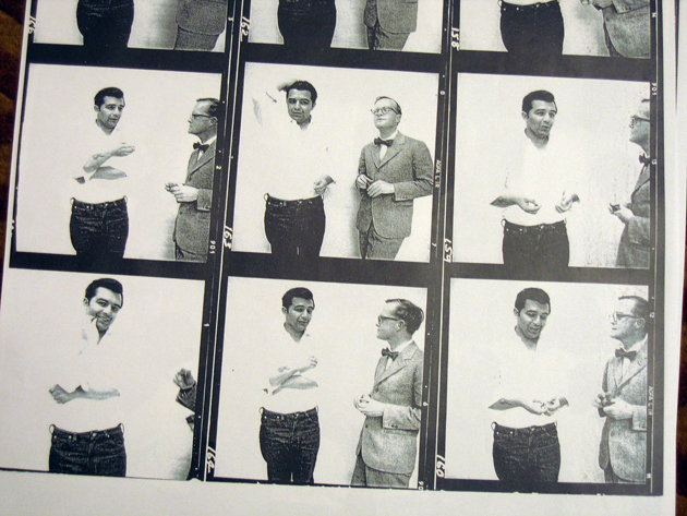
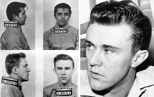
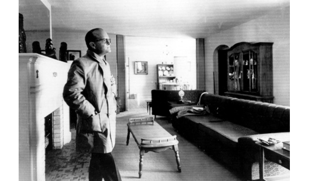
If he were alive today Truman Capote would be thrilled to know that his true crime novel In Cold Blood is still making headlines. First came the news that Florida prosecutors were exhuming the bodies of Perry Smith and Dick Hickock — the novel’s killers who were convicted and hanged for murdering the Clutter family in Holcomb, Kansas in 1959 — for new DNA testing in connection to a similar murder that happened in Florida barely a month after the Clutter massacre. And now The Wall Street Journal has dug up an old legal document from the Kansas Bureau of Investigation that reveals what many of the book’s most vocal critics have suspected for years: that Capote altered facts and fabricated crucial elements in his story, in part to cast the novel’s protagonist, detective Alvin Dewey, in a more heroic light.

Along with the likes of Tom Wolfe, Gay Talese, and Norman Mailer, Truman Capote is often credited with the rise of New Journalism, a literary movement that boomed in the late 60s and gave birth to the idea that you could incorporate fictional techniques into fact-based journalism. “I got this idea of doing a really serious work,” Capote has said of In Cold Blood. “It would precisely be like a novel, with a single difference: every word of it would be true from beginning to end.”

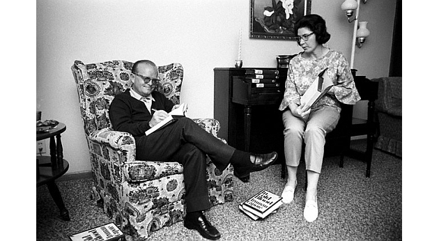
With help from childhood friend Harper Lee, Capote spent five years meticulously researching and writing In Cold Blood, accumulating some 8,000 pages of notes in the process. During that time he and Lee struck up an unusually intimate friendship with Alvin Dewey, the lead detective on the Clutter case. Dewey gave Capote unprecedented access to the investigation, allowing him to frequently visit the murderers, view confidential documents, and even take a look at the contents of 16-year-old Nancy Clutter’s diaries. Dewey and his wife also persuaded many hesitant Garden City residents to talk to the famed author.

In return, Capote massaged a few key facts, one of which makes Dewey and the KBI appear more competent than they actually were. After nineteen days on the cold trail, Dewey and his men received a tip from Floyd Wells, a former cellmate of Dick Hickock, that eventually led to the murderers’ capture. In Capote’s version of events, Dewey acts immediately on the tip by sending a dispatch to Dick’s farmhouse that very night. In reality, according to the KBI document and Duane West, a former prosecutor in the case, Dewey initially dismissed the tip and waited five days before changing his mind and acting on it. “Alvin Dewey pooh-poohed the Wells tip,” West told the Journal. “He said Wells was a no-good criminal who made the whole thing up.”

Capote’s smudge is mostly inconsequential in that it didn’t change the outcome of the case. Dick and Perry were caught within six weeks, convicted in five months, and hanged in 1965. But the discovery makes fresh the central accusation that’s trailed In Cold Blood since it was published in 1965: that Capote changed the facts to suit his story. What’s more damaging is that the KBI continue to stand by Capote’s version of events, even though it’s now clear that his version contradicts their own department’s official records.

Dewey always maintained that he gave Capote the same treatment as every other journalist. “As far as showing him any favoritism or giving him any information, absolutely not,” Dewey said in an interview before his death in 1987. “He went out on his own and dug it up.” That’s not true. In their correspondence Capote frequently addresses Dewey as “Foxy”, expresses gratitude for being given Nancy Clutter’s diary entries, and even arranges for Dewey’s wife to be a consultant to the 1967 film version of the novel, which earned her $10,000. To say that their professional relationship was ethical is something of an understatement.

But Dewey did admit, in an interview with The Garden City Telegram, that the treatment people received in the novel largely depended on whether or not Truman liked them. Of those people, Dewey told the reporter, “I was the luckiest.”

Lane Koivu

Share: Facebook,  Twitter  
18/02/2013

Don’t Mind The Gap

Don’t Mind The Gap

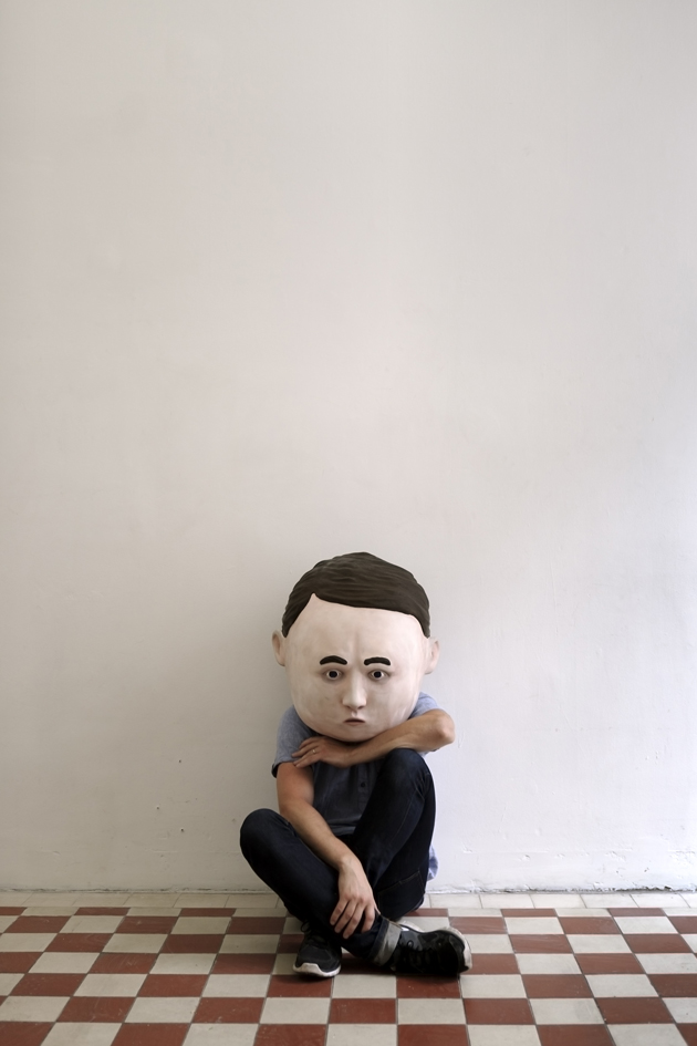
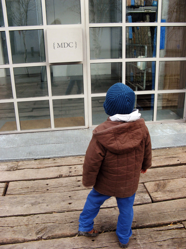
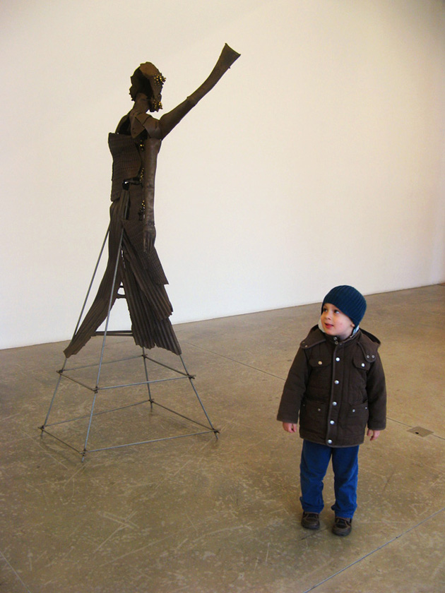
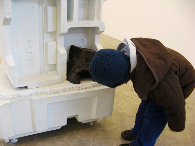
Do you know what a ‘aedo’ is? In the ancient Greek, it was a professional singer, a bard, considered as a prophet who, thanks to his blindness, was able to sharpen his attention and sensibility, without getting sidetracked by anything and anyone around. And “a contemporary aedo, interested in history, with force spells”, is the self-definition of our unusual guest: a little storyteller and mythology lover – so short that he needs to be carried to get closer to the artworks –, thrilled about the idea of visiting and freely reviewing an art show for us, unconsciously turning himself into its added value. We are at Massimo De Carlo gallery in Milan and Rodrigo B. (b. Milan, 2008) tells us something fresh and original about The Bronze Age, an exhibition that, at first glance, didn’t seem to have so much to say.


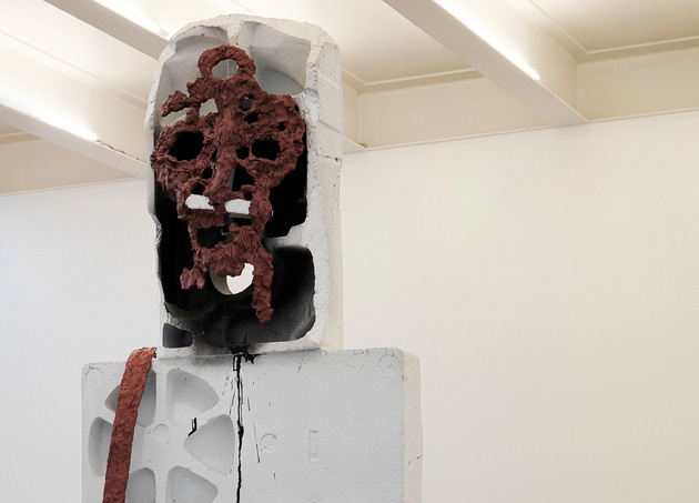
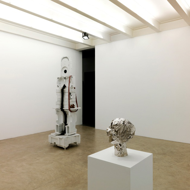
The gap between the size of the works and the child’s height influences his first impressions, but the point of view is undoubtedly fun, imaginative and genuine. The Ghost of Human Kindness by Huma Bhabha reminds Rodrigo of a bogeyman “the monster’s body is made of white stones, while one of his foot is of wood. He has a scary face, and the stones have pockets where he can hide arms. He is a giant, or maybe it’s me, I’m too little. Do you think he’s a friend of Gulliver’s? (…) I think the monster is a ghost, he is white as usually ghosts are”.

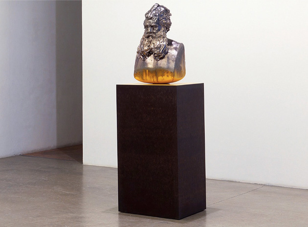
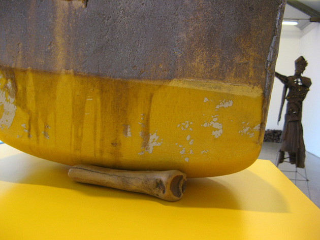
The sculptures seem to come alive, and from the “stubborn head” exhibited by George Condo we move to Steven Claydon’s A Corrupted Alloy: “This man is looking at me. He is made of silver and has a long beard. It is a blurred sculpture. Yes, I’m pretty sure he is Ulysses. I can recognise him from his beard, which grew while travelling ten years to go back home. He has a bulky head, enlarged to host the memories of all the events he lived. If you look at him from behind, you see two colours, dark yellow and black. It seems that his hair moves. Then, I cannot see it, but behind the sculpture there is a bone, I’m wondering why, maybe it is a magic arm that Ulysses will use when in need. You know, he is so smart”.


The Ibo created by the ironic, conceptual/pop French artist Bertrand Lavier attracts Rodrigo’s attention “he looks like a baby, a silver, super smooth baby with a belly full of ice cream. He is a baby coming from a tribe, here’s why he is undressed; he doesn’t need clothes where he lives. Isn’t he afraid of living among such strange sculptures?”

“Look, what a beautiful sculpture – Untitled, 2008 by Thomas Houseago. It has only an eye; the other one is closed. Astute face. It’s all black and it makes me feel the need to bite it like a piece of chocolate. I would ask Santa Claus to bring it to me, is it for sale? Where could I buy it?”
Time goes by so fast, and in a flash the visit comes to its end, we make the point of the situation: “This exhibition is for brave guys like me. It is a show for men, or for women, who are not afraid. I like the sculptures, and also the wood on the corner (Ed. Note, Bartolini Massimo, Deposito 2013); is it a sculpture too, right? This gallery doesn’t have the flooring. The works of art displayed are not so much; I think that’s good because you don’t get tired. Maybe we need some music and pillows to sit down comfortable while chatting about our impressions. The works are set too high for children like me. I’d like to touch the sculptures, why isn’t it possible? I’ll be careful; I won’t break them, I promise!”
/p>


Rodrigo B. & Monica Lombardi, special thanks to Emanuela Torri at Doremilab

Share: Facebook,  Twitter  
17/02/2013

Sunday Breakfast by Love For Breakfast

Sunday Breakfast by Love For Breakfast

I thrust the cloth of dreams in an apple pie prepared for the weekend. It brings the flavors of moments of peace.

Alessia Bossi from Love For Breakfast

Share: Facebook,  Twitter  
15/02/2013

Belgrade: I’m Just Like You

Belgrade: I’m Just Like You

The motto of Belgrade is “nema problema”, “no problem”. To make you understand the sense of it, here’s an example of a conversation with my guide: “You’re late for your date? Don’t bother!” “Do you want to leave already?” (after a three-hour lunch in the bohemian district of Skadarlija where, maybe, the concept of slowness has even artistic implications)”. “Antonio, there’s no hurry… here’s some grappa. What was I talking about?”


Even if you wouldn’t be so lucky to be accompanied by a guide who speaks well (and a lot) your language, sooner or later you will understand the motto of Belgrade by yourself. Doesn’t matter if it’s a matter of sipping a coffee in a bar or deciding a budget for a national event, the Belgradians are animated by a background of gentle lazyness that infects you (almost) without an escape. The meaning of this behavior isn’t clear to me, even if I get the sense in it. This city has a sad past, marked by wars and poverty. Maybe after years of sufferance these people are just breathing easy and, quite simply, what to you sounds like a problem or a difficulty, for them is just an ordinary setback.

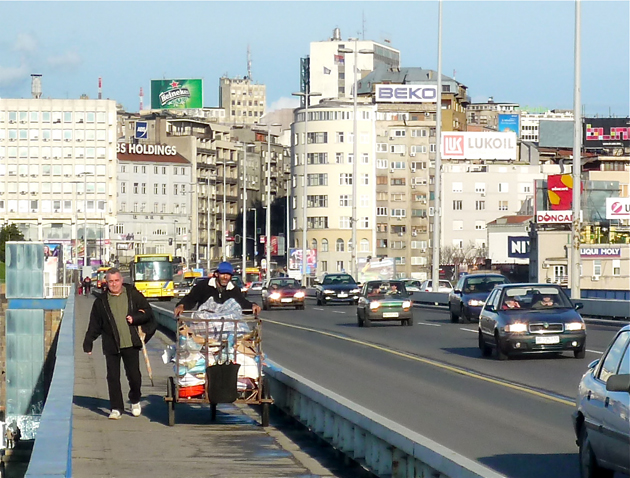
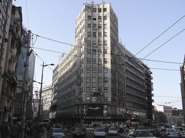
The district of Terazije is the emblem of the troubled history of this city. After the Second World War it was stripped of its fountains and flowerbeds and turned into a grey jumble of squared tower blocks with a Sovietic look, which all the years made even uglier. At the end of the 90’s they didn’t manage to put in action all the good intentions for urban redevelopment, when Nato bombardments on Belgrade during the Kosovo war obligated local administration to use the few available funds for the reconstruction of the damaged buildings.

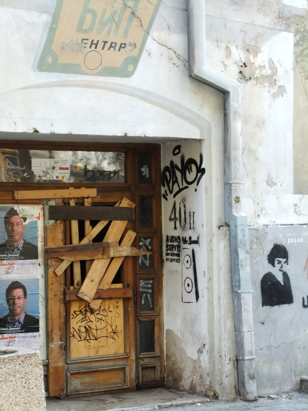
Many of them are still there today: old monsters of cement and rusty iron, in the middle of the city, between bazar-looking coffee bars and Ikea-style shops. The best way to get a sense of these brutal architectural contrasts – of the melting-pot between the ottoman heredity, the modernization and the socialist mark – is to walk up on Kalemegdan, the hill of Belgrade’s ancient fortress. Today you will find here the most important park of the city, from which you can also watch the confluence between Sava and Danube, the two rivers that flow through Belgrade. You can’t really appreciate this city if you don’t come here.

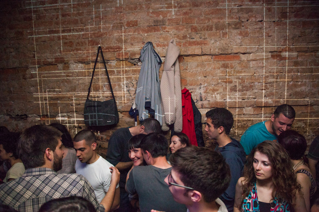
The restaurants that overlook on Danube are favored by the Belgradians, especially at evening time, for a happy hour or a dinner. The style of the youngsters of the city, generally sneakers and tracksuits for men, skinny jeans and high heels for women, can turn up some tourists’ nose (especially the Italians’, who arrive with matching belt and loafers), but that is also a nice thing. Finally, the beauty of this city is, in spite of all its problems, the effort of leaving home the Ugly Duckling clothing and looking normal, forgetting the past and, sometimes, the hard present too. This happens every year in Novi Sad, 90 km away from Belgrade, where is being organized the Exit Festival, one of the most important summer events throughout Europe. Tens of thousands of young people come from Serbia and all the world for five days of fun. In these days problems are forgotten and only music wins.


Antonio Leggieri – Images courtesy of Christof Autengruber, Xevi V, Daniele Pasci, Paradasos, Pearl Roig

Share: Facebook,  Twitter  
14/02/2013

Confezione Italiana

Confezione Italiana

There was a time when Italian fashion was not such a world-known and celebrated industry. On the contrary, it was a young and still local phenomenon. From the beginning, though, it had shown great promise of becoming one of the leading Italian trades.

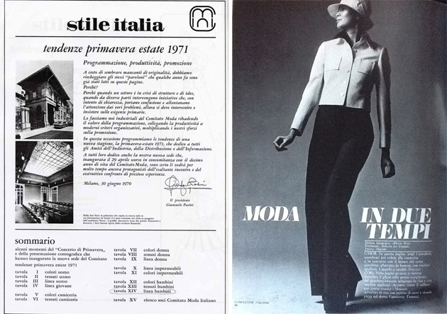
This all was happening when Fascism ruled Italy and fashion had been posed under the institutional control of an association, the AIIA (Associazione Italiana Industriali dell’Abbigliamento). Its role was to study, execute and promote clothing production, nationally and then abroad. To do that, a committee board was created: the Comitato Moda, which was in charge of trend research and the task of spreading the results to the industry and manufacture. It was necessary to keep up with Paris’ fashion status, and to be able to propose a valid alternative to it with the Italian trademark.

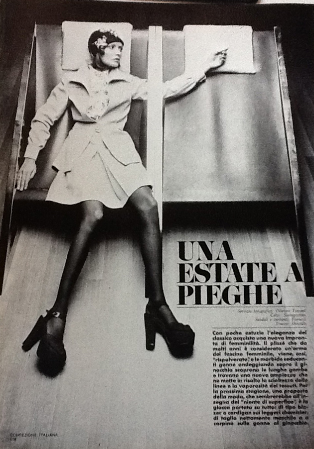
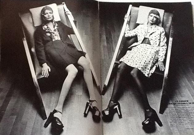
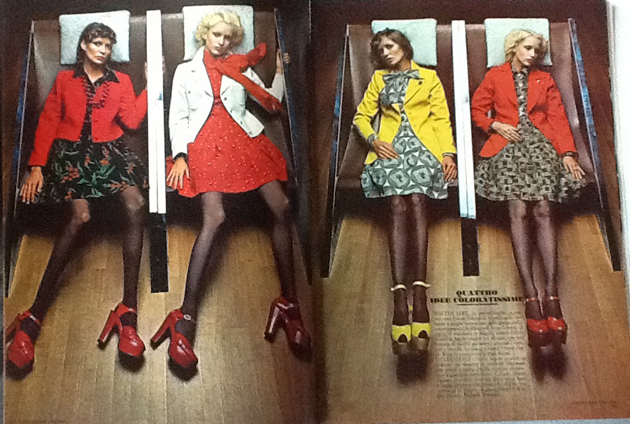
One of the aims of Comitato Moda was the publishing of its official magazine, Confezione Italiana in 1969. The idea was to create a publication addressed to the industry and the designers, as well as consumers, in order to always state one and only trend throughout the nation. From the first issues it featured at least a hundred of the major Italian productors and designers such as Biki, Iole Veneziani and Marucelli.


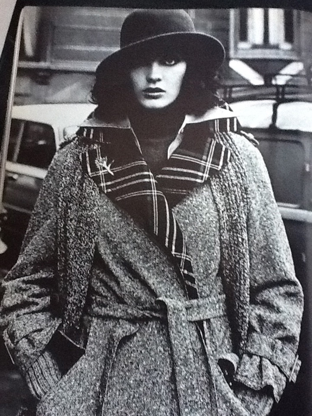
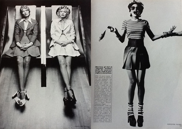
Fashion photography was central in every issue. Themes and locations were chosen according to the trend they should promote: ‘Weekend in the mountains’ for skiing garments, ‘Autodrome’ for leather jackets, ‘Sunday at the stadium’ for casualwear, and so on. What sounds predictable and without potential of making any change, turns out to be the exact opposite if seen live. The spreads are really hard to believe coming from the Italian 70s, as the suggestions they gave and the atmospheres they created were extremely contemporary, so much that they recall the magazines spreads we see nowadays. It is not easy to tell if they were avant-garde at the time, or simply so strong that they are still inspirational today. What is certain is that the atmospheres – playful, careless and unserious, but elegant and refined too – are the same we can find even now.

This was when and how Italian fashion developed its main features, so antithetical from the French fashion: being fun but desirable, suitable for everyone, anytime.


Sara Golfetto

Share: Facebook,  Twitter  
14/02/2013

Pour Homme Pour Femme

Pour Homme Pour Femme

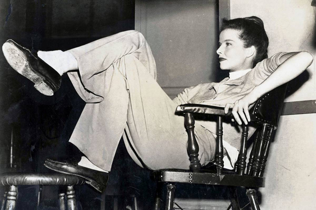
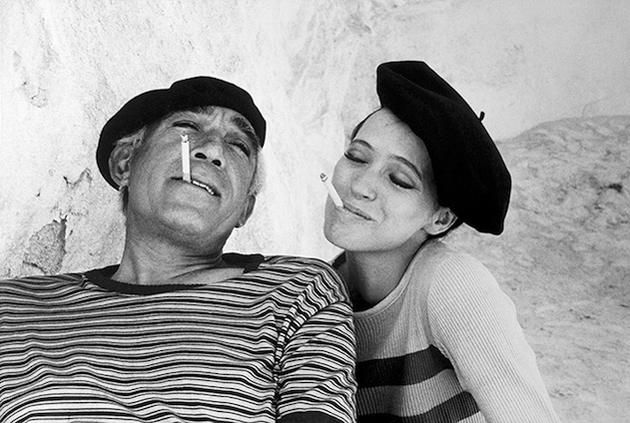
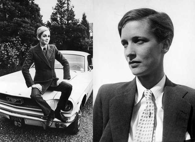
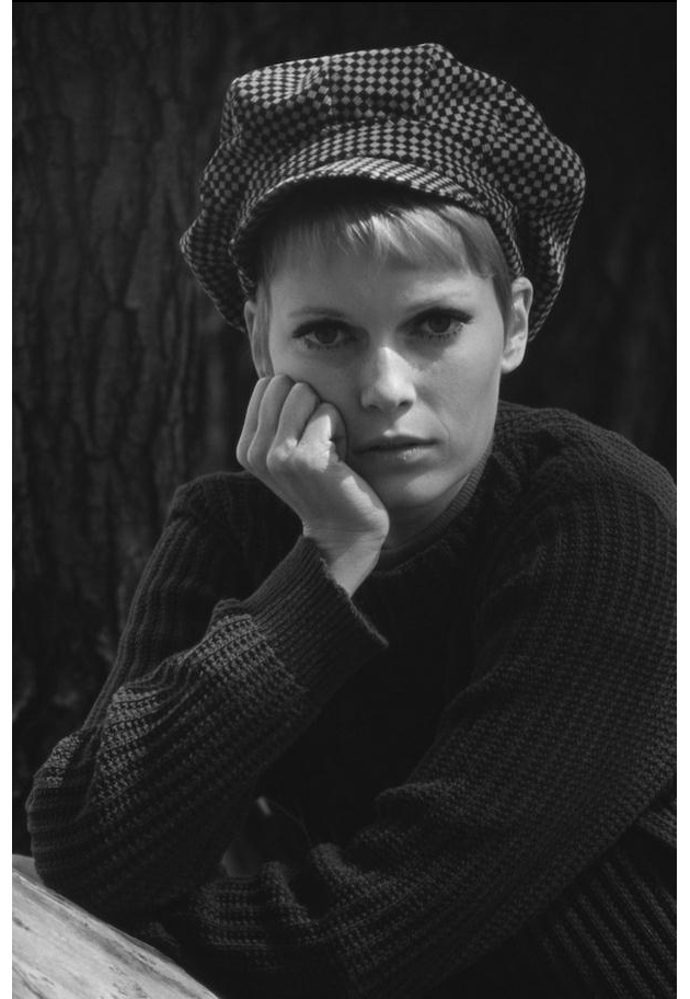
A blazer, a trenchcoat, a tuxedo, a pair of jeans and a bowler hat. Are these items you would find in a man’s closet or in a woman’s? The answer is: both. The trend of women wearing menswear has been for decades considered chic for several seasons, and can still be seen on the runways. Balenciaga, Balmain and Marni are just a few examples of fashion houses giving their take on the menswear trend 2013. How has this trend evolved through time?

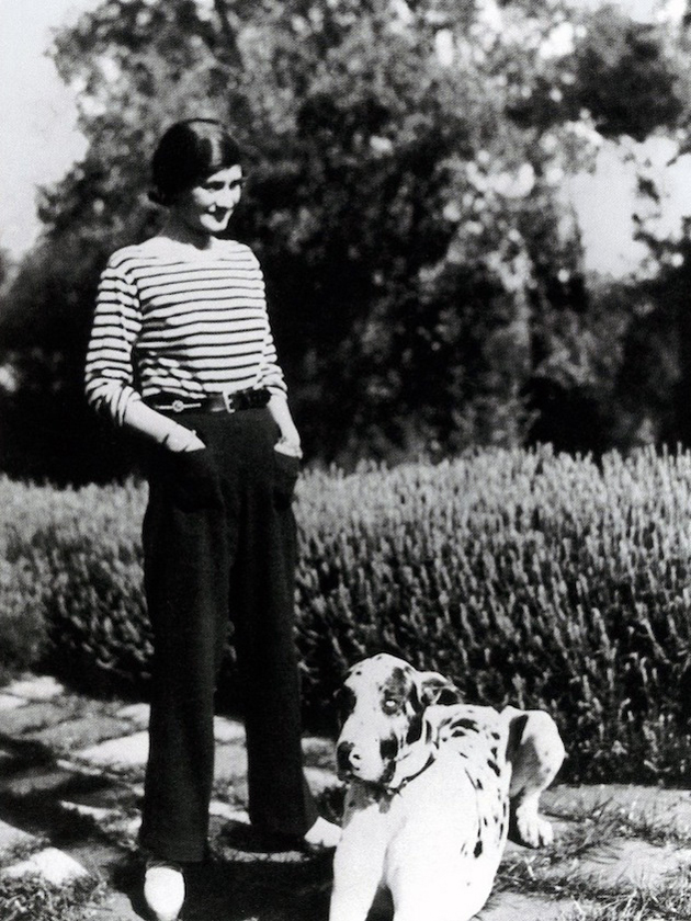
During World War I many women were forced to step in and do “men’s jobs”. That was something that changed the way women dressed, since the female wardrobe at that time wasn’t as practical as it needed to be. It was only natural to glance inside the male closet for inspiration. Some women openly wore both pants and blazers as well as cut their hair short and even smoke cigarettes, just like men. The novel La Garçonne (The Tomboy) was released in 1923 and became a big hit among women fighting for their freedom to live as they pleased, which came to increase the popularity of dressing androgynously.

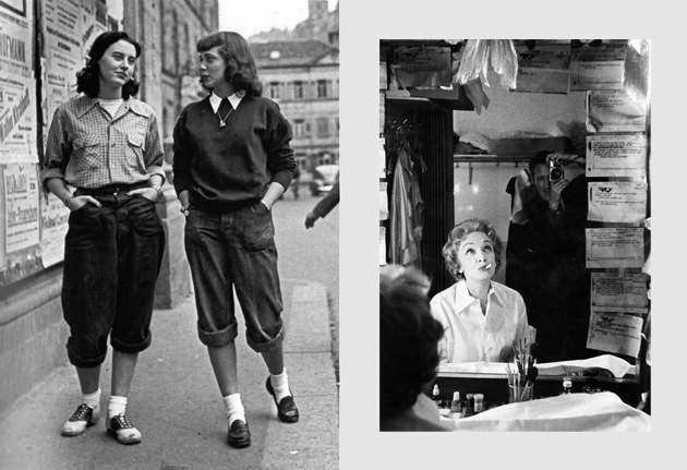
In the 1930s the trend was spotted even in Hollywood with names such as Marlene Dietrich and Katherine Hepburn sporting the look. It was through this that the male wardrobe became more accepted to be worn by a woman. Still it was to be adapted into a feminine take.


After World War II the feminine silhouette was brought back, mainly by Christian Dior who introduced “the New Look”. It supposedly reached all the approval it gained due to the fact that using a lot of fabric helped keeping the mind off the troubled years Europe had just left behind; something that menswear couldn’t compete with. However it didn’t take long for androgyny to re-enter the runways and the mindset of the fashionistas all over the world. During the 1960s, 70s, 80s and 90s it was interpreted in many ways; the hippie, the punk rocker, the popper and the grunger are just a few examples of styles created during these times.

In the 21st Century the ”Tomboy” is even more free to dress how she likes, not forced to stay within one specific genre. You can choose to add a feminine touch whenever you borrow something from a man’s closet, like adding a crystal cuff or mixing a preppy blazer with an oversized shirt. Why this trend works so well, is always an individual perception.


Victoria Edman

Share: Facebook,  Twitter