.
Guest Interview n°25: Giuseppe Basile
Domus is one of the world’s foremost design and architecture magazines. Founded by Gio Ponti and first published in 1928, it is an elemental part of Italy’s design and architectural worlds. It is also among the most iconic publications from Milan, having matured through the 20th century alongside its home city, and has experienced its ebbs and flows intimately. It remains a powerful symbol of Milan’s reign as world capital of design, and itself faces down a treacherous path in the coming decades as communication of every form faces radical shifts.
The magazine’s art direction has been on the cutting edge for decades thanks to Giuseppe Basile. From its high-contrast early 1990s look and deliberately “technological” feel of the 2000s through last year’s sweeping redesign, Mr. Basile’s work has always been exemplary. He is, indeed, one of today’s great art directors.
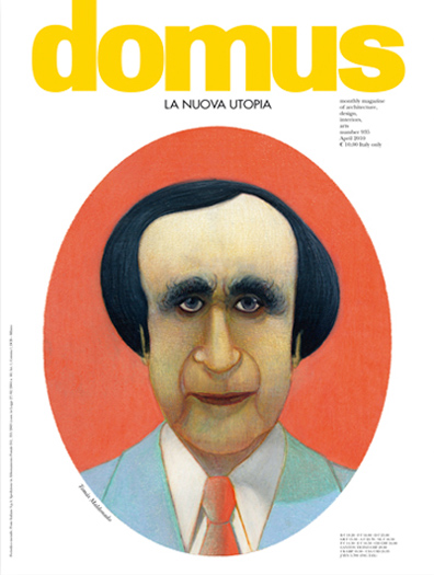
We had the pleasure of meeting with Basile just as Domus once again finds itself in the midst of a drastic redesign, and on the eve of Salone del Mobile – Milan’s defining event. His vast knowledge and sensibilities are a refreshing counterpoint to the transitory, superficial environment we often find ourselves in.
Tell us a bit about your beginnings. Your origins, your education, your career path. How did you get your start as an art director?
I studied at the ISA di Monza, the school wanted by Pagano and Persico to bring the Bauhaus experience to Italy. Those were fantastic years in which I had the possibility to get to know big names in the art world as a student… in the professional world, I gravitated instantly towards magazines, which had been a constant in my life, even if I never ignored other sectors of communication, I always held that the editorial world was and remains the “gym” for a graphic designer.
I arrived at Domus in the 1980s, just after Mendini’s first stint as director… the magazine was then run by Mario Bellini, Lampugnani and Di Battista with some of the most talented (then) young journalists in the world of architecture and design. Pierre Restany coordinated the art, and I had the great fortune of seeing Italo Lupi work as art director. From him I learned much, then little by little, the longer I stayed at the magazine, I met other major graphic designers like Simon Esterson, and most of all Alan Fletcher, which whom I collaborated for five amazing years.
The quick (and deliberate) turnover of directors at Domus meant that I never had to change magazines, because the magazine itself changed every three years. It remains like that to this day. For the future, we’ll see…
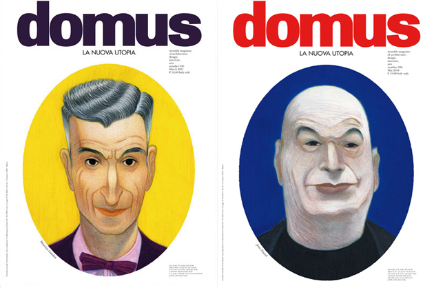
You’re the force behind last year’s stunning redesign of Domus, which coincided with Alessandro Mendini’s installation as director. Give us a bit of background on the drastic change.
It happened one year ago, when the editor asked Alessandro Mendini to confront the massive changes we’re experiencing in communication. He accepted, with a rather monographic vision of the magazine, made up of of eleven publications with a 360° look at the state of planning, architecture, and design in the world: LA NUOVA UTOPIA (The New Utopia).
And it was a unique experience. It gave me the opportunity to get closer to one of the most illuminated minds in contemporary planning for a project we passed over twenty years ago, and that we assumed would never have the chance to reach fruition. Mendini prepared Domus for the “new era,” which is now being undertaken by the young, intelligent and determined architect Joseph Grima, who will have the difficult job of reinventing the magazine in the world of new technologies in communication.
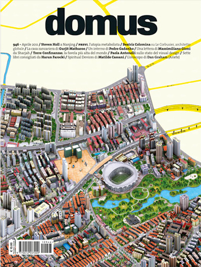
Since Mendini’s deliberately short stay has come to its end with the last issue, #945, can we expect another complete redesign anytime soon?
Like I mentioned before, the change is already underway. Grima will bear the torch of Domus for the future with a sharp eye on the contemporary and on technologies that will have an impact on the world of architecture, design and planning.
Now we’re preparing the new project, and the premises are really very interesting. Salottobuono and the company directed by Grima are developing a project that is a real pleasure to be a part of. Naturally, there will be many changes – these last eleven issues were “one-offs.”
Grima’s vision is different, and it will be unveiled in the next few days within the context of the grand events of Salone del Mobile.
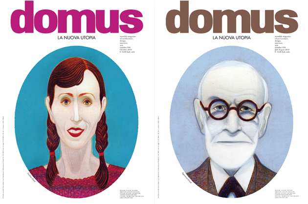
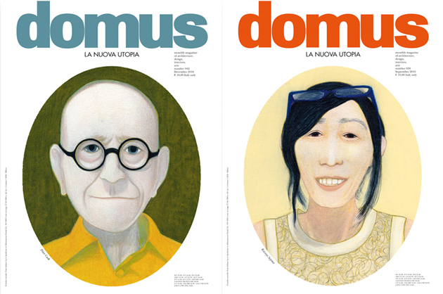
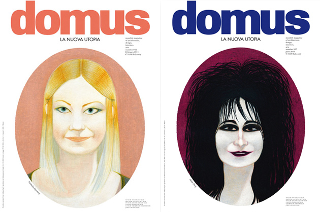
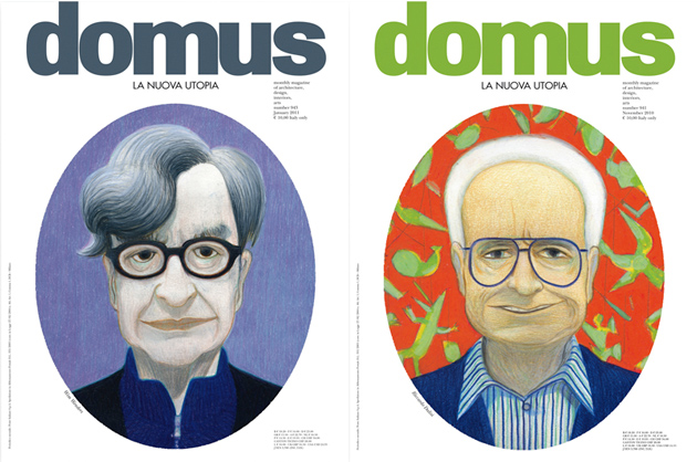
The most striking part of the last redesign remains the Lorenzo Mattotti portraits that have adorn the cover of the past year’s issue. Explain the decision to feature the portraits rather than imagery more directly related to contents?
Thirty years ago, when Mendini left Domus for the first time, he characterised his own direction with covers outside the “chorus,” which had lasting effects on art direction. In fact, he was the first to adopt the portrait in a systematic way for an architecture magazine. Back then they were photographs: pieces of artistically retouched “optical magic.” So, once again director, he wanted to revisit a discourse that had been abandoned as “suspect,” but with a new style. So he arrived at illustration, and the choice was made to commission Mattoti, probably the best-known Italian illustrator abroad.
The most interesting thing was the challenge of asking an artist whose style we liked, but who had never made portraits to make portraits! He accepted the experiment immediately, without hesitation and the result was perfect.
At the beginning the choice of these eleven portraits remained to be made, but once Maldonado was chosen (for the first of the issues), it became a natural progression.
What is working at Domus like? Is there a sense in the company that you’re the stewards of Gio Ponti’s legacy?
Of course. It has always been very gratifying to contribute to a project that has lasted for more than eighty years. Like I mentioned before, it gave me the opportunity to meet exceptional people, and that is the most that one can hope for from his profession because it permits you to keep growing.
Even today, with the this last experience with Alessandro Mendini, I was improved, enriched and surprised at the discoveries, and I don’t just mean on an intellectual level.
I consider this a real fortune.
Domus’ identity is wrapped up in the identity of Milan itself. Where do you see Milan in the grand scheme of things in today’s dramatically changed world?
Milano in the 1970s and 1980s was often referred to as the “Mecca” of design. That means that we have a heavy heritage to stack up to, and since we know when things are going well, the bad things are harder to see. Those things, which today are very present, leave it up to us to show that we deserve that heritage. And to do that, we must be even better than we were in the past.
What long-term impact do you think the 2015 Expo will have on the city? Its identity?
It’s difficult to express the difficulty with which everything is progressing for the Expo 2015 project. A huge opportunity has knocked on our door in a moment of extreme economic and social drama. This is a strong reason, thought that it must be overcome through our capacity for doing. Everything depends on how the operation will be managed, and only then can we really know anything about the impact it will have on the city.
Art direction can, paradoxically, be an invisible job. You’re charged at once with crafting a publication’s distinctive style while making sure that your work doesn’t distract or detract from contents. What do you consider your ‘signature’?
I don’t think it’s an invisible labour. I think the opposite: that we almost always tend to look solely at the aesthetic side to the detriment of content, and this puts us graphic designers in the front row. And in the line of criticism.
I think that art direction must be subordinate to communication, i.e. the content (nothing is really beautiful if its its separated from its contents, according to Charles Eames, but there’s a middle ground to be found). As in an orchestra, there are fundamental instruments that must be present and those that must be, let’s say, “discretely present” to play on their proper strengths. This is an ambitious result that is not always achieved… but when it’s like that, I’m happy with my work.
So, just how adventurous can an art director be while still effectively getting the publication’s message across?
Obviously, personal capacity is fundamental (this should be implicit in this question), but everything depends on the reader: the more illuminated he is, the more the art director can push himself forward. You’re lucky to have an audience that allows for uncensored possibilities, otherwise adventure would be downright reckless.
With everything from I.D.’s demise to the New York Times inevitable web-only future and a flooding of new tablet-based magazines, where do you see magazines a decade from now?
The calendar you’re asking me for is only in the agenda of people like Steve Jobs. It all depends on how technology will … . In fact, almost everything depends on this, so it will determine the acceleration of events. For our part, we can manage contents, but the case of NYT is simply a technological question. Giving news once a day obsolete when applications are updated in real time.
When you go deeper, it’s different. Criticism and research which naturally need time give the possibility of differentiation of mediums. The web has taken its place in the world, and will become powerful just like all the other means of communication in their own time… this of course will clean up the editorial world’s paper version.
But it is possible if well managed that magazines will become the reference point of these ten incredible years. This is a crucial point of the debates that are unfolding right now all over the world.
If you had to choose one typeface to use exclusively for the rest of your career, what would it be? (We’re stricter than Vignelli!)
Oh, Vignelli! I find that being able to express your own graphics using one or two fonts (like in the case of Vignelli, but also of Fronzoni and others) is naturally to make first-rate works. It is a measure of talent and capacity. It is one of the elements that characterises many of the “masters.” Still, many have shown an exceptional expressive capacity using as many as possible and exploiting huge creative possibilities in typography…Lubalin, Chermayeff, Fletcher, and Italo Lupi in Italy.
Me for my work, I have always followed and appreciated both schools of thought, but I have to say that I love all typographies. In every typeface, I find reason to fall in love, even in sheets of paper cut into characters… think of Matisse!
In your opinion, what is the most beautiful magazine in the world? (Other than Domus!)
I’m enticed by “mythical” magazines that have changed the world and our way of thinking…
Those which have the best contents, in all senses…

