11/03/2013

White Socks in Men’s Wardrobe

White Socks in Men’s Wardrobe

Socks are that kind of stuff fashion universe loves to experiment on or make it disappear in turn. It depends on the year and on the single designer. They are a part of the so-called details of a whole look; they can make the difference, or not. Apart from that, there is always something related that remains ambiguous, something that keeps dividing opinions: men who wear white socks. Are they actually cool or just geek?
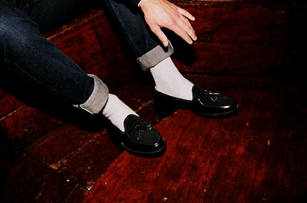
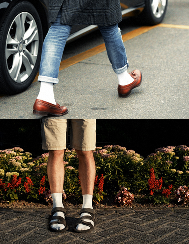
It may sound corny, but reality shows that although people are not scared of wearing colored patterned socks, many of them feel very uncomfortable about wearing the white ones. Most of us do not really know about the history of this curious element of men’s style, which can really be hard to match with, but on the other hand, give you a very personal and strong impact.

White socks have been identified until 60s as the classic, comfortable and better choice for worker men, and they have been called for years “athletic”, since everyone used them in sports. Around the end of 50s the term preppy became even more known and it was in 1961 that The Beach Boys came out. Buttoned-down shirt, chinos, penny loafers and white socks: male youth wanted to look exactly like them.
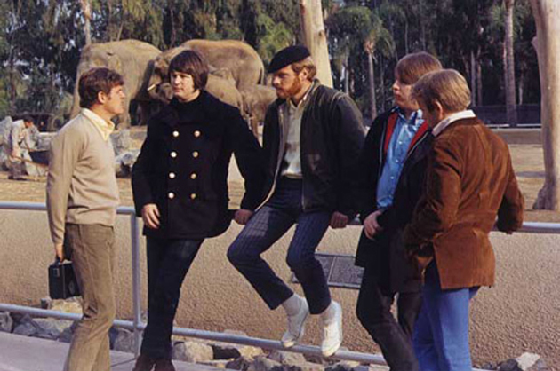
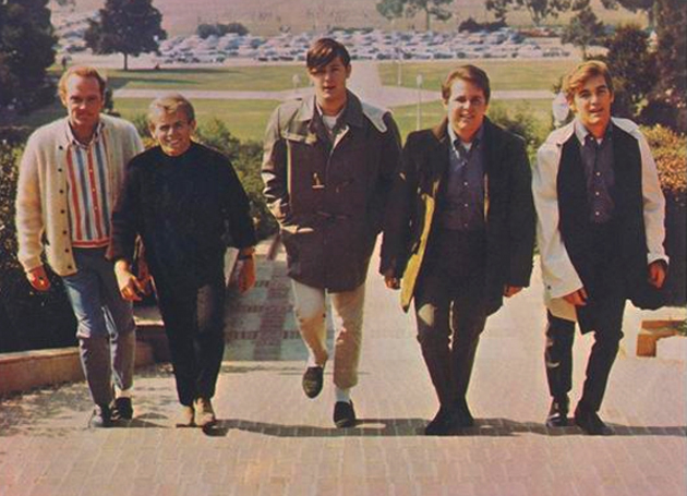
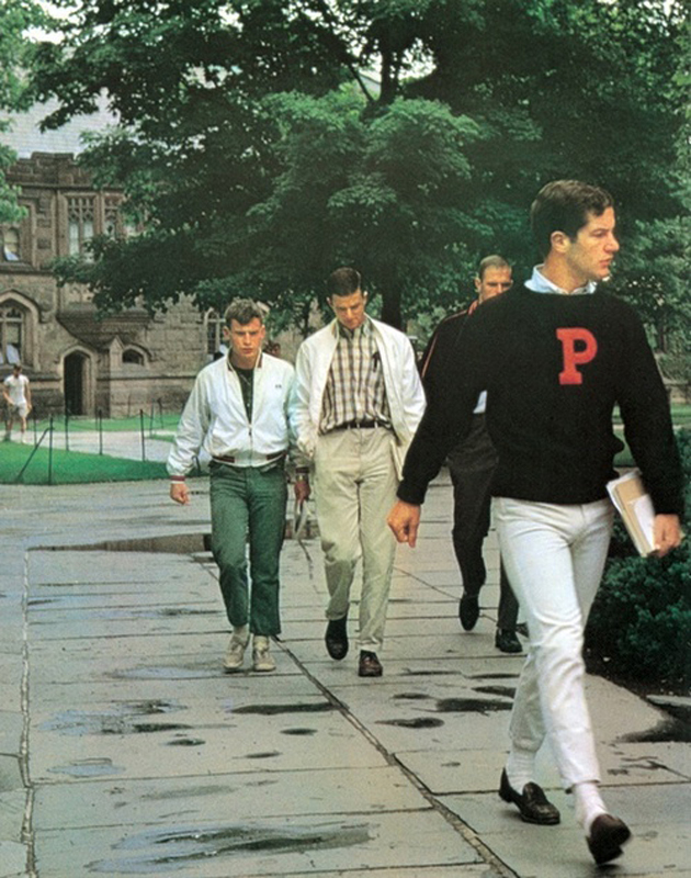
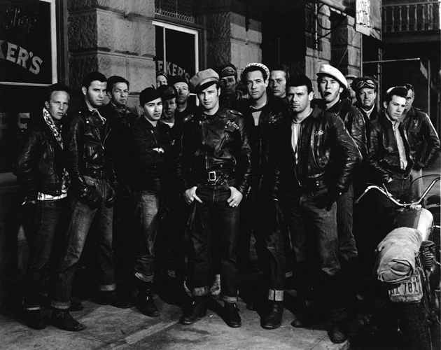
So if you were young, American and going to college during the end of 50s/beginning of 60s, wearing white socks was a must. It remained as a hit for several years till mid-60s, when they disappeared again. Some time after one noticed a shift from white to black, thanks to the upcoming era of urban look. Everyone, back then, aspired to dress up like Marlon Brando in the 1953 movie The Wild One. There was not more space for preppies.

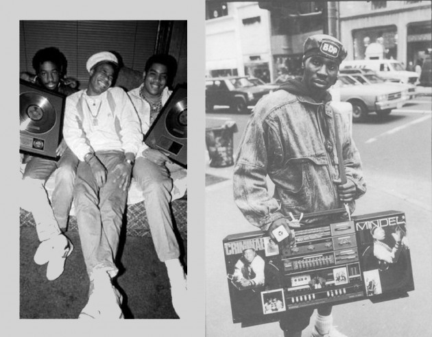
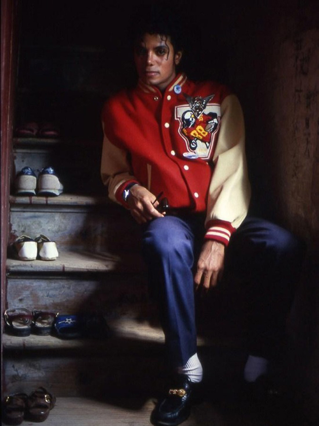
After almost ten years, white socks came back. This time it was because of the black American youngsters who were going to school dressed up in a urban-sporty way but wearing, very proudly, their white socks. The socks started being popular among the very “cool” people again. The 80s arrived and Michael Jackson made them part of his own signature style.

You may love or hate them, in any case they have been, and still are, an interesting trend in the male fashion universe.
Francesca Crippa

Share: Facebook,  Twitter  
08/03/2013

Clet – The Man on the Streets

Clet – The Man on the Streets

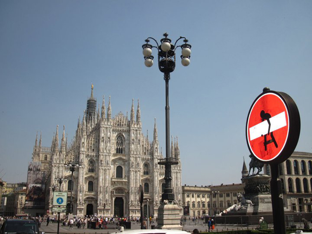
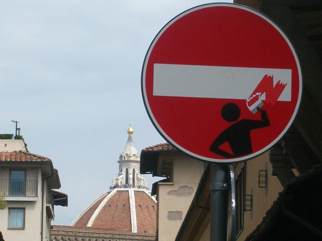
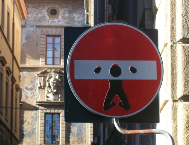
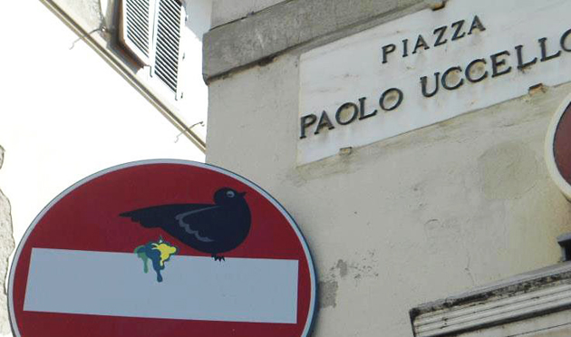
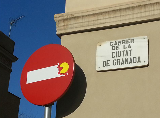
Have you seen them? Road signs modified with stickers. They’re works by Clet Abraham – an artist from Brittany, based in Florence – who has for few years been globetrotting the Italian and European cities with an unusual mission: attaching removable stickers to road signs, to modify their meaning without making them unrecognizable to drivers. From Bologna to Paris, passing through Valencia: Abraham’s nightly guerrilla changed “no entry” signs into pillories that imprison a man’s head and hands, the T indicating a “no through road” into a cross for Jesus Christ, the triangle that gives warning for the presence of an asymmetric bottleneck and the arrow indicating a one way direction, together, into two lovers and a pierced heart.


The 46-year-old artist declared that his art, rather than an hymn to anarchy, is a motivation for reflecting on the chains that tie modern society and its citizens, forced to do things because of the invisible road signs that give the obliged directions to everything. Judging by the presence of religious references, especially Christ and angels, Abraham seems also to attempt a critique to the religions, and gives life to a personal warning oriented towards local administrations, that often waste public space for useless buildings and architectural projects. You see, the ingredients for visibility are served: a smart, easy-to-use creativity spiced with messages of social, political and religious denunciation.


Abraham is, for definition, a street artist, but he considers his art less damaging and invasive than the graffitis, as an art form. Thinking about it, he is not much different from the Writers, especially from the most exhibitionist ones. He issues interviews, makes photos of his works and posts them on his Facebook fan page, followed by more than 25K fans. In 2010, he placed a self-portrait in the Loeser collection of Palazzo Vecchio, in Florence, in place of a Bronzino painting that was previously moved. Just few years earlier, in 2003, an unknown english graffiti artist entered into the Tate Gallery in London and casually hung his painting as if nothing had happened. You can bet that beyond all his good causes, when he carried out this little act, Abraham desired for himself even just a little piece of the fame that the graffiti artist had gained with his deed. His name was Bansky.


Antonio Leggieri

Share: Facebook,  Twitter  
07/03/2013

The Spotlights of Paris for AW1314

The Spotlights of Paris for AW1314

La ville lumière strikes again, and for next winter seems to tell us that when everything seems to be already said and done, and you can’t go too forwarding, then, let’ s all go emotional, doesn’t matter if you have to do it in a minimal or in a chaotic and apparently messed way. Note to self: always stay masculine and wear dark tones.

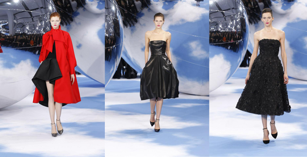
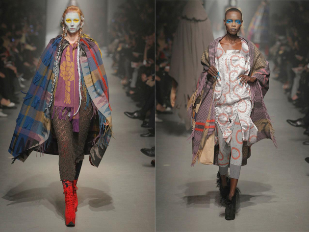
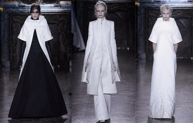
What we have seen on the catwalks is a particular emotional side of clothes, which embraces you subtly, then gently whispers to your ear. These voices are embodied in the warmer and rounder clean lines of Celine, in the combination of the mesmerizing set and perfection of the clothes Raf Simons creates for Dior, or in the colorful “over layered” chaos of Vivienne Westwood, up until the theatrical and monastic vibes Ann Demeulemeester, Rick Owens, and his pupil Gareth Pugh have shown.

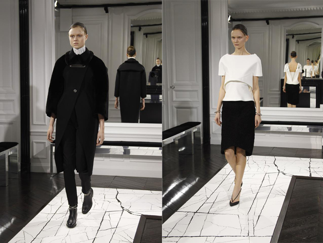
Minimal is a long time trend in more recent years, especially in these so called crisis days. More than ever, this season, there is no space for too frivolous or baroque volumes and details, at all. Damir Doma takes all off, leaving just the simple shape and just few important enlightened details; somehow similar to what Alexander Wang has done, his own way, in a B/W palette for his first collection at Balenciaga (very Cristobal indeed), keeping the traditional curved volumes of the house. The absolute certainty “less is more” has reached everyone, gets when an enfant terrible like Jean Paul Gaultier goes rather simple and serious with his dummy-like corsets and long chiffon skirts, or John Galliano’s former label flirts with discipline and a clean lines and volumes.

Chaos, a clash of moods and styles, is the key for the historical/ethnic pastiche of Madame Westwood, but also for the grunge meets 70s bohemian collection of Saint Laurent or the fil rouge at Junya Watanabe, where biker perfecto meets punkish tartan and tweed to become patchwork dresses. On the other side, at Givenchy, Riccardo Tisci is able to create a well balanced “Victorian meets gipsy meets flamenco meets punk and… Bambi prints”.

The trend of trends, this season, is being feminine on masculine wardrobe. If you have a quick look through, you’ll bump into several classic pinstripe fabrics, and you’ll see trousers winning over skirts 10-1. One collection says it all: Stella McCartney, after getting us used to a very feminine line, following the body curves, now, showing on the catwalk a strong pinstripe/tartan collection, deeply inspired by a savile row touch on classic men pieces with a sort of Japanese exaggerated sheltering volumes approach to them.


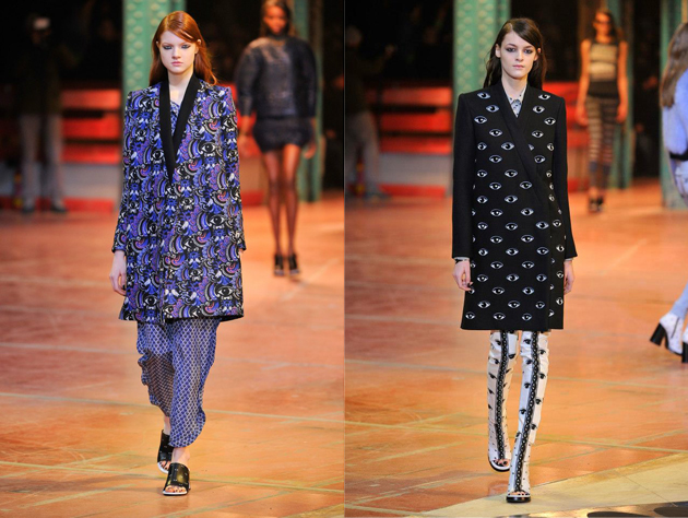
Last but not least: black is still up. We know it’s A/W, but for what we see on the catwalks, there is not much chance for bright plain colors: if designers are not going for dark tones, then it will be white or classics like tartan, brocade or floral prints and interesting surreal/playful patterns like the stylized eyes we have seen at Undercover, Givenchy and Kenzo. On the catwalks just few pale or acid pastels survives this “army” of B/W.

In the end, what counts more than trends, is that Paris sees a more-than-ever strong, subtly dressed, and self-confident woman coming for winter, even if she likes sneaking stuff by her man’s wardrobe.

Nicolò Parisi

Share: Facebook,  Twitter  
07/03/2013

Black And White Is Always Right

Black And White Is Always Right

Few colors have been used in fashion as much as black and white. Separate or together it seems like these two are a safe bet for any occasion. However, why has the combination of black and white been marked classic, while white and green is considered more capricious? As always the answer can be found by studying cultural and historical aspects.

The colors black and white have always been considered opposites within many cultures. In western culture black and white symbolize good and evil, or light and dark. Later, this came to be more apparent by dress code. White became synonymous with innocence and purity, particularly because white clothing or objects are so easy to stain. In most western countries this became a thought which developed the white wedding dress.

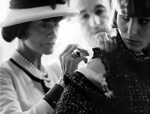
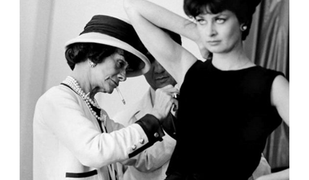
Black on the other hand was symbolism for dark times and death, and mourning apparel therefore came in black. In short, it can be said that black and white are colors that are understood through culture, but where does fashion fit in? After losing her beloved Prince Albert, Queen Victoria would naturally wear black making it unintentionally a fashionable color. Nevertheless it was Coco Chanel who introduced the little black dress in 1926, which was the beginning of bringing the mourning color onto the fashion scene.

Where black entered, its counterpart white naturally followed, and thus the black and white outfit of today started to develop. This can be linked to one simple fact: opposites attract. The reason why black and white go so well together has to do with their contrast. They enhance each other, making each of the colors pop, in opposite of what they would do next to a color closer to their own shade. Since both colors are deeply rooted within western culture it seems only natural for fashion to fall back on this color combination, for by looking at history it is not only classic, it is timeless.

Victoria Edman

Share: Facebook,  Twitter  
06/03/2013

Morrissey and the Media: What Difference Does It Make?

Morrissey & Media: What Difference Does It Make?

It’s been a tumultuous week for Morrissey, even by Morrissey’s standards. First, he issued a press release stating that his sold-out show at the Staples Center in Los Angeles on February 28th will be the arena’s first entirely meat-free concert. Pretty impressive, yes, only the Staples Center doesn’t seem to agree. He followed that up by canceling an appearance on the Jimmy Kimmel show after being informed that the program would also feature the cast of Duck Dynasty, a reality show about a family who sells duck calls and decoys to hunters. Morrissey referred to the cast as “animal serial killers”, Kimmel blasted him for canceling last-minute, and a feud ensued. And if that weren’t enough, he also gave an email interview with Rookie, a teenage girl’s magazine, in which he advised readers, among other things, that “Life is a very serious business for the simple reason that nobody dies laughing.”

Funny, nobody seems to remember Morrissey’s last single.

The Moz has been overtly controversial for most of his career, and pro-animal since the age of 11. He named The Smiths’ sophomore album Meat Is Murder and even forbade his own bandmates from being photographed eating meat. “The most political gesture you can make is to refuse to eat animals,” he quipped in that same Rookie interview. “It was so when I was a teenager, and is still the case now.” True to his word, he’s blasted Paul McCartney for allowing himself to be knighted by the Queen (due in part to her immense fur collection), refused to play in Canada because of their gruesome seal-slaughtering pastime, and often refers to Madonna as McDonna. For obvious reasons, of course.

He’s also a man of sharp contradiction. He toured extensively in the United States while the nation was engaged in two corrupt international wars, has made several racist comments over the course of his career (he once called the Chinese a “subspecies”), and said, in the Rookie interview, that “If more men were homosexual, there would be no wars, because homosexual men would never kill other men, whereas heterosexual men love killing other men.” Right.

So . . . Morrissey loves animals, despises humans? Got it.

Confused? Don’t worry. The Pope of Mope allegedly has a memoir in the works, so there’s a slight chance that all of this might start making a little more sense in the near future.

Lane Koivu

Share: Facebook,  Twitter  
05/03/2013

Pibal Bicycle by Philippe Starck and Peugeot

Pibal Bicycle by Philippe Starck and Peugeot

It’s been a long time since we’ve heard of Philippe Starck. Anyone, who has even a remote idea about design, surely is familiar with that name. Starck became widely known back in the nineties when a crisis in the design system and the rupture with the modernism has allowed him to emerge as a design superstar. Among his most iconic objects you may remember the juice squeezer shaped as a spider or a UFO, whichever pleases you best, or his lamps with the base which took form of a pistol, or even, one of his last designs for Steve Jobs’ yacht (which, as you may know didn’t end that well). Seen that he is so fond of both his superstar status in the world of design and the intentionally shocking objects which have earned him that status, it appears quite strange to see him involved in a project for a urban bicycle. Hey, but here it is, and it also seems actually quite useful and unobtrusive, two adjectives that Starck has deliberately rejected in the past.


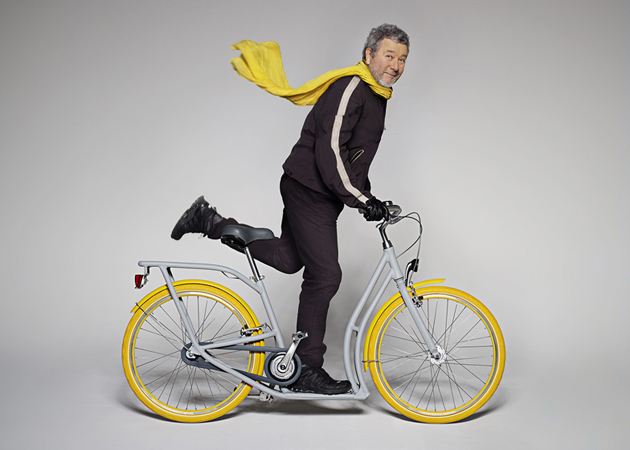
The bicycle in question was named Pibal and it is produced by Peugeot exclusively for the city of Bordeaux in France. It is a hybrid between a bicycle and a scooter, specifically developed after the citizens of the town listed a set of needs and suggestions that would allow them to cycle more easily. In fact, the set of references they have submitted has been translated into a perfect urban bike that one may traditionally pedal or, when traffic is heavy, use the low scooter-like platform to push themselves along with one foot. Pibal is made of aluminium and has yellow tires for visibility and big racks at the front and back. Currently developed in a limited edition series by French car manufacturer Peugeot, 300 units of Pibal will be lent to the citizens for free by the end of June.


“Just like the pibale, undulating and playing with the flow, Pibal is an answer to new urban ergonomics,” says Starck, “thanks to a lateral translation which allows oneself to pedal long distances, to scoot in pedestrian areas and to walk next to it, carrying a child or any load on its platform. It only has the beauty of its intelligence, of its honesty, of its durability. Rustic and reliable, it’s a new friend dedicated to the future Bordeaux expectations.” It’s is strange to hear Starck speak of an object in these terms, but since we whole-heartedly support this initiative, we can only say, let’s hope he does so more often.

Rujana Rebernjak 

Share: Facebook,  Twitter  
04/03/2013

Wandering in Silvia Bächli’s Ephemeral Worlds

Wandering in Silvia Bächli’s Ephemeral Worlds

Raffaella Cortese seldom, if ever misses a shot. After reviewing the women’s diverse expressions of mourning proposed by Kiki Smith last October, once again we return to the Milanese gallery to discover the first solo show by Silvia Bächli (b. 1956, Baden, Switzerland), another esteemed exponent of Ms. Cortese’s selected and intimist female art universe.
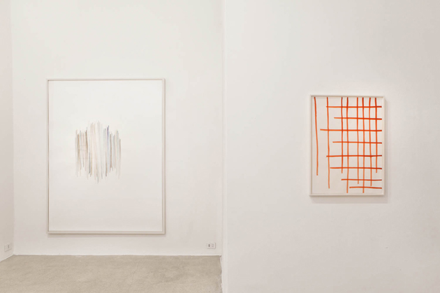

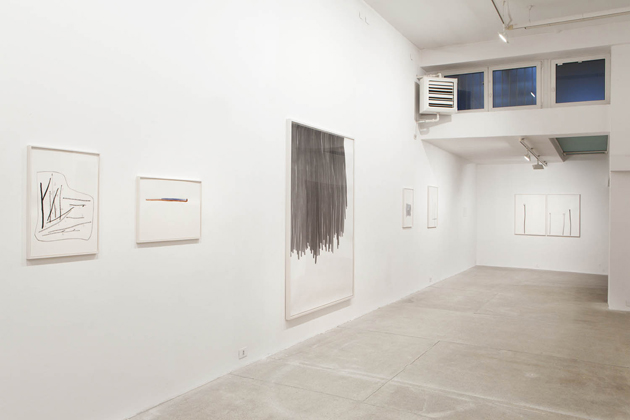
The Swiss artist, living and working between Paris and Basel, displays a bunch of her distinctive works created through the use of basic forms and materials: ink, gouache, charcoal, painting on white paper, characterised by a clean, delicate mark, tending to essential shapes with a light chromatism. Though reminding the abstraction of the minimalist American/Canadian artist Agnes Martin (1912-2004), Bächli’s approach is able to mix non-figurative and real elements strictly connected to the nature.

In her works flower stems turn into parallel lines, rectangles build vanishing forms and pale childlike female figures, apparently immersed in empty atmospheres, report an accurate, meditative construction of “unknown worlds where to wander, creating a space and exploring it, by acting with and against the paper edges.” 
In complete contrast to the present “spectacularization” of art, replacing the more and more flashy, shouted communication, the artist – who represented Switzerland at the 53rd Biennale of Venice – developed a low soft-spoken language made of slight, evocative and intimate words.


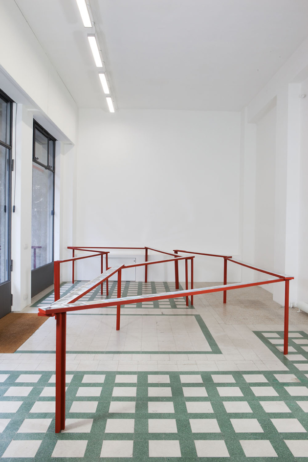
Exploiting the double exhibition space of the gallery, Bächli presents here, along with the series of drawings and paintings on paper of different sizes and techniques, a maybe less known, but still highly representative work. The photo installation entitled Hafnargata conceived with her husband, the Swiss artist Eric Hattan, and previously exhibited at the Kunsthalle Nürnberg in 2011, is the result of an explorative journey made by the couple in the barren landscapes of Iceland, a white primitive panorama, which perfectly reflects the essence of the artist’s poetic: “drawing means leaving things out.”


Monica Lombardi – Courtesy the artist and Raffaella Cortese Gallery, Milano © Lorenzo Palmieri

Share: Facebook,  Twitter  
03/03/2013

Sunday Breakfast by Love For Breakfast

Sunday Breakfast by Love For Breakfast

A bowl of fruit as a silent ode of love to the spring that still seems so far.

Alessia Bossi from Love For Breakfast

Share: Facebook,  Twitter  
01/03/2013

Your Childhood at V&A

Your Childhood at V&A

If you’re in London and looking for a way to ‘awaken your inner child’, the Victoria and Albert Museum of Childhood in Bethnal Green is the surest way to do it. Located in an airy, bright hall originally built for the Great Exhibition of 1855 and once part of the V&A Museum in South Kensington, the Museum of Childhood has an eclectic and delightful collection, bound to excite and inspire children both young and old.

Artefacts of childhoods recent and long-past are lovingly preserved in display cases. Within the permanent collection visitors can find treasures as varied as a doll from Ancient Egypt (1300 BC); a dollhouse from Restoration England; a complete Baroque puppet theatre; an unopened 1923 Christmas cracker (containing 6 different novelty caps, according to its advertisement); and a patchwork World War II party dress creatively made from scarps of material by its owner’s mother during wartime rationing. But be warned, you are just as likely to confront objects from your own childhood as from history, provoking all sorts of nostalgic memories. It is strangely reassuring to find your own treasures carefully labelled and artfully arranged in a museum, making you feel as if someone else cares as much about preserving your memories as you do.

In the middle of the first floor exhibit sits Sarah Raphael’s ‘The Childhood Cube’ (2000), a bright community art project created by Raphael and students from several schools. The cube is made up of 216 miniature rooms housing all sorts of mad-cap scenes and highlighted by dramatic optic fibre lighting. The effect is joyful and whimsical chaos, just as we would like to remember childhood. Mermaids lounge on sofas, the solar system hangs over black and white bathroom tiles and stairways shoot out in every possible direction.


However, the most disarming and affecting objects are currently to be found in the front room, where local community groups have been creating their own museum; exploring what it means to treasure something, what objects we treasure and why. Personal photos and objects are proudly presented: sometimes with accompanying quotes and stories, other times left enigmatically unexplained, leaving the viewer to draw their own conclusions. Appealing to your inner voyeur, the display gives the impression of rustling nosily through someone’s open drawers whilst they are in the other room fixing tea.

Best of all, you can enjoy the permanent collection and the exhibitions entirely free of charge. All in all, a great way to treat yourself and your inner child to some quality time together.

Jennifer Williams – Images courtesy of V&A Museum

Share: Facebook,  Twitter